The Silent Drop-Off: Diagnosing and Fixing Hidden Friction in Multi-Step Forms

Multi-step forms are supposed to help completion rates.
Break a long, intimidating wall of fields into smaller, digestible chunks and people are more likely to finish—at least, that’s the theory.
But if you’ve ever watched your analytics and seen a promising stream of visitors quietly vanish between Step 1 and “Submit,” you know the truth: multi-step flows are just as capable of losing people as they are of guiding them.
The problem is that the loss often looks silent. No error messages. No angry emails. Just a quiet drop-off curve that starts somewhere in the middle and never quite makes it to the end.
This post is about finding that hidden friction, understanding why it happens, and giving you practical ways to fix it—especially if you’re building with tools like Ezpa.ge, where you can quickly iterate on themes, layouts, and data flows.
Why Silent Drop-Off Is So Dangerous
A single abandoned form doesn’t feel like a crisis. But at scale, silent drop-off is expensive.
Here’s why it matters:
- You’re paying for traffic you never convert. Every ad, every campaign, every social post that drives someone to your form is an investment. If they bail out on Step 2 of 5, that spend never pays off.
- Your data gets skewed. When only the most determined users make it through a form, your dataset becomes biased. You’re optimizing for a subset of your audience, not the whole.
- You rarely get feedback on why they left. People don’t usually tell you, “I quit your signup flow because Step 3 felt sketchy and Step 4 asked for way too much.” They just close the tab.
The good news: silent drop-off is often predictable once you know what to look for.
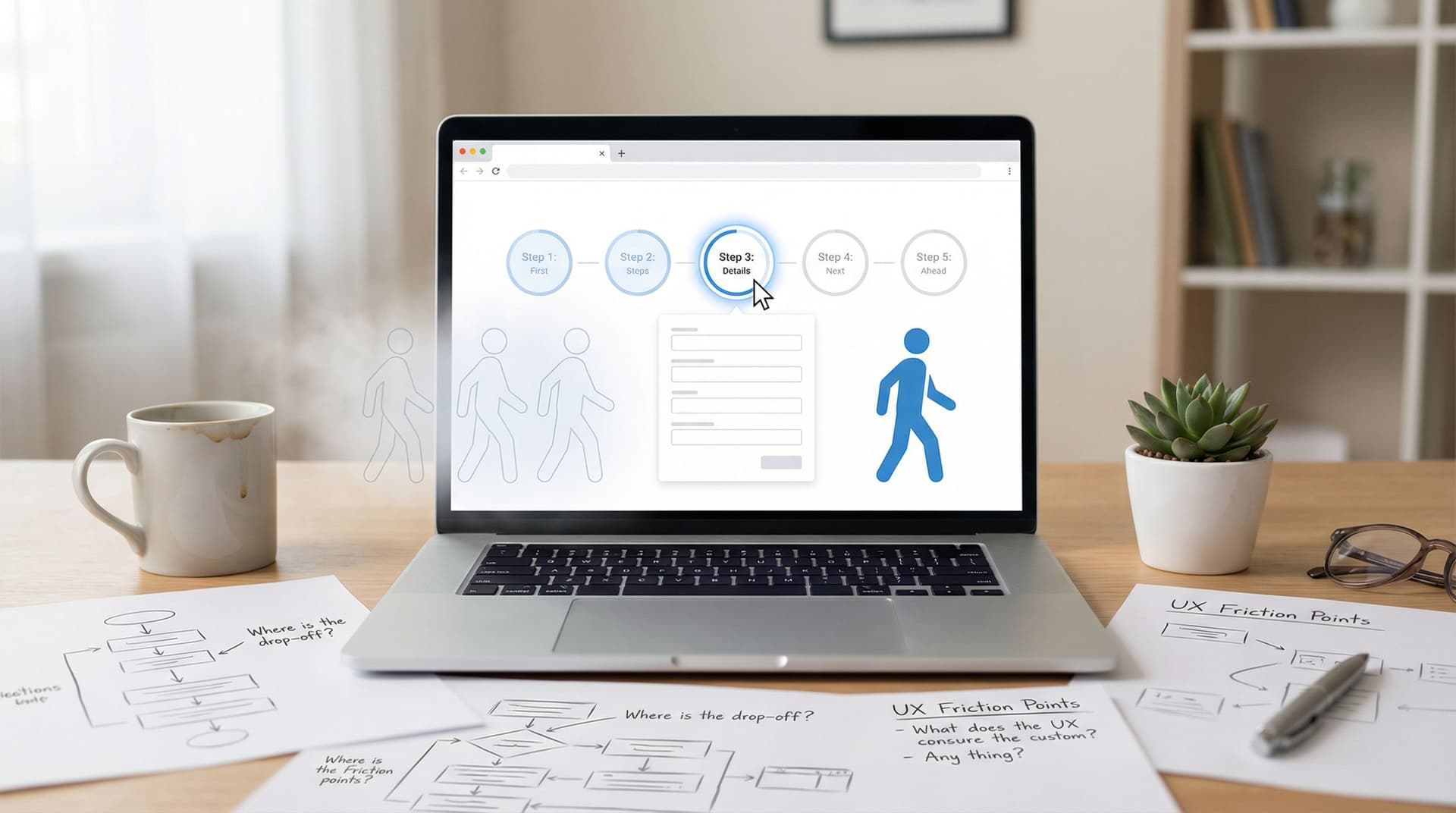
Step One: Make the Invisible Visible
You can’t fix what you can’t see. Before changing a single field, you need a clear picture of where people are abandoning your form.
Instrument your form by step
At a minimum, you should be tracking:
- Form views – how many people load Step 1.
- Step progression – how many people reach each subsequent step.
- Completion – how many people submit successfully.
A simple funnel might look like this:
- Step 1 viewed → Step 1 completed
- Step 2 viewed → Step 2 completed
- Step 3 viewed → Step 3 completed
- Final submission
If you’re using Ezpa.ge with real-time Google Sheets syncing, you can log each step transition as a row or column update and build a live funnel in Sheets. For a deeper dive into turning that live data into decisions, check out Real-Time Forms, Real-Time Strategy: Turning Google Sheets Sync into a Growth Engine.
Watch behavior, not just counts
Numbers tell you where the problem is. Behavior tells you why.
Use tools like:
- Session recordings (e.g., Hotjar, FullStory, LogRocket) to see rage clicks, back-and-forth navigation, and hesitation.
- Heatmaps to see which elements attract attention or get ignored.
- Field-level timing (if your analytics supports it) to see where people get stuck longest.
You’re looking for patterns like:
- Many users hovering over a field but not filling it.
- Repeated attempts to go back to a previous step.
- Long pauses before clicking “Next” on a particular step.
Those are your first friction flags.

The Usual Suspects: Common Sources of Hidden Friction
Most multi-step form problems fall into a few repeatable patterns. Let’s unpack them.
1. Step order that doesn’t match user intent
If the first thing you ask for feels misaligned with what users expect, they’ll bounce before you have a chance to explain.
Red flags:
- Asking for detailed personal info before explaining the value.
- Requesting payment details before demonstrating benefits.
- Forcing account creation before showing a preview of what they’re signing up for.
Fix it:
- Lead with value. Make Step 1 feel lightweight and clearly tied to what they get. Example: “Tell us what you’re trying to achieve” before “Create an account.”
- Delay sensitive asks. Move credit card fields, phone numbers, or company size to later steps once trust is built.
- Use progressive disclosure. Start with 2–4 simple fields, then expand only as needed.
2. Unclear progress and commitment
When users don’t know how long something will take, they assume the worst.
Red flags:
- No progress bar or step indicator.
- Vague labels like “Next” with no sense of how many steps remain.
- Steps that feel uneven—one is tiny, the next is a huge questionnaire.
Fix it:
- Add a clear progress indicator. “Step 1 of 4” plus a bar is ideal.
- Keep steps relatively balanced. If one step is substantially longer, give it a label that justifies it, like “Tell us about your business (about 60 seconds).”
- Set expectations early. A short note at the start—“This takes about 2 minutes”—can dramatically reduce anxiety.
3. Fields that feel invasive or unnecessary
Not all friction is about layout. Sometimes the question itself is the problem.
Red flags:
- Asking for phone numbers when you don’t clearly need them.
- Detailed demographic questions early in the flow.
- Sensitive questions (income, health, etc.) without context.
Fix it:
- Explain the “why.” A small line of helper text—“We’ll only use this to send shipping updates”—can save a field.
- Make optional fields truly optional. Don’t mark everything as required by default.
- Defer or remove low-value questions. If you can ask it later via onboarding or email, do that instead.
4. Cognitive overload on a single step
Even if you’ve broken your form into steps, one step can still feel overwhelming.
Red flags:
- Long walls of text and tiny fields.
- Many different field types (dropdowns, radios, text areas) crammed together.
- Complex questions without examples.
Fix it:
- Group related fields with clear headings. For example: “Contact info,” “Project details,” “Preferences.”
- Use smart defaults and placeholders. Show realistic examples so people know what to type.
- Split especially heavy steps. It’s better to have 5 smooth steps than 3 painful ones.
For more on how layout and responsiveness affect perceived effort—especially on phones—see Designing Forms That Feel Native on Any Device: A Practical Guide to Truly Responsive UX.
5. Micro-interactions that break trust
Subtle details can make people uneasy, even if they can’t articulate why.
Red flags:
- The “Next” button occasionally feels unresponsive.
- Error messages appear late or in unexpected places.
- The form jumps or reflows awkwardly on mobile.
Fix it:
- Provide immediate feedback. Highlight invalid fields as users type. Show loading states between steps.
- Keep layout stable. Avoid elements that cause content to shift when they appear.
- Match your brand and URL. With Ezpa.ge, custom themes and custom URLs help your form feel like a natural extension of your site, not a random third-party page.
A Practical Diagnostic Framework for Your Multi-Step Form
Let’s put this into a repeatable workflow you can run on any form.
1. Map the journey from the user’s perspective
Before you dive into analytics, answer these:
- What is the promise that brings users to this form? (e.g., “Get a demo,” “Download the guide,” “Join the waitlist.”)
- How many steps stand between the click and that promise being fulfilled?
- At which step might a reasonable person think, “This is too much” or “I’m not sure I trust this”?
Write down each step with:
- Step name
- Fields included
- Estimated time to complete
This gives you a baseline hypothesis.
2. Overlay real data on that journey
Now bring in your tracking:
- Drop-off rate per step. Where is the steepest decline?
- Average time per step. Where do people linger or stall?
- Device breakdown. Is drop-off worse on mobile or desktop?
Combine that with your behavioral tools:
- Watch 5–10 session recordings for users who drop off at the highest-friction step.
- Note any repeated patterns of confusion or hesitation.
3. Classify the friction type
For each problematic step, ask:
- Is this emotional friction? (Trust, privacy, fear of spam.)
- Is this cognitive friction? (Complex wording, too many choices.)
- Is this mechanical friction? (Slow loading, buggy validation, poor responsiveness.)
This classification will guide your fixes.

High-Impact Fixes You Can Implement Quickly
Once you know where and why people drop off, you don’t have to redesign everything. Start with these targeted improvements.
1. Make Step 1 irresistibly easy
Your first step should feel like dipping a toe in the water, not jumping off a cliff.
Try this:
- Limit Step 1 to one primary action: email, or a simple preference choice, or a single multiple-choice question.
- Add a short, benefit-focused headline: “Tell us who this is for so we can tailor your demo.”
- Use a friendly progress hint: “Step 1 of 4 · About 2 minutes total.”
If you’re using Ezpa.ge, this is where a strong theme and clear typography go a long way. A clean, branded Step 1 builds confidence that the rest of the experience will be worth it.
2. Reduce unnecessary fields ruthlessly
Every field should have to justify its existence.
Ask of each field:
- Do we use this data immediately to improve the user’s experience?
- Is this legally or operationally required?
- Could we collect this later via onboarding, email, or a follow-up survey?
If the answer to all three is “no,” cut it—or make it optional.
For fields you keep:
- Add helper text where the intent might be unclear.
- Use dropdowns or radios instead of open text where appropriate to reduce effort.
3. Smooth out validation and error handling
Nothing kills momentum like filling out an entire step only to get a vague error.
Best practices:
- Validate as users type for key fields (email, phone, password strength).
- Show error messages next to the problematic field, not just at the top.
- Use plain language: “Please enter a valid email, like name@example.com,” instead of “Invalid input.”
4. Optimize for the device your users actually use
If most of your traffic is on mobile, but your form was designed on a wide desktop monitor, you’re probably introducing hidden friction.
Check:
- Tap targets: Are buttons and fields easy to tap with a thumb?
- Keyboard behavior: Does the right keyboard show up for each field type (email, number, etc.)?
- Scrolling: Do users have to scroll awkwardly within a step, or is the layout clean and vertical?
Ezpa.ge is built to create responsive forms, but the details still matter. For deeper tips on getting this right, you might like Mastering Mobile Consistency: Bridging the Gap Between Aesthetics and Functionality.
5. Add microcopy that reduces anxiety
A few well-placed words can dramatically lower friction.
Consider adding:
- Under email fields: “No spam. Ever. Unsubscribe in one click.”
- Near phone fields: “We’ll only text you about your order status.”
- Before payment steps: “You won’t be charged until after your free trial ends.”
This kind of reassurance is especially helpful on later steps, when users are about to commit.
6. Use feedback loops to keep improving
Friction isn’t something you solve once. As your audience, product, or offer evolves, your forms need to evolve too.
You can:
- Add a tiny, optional question on the final step for those who do complete: “What almost stopped you from finishing this form?”
- Run periodic A/B tests on step order, copy, and field sets.
- Set up real-time monitoring using Google Sheets or your analytics tool to alert you if completion rates suddenly drop.
If you want to go further in turning user input into an improvement engine, explore Frictionless Feedback Loops: Using Forms to Continuously Improve Your Product Experience.
Putting It All Together: A Simple Playbook
Here’s a condensed version you can use as a checklist:
- Track by step. Make sure you know exactly where users drop off.
- Watch real sessions. Use recordings and heatmaps to understand behavior.
- Identify friction type. Emotional, cognitive, or mechanical?
- Fix the first impression. Make Step 1 light, clear, and valuable.
- Trim the fat. Remove or defer any field that isn’t essential.
- Clarify progress. Add step indicators and time expectations.
- Polish micro-interactions. Smooth validation, stable layout, responsive design.
- Reassure with microcopy. Explain why you’re asking for sensitive info.
- Iterate with feedback. Use real-time data and user comments to keep refining.
Run this playbook once, and you’ll usually see a noticeable lift in completion rates. Run it regularly, and your forms become living, optimized experiences instead of static questionnaires.
Summary
Silent drop-off in multi-step forms isn’t random—it’s the result of small, compounding friction points that push people away before they finish.
By:
- Instrumenting your forms step by step,
- Watching real user behavior instead of guessing,
- Classifying friction as emotional, cognitive, or mechanical,
- And applying targeted fixes to step order, field design, progress indicators, and microcopy,
…you can turn a leaky, frustrating experience into a smooth, confidence-building journey.
Tools like Ezpa.ge give you the flexibility to iterate quickly—adjust themes, reorganize steps, tweak copy, and connect everything to live data sources like Google Sheets. The real advantage comes when you use that flexibility with intention.
Your Next Move
Don’t wait for another month of half-finished forms to tell you something’s wrong.
Here’s a simple way to start today:
- Pick your most important multi-step form—signups, demos, applications, or surveys.
- Look at completion rates by step for the last 7–30 days.
- Choose the one step with the biggest drop-off.
- Apply one improvement from this article—simplify that step, clarify progress, or add reassuring microcopy.
- Publish the change and monitor results for a week.
If you’re building with Ezpa.ge, log in, duplicate that form, and start experimenting. Small, thoughtful changes can reclaim a surprising number of “almost” users.
The silent drop-off doesn’t have to stay silent. Start listening, start testing, and let your forms do the job they were meant to do: guide people smoothly from interest to action.