brand trust
inclusivity
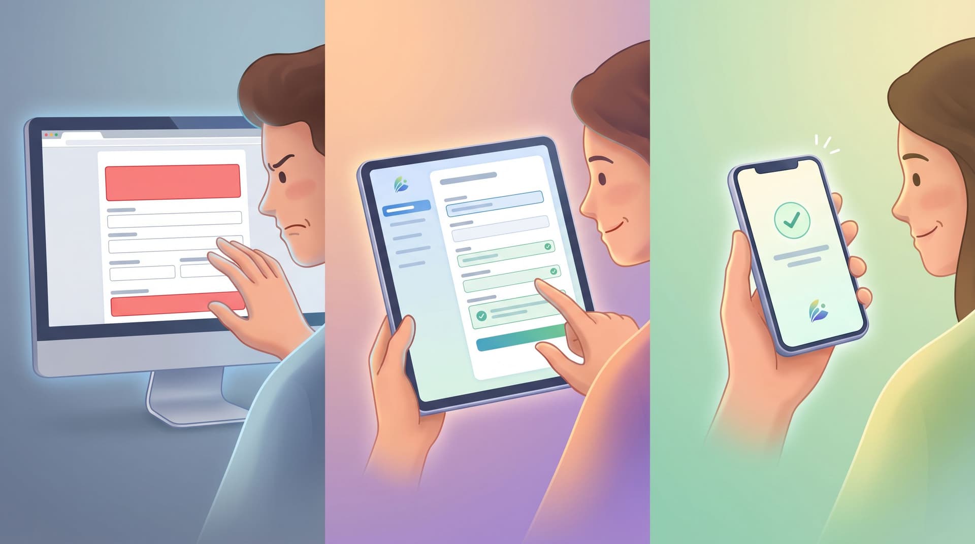
Forms as Brand Safe Rooms: UX Patterns That Protect Sensitive Topics Without Feeling Clinical
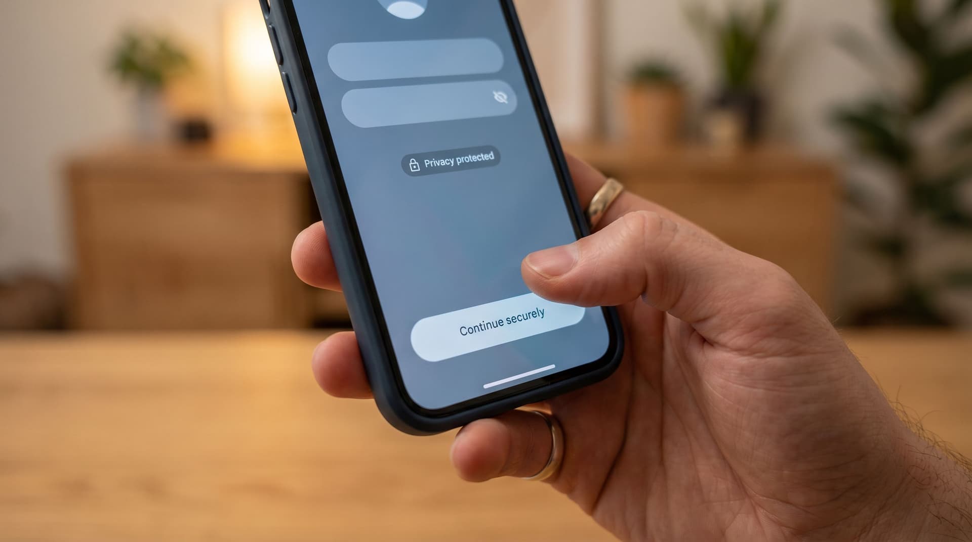
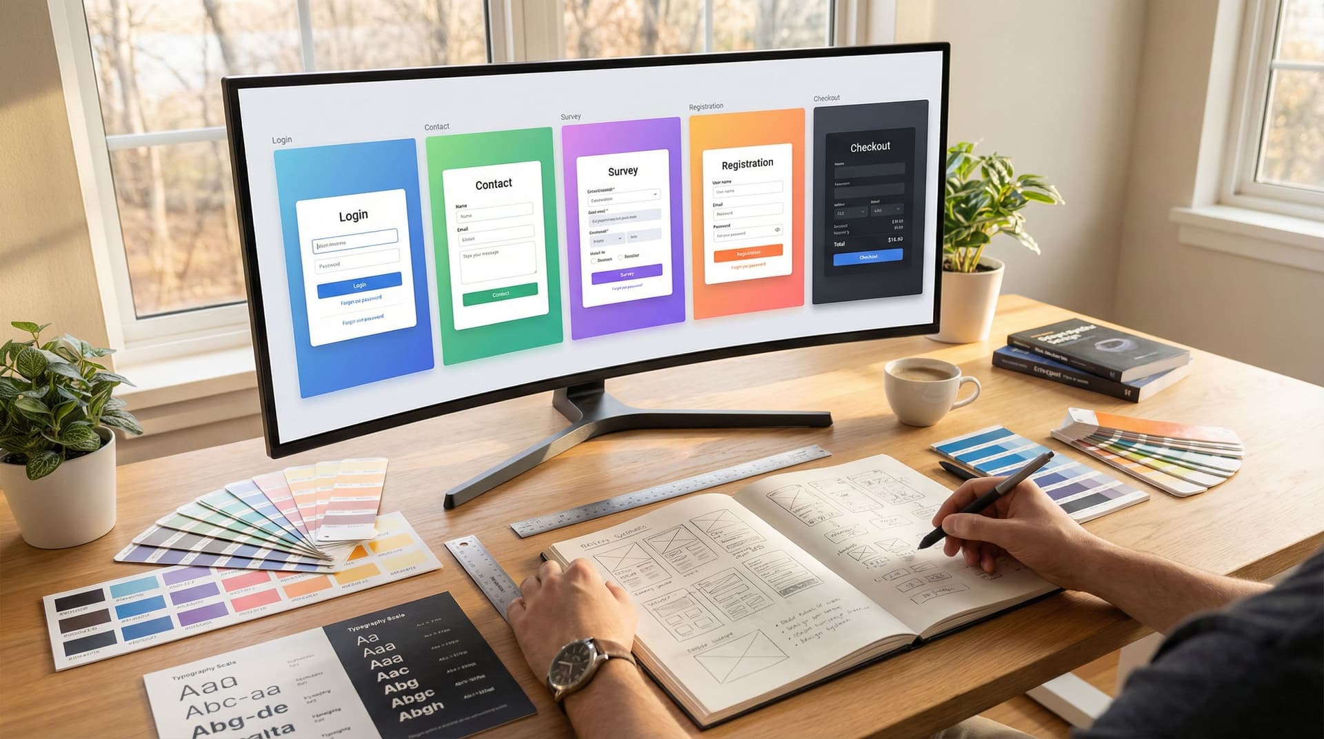
When someone hits your form to talk about money stress, burnout, harassment, health, or layoffs, they’re not just “converting.” They’re stepping into a vulnerable moment. Handled well, your form becomes a brand safe room: a space that feels private, grounded, and human—while still collecting the information your team needs. Handled poorly, it feels like a medical intake clipboard or, worse, a surveillance system. This post is about how to design forms that hold sensitive topics with care without turning your experience into a sterile questionnaire or a wall of legales