themes
analytics
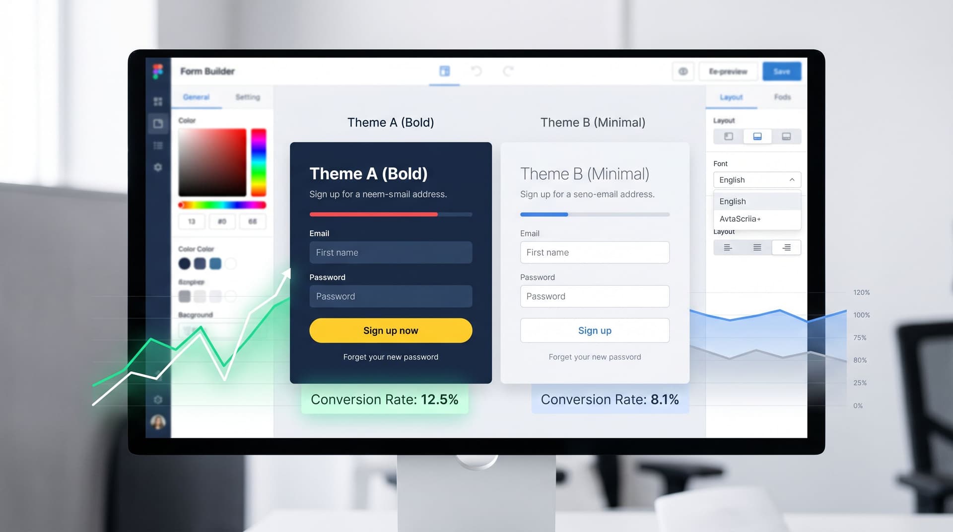
Theme-Driven A/B Testing: Experimenting with Copy, Layout, and Visual Hierarchy Without New Pages
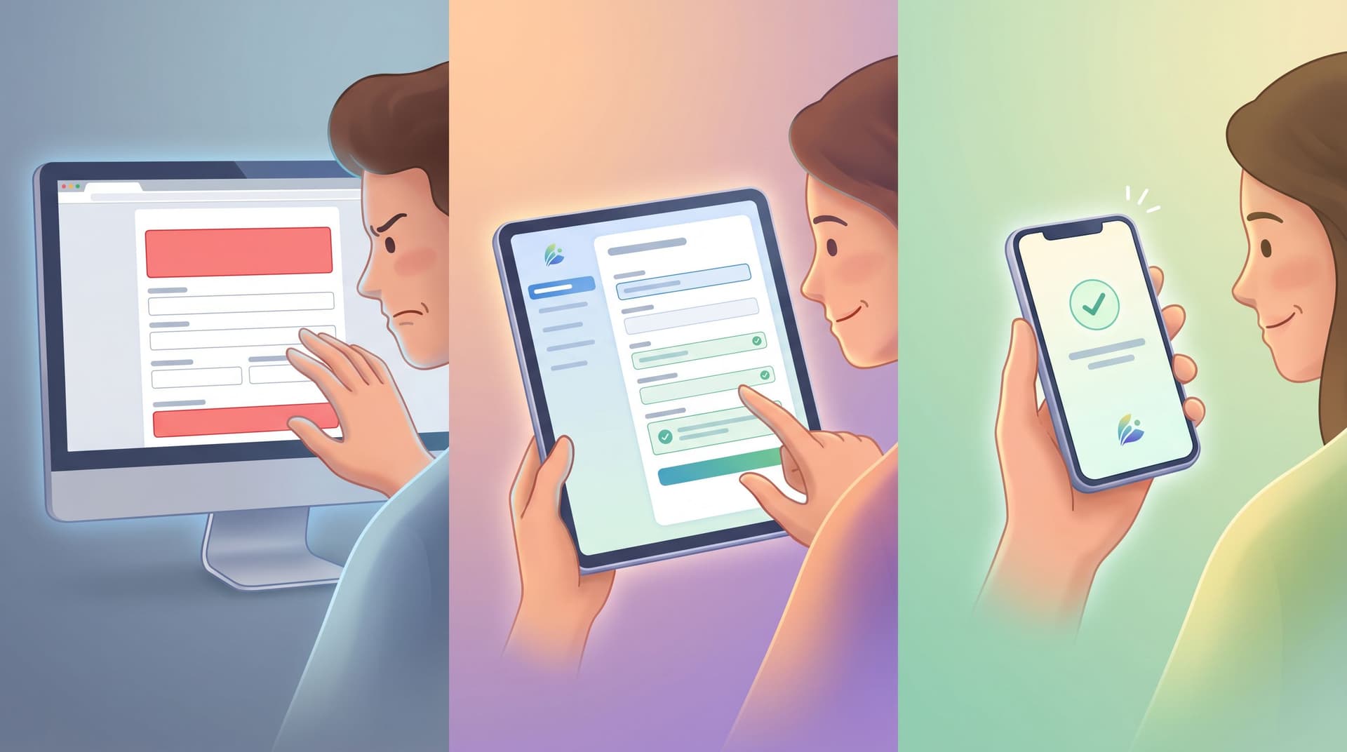
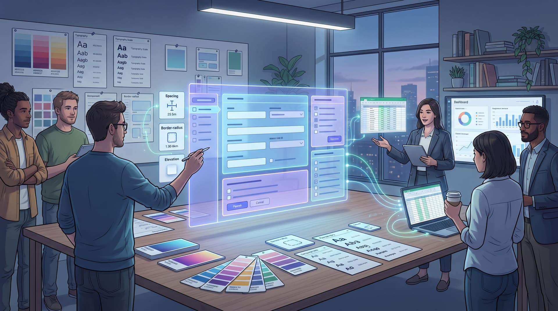
Form teams are finally waking up to a simple truth: you don’t need a new landing page for every experiment. If your forms already sit on flexible themes—colors, typography, spacing, and components you can swap like Lego bricks—you can run serious A/B tests entirely at the theme layer: Headlines and supporting copy Layout and field groupings Button style and placement Visual hierarchy, from contrast to whitespace All without spinning up a fresh URL, wrangling another CMS template, or asking engineering to clone a page “just for this test.” This post is about how to do exactly that: use theme-driven A/B testing to learn faster, keep your data clean, and ship more confident changes to your funnels