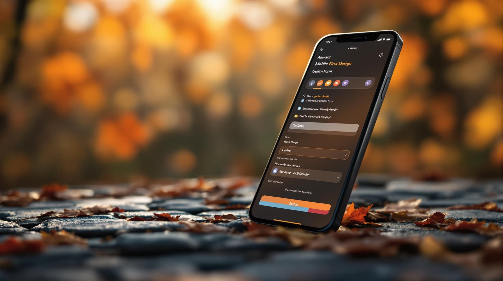
Designing Mobile-First Forms for Enhanced User Interaction

In the era of smartphones and tablets, designing mobile-first forms has become an essential strategy for engaging users effectively. With the majority of online interactions happening on mobile devices, creating forms that are optimized for smaller screens is not just a trend—it's a necessity. The mobile-first approach ensures that forms are accessible, user-friendly, and engaging, leading to higher completion rates and better user satisfaction.
Why Mobile-First Matters
The shift towards mobile-first design stems from the need to cater to the growing number of users accessing content and services on mobile devices. Here are some compelling reasons why mobile-first forms are crucial for enhanced user interaction:
- Increased Accessibility: Mobile-first forms are designed with the mobile user in mind, ensuring that forms are accessible and functional across various devices and screen sizes.
- Higher Conversion Rates: Well-optimized mobile forms reduce friction and make it easier for users to complete actions, leading to higher conversion rates.
- Improved User Experience: A mobile-first approach prioritizes user experience, ensuring that forms are easy to navigate, visually appealing, and quick to load.
- SEO Benefits: Search engines favor mobile-friendly websites, which can improve visibility and ranking.
Crafting the Perfect Mobile-First Form
To create forms that enhance user interaction on mobile devices, consider the following strategies:
Prioritize Essential Information
When designing forms for mobile, simplicity is key. Focus on collecting only the necessary information to reduce user fatigue and abandonment rates.
- Limit Form Fields: Ask for only the essential information. For instance, instead of requesting a full address, consider whether a zip code might suffice for your needs.
- Use Conditional Logic: Implement conditional fields that appear only when relevant, streamlining the user experience.
Optimize for Touch Navigation
Touch navigation is a critical aspect of mobile-first design, as users interact with their devices primarily through touch.
- Size Matters: Ensure that buttons and interactive elements are large enough to be easily tapped. A minimum size of 44x44 pixels is recommended.
- Spacing: Provide ample spacing between form fields and buttons to prevent accidental taps and improve usability.
- Gestures: Where possible, utilize gestures such as swipes and pinches to enhance interaction.
Enhance Visual Hierarchy
Creating a clear visual hierarchy guides users through the form effortlessly.
- Use Bold Labels: Highlight labels and headings to help users quickly understand what information is required.
- Contrast and Color: Employ contrasting colors to differentiate between different sections or actions, making the form easier to navigate.
- Progress Indicators: For multi-step forms, include progress bars to inform users of their advancement and remaining steps.
Ensure Fast Loading Times
Speed is a crucial factor in retaining mobile users. Slow-loading forms can lead to frustration and abandonment.
- Minimize Resources: Reduce the size of images and use compressed files to speed up loading times.
- Lazy Loading: Implement lazy loading for non-essential elements, ensuring that the form loads quickly without waiting for all components.
Test Across Devices
To guarantee a seamless experience, test your forms on a variety of devices and screen sizes.
- Cross-Device Testing: Use tools like BrowserStack or Device Mode in Chrome DevTools to simulate how your form appears on different devices.
- Real User Testing: Conduct user testing sessions to gather feedback on usability and make necessary adjustments.
Real-World Examples and Tools
To inspire your mobile-first form design, here are a few examples and tools that can aid in the process:
- Responsive Design Frameworks: Utilize frameworks like Bootstrap or Foundation to ensure your forms are responsive and adaptable.
- Analytics Tools: Implement analytics tools such as Google Analytics to monitor form performance and identify areas for improvement.
- Form Builders: Consider using a form builder like Ezpa.ge, which offers features like drag-and-drop editing, customizable themes, and real-time Google Sheets syncing to simplify form creation.
Summary
Designing mobile-first forms is a strategic approach that addresses the growing need for mobile accessibility and enhances user interaction. By prioritizing essential information, optimizing touch navigation, enhancing visual hierarchy, ensuring fast loading times, and testing across devices, you can create forms that are not only functional but also engaging and efficient.
Take the First Step
Ready to transform your forms into mobile-first masterpieces? Start by evaluating your current forms and identifying areas for improvement. Embrace the strategies outlined in this post to optimize your forms for mobile users, and watch as your user engagement and conversion rates soar.
To begin your journey toward better mobile form design, try Ezpa.ge today and explore the powerful features that can help you create stunning, responsive forms with ease. Embrace the future of user interaction and make your forms accessible and engaging for all users, no matter their device.