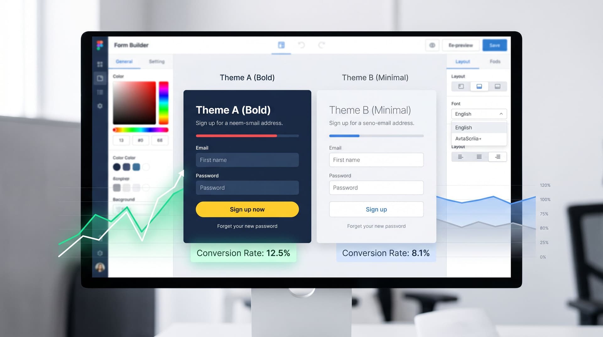
themes
mobile optimization
Responsive by Default: Designing Form Themes That Survive Embeds, Pop-Ups, and In-App Modals
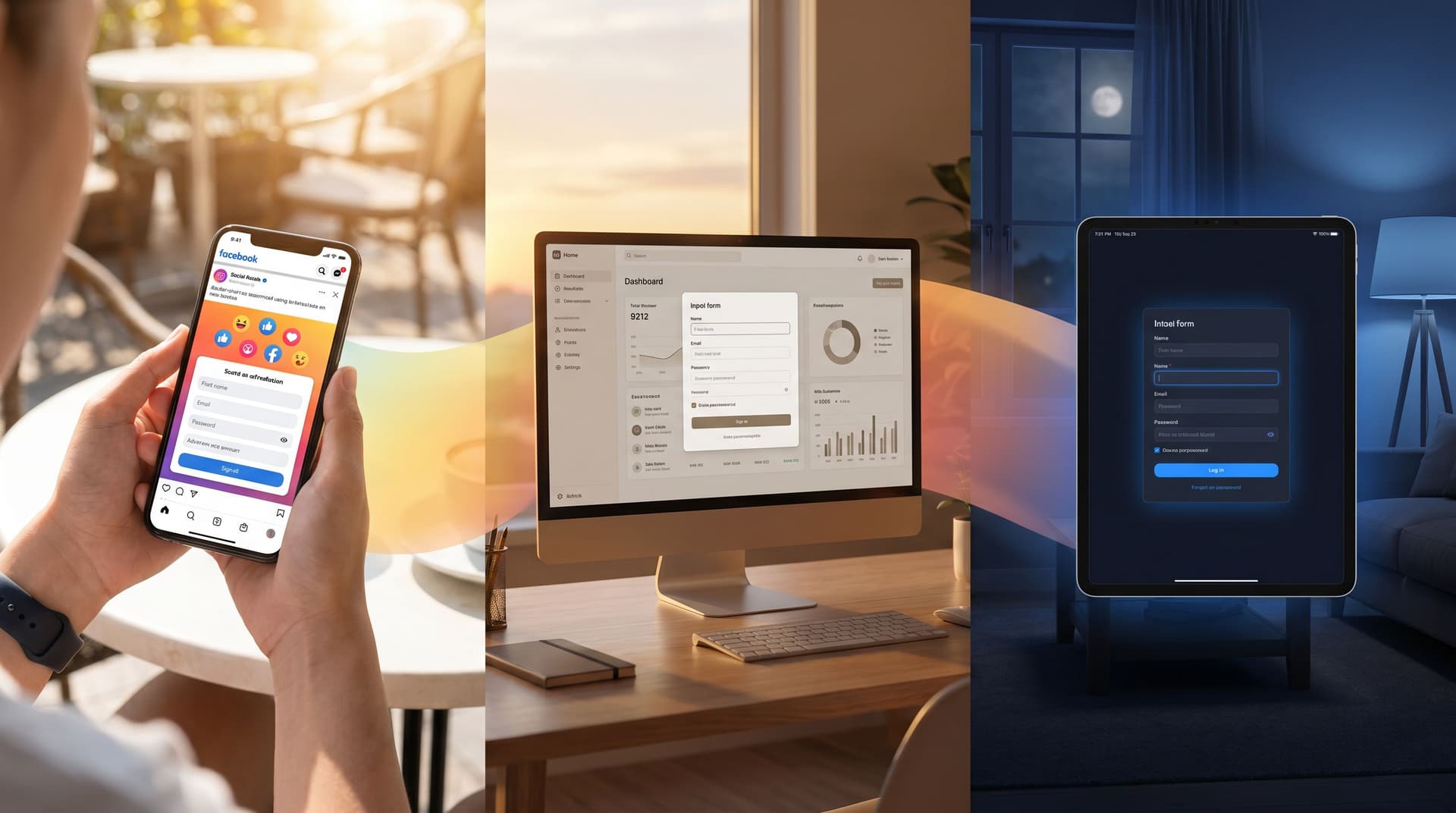
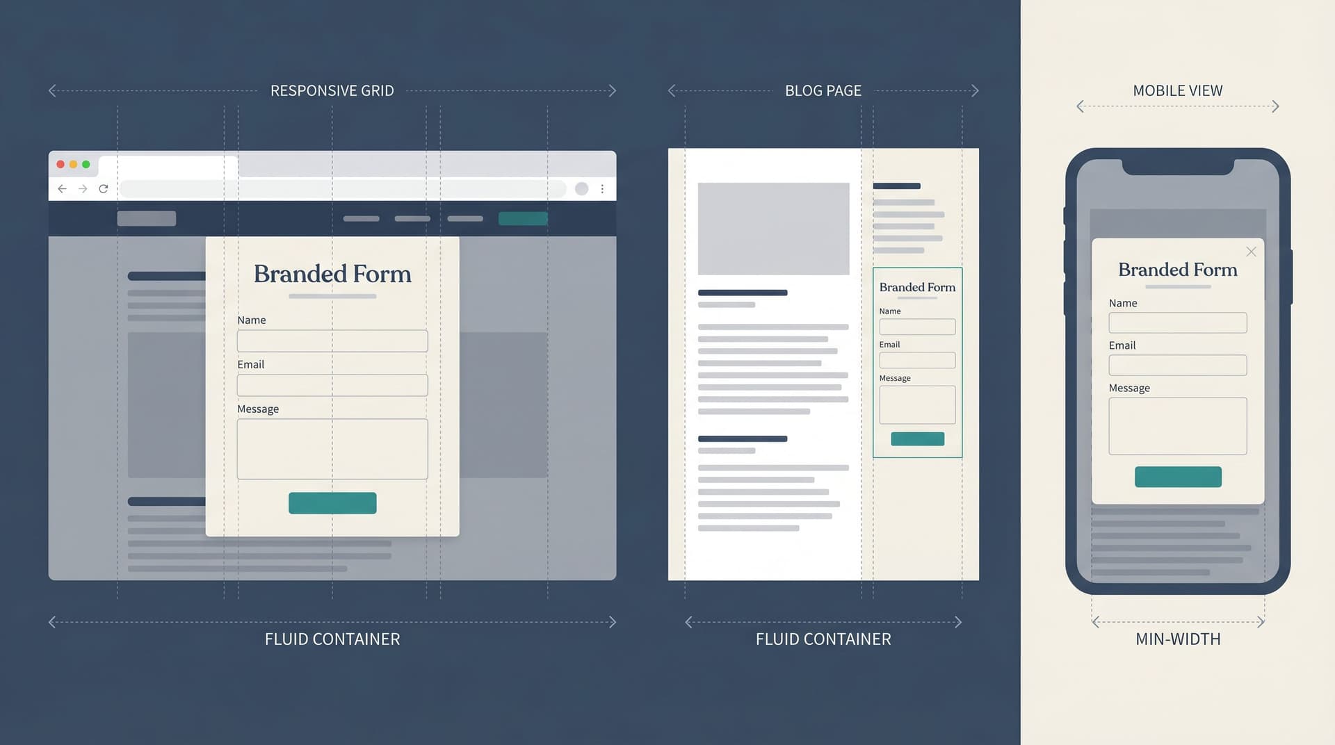
Most forms are still designed as if they’ll live a calm, predictable life: centered on a blank page, with plenty of white space and no surprises. That’s not where your forms actually end up. They’re dropped into: Blog posts with cramped sidebars Exit-intent pop-ups on ecommerce sites In-app modals inside React/Flutter views Embedded iframes in community platforms, help centers, and partner portals And they’re viewed mostly on phones. Recent analyses put mobile traffic at around 60–64% of global web visits—and in some regions, it’s over 70%. That includes a huge share of in-app browser sessions from links tapped inside social feeds and messaging app