Beyond ‘Contact Us’: Designing Service Menus and Triage Flows That Replace Email Chaos

Customer email inboxes used to feel manageable.
A few support requests here, a couple of sales inquiries there, the occasional partnership pitch. Then your product grew, your audience widened, and suddenly everything was coming through the same front door: support@, hello@, and whatever lands in your personal inbox.
Now you’re juggling:
- Bug reports mixed with billing issues
- High-intent enterprise leads sitting next to feature suggestions
- Urgent “site is down” alerts buried under newsletters and FYIs
The result: slow responses, dropped balls, stressed teams, and customers who feel like they’re shouting into the void.
The fix isn’t “inbox zero.” It’s replacing the inbox as the primary intake channel.
Thoughtfully designed service menus and triage flows can turn that chaos into a system:
- The right requests land with the right team, already structured
- Priority work is surfaced automatically
- Your team stops playing email tag and starts doing the work
And tools like Ezpa.ge make it realistic to do this without standing up a full-blown ticketing or workflow platform.
Why “Contact Us” Is Failing You
A generic “Contact Us” link is a design decision—just not a very good one.
When you give people one unlabeled door, they’ll push everything through it.
Common failure modes of catch-all contact forms and inboxes:
- No routing: Every message lands in one place. Someone has to manually forward, tag, or copy-paste into other tools.
- No expectations: Users don’t know what belongs there, how long it’ll take, or what information you need.
- No structure: Free-text emails make it hard to sort, search, and report. You’re stuck reading threads to understand what’s going on.
- No prioritization: A feature idea and a production outage look identical in the inbox preview.
That’s why so many teams quietly build parallel systems—Google Forms, Notion templates, ad-hoc Typeforms—while the “Contact Us” page limps along.
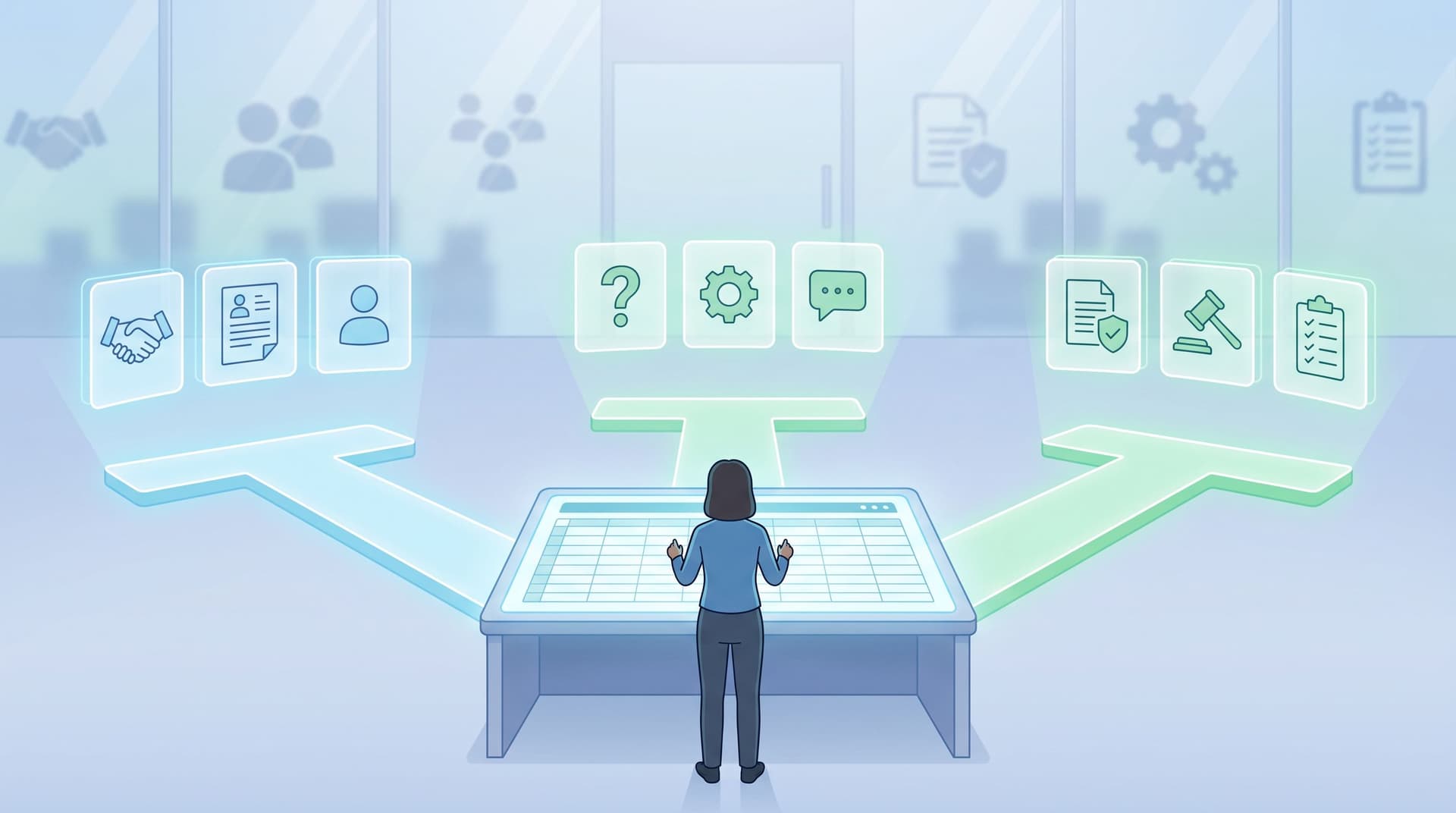
The opportunity is to replace that single, fuzzy entry point with a clear service menu and structured triage flow—all powered by forms.
Service Menus vs. Triage Flows: What’s the Difference?
Before you design anything, it helps to separate two layers:
-
Service menu – The front-of-house experience. It answers:
- “What kinds of help or interactions are available here?”
- “Which one is right for me?”
- “What should I expect if I pick this?”
-
Triage flow – The back-of-house logic and structure that:
- Routes requests to the right team or tool
- Collects the right fields for each type of request
- Encodes prioritization rules (SLA, urgency, customer tier, etc.)
You can think of the service menu as the navigation, and the triage flow as the workflow.
When you design both with intention—and back them with a form stack like Ezpa.ge plus Google Sheets—you move from “email chaos” to an actual operations system.
Step 1: Map Your Real Request Types (Not Your Org Chart)
Most teams start from the wrong place: “We have Support, Sales, and Partnerships, so we’ll make three options.”
Your users don’t think in departments. They think in jobs-to-be-done:
- “I’m stuck and need help.”
- “I want to buy this for my team.”
- “Something is broken and it’s costing us money.”
- “I have an idea or request.”
Start with a quick audit:
- Pull the last 200–500 inbound emails from your main inboxes.
- Cluster them by intent, not sender or product area. For example:
- Urgent incident / outage
- Billing / account access
- Product support question
- Feature request / feedback
- Sales / demo request
- Partnership / press
- Legal / compliance
- For each cluster, answer:
- What information do we always end up asking for?
- Who actually handles this today?
- How urgent is it, typically?
You’ll end up with a list of 6–10 “service types” that should show up on your service menu.
Hint: If you already use form analytics or partial submit tracking, you can shortcut this by looking at which topics people select or where they drop off. We go deeper into this kind of analysis in From Gut Feel to Form Analytics.
Step 2: Turn Those into a Clear, Human Service Menu
Once you know what people are actually trying to do, you can design a service menu that makes those paths obvious.
Think of this like the home screen of your support or ops hub.
What a good service menu does
A strong service menu:
- Uses plain-language labels – “Get technical support” beats “Submit a ticket.”
- Sets expectations – “Typical response time: 1 business day” or “Urgent issues: under 1 hour.”
- De-risks choices – Short descriptions that clarify edge cases.
- Surfaces urgency paths – Outages and billing issues shouldn’t be buried.
Example structure
Instead of one “Contact Us” button, imagine a page with:
-
Report a critical issue
“Site down, data loss, or security concern.”
Response: within 1 hour during business hours. -
Get help using the product
“Questions about features, setup, or best practices.”
Response: within 1 business day. -
Ask about pricing or talk to sales
“Quotes, volume discounts, or purchasing for your team.” -
Share feedback or request a feature
“Ideas, suggestions, or things you’d love to see.” -
Partnerships, press, and everything else
“Media, collaborations, or general inquiries.”
Each of these tiles links to a dedicated Ezpa.ge form or a shared form with conditional logic.
With Ezpa.ge, you can:
- Use custom URLs like
help.yourdomain.com/outageorforms.yourdomain.com/sales-demoto make these paths memorable. - Apply themes so the service menu and each form feel on-brand and consistent.
- Keep everything backed by live Google Sheets so ops can manage workflows without engineering.
For multi-product orgs, this pairs nicely with the URL strategies we covered in Custom Domains, Custom Journeys.
Step 3: Design Triage Flows That Do the Thinking for You
A service menu is only half the story. The magic happens when each entry routes into a triage flow that:
- Asks the right questions for that request type
- Classifies and prioritizes automatically
- Hands off to the right team or system
Core triage design principles
For each request type, design your form with:
-
Minimum viable questions
Only ask what you need to:- Understand the problem or request
- Route it correctly
- Decide priority
-
Structured fields first, free text last
Use dropdowns, radios, and checkboxes to capture:- Category (e.g., “Billing”, “Login”, “API”)
- Impact (e.g., “Cannot work”, “Slower than usual”, “Cosmetic issue”)
- Environment (e.g., “Staging”, “Production”)
Then give one generous free-text field: “Anything else we should know?”
-
Smart branching
Use conditional logic to show or hide fields based on earlier answers. For example:- If “Billing” is selected → show “Invoice number” and “Last 4 digits of card (optional)”
- If “Security issue” is selected → show a special disclaimer and secure contact instructions
-
Embedded expectations
Inline copy like: “Most issues of this type are resolved within 24 hours. If this is blocking production, choose ‘Critical’ below.”
Example: Triage for a critical issue form
Fields might include:
- “What type of issue is this?” (Outage / Data loss / Security / Other)
- “How many users are affected?” (Just me / My team / My whole company / Our customers)
- “Where are you seeing the issue?” (URL, feature area)
- “When did it start?” (Timestamp)
- “How are you blocked?” (Multiple choice + optional text)
- “Attach logs or screenshots” (file upload)
Behind the scenes, you can:
- Use Google Sheets formulas or Apps Script to tag and prioritize rows.
- Pipe “Critical” issues into a Slack channel or incident board.
- Maintain an SLA dashboard based on timestamps.
If you’re designing flows for HR, nonprofit ops, or other internal teams, you’ll see similar patterns to the ones we explored in Form UX for Human Resources and Form UX for Nonprofits: one URL, multiple structured jobs.
Step 4: Use Themes and URLs to Signal Priority and Context
Once your service menu and triage flows exist, you can fine-tune how they feel and where they live.
Visual cues for priority
With a tool like Ezpa.ge, you can:
- Give urgent forms (incidents, security) a high-contrast theme with clear warning colors and bold typography.
- Give feedback and feature request forms a lighter, more conversational style that invites ideas.
- Match sales and partnership forms to your marketing site’s brand to keep the experience seamless.
These visual differences help users self-select the right path and understand the seriousness of what they’re submitting.
URL strategy
Use custom URLs as mental shortcuts:
status.yourdomain.com/reportfor incidentsfeedback.yourdomain.comfor feature ideastalk-to-sales.yourdomain.comfor demos
You can even embed parameters to pre-fill context, as we explored in Pre-Filled, Not Pre-Judged (for example, pre-filling account IDs or plans) while staying on the right side of user trust.
Step 5: Connect Triage Flows to Your Real Ops
Forms are only as powerful as what happens after someone hits “Submit.”
The good news: you don’t need a massive workflow engine to make triage useful. Start with a simple stack:
-
Ezpa.ge form → Google Sheets
Every request lands as a new row with:- Request type
- Priority
- Assigned team or owner
- SLA target
- Status (New / In progress / Resolved)
-
Sheet → notifications
Use:- Email notifications for low-volume, high-stakes forms (security, legal)
- Slack or Teams notifications for high-volume channels (support, incidents)
-
Sheet → reports
Build simple dashboards for:- Volume by request type
- Average time-to-first-response
- SLA breaches
- Top recurring issues
This is where your forms stop being “just contact channels” and start acting as ops telemetry. If you want help turning those Sheets into insight briefs, we covered that pattern in AI as Your Form Data Analyst.
Step 6: Measure, Iterate, and Decommission Old Paths
Replacing email chaos is a transition, not a flip of a switch.
You’ll likely run forms and email in parallel for a while. That’s fine—as long as you’re measuring and nudging behavior.
What to track
- Completion rates for each form (by device, traffic source)
- Drop-off points – Are people bouncing at the service menu or inside a specific triage flow?
- Time-to-first-response – Compare form-based requests vs. email.
- Resolution quality – Are structured requests leading to fewer back-and-forths?
You can use the playbook from From Gut Feel to Form Analytics to instrument this: looking at drop-off, time-to-complete, and submission quality.
How to steer behavior away from email
- Add soft redirects: auto-replies to
support@that say, “For the fastest response, use our help form here,” with a direct link. - Update in-product links and CTAs to point to your service menu instead of
mailto:links. - Give VIP customers direct links to the right triage form with pre-filled account details.
Over time, you can:
- Lock down legacy addresses (e.g., only internal senders)
- Use filters to auto-respond and redirect
- Remove email links from your site altogether
The goal isn’t to eliminate email entirely—it’s to make email the exception, not the default.
Common Pitfalls (and How to Avoid Them)
Even with the right intent, service menus and triage flows can go sideways. Watch out for:
-
Too many options
A service menu with 15 tiles is just a fancy confusion screen. Aim for 5–8 primary options, then use branching inside forms for nuance. -
Department-speak
Labels like “Customer Success” or “RevOps” mean nothing to most users. Stick to verbs and outcomes: “Get help,” “Ask about pricing,” “Report an issue.” -
Interrogation forms
If your triage flow feels like a tax return, people will bail. ruthlessly cut non-essential fields and use smart defaults and pre-fill where you can. -
One-size-fits-all layouts
Don’t assume the same form pattern works everywhere. For some flows, a multi-step layout reduces overwhelm; for others, a single page is faster. Our guide on Multi-Step vs. Single-Page Forms breaks down when each pattern wins. -
Ignoring mobile
Many urgent issues and quick questions start on phones—often from in-app browsers or QR codes. Make sure your forms are thumb-friendly, as we covered in Mobile-First Forms in a Desktop-Designed World.
Bringing It All Together
When you replace a generic “Contact Us” with a thoughtful service menu and triage flows, you:
- Reduce chaos – Fewer mystery emails, fewer forwards, fewer lost threads.
- Increase speed – The right team gets structured information from the start.
- Improve customer trust – Clear options and expectations feel more professional than a black-hole inbox.
- Unlock insight – Every request becomes structured data you can analyze and act on.
You’re not just “making a better form.” You’re redesigning how your organization listens and responds.
Your Next Move
You don’t need a full re-platform to start.
Pick one high-impact area where email chaos is hurting you—support, sales inquiries, or internal requests—and:
- Map the top 5 request types hitting that inbox.
- Create a simple service menu with those 5 options.
- Build one Ezpa.ge form per option, with:
- 3–7 essential fields
- Clear expectations
- A live Google Sheet behind it
- Swap the email link in your product or site for this new menu.
Ship it, watch what happens for two weeks, then iterate.
If you treat forms as your new front door—not just a prettier inbox—you’ll find that “contact” isn’t a problem anymore. It’s an organized, measurable, and improvable system.
And that’s when your team can finally stop firefighting in the inbox and start doing their best work.