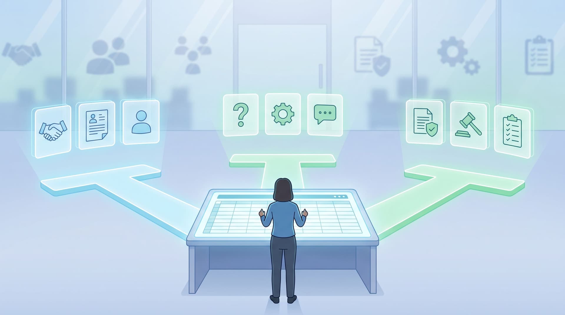
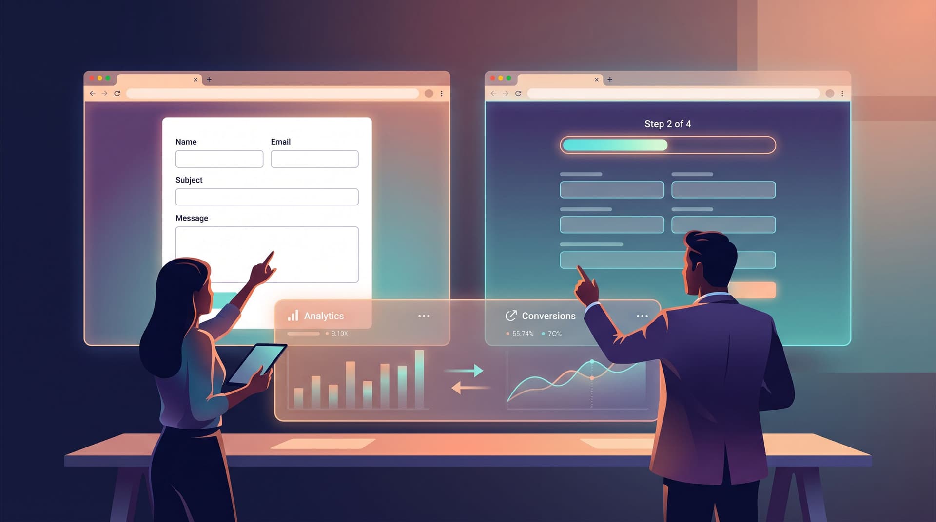
Form UX for Nonprofits: Donations, Volunteer Intakes, and Impact Reports in One URL

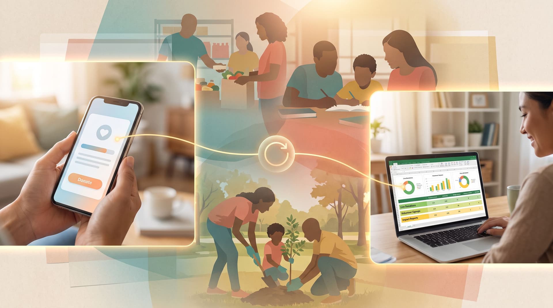
Form UX for Nonprofits: Donations, Volunteer Intakes, and Impact Reports in One URL
Nonprofits don’t have the luxury of wasted clicks.
Every extra field, every confusing step, every broken link isn’t just “a UX issue”—it’s potential donations lost, volunteers discouraged, and impact stories that never get told.
The good news: you don’t need a full engineering team or a custom CRM to fix this. With a thoughtful form strategy and tools like Ezpa.ge, you can turn one URL into a hub that powers:
- Seamless online donations
- Volunteer signups and onboarding
- Impact and outcomes reporting to funders and your community
All backed by a live Google Sheet that your team can actually use.
This post walks through how to design that experience so it’s simple for supporters, maintainable for staff, and flexible enough to grow with your programs.
Why form UX matters so much for nonprofits
Nonprofits face a specific set of constraints:
- Limited staff and technical capacity – You might have one person juggling comms, fundraising, and operations.
- Fragmented tools – A donation platform here, a volunteer tool there, plus ad‑hoc Google Forms for everything else.
- High trust bar – Donors and volunteers are handing you money, time, and personal data. If the experience feels clunky or sketchy, they hesitate.
Strong form UX addresses all three:
-
More completed actions with the same traffic
A clearer, faster donation or volunteer form can lift completion rates by double digits. That’s more recurring donors and active volunteers without increasing ad spend or staff time. -
Less operational chaos behind the scenes
When your donation, volunteer, and impact flows all feed into a single, structured Sheet, your team spends less time reconciling exports and more time acting on the data. -
Higher trust and stronger relationships
A clean, branded, mobile-friendly form says: “We’re organized. We respect your time. We’ll handle your data responsibly.” That’s especially important if your audience is privacy‑conscious, a topic we’ve explored in depth in Forms for Privacy-Conscious Users: Designing High-Trust Intakes When Your Audience Is Skeptical.
The one-URL model: how it works
Instead of sending people to different tools for every task, you create a single, memorable URL that acts as your organization’s “action hub.” For example:
give.yourorg.orgyourorg.org/actsupport.yourorg.org
Behind that URL, you can:
- Route people to different form views (donation, volunteer, impact report) based on buttons or links.
- Use custom URLs and query parameters to pre-filter or pre-fill forms for different campaigns.
- Keep everything synced to one Google Sheet per flow (or one master Sheet with tabs) so reporting is straightforward.
If you want to go deeper on how URLs themselves shape user journeys, check out Custom Domains, Custom Journeys: Advanced URL Structures for Multi-Product SaaS. The same principles apply to nonprofits: clear, intentional paths beat a tangle of one-off links.
Step 1: Map the three core journeys
Before you touch a form builder, get clear on the three journeys you’re designing for.
1. Donation flows
Common jobs to be done:
- “I want to make a one-time gift.”
- “I want to become a monthly donor.”
- “I want to give in honor of someone.”
Key UX goals:
- Speed – Minimize steps from intent to confirmation.
- Clarity – Make amounts, frequency, and payment options obvious.
- Reassurance – Show security, transparency, and impact.
2. Volunteer intake and onboarding
Common jobs to be done:
- “I want to raise my hand to help.”
- “I’m an existing volunteer updating my availability.”
Key UX goals:
- Qualification without overwhelm – Ask enough to place them well, but not so much that they bounce.
- Expectation-setting – Time commitment, roles, training requirements.
- Follow-through – Clear next steps after they hit submit.
3. Impact and outcomes reporting
Common jobs to be done:
- “I want to submit a program outcome or story from the field.”
- “I need to log metrics for a grant report.”
Key UX goals:
- Consistency – Standard questions so data is comparable.
- Ease of use – Staff and partners can submit quickly, even from a phone.
- Data quality – Guardrails that keep entries clean and usable.
Write these journeys down. For each, list:
- Who is filling it out (donor, volunteer, staff, partner)
- What they expect to happen
- What your team needs to capture to do your job
This becomes your blueprint.

Step 2: Design form patterns that respect supporter time
Once you know the journeys, you can choose the right form patterns for each.
Donations: keep it focused and friction-light
For most donation flows, a single, well-structured page works best:
-
Top section: impact framing
One or two sentences about what their gift does. Avoid long stories; link to a separate page if needed. -
Middle section: amount and frequency
- Pre-set buttons (e.g., $25, $50, $100, $250) plus a custom field.
- Clear toggle between one-time and monthly.
-
Lower section: personal and payment details
- Name, email, optional phone.
- Address only if legally required or needed for receipts.
- Payment fields or a clear link out to your processor if you’re embedding.
A few practical tips:
- Minimize required fields. If it doesn’t change how you’ll steward the donor or fulfill legal obligations, consider making it optional.
- Use inline validation. Catch errors (like email typos) before submit, but keep messages friendly.
- Reassure at the moment of payment. Show security badges, a note about how data is handled, and what happens next.
If you’re debating between a single-page or multi-step donation form, the tradeoffs we covered in Multi-Step vs. Single-Page Forms: A Data-Driven Playbook for When Each Pattern Wins apply here too. For small, simple donations, single-page usually wins; for complex pledges or corporate gifts, multi-step can help.
Volunteer intakes: multi-step often wins
Volunteer forms tend to ask more questions:
- Skills and interests
- Availability
- Background checks or waivers
- Emergency contacts
Trying to cram this onto one page can feel overwhelming. A short, multi-step flow can make it feel more manageable:
- About you – Name, contact info, how you heard about the organization.
- How you’d like to help – Skills, interests, preferred roles.
- Availability and logistics – Days/times, transportation, location preferences.
- Agreements and next steps – Waivers, consent, and what happens after submit.
Design details that help:
- Progress indicator – “Step 2 of 4” reduces anxiety.
- Save-and-return (if possible) – For longer intakes, especially if you require uploads.
- Inline explanations – Short helper text under fields that might be confusing.
Impact reports: design for repeat use
Impact and outcomes forms are often filled by internal staff or partners on a recurring basis. Here, UX is about:
- Speed for power users
- Consistent structure for reporting
Patterns that work well:
- Sectioned single-page form with clear headings: “Program Details,” “Metrics,” “Stories,” “Attachments.”
- Pre-filled fields when used via custom URLs (e.g., program name or region already filled in from the link you send a specific partner).
- Dropdowns and checkboxes instead of free text where you need consistent categories.
Because these forms are used regularly, invest a bit more time in field naming and ordering. Future-you, building a grant report from the Sheet, will be grateful.
Step 3: Use one URL with smart routing
Now that you have three flows, it’s time to connect them under a single, memorable URL.
Create a clear entry page
Your one URL should land people on a simple, action-oriented page, for example built with Ezpa.ge:
- A short headline: “Support Our Work.”
- A one-sentence subheader: “Give, volunteer, or share your impact—right here.”
- Three primary buttons:
- Donate
- Volunteer
- Report Impact
Each button routes to a specific form view or URL variant, such as:
support.yourorg.org?flow=donatesupport.yourorg.org?flow=volunteersupport.yourorg.org?flow=impact
With a tool like Ezpa.ge, you can:
- Maintain separate forms behind each flow while keeping the URL consistent.
- Use themes so each flow feels on-brand but visually distinct (e.g., green accents for volunteers, blue for donations).
- Sync each flow to its own Google Sheet or tab, keeping data clean.
Tailor URLs for campaigns and partners
A single base URL doesn’t mean every link is generic. You can create specialized links for:
- Specific campaigns:
support.yourorg.org?flow=donate&campaign=summer-drive - Corporate partners:
support.yourorg.org?flow=volunteer&partner=acme-inc - Programs or regions:
support.yourorg.org?flow=impact&program=youth-mentoring
Those parameters can:
- Pre-fill hidden fields in your forms (so you can attribute gifts and hours correctly).
- Adjust copy (e.g., show “Thank you, ACME Inc. team!” on the volunteer form).
- Route submissions to different tabs or filtered views in your Sheet.
We’ve explored these patterns in more depth in Pre-Filled, Not Pre-Judged: Ethical Personalization Patterns for Smarter Custom URLs. The key for nonprofits: use personalization to reduce friction and increase relevance, not to pressure or profile.
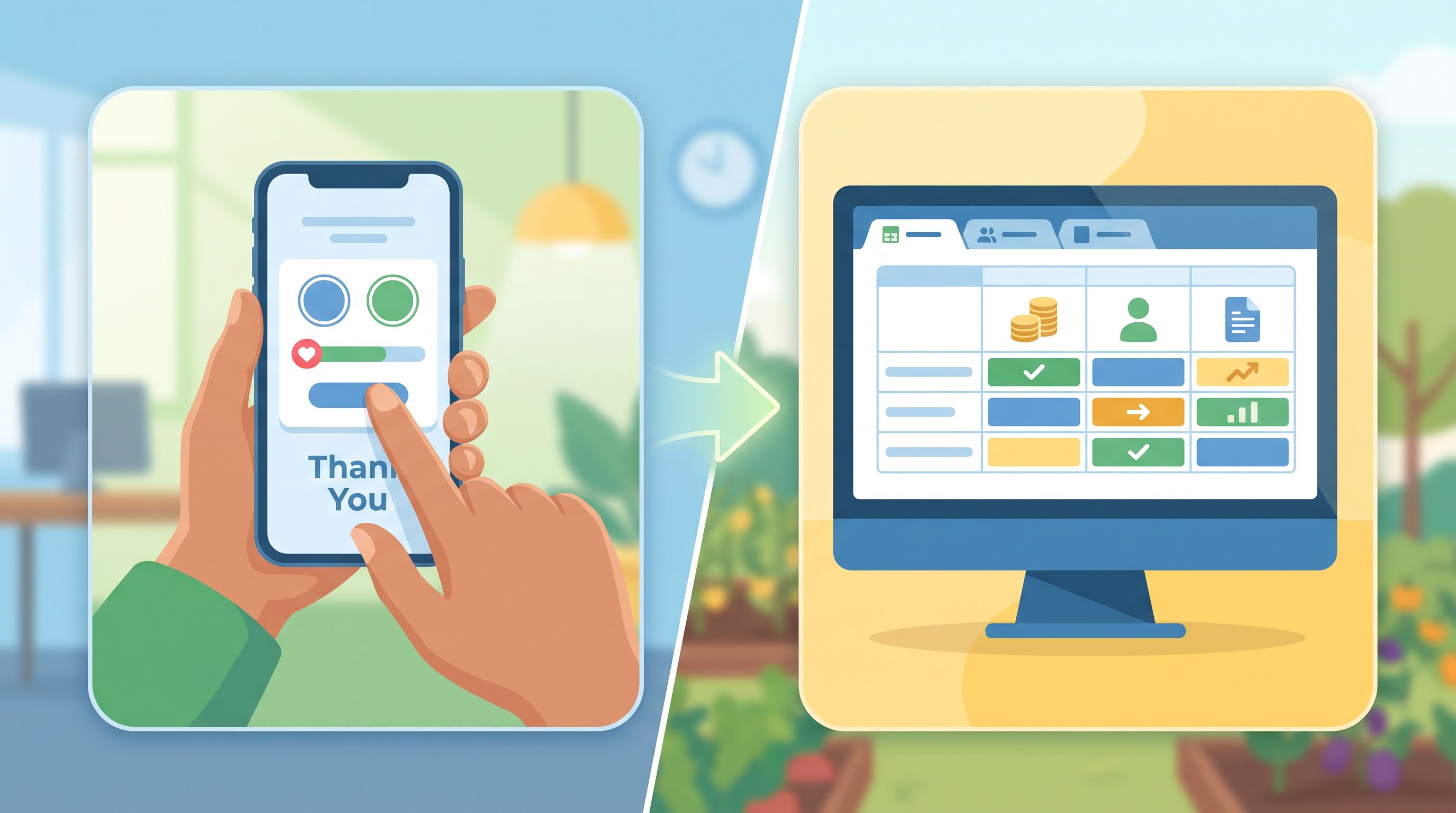
Step 4: Make it mobile-first and context-aware
A huge share of nonprofit traffic comes from:
- Social media posts and stories
- Email newsletters opened on phones
- QR codes on posters or event materials
That means many people will experience your forms on a small screen, often one-handed.
Mobile-first basics:
- Large tap targets for buttons and checkboxes.
- Inputs that match the data type (numeric keypad for amounts, email keyboard for email fields).
- Sticky submit/next buttons near the thumb zone where appropriate.
If you want to go deeper on designing for real-world mobile use (thumb zones, scroll depth, keyboard behavior), see Mobile-First Forms in a Desktop-Designed World: Fixing Thumb Zones, Keyboards, and Tap Targets.
Context-aware tweaks:
- Links from social stories – Emphasize speed: “Give in under 60 seconds.”
- Links from email footers – Emphasize relationship: “Update your volunteer preferences.”
- Links from QR codes at events – Emphasize immediacy: “Log your hours from today’s shift.”
Small copy changes framed to context can significantly improve completion rates.
Step 5: Connect everything to a live Google Sheet
A one-URL strategy only pays off if your data is usable.
With Ezpa.ge’s real-time Google Sheets syncing, each form submission shows up as a new row in your Sheet instantly. That unlocks:
- Unified donor views – Combine donation and volunteer data to see who’s most engaged.
- Automated thank-yous – Trigger emails or tasks from new rows using tools like Zapier or Make.
- Grant-ready reporting – Filter and pivot by campaign, program, date, or region.
Practical setup tips:
- Use consistent column names across related forms (e.g.,
email,first_name,last_name) so you can join data later. - Reserve columns for internal use only (e.g.,
stewardship_owner,follow_up_date) that your team updates manually. - Create saved filters or views in Sheets for common questions: “New donors this week,” “Volunteers with weekend availability,” “Impact stories tagged ‘youth.’”
If you’re curious about how to turn those raw rows into actual insight, we break that down in AI as Your Form Data Analyst: Turning Google Sheets Submissions into Weekly Insight Briefs.
Step 6: Close the loop with better confirmations and follow-up
The form submit is not the end of the journey. For nonprofits, it’s often the beginning.
Confirmation pages that build trust
For each flow, your confirmation screen should:
-
Restate what just happened
- Donations: “You gave $50 as a one-time gift to support our after-school program.”
- Volunteers: “You’ve applied to volunteer as a mentor. We’ll review your info within 3 business days.”
- Impact reports: “Your story for the Youth Mentoring program was submitted and logged for the Q3 report.”
-
Set expectations
- When will they hear from you?
- How (email, phone, text)?
- What’s the next step (orientation, tax receipt, follow-up survey)?
-
Offer one optional next action
- Share on social
- Join the newsletter
- Read recent impact stories
Avoid overwhelming people with a wall of links. One clear suggestion is usually enough.
Email follow-ups that feel human
Use your Sheet-backed data to power:
- Automated receipts and thank-yous for donations, with personalized details.
- Volunteer onboarding sequences – orientation dates, training materials, role descriptions.
- Impact feedback loops – “We used your story in our annual report; here’s the link.”
Because your forms are structured, you can segment:
- Donors who gave via a specific campaign
- Volunteers with certain skills
- Staff submitting impact from a particular program
This lets you send communications that feel relevant, not generic.
Step 7: Iterate based on real behavior
Once your one-URL hub is live, treat it as a living system.
Things to monitor:
- Completion rates per flow – Are people dropping off at a particular step in the volunteer intake?
- Time to complete – Are donors spending too long on the amount selection screen?
- Device mix – If 80% of visits are on mobile, prioritize mobile optimizations.
You can also:
- Run A/B tests on copy (e.g., “Donate” vs. “Fuel this work”).
- Experiment with field order (moving optional questions later).
- Try different themes for campaign-specific variants.
Because everything lives under one URL and one form stack, changes are easier to roll out consistently—and easier to measure.
Bringing it all together
When you combine thoughtful UX with a one-URL strategy, you get more than cleaner forms. You get:
- A single, memorable place to send supporters – Whether it’s from a newsletter, a QR code, or a board member’s email signature.
- Three core journeys that feel coherent – Donations, volunteering, and impact reporting all share a common look and logic.
- Operational clarity behind the scenes – Data that lands in Sheets you can actually use, instead of siloed exports.
For a nonprofit, that translates directly into:
- More completed donations
- Better-matched volunteers
- Stronger, more credible impact stories
All without adding yet another tool or login to your stack.
Where to start (even if you’re busy and under-resourced)
If you only have capacity for a few steps this month, focus on:
-
Claim your one URL.
Decide on a short, memorable address for your action hub and set it up. -
Rebuild your donation form with supporter time in mind.
Strip it down to the essentials, make it mobile-friendly, and connect it to a live Sheet. -
Add a simple volunteer intake.
Even a basic, two-step form is better than a generic contact form. -
Plan your first impact report form.
Start with the minimum fields you need for your next grant report or annual report.
Once those are in place, you can layer on smarter URLs, personalization, and automated reporting.
Take the first step with Ezpa.ge
You don’t need a custom portal or a full-time developer to make this real.
With Ezpa.ge, you can:
- Spin up beautiful, responsive forms for donations, volunteer intakes, and impact reports in minutes.
- Put them all behind one custom URL that’s easy to share everywhere.
- Sync everything into live Google Sheets that your team can actually work from.
Start by sketching your three journeys, then build your first version of the hub. Share it with your team, test it from your phone, and iterate.
Your supporters are already willing to give their money, time, and stories. A well-designed, one-URL form experience simply makes it easier for them to say yes.