Multi-Step vs. Single-Page Forms: A Data-Driven Playbook for When Each Pattern Wins

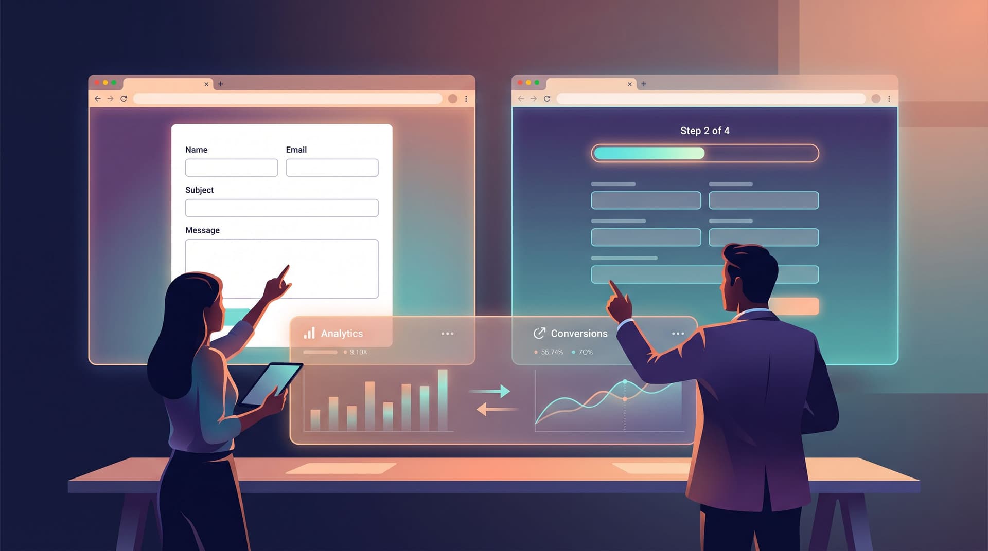
Form design isn’t just a UX preference debate; it’s a revenue, lead quality, and completion-rate decision.
Switching a key intake from single-page to multi-step (or vice versa) can:
- Lift completion rates by 10–30%
- Change who finishes (and therefore who you talk to)
- Shift how trustworthy, fast, or “serious” your product feels
But the pattern that works brilliantly for one team can flop for another. The right choice depends on job-to-be-done, traffic source, device mix, and risk profile—not designer taste.
This post gives you a practical, data-driven playbook for deciding when to use multi-step vs. single-page forms, how to test them, and how to implement both patterns cleanly with tools like Ezpa.ge.
Why This Choice Matters More Than It Looks
Forms are usually the last step before something important happens:
- A lead hits your CRM
- A trial starts
- A beta user joins your product
- A candidate applies
- A customer gives feedback that shapes your roadmap
That means your form pattern is a lever on conversion, not just aesthetics. A few key reasons to treat this as a strategic decision:
- Perceived effort vs. actual effort: People often underestimate a multi-step flow if each step looks light, and overestimate a dense single-page form even if it’s technically shorter.
- Trust and seriousness: Longer, structured flows can signal rigor (great for loans, admissions, compliance); short, single-page forms can signal speed (great for quick signups or low-stakes feedback).
- Data quality and segmentation: Multi-step flows let you stage questions so only serious users see deeper questions, while single-page forms make it easier to review before submitting.
- Measurement and optimization: Multi-step flows give you richer analytics about where people drop off. Single-page forms give you a simpler funnel but fewer diagnostic waypoints.
If you’re already thinking about context and journeys, you’ll see how this choice lines up with URL strategy and routing—something we explored for multi-product SaaS in Custom Domains, Custom Journeys: Advanced URL Structures for Multi-Product SaaS.
The Core Trade-Offs: Multi-Step vs. Single-Page
Before we get into patterns and tests, it helps to have a clear mental model of what each form type is actually good at.
Single-Page Forms: The Power of “One and Done”
Best when:
- The task is low stakes (newsletter, waitlist, basic contact)
- You have fewer than ~8–10 fields
- People arrive with high intent and want to move fast
- You’re embedding in tight UI contexts (pop-ups, sidebars, in-app modals)
Strengths:
- Speed and clarity: Everything is visible. People can scan the whole commitment upfront.
- Easy review: Users can check and edit answers before submitting without navigating back.
- Lower implementation overhead: One URL, one layout, simpler tracking.
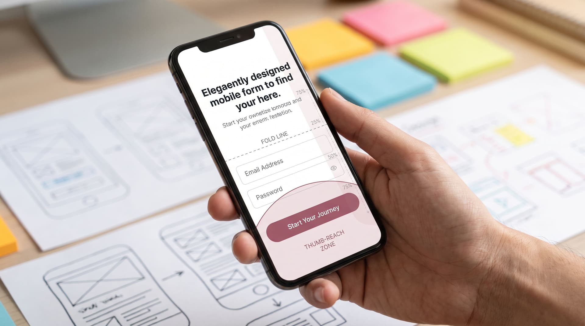
- Great for mobile if optimized: Short, well-designed single-page forms can be incredibly fast on phones—especially if you’ve already tuned for thumb zones and scroll depth, as we covered in Responsive by Intention, Not Accident: Designing Forms for Fold, Thumb Zone, and Scroll Depth.
Risks:
- Intimidation effect: A long vertical stack of fields can feel like work.
- Perceived complexity: Even optional fields can make the form look heavy.
- Limited analytics: You mostly know “viewed vs. submitted,” not where they hesitated.
Multi-Step Forms: Guiding People Through a Journey
Best when:
- You have complex requirements (eligibility, compliance, qualification)
- The decision is high-stakes (loans, admissions, B2B contracts)
- You want to progressively qualify and branch the experience
- You need more granular analytics on where people drop off
Strengths:
- Chunking reduces overwhelm: 3–6 fields per step feels manageable.
- Progress indicators: Showing “Step 2 of 5” or a progress bar helps people commit.
- Conditional logic: You can show different steps based on previous answers.
- Richer diagnostics: You learn exactly which step (and question cluster) causes friction.
Risks:
- Drop-off between steps: Each “Next” click is a chance to bail.
- Hidden scope: If you don’t signal total length, users can feel tricked.
- Back-navigation pain: Poorly designed flows make it hard to revise earlier answers.
A Simple Framework: Match Pattern to Form “Job”
Instead of asking, “Are multi-step forms better?”, ask:
What job is this form doing for the user and for the business?
Then map that job to a pattern.
1. Lead Capture & Lightweight Signups
Examples: newsletter, early access waitlist, webinar registration, “contact sales.”
Default pattern: Single-page
Why:
- People expect these to be quick.
- You usually don’t need deep data to start a conversation.
- Traffic often comes from social or email—contexts where attention is fragile.
When to consider multi-step:
- You’re qualifying leads by company size, budget, or use case.
- You’re routing to different teams (SMB vs. enterprise) based on answers.
- You want to turn the form into a value-delivering experience (e.g., a short diagnostic that ends in a tailored recommendation).
2. Applications, Compliance, and High-Stakes Intakes
Examples: loan applications, grant applications, enterprise onboarding, security questionnaires.
Default pattern: Multi-step
Why:
- Users expect rigor; a too-short form can feel unserious.
- You can group questions into logical sections (identity, financials, references, etc.).
- You can stage commitment: basic info first, then deeper questions once trust is earned.
This is the territory we went deep on in Forms for High-Stakes Decisions: Intake Patterns for Loans, Admissions, and Compliance-Heavy Flows—where the form is effectively part of your risk engine.
When to consider single-page:
- You’re running an initial screening before a longer follow-up form.
- You want a “pre-application” to gauge interest and basic eligibility.
3. Product Feedback, Research, and NPS
Examples: feature request forms, post-onboarding surveys, NPS pulses, research signups.
Default pattern: It depends on length and context.
- Short pulse (3–5 questions) → Single-page
- Longer research survey (15+ questions) → Multi-step
Why:
- For quick pulses, multi-step feels like overkill.
- For deeper research, chunking keeps people moving and lets you reorder or branch questions without overwhelming them.
4. Multi-Product or Multi-Audience Funnels
Examples: SaaS with several products, creators with multiple offers, agencies with multiple service tiers.
Default pattern: Multi-step or single-page with strong conditional logic
Why:
- You need to route people quickly to the right branch of your business.
- The first step is often a “chooser”: Who are you? What are you here for?
Here, your choice of pattern is tightly coupled with your URL strategy and routing logic. Multi-step forms can work hand-in-hand with custom URLs to create clean journeys, especially when your forms serve as the front door for multiple products or offers—as described in Custom Domains, Custom Journeys: Advanced URL Structures for Multi-Product SaaS and From Link in Bio to Live Ops: Using Custom URLs and Forms to Run Creator Workflows.
Data-Driven Signals: How to Decide (and Not Guess)
Here’s a practical process you can run on any important form.
Step 1: Audit the Current Form
Start with what you have.
Measure:
- View → Start rate: Of people who load the page, how many begin typing?
- Start → Submit rate: Of people who start, how many finish?
- Time to complete: Median and 90th percentile.
- Device mix: Desktop vs. mobile vs. tablet.
- Traffic source: Ads, email, in-app, organic, etc.
On Ezpa.ge, syncing to Google Sheets means you can combine timestamps, UTM parameters, and partial submissions (if you track them) into a simple dashboard. If you’re not yet using partials as a diagnostic tool, Signals in Partial Submits: What Abandoned Forms Can Teach You About Copy, Friction, and Fit is a good next read.
Step 2: Identify the Friction Type
Is your problem perceived effort or actual effort?
-
Perceived effort: High bounce before people even start.
- Likely culprits: intimidating layout, long scrolly page, unclear value prop.
- Pattern fix: Try multi-step to visually lighten the load, or aggressively trim fields.
-
Actual effort: People start but don’t finish.
- Likely culprits: too many required fields, confusing questions, poor mobile UX, slow validation.
- Pattern fix: Multi-step with better grouping and progress, or single-page with fewer fields and clearer copy.
Step 3: Map Questions into Logical Groups
Regardless of pattern, group related fields:
- Identity (name, email, company)
- Context (how you heard about us, segment, use case)
- Details (requirements, preferences, budget)
- Compliance (legal, consent, documentation)
If you can’t create 2–5 coherent groups, you probably don’t need multi-step yet. If you can and those groups are substantial, multi-step becomes more attractive.
Step 4: Prototype Both Patterns Quickly
Using a builder like Ezpa.ge, you can:
- Clone the existing form.
- Turn one version into a multi-step flow (grouped by your question clusters).
- Keep one as a streamlined single-page version, but:
- Remove non-essential fields.
- Improve mobile layout and keyboard behavior.
- Tighten copy and helper text.
If you’re not sure how many steps to use, start with 3–5 steps, each with 3–6 fields. That’s usually enough to feel guided without feeling endless.
Step 5: A/B Test with Clear Success Metrics
Run an experiment where:
- Variant A: Single-page optimized form
- Variant B: Multi-step form with progress indicator
Measure:
- Completion rate
- Time to complete
- Lead quality (downstream: meetings booked, deals won, NPS, etc.)
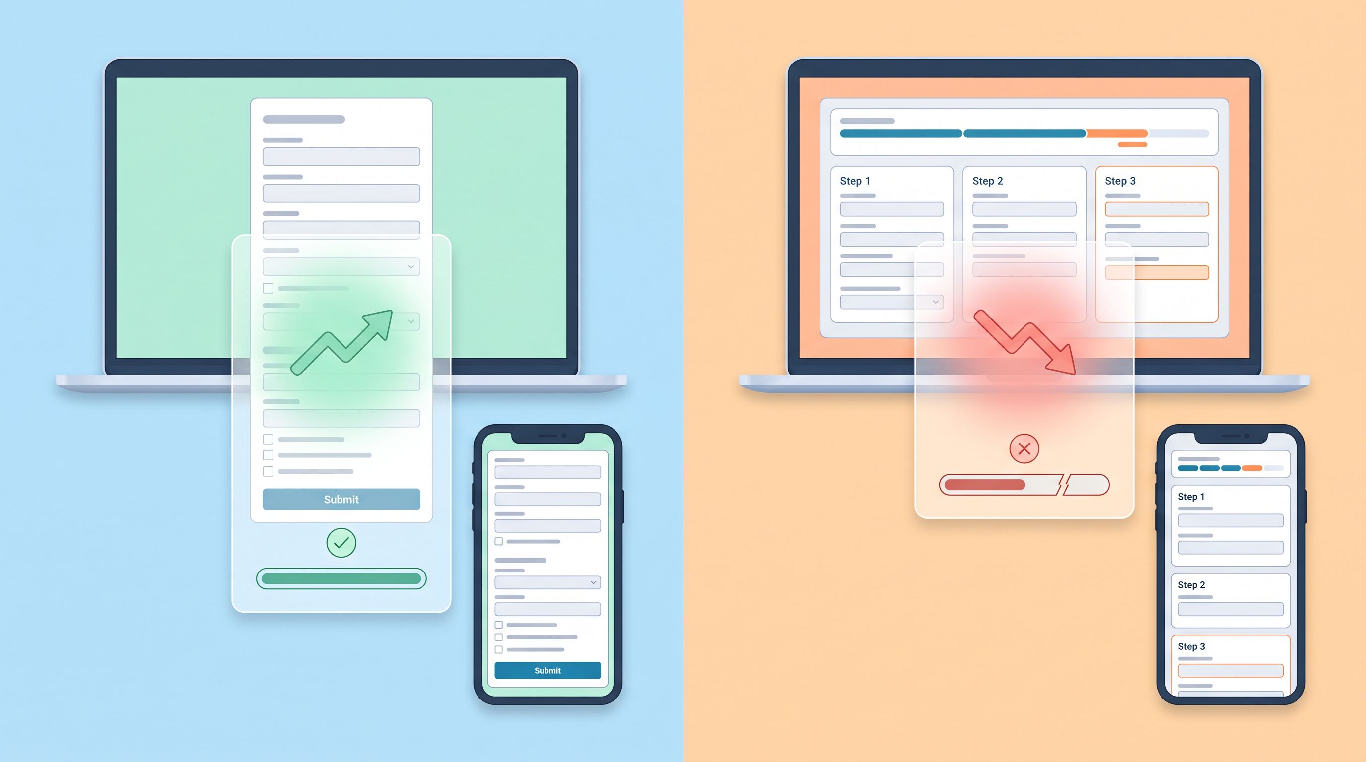
Pay attention to device-specific results. It’s common to see:
- Multi-step winning on desktop (more guidance, better perceived structure)
- Single-page winning on mobile (less tapping, fewer page transitions)
When that happens, you can:
- Use device-targeted variants (e.g., single-page on mobile, multi-step on desktop), or
- Use a hybrid pattern (see below).
Hybrid Patterns: Getting the Best of Both Worlds
You’re not stuck choosing one pattern forever. Some of the highest-converting flows use hybrid strategies.
1. “Micro-Gate” Then Single-Page
Pattern:
- Step 1 (micro-gate): One or two fields (email + primary goal).
- Step 2: A single-page with the rest of the fields.
Why it works:
- People commit with a tiny first step.
- Once they’ve given an email, you can follow up even if they don’t finish.
- You get segmentation early, which can power conditional logic on the next page.
2. Single-Page with Collapsible Sections
Pattern:
- One URL, one page.
- Sections like “More details” or “Advanced options” are collapsed by default.
Why it works:
- Keeps the initial view light.
- Power users can expand and give richer data.
- You avoid the overhead of true multi-step navigation while still reducing perceived complexity.
3. Multi-Step with a Final Review Page
Pattern:
- Multi-step flow with 3–6 steps.
- Final page summarizing all answers with inline edit links.
Why it works:
- People get the guidance of multi-step.
- They still have a single, clear moment to review and correct.
On Ezpa.ge, you can approximate this pattern by:
- Using multi-step sections for input.
- Adding a final step that echoes key answers in read-only text with clear “Back” navigation to edit.
Practical Design Tactics for Each Pattern
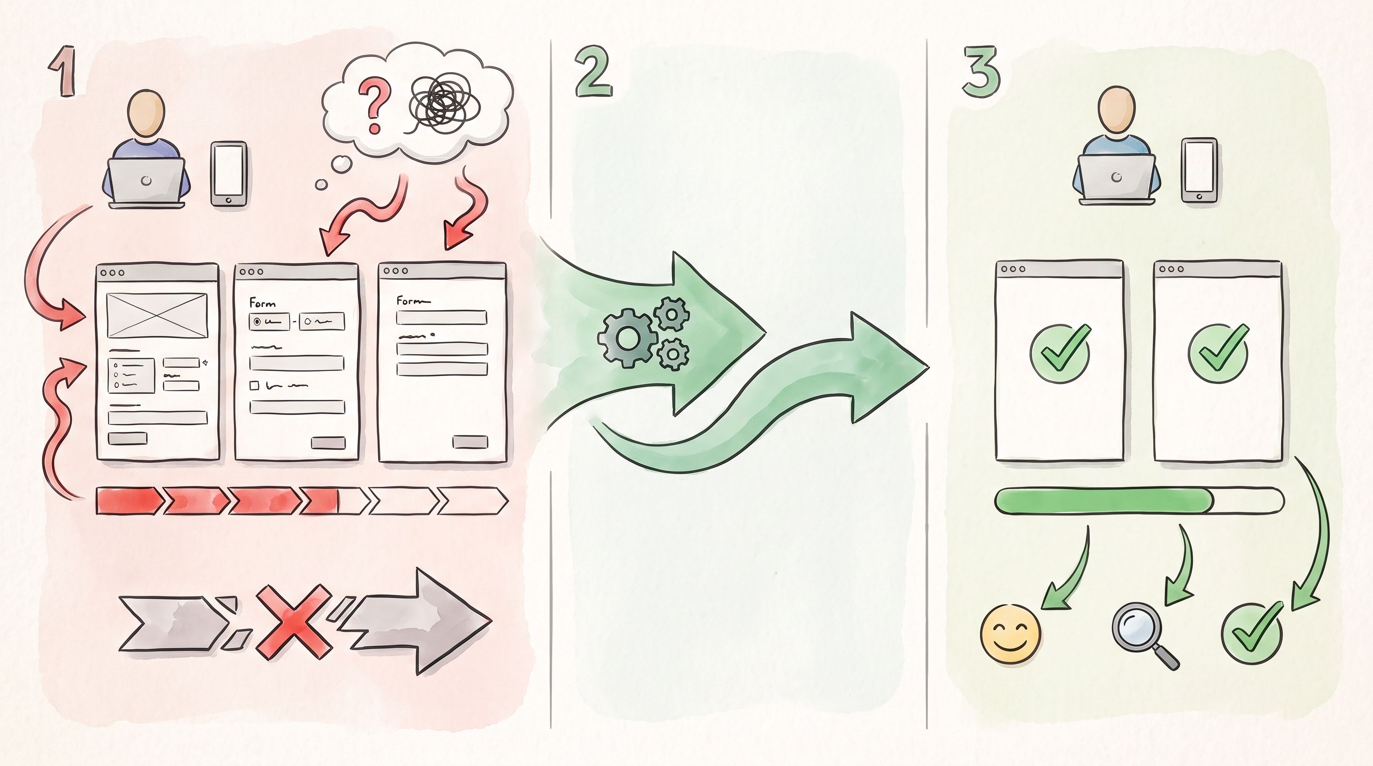
Once you’ve chosen a pattern, details matter. Here are concrete moves you can apply immediately.
For Single-Page Forms
-
Brutally prioritize fields
- Ask: What do we absolutely need before the next step in the relationship?
- Move nice-to-have fields to later emails or in-app onboarding.
-
Optimize for mobile first
- Use large tap targets and clear spacing.
- Ensure the primary CTA is reachable in the thumb zone.
- Avoid horizontal layouts that break on narrow screens.
- If you haven’t yet, read Mobile-First Forms in a Desktop-Designed World: Fixing Thumb Zones, Keyboards, and Tap Targets for a deeper dive.
-
Use visual hierarchy, not just labels
- Group related fields with subtle dividers or background tints.
- Use bold section titles sparingly: “About you,” “Project details,” etc.
-
Make optional fields clearly optional
- Mark only non-required fields as “Optional”—don’t mark every required field.
- Consider hiding advanced fields behind a “Show advanced” toggle.
-
Leverage pre-fill and URL personalization
- Use custom URLs to pre-fill what you already know (email, plan, campaign).
- This shortens the visible form and reduces typing.
For Multi-Step Forms
-
Show honest progress
- Use a progress bar or “Step X of Y.”
- Avoid loading new steps without updating progress—it feels endless.
-
Name your steps like chapters, not errors
- “About your company,” “Your goals,” “Timeline & budget.”
- Avoid vague labels like “Step 3” with no context.
-
Keep steps balanced
- Don’t put 2 fields on one step and 15 on the next.
- Aim for a consistent rhythm so expectations stay stable.
-
Support safe backtracking
- Make it obvious that people can go back without losing data.
- Preserve answers between steps; don’t punish exploration.
-
Use conditional logic to remove irrelevant steps
- If someone selects “Individual” instead of “Company,” skip the company details step.
- If someone chooses “Self-serve,” skip the enterprise procurement questions.
If you’re designing complex logic trees, One Form, Many Journeys: Using Conditional Logic to Personalize Flows Without Creating New Pages pairs nicely with this playbook.
Implementing This with Ezpa.ge
Ezpa.ge is built for exactly this kind of experimentation:
- Multi-step vs. single-page layouts: You can structure forms into sections (steps) or keep them flat.
- Custom themes: Match your brand across both variants so the pattern—not the styling—is what you’re testing.
- Custom URLs: Route different audiences to different variants, or run A/B tests via your routing layer.
- Real-time Google Sheets syncing: Capture timestamps, partials, and outcomes so you can analyze:
- Completion time by variant
- Drop-off patterns
- Downstream performance (who booked, who bought, who churned)
Once you have that live spreadsheet, you can even layer AI on top to summarize what’s happening week over week—something we explored in AI as Your Form Data Analyst: Turning Google Sheets Submissions into Weekly Insight Briefs.
Bringing It All Together
Multi-step vs. single-page is not a one-time, one-size-fits-all decision. It’s a design lever you can pull depending on:
- The stakes of the decision your form represents
- The complexity and number of fields you truly need
- The context (device, traffic source, expectations)
- The data you gather from real users: where they start, stall, and succeed
If you treat forms as living funnels instead of static widgets, you’ll:
- Capture more of the right users
- Reduce friction without sacrificing quality
- Turn each form into a learnable, optimizable asset in your growth stack
Your Next Move: Pick One Form and Run the Play
You don’t need to redesign your entire funnel to see impact. Start small:
- Pick one meaningful form
- A demo request, beta waitlist, or key onboarding intake.
- Audit it
- Measure view → start → submit, time to complete, device mix.
- Decide on a hypothesis
- “A 3-step flow will outperform our current long single-page form on mobile,” or
- “A streamlined single-page version will beat our current 6-step flow for ad traffic.”
- Build both variants in Ezpa.ge
- Use themes and custom URLs to keep everything on-brand and easy to route.
- Run the experiment and learn
- Look beyond conversion: check lead quality and downstream behavior.
Once you’ve seen the lift on one form, you’ll have a repeatable playbook for the rest of your stack.
Ready to see which pattern actually wins for your audience? Spin up a new Ezpa.ge form, clone your existing intake into both a single-page and a multi-step version, and let your data—not your instincts—decide the winner.