Pre-Filled, Not Pre-Judged: Ethical Personalization Patterns for Smarter Custom URLs

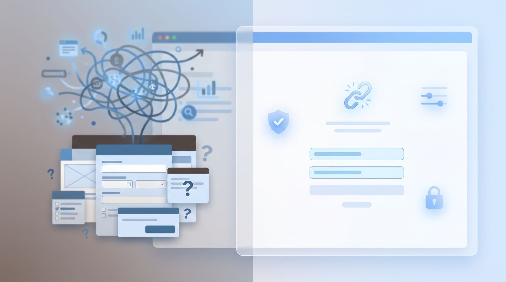
Custom URLs and pre-filled fields are one of the most underrated levers in form design.
A single link can:
- Route someone to the right variant of a form
- Pre-fill what you already know (email, plan, campaign source)
- Shorten time-to-submit
- Quietly increase completion rates
But there’s a thin line between helpful personalization and creepy profiling.
When a form feels like it “knows too much,” people hesitate. When a URL feels like it’s steering them toward a decision they didn’t make, they bounce. For privacy-conscious users, this is especially true—something we explored in depth in Forms for Privacy-Conscious Users: Designing High-Trust Intakes When Your Audience Is Skeptical.
This post is about staying on the right side of that line: using custom URLs and pre-filled fields to reduce friction and increase clarity—without pre-judging users, boxing them into segments they can’t escape, or eroding trust.
Why Ethical Personalization for Custom URLs Matters
Personalization used to be a “nice to have.” Now it shapes whether people complete your form at all.
What’s at stake
1. Trust and consent
People are more aware of data use than ever. Surveys from major privacy and consumer research firms consistently show that a majority of users are willing to walk away from brands they don’t trust with their data. When a form shows up pre-filled from a tracking link, the unspoken questions are:
- Where did you get this information?
- What else do you know about me?
- Can I change it—or opt out?
If you can’t answer those questions clearly through design, copy, and behavior, your conversion rate will quietly suffer.
2. Accuracy of your data
Pre-filled fields are a double-edged sword. They reduce friction, but they also anchor people. If the form “guesses” wrong and the guess is hard to change, users will:
- Correct it (if they care enough)
- Leave it wrong (if they’re rushed)
- Abandon the form (if it feels like a fight)
All three outcomes are worse than asking cleanly and honestly.
3. Fairness in high-stakes flows
When forms influence credit limits, admissions, or compliance outcomes, personalization patterns can cross into ethical and regulatory territory quickly. If your custom URLs imply different questions, defaults, or paths based on inferred traits, you’re not just optimizing UX—you’re shaping decisions. For more on why that matters, see Forms for High-Stakes Decisions: Intake Patterns for Loans, Admissions, and Compliance-Heavy Flows.
The Core Principle: Pre-Filled, Not Pre-Judged
A simple rule:
Use custom URLs to remember what the user has already chosen or told you—never to decide for them.
That means:
- Pre-fill facts you already know and can verify (their email from a logged-in session, their company from your CRM)
- Suggest defaults that are easy to change (plan tier, role, use case)
- Avoid locking in assumptions (income bracket, risk tolerance, eligibility) based purely on a segment or campaign
In other words, personalization should feel like a helpful assistant, not a silent judge.
Common Missteps With Custom URLs and Pre-Filled Fields
Before we design better patterns, it helps to name the anti-patterns.
1. The Invisible Override
You send a link like:
https://yourform.ezpa.ge/feedback?plan=enterprise&source=upsell_q3
The user never sees these parameters, but they change:
- Which questions they see
- How their response is routed
- Whether they qualify for certain offers
Why it’s a problem:
- The user has no way to understand or override the assumptions
- If the segment is wrong, your data and decisions are wrong
Better: Expose key assumptions as visible, editable fields.
2. The “Too Much Information” Moment
You email a user a link, and when they open it, the form already knows:
- Their full name
- Their company
- Their job title
- Their location
…even though they never remember telling you all of that.
Why it’s a problem:
- It feels like surveillance, even if it came from legitimate sources (e.g., enrichment tools)
- It raises questions about what else you’re storing
Better:
- Pre-fill only the essentials
- Use inline explanations for sensitive pre-filled fields: “We filled this from your account profile. You can change it.”
3. The No-Escape Segment
A prospect clicks an “Enterprise” pricing page CTA, lands on a pre-filled form with Company size: 500+ employees and no way to change it.
Why it’s a problem:
- People end up misclassified
- Sales and onboarding workflows break
- Users feel pushed into a box
Better:
- Always allow users to correct segmenting fields
- Design flows that gracefully handle changes (e.g., different follow-up paths based on the final answer)
A Practical Framework for Ethical Personalization
Let’s turn principles into a simple checklist you can apply every time you create a custom URL or pre-filled flow in Ezpa.ge.
Step 1: Classify Your Fields by Sensitivity
Start by labeling each field in your form:
- Low sensitivity: name, company, role, non-identifying preferences
- Medium sensitivity: phone, region, product usage data
- High sensitivity: income, health info, legal status, demographics, anything regulated
Guideline:
- It’s usually safe to pre-fill low-sensitivity fields from a custom URL or logged-in state
- Be cautious and explicit with medium-sensitivity fields
- Avoid pre-filling high-sensitivity fields unless the user has already provided them in a clearly related context—and even then, explain why they’re there and keep them editable
This is especially important for high-stakes flows like those covered in Forms for High-Stakes Decisions.
Step 2: Decide What Should Be Remembered vs. Re-Asked
Ask two questions for each candidate field:
-
Did the user already give us this information in a related context?
- If yes, pre-fill and label the origin: “From your billing profile.”
- If no, consider asking fresh.
-
Does pre-filling this reduce effort without reducing agency?
- If yes, pre-fill with a clear option to change.
- If no, show it as an empty field.
Good candidates for pre-fill:
- Email address (from a logged-in session or a magic link)
- Company name and website (from CRM or previous form)
- Plan type or product area they selected on the previous screen
Fields to re-ask or confirm:
- Anything that might have changed (team size, budget, timeline)
- Anything that could be used to qualify or deny access (e.g., eligibility criteria)
Step 3: Make Assumptions Visible and Editable
Ethical personalization is mostly about transparency.
Concretely:
-
Surface pre-filled values in normal, editable inputs
Don’t hide them in read-only text or behind toggles. -
Use helper text to explain why something is filled in
Example: “We filled this from your last signup. Update it if anything’s changed.” -
Highlight critical assumptions
For routing or eligibility fields (e.g., “Are you a current customer?”), consider a subtle badge: “Suggested based on your account.” -
Avoid hidden routing based on URL parameters alone
If?segment=partnerchanges the path, show a visible field like “Relationship to us” with “Partner” selected—and let them change it.

Designing Smarter Custom URL Patterns
Now let’s zoom in on the URL itself. With tools like Ezpa.ge, custom URLs are more than vanity links—they’re tiny configuration files for your forms.
Pattern 1: Context-Rich but User-Friendly URLs
Instead of:
/signup?utm_source=linkedin&campaign=leadgen_q2&seg=midmarket&pl=pro
You might design:
/signup/midmarket-pro?source=linkedin
Then, inside your form builder:
- Map the
midmarket-propath to:- Pre-fill
Company size≈ 50–500, but show it as a range selector the user can change - Pre-select
Plan interest: Pro, but allow other options
- Pre-fill
- Use
source=linkedinonly for analytics and copy tweaks (e.g., “Saw us on LinkedIn?”), not for gating features or pricing
Why this works:
- The URL is readable and explainable
- The user sees and can edit the assumptions
- You still get segmentation and context
Pattern 2: One Canonical Form, Many Entry Points
Instead of cloning forms for every campaign, use one canonical form with multiple custom URLs that:
- Pre-fill a few non-sensitive fields
- Toggle certain sections on or off
- Adjust microcopy to match the promise that brought them there
For example, a feature feedback form could have:
/feedback/beta-users– pre-fills “Are you in the beta?” = Yes, shows beta-specific questions/feedback/customers– pre-fills “Are you a current customer?” = Yes, shows account-related questions/feedback/general– no pre-fills, generic copy
All three URLs point to the same underlying form and spreadsheet, which makes it much easier to analyze patterns later—especially if you’re using workflows like those in AI as Your Form Data Analyst: Turning Google Sheets Submissions into Weekly Insight Briefs.
Key safeguards:
- Every pre-filled flag is visible and changeable
- Copy reassures people: “This link is tailored based on how you know us. Adjust anything that doesn’t fit.”
Pattern 3: Progressive Personalization Over Time
Not every form needs to be heavily personalized from the first touch.
A healthier pattern:
-
First interaction:
- Minimal pre-fill, minimal assumptions
- Focus on clarity, consent, and value
-
Second interaction (e.g., onboarding or deeper survey):
- Use what they already told you to reduce repetition
- Introduce light segmentation (“We saw you selected ‘Product Manager’ earlier—still true?”)
-
Ongoing interactions:
- Use account data to pre-fill routine fields (name, company, role)
- Let users manage their profile and preferences directly
This aligns neatly with the philosophy in The Minimal Field Manifesto: How Fewer Inputs Can Actually Enrich Your First-Party Data: start lean, then deepen the relationship as trust grows.
Implementation Tips for Ezpa.ge Users
Ezpa.ge gives you flexible building blocks—custom URLs, themes, and real-time Google Sheets syncing. Here’s how to apply everything above in practice.
1. Standardize Your URL Schema
Choose a consistent structure so your team knows what each part of a URL does. For example:
/{form-slug}/{audience}-{intent}?source={channel}
audience–customers,partners,beta,internalintent–signup,feedback,request-demosource–email,linkedin,qr, etc.
Inside Ezpa.ge, map audience and intent to:
- Pre-filled, visible fields (e.g., “Relationship to us”)
- Optional sections (e.g., partner-only fields)
2. Use Themes to Reinforce, Not Exaggerate, Personalization
Pair your custom URLs with themes that:
- Match the promise that brought someone there (e.g., “Beta feedback” theme for beta users)
- Use subtle visual cues rather than heavy-handed “We know you” language
For guidance on tuning themes to context, see Conversion by Context: How to Tune Form Themes for Ads, Email, In-App, and QR Codes.
3. Sync to Google Sheets With Clear Columns for Assumptions
When your Ezpa.ge forms sync into Google Sheets:
- Add columns for URL-derived parameters (e.g.,
entry_audience,entry_intent,entry_source) - Add separate columns for user-confirmed fields (e.g.,
relationship_confirmed,plan_selected)
This lets you:
- Compare what you assumed vs. what users actually chose
- Spot segments where your assumptions are consistently wrong
- Iterate your URLs and pre-fill logic over time
Pair this with an AI-driven weekly review (as described in the AI as Your Form Data Analyst post) to catch patterns early.
4. Test for “Creepiness” as Rigorously as Conversion
When you run experiments on custom URLs and pre-fills:
- Don’t just track completion rate and time-to-submit
- Ask a quick, optional question at the end: “Did this form feel respectful of your privacy?” with a short scale
- Read free-text comments every week for phrases like “weird,” “creepy,” “how did you know…”
If a variant lifts conversion but generates discomfort, treat that as a failed experiment.

Quick Checklist: Are Your Custom URLs Ethical and Effective?
Before you ship a new custom URL pattern, run through this list:
-
Can a reasonable user explain why fields are pre-filled?
If not, add helper text or reduce the amount of pre-fill. -
Can they change every meaningful assumption?
Segments, plans, roles, and eligibility questions should always be editable. -
Are the most sensitive fields empty by default?
Or, if pre-filled, clearly labeled with their source and purpose. -
Is there a clear separation between URL assumptions and user-confirmed data in your sheet?
This protects your analysis and helps you spot misalignment. -
Have you tested with real users or teammates for “creepiness”?
If anyone says “Whoa, how did it know that?”, reconsider. -
Does personalization help them, or just help you?
If the primary benefit is internal (e.g., sales routing) and the UX cost is high, rethink the pattern.
Bringing It All Together
Ethical personalization isn’t about avoiding pre-filled fields or custom URLs. It’s about using them in service of the user’s goals, not just your funnel metrics.
When you:
- Pre-fill what’s truly helpful
- Make assumptions visible and editable
- Respect sensitivity and context
- Treat discomfort as a failure state, not a side effect
…you get forms that feel like a continuation of a relationship, not a data grab.
And from an operations perspective, you still get all the benefits:
- Cleaner data in your Google Sheets
- More reliable segments
- Higher completion rates from less friction
- A foundation you can plug into downstream workflows—from onboarding journeys to feature rollouts and beyond.
Where to Go From Here
If you’re ready to put these ideas into practice with Ezpa.ge:
-
Pick one high-traffic form.
A signup, waitlist, or feedback form is perfect. -
Map your current URLs.
List every variant you’re using (ads, email, QR codes, internal docs). Note what each one assumes about the user. -
Refactor to a cleaner, more transparent pattern.
- Standardize your URL schema
- Reduce or explain pre-fills
- Add visible, editable fields for key assumptions
-
Wire it into Sheets with clear columns for assumptions vs. confirmations.
Use that structure to review how well your personalization is working. -
Run a small experiment.
Ship the new, ethical-personalization variant to a subset of traffic. Track conversion, completion time, and perceived respect for privacy.
You don’t have to rebuild your entire form stack to benefit from this. One thoughtfully designed, pre-filled-but-not-pre-judged flow can become the template for everything else.
If you’re using Ezpa.ge already, open your highest-impact form and start by cleaning up a single URL. If you’re not, spin up a new form, connect it to Google Sheets, and experiment with a couple of custom URLs.
The goal isn’t just smarter links. It’s smarter, fairer, more trustworthy interactions—one URL at a time.