Forms for Privacy-Conscious Users: Designing High-Trust Intakes When Your Audience Is Skeptical


Privacy-conscious users aren’t a niche anymore—they’re the default.
Cisco’s 2024 Consumer Privacy Survey found that more than three-quarters of people say they won’t buy from organizations they don’t trust with their data. (cisco.com) Deloitte’s 2024 Connected Consumer research shows similar patterns: people reward companies that are transparent and give them real control over their data. (deloitte.com)
If your product depends on forms—signups, onboarding, waitlists, feedback, applications—you’re asking people to hand over data at the exact moment their guard is up. That’s a design challenge, but it’s also a huge opportunity: a well-designed intake can be the moment someone decides you’re one of the good ones.
This post is about how to design those high-trust forms—especially when your audience is skeptical, informed, and willing to walk away.
Why trust-heavy intakes matter more than ever
When someone hits your form, a few things are happening in their head:
- “Do I actually want what’s on the other side?”
- “Is this worth the information they’re asking for?”
- “Are they going to spam me, track me, or sell this?”
Your form either answers those questions clearly—or leaves them hanging.
The business case for privacy-respectful forms
High-trust forms don’t just “feel better.” They:
- Increase completion rates among the very people you care most about (thoughtful, discerning users who often become your best customers).
- Improve data quality because people are less likely to lie, omit, or use burner info when they feel safe.
- Reduce regulatory and reputational risk by aligning with privacy expectations and making your practices explicit.
- Strengthen your first-party data strategy by turning consent into a value exchange instead of a checkbox. (If you’re thinking about this angle, pair this with The Minimal Field Manifesto: How Fewer Inputs Can Actually Enrich Your First-Party Data.)
What privacy-conscious users actually want
Across recent surveys, a few themes show up again and again:
- Transparency: Plain-language explanations of what’s collected, why, and for how long.
- Control: The ability to opt in, opt out, or limit use—not just a one-time blanket consent. (interac.ca)
- Security and restraint: A sense that data is protected and not overshared, combined with a clear signal that you’re not collecting more than you need. (prnewswire.com)
- Consistency: No surprises—your behavior matches what you promised in the form.
Designing for these expectations is how you earn the right to ask for more meaningful information over time.
Step 1: Decide what you truly need to ask
The first trust decision happens before you even open your form builder.
Start with the job of the form
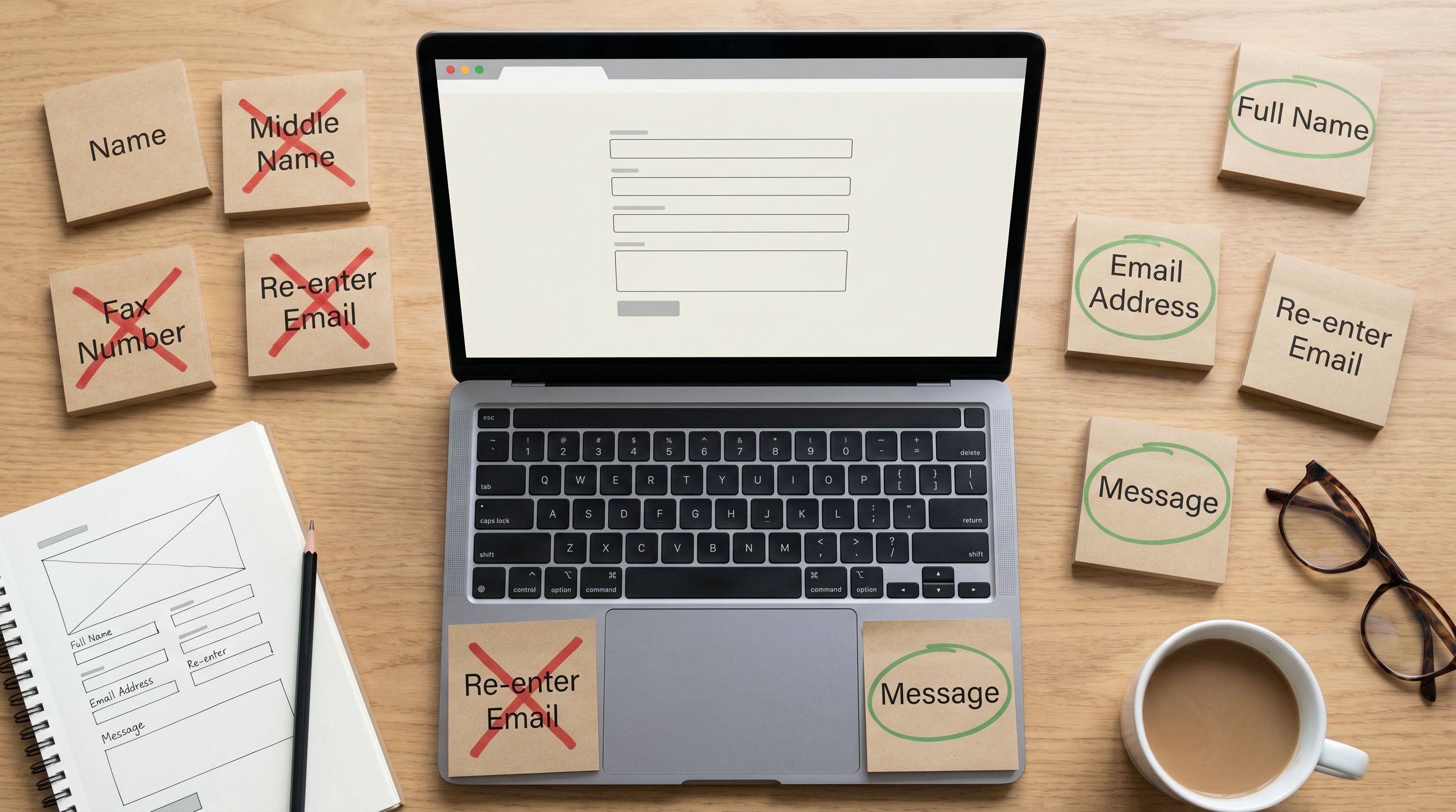
Ask: What decision will we make with this submission within 7 days? Anything you can’t tie to a near-term decision is a candidate to cut.
Map each field to a decision or action. For every input, write:
- Field: “Company size”
Used for: Route to SMB vs. enterprise sales - Field: “How did you hear about us?”
Used for: Adjust channel spend monthly - Field: “LinkedIn profile”
Used for: ???
If you can’t fill in the “Used for,” remove it—or move it to a later touchpoint.
This is the same discipline we talk about in The Minimal Field Manifesto, but for privacy-conscious audiences, it’s non-negotiable. Every unnecessary field reads as, “We’re collecting this just in case.”
Ask less now, earn more later
A high-trust pattern:
- Phase 1 – Minimal intake: Only the fields required to deliver the immediate value (e.g., email + one qualifier).
- Phase 2 – Contextual follow-up: Once you’ve delivered something useful, ask for 1–2 more details with a clear reason.
- Phase 3 – Relationship-building surveys: Invite deeper sharing for people who’ve opted into a longer-term relationship.
Tools like Ezpa.ge make this easy: you can spin up separate, themed intakes that sync into the same Google Sheet, so your “Phase 1” and “Phase 2” forms still land in one structured dataset.
Step 2: Make your value proposition and privacy deal explicit
Privacy-conscious users are constantly evaluating trades: “Is this worth it?” Your form should answer that without making them hunt.
Lead with why, not with fields
Above the first input, clearly state:
- What they get (the outcome, not just “submit this form”).
- When they get it (immediately? within 24 hours?).
- What you’ll do with their data in one sentence.
Example:
Get early access to the beta
We’ll use your answers to prioritize access and tailor onboarding. Your responses stay in our internal tools and are never sold.
If you’re running a beta or gated access program, your intake is doing double duty. Pair this with the patterns from Forms for Product Betas: Waitlists, Access Codes, and Rapid Feedback Loops in One Sheet-Backed Stack so the promise (“We’ll actually use this to shape the product”) is real.
Use plain-language microcopy for sensitive fields
Any time you ask for something that feels personal—phone number, company revenue, role, demographics—add short, direct helper text:
- Phone number
“Only used for time-sensitive account issues. No marketing texts.” - Role / title
“Helps us route you to the right onboarding path. Not visible publicly.” - Budget range
“Used internally to recommend the right plan. We don’t share this with partners.”
Keep it under 15 words and avoid legalese. You’re writing for human reassurance, not compliance checklists.
Make your privacy policy feel like part of the experience
Linking to a generic privacy policy in 8pt footer text doesn’t cut it anymore.
Better patterns:
- A short, scannable summary right under the submit button:
“By submitting, you agree to our Privacy Policy (no selling data, no surprise charges).” → link to full policy. - A one-sentence data retention note for high-sensitivity forms:
“We keep these responses for 12 months to support your account, then archive.” - Inline links for key phrases like “no selling data” so people can dig deeper if they want.
Step 3: Design the visual layer for trust and calm
Even before someone reads your copy, they’re making snap judgments based on layout, color, and motion.
Visual signals that build trust
- Stable, recognizable URL: Custom domains or clean custom URLs (e.g.,
forms.yourbrand.com/intake) reassure people they’re still with you. - Brand-consistent but subdued themes: Avoid casino-bright colors and aggressive gradients for serious intakes (finance, health, HR). Neutral backgrounds with one accent color signal calm.
- Generous spacing and short sections: Crowded fields feel like you’re trying to rush them. Space says, “You can take your time.”
- Minimal motion: Limit animations, pop-ups, and auto-playing embeds. Movement during data entry feels distracting at best, scammy at worst.
If you want a structured way to evaluate whether your themes are doing their job, the framework in Beyond ‘Looks Good’: A Practical Framework for Scoring Form Themes by Trust, Clarity, and Speed is a useful companion.
Copy and labels that reduce anxiety
- Use descriptive button labels: Replace “Submit” with “Request access,” “Save application,” or “Join waitlist.” It tells people what happens next.
- Avoid vague or loaded field names: “Personal info” is scarier than “Contact details.” “Background check info” should be explained.
- Show progress clearly: For multi-step forms, add a stepper with labels (“1. About you → 2. Your needs → 3. Review”). It reassures people there’s an end.
Accessibility is part of trust
Privacy-conscious users often overlap with users who care about accessibility and control. Basics that matter:
- High contrast between text and background.
- Clear focus states for keyboard navigation.
- Labels that stay visible even when fields are filled (no disappearing placeholder-only labels).
These aren’t just checkboxes. They communicate, “We’ve thought about different ways you might use this.”
Step 4: Give users meaningful control, not just a checkbox
Skeptical users are paying attention to how much control they actually have.
Design real choices into the flow
Instead of a single “I agree to everything” checkbox, consider:
- Granular consent toggles for:
- Product communication (onboarding tips, feature updates)
- Marketing communication (newsletters, offers)
- Research participation (surveys, interviews)
- Optional fields clearly marked as optional, not just with asterisks but with helper text like: “Optional, but helps us tailor your experience.”
- Easy ways to say no: For example, a small link under the email field: “Prefer not to share your email? Contact us another way.” with a mailto or alternative channel.
Explain the upside of each consent
Rather than hiding behind legal phrasing, spell out the benefit:
- “Yes, send me onboarding tips so I can get value faster.”
- “Yes, invite me to occasional research sessions (we often include gift cards or discounts).”
When the value is clear, consent becomes a choice, not a trap.
Respect withdrawal—and say so
Some of the strongest trust signals are about what happens after submission:
- Add a line near your consent toggles:
“You can change these preferences or unsubscribe anytime from any email.” - In high-sensitivity contexts, consider a brief note:
“Want your data deleted later? Reply to any email from us or reach out at privacy@yourbrand.com.”
These small commitments feel risky to some teams, but they’re increasingly aligned with both regulation and user expectations. (cisco.com)
Step 5: Reduce hidden friction that erodes trust
Even if your form looks and reads well, technical quirks can undermine confidence.
Watch out for these anti-trust patterns
- Domain hops mid-form: Jumping between multiple domains or subdomains without explanation.
- Aggressive trackers and third-party scripts: Extra consent banners and slow load times scream “you’re being watched.”
- Unclear errors: Generic “Something went wrong” messages, especially after a long form, feel like a betrayal.
- Field resets: Losing everything on a validation error or flaky connection.
Some of these issues live in your integrations layer. If you’re wiring forms into CRMs, analytics, or automation tools, the patterns in Invisible Integrations: How to Connect Forms to Your Stack Without Breaking UX or Brand Trust are especially relevant.
Practical fixes that reassure skeptical users
- Use stable, branded URLs for your Ezpa.ge forms so the address bar feels consistent.
- Keep scripts lean: Only load what you truly need. Defer non-essential scripts so the form itself loads instantly.
- Design forgiving validation:
- Validate on blur or on submit—not on every keystroke.
- Preserve input on errors and clearly highlight only the problematic fields.
- Pair error states with helpful microcopy: “We use this to send your receipt, so please double-check the spelling.”
- Handle bad connections gracefully:
- Show a clear saving/submitting state.
- Offer a “Save and finish later” option for long, sensitive forms.
- If you expect poor connectivity (fieldwork, events), borrow patterns from Offline-Adjacent Forms: Designing Intakes That Work When Your Users Have Bad Wi-Fi.
Step 6: Prove you’re listening by closing the loop
Trust isn’t just about how you collect data—it’s about what happens after.
Send confirmations that respect privacy
Your confirmation screen and follow-up email are chances to reinforce the trust contract:
- Restate what they can expect:
- “We’ll review your application within 2 business days.”
- “You’ll get a single confirmation email, then a monthly update at most.”
- Recap key choices:
- “You opted into onboarding tips, but not marketing emails. You can change this anytime.”
- Offer visibility into their data:
- “Want to see or update your answers? Use this secure link.”
Use their data responsibly—and let them see it
Because Ezpa.ge syncs directly into Google Sheets, you already have a live, structured record of each submission. Use that to:
- Route people into appropriate onboarding journeys (see From Form to Onboarding Journey for deeper patterns).
- Avoid asking the same questions twice—few things feel more disrespectful than re-collecting data you already have.
- Periodically audit which fields you’re actually using; if a field isn’t driving action, consider removing it from the form.
Over time, your behavior becomes your strongest privacy signal. When people see that you:
- Don’t spam them.
- Don’t surprise them with new uses of their data.
- Do respond based on what they shared.
…they’re far more likely to share richer, more honest information the next time.
A quick checklist for high-trust, privacy-conscious forms
Before you ship your next intake, run it through this lens:
-
Fields
- [ ] Every field maps to a decision or action within 7 days.
- [ ] Sensitive fields have clear, human helper text.
-
Value and privacy deal
- [ ] The top of the form clearly states what they get and when.
- [ ] There’s a one-sentence explanation of how you’ll use their data.
- [ ] Your privacy policy is linked in context, not buried.
-
Visual design
- [ ] URL and branding are consistent and stable.
- [ ] Layout is calm, uncluttered, and accessible.
- [ ] Multi-step forms show clear progress.
-
Control and consent
- [ ] People can opt in/out of different communication types.
- [ ] Optional fields are clearly marked and truly optional.
- [ ] You explain how to change preferences or request deletion.
-
Technical trust
- [ ] No unexplained domain hops or surprise pop-ups.
- [ ] Errors preserve input and explain how to fix issues.
- [ ] The form behaves predictably on flaky connections.
-
Follow-through
- [ ] Confirmation screens/emails restate expectations and choices.
- [ ] Collected data actually drives how you respond or onboard.
- [ ] You periodically prune unused fields.
If you can tick most of these boxes, you’re already ahead of the majority of forms people see.
Bringing it all together
Privacy-conscious, skeptical users aren’t a problem to be solved—they’re the audience that pushes you toward better, more intentional design.
When you:
- Ask only for what you need (and can justify).
- Explain the value and the privacy deal in plain language.
- Design themes and flows that feel calm, consistent, and accessible.
- Give people real control over how their data is used.
- Back it all up with dependable, respectful follow-through.
…your forms stop feeling like surveillance and start feeling like collaboration.
That’s where trust is built—and where your first-party data becomes a genuine asset instead of a liability.
Your next move
You don’t need a full privacy rebrand to start earning more trust. Pick one high-traffic form—your main signup, your beta waitlist, your core intake—and:
- Remove 2–3 fields that don’t map to clear decisions.
- Add a single, honest sentence about how you’ll use the data.
- Swap “Submit” for a button label that matches the outcome.
- Turn on real-time syncing to a Google Sheet so you can actually act on what people share.
If you’re using Ezpa.ge, you can do all of this in minutes: tune the theme for calm, customize the URL so it feels like home, and wire it to a live sheet that powers respectful, responsive workflows.
Start there. Ship one high-trust intake. Then use what you learn to raise the bar across everything else.
Your most privacy-conscious users will notice—and they’re the ones worth earning.