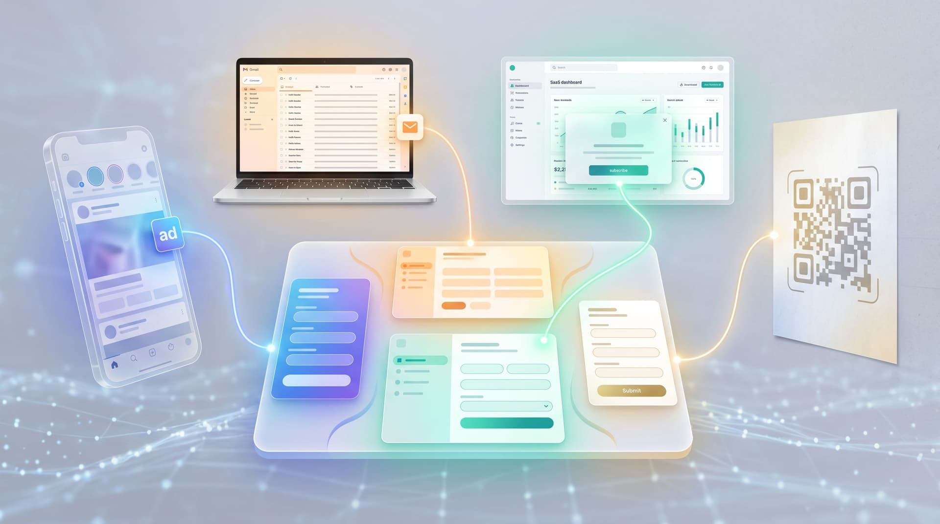
Conversion by Context: How to Tune Form Themes for Ads, Email, In-App, and QR Codes

Every form lives in a context.
A signup form from a retargeting ad. A beta waitlist linked in your product’s settings. A feedback survey opened from a QR code on a conference badge. The URL might be the same, but the job that form has to do—and the mindset of the person hitting it—are completely different.
If you’re using Ezpa.ge, you already have the building blocks: themes, custom URLs, and real-time Google Sheets syncing. The question is how to tune those themes so a form from an ad doesn’t look and feel like a form from an in-app nudge.
This matters because small contextual tweaks compound:
- Higher completion rates when the form visually matches the promise that brought someone there.
- Cleaner data because people understand what they’re doing and what happens next.
- Stronger brand trust when the experience feels intentional instead of generic.
This post walks through how to design (and re-use) form themes for four high-impact contexts:
- Paid ads
- In-app
- QR codes (offline-to-online)
Along the way, we’ll connect to other Form & Function playbooks—like building reusable form libraries and scoring themes for trust, clarity, and speed.
Start with intent: same form, different promises
Before you touch colors or logos, write down two things for each context you care about:
- What did we promise just before the click/scan/tap?
Example: “Get a personalized pricing benchmark in 2 minutes.” - What does the user expect to see first on the form?
Example: A short explanation and a clear progress indicator.
Then ask: What would make this feel like a bait-and-switch? That’s usually where your theme needs to carry more of the load.
A good contextual theme does three things within the first second:
- Confirms they’re in the right place (visual continuity with the source).
- Signals the type of interaction (quick opt-in vs. serious application vs. feedback).
- Hints at time/effort (minimal layout, progress bar, or step count).
Keep those three checks in mind as we walk through each channel.
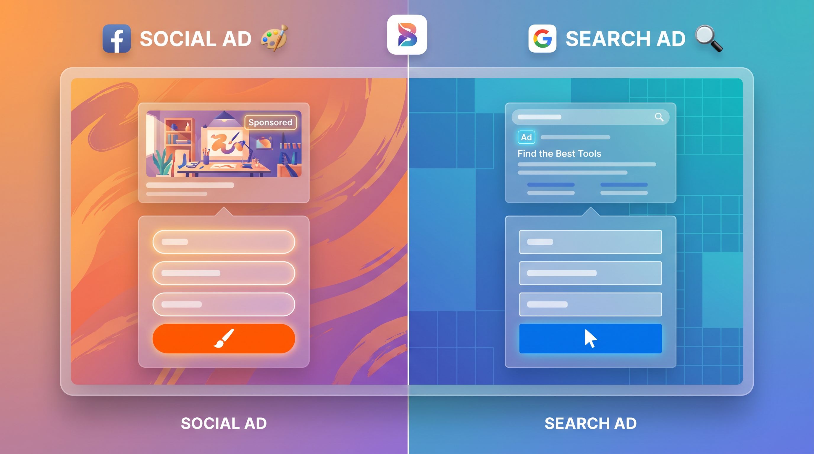
Forms from ads: reduce doubt, amplify the offer
When someone clicks an ad, they’re moving from a noisy, skeptical environment into your world. Your form theme is the first test of whether that click was worth it.
Design principles for ad-driven forms
1. Mirror the ad creative, not the homepage
- Use the same primary color and accent color from the ad’s button or background.
- Reuse headline phrases in the form title or subheading.
- If the ad used a strong visual motif (e.g., gradient, geometric shapes, product mockup), echo a simplified version in the form header.
This doesn’t mean copying the entire ad. It means giving the brain a fast “Yes, this is what I just clicked” confirmation.
2. Make the value prop visually dominant
On ad-landing forms, people are still deciding whether to commit. Your theme should:
- Reserve top-of-form space for a bold headline and one-line benefit.
- Use contrast (larger font, bold weight, or a tinted background block) to separate the promise from the fields.
- Keep the first screen scannable on mobile: no walls of text, no dense grids.
3. Use urgency and proof carefully
Instead of cluttering the form with badges and logos, bake urgency and proof into the theme subtly:
- A small, calm accent color (e.g., amber) for limited-time notes: “This cohort closes Friday.”
- Muted logos or a low-contrast strip for social proof: “Trusted by teams at …”
- Avoid blinking countdowns or aggressive red; they read as scammy and crush trust.
4. Theme variants by funnel stage
You can often reuse the fields across campaigns but swap the theme based on intent:
- Top-of-funnel (TOFU) lead gen:
- Lighter backgrounds, more white space.
- Fewer required fields.
- Softer button text (e.g., “Send me the guide”).
- Mid-funnel demos/trials:
- More neutral, product-like theme.
- Clear step labels (“Step 1 of 2: About your team”).
- Stronger CTA (“Book my demo”).
This is where Ezpa.ge’s themes and form-led experimentation shine: you can keep your schema intact while testing theme variants per audience or campaign.
Forms from email: continuity, calm, and context
Email clicks are different. People are usually less skeptical (they know you) but more distracted (they’re in an inbox). Your theme should feel like a natural extension of the email itself.
Design principles for email-driven forms
1. Match the email’s typography and color rhythm
- Use the same or similar font pairing as your email templates (e.g., sans-serif for headings, system font for body).
- Carry over the button color from the email CTA to the form’s primary button.
- If your email used a light background with a colored section, echo that structure: a neutral form body with a colored header or footer.
2. Lead with context, not a hard sell
People often click from:
- Product update emails
- Newsletter segments
- Lifecycle campaigns (onboarding, renewals, expansion)
Your form theme should give them a quick “You’re here because…” frame:
- A subtle banner at the top: “You clicked from our onboarding series” or “This helps us tailor your next releases.”
- A softer color palette than your ad landers; think “conversation” more than “campaign.”
If you’re collecting ongoing feedback, pair this with the system described in Forms for Modern Feedback Loops so every submission feeds a real roadmap signal.
3. Respect the email’s promise on time and effort
If your email said “30-second survey,” your theme must visually support that claim:
- Use a single-column layout with generous spacing so the form looks short.
- Group related questions into clear sections with dividers instead of mixing everything together.
- Consider a progress indicator only if there’s more than one screen; otherwise, the visual weight can make the form feel longer than it is.
4. Personalization without creepiness
Email forms are a great place to personalize themes lightly:
- Show the recipient’s first name or company in the header copy.
- Use segment-specific themes (e.g., different accent colors for customers vs. prospects).
Just make sure the visual treatment still reads as one brand. If you’re juggling many variants, a reusable library as described in From Theme to Template keeps chaos in check.
In-app forms: feel like part of the product
In-app forms are where people are deeply in context. They’re already using your product, already mid-task. Here, the worst sin is making the form feel like a different tool.
Design principles for in-app forms
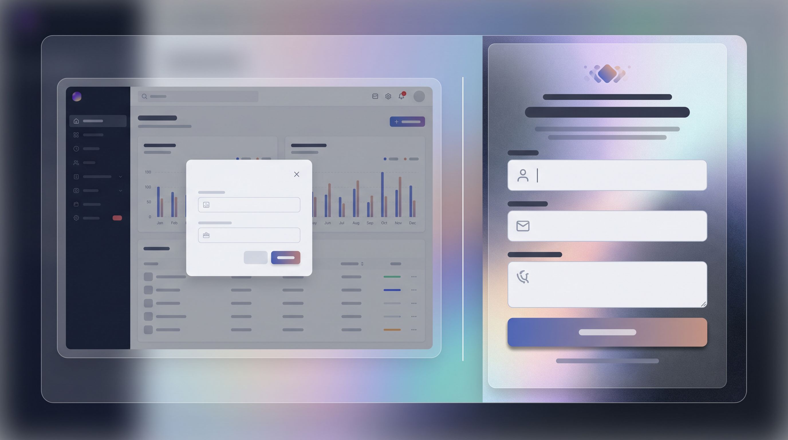
1. Steal your product’s UI, not your marketing site
Your in-app theme should:
- Use the same base background color as your app surface (not your marketing hero gradient).
- Match border radius, shadows, and spacing of your native components.
- Align button hierarchy with your app (primary, secondary, destructive).
If your app is dark mode–friendly, consider a dark-theme variant for in-app forms while keeping ad/email forms light.
2. Design for embeds, modals, and side panels
In-app forms rarely live on a full, empty page. They’re often:
- Embedded in a settings page
- Opened as a modal
- Slid in as a side panel
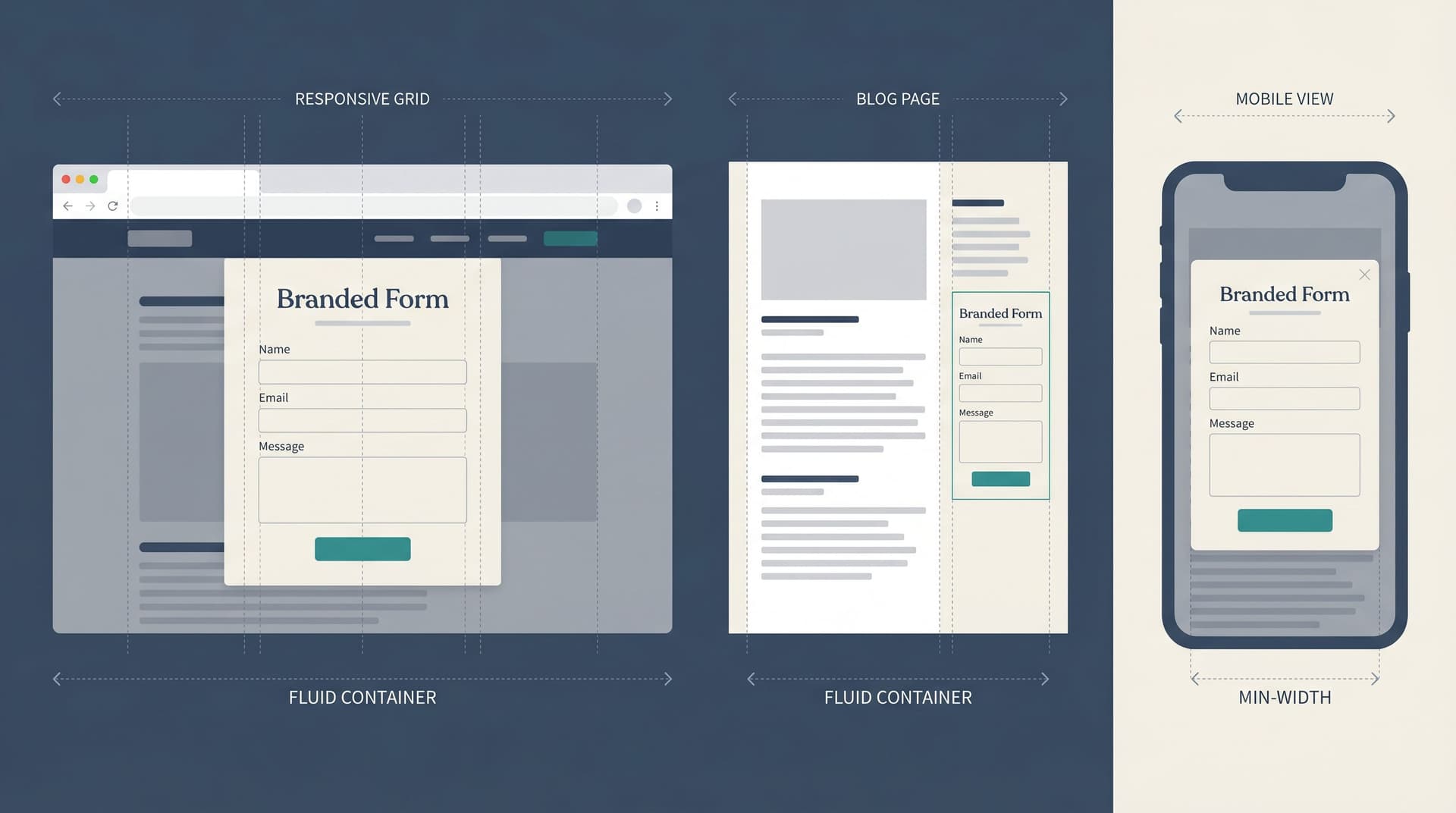
Your theme should be responsive by default and tested in those containers. If you haven’t yet, the patterns in Responsive by Default are worth adopting:
- Avoid full-bleed backgrounds that clash with the host surface.
- Use clear section headers and chunking so scrollable areas feel manageable.
- Keep primary CTAs pinned or easily reachable on mobile.
3. Make the form feel like a step in a workflow, not a detour
In-app forms often gate real actions:
- Requesting a feature
- Changing a plan
- Inviting teammates
Your theme can reduce friction by:
- Using inline success states that match your app’s notification style.
- Including microcopy in the same tone as your product (not your marketing voice).
- Minimizing decorative elements; here, clarity beats flair.
4. Use themes to signal seriousness
Changing billing details should not look the same as submitting a quick NPS score.
- For high-stakes forms (billing, permissions, security):
- Use more muted, serious tones.
- Increase contrast and field labels size.
- Consider a subtle border or card around the entire form to frame it as a “document.”
- For lightweight feedback or quick polls:
- Use a lighter accent and more breathing room.
- Keep the form visually small—no massive headers.
QR code forms: clarity first, then delight
QR codes are the bridge between physical and online. Someone scans from a poster, a table tent, a box insert, or a conference badge. Their environment is unpredictable; your theme has to work hard to orient them quickly.
Design principles for QR-driven forms
1. Assume low attention and variable lighting
People may be scanning:
- In a hallway between sessions
- At a noisy booth
- In a dim restaurant
Design for legibility and speed:
- High contrast between background and text (no low-contrast pastel-on-pastel).
- Large, clear headings and labels.
- Generous tap targets and spacing.
This is where the patterns from Designing Forms for ‘Skim-Only’ Users are especially helpful: chunk questions, use defaults, and minimize cognitive load.
2. Mirror the physical artifact just enough
If the QR is on:
- A conference badge: match the event’s primary color or typeface in the header.
- A product package: echo the packaging colors and maybe a small illustration.
- A poster or table tent: reuse the same headline and icon.
The goal is to make the jump from physical to form feel like one continuous experience.
3. Make the “what” and “why” unmissable
Above the fold on a QR form, someone should be able to answer:
- What is this? (e.g., “Session feedback” or “VIP waitlist.”)
- Why should I care now? (e.g., “Helps us improve tomorrow’s agenda” or “Unlock launch-day perks.”)
Theme-wise, this means:
- A tight header block with a bold title and one-line benefit.
- A subtle icon or illustration that matches the QR context.
- Very little else before the first field.
4. Design for spotty connections and short sessions
People scanning QR codes might be on flaky conference Wi-Fi or cellular.
While the theme itself doesn’t change performance, it can:
- Avoid heavy background images that slow perceived load.
- Use simple, lightweight visual elements instead of large hero graphics.
- Encourage short, self-contained flows—if you need a longer process, split it into a micro-funnel and chain forms, as described in Micro-Form Funnels.
Building a small library of context-aware themes
You don’t need 20 themes. You need a small, opinionated library that covers your main contexts and can be tweaked per campaign.
A practical starting set:
- Ad Lander Theme
- High contrast, bold value prop block, echoes performance creative.
- Email Theme
- Softer palette, typography aligned with your newsletter, more context space.
- In-App Theme (Light + Dark)
- Mirrors product UI; minimal decoration, strong clarity.
- QR Theme
- High legibility, fast-loading, compact header, big tap targets.
For each theme, document:
- Intended contexts (where it should and shouldn’t be used).
- Default header pattern (headline + subheading + optional badge).
- Button hierarchy (primary/secondary colors and wording examples).
- Do/Don’t examples (e.g., “Don’t add hero images to QR theme”).
If you centralize this in a shared library, it becomes much easier for non-designers to launch forms that still feel cohesive. Pair it with the scoring model from Beyond ‘Looks Good’ so every new variant is evaluated on trust, clarity, and speed—not just aesthetics.
Turning themes into experiments, not opinions
Context-aware themes are a perfect place to run structured experiments without rewriting your entire funnel.
Ideas to test across contexts:
- Ad forms
- Variant A: Heavy brand color background, white card for fields.
- Variant B: Neutral background, brand color reserved for buttons and key text.
- Email forms
- Variant A: More conversational, newsletter-like header.
- Variant B: Straight-to-the-point, product-style layout.
- In-app forms
- Variant A: Full-screen takeover with progress bar.
- Variant B: Side panel with inline explanations.
- QR forms
- Variant A: Icon + text header.
- Variant B: Text-only, ultra-minimal.
With Ezpa.ge and real-time Google Sheets syncing, you can:
- Route different audiences to different custom URLs (per campaign, email segment, or in-app flag).
- Track completion rates and time-to-complete per theme.
- Feed results back into your reusable library and retire underperforming variants.
If you’re already using Sheets as a control panel for launches or feature flags, the playbook in From Form to Feature Rollout pairs nicely with this: themes and URLs become part of how you manage experiments, not just how things look.
Bringing it all together
Context-aware themes are less about decoration and more about alignment:
- From ads, your form should feel like the natural next step in the same story, with the offer front and center.
- From email, your form should feel like a continuation of a conversation, with calm visuals and clear context.
- In-app, your form should feel indistinguishable from the product, with themes that signal how serious or lightweight the task is.
- From QR codes, your form should be instantly legible, clearly tied to the physical artifact, and respectful of short, distracted sessions.
Underneath, you can keep a stable core: minimal fields, clear labels, and privacy-forward patterns that respect people’s data—principles we explore more deeply in The Minimal Field Manifesto and Privacy-Forward Forms.
Where to start this week
If you want to put this into practice without boiling the ocean, try this 5-step plan:
- List your top 3–4 form entry points (e.g., “LinkedIn ads → demo request,” “Onboarding email → setup checklist,” “In-app banner → feedback,” “Conference QR → VIP list”).
- For each one, write the promise and expectation in a single sentence.
- Create or adapt one Ezpa.ge theme per context using the principles above.
- Wire each campaign or channel to the right theme + URL—don’t let everything share a single generic look.
- Measure completion and quality for a month, then iterate themes before you touch copy or fields.
You’ll often find that aligning themes to context unlocks conversion lifts before you change a single question.
Take the first step with Ezpa.ge
You don’t need a full redesign or a new form tool to make this work. You need a few thoughtful themes and the discipline to match them to context.
If you’re already using Ezpa.ge:
- Spin up one new theme for ads and one for in-app this week.
- Point your highest-traffic campaign or in-app banner to the new theme.
- Use your Google Sheets sync to watch how completion and data quality change.
If you’re not using Ezpa.ge yet, this is a great moment to try it:
- Build a form once.
- Give it different themes and URLs per context.
- Watch how much more natural your funnels feel when every form looks like it belongs exactly where it shows up.
Conversion is rarely about one magic button. It’s about context—the quiet alignment between where someone comes from, what you promised, and what they see next. Your themes are where that alignment becomes visible.
Start there.