Brand-Consistent Forms at Scale: Theme Governance for Distributed Marketing Teams


If you run marketing across regions, business units, or partner networks, your forms are probably all over the place.
One team uses the old logo. Another invents a new shade of blue. A third spins up a “quick” signup form on some random tool because “we just needed it live for the webinar.”
Individually, none of these feel catastrophic. Collectively, they chip away at trust, data quality, and your ability to run campaigns that feel like one brand.
Theme governance is how you fix that—without turning into the brand police.
Instead of treating every form as a one-off, you define how forms should look, feel, and behave across your organization, then make it easy for distributed teams to stay on-brand while still moving fast. Ezpa.ge’s themes, custom URLs, and Google Sheets syncing give you the building blocks; governance is the operating system on top.
This post walks through a practical approach to theme governance for distributed marketing teams: how to design it, roll it out, and keep it flexible enough that people actually use it.
Why Theme Governance Matters More Than You Think
When forms are inconsistent, you don’t just have a visual problem—you have a performance and trust problem.
1. Brand trust is fragile at the point of data entry
The moment someone hits your form, they’re deciding whether to hand over their email, budget, or personal details. A form that looks “off” can quietly tank conversions:
- Mismatched colors and logos can feel like a phishing attempt.
- Cluttered or dated layouts can suggest the product behind the form is just as neglected.
- Inconsistent button labels and microcopy (“Submit,” “Send,” “Get started,” “Request access”) create uncertainty about what will actually happen.
You’ve already invested in brand, content, and acquisition. A form that doesn’t feel like you is a leaky pipe at the exact point where trust needs to peak.
2. Distributed teams amplify inconsistency
The more regions, business units, and agencies you work with, the more likely you are to see:
- Shadow tools: teams spinning up forms in whatever platform they personally like.
- Copy‑pasted legacy themes: old brand colors, deprecated logos, outdated disclaimers.
- Campaign-specific Frankenforms: one-off layouts for every webinar, event, or co-marketing push.
Without governance, every new initiative adds another slightly-off form to the pile.
3. Data quality and reporting quietly suffer
Theme governance isn’t just about colors. It’s also about consistent field patterns, labels, and flows.
When teams improvise forms:
- “Company size” becomes five different fields across different forms.
- Legal opt-in language varies by region, risking compliance issues.
- Analytics and A/B tests are harder to interpret because the UX and visual hierarchy keep changing.
If you’re already syncing forms to Google Sheets, as Ezpa.ge does by default, governance is what turns that structured data into something you can actually trust.
Start with a Form Theme System, Not a Single Template
Most teams start with a “master form template.” That helps—but it doesn’t scale. You don’t just need one theme; you need a small, intentional system of themes that cover your main use cases.
Think in terms of form archetypes, not individual forms.
Map your core form types
Across your org, you’ll see the same patterns repeat:
- Lead capture: demo requests, trial signups, newsletter opt-ins.
- Event flows: registrations, check-ins, post-event surveys.
- Feedback and research: NPS, feature requests, satisfaction surveys.
- Internal ops: creative briefs, sales exceptions, partner requests.
Each archetype has different jobs, stakes, and expectations. The theme system should reflect that.
Define a small, opinionated set of themes
Rather than allowing everyone to pick colors at will, define 4–7 canonical themes, each with a clear purpose. For example:
- Primary Brand Theme – For high-visibility, external forms (pricing page demos, main newsletter signups).
- Campaign Accent Theme – For paid campaigns and co-marketing, tuned to the creative but still recognizably “you.”
- Utility Theme – For low-friction, quick tasks (micro-surveys, one-question polls).
- High-Stakes Theme – For compliance-heavy, sensitive flows where trust and clarity matter most.
- Internal Theme – For internal requests, approvals, and briefings.
If you’re thinking about where those high-stakes forms need extra care, it’s worth pairing this with the patterns in Forms for High-Stakes Decisions: Intake Patterns for Loans, Admissions, and Compliance-Heavy Flows.
Each theme should have:
- Color tokens: primary, secondary, background, surface, error, success.
- Typography rules: heading sizes, body text, label weight.
- Component styles: input borders, focus states, buttons, error messages.
- Layout defaults: max width, spacing, mobile behavior.
The goal: a marketer in any region can pick a theme that fits the job, confident it’s already on-brand.

Decide What’s Centralized vs. Flexible
Governance fails in two ways:
- Too rigid: everything funnels through a central team; people bypass the system.
- Too loose: everyone can change everything; you’re back to chaos.
The sweet spot is guardrails + freedom.
Lock down the non-negotiables
These are the elements that should be controlled centrally—ideally at the theme level in a tool like Ezpa.ge:
- Logo usage: which lockups are allowed, how they scale on mobile.
- Core colors: primary and secondary brand colors, link colors, error states.
- Base typography: font family, base size, heading hierarchy.
- Form shell: background treatments, card vs. full-bleed, padding.
- Legal and compliance blocks: privacy links, opt-in language, regional footers.
If a local team wants to change any of these, they should work through a defined request path—not hack it in a one-off form.
Create intentional “play zones” for local teams
Give distributed teams safe levers they can pull without needing approvals:
- Accent color slots for campaigns (pre-approved palette).
- Hero area variations: image vs. icon vs. text-only.
- Button copy presets: e.g., “Get the guide,” “Book my demo,” “Join the waitlist.”
- Optional components: progress bars, step indicators, microcopy hints.
In Ezpa.ge, this might look like:
- A locked base theme with brand tokens.
- A set of editable theme variants for specific teams or regions.
- Internal documentation that says: “You can change X, Y, Z. You cannot change A, B, C.”
This balance keeps forms recognizable while still letting campaigns feel tailored.
Build Themes That Survive Real-World Contexts
Even the best theme falls apart if it only works on a wide desktop monitor with perfect Wi‑Fi.
Your forms will be:
- Opened on phones from QR codes.
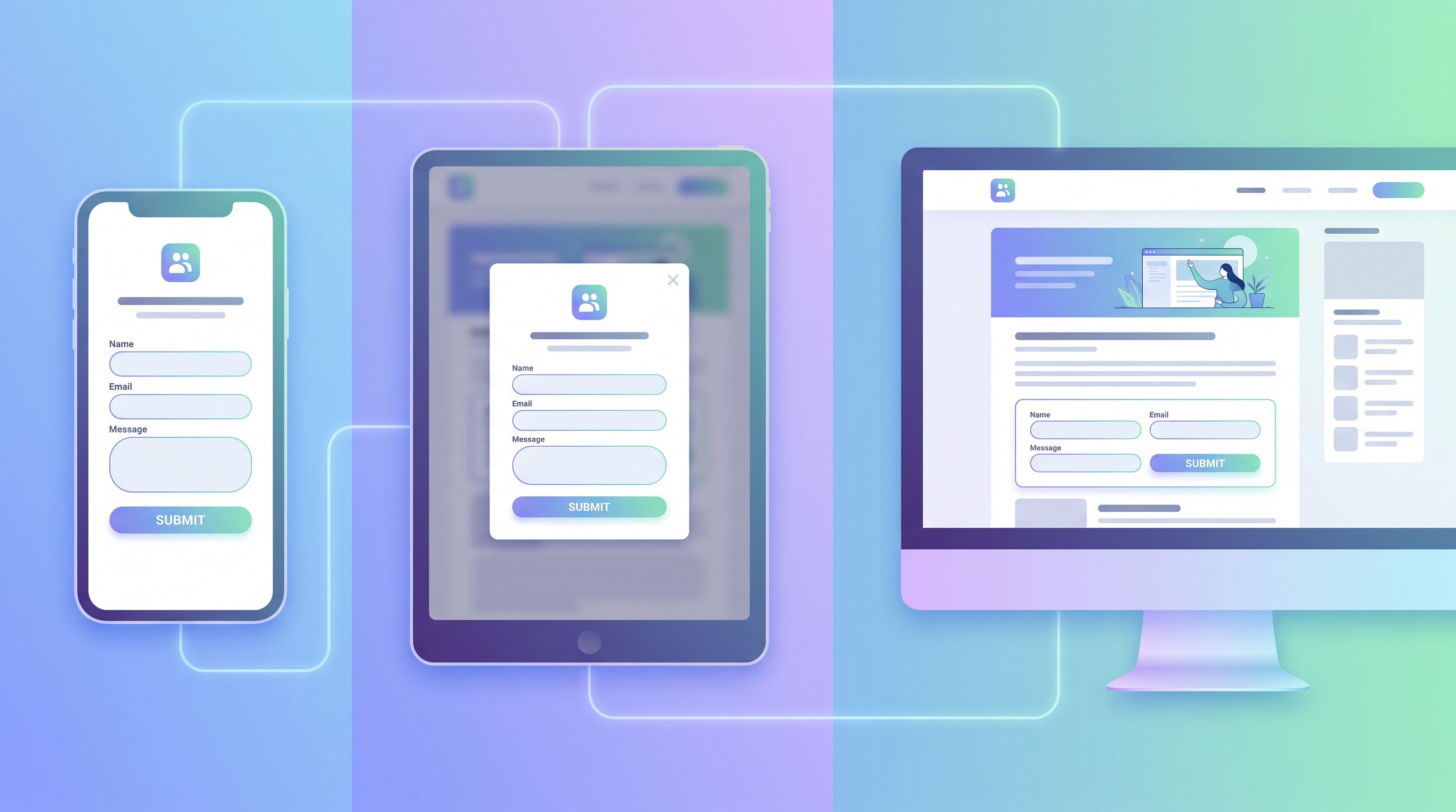
- Embedded in blog posts, help centers, and partner portals.
- Loaded inside in-app modals and popovers.
Your theme system has to assume that reality.
Design for mobile as the default
If most of your traffic is on mobile, your theme should be optimized for thumbs first, not retrofitted later. That means:
- Generous tap targets for buttons and inputs.
- Readable text sizes without pinch-zooming.
- Sticky or anchored primary CTA that stays within thumb reach.
For a deeper dive on this, pair your theme work with Mobile-First Forms in a Desktop-Designed World: Fixing Thumb Zones, Keyboards, and Tap Targets.
Plan for embeds, modals, and pop-ups
A form that looks great on a blank page can feel cramped inside a modal.
When defining your themes:
- Use a max-width so forms don’t stretch awkwardly in wide layouts.
- Test background contrast against both light and dark host pages.
- Avoid over-reliance on page-level backgrounds; favor card-based designs that can sit inside other UIs.
Our post Responsive by Default: Designing Form Themes That Survive Embeds, Pop-Ups, and In-App Modals goes deeper on patterns that make themes resilient across containers.
Consider low-connectivity scenarios
If your forms are used at events, retail locations, or field operations, your theme should support forgiving UX under bad connections:
- Clear loading states and disabled buttons during submit.
- Error messages that persist and don’t vanish on refresh.
- Minimal heavy imagery that slows initial load.
Pairing your theme governance with the ideas in Offline-adjacent patterns (see Offline-Adjacent Forms: Designing Intakes That Work When Your Users Have Bad Wi-Fi) can dramatically reduce drop-off where connectivity is shaky.
Use Custom URLs as Part of Governance, Not Just Convenience
Theme governance isn’t only visual. Where and how people access forms matters just as much.
Custom URLs are an underrated governance tool:
- Predictable patterns:
/forms/demo,/forms/events/<event-name>,/forms/partners/<region>. - Campaign tracking: UTM parameters layered on top of clean base URLs.
- Internal shortcuts: memorable links for frequently used internal forms.
With Ezpa.ge, you can:
- Give each canonical form a stable, branded URL.
- Use query parameters to pre-fill known fields (company, email, region).
- Route different audiences to different theme variants using links.
If you’re experimenting with personalization, it’s worth revisiting Pre-Filled, Not Pre-Judged: Ethical Personalization Patterns for Smarter Custom URLs to keep those flows helpful without feeling invasive.
Operationalize Governance: Roles, Workflows, and Documentation
A theme system is only as good as the way it’s run. Governance needs owners, rituals, and simple docs.
Assign clear ownership
At minimum, define:
- Brand owner – Sets the visual standards, approves new theme variants.
- Marketing ops owner – Implements themes in Ezpa.ge, manages integrations and Sheets.
- Regional or BU champions – Give feedback, request tweaks, and help roll out themes locally.
Make it explicit: who can create new forms, which themes they can use, and how exceptions are handled.
Create a lightweight theme catalog
Centralize your themes in a simple, shareable place:
- A short internal page that lists:
- Theme name and purpose.
- When to use it.
- Example forms.
- Editable vs. locked elements.
- Direct links to:
- Ezpa.ge templates using that theme.
- The Google Sheet(s) those forms sync into.
This catalog should be the first stop for any marketer or partner who needs a new form.
Standardize fields and flows where it counts
Theme governance and schema governance go hand-in-hand:
- Define canonical fields for common concepts (company size, role, industry).
- Standardize opt-in and consent fields across regions, with localized variants.
- Use conditional logic to adapt flows instead of cloning forms for every edge case.
Ezpa.ge’s conditional logic makes it possible to maintain one canonical form that branches intelligently by segment, instead of a zoo of slightly different forms. For a deeper dive on that pattern, see One Form, Many Journeys: Using Conditional Logic to Personalize Flows Without Creating New Pages.
Measure and Iterate on Theme Performance
Governance isn’t a one-time rollout. Your themes should evolve based on data, not just taste.
Track performance by theme
At a minimum, track for each theme:
- Completion rate (overall and by device).
- Time to complete.
- Drop-off by step or field.
- Error frequency (which fields cause the most friction).
If you’re syncing submissions to Google Sheets, you can:
- Add a hidden field that records the theme ID or name.
- Use that field to segment performance in your reporting.
- Feed those Sheets into AI summaries, as outlined in AI as Your Form Data Analyst: Turning Google Sheets Submissions into Weekly Insight Briefs.
Run structured experiments
Instead of random redesigns, test specific hypotheses:
- Does a progress indicator in your high-stakes theme improve completion?
- Does a lighter utility theme reduce drop-off for micro-surveys?
- Does tightening error message copy reduce abandonments on mobile?
Use Ezpa.ge’s ability to clone themes and variants to A/B test changes while keeping the core system intact.
Close the loop with distributed teams
Your regional marketers and partners will see issues before you do. Make it easy for them to:
- Flag forms that feel off-brand or underperforming.
- Request new theme variants for emerging needs (e.g., a new product line).
- Share best-performing examples with other teams.
A simple feedback form—built with your internal theme, of course—can become the intake for governance improvements.
Putting It All Together
To recap, brand-consistent forms at scale come from systems, not heroics:
- Define a small set of canonical themes mapped to your main form archetypes.
- Centralize the non-negotiables (colors, typography, logos, legal) and clearly mark what’s flexible.
- Design themes to survive real-world contexts: mobile, embeds, modals, and shaky connections.
- Treat custom URLs and pre-fills as governance tools, not just conveniences.
- Operationalize governance with clear ownership, a theme catalog, and standardized fields.
- Measure theme performance and iterate based on data and feedback.
With Ezpa.ge, you already have the mechanics—responsive themes, custom URLs, real-time Google Sheets syncing. Governance is how you turn those mechanics into a coherent, scalable system that lets every marketer move fast and stay on-brand.
Your Next Step
You don’t need a six-month project to get started. You can lay the foundation for theme governance this week:
- Audit your existing forms: list the tools, themes, and URLs in use across teams.
- Identify 3–5 core archetypes (lead capture, events, feedback, internal ops).
- Create one Ezpa.ge theme per archetype, with clear notes on what’s locked vs. editable.
- Publish a one-page theme catalog and share it with your distributed teams.
- Route all new forms through this system, then start measuring performance by theme.
If you’re ready to turn scattered, one-off forms into a unified, brand-consistent system, start by designing your first canonical Ezpa.ge theme and assigning an owner for it. Once that’s in place, every new form becomes easier, faster, and more on-brand by default.
Your brand—and your users—will feel the difference at the very first field.