Mobile-First Forms in a Desktop-Designed World: Fixing Thumb Zones, Keyboards, and Tap Targets


Most forms are still designed like tiny desktop pages that just happen to shrink down on a phone.
But traffic doesn’t look like that anymore. Multiple industry reports put mobile at roughly 60–65% of global web traffic—and that includes a huge share of in‑app browser sessions from social and messaging links. Your “desktop-perfect” form is probably being completed one‑handed, on a thumb‑smeared screen, while someone juggles a coffee.
When you ignore that reality, you get:
- Inputs hidden under the keyboard
- Tiny tap targets that require zooming
- Primary buttons stranded in hard‑to‑reach corners
- People abandoning halfway through because it just feels like work
This post is about treating mobile as the default and desktop as the bonus. We’ll focus on three levers that quietly make or break mobile form UX:
- Thumb zones (where you put the important stuff)
- Keyboards (how and when they appear)
- Tap targets (what it feels like to tap anything)
Along the way, we’ll look at concrete patterns you can apply whether you’re hand‑coding or using a tool like Ezpa.ge to ship forms that are responsive, themeable, and synced to Google Sheets in real time.
Why Mobile-First Forms Matter More Than Ever
Mobile‑first isn’t a buzzword; it’s a survival tactic for forms.
When your form works beautifully on a phone, you get:
- Higher completion rates – Less friction means fewer rage‑quits.
- Better data quality – People are more willing to type real answers when the layout, keyboard, and feedback feel effortless.
- Stronger trust – A form that feels polished on mobile signals that you respect the person’s time and attention.
- More reliable experiments – If you’re running A/B tests or iterating on copy, you’re not accidentally testing “layout broken on mobile” vs. “layout okay on mobile.”
We’ve written before about how form UX can build or break trust in posts like “Forms for Privacy-Conscious Users: Designing High-Trust Intakes When Your Audience Is Skeptical”. Mobile is where that trust is tested first. A clumsy thumb experience feels just as sketchy as a confusing privacy disclosure.
The good news: you don’t need a full redesign. You need a clear checklist for thumb zones, keyboards, and tap targets—and a form builder that lets you implement those patterns without fighting the layout.
Thumb Zones: Where Your Primary Actions Actually Live
On a phone, not all pixels are equal.
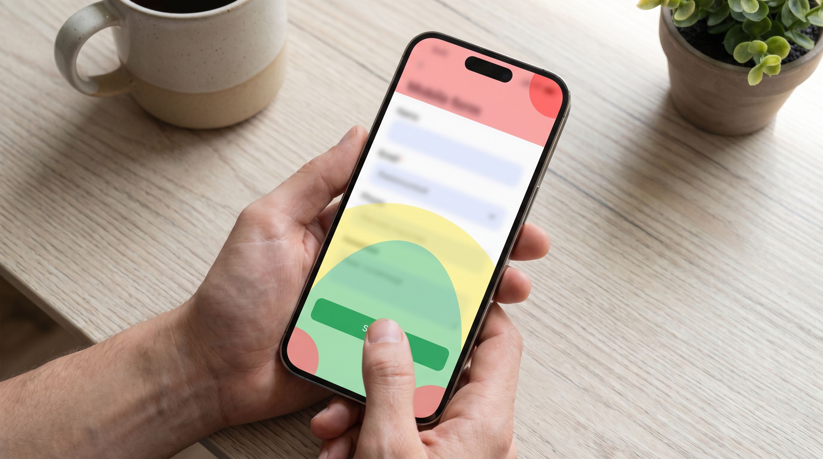
Most people hold their phone one‑handed, with the thumb doing almost all the work. That thumb has a comfort zone—a curved area it can reach easily—plus stretches and outright painful corners. If your primary button lives in a hard‑to‑reach spot, you’re taxing every interaction.
The Three Thumb Zones (Simplified)
Think of the screen in three bands:
- Easy zone (primary) – Lower middle of the screen; where the thumb naturally rests.
- Stretch zone (secondary) – Upper middle and far sides; reachable with effort.
- Danger zone (avoid for primary) – Top corners; require grip changes or second hand.
On most modern phones, that means:
- Bottom‑anchored buttons are good.
- Top‑right “Next” buttons are bad (especially for right‑handed users).
- Floating elements in the middle can be fine if they don’t get covered by the keyboard.
Practical Thumb-Friendly Patterns for Forms
You don’t need heatmaps to get this mostly right. Use these patterns:
1. Anchor primary actions near the bottom
- Place Next, Continue, and Submit near the bottom of the viewport.
- If your form builder supports it (Ezpa.ge does via themes), use a sticky bottom bar for the main action so it’s always reachable.
2. Keep destructive or secondary actions out of the easy zone
- Put Cancel, Clear, or Back to site links above the main button or in smaller text.
- Use lower visual weight (link style vs. solid button) so the thumb naturally gravitates to the primary action.
3. Avoid top‑of‑screen navigation for core progress
- Progress indicators (step dots, “Step 2 of 4”) can live at the top.
- The actual Next and Previous controls should live near the bottom.
4. Simplify per-screen decisions
Each screen should ideally ask for one main decision in the thumb zone:
- Choose an option
- Fill a single critical field
- Confirm a choice and continue
That aligns nicely with multi‑step forms, which also help with perceived effort. If you’re already experimenting with step‑based flows, posts like “Form UX for Customer Research: Turning Signups and Surveys into Always-On Insight Streams” can help you decide what belongs on each screen.
Keyboards: Designing for the Moment the Screen Disappears
The second someone taps an input on mobile, half (or more) of the screen vanishes behind the keyboard.
If you haven’t designed for that moment, you get:
- Labels and hints hidden behind the keyboard
- “Next” buttons off‑screen
- People losing context about what they’re answering
Use the Right Keyboard for the Right Field
This is one of the highest‑leverage, lowest‑effort upgrades you can make.
Map each input type to its ideal mobile keyboard:
- Email fields → email keyboard (
type="email"): shows@and.comkeys. - Phone fields → phone keypad (
type="tel"): big numeric keys, easier to tap. - Numeric fields (price, quantity, age) → numeric keyboard (
inputmode="numeric"ortype="number"with care). - URL fields → URL keyboard (
type="url"):.and/are easier to reach. - Credit card fields → numeric keyboard, with auto‑formatting for groups.
If you’re using Ezpa.ge, this is often just a matter of picking the correct field type in the builder instead of defaulting everything to “short text.”
Keep Labels Visible When the Keyboard Is Open
People forget the question the second the keyboard pops up.
To prevent that:
- Use floating labels that move above the field once focused.
- Avoid placing crucial instructions only below the input; they’ll be hidden.
- For longer helper text, keep a short version above the field and an optional “More info” link that opens a small overlay.
If you’re hand‑rolling your UI, test this explicitly: focus each field on a real phone and check whether the label and any critical hint text are still visible.
Nudge People Through With Input Navigation
On desktop, people tab between fields. On mobile, they tap.
You can reduce taps by:
- Enabling “Next” and “Previous” navigation in the keyboard toolbar where supported.
- Structuring your form so that related fields are grouped (e.g., first and last name together) and can be completed in one flow.
- Auto‑advancing focus for short, fixed‑length fields (e.g., 4‑digit code inputs) with a visible cursor and clear state.
Prevent “Keyboard Traps”
Keyboard traps are moments where the user can’t see what they need or can’t dismiss the keyboard easily.
Guardrails:
- Ensure there’s always a visible, reachable way to dismiss the keyboard (often tapping outside the field or a dedicated “Done”/“X” in the toolbar).
- Don’t place primary CTA buttons directly under the keyboard; use sticky bottom bars that sit just above it.
- Avoid auto‑scrolling the view in surprising ways when the keyboard opens; keep the active field centered or slightly above center.
Tap Targets: Making Every Tap Feel Effortless
If your form feels “tiny” on mobile, it’s usually not the font size. It’s the tap targets.
Small, crowded targets lead to:
- Mis‑taps and accidental selections
- People zooming in just to hit a checkbox
- A general sense that the form is “fiddly” or “broken”
Aim for Comfortable Target Sizes
A good rule of thumb (literally):
- Minimum 44×44 px for interactive elements on mobile.
- Extra padding around icons, especially close icons and toggles.
That doesn’t mean giant buttons; it means generous touch padding even if the visible element is smaller.
Priorities:
- Primary buttons (Submit, Continue)
- Secondary buttons (Back, Skip)
- Radio buttons and checkboxes
- Toggles, chips, and pill‑style option selectors
Rethink Radios and Checkboxes on Mobile
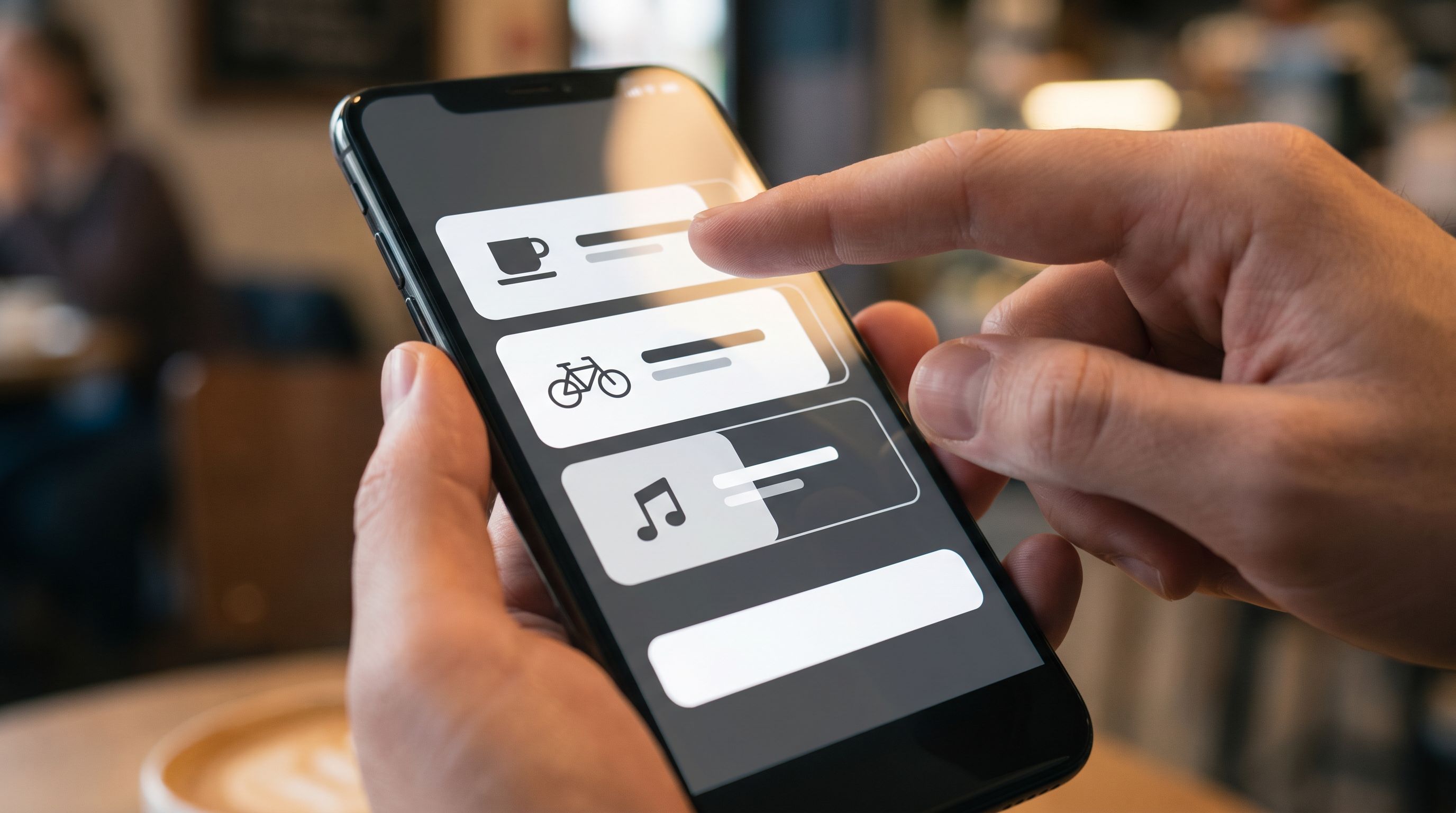
Classic tiny circles and squares are hard to hit. Better patterns:
-
Card‑style options – Turn each option into a full‑width card with:
- Clear label
- Optional description
- Big tap area
- A subtle checkmark or border change when selected
-
Pill or chip groups – For shorter lists (3–6 options), use pill buttons with good spacing.
-
Inline icons – When the choice is about type (e.g., role, device, plan), add simple icons to reinforce the meaning and expand the visual target.
Space Out Actions That Shouldn’t Be Hit Together
Avoid placing primary and destructive actions side by side on mobile.
Better:
- Primary action as a full‑width button.
- Secondary/destructive actions as smaller links below or above, with a bit of breathing room.
This is especially important on confirmation screens (e.g., “Delete account” vs. “Never mind”). Your goal is to make the right tap easy, not just any tap.
Layout Patterns That Quietly Help Mobile Users
Thumb zones, keyboards, and tap targets are the foundation. A few layout patterns pull them together into a form that feels intentionally mobile‑first.
1. One Column, One Focus
- Stick to a single column on mobile.
- Avoid side‑by‑side fields (e.g., city and ZIP) unless they’re extremely short and still meet tap‑target and label‑visibility rules.
- Use visual grouping (subheadings, subtle dividers) instead of complex grids.
2. Progressive Disclosure for Complex Questions
Don’t show everything at once.
- Use conditional logic to reveal follow‑up questions only when needed.
- Break complex flows into steps: identity → context → details → confirmation.
If you’re already using conditional logic in your forms, “One Form, Many Journeys: Using Conditional Logic to Personalize Flows Without Creating New Pages” has deeper patterns you can borrow.
3. Avoid Full-Screen Modals for Critical Steps
Full‑screen modals can:
- Interfere with native keyboard behavior
- Make back navigation confusing (browser back vs. modal close)
- Hide URL and security indicators
Instead:
- Use inline expansions (accordion sections) for extra details.
- Reserve full‑screen overlays for non‑critical help content, not core input.
4. Respect Network Realities
Mobile doesn’t just mean small screens; it also means flaky connections.
Combine mobile‑first UI with resilient behavior:
- Save progress as people go, not only on final submit.
- Show clear loading states after submit, with optimistic confirmation when safe.
- Avoid wiping the form on error; highlight just the fields that need attention.
If you’re working with users who often have poor connectivity, “Offline-Adjacent Forms: Designing Intakes That Work When Your Users Have Bad Wi‑Fi” digs deeper into this.
A Quick Mobile-First Form Audit Checklist
You don’t have to rebuild everything. Start with your highest‑traffic or highest‑value form and run this quick audit on an actual phone.
Thumb zones
- [ ] Can I reach Next/Submit with my thumb without changing grip?
- [ ] Are destructive or low‑priority actions away from the easiest zone?
- [ ] Is progress clear without relying on top‑of‑screen buttons?
Keyboards
- [ ] Does each field trigger the right keyboard (email, numeric, phone, URL)?
- [ ] When the keyboard opens, can I still see the field label and key hint text?
- [ ] Can I move between fields with minimal taps (Next/Previous or sensible grouping)?
- [ ] Is there an obvious way to dismiss the keyboard without losing my place?
Tap targets
- [ ] Are buttons, cards, and chips comfortably tappable (around 44×44 px or better)?
- [ ] Are radios/checkboxes upgraded to card or pill patterns where possible?
- [ ] Are primary and destructive actions spaced apart vertically?
Layout & resilience
- [ ] Is the layout strictly one column on mobile?
- [ ] Are long flows broken into clear, well‑labeled steps?
- [ ] Does the form preserve what I’ve typed if there’s an error or a brief connection issue?
If you’re using Ezpa.ge, many of these improvements are theme‑level decisions:
- Adjust button placement and sticky bars once, then reuse.
- Standardize field types so keyboards “just work.”
- Turn small options into reusable card components.
Do this work once, and every new form benefits.
Bringing It All Together
Designing mobile‑first forms isn’t about chasing a trend. It’s about aligning with how people actually use your forms:
- One hand.
- Short windows of attention.
- Imperfect networks.
When you respect thumb zones, keyboards, and tap targets, you:
- Make it physically easier to complete the form.
- Reduce cognitive load by keeping labels visible and flows predictable.
- Increase trust by avoiding surprise scrolls, hidden buttons, and mis‑taps.
And because tools like Ezpa.ge let you ship responsive, theme‑driven, Sheet‑synced forms quickly, these improvements aren’t “nice‑to‑have polish.” They’re a practical way to:
- Lift completion rates on your most important intakes
- Get cleaner data for your product decisions
- Build a consistent, reliable form library across your team
Your Next Step
Don’t try to fix every form you’ve ever shipped. Pick one:
- The signup that gets the most traffic
- The beta waitlist you’re about to promote
- The feedback form you link in‑app
Then:
- Open it on your own phone.
- Fill it out one‑handed, without cheating.
- Use the checklist above to spot the biggest pain points.
- Make one structural change (button placement, keyboard types, or option cards) and ship.
If you’re building with Ezpa.ge, that might be as simple as:
- Switching to a mobile‑optimized theme
- Updating a few field types
- Turning radio lists into card‑style options
From there, you can iterate—test variants, tune themes, and turn your forms into a quiet superpower for your product, marketing, and ops teams.
The smallest change your thumbs will thank you for? Moving that primary button where it always should have been: right under your thumb, ready to tap.