Responsive by Default: Designing Form Themes That Survive Embeds, Pop-Ups, and In-App Modals

Most forms are still designed as if they’ll live a calm, predictable life: centered on a blank page, with plenty of white space and no surprises.
That’s not where your forms actually end up.
They’re dropped into:
- Blog posts with cramped sidebars
- Exit-intent pop-ups on ecommerce sites
- In-app modals inside React/Flutter views
- Embedded iframes in community platforms, help centers, and partner portals
And they’re viewed mostly on phones. Recent analyses put mobile traffic at around 60–64% of global web visits—and in some regions, it’s over 70%. That includes a huge share of in-app browser sessions from links tapped inside social feeds and messaging apps.
If your form theme isn’t responsive by default, you’re not just dealing with a cosmetic issue. You’re dealing with:
- Broken layouts inside modals
- Cut-off buttons in small viewports
- Double scrollbars inside iframes
- “Why is this form on a totally different domain?” trust issues
This post is about designing form themes that survive all of that—and still feel intentional, branded, and trustworthy.
We’ll focus on patterns you can apply directly in tools like Ezpa.ge, where themes, custom URLs, and real-time Google Sheets syncing give you a lot of control without needing to ship new code every time.
Why “Responsive by Default” Matters for Forms
Responsive design is table stakes for marketing sites. But form themes are often treated as an afterthought: a nice-looking card, some on-brand colors, and maybe a rounded button.
That’s not enough anymore. Forms are:
- The first touchpoint for new customers (demo requests, trials, waitlists)
- The control panel for operations (intake, approvals, internal requests)
- The trigger for experiments and feature rollouts (see how teams use Google Sheets signals to drive launches)
If the theme breaks when you:
- Embed it in a CMS
- Load it in a pop-up
- Open it inside an app’s webview
…you’re losing conversions and data quality exactly where they matter most.
A responsive-by-default form theme gives you:
- Portability – One canonical form you can safely reuse across pages, campaigns, and surfaces.
- Predictability – Fewer “it looked fine on staging” surprises when marketing embeds the form somewhere new.
- Trust – A consistent, stable visual system that feels like part of your product, not a bolted-on tool.
- Speed – You don’t have to redesign or QA a new layout every time you change the container.
If you’ve read our piece on scoring form themes by trust, clarity, and speed, you can think of responsiveness as the multiplier on all three. A theme that only works on a perfect, full-width canvas will fail those dimensions the moment it’s embedded anywhere real.
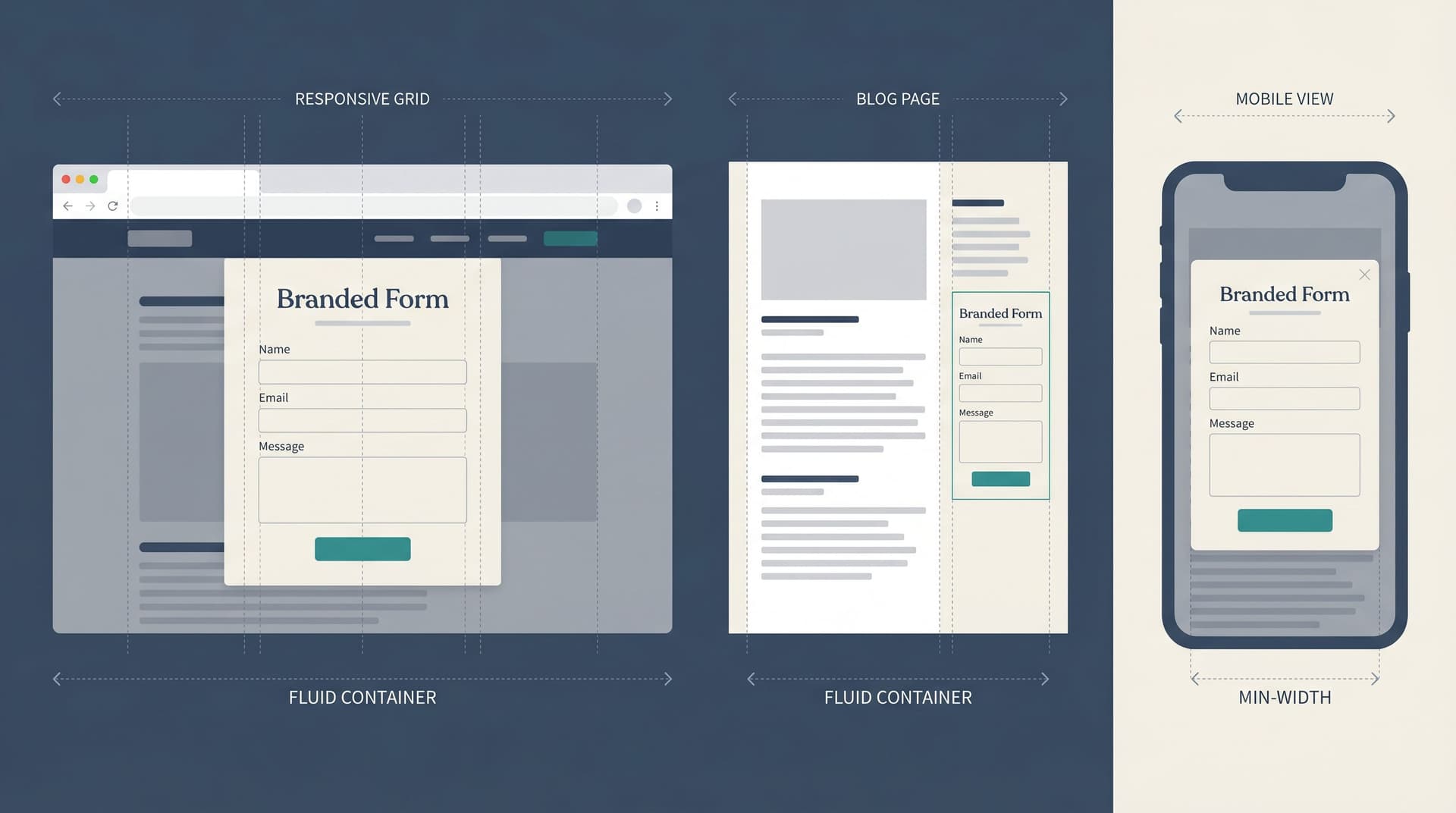
Step 1: Design for the Smallest Container First
Most teams start with a desktop view, then “shrink” the form. For themes that need to live inside modals and embeds, flip that:
Design for the smallest, most constrained container you expect—and then scale up.
That container might be:
- A 320–360px wide mobile viewport inside an in-app browser
- A narrow column on a blog (e.g., 400–500px wide inside a two-column layout)
- A small modal with generous padding around the edges
Practical guidelines
1. Set a sensible max-width, not a fixed width.
- Use a max-width like 480–640px for the form body.
- Let it shrink down to ~280–320px without breaking.
- Avoid fixed widths (like 800px) that will overflow modals and sidebars.
2. Use a single-column layout by default.
Multi-column forms almost always break first in constrained containers. For themes that must survive embeds:
- Make single-column the default layout.
- If you support multi-column on large screens, ensure it automatically collapses to a single column below a certain breakpoint.
3. Treat padding as a percentage, not a luxury.
- On small containers, aim for 16–20px side padding inside the form.
- Avoid stacking padding: if your host page or modal has heavy padding, your form should be able to “breathe” with slightly tighter internal spacing.
4. Test in a fake modal early.
Before you finalize a theme, drop it into a simple fake container:
- 360px wide, 24px padding
- Darkened backdrop
- Close button in the corner
If the form feels cramped, misaligned, or fragile here, it will feel worse in a real app.
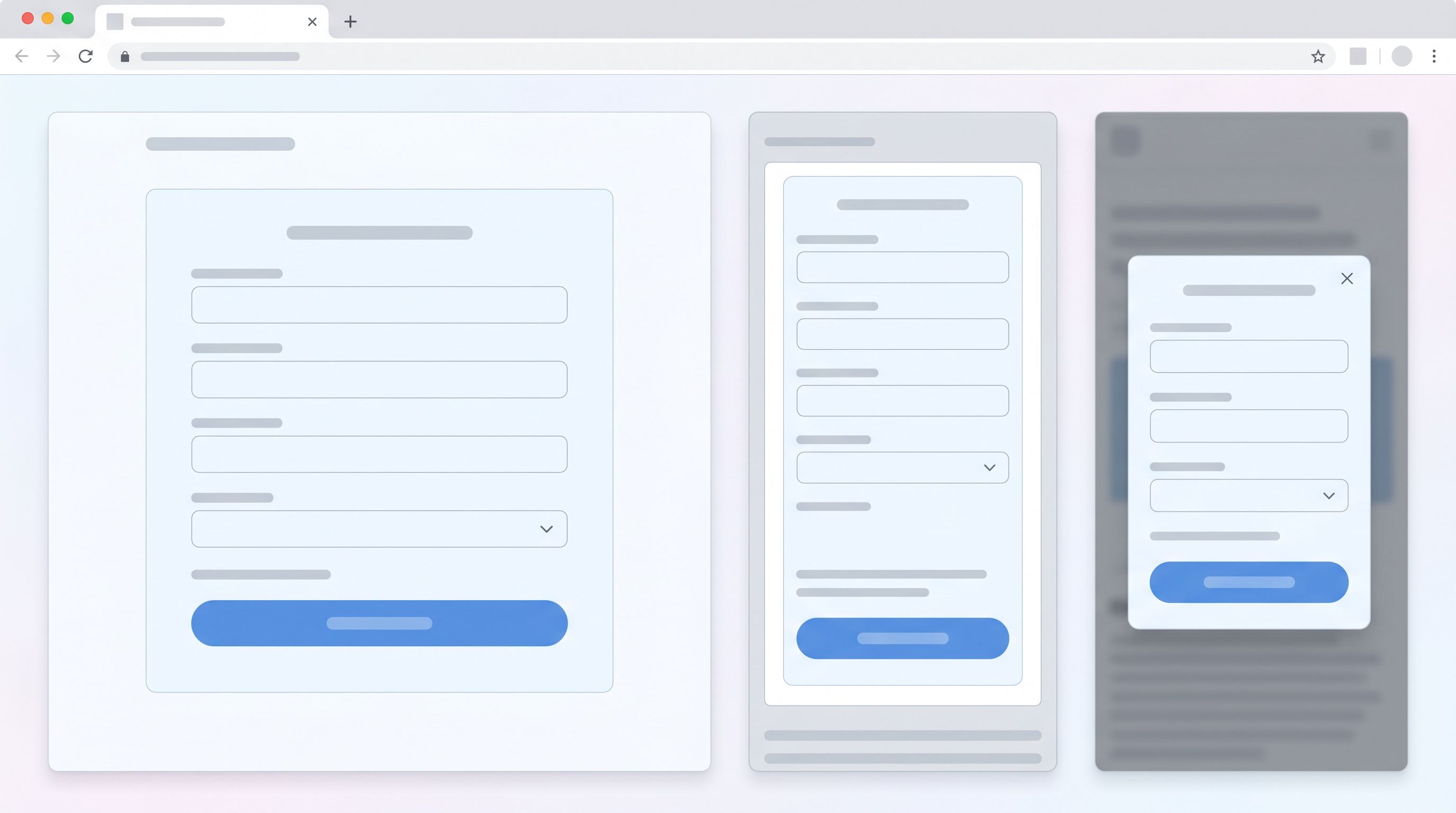
Step 2: Make Typography and Spacing Container-Aware
The most common failure mode for embedded forms isn’t the grid—it’s text. Type that looks elegant on a 1440px desktop can feel like a wall of noise when squeezed into a modal.
Use a size system, not vibes
Define a small, consistent type scale and stick to it:
- Title / H1: 20–24px on mobile, 24–28px on desktop
- Section headings: 16–18px, medium weight
- Labels: 14–16px, medium weight
- Helper text / error text: 12–14px
- Input text: 14–16px
Key patterns:
- Cap line lengths. Aim for 45–75 characters per line. In a narrow modal, that usually means smaller headings and slightly tighter line-height.
- De-emphasize the chrome. Labels and helper text should be readable but not louder than the input content.
Space for touch, not just for looks
On phones and in-app browsers, people are using thumbs, not cursors. Build that into the theme:
- Tap targets: At least 44x44px for buttons and key actions.
- Vertical spacing: 8–12px between label and input; 16–24px between fields.
- Primary button area: Extra padding (12–16px) around the main CTA so it doesn’t sit flush with the modal edge or viewport bottom.
If you’re designing with Ezpa.ge, make these choices in your base theme so every new form inherits them. That way, when you start using conditional logic (like we cover here), new branches don’t accidentally introduce cramped, unreadable layouts.
Step 3: Design for Three Reality Checks
To build a theme that “just works” in embeds, pop-ups, and in-app modals, design against three specific scenarios.
Reality Check A: The iframe embed
This is the classic “drop it into a CMS” use case: your form lives inside an iframe on a landing page or blog.
Risks:
- Double scrollbars (page + iframe)
- Form height cut off by fixed iframe dimensions
- Theme clashing with host page background
Design patterns:
- Neutral outer background. Use a background color that works on both light and dark hosts, or add a subtle card with a 1px border and 8–16px radius.
- Flexible height. Avoid assumptions like “this form will only be 400px tall.” Expect fields, conditional logic, and error messages to extend the height.
- Visible CTA at load. On mobile, try to ensure at least the top of the primary button is visible without scrolling when the iframe first loads.
If you control the host page, use auto-resizing scripts or responsive embed patterns. If you don’t, design as if the iframe might be shorter than ideal and make the form still feel usable.
Reality Check B: The marketing pop-up
Newsletter pop-ups, discount modals, exit-intent offers—these are everywhere, and they often host forms.
Risks:
- Overly large typography that forces scrolling inside the modal
- Close button overlapping headings or fields
- Keyboard overlap on mobile hiding inputs or the CTA
Design patterns:
- Compact header. Keep the form title to 1–2 lines; move supporting copy into a short paragraph below.
- Scroll-friendly structure. Accept that the modal may scroll on mobile. Ensure the scroll feels smooth and the background doesn’t scroll while the modal is open.
- Safe zones. Leave extra space at the top-right for close icons and at the bottom for OS/browser bars.
Reality Check C: The in-app modal or webview
Links from mobile apps often open in in-app browsers (Instagram, LinkedIn, Slack, etc.). Product teams also use webviews and modals to show forms inside native apps.
Risks:
- Toolbars eating into vertical space
- Unpredictable fonts and zoom behaviors
- Users assuming any jank is the app’s fault
Design patterns:
- Minimal external branding clutter. Keep the form visually consistent with your app or site, so it feels like part of the same system.
- Avoid fixed-position footers. They can conflict with native navigation bars or feel broken when the keyboard opens.
- Short, clear progress cues. If the form has multiple steps, use a simple step label (“Step 1 of 3”) instead of complex progress bars that may not scale.

Step 4: Make Errors and States as Responsive as the Layout
A form theme isn’t responsive if it falls apart the moment something goes wrong.
Error messages that don’t blow up the layout
On a wide desktop layout, you can get away with long inline error messages. Inside a modal or narrow embed, those messages can:
- Push fields far down the page
- Wrap awkwardly and overlap other elements
- Trigger double scrollbars
Better patterns:
- Short, specific copy. “Enter a valid email address” instead of a paragraph.
- Inline, but compact. Place error text directly under the field, with 4–8px spacing.
- Consistent iconography. A small warning icon + color change on the border is enough.
States that survive theme reuse
If you’re building a reusable theme library (something we explore in depth here), pay attention to how different states behave across containers:
- Focus state: Should be visible but not explosive (e.g., don’t add 4px glows that change layout).
- Disabled state: Needs enough contrast to be legible even on low-brightness phones.
- Loading state: For the submit button, use a spinner or label change (“Submitting…”) that doesn’t widen the button beyond the container.
The goal: no state change should alter the overall footprint of the form in a way that breaks its container.
Step 5: Respect the Host Brand While Keeping Your Own Signals
When you embed a form on a partner site, inside a community, or in a third-party tool, you’re a guest in someone else’s visual system.
You want two things at once:
- Trust-by-association with the host brand (it should feel native enough not to be jarring).
- Clear ownership so users know who they’re actually sharing data with.
Visual alignment without losing identity
Align on:
- Border radius and shadows – Match the general feel: sharp vs. rounded, soft vs. strong shadows.
- Typography size and density – If the host is very airy, don’t pack your form like a spreadsheet.
- Corner placement and margins – Respect existing gutters and grids.
Keep your signals:
- Logo or wordmark – A small, tasteful logo at the top or bottom of the form.
- URL clarity – Custom domains or subdomains that clearly identify your brand.
- Microcopy tone – Consistent with your other forms and product surfaces.
We dig deeper into how themes communicate these subtle cues in Signals in the Theme: What Your Form Aesthetics Quietly Tell Users About Your Brand. The short version: a responsive theme isn’t just about fitting the box—it’s about sending the right message in any box.
Step 6: Build a Lightweight Stress-Testing Ritual
You don’t need a full device lab to know whether your theme will survive real usage. You just need a repeatable, low-friction test you run before you ship.
Here’s a simple checklist you can use with Ezpa.ge (or any modern form builder):
1. The 10-minute container test
Open your form in:
- A full-page view on desktop
- An embedded view in a CMS or marketing page
- A mock pop-up (or a real one if you use a pop-up tool)
- A mobile phone, both in a browser and in at least one in-app browser (tap a link from Slack or a social app)
For each, answer:
- Is the primary action obvious without hunting or zooming?
- Does any text wrap in a weird way or feel too dense?
- Do error messages stay readable without making the form feel broken?
2. The keyboard and scroll test
On mobile:
- Focus the first field and tab through the form.
- Watch how the on-screen keyboard interacts with the layout.
- Ensure the submit button is reachable without weird scrolling gymnastics.
3. The “bad data” test
Try to break the form:
- Submit without filling anything.
- Enter invalid emails, phone numbers, or formats.
- Toggle any conditional logic paths.
If the layout survives this on a 360px-wide viewport, it will likely survive your real embeds and modals.
Make this a ritual: every new theme, every major change, same checklist.
Bringing It All Together
Designing form themes that are responsive by default isn’t about chasing edge cases. It’s about recognizing where forms actually live:
- Inside blog posts and documentation
- In marketing pop-ups and announcement bars
- Embedded in partner sites and community platforms
- Surfaced in in-app modals and webviews
To recap the key moves:
- Start from the smallest container. Design for narrow, modal-like layouts first.
- Tune typography and spacing for touch. Short, legible copy and generous tap targets.
- Stress-test three realities. Iframe embeds, marketing pop-ups, and in-app modals.
- Make states resilient. Errors, focus, disabled, and loading states shouldn’t blow up the layout.
- Blend in without disappearing. Align with host brands while keeping clear ownership signals.
- Institutionalize quick testing. A simple, repeatable ritual beats one-off QA heroics.
When you do this well, you unlock a powerful pattern: one canonical form, many safe placements. Marketing can embed it wherever they need. Product can surface it in-app. Ops can reuse it for internal workflows. And you don’t have to redesign the theme every time.
Your Next Step
If you’re already using Ezpa.ge, you have most of the pieces you need:
- Themes you can standardize across teams
- Custom URLs that make embeds and in-app links feel trustworthy
- Real-time Google Sheets syncing that turns every submission into an operational signal
Here’s a simple way to start:
- Pick your most important form (demo request, main intake, flagship signup).
- Create a “responsive by default” theme based on the principles above.
- Drop that form into three places: a full page, an embed, and a pop-up or in-app context.
- Run the 10-minute test with one or two teammates and fix what feels off.
Once you’re happy with that baseline, promote the theme to your internal library and make it the default for new forms.
The result: every time someone on your team spins up a new form, it’s already ready for embeds, pop-ups, and in-app modals—without a design review or a round of “why is the submit button off-screen?” screenshots.
That’s what responsive by default really means: your forms are ready for wherever your users actually meet them.