Design Systems for Forms: Component Libraries, Tokens, and Guardrails Your Whole Team Can Use

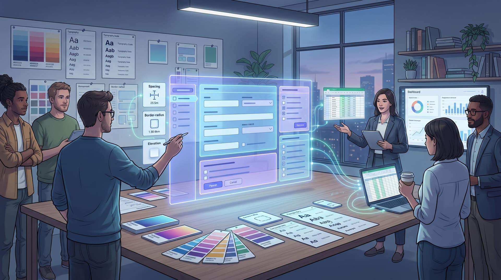
Most teams don’t fail at forms because they lack ideas. They fail because every form is a one‑off.
Marketing ships a new lead form with its own layout and error messages. Product tweaks onboarding fields in a way support has never seen before. Ops builds an internal request form that ignores everything design documented last quarter.
The result: inconsistent experiences for users, brittle integrations for ops, and a lot of “Wait, which version is live?” in Slack.
A form-focused design system changes that. Instead of reinventing every field, label, and validation pattern, you give your team a shared library of components, tokens, and guardrails that make every form:
- Consistent and on-brand
- Accessible and performant
- Easier to build, test, and maintain
Tools like Ezpa.ge—where you can ship fully branded forms with custom URLs and real-time Google Sheets syncing—make this especially powerful. You’re not just documenting patterns; you’re putting them in the hands of non-technical teammates who can ship new forms without breaking the system.
Why Forms Deserve Their Own Design System
You probably already have a product design system: buttons, typography, colors, spacing, maybe even a Figma library. But forms are where:
- People share sensitive data (payment, identity, health)
- Revenue-critical actions happen (demos, trials, upgrades)
- Operational workflows start (support tickets, internal requests)
That makes form quality disproportionately important.
When you don’t systematize form design, you get:
- Inconsistent UX: Different placeholder styles, error patterns, and help text on every form.
- Accessibility gaps: Some forms have proper labels and focus states; others don’t.
- Broken analytics: Fields are named differently in each form, so reporting and automation become fragile.
- Slow iteration: Every change requires design and engineering to re‑decide basic questions.
When you do build a form design system, you get:
- Reusable components that ship faster with fewer bugs.
- Shared tokens for spacing, colors, and typography that keep everything consistent.
- Guardrails (content standards, validation rules, accessibility checks) that protect quality even when non-designers are building.
- Better data that feeds into your CRM, Google Sheets, and AI workflows cleanly.
If you’re already thinking about forms as operational engines—routing work, triggering automations, and syncing into tools like Sheets and CRMs—your design system is the backbone that keeps those engines stable. Posts like “Forms as Signal Hubs: Connecting Google Sheets, CRMs, and Webhooks Without Engineering Help” show how powerful that can be once the plumbing is in place.
Start With the Form Inventory
Before you define tokens or components, you need a clear picture of what you actually have.
1. Collect every live form
- Marketing: lead gen, newsletter, event registration
- Product: signup, onboarding, in-app feedback
- Support & Success: ticket intake, NPS, QBR prep
- Ops & HR: internal requests, approvals, hiring pipelines
Drop them into a simple spreadsheet or a shared doc with:
- URL
- Owner
- Purpose
- Audience (prospects, customers, internal)
- Platform (Ezpa.ge, in‑app, embedded, etc.)
2. Identify the common patterns
Across these forms, note:
- Field types: text, email, phone, selects, radios, checkboxes, file uploads, date pickers, multi-step flows
- Repeated questions: name, email, company size, budget, use case, urgency
- Repeated pain points: where users drop off, error rates, support complaints
3. Flag the rough edges
Look for:
- Inconsistent labels for the same concept (e.g., “Company size” vs. “Team size” vs. “Employees”)
- Different validation rules (phone format, password strength, required vs optional fields)
- Visual drift (different paddings, font sizes, button styles)
This inventory becomes your raw material. Your design system should cover the 80% of patterns you see over and over, not every theoretical edge case.
Tokens: The Foundation Your Forms Stand On
Design tokens are named values—colors, spacing, typography, radii—that you reuse everywhere. They’re the fastest way to make forms feel cohesive across tools and surfaces.
Core token categories for form design:
-
Color tokens
color-bg-surface(form background)color-border-default(field borders)color-border-focus(focused field outline)color-text-label,color-text-helper,color-text-errorcolor-fill-primary(submit buttons),color-fill-disabled
-
Typography tokens
font-family-basefont-size-label,font-size-input,font-size-helperfont-weight-label,font-weight-heading
-
Spacing tokens
space-xs(between label and field)space-sm(between fields in a group)space-md(between sections)space-lg(form padding)
-
Shape and elevation tokens
radius-input,radius-buttonshadow-elevated(for key surfaces like modal forms)
-
State tokens
color-state-focus-ringcolor-state-error-bg,color-state-error-bordercolor-state-success-bg,color-state-success-border
How to put tokens to work in forms:
- Define a small, opinionated set of tokens in your design tool and in your form builder (Ezpa.ge themes map naturally to these).
- Document them in a single place—ideally with before/after examples of messy vs. tokenized forms.
- Make tokens the only allowed values for colors, spacing, and type in your forms. No hex codes or ad‑hoc font sizes.
Over time, you can evolve these tokens into more advanced theme systems. If you’re exploring that path, “Theme Systems for Startups: How to Look Enterprise-Grade While Your Product Is Still in Beta” is a good companion read.
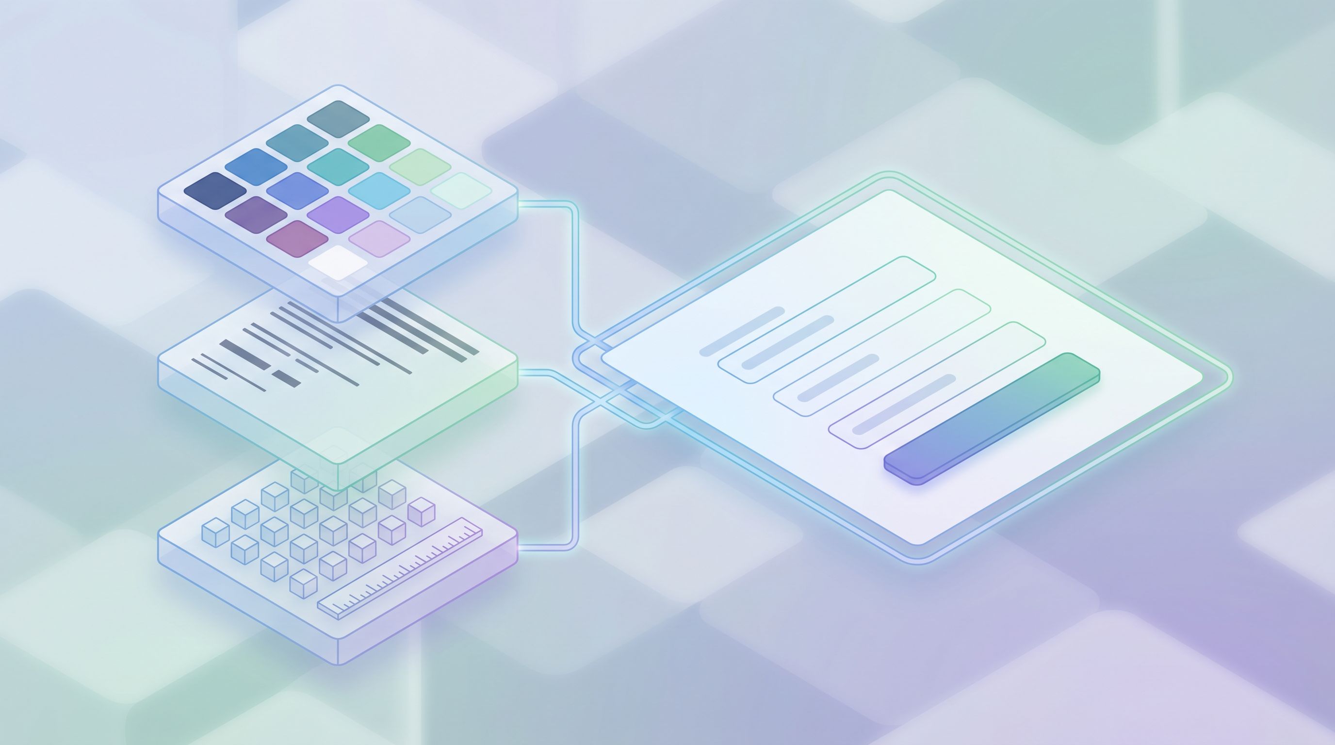
Components: Your Reusable Form Building Blocks
Once tokens are in place, components are how you package them into repeatable pieces your whole team can use.
The core form component set
At minimum, your form design system should define:
-
Text input
- Variants: single-line, multi-line (textarea), with prefix/suffix (e.g., currency)
- States: default, hover, focus, error, disabled, success
- Anatomy: label, optional marker, helper text, error text, character counter
-
Selects and dropdowns
- Single-select, multi-select
- Searchable vs. simple
- Clear affordances for open/close and selected state
-
Choice inputs
- Radio groups (mutually exclusive choices)
- Checkboxes (multiple selection and single consent)
- Toggle switches (for binary settings, not multi-choice questions)
-
File upload
- Drag-and-drop area plus “Browse” button
- Accepted file types and size limits clearly explained
- Progress and error states
-
Date and time pickers
- Keyboard-accessible, with clear formatting
- Support for manual entry and calendar selection
-
Buttons and actions
- Primary (submit), secondary (back, cancel), tertiary (link-style)
- Loading and disabled states
-
Form layout containers
- Single-column vs. two-column layouts
- Section headers and descriptions
- Multi-step pagination (progress indicator, step titles)
Patterns, not just parts
Components are the “what.” Patterns are the “how.” Your design system should define a few key patterns:
- Labeling: top-aligned labels by default; left-aligned only for dense internal tools.
- Required vs optional: choose one pattern and stick to it (e.g., mark optional fields instead of required ones).
- Error handling: show errors inline, near the field, and summarize at the top for longer forms.
- Help and hints: use helper text to clarify why you’re asking, not just how to format.
Document these as recipes:
- “Short lead form (3–5 fields)”
- “Long intake form (multi-step)”
- “Sensitive data form (payment, health, identity)”
Each recipe should specify:
- Recommended components
- Layout (single vs multi-step)
- Copy tone and level of explanation
For sensitive flows—like payment or health data—pair your component recipes with the trust patterns from “Trust at First Tap: Mobile Form Patterns That Make Users Comfortable Sharing Sensitive Data”. That’s where microcopy, iconography, and subtle animations become part of your design system too.
Guardrails: Keeping Quality High When Everyone Can Build
A design system only works if it’s actually used. That means building in guardrails so non-designers can move quickly without creating chaos.
1. Content standards for form copy
Define simple rules everyone can follow:
- Voice and tone: plain language, second person (“you”), short sentences.
- Question framing: one idea per field; avoid double-barreled questions.
- Field labels: nouns or noun phrases (“Job title”), not questions (“What is your job title?”) unless you’re in a conversational pattern.
- Error messages: specific and actionable (“Enter a valid email like name@company.com”).
Provide examples of good vs. bad copy for:
- Labels
- Helper text
- Placeholder text (and when not to use it)
- Error messages
2. Validation and data standards
Collaborate with ops and engineering to define:
- Standard field names for common concepts (email, company_size, plan_type).
- Validation rules (email format, password strength, phone formats, required fields).
- Data types and formats (dates, currencies, country codes).
Then, encode those rules in your form builder:
- Preconfigured field types with built-in validation
- Standard options lists for common selects (industries, countries, size ranges)
- Default required/optional settings for high-importance fields
This is where tools like Ezpa.ge shine: you can pair a clean design system with real-time syncing to Google Sheets and downstream tools, so your field naming and validation rules actually stick.
3. Accessibility as a non-negotiable
A form design system that isn’t accessible isn’t finished.
Bake in:
- Proper use of
<label>associations or equivalent semantics in your tool - Clear focus states for all interactive elements
- Sufficient color contrast for text, borders, and states (use tools like the WCAG contrast checker)
- Logical tab order and support for keyboard-only navigation
- Meaningful error messages announced to assistive tech
You can go deeper on inclusive patterns in “Inclusive by Default: Accessible Form Patterns That Don’t Sacrifice Conversion”. The key is: accessibility lives in your components and tokens, not as a one-off QA checklist.
4. Governance without bureaucracy
You don’t need a committee to approve every form. You do need a simple process:
- Tier 1 forms (mission-critical, public-facing): require design/system review.
- Tier 2 forms (internal or low-risk): can be self-serve if they use approved components and themes.
Provide:
- A short checklist for self-serve builders (tokens? components? accessibility? data standards?)
- A Slack channel or request form for “system exceptions” or new pattern proposals
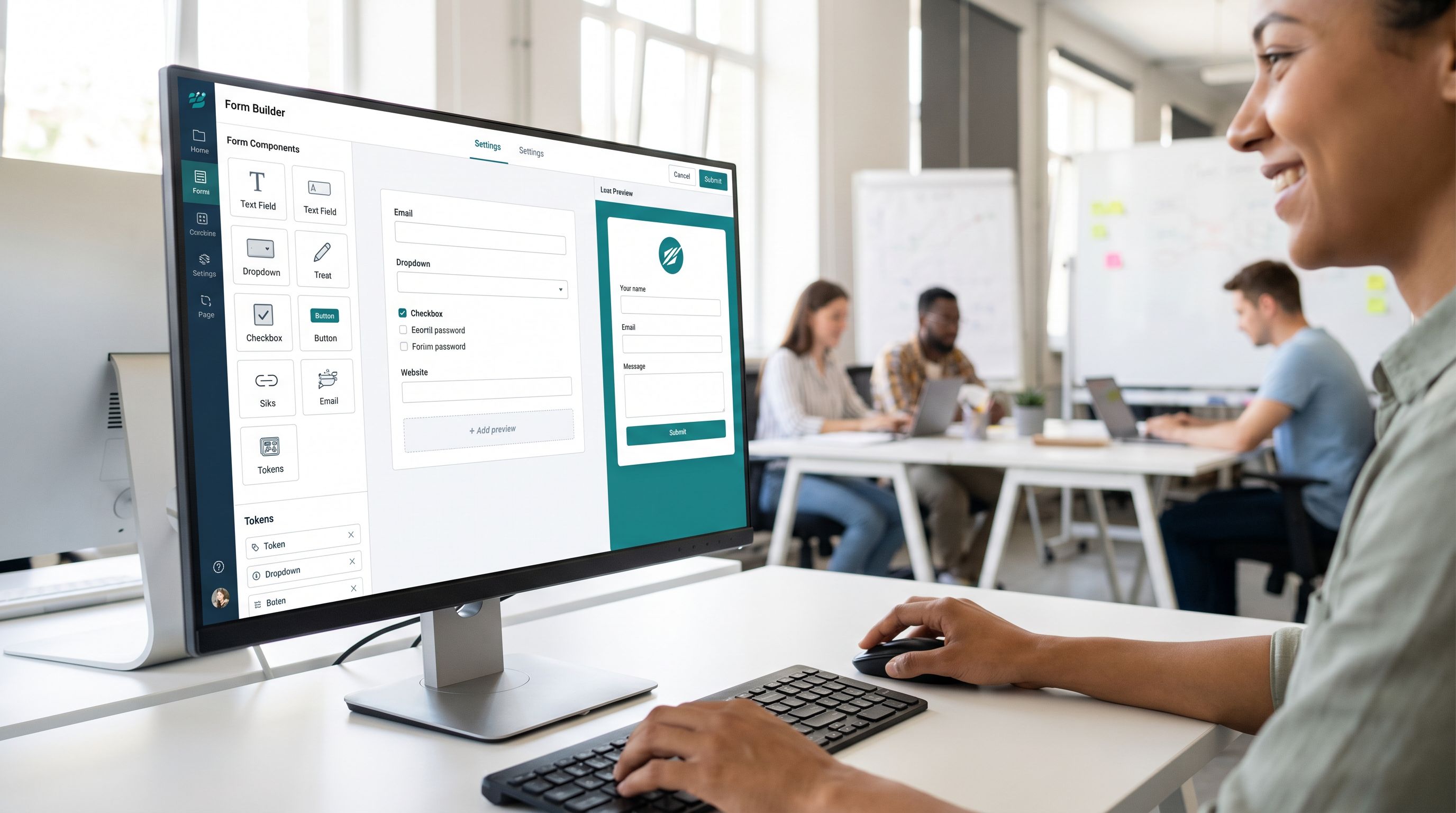
Making the System Real in Your Tools
A beautiful Figma library that never leaves design doesn’t help anyone. The power move is aligning:
- Design tokens and components in Figma (or similar)
- Implementation in your form tool (Ezpa.ge, in-app components, etc.)
- Data contracts in your backend and Sheets/CRM
1. Map tokens to themes
In Ezpa.ge or your chosen form platform:
- Create a base theme that encodes your color, typography, and spacing tokens.
- Save variants for key use cases: marketing, product, internal tools.
- Lock themes so casual editors can choose from approved options, not invent new ones.
2. Turn components into templates
Instead of asking teammates to assemble forms from scratch:
- Build form templates for your most common flows:
- Short marketing lead form
- Multi-step onboarding
- Support intake
- Internal request
- Each template should:
- Use your core components and tokens
- Follow your content and validation standards
- Include placeholder copy that demonstrates best practices
3. Wire data into your ops backbone
Pair your design system with a data system:
- Use consistent field IDs across templates.
- Sync responses to Google Sheets with stable column names.
- Connect Sheets to your CRM, support tool, or workflow automation.
If you want a concrete walkthrough of that side, “Forms as Signal Hubs: Connecting Google Sheets, CRMs, and Webhooks Without Engineering Help” and “From Form Fill to Auto-Routing: Designing Intake Flows That Assign Owners, SLAs, and Next Steps by Default” are great next reads.
How to Roll Out a Form Design System Without Stalling Work
You don’t need a six‑month project plan. You need a focused, incremental rollout.
Step 1: Pick one high-leverage flow
Choose a form that matters:
- New business demo request
- Primary support intake
- Core onboarding survey
Redesign just that form using your emerging tokens, components, and guardrails.
Step 2: Extract the reusable pieces
From that redesign, pull out:
- The token set you actually used
- The components you needed
- The content and validation patterns that worked
Document them in a one-pager. Share before/after screenshots and metrics (completion rate, error rate, support tickets).
Step 3: Turn them into templates and themes
In Ezpa.ge or your form tool:
- Create a theme that encodes your tokens.
- Save your redesigned form as a template.
- Label it clearly: “Standard Lead Form (v1)” or similar.
Step 4: Socialize and support
- Run a 30-minute session with marketing, success, and ops.
- Show them how to:
- Duplicate the template
- Adjust copy safely
- Add/remove fields without breaking standards
- Give them a simple checklist and a place to ask for help.
Step 5: Iterate based on real usage
- Track performance with a lightweight analytics framework (if you don’t have one yet, see “Baseline to Benchmarks: Building a Lightweight Form Analytics Framework Your Team Will Actually Use”).
- Refine tokens, components, and guardrails based on what actually improves completion and data quality.
- Version your system: v1, v1.1, etc., with clear change notes.
Over a quarter, this compounding approach will quietly replace a patchwork of one-offs with a coherent system—without freezing shipping velocity.
Bringing It All Together
A form design system isn’t a vanity project. It’s how you:
- Protect trust when you ask for sensitive information.
- Move faster without sacrificing quality or accessibility.
- Improve data so routing, analytics, and AI models actually work.
- Empower non-designers to build forms that look and feel like your product.
Tokens give you a shared visual language. Components turn that language into reusable building blocks. Guardrails keep everything coherent when more people start to build.
Do this well, and every new form—whether it’s a quick Ezpa.ge link or a core in‑product flow—feels like part of the same thoughtful system.
Your Next Move
You don’t need a perfect system to start. You just need a better default.
Here’s a simple first step you can take this week:
- Pick one important form.
- Audit it against the ideas above: tokens, components, copy, validation, accessibility.
- Redesign it as your “standard form v1” and turn it into a reusable template.
- Share it with your team as the starting point for anything new.
If you’re using Ezpa.ge, you can do all of this—theme setup, template creation, and Google Sheets syncing—without waiting on engineering.
Start with one form. Turn it into a system. Then let that system carry the weight, so your team can focus on the work that only humans can do.