Trust at First Tap: Mobile Form Patterns That Make Users Comfortable Sharing Sensitive Data

Every important relationship your product has with a customer passes through a form.
Payment details. Health histories. Salary bands. Identity documents. Security questions.
On mobile, that moment is even more fragile. Tiny screens, spotty connections, and a thumb hovering over the back button mean one thing: if people don’t feel safe immediately, they won’t share what you need.
This post is about how to design mobile forms that earn trust at the very first tap—especially when you’re asking for sensitive data.
We’ll look at the patterns, micro-interactions, and content choices that quietly tell users: “You’re in control here. Your data is safe. This is worth finishing.”
Why Trust Is the Real Conversion Metric for Sensitive Forms
When you’re asking for sensitive data—credit cards, medical info, government IDs—conversion is downstream of trust.
If someone abandons a form after seeing a credit card field, that’s not a UX problem. It’s a trust problem.
Why this matters:
- Regulatory pressure is rising. Between GDPR, CCPA, and sector-specific rules in finance and healthcare, mishandling data is expensive and public.
- Security breaches are front-page news. Users arrive with learned skepticism. They’ve seen what happens when companies are careless.
- Mobile contexts are messy. People fill out forms in transit, in line, or on the couch. If anything feels off, they’ll “do it later” and never come back.
The upside: when your mobile forms feel safe and competent, you don’t just improve completion rates—you:
- Increase willingness to share richer context (better routing, better personalization)
- Reduce fake data and throwaway answers
- Create a foundation for more advanced workflows like AI-aware question design and edge scoring
Trust isn’t a single feature. It’s the sum of dozens of small choices. Let’s break them down.
Principle 1: Make Safety Visible, Not Just Real
You can have great security behind the scenes and still feel sketchy at the surface.
On mobile, you need to show safety in ways that are obvious, legible, and quick to process.
1.1. Anchor Trust With Visual Signals
People make snap judgments in under a second. Your job is to load that first second with cues that say “reliable.”
Key patterns:
- Consistent theming and typography
- Use a coherent theme system across all forms—colors, spacing, buttons. Inconsistent styling between screens is a red flag.
- If your site is rough but your forms are polished, you can still look enterprise-ready. See: Theme Systems for Startups.
- Clear brand presence
- Show logo and product name in the header.
- Match the URL to your brand (custom domains or custom URLs, not a random subdomain if you can avoid it).
- Subtle motion, not theatrics
- Use small, purposeful animations (e.g., a progress bar easing forward, a checkmark on validation), not bouncy loaders.
- Overly playful motion can feel unserious when you’re asking for sensitive details.
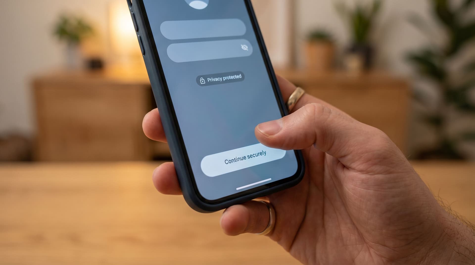
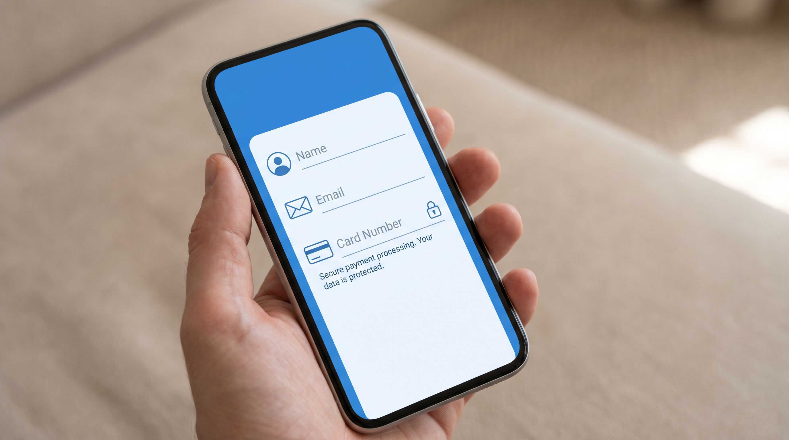
1.2. Show Security Where It Matters
Instead of burying security in a footer, surface it right next to sensitive fields.
Concrete examples:
- For payment details:
- Show card network logos (Visa, Mastercard, Amex) in muted tones.
- Add a short line under the field: “256-bit SSL encrypted. We never store your full card number.”
- For identity verification:
- Add a compact note: “Used only for identity verification. We never share this with third parties without your consent.”
- For health or HR data:
- Call out compliance where relevant (e.g., HIPAA, SOC 2) with a brief explanation link.
Pattern to avoid: generic lock icons with no explanation. Visuals without words can feel like decoration, not protection.
Principle 2: Reduce Cognitive Load Before You Reduce Fields
You’ve heard “shorter forms convert better.” That’s only half-true.
For sensitive data, clarity beats brevity. Users will answer more questions if they understand:
- Why you’re asking
- How long it will take
- What happens next
2.1. Set Expectations Upfront
On the first screen, answer three questions in a single glance:
- What is this?
- A short title: “Secure account setup” or “Verify your identity”
- How long will it take?
- “Takes about 2 minutes” or “3 quick steps”
- Why should I bother?
- “To protect your account and unlock instant payouts”
A simple pattern:
Header: Secure identity check
Subcopy: 3 quick steps to keep your account safe and unlock same-day payouts.
2.2. Use Multi-Step Flows Strategically
On mobile, a long single-page form feels like paperwork. Breaking it into steps:
- Lowers perceived effort
- Lets you group sensitive questions with context
- Creates natural places to reinforce trust
Guidelines:
- 1 question or 1 tight cluster per screen
- Example: Name + email together; SSN alone with extra explanation.
- Always show progress
- Use a simple progress bar or “Step 2 of 4” label.
- Avoid vague “Almost done!” messages until the last step.
- Place the most sensitive fields later
- Start with low-friction fields to build momentum and familiarity.
If you’re deciding between multi-step and single-page for a specific use case, see: Multi-Step vs. Single-Page Forms.
2.3. Explain Every Sensitive Question
For any field that might trigger hesitation, pair it with a why.
Examples:
- “Date of birth”
- Microcopy: “Required to verify your age and comply with financial regulations. We don’t share this with advertisers.”
- “Government ID upload”
- Microcopy: “We use this once to confirm your identity and prevent fraud. Your photo ID is encrypted and stored securely.”
- “Salary range” (for job applications)
- Microcopy: “Used only to calibrate expectations for this role. Your current employer will never see this.”
Format tips:
- Keep explanations short (1–2 lines).
- Use tooltips or “Why we ask this” links for deeper detail.
- Avoid legalese. Aim for plain, direct language.
Principle 3: Design for Thumb-First Confidence
Most mobile form patterns still feel like desktop forms squeezed onto a phone.
To build trust at first tap, you need to design for thumbs, one-handed use, and real-world interruptions.
3.1. Make Tap Targets Generous and Predictable
Nothing erodes confidence like mis-taps.
- Button size: At least 44px tall with ample horizontal padding.
- Spacing: Enough vertical spacing between fields that tapping doesn’t accidentally focus the wrong input.
- Sticky primary action: Keep “Continue” or “Next” anchored near the bottom, above the keyboard when possible.
3.2. Keyboard and Input Hygiene
Smart defaults signal competence—and competence signals safety.
- Trigger the right keyboard:
- Numeric keypad for phone, OTP codes, card numbers.
- Email keyboard for email fields.
- Auto-advance where appropriate:
- Move from one OTP digit to the next automatically.
- Jump from card number to expiry when length is met.
- Real-time, gentle validation:
- Validate as they type, but avoid red errors until they leave the field.
- Use clear, constructive messages: “This card number doesn’t look right. Double-check the digits.”
3.3. Plan for Interruptions and Weak Connections
Sensitive forms often get abandoned because life intervenes.
Patterns that help:
- Auto-save progress
- Save each step as it’s completed so users can safely leave and return.
- Graceful error states
- If a network error occurs on submission, show: “We saved your answers. Tap retry when you’re back online.”
- Visible last-saved moments
- A tiny “Saved a moment ago” indicator can be surprisingly reassuring.
Under the hood, this is where forms become more than static pages. When you treat them as signal hubs, you can sync partial responses to Google Sheets in real time, trigger alerts for stuck high-value signups, and design smarter recovery experiences.
Principle 4: Give Users Control Over Their Data
Trust grows when people feel in control, not trapped.
Even small gestures of control can dramatically change how safe a form feels.
4.1. Be Explicit About What’s Optional
On mobile, users scan. If they can’t tell what’s required, they assume everything is.
- Mark required fields clearly (e.g., “Required” in a subtle label, not just an asterisk).
- For sensitive-but-optional fields, say so directly:
- “This helps us personalize recommendations, but you can skip it.”
- Avoid dark patterns like hiding the “Skip for now” option in low-contrast text.
4.2. Offer Clear Privacy and Consent Controls
Instead of a single wall of legal text, break privacy into small, understandable pieces:
- Inline consent checkboxes
- Example: “I agree to the Terms and Privacy Policy” with links.
- Separate marketing opt-in
- Don’t bundle marketing consent into account creation.
- Use plain language: “Send me product updates and occasional offers (2–3 emails per month).”
- Granular controls for sensitive sharing
- If data might be shared with partners, spell out who and why, and let users opt out when possible.
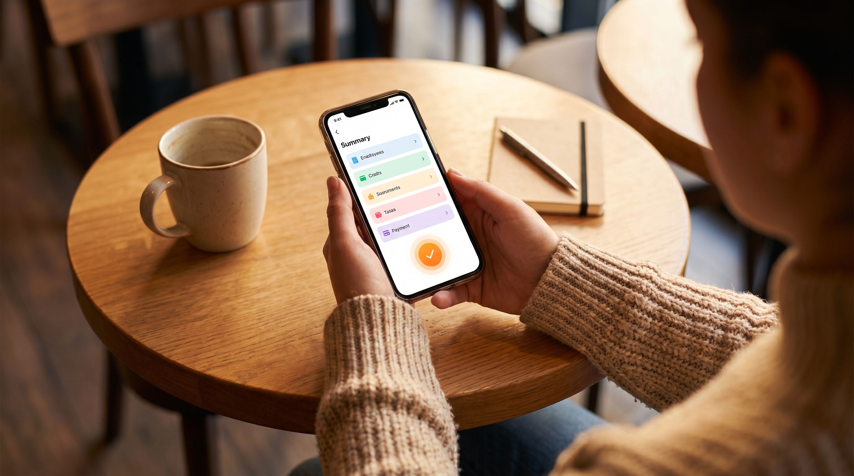
4.3. Let People See and Edit Before Committing
On the final step:
- Show a readable summary of the key details they’re about to submit.
- Make each section tappable to edit.
- Use a clear, unambiguous final action label:
- “Create secure account”
- “Submit verification”
- “Confirm payment”
When users can easily review and correct information, they’re more willing to share sensitive details in the first place.
Principle 5: Use Content and Tone to Humanize the Experience
Security isn’t just about encryption and compliance. It’s also about how you talk to people.
5.1. Write Like a Person, Not a Policy Document
For sensitive forms, the most trustworthy tone is:
- Plain – no jargon, no buzzwords
- Calm – no urgency tricks, no scare tactics
- Specific – concrete explanations instead of vague assurances
Examples of tone shifts:
-
Instead of: “We may collect certain personal information for service delivery purposes.”
-
Say: “We ask for your address so we can send your card to the right place.”
-
Instead of: “Your data is secure with industry-standard protocols.”
-
Say: “Your answers are encrypted in transit and at rest. Only our security team can access them.”
5.2. Use Microcopy to Reduce Fear, Not Just Confusion
Microcopy is more than hints under fields. It’s how you respond to the emotions that sensitive questions trigger.
Consider:
- Acknowledging sensitivity
- “We know salary can feel personal. Here’s why we ask…”
- Normalizing the process
- “Most customers complete this verification in under 2 minutes.”
- Reassuring on failure
- “This code didn’t work, but that’s common. We’ve sent a new one to your email.”
5.3. Align Visual Tone With Emotional State
If someone is:
- Reporting a fraud incident
- Sharing medical history
- Filing a sensitive HR report
…a loud, high-contrast, marketing-heavy theme will feel wrong.
This is where theme-first onboarding shines. With tools like Ezpa.ge, you can design specific themes for high-sensitivity flows—muted colors, softer typography, fewer promotional elements—so the form’s visual tone matches the emotional weight of the task. For a deeper dive, read Theme-First Onboarding.
Principle 6: Close the Loop After Submission
Trust doesn’t end at the “Submit” button.
The moments after someone shares sensitive data are just as important as the moments before.
6.1. Design a Thoughtful Confirmation State
Your confirmation screen should:
- Clearly state what just happened:
- “Your identity has been verified.”
- “Your application has been submitted.”
- Explain what happens next, with timeframes:
- “We’ll review your documents within 1 business day and email you at jane@…”
- Offer a way to reach support if something feels wrong:
- A link to help docs or a support channel.
6.2. Provide a Record or Receipt
For sensitive flows, people often want proof.
Options:
- Email confirmation with a summary of what was submitted (excluding the most sensitive fields, like full card numbers).
- A reference ID or ticket number.
- A link to a dashboard where they can review and update their information later.
6.3. Connect Submission to Real Operations
Nothing erodes trust like silence.
If your form feeds into a black hole, even the best UX won’t save the experience.
This is where solid ops patterns matter:
- Use routing rules so every submission automatically gets an owner, SLA, and next step. (If you’re not there yet, start with From Form Fill to Auto-Routing.)
- Sync responses into Google Sheets or your CRM in real time, and trigger alerts for high-risk or high-value submissions.
- Build lightweight analytics so you know where people drop off in sensitive flows and can iterate confidently. Baseline to Benchmarks is a good blueprint here.
When follow-up is fast, clear, and predictable, users retroactively trust the form more—and are more willing to share sensitive data next time.
Putting It All Together: A Checklist for Trustworthy Mobile Forms
Before you ship a mobile form that asks for sensitive data, run it through this quick checklist:
First impression
- [ ] Consistent, professional theming that matches your brand
- [ ] Clear title and 1–2 line explanation of purpose
- [ ] Time estimate or step count visible
- [ ] Custom URL or domain that feels obviously connected to your product
Flow and structure
- [ ] Multi-step flow with 1–3 fields per screen
- [ ] Progress indicator (steps or percentage)
- [ ] Sensitive fields placed after some initial, low-friction questions
Field-level trust
- [ ] Inline explanations for every sensitive field (“Why we ask this”)
- [ ] Appropriate keyboard types and input masks
- [ ] Gentle, real-time validation with helpful error messages
Control and consent
- [ ] Required vs optional fields clearly labeled
- [ ] Separate, clear consent for marketing
- [ ] Easy-to-find links to Terms and Privacy Policy
- [ ] Review screen before final submission with editable sections
Resilience and follow-through
- [ ] Auto-save of progress between steps
- [ ] Graceful offline and error states with reassurance
- [ ] Clear confirmation screen with next steps and timelines
- [ ] Notifications or workflows wired so submissions never disappear into a void
If you can confidently check these boxes, you’re not just collecting data—you’re building a relationship.
Summary
Mobile forms are where trust is tested in real time.
When you ask for sensitive data, users are scanning for answers to a few simple questions:
- Does this look like a serious, competent company?
- Do I understand why they need this information?
- Can I control what I share and what happens next?
- If something goes wrong, will a real process catch me?
The patterns we’ve covered—visible security, expectation-setting, thumb-first design, clear consent, human microcopy, and strong post-submission flows—work together to answer yes to all of the above.
Get those right, and you’ll see:
- Higher completion rates on sensitive flows
- Better-quality data with fewer fake answers
- More willingness from users to opt into richer, more helpful experiences
Trust at first tap isn’t a nice-to-have. It’s the foundation everything else rests on.
Ready to Build a More Trustworthy Mobile Form?
You don’t need a full redesign or a new app to start.
You can:
- Pick one sensitive flow—payments, identity verification, HR intake, or healthcare onboarding.
- Map it to the checklist above.
- Rebuild it as a focused, mobile-first form with:
- A clear, calm theme
- Step-by-step structure
- Inline explanations for every sensitive question
- Real-time syncing into Google Sheets so you never lose a response
Tools like Ezpa.ge make it simple to ship that new version quickly: fully branded, with custom URLs, responsive layouts, and live syncing to the systems you already use.
Start with one form. Make it the most trustworthy surface in your product. Then use what you learn to raise the bar everywhere else.
Your users are already deciding whether to trust you at the first tap.
Now’s the moment to earn it.