Theme Systems for Startups: How to Look Enterprise-Grade While Your Product Is Still in Beta

Your product might still be rough around the edges. The roadmap is longer than your runway. But your prospects don’t care about any of that.
They care about one thing: “Does this feel like a company I can trust with my money, my team, or my data?”
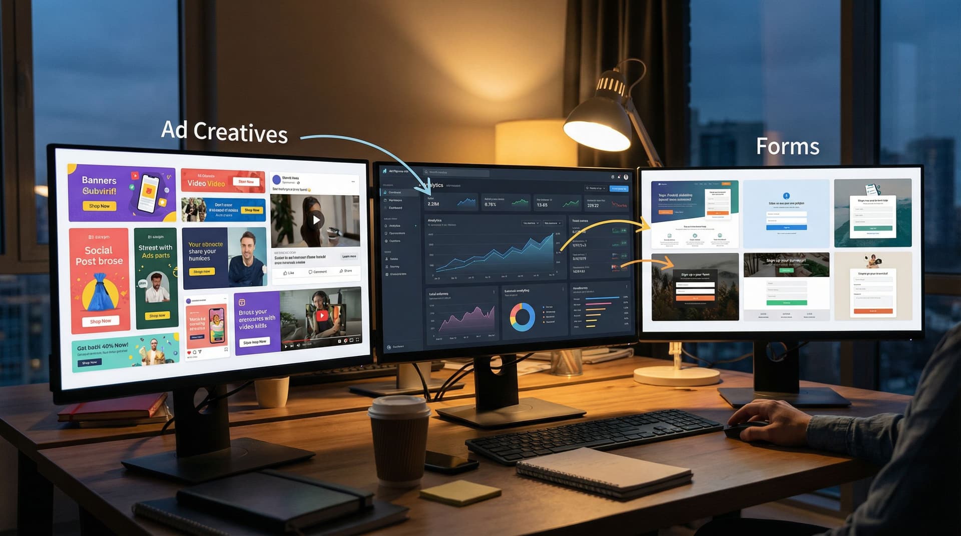
That perception is shaped less by your codebase and more by your surfaces—the places where customers actually interact with you: signup flows, demo requests, onboarding forms, partner applications, support intake.
If those surfaces feel improvised, you look early-stage. If they feel intentional and consistent, you look enterprise-ready—even if your product is still in beta.
This is where theme systems come in.
A theme system is a deliberate way of managing colors, typography, spacing, components, and layouts across all your high-intent touchpoints. Instead of designing one form at a time, you design a reusable visual language that can stretch across:
- Marketing and campaign forms
- Sales and partnership intake
- Customer success check-ins
- Internal ops workflows
Tools like Ezpa.ge make this practical: you can define themes once, apply them across dozens of forms, and sync all responses straight into Google Sheets—without waiting on a designer or developer.
Why “Looking Enterprise” Matters Before You Feel Enterprise
You don’t need a 40-person design team to earn trust. You do need to avoid looking like a side project.
Here’s why investing in a theme system early is worth it:
1. Trust and risk perception
Enterprise buyers, agencies, and even sophisticated SMBs are constantly scanning for risk. Inconsistent or sloppy interfaces send subtle signals:
- “Will this team handle our data carefully?”
- “Will they still be around in 12 months?”
- “Will this integrate cleanly with the rest of our stack?”
A cohesive visual system doesn’t guarantee reliability, but it telegraphs maturity and care.
2. Shorter sales cycles
When your forms, emails, and touchpoints feel enterprise-grade, stakeholders have fewer “red flags” to resolve. That means:
- Less time justifying the vendor to internal teams
- Fewer questions about security, reliability, and support
- More time focused on value and outcomes
3. Higher conversion on high-intent flows
Most of your meaningful revenue moments start with a form: demo requests, waitlists, partner applications. If those forms feel polished, people are more willing to:
- Share detailed context
- Commit to next steps
- Loop in teammates
If you’re curious about how form UX alone can transform these flows, you might like From Clicks to Conversations: Designing Forms That Feel Like Guided Chats, Not Questionnaires.
4. Design leverage without a design team
A theme system lets you:
- Ship new forms and flows in hours, not weeks
- Keep everything aligned with your evolving brand
- Avoid the “every form looks like a different startup” problem
Instead of art-directing every surface, you define a few strong patterns once and let them scale.
Principles of an Enterprise-Grade Theme System
Before we get into concrete steps, it helps to define what “enterprise-grade” actually looks and feels like.
1. Restraint beats decoration
Enterprise-grade doesn’t mean “busy” or “fancy.” It usually means:
- Limited color palette (1 primary, 1 accent, 2–3 neutrals)
- Consistent typography (1–2 font families, clear hierarchy)
- Predictable spacing (same padding, margins, and gaps everywhere)
- Minimal ornamentation (few shadows, gradients, or random flourishes)
The goal is to look considered, not clever.
2. Consistency across contexts
Your demo request form and your partner application shouldn’t feel like they were designed by two different teams.
That means:
- Same primary button style and hover state
- Same error message styling and placement
- Same input shapes, borders, and focus states
- Same heading sizes and weights
If someone moves from one flow to another, they should feel like they’re still in the same product universe.
3. Accessibility as a non-negotiable
Enterprise buyers care about inclusivity, compliance, and usability. Accessible themes:
- Use sufficient color contrast (aim for WCAG AA as a baseline)
- Avoid relying on color alone to communicate state (e.g., error + icon + text)
- Support keyboard navigation and clear focus rings
If you want a deeper dive on this, check out Inclusive by Default: Accessible Form Patterns That Don’t Sacrifice Conversion.
4. Modularity, not one-offs
A theme system should be modular:
- A small set of color tokens (e.g.,
primary,accent,success,danger,background,surface,border) - A type scale (e.g.,
h1,h2,h3,body,caption) - A spacing scale (e.g., 4, 8, 12, 16, 24, 32px)
- A component library (e.g., inputs, textareas, selects, radio groups, CTA blocks)
Once this is set up, you can change the feel of a whole flow by tweaking tokens, not rebuilding screens.
Step 1: Start With Your Highest-Intent Form
Don’t try to redesign everything at once. Start where perception matters most.
For most startups, that’s one of these:
- Demo request or sales contact
- Beta waitlist or early access signup
- Partner or reseller application
- Enterprise security / compliance questionnaire intake
Pick one and treat it as your “theme lab.” This is where you’ll:
- Define your core tokens (colors, typography, spacing)
- Standardize your input and button styles
- Decide on error states, help text, and microcopy conventions
If you’re using Ezpa.ge, this is where you create your first reusable theme:
- Set your brand colors (primary, background, text, accents).
- Choose typography that’s legible and widely available (e.g., system fonts or a single web-safe family).
- Configure base spacing and container width so your form feels spacious, not cramped.
- Save this as a named theme (e.g.,
Core EnterpriseorDefault Production).
This first form becomes your reference implementation. Every future theme and form should be compared against it.
Step 2: Design for States, Not Screens
Enterprise-grade experiences don’t fall apart when something goes wrong.
When you design your theme system, don’t just look at the “happy path” mock. Explicitly design for:
- Empty state – before a user has typed anything
- Active state – when a field is focused
- Filled state – when a field has valid input
- Error state – invalid input, missing required fields
- Success state – confirmation, next steps
For each of these, define:
- Border color
- Background color
- Label color and weight
- Helper text style
- Icon usage (e.g., checkmarks, warning icons)
A simple checklist for each field type:
- [ ] What does this field look like before interaction?
- [ ] What changes when it’s focused?
- [ ] How do we show a clear error without being harsh?
- [ ] How do we show success without adding clutter?
Doing this once in your theme system means every new form inherits that polish.
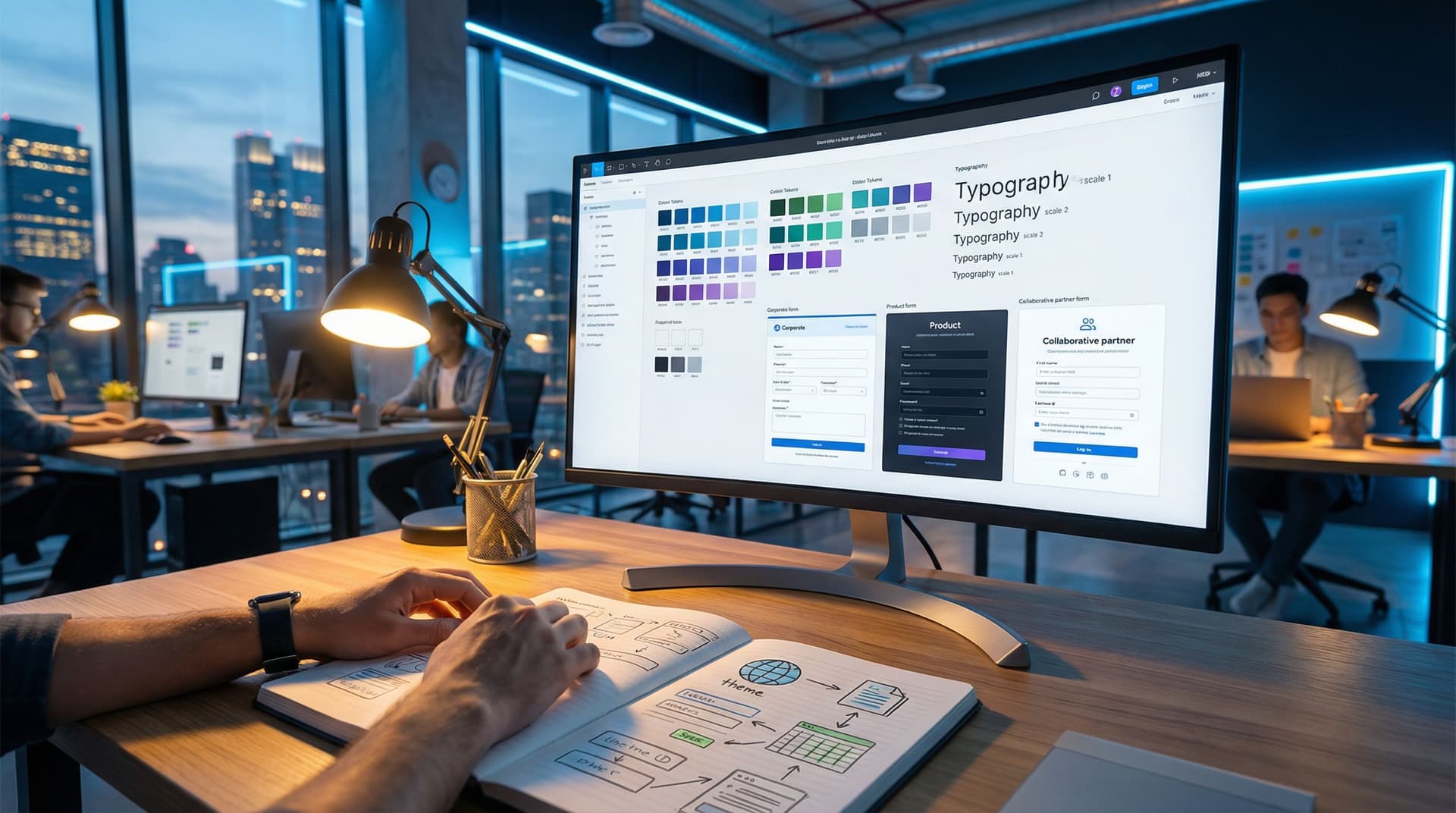
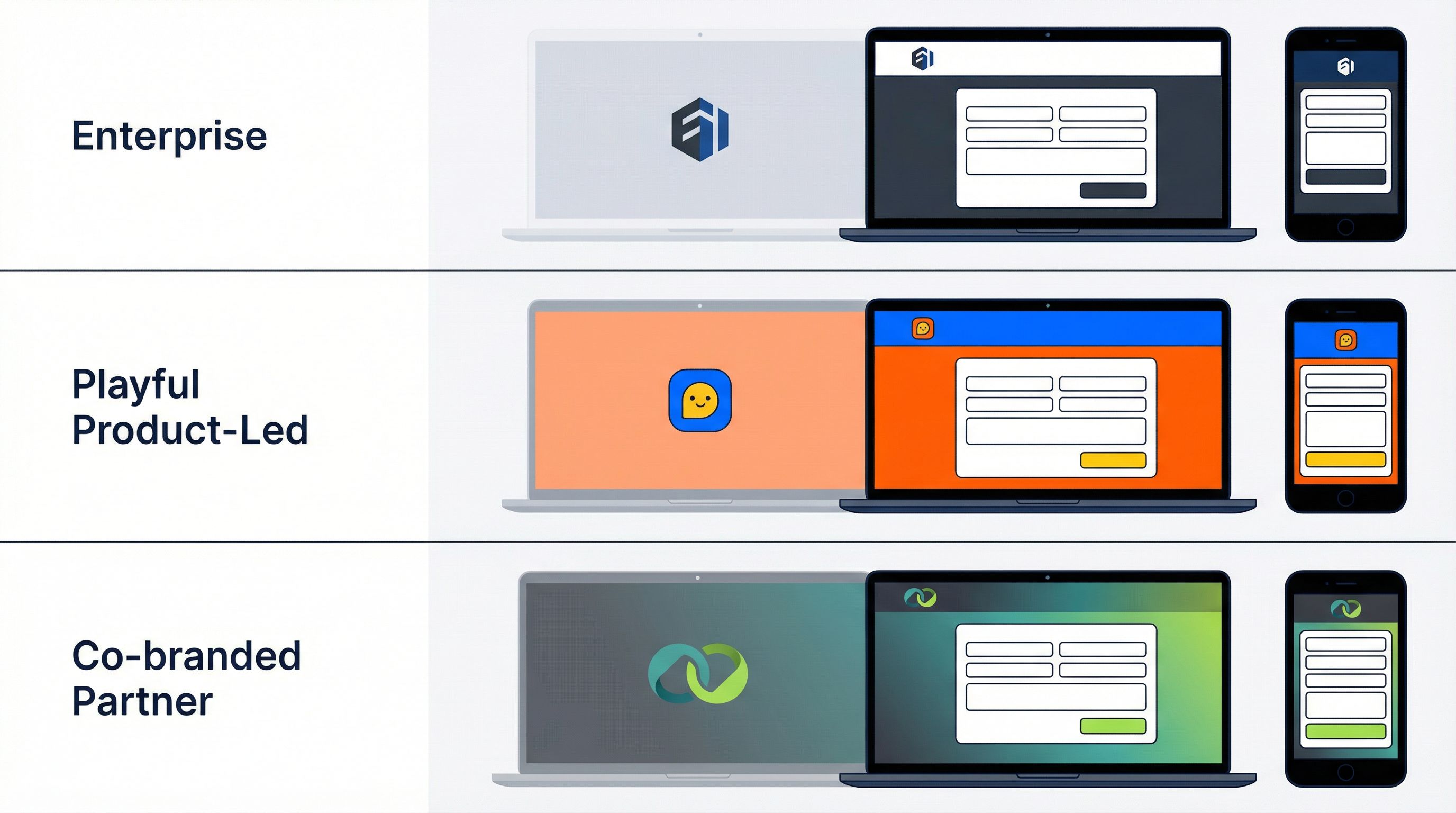
Step 3: Create 3–5 “Persona Themes” You Can Reuse
Once your base theme is solid, resist the urge to create endless variations. Instead, define 3–5 persona-based themes that all share the same underlying system.
Think of them as modes, not separate brands:
-
Core Enterprise – your default
- Neutral background, strong contrast
- Conservative use of accent colors
- Great for security, compliance, and B2B flows
-
Product-Led / Self-Serve
- Slightly brighter accent color
- More prominent CTAs
- Ideal for trials, freemium signups, and quick-start flows
-
Partner / Agency
- Room for co-branding (logo lockups, shared colors)
- More descriptive copy blocks
- Perfect for white-label and partner programs (see also One Form, Many Brands: Running White-Label Programs with Themes and Custom URLs)
-
Experimental / Campaign
- Bolder accent, maybe a different illustration style
- Used for time-bound experiments, not core flows
Each persona theme should be:
- Built from the same token set
- Using the same components and spacing
- Differentiated mainly by color, imagery, and tone of copy
On Ezpa.ge, that might look like:
- Duplicating your
Core Enterprisetheme - Tweaking accent colors and backgrounds
- Saving each as a named variant (e.g.,
Core Enterprise,Self-Serve,Partner Co-Brand)
This gives you the flexibility to match context and audience without losing consistency.
Step 4: Wire Themes Directly Into Your Ops
Looking enterprise-grade isn’t just about visuals; it’s about how your system behaves when volume and complexity increase.
A strong theme system should be tightly linked to how your team works, not just how things look.
Here’s how to connect the dots:
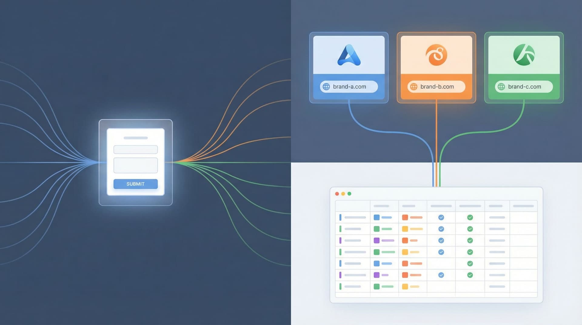
1. One data model, many themes
Keep your underlying form structure consistent wherever possible:
- Same core fields for leads (company, role, use case, timeline)
- Same hidden fields for source, campaign, and owner
- Same validation rules
Then use themes and custom URLs to adapt the surface to different channels or segments.
This “one form, many faces” pattern is powerful when combined with Google Sheets syncing. You get:
- Clean, centralized data
- Easy reporting across campaigns
- Minimal maintenance overhead
2. Themes as routing signals
Because tools like Ezpa.ge sync to Google Sheets in real time, you can:
- Use different themes or URLs for SMB vs. enterprise prospects
- Add a hidden field that records which theme or URL was used
- Build Sheets filters, views, or automations (via Zapier/Make) that change routing based on that value
Suddenly, your visual system is also an ops control panel.
If you want to go deeper on turning form responses into real operating muscle, From Form to Playbook: Turning Google Sheets Responses into Repeatable Ops SOPs is a great next read.
3. Themes for internal flows
Don’t just use your theme system externally. Apply it to internal ops forms:
- Deal desk / discount approvals
- Security review requests
- Feature flag or beta access requests
This reinforces the same sense of polish inside your company, which:
- Trains teams to take process seriously
- Makes it easier to onboard new hires
- Keeps internal tools from feeling like “temporary hacks”
Step 5: Use Themes as Brand and Product Experiments
One underrated benefit of a theme system: it lets you run controlled experiments with very low risk.
You can:
- Test a more premium color palette on your enterprise demo flow
- Try a friendlier, more conversational tone on your self-serve signup
- Introduce subtle motion or microcopy changes for specific segments
Because your underlying structure is consistent, you can:
- Compare completion rates across themes
- Measure impact on data quality (e.g., more complete answers)
- Roll out winning patterns across more surfaces
Posts like Form Themes as Brand Labs: Rapidly Prototyping Positioning, Pricing, and Messaging Without Rebuilding Your Site go deeper on using themes as your primary experimentation layer instead of constantly rebuilding pages.
Step 6: Document Just Enough to Scale
A theme system doesn’t need a 60-page design spec. But it does need just enough documentation so future you—and future teammates—don’t break it.
Create a lightweight “Theme System” doc that covers:
1. Tokens
List your core tokens and when to use them:
primary– main CTA buttons and key highlightsaccent– secondary highlights, tags, and badgesbackground– page backgroundsurface– card and form container backgroundsborder– input borders, dividersdanger– errors and destructive actions
2. Components
Screenshots or examples of:
- Text input (empty, focused, error, filled)
- Dropdown/select
- Radio/checkbox groups
- Primary and secondary buttons
- Inline validation messages
3. Copy patterns
A few examples of:
- How you label fields (e.g., “Work email” vs. “Email”)
- How you write helper text (short, specific, action-oriented)
- How you phrase errors (clear, non-blaming)
4. Do/Don’t examples
Show 2–3 examples of:
- Good: clean spacing, limited colors, clear hierarchy
- Bad: too many colors, inconsistent button styles, dense walls of text
Host this doc somewhere everyone can see it. Make it the default reference before anyone creates a new form, page, or flow.
Step 7: Ship a “Theme-First” Beta Experience
Now it’s time to put everything together.
Pick a narrow but important slice of your funnel—like “From first touch to scheduled demo”—and rebuild it around your theme system:
-
Top-of-funnel capture
- A campaign-specific or channel-specific form using your
Product-LedorCampaigntheme - Custom URL that matches the promise of the ad or outreach
- A campaign-specific or channel-specific form using your
-
Qualification and routing
- Same underlying form structure, different themes for SMB vs. enterprise
- Hidden fields capturing theme/URL for routing
-
Onboarding or pre-demo intake
- A short, polished form using your
Core Enterprisetheme - Clear, accessible layout and copy that sets expectations
- A short, polished form using your
-
Internal ops
- A matching internal form for deal desk, security review, or implementation planning
When someone moves through this journey, they should feel like they’re dealing with a company that has its act together—even if your product is still labeled “beta” in the navbar.
Recap: What You Gain From a Theme System in Beta
A deliberate theme system gives your startup:
- Credibility – You look like a team that takes details seriously.
- Speed – You can spin up new forms and flows in minutes, not weeks.
- Consistency – Every surface feels like part of the same product story.
- Experimentation power – You can test positioning, messaging, and UX without rebuilding everything.
- Operational clarity – Themes and custom URLs become levers for routing, reporting, and automation.
You don’t need a full rebrand or a massive design budget. You need a small set of strong decisions, encoded in a system that your whole team can use.
Where to Go From Here
If you’re ready to look enterprise-grade while your product is still in beta, here’s a simple sequence to follow this week:
- Choose your highest-intent form (demo request, beta waitlist, or partner intake).
- Define a base theme in Ezpa.ge:
- Colors, typography, spacing
- Input, button, and error styles
- Create 2–3 persona themes as variants of that base.
- Wire everything into Google Sheets, using hidden fields for theme/URL.
- Document your tokens and components in a short, shareable doc.
- Rebuild one key journey (e.g., first touch → scheduled demo) using only these themes.
You’ll be surprised how quickly the perception of your product shifts when every form, every link, and every interaction feels like it came from the same thoughtful system.
If you’re using Ezpa.ge, you already have the building blocks: customizable themes, custom URLs, and real-time Sheets syncing. The next move is yours.
Take the first step today: pick that one high-intent form, define your base theme, and ship a version that looks like the company you’re becoming—not the prototype you started with.