Designing Inclusive Forms: Practical Patterns for Language, Accessibility, and Device Diversity


Inclusive form design isn’t just “nice to have” anymore. Forms are how people sign up for care, apply for jobs, access financial support, and share sensitive feedback. When a form is hard to read, impossible to use with a screen reader, or broken on a small phone, you’re not just losing conversions—you’re excluding people.
The good news: you don’t need a full redesign or a massive accessibility budget to make meaningful progress. You can start with small, concrete patterns that improve language, accessibility, and device support—especially if you’re using a flexible builder like Ezpa.ge.
This guide walks through practical patterns you can apply right away, with examples you can adapt to your own forms.
Why Inclusive Forms Pay Off
Designing for inclusion is both the right thing to do and the smart thing to do.
1. You reach more people.
Accessible, device-friendly forms work for:
- Screen reader users
- Keyboard-only users
- People on slow connections or older devices
- Multilingual audiences
- Neurodivergent users who need clarity and predictability
2. You earn more trust.
When your form:
- Uses respectful, clear language
- Explains why information is requested
- Handles errors gently and clearly
…people feel safer sharing their information. If you want to go deeper on the trust side of interaction design, see how micro-interactions and validation patterns can help in From Click to Confidence.
3. You reduce silent drop-off.
A confusing address field, a date picker that doesn’t work with a keyboard, or a tiny mobile tap target can cause people to quietly abandon your form. Those issues rarely show up in error logs—but they show up in your completion rates. If you’re already dealing with multi-step flows, you’ll recognize this from The Silent Drop-Off.
4. You future-proof your data.
When you design for a wider range of people and devices, your data quality improves: fewer invalid entries, less guesswork, more consistent structure for analysis and automation.
Start with Language: Clear, Respectful, and Contextual
If your language is confusing or alienating, it doesn’t matter how good your layout is. People will hesitate or bail.
1. Ask for only what you truly need
Every extra field is extra cognitive load. Question each one:
- Can we complete this process without this field? If yes, delete it.
- Can we ask this later? Move it to a follow-up form or profile completion.
- Is this sensitive? If so, explain why you need it and how it will be used.
A simple pattern:
Field label: Phone number (optional)
Helper text: We’ll only use this to text you updates about your order.
On Ezpa.ge, you can use helper text and conditional logic to keep the main form lean while still collecting detail where it matters.
2. Use plain, human language
Avoid jargon, legalese, and internal terminology. Prefer:
- “Home address” instead of “Primary residence location”
- “Company size” instead of “Headcount band”
- “Tax ID (for billing only)” instead of “TIN/EIN” with no context
Guidelines:
- Use short sentences in helper text.
- Prefer verbs (“Tell us about…”, “Choose…”) over abstract nouns (“Selection”, “Submission”).
- Avoid double negatives and tricky phrasing.
3. Make labels explicit, not clever
Labels should answer: What exactly do you want from me here?
- Good: “Work email”
- Better: “Work email (we’ll send your login link here)”
- Avoid: “Where can we reach you?” (Is this phone? Email? Social?)
If you’re offering multiple options, say so in the label:
- “Preferred contact method” (with options Email, SMS, Phone call)
4. Respect names, gender, and identity
Some of the most common exclusion patterns show up in personal information fields.
Name fields
- Use “Full name” or separate “First name” and “Last name” only if you truly need them separated.
- Avoid forcing people into formats that don’t match their culture (e.g., middle name required, or strict character sets).
Gender fields
- Only ask for gender if there’s a clear, user-centered reason.
- If you must ask, consider a pattern like:
- Female
- Male
- Non-binary
- Prefer to self-describe: [text field]
- Prefer not to say
Titles and honorifics
- Avoid making titles required (Mr, Ms, Mrs, etc.) unless legally necessary.
- When used, include a “Prefer not to use a title” option.
5. Localize thoughtfully (even if you only support one language)
Even if your form is only in English, you can:
- Use region-appropriate formats (dates, phone numbers, currency) or clearly label the expected format:
- “Date of birth (MM/DD/YYYY)”
- Avoid idioms and cultural references that may not translate well.
- Keep sentences short so future translation is easier.
If you do localize:
- Don’t hard-code text in images or icons; keep it in labels and helper text so it can be translated.
- Leave space in your layout—translated text can be 20–30% longer.

Accessibility Foundations You Should Treat as Non-Negotiable
Accessibility is a spectrum, not a checkbox. But there are foundational practices that dramatically improve usability for a wide range of people.
1. Structure your form semantically
Screen readers and other assistive technologies rely on structure more than visuals.
- Use proper headings (
h1,h2,h3) to group sections. - Group related fields using fieldsets and legends (e.g., a group of radio buttons under “Preferred contact method”).
- Ensure every input has a programmatically associated label.
If you’re using Ezpa.ge, lean on the default field components—they’re designed to produce clean, semantic HTML, so you’re not wrestling with ARIA from scratch.
2. Design clear, accessible labels and instructions
Place labels consistently and keep them visible.
- Avoid relying on placeholder text as the only label. Placeholders disappear when people type and are not always read reliably by assistive tech.
- Use helper text for examples and constraints, not the label itself.
- Label: “Password”
- Helper text: “At least 12 characters, including a number and a symbol.”
3. Make error handling supportive, not punishing
Error messages are a huge accessibility and inclusion touchpoint.
Best practices:
- Be specific: “Your password must be at least 12 characters” instead of “Invalid input.”
- Place errors near the field and provide a summary at the top for longer forms.
- Don’t clear valid data when there’s an error; making people retype everything is especially hard for users with motor or cognitive disabilities.
- Use color and text to indicate errors (e.g., red outline plus an icon and message). Don’t rely on color alone.
This pairs nicely with thoughtful inline validation and micro-interactions—if you’re interested in that layer, check out From Click to Confidence.
4. Support keyboard and assistive tech users
Your form should be fully usable without a mouse.
- Tab order: Make sure the focus order follows the visual order of fields.
- Visible focus state: Don’t remove the default focus outline without a clear replacement. Users need to see where they are.
- Logical grouping: Radio buttons and checkboxes should be grouped so users can navigate them efficiently.
Test quickly:
- Put your mouse aside.
- Use
Tab,Shift+Tab, arrow keys, andEnter/Spaceto complete the form. - Note where you get stuck, lost, or confused.
5. Ensure sufficient contrast and legibility
Low contrast is one of the most common accessibility failures.
- Aim for at least WCAG AA contrast between text and background (4.5:1 for normal text, 3:1 for large text).
- Don’t put essential text over busy images.
- Use a readable base font size (16px or larger) and generous line spacing.
If you’re customizing themes in Ezpa.ge, choose palettes and typography that support these basics. You can still be on-brand and beautiful while being accessible.
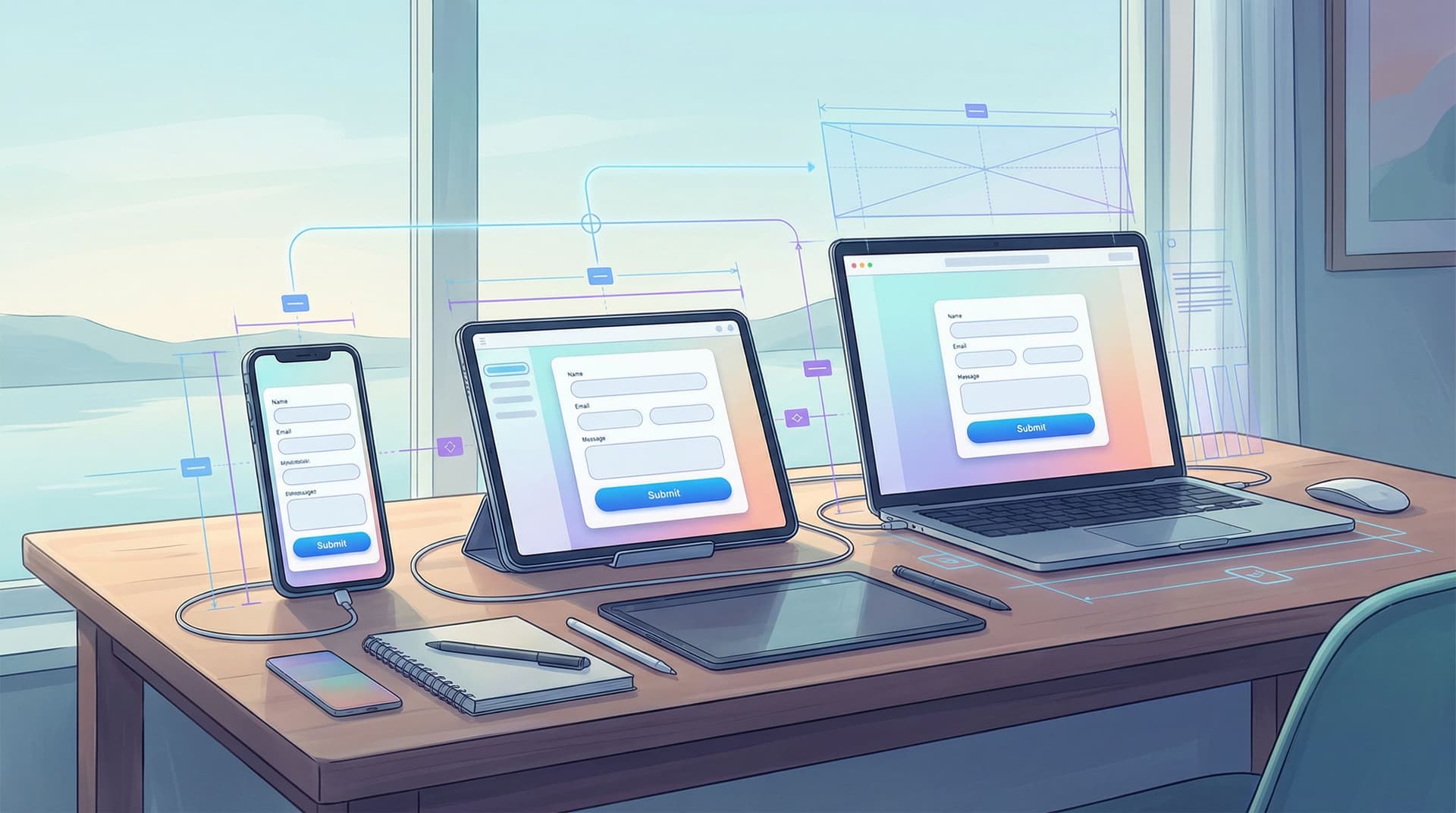
Designing for Device Diversity: From Tiny Screens to Wide Monitors
Your form has to work on whatever device someone has in their hand—small phones, large phones, tablets, laptops, desktops, even assistive devices.
We cover this in depth in Designing Forms That Feel Native on Any Device; here are the essentials to apply right away.
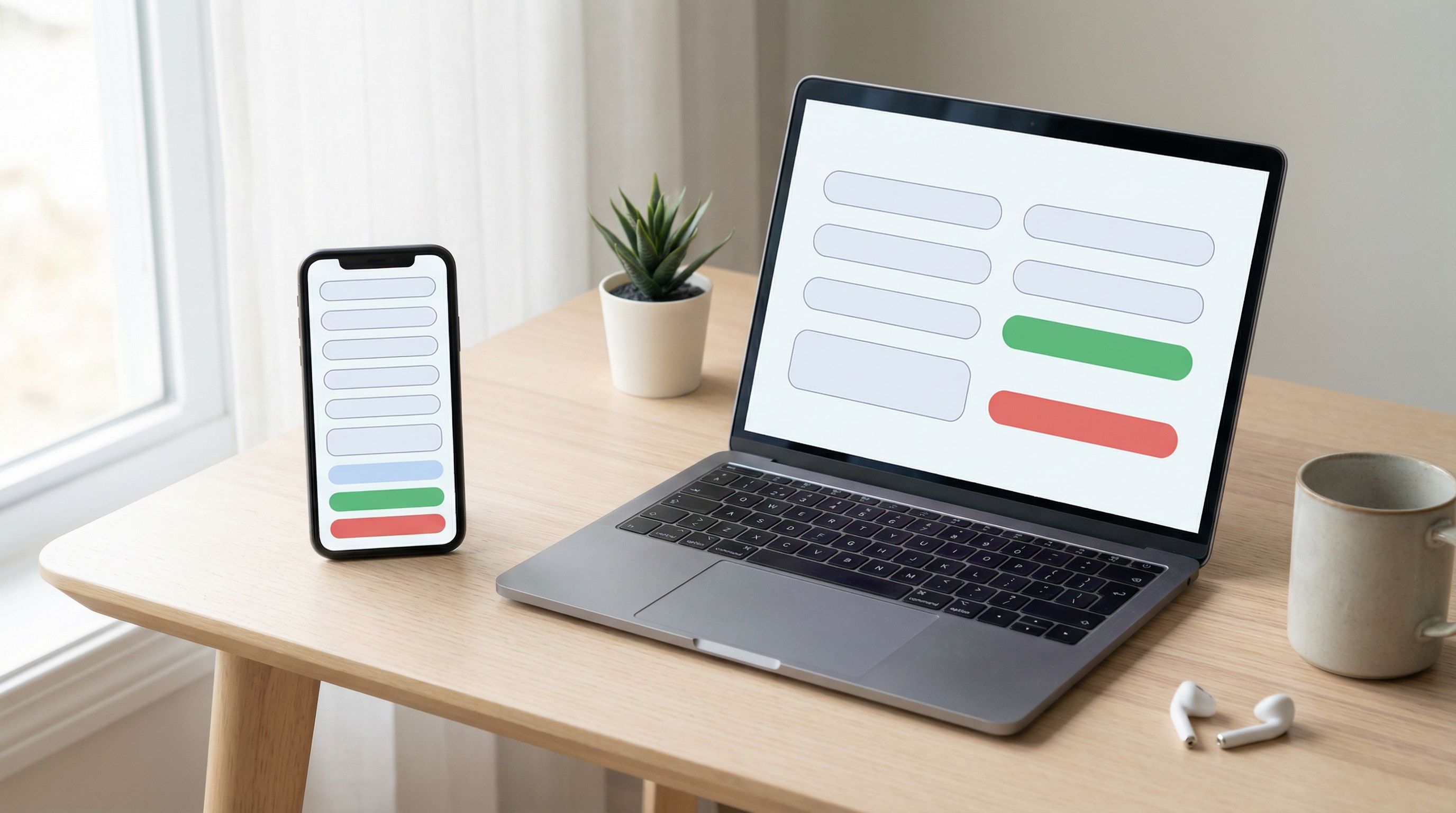
1. Layout that adapts gracefully
Instead of designing one layout and shrinking it, think mobile-first:
- Single-column layout on small screens to avoid horizontal scrolling.
- Logical section breaks with clear headings so long forms don’t feel endless.
- Avoid multi-column field layouts on phones; they’re hard to scan and tap.
On wider screens, you can:
- Use two columns for non-critical fields (e.g., city and state side by side) while keeping important fields full-width.
- Maintain consistent spacing so the form doesn’t feel like a scattered spreadsheet.
2. Touch-friendly targets and controls
On touch devices:
- Make buttons and tap targets at least 44x44px (Apple’s guideline) or similar.
- Provide enough spacing between checkboxes and radio options so people don’t tap the wrong one.
- Use native pickers where appropriate (date, time, select menus) to leverage built-in accessibility and familiarity.
3. Use the right input types
HTML input types are a simple but powerful way to support different devices:
type="email"shows an email-optimized keyboard on phones.type="tel"for phone numbers.type="number"for numeric inputs, but avoid it for things like credit cards where leading zeros matter.
If you’re building with Ezpa.ge, you can set these from the field configuration panel—no code required.
4. Plan for low bandwidth and flaky connections
Not everyone is on fast Wi‑Fi.
- Keep assets light: avoid massive background images on form pages.
- Allow users to save progress on longer forms if possible.
- Show clear loading states when the form is submitting; don’t leave people wondering if their tap worked.
Putting It All Together: A Simple Inclusive Design Checklist
Use this checklist the next time you create or audit a form in Ezpa.ge (or any builder):
Language & content
- [ ] Every field has a clear reason to exist.
- [ ] Labels are explicit, not clever or ambiguous.
- [ ] Helper text explains why and how, in plain language.
- [ ] Sensitive questions include a brief explanation of use.
- [ ] Name, gender, and identity fields are respectful and flexible.
Accessibility
- [ ] Headings and sections are structured logically.
- [ ] Each input has a proper, visible label.
- [ ] Placeholders are not used as the only labels.
- [ ] Error messages are specific, helpful, and persistent.
- [ ] The form is fully usable with a keyboard only.
- [ ] Focus states are visible and consistent.
- [ ] Text and key UI elements meet contrast guidelines.
Device diversity
- [ ] The layout works in a single column on small screens.
- [ ] Tap targets are large enough and well spaced.
- [ ] Appropriate input types are set (email, tel, etc.).
- [ ] The form loads quickly on a slower connection.
- [ ] Critical interactions (like Submit) have clear loading and success states.
If you’re syncing responses to Google Sheets or other tools, you can even use those systems to tag and track where users drop off, then iterate. For ideas on turning that stream of responses into insight, see Real-Time Forms, Real-Time Strategy.
How Ezpa.ge Helps You Build More Inclusive Forms
Ezpa.ge is built to make many of these best practices the default, not an afterthought:
- Responsive by design: Forms automatically adapt to different screen sizes, and you can preview layouts across devices as you build.
- Accessible components: Standard fields come with proper labels and structure baked in, so you’re starting from a solid baseline.
- Custom themes with guardrails: You can align forms with your brand while still maintaining legibility and contrast.
- Real-time syncing: With live Google Sheets syncing, you can quickly spot patterns—like where people abandon a form—and then adjust labels, helper text, or structure accordingly.
The platform doesn’t replace thoughtful design decisions, but it does remove a lot of the technical friction so you can focus on the human side.
Summary
Inclusive form design sits at the intersection of language, accessibility, and device diversity. When you:
- Use clear, respectful language that explains what you need and why,
- Apply accessibility fundamentals like semantic structure, visible labels, supportive error handling, and good contrast,
- And design for a wide range of devices and connection qualities,
…you create forms that more people can complete with confidence.
You’ll see the impact in higher completion rates, better-quality data, and a stronger sense of trust between you and the people filling out your forms.
Your Next Step
Pick one form that matters to your business—a signup, a feedback survey, an application. Then:
- Walk through it as if you were a new user. On desktop and on your phone. With your mouse, and then with just your keyboard.
- Identify three small changes you can make using the patterns above—maybe rewriting two labels and adding one piece of helper text, or fixing one contrast issue and one error message.
- Open that form in Ezpa.ge (or your builder of choice) and implement those changes this week.
You don’t have to solve everything at once. Inclusive design is iterative. Start small, observe what changes, and keep refining. Every clearer label, every accessible control, and every device-friendly layout is another person who gets through your form instead of dropping off.
And that’s the real goal: forms that work beautifully—for everyone who needs them.