From Click to Confidence: Building Trust with Progress Indicators, Inline Validation, and Micro-Interactions

From Click to Confidence: Building Trust with Progress Indicators, Inline Validation, and Micro-Interactions
When someone hits your form, they’re doing something vulnerable: sharing information, time, and attention. Every click is a small leap of faith.
Your job is to turn that leap into confidence.
Three of the most powerful (and often underused) tools for this are:
- Clear progress indicators
- Thoughtful inline validation
- Delightful, subtle micro-interactions
Together, they turn a form from “Ugh, another chore” into “Okay, this feels easy—and safe.” For teams using Ezpa.ge, these are exactly the kinds of details that transform simple signups and feedback forms into experiences people actually complete.
Why Confidence Is the Real Conversion Metric
We talk a lot about conversion rates, but underneath that metric is a simple question:
Does this experience make people feel confident enough to finish what they started?
Confidence in a form experience has a few dimensions:
- Clarity: Do I understand where I am, what’s required, and what happens next?
- Control: If I make a mistake, will I know? Can I fix it easily?
- Safety: Does this feel trustworthy and intentional—or rushed and careless?
Progress indicators, inline validation, and micro-interactions each address one or more of these dimensions. They:
- Reduce perceived effort
- Lower anxiety around errors
- Signal professionalism and care
- Build trust that your brand knows what it’s doing
If you’ve ever seen users quietly vanish midway through a multi-step flow, you’ve already felt the cost of missing these pieces. We explored that deeper in The Silent Drop-Off: Diagnosing and Fixing Hidden Friction in Multi-Step Forms. Here, we’ll zoom in on three specific levers you can pull to keep people engaged—from first click to final submit.
1. Progress Indicators: Turning Uncertainty into Momentum
Nothing kills motivation like not knowing how much is left.
A good progress indicator answers that question instantly: Where am I, how far is left, and what’s coming next?
Types of Progress Indicators (and When to Use Them)
-
Stepper with labels
- Best for: Multi-step signup, onboarding, applications
- Example:
Account → Profile → Preferences → Review - Strength: Sets expectations and reduces anxiety by naming each stage.
-
Progress bar (percentage or fill)
- Best for: Longer flows where the number of steps may be less important than overall completion.
- Strength: Creates a sense of momentum—people love seeing progress.
-
Hybrid (stepper + bar)
- Best for: Complex or high-stakes forms (loans, medical, legal, enterprise onboarding).
- Strength: Combines clarity (steps) with motivation (visual progress).
-
Inline section headers
- Best for: Single-page forms that are long but don’t justify multiple screens.
- Strength: Breaks content into chapters without navigating away.
Principles for Effective Progress Indicators
- Be honest about effort. Don’t show “Step 1 of 2” if each step is essentially a full form. Misleading indicators destroy trust.
- Name steps in plain language. Use labels like Contact info, Project details, Billing instead of Step 1, Step 2.
- Make progress visible above the fold. Don’t bury indicators at the bottom of the page.
- Show completion, not just position. “3 of 5” is more motivating than just “Step 3”.
- Reflect reality. If steps are dynamically skipped (e.g., based on previous answers), ensure the indicator updates accordingly.
Implementing Progress Indicators with Ezpa.ge
If you’re building forms in Ezpa.ge:
- Use multi-step layouts to break long forms into logical chunks.
- Add clear step titles that map to the user’s mental model (e.g., About you, Your organization, Payment).
- Match the theme styling of the progress bar or stepper to your brand colors for consistency.
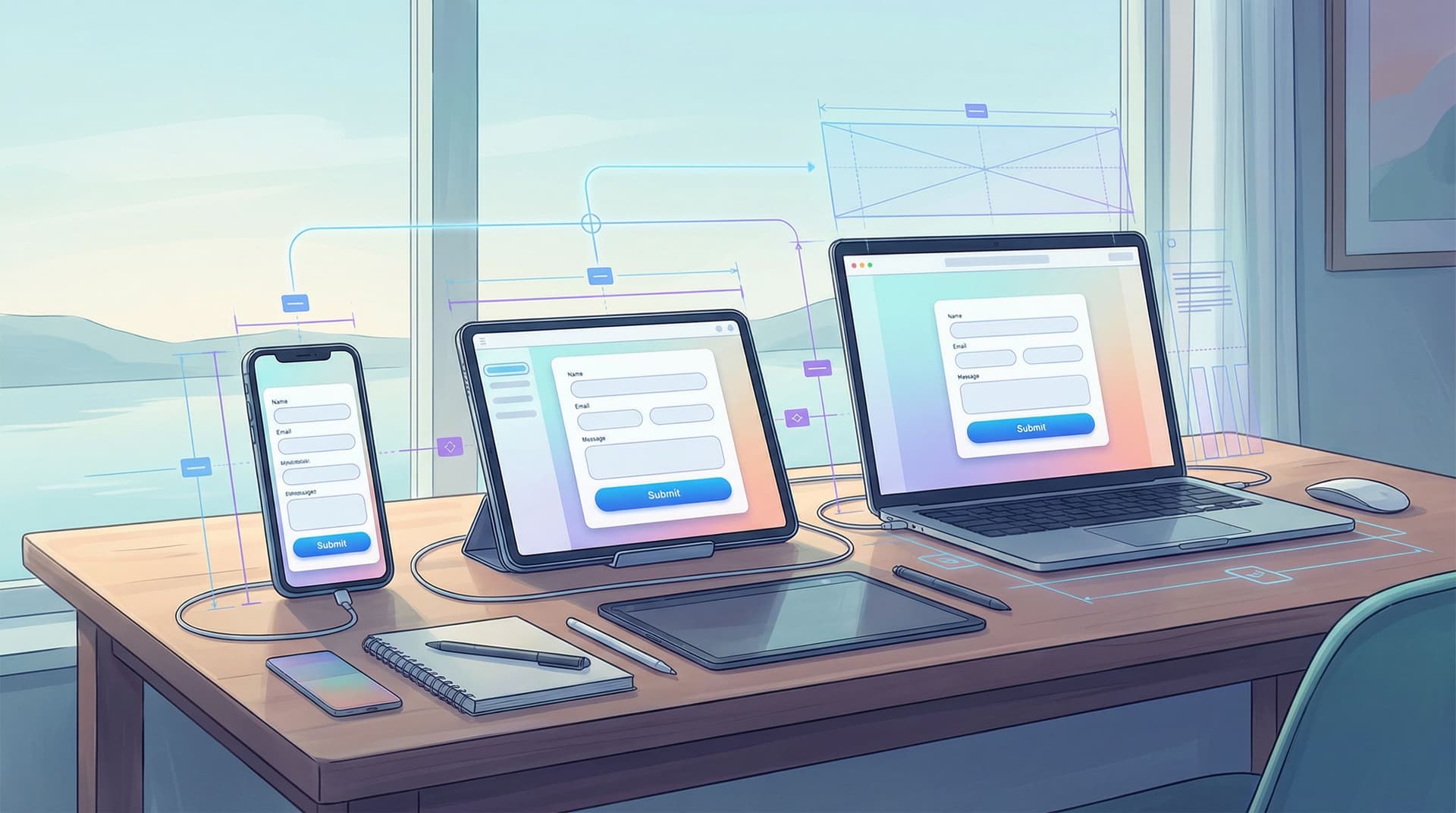
- Test on mobile—pair this with the advice in Designing Forms That Feel Native on Any Device: A Practical Guide to Truly Responsive UX to ensure the progress indicator stays legible and tappable on smaller screens.

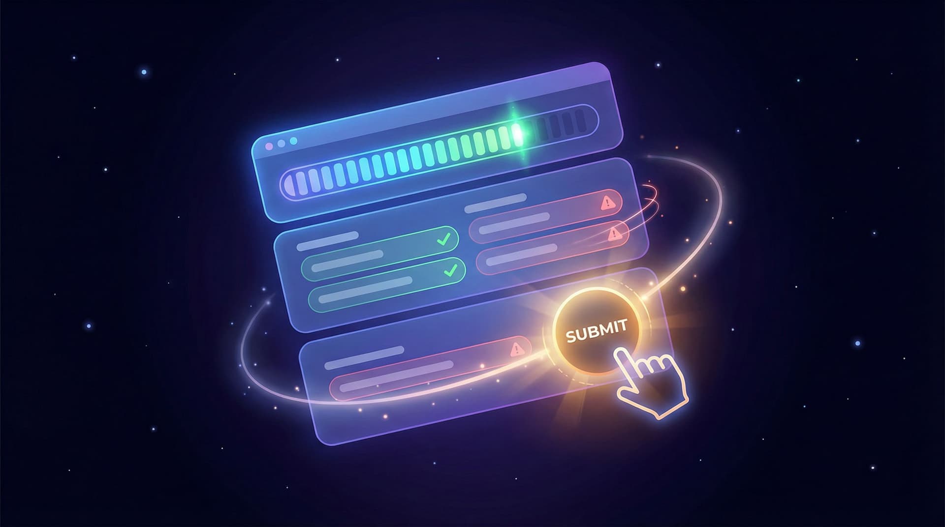
2. Inline Validation: Catching Errors Before They Become Regrets
Every time someone hits “Submit” and gets slammed with a wall of red error messages, a little trust dies.
Inline validation flips that: instead of punishing people at the end, you help them as they go.
What Good Inline Validation Looks Like
Inline validation is feedback that appears near the field while the user is interacting with it or immediately after they leave it. When done well, it:
- Prevents surprise failures at the end
- Reduces cognitive load (users fix issues in context)
- Signals competence (your system “knows what it’s doing”)
Key patterns:
-
Real-time validation for structured fields
- Email, phone number, password strength, credit card format.
- Show small, clear messages like “We’ll never share your email” (helper text) plus “Please enter a valid email address” (error text) when needed.
-
On-blur validation for more subjective fields
- Names, open text, descriptions.
- Validate after the user leaves the field to avoid feeling intrusive.
-
Positive reinforcement
- A subtle green checkmark or “Looks good” note can reassure users they’re on the right track.
Guidelines for Helpful (Not Annoying) Validation
-
Be specific and human.
- Bad: “Invalid input.”
- Better: “Your password needs at least 8 characters and one number.”
-
Pair color with text.
- Don’t rely solely on red/green; include icons and clear copy.
- This helps with accessibility and color vision deficiencies.
-
Avoid premature scolding.
- Don’t show “This field is required” while someone is still typing.
- Wait until they move away from the field or try to submit.
-
Keep the layout stable.
- Reserve space for error messages so the form doesn’t jump around when validation appears.
-
Use validation to educate, not just reject.
- If you’re asking for a specific format (e.g., tax ID, membership number), show an example.
Inline Validation + Real-Time Data = Superpowers
When your form is connected to live systems, validation becomes more than just checking formats:
- Check if a coupon code is valid in real time.
- Warn if an email is already registered and offer a login link.
- Validate inventory or capacity (e.g., “Only 3 seats left on this date”).
If you’re syncing your Ezpa.ge form to Google Sheets, you can start building these kinds of checks into downstream workflows, then evolve them into live feedback as your stack matures. For more ideas on using live data, see Real-Time Forms, Real-Time Strategy: Turning Google Sheets Sync into a Growth Engine.
3. Micro-Interactions: Small Moments, Big Signals
Micro-interactions are the tiny, fast feedback loops that show your form is listening.
They’re not just decoration. They’re communication.
Common Micro-Interactions in High-Trust Forms
-
Button states
- Hover: subtle color shift or shadow.
- Pressed: quick “dip” animation.
- Disabled: clearly different state with explanatory tooltip or helper text.
-
Field focus effects
- Soft highlight around the active field.
- Label moves smoothly above the field when typing begins.
-
Loading and submission feedback
- A brief spinner or progress bar after clicking “Submit”.
- A clear transition to the confirmation state (no awkward “Did it work?” moment).
-
Success confirmations
- A short, friendly message: “Thanks! Your application is in review.”
- Optional: a subtle checkmark animation or confetti burst for celebratory moments (e.g., completing a long application).
How Micro-Interactions Build Trust
-
They prove the system is responsive.
- Immediate visual feedback reassures users that their actions are registered.
-
They reduce ambiguity.
- If a button clearly changes state, users know whether it’s clickable, loading, or done.
-
They add personality without getting in the way.
- A tiny, tasteful animation can make your brand feel more human.
Guardrails: Where Micro-Interactions Go Wrong
-
Too loud or too frequent.
- Over-the-top animations slow users down and feel gimmicky.
-
Inconsistent behavior.
- If one button animates and another doesn’t, people will question whether something broke.
-
Accessibility blind spots.
- Animations should be short, subtle, and never the only way to convey meaning.
When you’re using Ezpa.ge, many of these micro-interactions are handled by the underlying design system. Your job is to tune them through theme customization—color, motion intensity, and typography—so they feel like a natural extension of your brand. If you want to go deeper on that front, you’ll find plenty of inspiration in Unlocking the Power of Custom Themes for Enhanced User Engagement.

Putting It All Together: A Trust-First Form Blueprint
Let’s walk through how you might redesign a typical multi-step signup form using these three pillars.
Step 1: Map the Journey
Before you touch the UI, answer:
- What’s the minimum information we truly need at each stage?
- Where do people currently drop off? (Check your analytics.)
- Which steps are emotionally heavy (e.g., payment, legal info) and need extra reassurance?
Step 2: Design the Progress Experience
- Group fields into 3–5 logical steps.
- Name each step in user language, not internal jargon.
- Add a stepper with labels at the top of each page.
- If the total effort is large, add a progress bar as well.
Step 3: Layer in Inline Validation
For each field, decide:
- When should this validate? (real-time vs. on blur vs. on submit)
- What does a clear, human error message look like?
- What helper text would prevent errors in the first place?
Then implement:
- Reserved space below each field for messages.
- Consistent colors and icons for error, warning, and success states.
- Smart defaults where possible (e.g., pre-select country, infer city from ZIP when appropriate).
Step 4: Add Micro-Interactions as the Final Polish
Start small:
- Add focus styles to fields.
- Create hover and pressed states for buttons.
- Show a loading state after submission.
- Smoothly transition to a thank-you screen with clear next steps.
Optional, but powerful:
- A subtle “step completed” checkmark when each section is done.
- A tiny celebratory animation on final submission for longer, effortful flows.
Step 5: Measure and Iterate
Trust is not a one-and-done project.
Track:
- Step completion rates (Where do people stop?)
- Error frequency per field (Which questions confuse people?)
- Time to complete (Are people getting stuck?)
Feed what you learn back into your form design. Over time, your form becomes a living feedback loop—something we explore more deeply in Frictionless Feedback Loops: Using Forms to Continuously Improve Your Product Experience.
How Ezpa.ge Helps You Ship This (Without a UX Team of 20)
Ezpa.ge is built around the idea that beautiful, trustworthy forms shouldn’t require a huge design or engineering investment. When you combine its core features, you get a trust toolkit out of the box:
- Multi-step layouts → Clear progress and reduced overwhelm
- Custom themes → Consistent, branded micro-interactions and visual language
- Custom URLs → Professional, memorable links that signal legitimacy
- Real-time Google Sheets syncing → The foundation for smarter validation and faster response
Instead of wrestling with HTML, CSS, and JavaScript to get the basics right, you can:
- Drag and drop your fields into logical steps.
- Apply or tweak a theme so your progress indicators and feedback states feel on-brand.
- Connect your form to Google Sheets and start watching how people actually move through it.
- Iterate quickly based on real usage, not guesses.
The result: forms that don’t just collect data, but build relationships.
Recap: From Click to Confidence
Let’s bring it home.
To turn casual clicks into confident completions:
- Use progress indicators to reduce uncertainty.
- Show people where they are, what’s left, and what’s coming.
- Use inline validation to prevent frustration.
- Catch issues early, explain them clearly, and help users succeed.
- Use micro-interactions to signal care and competence.
- Provide instant, subtle feedback that the system is listening.
None of these patterns are flashy on their own. But together, they create a form experience that feels:
- Predictable
- Supportive
- Professional
- Worth finishing
That’s what confidence looks like.
Your Next Step
If you’re already collecting signups, feedback, or applications, you don’t need a full redesign to start.
Pick one live form and:
- Add or refine a progress indicator.
- Improve inline validation on the top three error-prone fields.
- Introduce at least one new micro-interaction (better button states, clearer loading feedback, or a more reassuring success screen).
Then watch what happens.
If you’re using Ezpa.ge—or ready to try it—open a form you care about and spend 30 focused minutes applying what you’ve just read. That’s often enough to turn an anxious, leaky flow into one that quietly builds trust, one click at a time.
Your users are already taking a small risk when they start filling out your form.
Make sure every interaction tells them: You made the right call.