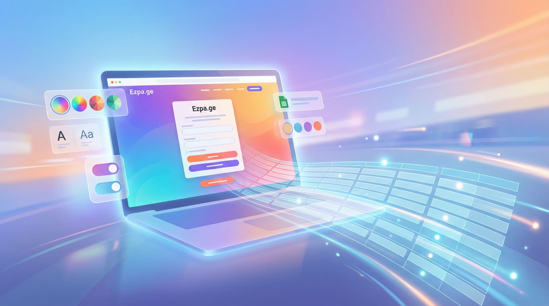
Form Themes for Non-Design Brands: Looking Premium Even When Your Site Is Still V1

If you’re honest, your product is further along than your brand.
The backend works. Your offer is clear enough. Customers who make it through to a kickoff call usually say yes.
But the first impression? A scrappy homepage, a logo from a friend-of-a-friend, and a handful of forms that look like the default from whatever tool you grabbed on launch day.
Here’s the good news: you don’t need a full redesign to look like you have your act together.
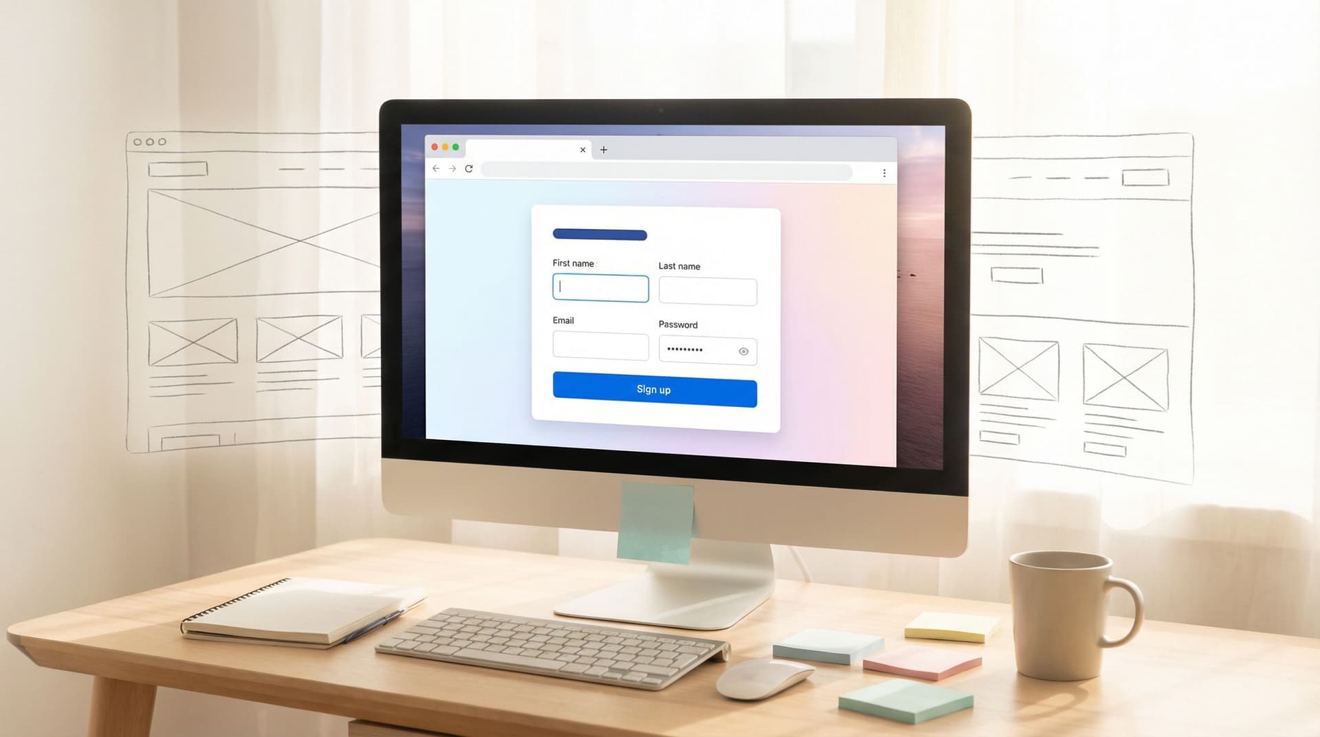
Your forms are the highest-intent surface you own. They’re where people:
- Ask for a demo
- Apply for a role
- Request a partnership
- Share sensitive details
If those forms feel polished, intentional, and on-brand, you can buy yourself months (or years) before you have to tackle a full site overhaul.
This is where form themes come in.
Why “V1 but premium” matters so much at the form layer
Multiple studies have found that people judge a site’s credibility within 50 milliseconds, and that visual design quality is one of the strongest predictors of perceived trust. In some research, over 70% of credibility judgments are driven by visual design alone.
That’s not fair. But it’s real.
When your brand is still early, that bias cuts both ways:
- A rough site + rough forms → people assume the product is also rough.
- A rough site + surprisingly polished forms → people assume you’re leveling up and just haven’t caught the rest of the surface yet.
For non-design-led teams, this is a huge advantage:
- Forms are contained. You don’t have to rework your whole IA, blog, or navigation.
- Forms are operationally critical. A better form isn’t just prettier; it directly improves conversion, data quality, and routing.
- Forms are repeatable. Once you have a handful of strong themes, you can reuse them across campaigns, partners, and teams.
Think of themes as a way to dress your V1 site in a tailored jacket. Underneath, it’s still the same product. But people treat you differently.
What “premium” actually looks like when you don’t have a designer
“Premium” is not about gradients, 3D blobs, or the trend of the month.
For non-design brands, premium usually boils down to four things:
- Consistency
- Restraint
- Clarity
- Confidence
Let’s translate that into form-specific decisions.
1. Consistency: one story across every touchpoint
Even if your logo is temporary, you can still:
- Use one primary color for buttons and key highlights.
- Pick one neutral background (white or a very light gray) and stick to it.
- Limit yourself to one accent color for links or subtle highlights.
- Use the same logo lockup and favicon across forms and emails.
On Ezpa.ge, this is exactly what themes are for: you define your color tokens, typography, and spacing once, then apply them to every form. If you want to go deeper on the underlying system, we unpack this in detail in Theme Tokens, Not One-Off Styles: Building a Form Design System That Scales Across Brands.
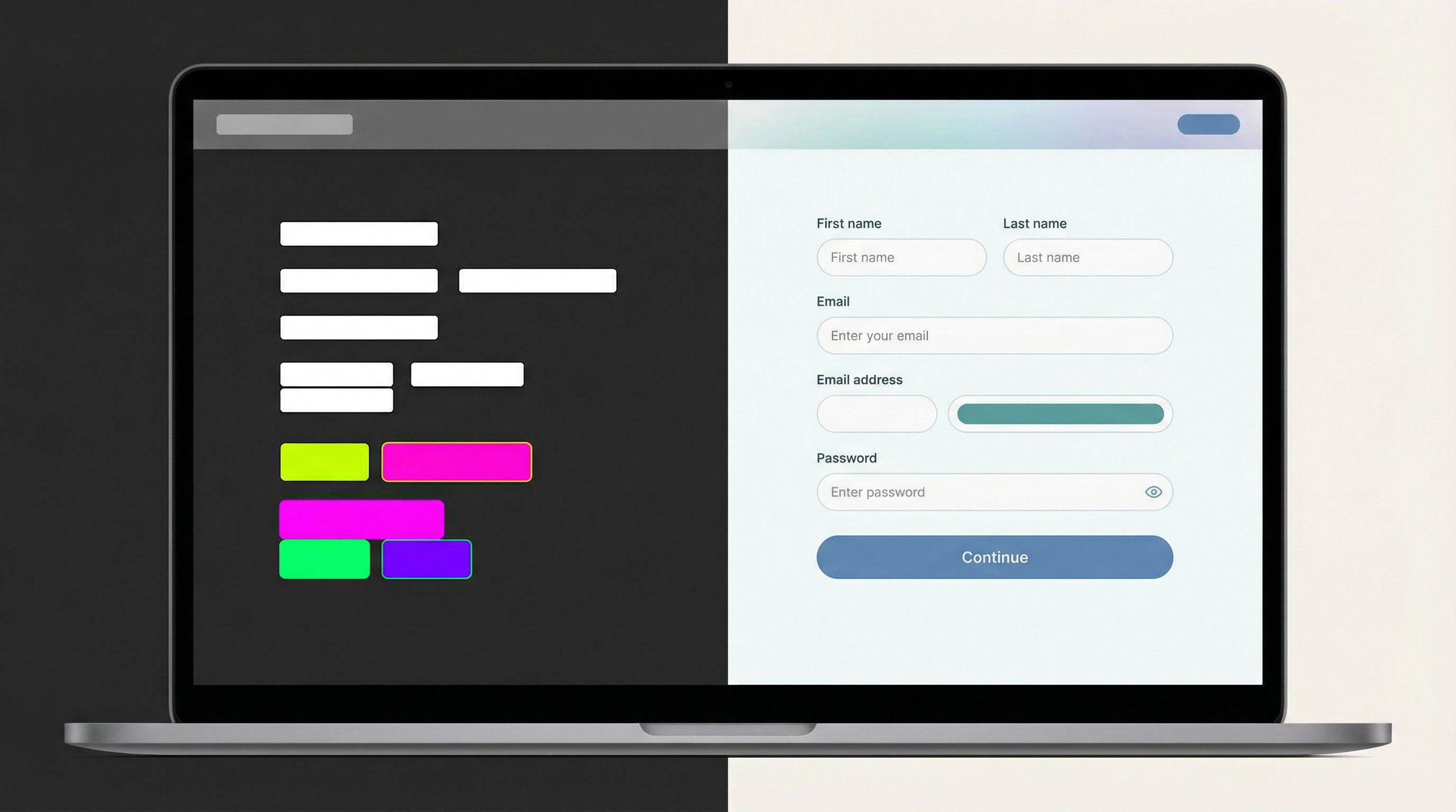
2. Restraint: fewer, stronger choices
Most early teams over-style because they’re not confident in the basics.
Premium forms do the opposite:
- One font family, two weights (regular + semi-bold) is plenty.
- One button style (solid, rounded to the same radius everywhere).
- Minimal borders; rely on spacing and background blocks instead.
- No random shadows. If you use elevation, use it sparingly and consistently.
A good rule of thumb: if you’re not sure whether to add a visual treatment, don’t. Ship the simpler version.
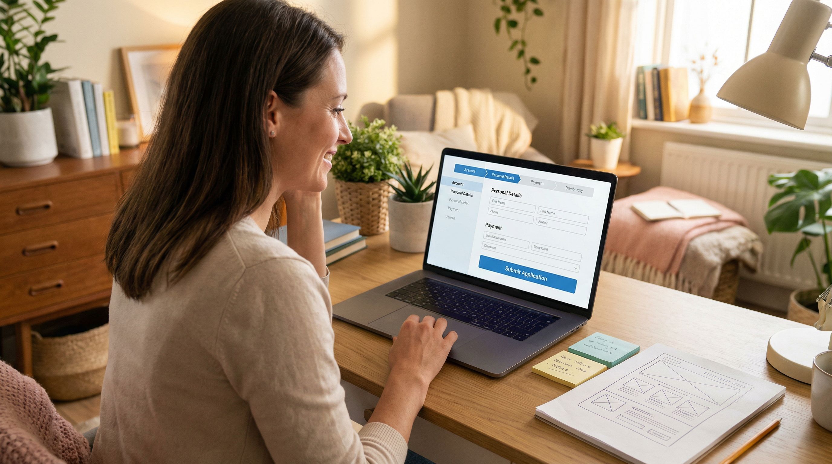
3. Clarity: every element has a job
When someone lands on your form, they should instantly understand:
- Where they are
- What they’re doing
- Why it matters
You can achieve that with:
- A clear, benefit-driven title (e.g., “Request a 30-Minute Implementation Review” instead of “Contact Us”).
- A short supporting sentence that sets expectations about what happens next.
- Logical grouping of fields into sections with short, descriptive headings.
Clarity is a design choice. You don’t need a visual brand guide to make it.
4. Confidence: own the small details
Premium experiences sweat the details that most people ignore:
- Microcopy under sensitive fields (“We’ll never share this outside your project team.”)
- Inline validation that feels human (“This email looks off—mind double-checking?”)
- A confirmation state that feels intentional, not generic (“You’re in. Here’s what happens over the next 24 hours…”)
These details are cheap to implement and disproportionately impact how serious you feel.
A simple blueprint for premium form themes (even if you “don’t do design”)
Let’s walk through how to go from “default form” to “this feels like a real brand” using a few deliberate decisions.
Step 1: Choose a visual lane and commit to it
Pick one of these three lanes and stick with it for at least a quarter:
-
Clean SaaS
- White background, soft gray cards
- A single bold accent color for buttons (e.g., electric blue, emerald, or coral)
- Rounded corners (4–8px), subtle dividers
- Great for B2B tools, platforms, and API products
-
Editorial Calm
- Warm off-white background (e.g., #FAF7F2)
- Deep ink text (not pure black)
- Muted accent color (forest, wine, navy)
- Slightly larger line height, more generous spacing
- Great for consultancies, agencies, and premium services
-
Utility Minimal
- Light gray background, white form card
- High-contrast text and buttons (e.g., black on white, or white on black)
- Squared corners, no shadows
- Great for ops-heavy or technical products where “serious” matters
You don’t have to invent something new. You just have to not mix lanes.
In Ezpa.ge, you can set up each lane as a reusable theme and then give each form a matching custom URL, which is especially useful if you’re already leaning into a forms-as-microsites strategy.
Step 2: Define your “minimum viable theme” tokens
You don’t need a full design system. A handful of decisions gets you 80% of the way:
-
Colors
background.page: white or off-whitebackground.card: white or a slightly darker neutraltext.primary: near-blacktext.muted: medium grayaction.primary: your brand colorborder.subtle: very light gray
-
Typography
- Font family: pick a widely available, neutral typeface (Inter, system UI, or a single Google Font).
- Sizes:
- Title: 24–32px
- Section headings: 18–20px
- Body + labels: 14–16px
-
Radius + spacing
- Field radius: 6–8px (or 0 for Utility Minimal)
- Vertical spacing between fields: 16–20px
- Padding inside the form card: 24–32px
In a tool like Ezpa.ge, you can capture these as theme tokens, so when you update action.primary later, every button updates automatically.
If you want more depth on why tokens beat one-off styling, it’s worth skimming Brand-Consistent Forms at Scale: Governance Rules for Themes, URLs, and Copy as a companion.
Step 3: Design one “hero” form and let it set the standard
Instead of theming everything at once, pick one high-impact flow and make it your reference:
- Demo / sales request
- Primary waitlist or signup
- Flagship campaign or launch funnel
For that hero form:
-
Write the narrative first
- Title: what’s the value of completing this form?
- Subtitle: what happens after I hit submit?
- Sections: what are the 2–3 logical chunks of information you need?
-
Apply your theme with discipline
- Use your chosen lane (Clean SaaS, Editorial Calm, or Utility Minimal).
- Apply your color, type, and spacing tokens.
- Make sure every heading level, button, and link follows the same rules.
-
Polish the “edges”
- Empty state (before someone starts typing)
- Error states (validation messages that sound human)
- Success state (confirmation page or message that’s specific and reassuring)
Once that hero form feels premium, you can clone it for other use cases and only change:
- The title and copy
- The fields
- Any logic or branching
The theme stays the same, which keeps your brand coherent even if your main site is still catching up.
Step 4: Align themes with URLs and context
Themes really shine when they’re paired with intentional URLs and context.
For example:
/partners/apply→ Partner program theme (maybe co-branded colors)/vip-support→ High-contrast, no-nonsense theme for urgent requests/launch/alpha→ Bold, campaign-specific theme that still respects your core tokens
If you’re curious how far you can push this pattern, we go deep on it in The New Microsite: Using Custom URLs + Themes to Replace Landing Pages for Campaigns and Partnerships.
With Ezpa.ge, you can:
- Give each form a clean, memorable URL.
- Reuse themes across those URLs.
- Wire everything into the same Google Sheet, so ops doesn’t suffer just because design is leveling up.
Step 5: Add just enough “premium” signals
You don’t need motion design or custom illustration to feel premium. A few subtle cues go a long way:
-
Logos and avatars
- Add your logo in a consistent size and position.
- For partner or co-branded flows, show both logos with a clear relationship.
-
Trust and clarity
- Short privacy note near email/phone fields.
- A one-line SLA on response time (“We’ll get back to you within one business day.”)
- Optional: tiny line of social proof (“Trusted by teams at…”) if you have it.
-
Micro-layout choices
- Align labels and fields consistently (left-aligned usually wins).
- Avoid multi-column layouts on desktop unless you really know why you’re doing it.
- Make the primary button visually dominant and place it where the eye naturally ends.
These are all “ops-owned” decisions. You don’t need a creative director to ship them.
Common mistakes that make forms feel cheap (and how to fix them)
You can avoid most “this feels sketchy” vibes by watching for a few traps.
1. Mixing too many styles
Symptoms
- Different button shapes and colors on the same form
- Random font changes between headings and body text
- Inconsistent spacing between sections
Fix
- Audit one hero form and standardize:
- One button style
- One heading style per level
- One spacing rhythm
- Capture those choices in your form theme so they apply everywhere.
2. Overloading the form with fields
Symptoms
- Long, unbroken walls of fields
- Asking for information you don’t actually use
- Drop-off spikes halfway through the form
Fix
- Ruthlessly cut or defer fields that don’t drive action.
- Group related questions into sections (or steps if it truly needs to be multi-step).
- Use conditional logic to only show advanced fields when relevant.
3. Ignoring mobile
Symptoms
- Text feels tiny on phones
- Horizontal layouts break
- Buttons are hard to tap
Fix
- Preview every form theme on mobile first.
- Increase tap targets and line height.
- Avoid side-by-side fields; stack them vertically.
4. Default confirmation experiences
Symptoms
- Generic “Thanks for submitting” message
- No indication of next steps
- People follow up asking, “Did this go through?”
Fix
- Customize the confirmation page or message for each form type.
- Include:
- What happens next
- When they’ll hear from you
- How to reach out if it’s urgent
A thoughtful confirmation page is one of the cheapest “premium” upgrades you can make.
Turning themes into an ops advantage
The real power move is when your themes aren’t just about aesthetics—they’re wired into how you run the business.
With Ezpa.ge + Google Sheets, a themed form can become:
- A launch funnel that looks fully branded but was shipped in under an hour. (If you want a walkthrough, we break this pattern down in Zero to Live in 30 Minutes: Building a Fully-Branded Launch Funnel with Ezpa.ge and Google Sheets.)
- A partner intake that carries your brand while still giving partners their own flavor.
- A support intake that feels calm and trustworthy even when someone is stressed.
Because themes are reusable, you can:
- Spin up new URLs for campaigns, referrers, or segments without breaking brand.
- Test new positioning or messaging at the form layer before committing to a full-site update.
- Keep ops happy by routing everything into the same structured data backbone.
This is especially useful when you’re experimenting with new narratives. Instead of redesigning your homepage, you can:
- Wrap a proven intake flow in a different theme.
- Tweak copy and positioning.
- Send it to a specific audience.
- Watch how they convert.
If it works, that’s your brief for the eventual site redesign.
Bringing it all together
If your site still feels like V1, you’re not alone. Many strong products live behind “starter” front-ends for longer than anyone would like.
But you don’t have to wait for a full rebrand to look and feel premium where it matters most.
By treating form themes as a deliberate, reusable asset, you can:
- Create a consistent visual lane that makes you look intentional, not accidental.
- Use a minimal set of tokens (colors, type, spacing) to keep everything coherent.
- Elevate one hero form and clone its standard across the rest of your flows.
- Pair themes with custom URLs and context so each form feels like a tiny, well-crafted microsite.
- Turn “design polish” into operational leverage by wiring everything into Sheets and your existing workflows.
Your forms are where trust is won or lost. Make them the first place your brand grows up.
Your next step
You don’t need a rebrand. You need one great theme.
Here’s a simple way to start this week:
- Pick your highest-impact form (demo, signup, partner, or support).
- Choose a lane: Clean SaaS, Editorial Calm, or Utility Minimal.
- Define a minimum viable theme: colors, type, spacing, button style.
- Rebuild that single form in Ezpa.ge with a custom URL and live Google Sheets sync.
- Ship it, share it internally as the “new standard,” and clone from there.
If you want to see how far you can push forms as your primary surface for brand and ops, try building your next campaign as a form-first microsite instead of another landing page.
Your product already deserves to be taken seriously. It’s time for your forms to make that obvious.