Forms as Microsites: Replacing One-Off Landing Pages with Theme-Driven Flows


Marketing and ops teams are quietly running an experiment right now, whether they realize it or not:
What happens if the form is the page?
Instead of spinning up a new one‑off landing page for every campaign, event, or offer, more teams are moving to form‑as‑microsite flows: fully themed, multi‑step forms with custom URLs, embedded storytelling, and just enough navigation to feel like a tiny site.
Tools like Ezpa.ge make this shift practical. You can create responsive, branded forms, give each a clean URL, and sync everything straight into Google Sheets—without waiting on a designer or developer.
This isn’t just a design preference. It’s a structural change in how you ship campaigns, capture intent, and run operations.
Why “Form as Microsite” Matters
Traditional landing pages have done their job for years, but they come with real costs:
- A new page often means a new layout, new assets, and yet another implementation cycle.
- Each one introduces another place that can drift off‑brand.
- Analytics, routing, and ops wiring need to be rebuilt over and over.
Meanwhile, the conversion moment almost always happens in a form anyway.
Conversion is already form‑centric
Across studies, the average landing page conversion rate hovers around 7–11% depending on industry and offer quality, with top performers going higher when the form experience is carefully optimized. Multi‑step forms, in particular, can boost conversions dramatically—some benchmarks show up to 3x higher completion rates than long single‑step forms when you need more than a handful of fields.
If the form is where the decision happens, it makes sense to:
- Bring more of the story into the form itself.
- Treat the form as the primary surface—not an afterthought bolted onto a page.
What changes when the form becomes the microsite
When you design a form as a microsite, you get:
-
Speed to launch
No need for a full page build. A marketer or ops lead can ship a new campaign in an afternoon. -
Consistent branding by default
Themes, typography, and layout patterns come from a shared system, not a one‑off design. If you’re already thinking about governance, this pairs naturally with ideas from Brand‑Consistent Forms at Scale. -
Less surface area to maintain
Instead of a page plus a form plus a tracking setup, you maintain one object: the flow. -
Cleaner data and routing
Every interaction is a structured response, feeding directly into your sheet, CRM, or automation. -
Better mobile experience
A focused, responsive form is easier to use than a busy page with multiple sections and sidebars.
For teams already using forms as the backbone of operations—like in Forms as Source‑of‑Truth Dashboards or Forms for Service Teams—treating forms as microsites is a natural next step.

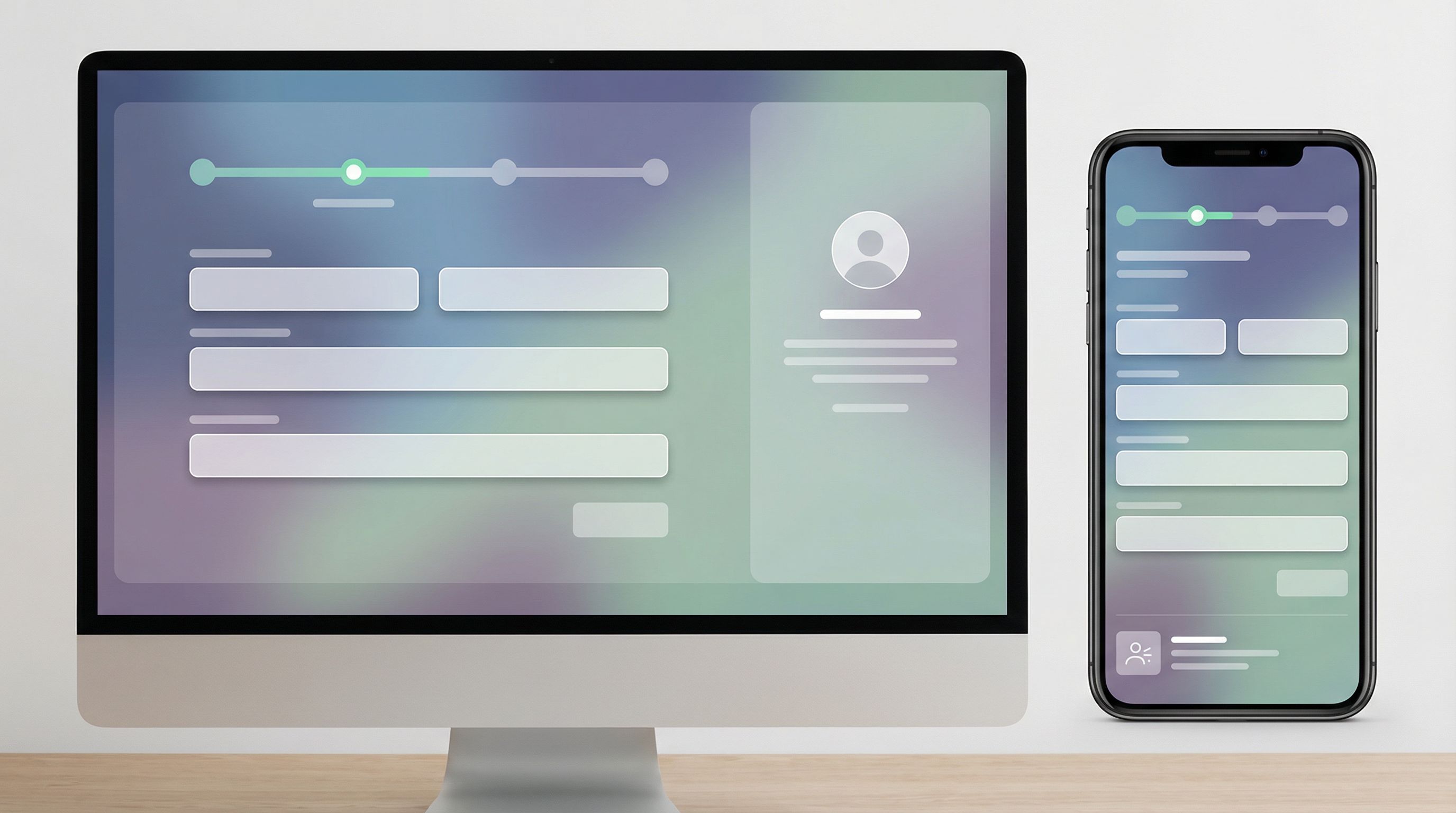
What a Form‑as‑Microsite Actually Looks Like
Think of a form‑as‑microsite as a guided story with structure. Instead of:
- Hero section
- Feature grid
- Testimonials
- FAQ
- Footer
- Small form in the corner
…you have a multi‑step flow where each step does both jobs: educate and capture.
Core building blocks
A strong microsite‑style form usually includes:
-
A clear, ownable URL
Something likeyourbrand.com/forms/partner-launch-2026or a custom Ezpa.ge URL. The URL matches the campaign, channel, or audience. -
A theme that feels like a page, not a widget
- Full‑bleed background or card layout
- Big, legible typography
- Brand colors and button styles
- Room for short narrative copy on each step
-
A visible journey indicator
- Step counter (1/4, 2/4, …)
- Section labels (About you → Your use case → Details → Confirm)
-
Microcopy that replaces missing page sections
Instead of a separate “Why this matters” block, you embed that into the question labels, helper text, and step intros. -
Logic that feels like navigation
Conditional steps, branching, and optional sections give people a sense of moving through a small site—even though they’re always in the same form shell. -
Post‑submit states that act like thank‑you pages
Rich confirmation screens with next steps, links, and optional calendar embeds.
When to Use a Form as a Microsite
Form‑as‑microsite flows shine when:
-
You’re running many one‑off campaigns
Webinars, co‑marketing offers, regional promos, beta waitlists. -
You have constrained design/dev capacity
Ops and marketing need to move faster than the main site roadmap. -
You care more about qualified responses than pageviews
Sales, support, and hiring funnels where every submission is high‑value. -
You’re testing new positioning or visual directions
Instead of a full site redesign, you can wrap your flows in new themes. This pairs nicely with ideas from Theme‑First Branding. -
You need strict data structure and auditability
Especially if you’re already using something like Ops‑Ready Form Logs to track changes.
You don’t have to replace every landing page. But for one‑off, form‑centric offers, a microsite‑style form is often a better default.
Designing Your First Microsite‑Style Form
Let’s walk through how to build one of these flows step by step in a tool like Ezpa.ge.
1. Start with the job, not the layout
Before you touch themes or URLs, answer:
- What decision do we want someone to make by the end of this flow?
- What information does your team need to act confidently on that decision?
- What reassurance does the user need to feel good about submitting?
Write this out in a simple doc. That becomes your blueprint.
2. Map the journey into 3–5 steps
Resist the urge to create a 12‑step epic. Most high‑intent flows can be expressed in 3–5 steps:
- Context – Who are you and what brought you here?
- Fit – What are you trying to achieve / what’s your use case?
- Details – The fields your team actually needs (budget, timing, account IDs, etc.).
- Extras (optional) – Attachments, preferences, nice‑to‑have questions.
- Confirm – Summary and consent.
Each step should:
- Have a short, clear heading (e.g., Tell us about your team).
- Include 1–4 questions max.
- Use helper text instead of separate “education” sections.
3. Turn your brand into a reusable theme
This is where the “theme‑driven” part matters.
Rather than styling each form from scratch, define a theme that captures your brand:
- Primary/secondary colors
- Button styles and hover states
- Field borders and focus states
- Typography scale (H1, H2, body, caption)
- Spacing and card layout
If you’re managing multiple brands or partner programs, take inspiration from Theme Tokens, Not One‑Off Styles and define tokens like:
color.action.primaryradius.fieldshadow.card
Then create themes that reference those tokens. In Ezpa.ge, you can apply a theme to any new flow, so every microsite‑style form ships on‑brand by default.
4. Treat the URL like navigation and routing
A form‑as‑microsite lives or dies on URL clarity.
Good patterns:
- Use human‑readable slugs:
/partner-application,/vip-demo,/beta-waitlist. - Encode channel or campaign where helpful:
/demo/paid-linkedin,/demo/email-q1. - Keep a simple taxonomy so your ops team can tell what’s what at a glance. (For a deeper dive, see Form Systems, Not One‑Off Links.)
Once the URL is set, use it as routing logic:
- Map
?source=linkedinor/linkedinvariants to different hidden fields. - Adjust copy or field defaults based on URL parameters.
- Route submissions differently in your sheet or CRM based on the URL they came through.
This lets you run multiple “microsites” off a single core form when needed, instead of cloning endlessly.
5. Embed your story into the flow
Without a full landing page, your form has to carry more narrative weight. That doesn’t mean long paragraphs; it means smart, concise copy in the right places.
Use:
- Step intros: One or two sentences explaining what this step is for and what happens next.
- Helper text: Under field labels, clarify why you’re asking and how the data will be used.
- Inline reassurance: Small notes about response times, privacy, or what to expect.
Examples:
- “We’ll use this to match you with the right onboarding specialist—no sales spam.”
- “Most customers see value within 2 weeks; these questions help us get you there faster.”
Making It Operational: Sheets, Routing, and Iteration
A microsite‑style form isn’t just a nicer front end. It’s an ops primitive.
Real‑time syncing to your “ops brain”
With Ezpa.ge, every submission can sync in real time to Google Sheets. From there, you can:
- Filter by source URL, channel, or campaign.
- Build views for different teams (sales, CX, partnerships).
- Trigger downstream automations (Slack alerts, email sequences, task creation).
If you’re already using Sheets as your operational hub, the ideas in Google Sheets as Your Ops Brain plug in directly: use formulas, filters, and add‑ons to turn form data into a live decision engine.
Routing based on intent and context
Because your “page” is the form, you can route on anything you collect:
- High‑intent demo requests → instant Slack ping + calendar link.
- Low‑intent newsletter signups → nurture sequence.
- Complex support issues → specialized queue with extra fields.
Smart routing is especially powerful when you’re replacing traditional support portals, as covered in Forms for Service Teams.
Versioning without breaking URLs
One of the biggest headaches with traditional landing pages is version control:
- Someone edits the page for a new campaign.
- Old traffic is still hitting the same URL.
- Analytics and attribution get muddy.
With form‑as‑microsite flows, you can:
- Keep the URL stable.
- Iterate on fields, copy, and logic inside the form.
- Use lightweight logs (like Ezpa.ge’s change history) to see who changed what and when.
This is where ops‑ready logging really pays off: you can run experiments without losing the ability to audit.
Common Pitfalls (and How to Avoid Them)
As with any pattern, there are ways to get this wrong. Here are a few traps to watch for.
1. Rebuilding a full site inside your form
If your microsite‑style form starts to look like a mini homepage with long sections, you’ve gone too far.
Fix:
- Keep each step focused on a single decision or topic.
- Move dense content (like case studies) to optional links or post‑submit resources.
2. Asking everything at once
Just because you can add 20 fields doesn’t mean you should.
Fix:
- Start with the minimum needed for a meaningful next step.
- Use follow‑up flows (email, in‑product prompts, account setup) to gather the rest.
3. Ignoring mobile
A form can technically be responsive and still be painful on a phone.
Fix:
- Test your form on common mobile devices.
- Prefer bigger tap targets, fewer fields per step, and clear back/next controls.
- Avoid long dropdowns where a simple multiple‑choice grid would work.
For more depth on this, see Form UX for Tiny Screens.
4. Letting themes drift
If every team tweaks colors and spacing “just a little,” you’re back to one‑off pages.
Fix:
- Lock core themes and expose only safe knobs (e.g., accent color, header image).
- Document when to create a new theme vs. reuse an existing one.
5. Treating confirmation as an afterthought
Your confirmation screen is part of the microsite. Don’t waste it on a generic “Thanks.”
Fix:
- Use confirmation to set expectations: response time, next steps, links.
- Consider embedding a calendar, resource links, or a short video.
Putting It All Together: A Simple Blueprint
Here’s a concrete blueprint you can adapt for your first form‑as‑microsite in Ezpa.ge.
-
Define the purpose
- Example: Qualify high‑intent demo requests for Enterprise plans.
-
Sketch the steps
- Step 1: About your company (name, size, region).
- Step 2: What you’re trying to solve (multiple choice + short text).
- Step 3: Technical and commercial details (timeline, budget range, integrations).
- Step 4: Contact + consent.
-
Apply a theme
- Use your primary brand theme.
- Add a hero headline on Step 1 and concise intros on each subsequent step.
-
Set a clean URL
- Example:
yourbrand.ezpa.ge/enterprise-demo.
- Example:
-
Wire up Sheets
- Sync submissions to
Enterprise_Demo_Leads. - Add columns for
source,campaign, andform_version.
- Sync submissions to
-
Add routing logic
- If
company_size >= 200andtimeline <= 3 months, send Slack alert to sales. - Otherwise, tag for nurture sequence.
- If
-
Ship, then iterate
- Watch completion rate, time on step, and drop‑off.
- Adjust copy or step order—not the URL.
Summary
Form‑as‑microsite flows recognize a simple truth: the form is already where the real decision happens.
By making the form the primary surface—with strong themes, clear URLs, and multi‑step journeys—you can:
- Ship campaigns faster, without waiting on full page builds.
- Keep branding consistent across dozens or hundreds of flows.
- Give users a focused, mobile‑friendly experience.
- Wire submissions directly into your operational brain (often Google Sheets).
- Iterate safely, with logs and governance instead of brittle one‑offs.
You don’t have to rebuild your entire marketing stack to start. Pick one high‑intent flow and treat it like a microsite. Let the results guide what you do next.
Your Next Step
If you’re still shipping a new landing page for every campaign, partner, or intake flow, this is your moment to try a different pattern.
- Choose one upcoming campaign or form‑heavy project.
- Open Ezpa.ge and design it as a theme‑driven, multi‑step form with a clean custom URL.
- Sync it to a Google Sheet, add basic routing, and ship.
From there, you can:
- Standardize themes so every new form feels like part of a system.
- Evolve your URL taxonomy so ops can actually reason about links.
- Gradually replace brittle one‑off landing pages with flows your team can own.
The easiest way to see what’s possible is to build one. Open Ezpa.ge, create a new form, pick a theme, and turn your next “simple landing page” into a microsite‑style flow instead.