Theme Tokens, Not One-Off Styles: Building a Form Design System That Scales Across Brands

If you only ship a handful of forms a year, one-off styling is annoying but survivable.
If you’re:
- Running multiple brands or sub-brands
- Supporting different regions, languages, and partner programs
- Shipping new campaigns every week
…then one-off styling turns into a tax. Every color tweak, every logo swap, every “can we make the buttons more on-brand for Partner X?” becomes another brittle fork of your form UI.
Theme tokens are how you stop paying that tax.
Instead of hard-coding styles directly into each form, you define tokens—named design decisions like color.action.primary or radius.field—and group them into themes. Components and layouts reference tokens, not raw values. Swap the theme, and the same form system instantly adapts to a new brand.
For teams using Ezpa.ge to power signups, feedback, and intake flows, this isn’t just a nice abstraction. It’s the difference between:
- Maintaining 15 slightly different “demo request” forms, or
- Maintaining one form system that can wear 15 different outfits on demand.
Let’s walk through how to think in tokens, how to set them up for multi-brand reality, and how to plug that into a form stack like Ezpa.ge + Google Sheets.
Why Theme Tokens Matter for Form-Heavy Teams
Design tokens have become a core building block of modern design systems: they’re named variables that store design attributes like color, typography, spacing, and radius, and act as a single source of truth across platforms and products.(en.wikipedia.org) When you pair them with theming, you get a powerful lever:
Change one theme file, and every form wearing that theme updates—without touching the components.
For form-heavy teams, that unlocks several advantages.
1. Multi-brand, Single System
Multi-brand case studies consistently show that a tokenized system lets one component library serve multiple brands with different visual identities—often cutting delivery time by 50–60%.(mikeheaver.co.uk)
Applied to forms, that means:
- One set of form components (inputs, selects, steppers, error states)
- Many brand themes layered on top
- No need to rebuild forms when you add a new logo, palette, or type stack
2. Faster, Safer Iteration
Tokens turn risky redesigns into reversible experiments:
- Want to test higher-contrast buttons on your onboarding form? Tweak
color.action.primaryin a variant theme. - Want to try a softer, more editorial look for research surveys? Adjust
radius.cardandfont.family.display.
Because tokens abstract the underlying values, you can run these experiments without touching component code or layout logic.
If that sounds familiar, it’s the same principle we use in Theme-First Branding: Using Form Skins to Test Positioning Before You Redesign Your Site. Tokens are how you make those “skins” systematic instead of one-off.
3. Consistency Without Policing
When every designer and operator can pick any color from a palette or tweak padding by hand, you inevitably get:
- Slightly different button styles across forms
- Inconsistent error messaging or helper text
- Layouts that feel “off” but are hard to diagnose
Tokens act as guardrails:
- You don’t choose a random blue; you choose
color.action.primary. - You don’t guess a radius; you choose
radius.field.
That reduces review overhead and keeps forms feeling cohesive even as non-designers build and modify them—something we talk about deeply in Form UX for Busy Operators: How to Build Flows Your Team Can Update Without a Designer or Developer.
4. Accessibility and Modes Baked In
A good token system can store values for multiple modes—light, dark, and high-contrast—inside the same semantic token, so components stay accessible across contexts without custom overrides.(sap.com)
For forms, that means you can:
- Launch a high-contrast theme for compliance-sensitive flows
- Support dark mode without duplicating components
- Guarantee minimum contrast ratios at the token level
From One-Off Styles to Tokens: A Mental Shift
Before we dive into steps, it helps to reframe how you think about form styling.
Most teams start like this:
- “Make this button orange for Brand A.”
- “Use 12px radius on cards for Brand B.”
- “Change the headline font on the hiring form.”
Each decision is applied directly to a specific element.
With tokens, you instead ask:
- “What is our primary action color?” →
color.action.primary - “What is our default field radius?” →
radius.field - “What is our form headline style?” →
font.form.heading
Forms never talk to hex codes or font stacks directly. They talk to tokens. Themes decide what those tokens mean for a given brand.
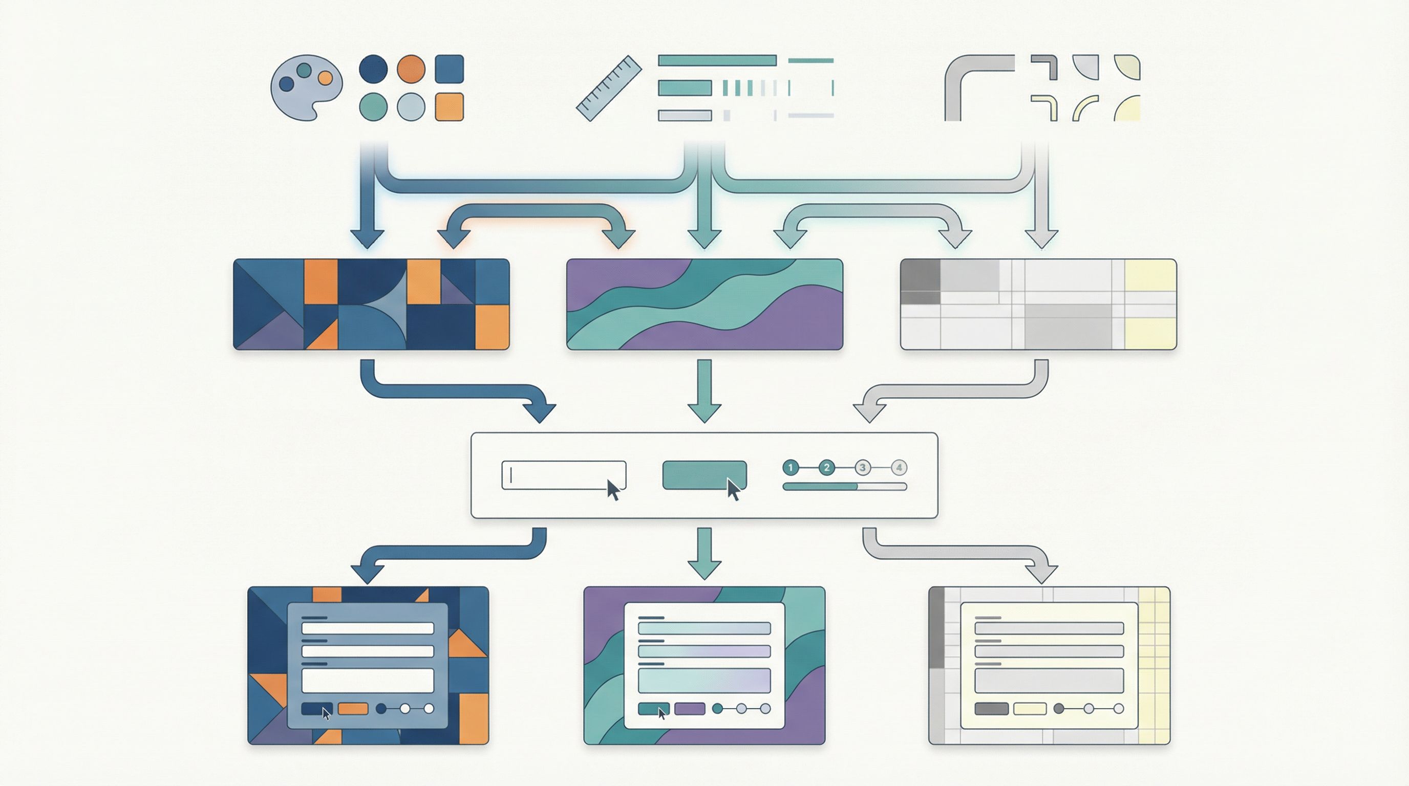
Think of tokens as:
- Primitives – raw values like
color.blue.500orspace.16 - Semantic tokens – purpose-driven names like
color.action.primaryorspace.form.gap
Multi-brand systems typically use primitives as the stable base and semantic tokens as the layer that maps brand intent to actual values.(mikeheaver.co.uk)
Step 1: Define the Core Form Token Set
Start with a brand-agnostic core. This is the set of tokens that should mean the same thing across every brand, even if the values differ.
For forms, focus on:
Color
color.background.pagecolor.background.formcolor.text.defaultcolor.text.mutedcolor.action.primarycolor.action.secondarycolor.border.fieldcolor.border.focuscolor.status.successcolor.status.error
Typography
font.family.basefont.family.accentfont.size.bodyfont.size.labelfont.size.headingfont.weight.headingline.height.body
Spacing & Layout
space.form.paddingspace.field.gap(between label, input, and help text)space.section.gap(between form sections)space.button.inlinespace.button.stack
Shape & Elevation
radius.fieldradius.cardshadow.cardborder.width.field
Motion (Optional but Powerful)
motion.focus.durationmotion.focus.easingmotion.submit.feedback.duration
These tokens should not reference a specific brand in their names. They describe roles and relationships, not colors or logos.
Tip: If you can’t explain when a token should be used without showing a screenshot, it’s probably too specific. Pull it back up a level.
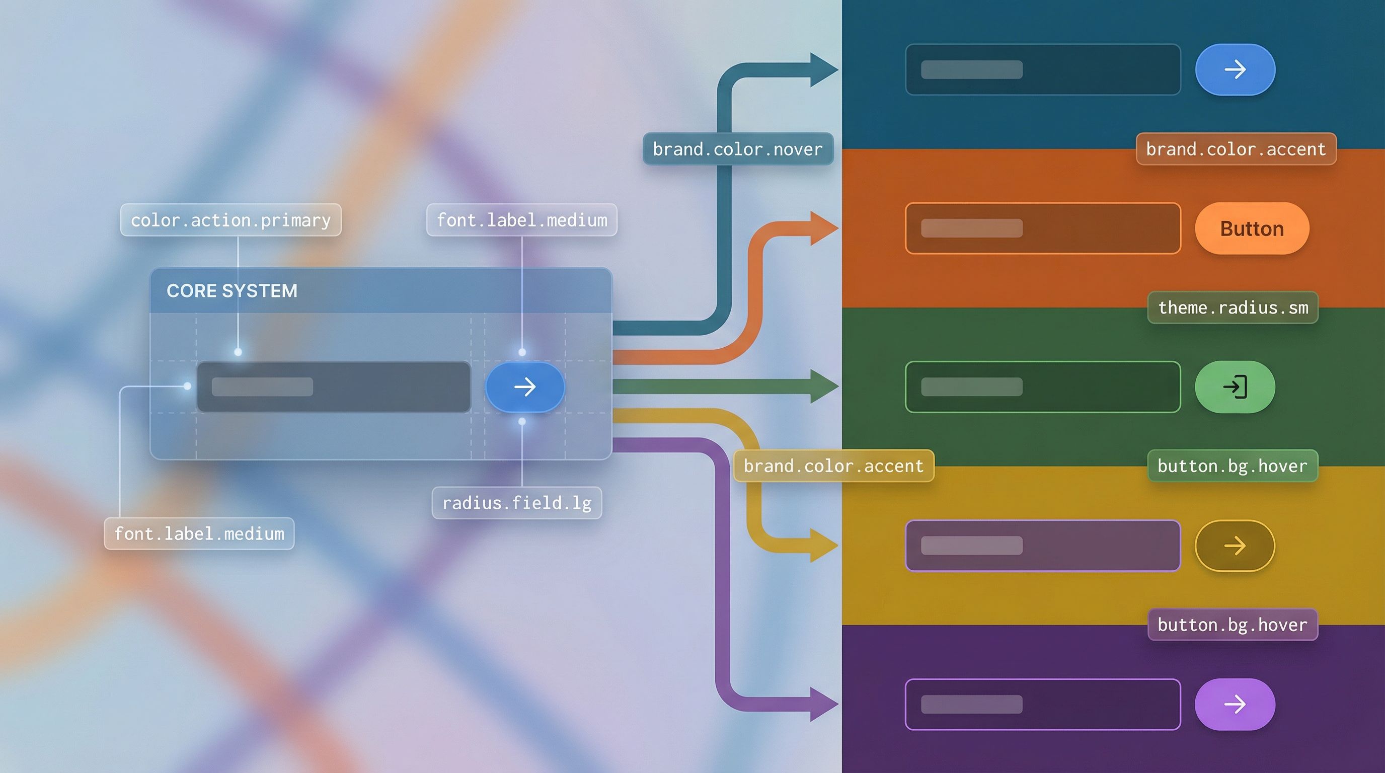
Step 2: Map Tokens to Form Components
Next, wire your components to the token system. Whether you’re working in Figma, code, or Ezpa.ge’s theming layer, the idea is the same: components depend on tokens, never on raw values.
Take a simple text field component:
- Label color →
color.text.default - Helper text color →
color.text.muted - Input background →
color.background.form - Input border (rest) →
color.border.field - Input border (focus) →
color.border.focus - Error message →
color.status.error - Padding →
space.field.gap - Radius →
radius.field
A primary button on the same form might use:
- Background →
color.action.primary - Text →
color.text.onAction(another semantic token) - Padding →
space.button.inline - Radius →
radius.field
Once that mapping is in place, you can:
- Swap themes per brand without touching components
- Add new brands by defining a new token set
- Run experiments (e.g., higher contrast) at the token level
This is also where Ezpa.ge’s custom themes shine: you can encode these token decisions in your theme configuration and reuse them across many forms, instead of restyling each form from scratch.
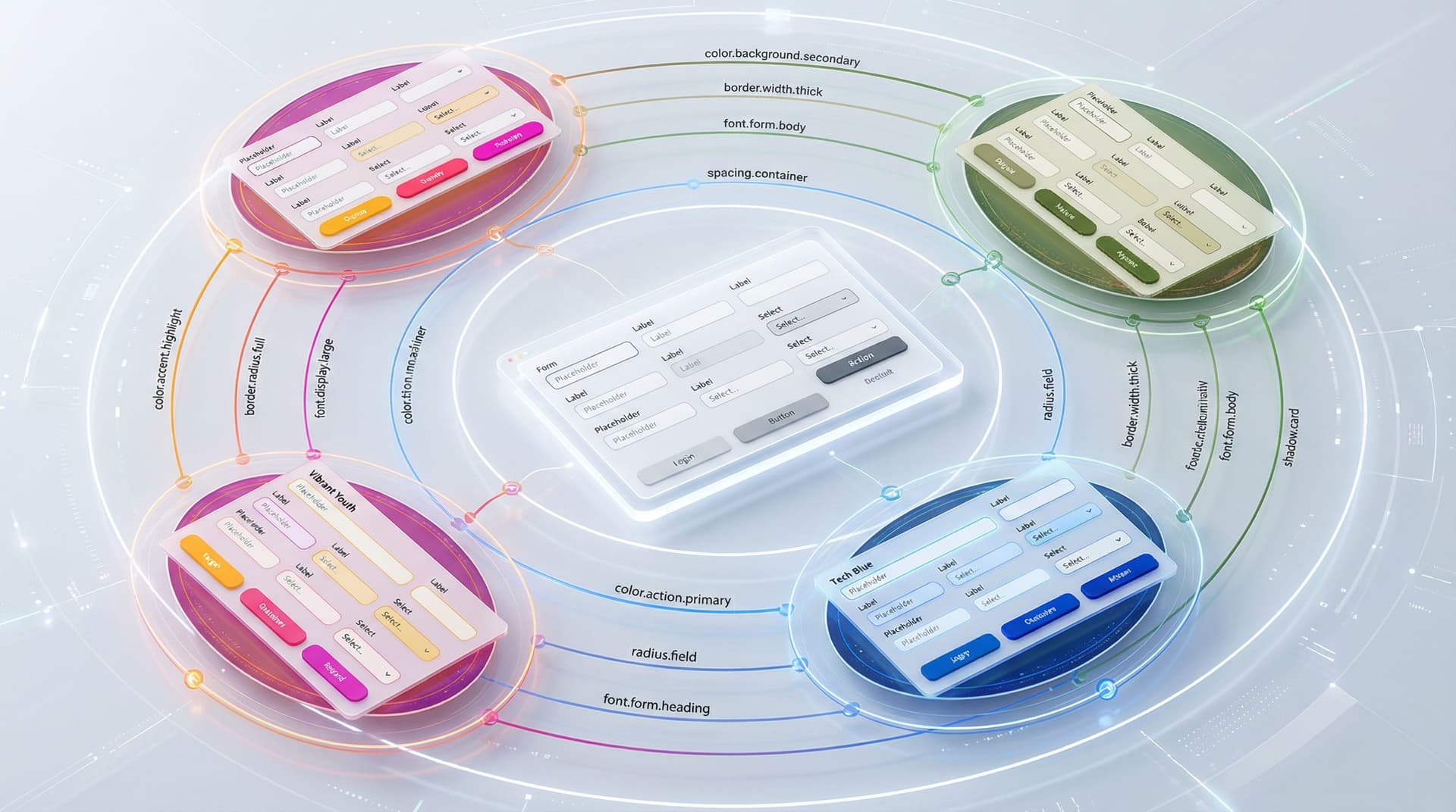
Step 3: Design a Multi-Brand Token Architecture
With a core token set and component mapping in place, you’re ready to go multi-brand.
Most successful systems follow a layered structure:(thesigma.co)
- Global primitives – shared across all brands
color.blue.500,color.orange.500,space.16,radius.8
- Brand theme tokens – mapping primitives to semantic roles
- Brand A:
color.action.primary = color.orange.500 - Brand B:
color.action.primary = color.blue.500
- Brand A:
- Component tokens (optional) – fine-grained control for specific components
button.primary.background = color.action.primaryfield.default.border = color.border.field
This gives you three key benefits:
- Reusability – structure and semantics stay consistent across brands
- Flexibility – each brand can have its own palette and type system
- Safety – changes to a brand theme don’t accidentally leak into others
In practice, that might look like:
// primitives.json
{
  "color.blue.500": "#0066FF",
  "color.orange.500": "#FF7A00",
  "space.16": "16px",
  "radius.8": "8px"
}

// brand-a.theme.json
{
  "color.action.primary": "{color.orange.500}",
  "radius.field": "{radius.8}",
  "space.form.padding": "{space.16}"
}

// brand-b.theme.json
{
  "color.action.primary": "{color.blue.500}",
  "radius.field": "{radius.8}",
  "space.form.padding": "{space.16}"
}
Your Ezpa.ge forms don’t care whether they’re serving Brand A or Brand B—they just ask for color.action.primary. The active theme decides what that means.
Step 4: Connect Tokens to Your Form Builder and Sheets
Tokens are only useful if they reach the tools where you actually ship forms.
In Your Design Tool
If you’re using Figma, you can:
- Use Variables and collections to represent token sets per brand
- Store primitives in one collection, themes in another
- Bind form components (inputs, selects, radios) to variables, not local styles
This mirrors what many multi-brand design system teams do with Figma variables and theme collections to support brand toggling.(don.design)
In Ezpa.ge
Ezpa.ge already gives you:
- Custom themes – to encode your token values
- Custom URLs – to route traffic to the right branded form variant
- Real-time Google Sheets syncing – to keep data structured across brands
A token-based approach lets you:
- Maintain a base form (fields, logic, validation)
- Attach different themes per brand, region, or partner
- Use URL-level routing (see also Custom URLs as Routing Logic: Directing Traffic by Intent, Channel, and Buyer Stage) to send people to the right theme without duplicating the form logic
In Google Sheets
Tokens don’t live in Sheets, but they shape the data you get there:
- Consistent field spacing and labeling → fewer user errors → cleaner data
- Accessible color and contrast → higher completion rates
- Consistent error patterns → easier to debug drop-offs with analytics
Combine your Ezpa.ge forms with the workflows in Google Sheets as Your Ops Brain: Advanced Form-Driven Workflows Beyond Simple Syncing, and you end up with a system where:
- Themes handle brand expression
- Forms handle structure and logic
- Sheets handle operations and routing
Each layer is decoupled, but they all speak the same language.
Step 5: Govern Tokens Without Slowing Down
A token system can rot just as easily as a style guide if no one looks after it. The trick is lightweight governance that keeps things coherent without turning every change into a committee meeting.
A few practical patterns:
1. Define a Small “Core Council”
- A designer, a front-end engineer, and an operator
- Owns the core token set and theme architecture
- Reviews new tokens and deprecations
2. Document Usage, Not Just Values
For each token, capture:
- What it’s for – e.g., “Use
color.action.primaryfor the main action on any form, once per view.” - What it’s not for – e.g., “Don’t use for secondary links or text-only buttons.”
- Examples – screenshots of good and bad usage
3. Create a Deprecation Path
Tokens will evolve. Plan for it:
- Mark tokens as
@deprecatedin your source - Keep them mapped for a release or two
- Provide a migration guide: “Replace
color.button.primarywithcolor.action.primary.”
4. Bake Tokens into Your Form Templates
In Ezpa.ge, create starter templates for:
- Demo request
- Support intake
- Candidate application
- Research survey
Each template should:
- Use the same token-backed theme
- Follow the same spacing and typography rules
- Be easy to clone for new brands by swapping themes, not editing styles
This is how you avoid the “one-off link” trap we describe in Form Systems, Not One-Off Links: Designing a URL Taxonomy That Scales With Your Ops.
Step 6: Start Small, Prove the Value, Then Scale
You don’t have to freeze everything and launch a perfect token system in one go. In fact, you shouldn’t.
Instead:
- Pick one high-leverage flow.
- A demo request form, a partner intake flow, or a hiring application.
- Define a minimal token set for that flow.
- Colors, typography, spacing, radius.
- Refactor the form to use tokens.
- In Figma, in Ezpa.ge themes, or in code—wherever your source of truth lives.
- Create a second theme for a second brand.
- Same structure, different values.
- Measure impact.
- Time to launch a new brand variant
- Number of style bugs or inconsistencies
- Form completion and error rates
Once you’ve proven that a tokenized approach lets you ship new branded variants in days instead of weeks—and keep them consistent—you’ll have the leverage to extend the system across more flows.
Bringing It All Together
A token-based theming system for forms isn’t about aesthetics. It’s about:
- Speed – ship new brand variants without rebuilding forms
- Safety – keep accessibility and consistency baked into the foundation
- Control – let operators and marketers move fast without breaking your brand
When you:
- Define a clear, brand-agnostic core token set
- Map tokens to form components instead of hard-coded values
- Layer brand themes on top of shared primitives
- Connect those themes to Ezpa.ge forms and URL routing
- Govern tokens lightly but deliberately
…you turn forms from a pile of one-offs into a scalable design system that can stretch across brands, regions, and campaigns without losing its shape.
Summary
- Theme tokens are named design decisions (like
color.action.primary) grouped into themes; forms reference tokens, not raw styles. - A multi-brand architecture layers global primitives → brand theme tokens → component tokens, letting one component library serve many brands.
- Wiring form components to tokens means you can swap brand themes, support dark/high-contrast modes, and run visual experiments without touching form logic.
- Tools like Ezpa.ge plus Google Sheets become more powerful when they sit on top of a tokenized design system: themes handle expression, forms handle structure, Sheets handle operations.
- You don’t need a big-bang rollout. Start with one critical flow, refactor it to tokens, add a second theme, and prove the speed and consistency gains.
Your Next Step
If your team is juggling more than one brand—or even just lots of campaigns that all “need their own look”—this is the moment to move from one-off styles to theme tokens.
You don’t have to redesign everything. Start with:
- Listing the colors, type styles, and spacing rules your best-performing form already uses.
- Turning those into a small, semantic token set.
- Encoding that set as a reusable theme in Ezpa.ge and applying it to your next form.
From there, add a second theme for a second brand or campaign and see how quickly you can ship a polished, on-brand variant without touching the form’s structure.
Let your forms be the proving ground for a token-based design system that can scale across brands—long before you commit to a full-site redesign.