Form UX for Side Projects: Spinning Up Launch-Ready Intakes Before You Have a Website


Side projects rarely start with a polished marketing site.
They start with a hunch:
- “People keep asking me for this—maybe I should spin up a beta.”
- “I’m not ready for a full product, but I want to validate this offer.”
- “I just need a way to collect interest, feedback, or early customers.”
What you do need right away is a way for people to raise their hand.
That’s where form UX becomes your unfair advantage. A well-designed intake form can function as your:
- Landing page
- Lead capture
- Qualifier
- Lightweight onboarding
All before you’ve written a single line of frontend code or opened a site builder.
This post is about treating forms as your first product surface—not a temporary hack—so you can launch faster, learn faster, and make better decisions about what to build next.
Why Forms Are the Perfect First Surface for a Side Project
When you’re working nights and weekends, you’re optimizing for momentum. A form-centric approach gives you that in a few important ways:
1. You can launch in hours, not weeks.
No layout decisions. No navigation. No CMS. A focused intake built with a tool like Ezpa.ge can be:
- Branded enough to feel real
- Structured enough to be useful
- Simple enough to share anywhere (email, DM, social, QR)
2. You capture intent while it’s still warm.
If someone hears about your idea on a podcast, sees a tweet, or gets a referral, you want a link you can send right now.
A clean, trustworthy form URL is all you need to:
- Collect emails for a beta waitlist
- Qualify consulting leads
- Capture feedback on a concept
- Pre-sell a cohort or workshop
(If you want to go deeper on turning those intakes into long-term assets, check out From Form to Lead Magnet: Turning Simple Intakes into Evergreen Assets for Your Funnel.)
3. You don’t have to guess what to build.
Every field you add (or remove) is a hypothesis:
- “Do people care more about feature A or outcome B?”
- “Is this for solo founders or small teams?”
- “Is price sensitivity the blocker?”
Your form becomes a structured interview that runs 24/7. With real-time Google Sheets syncing, you can watch patterns emerge:
- Which use cases show up most often
- Which segments are actually responding
- What language people use to describe their problems
4. You avoid premature complexity.
Instead of:
- Building a full onboarding flow
- Wiring a complex CRM
- Designing a custom dashboard
…you can start with a single sheet and a few automations. As you learn, you can graduate from “interest list” to “lightweight CRM” to “full product onboarding”—without throwing away your early data.
Start With the Job, Not the Fields
Before you open a form builder, answer one question:
What job is this form doing for you and for them?
For a side project, the job is usually one of these:
- Validate demand – “Do enough people care about this that I should keep going?”
- Shape the product – “What should I build first, for whom, and why?”
- Prepare for onboarding – “If this works, how do I quickly get people to a ‘first win’?”
- Capture revenue opportunities – “Who’s willing to pay, and for what?”
Pick one primary job. Everything else is secondary.
Then design backwards from that job:
- What decision will you make once you have 20, 50, or 100 submissions?
- What minimum information do you need to make that decision confidently?
That’s your field list.
If you’re tempted to ask for more, revisit The Minimal Field Manifesto: How Fewer Inputs Can Actually Enrich Your First-Party Data. The short version: fewer, better questions often give you richer, more honest answers.
Designing a Launch-Ready Intake Without a Website
Let’s walk through a practical pattern you can reuse for almost any side project.
1. Choose a URL That Feels Like a Promise
If your form is your only surface, the URL carries a lot of weight. It’s:
- What people see when they hover over a link
- What gets read aloud on a podcast
- What someone pastes into Slack or WhatsApp
Aim for URLs that:
- Match the offer.
ezpa.ge/podcast-booking,ezpa.ge/founder-betas,ezpa.ge/landing-page-teardowns. - Avoid mystery meat.
ezpa.ge/form-123doesn’t signal anything. - Can be spoken easily. No tongue-twisters or random strings.
If you want to go deeper on how URLs influence behavior, The URL Is the New CTA: How Link Structure Shapes Ad Performance More Than Button Copy is worth a read.
2. Treat the Header as Your “Mini Landing Page”
Without a full site, the top of your form has to do extra work:
- Explain what this is
- Set expectations
- Reduce anxiety
You don’t need a wall of copy. You do need clarity.
Pattern you can reuse:
- Title: Outcome-focused, not feature-focused.
- “Join the early access list for a simpler client reporting workflow.”
- “Get 1:1 landing page feedback before you launch.”
- Subtitle: Who it’s for + what happens next.
- “For freelancers and small agencies shipping monthly reports. We’ll email you within 48 hours if you’re a fit for the beta.”
- Micro-bullets (optional): 2–3 points that answer “Why bother?”
- “No spam, ever.”
- “We’ll share aggregated insights from this beta with everyone who joins.”
Keep the tone human and specific. You’re not writing a pitch deck; you’re writing a friendly invitation.

3. Ask Only What You’ll Actually Use (Now)
Side project forms often fail because they try to be a CRM, product analytics, and user research study all at once.
Instead, ask:
- What will I definitely use in the next 30 days?
- What can I infer later from behavior, not ask upfront?
A simple structure that works well:
- Contact basics
- Email (required)
- Name or handle (optional but helpful)
- Segmenting question
- “Which best describes you?” with 3–5 options max.
- Use case / goal
- Short multiple choice + optional free-text.
- Urgency / timing
- “When are you hoping to start?” with clear ranges.
- Open-ended context (one field max)
- “Anything else we should know?”
A few tips grounded in UX research:
- Use multiple choice where you can. It’s faster and gives you cleaner data.
- Reserve textareas for high-signal questions. People will write more when they feel it matters.
- Mark required fields sparingly. Everything required should have an obvious reason.
If you expect to route people to different paths later (e.g., self-serve vs. high-touch onboarding), design your fields so they map cleanly to that logic from day one.
4. Make the Form Feel “Zero Instruction”
If you need a paragraph of instructions above your form, the form is doing too much.
Borrow patterns from Designing Forms for ‘Zero Instruction’ Use (another Form & Function post):
- One concept per row. Don’t cram unrelated fields side by side.
- Logical grouping. Contact → context → expectations → consent.
- Plain language labels. “What are you hoping this helps you do?” beats “Primary value proposition sought.”
- Inline hints instead of long descriptions. Short, gray helper text is enough for most fields.
Your goal: someone should be able to skim the labels and complete the form correctly without reading anything twice.
5. Tune the Theme for Where the Link Lives
A side-project form might live in:
- Your Twitter/X bio
- A LinkedIn post
- A QR code on a slide at a meetup
- A DM to a potential beta user
The context changes how the form should feel.
- From a social post: keep it light, high-contrast, mobile-first.
- From a warm intro email: calmer palette, more whitespace, slightly longer copy is okay.
- From a QR code at an event: large text, big tap targets, minimal fields.
If you’re using Ezpa.ge, you can create multiple themes for the same form and tune them for each channel. For a deep dive on this idea, check out Conversion by Context: How to Tune Form Themes for Ads, Email, In-App, and QR Codes.
6. Make the Submit Moment Feel Like a Clear Next Step
The button label and confirmation state are your stand-in for a full onboarding flow.
- Button copy: be specific about what happens.
- “Join the beta waitlist”
- “Request a teardown”
- “Apply for early access”
- Confirmation message: answer three questions quickly:
- Did this work?
- What happens next?
- When should I expect to hear from you?
Example:
“You’re on the list. We’re reviewing submissions weekly and inviting a small batch each Monday. If you’re a fit for this round, you’ll hear from us by next Friday.”
If you’re syncing to Google Sheets, you can even use that confirmation copy as a trigger for your own workflow: “If someone expects a reply by Friday, what do I need to do on Tuesday?”
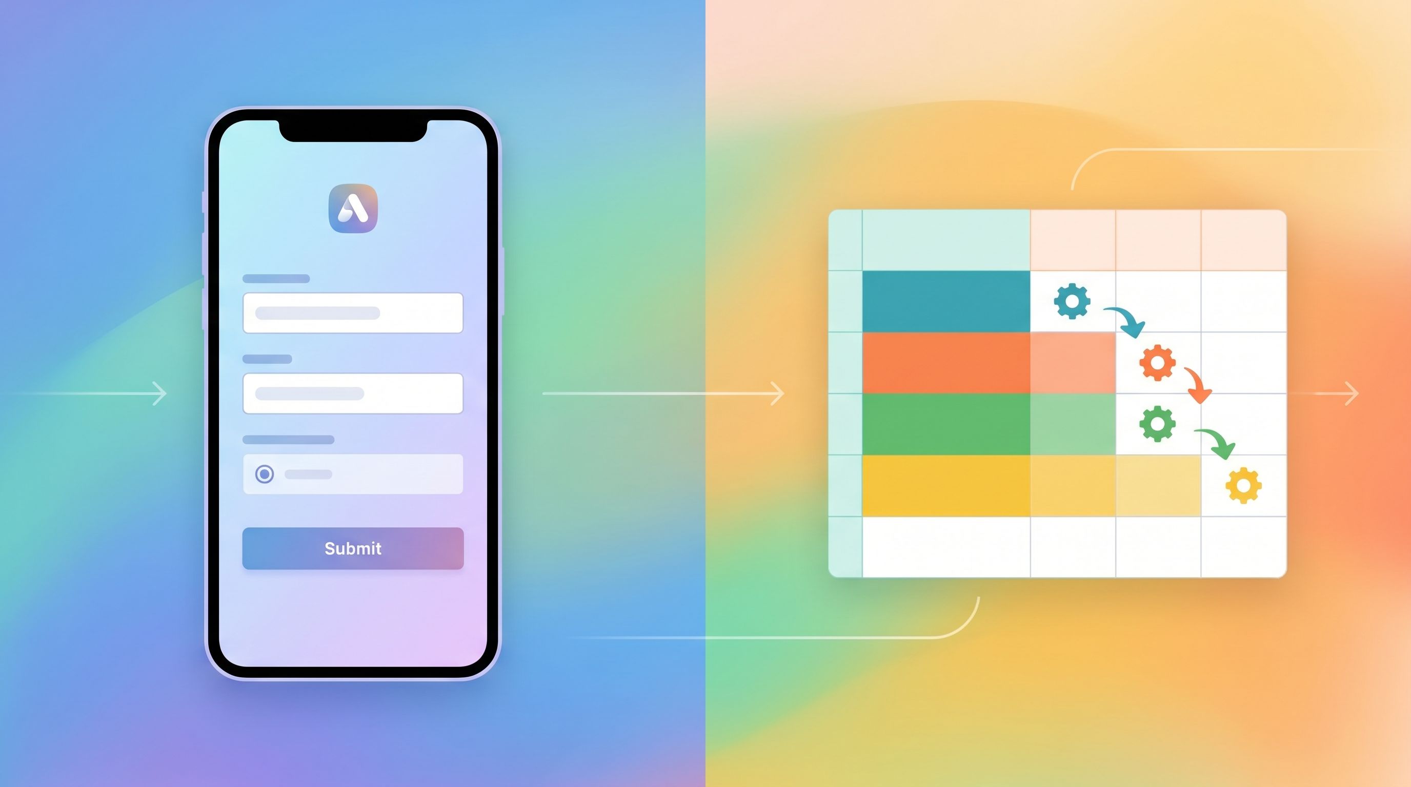
Plugging Your Form Into a Lightweight Ops Stack
A launch-ready intake isn’t just about UX; it’s about what happens after submission.
You don’t need a full CRM to start. You do need a basic, reliable loop:
- Capture – the form itself
- Store – a single Google Sheet
- Act – simple automations
1. Use Google Sheets as Your Control Panel
With real-time syncing, every submission becomes a new row you can:
- Filter by segment or use case
- Sort by “submitted at” to see recency
- Add manual tags like “hot lead,” “beta invited,” or “follow up later”
Over time, that sheet becomes:
- Your early adopter CRM
- Your research repository
- Your roadmap backlog
If you later move to a dedicated tool, you can import this clean, structured data instead of copy-pasting from DMs and email threads.
2. Add Just Enough Automation
Start with one or two automations that save you real time:
- Auto-acknowledge: Send a short, friendly email when someone submits.
- “Got it—thanks for your interest. Here’s what to expect…”
- Flag high-intent submissions:
- Use filters or conditional formatting when someone selects “Ready to start this month” or a high-value segment.
- Create follow-up tasks:
- Use tools like Zapier, Make, or native integrations to create a task in your project tool for certain segments.
The key: don’t automate so much that you lose the human touch. Side projects win on personality and responsiveness.
3. Connect Submissions to a Simple Onboarding Journey
Even without a full product, you can design a basic journey from “submitted” to “engaged.” For example:
- Day 0: Auto-acknowledge email + quick thank-you.
- Day 1–2: Manual, personalized reply to top-priority submissions.
- Day 3–5: Send a short survey or loom video to learn more from highly engaged people.
- Day 7+: Share an update: what you’ve learned so far, what you’re building next.
When you’re ready, you can evolve this into the patterns described in From Form to Onboarding Journey: Mapping Every Submission to Emails, Tasks, and Touchpoints.
Examples of Side-Project-First Forms You Can Ship This Week
To make this concrete, here are a few patterns you can adapt.
1. Beta Waitlist for a SaaS Tool
Job: Validate demand + understand segments.
Core fields:
- “Which best describes you?” (founder, marketer, ops, etc.)
- “What problem are you hoping this solves?” (multiple choice)
- “How urgent is this problem for you?” (low/medium/high)
- Optional: short free-text for extra context
Follow-up: Invite the highest-urgency, best-fit segment to a short call or early access.
2. Consulting or Coaching Intake
Job: Qualify leads + scope engagements.
Core fields:
- Email + name
- Company size or stage
- “What are you hoping to get help with in the next 60 days?”
- Budget range (bands, not open text)
- “How did you hear about this?”
Follow-up: Use budget + timing to decide who gets a call, who gets a resource, and who you politely decline.
3. Course or Cohort Interest List
Job: Gauge demand + prioritize topics.
Core fields:
- Experience level (beginner/intermediate/advanced)
- “Which of these topics are you most interested in?” (multi-select)
- Preferred format (live cohort, self-paced, hybrid)
- Time zone (for scheduling)
Follow-up: Once you have 30–50 responses, design the first cohort around the most common topic + time zone cluster.
Common Pitfalls (and How to Avoid Them)
1. Building the form for yourself, not your users.
If your fields mirror your internal spreadsheet instead of their mental model, you’ll lose people. Rewrite labels and hints in the language they’d use in a conversation.
2. Asking for commitment too early.
“Book a 60-minute call” is a big ask. For early validation, “Join the early access list” or “Tell me what you’re working on” is often enough.
3. Treating the form as throwaway.
The quickest way to create a graveyard of half-broken forms is to spin them up without a plan. Even for a side project, aim for:
- One canonical URL per “job”
- A single sheet as the source of truth
- A simple review cadence (e.g., check new submissions every other day)
4. Ignoring mobile.
Most early traffic will come from social and messaging—i.e., phones. Use a theme that:
- Keeps labels short
- Uses large tap targets
- Avoids side-by-side fields that break on small screens
For more on making forms survive embeds, pop-ups, and small viewports, Responsive by Default: Designing Form Themes That Survive Embeds, Pop-Ups, and In-App Modals is a helpful companion read.
Bringing It All Together
You don’t need a full website to start building a real product.
A single, well-designed form can:
- Tell people what you’re building and for whom
- Capture the right data to shape your roadmap
- Qualify who you should talk to first
- Kick off lightweight, human onboarding flows
If you treat that form as a core part of your product—not just a stopgap—you get to:
- Launch earlier, with less risk
- Learn from real users instead of guessing
- Build an audience and pipeline alongside your product
That’s the essence of form-led side projects: the form is the first version of your product experience.
Your Next Step
If you’ve read this far, you probably have at least one side project idea in the back of your mind.
Here’s a concrete challenge:
- Pick one job your first form will do (validate demand, qualify leads, or shape the product).
- Draft 5–7 fields you’ll actually use in the next 30 days.
- Spin up a branded form in Ezpa.ge with a clear header, focused fields, and a confirmation message that sets expectations.
- Share the URL in one channel this week—social, a community, or a DM to someone you trust.
You don’t need a full site. You just need a link that lets people raise their hand.
Start with the form. Let the rest of the product grow from there.