From Chaos to Components: Creating a Reusable Field Library for Faster Form Builds

If every new form build feels like starting from scratch, you’re not alone.
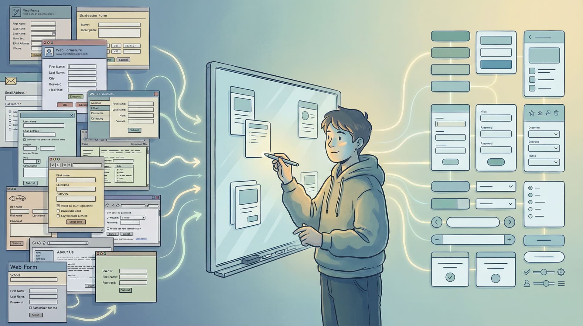
One week you’re cloning last quarter’s signup form. The next, you’re hunting through old Figma files and half-forgotten code snippets. Labels don’t match. Validation is inconsistent. Someone changed the phone field pattern in one place but not another. And every “quick tweak” somehow turns into a mini refactor.
A reusable field library is how you escape that loop.
Instead of designing and implementing fields over and over, you create a set of well-defined, battle-tested components—then assemble them like LEGO. With a good field library, building a new form becomes less “craft project” and more “configuration.”
This post walks through how to get there: from messy one-offs to a flexible, reusable system that works beautifully with tools like Ezpa.ge.
Why a Reusable Field Library Changes Everything
Before we talk about how to build one, it’s worth getting clear on why this matters.
1. Faster builds, fewer meetings
Once you’ve defined your field types (e.g., Text, Email, Phone, Multi-select, Date, Country, etc.), building a new form becomes:
- Choose fields from the library.
- Configure labels, helper text, and options.
- Hit publish.
You’re no longer debating basic details every time:
- “Do we show country code in the phone field?”
- “Should this be radio buttons or a dropdown?”
- “What does the error message say again?”
The decisions live in the components—not in recurring Slack threads.
2. Consistency users can feel (and trust)
Inconsistent forms erode confidence:
- Different date formats across flows
- Slightly different email validation rules
- Error messages that sound like they came from three different teams
A field library enforces:
- Consistent patterns (same behavior for the same input type everywhere)
- Consistent language (aligned with your microcopy standards)
- Consistent accessibility (labels, focus states, ARIA attributes baked into every component)
That consistency quietly boosts completion rates. When people recognize patterns, they move faster and make fewer mistakes.
3. Built-in quality and accessibility
When every field is hand-rolled, accessibility and edge cases are easy to miss.
When you centralize those concerns in a field library, you can:
- Fix an accessibility issue once and roll it out everywhere.
- Upgrade keyboard navigation or focus styles globally.
- Improve error handling across all forms by updating a single component (and pairing it with the strategies from Error States that Convert).
4. Easier experimentation and optimization
If your forms sync live to Google Sheets (like Ezpa.ge does), you can watch how different fields perform and iterate quickly.
With a field library, that looks like:
- Updating a
PhoneFieldcomponent to reduce formatting errors. - Tweaking the
MultiStepProgresspattern to reduce drop-off. - Adjusting inline validation timing across all
EmailFieldinstances.
Instead of manually editing dozens of forms, you change the component, republish, and measure the impact—very much in the spirit of Real-Time Form Optimization.

Step 1: Audit Your Existing Forms (and Find the Real Patterns)
Don’t start by opening your design tool or code editor. Start by looking at what you already have.
Collect your current forms
Gather a representative sample:
- High-traffic signup forms
- Long surveys and feedback forms
- Multi-step onboarding flows
- Niche forms (e.g., regional, internal tools, beta access)
If you’re using Ezpa.ge, list out your existing forms and grab screenshots or exports of each.
Identify your true field primitives
Go through each form and list every unique type of field you’re using. Not every label—every pattern.
Common primitives include:
- Single-line text (name, city, short answer)
- Multi-line text (open feedback, descriptions)
- Email (with format validation)
- Phone (with country code and formatting)
- Number (quantities, budgets, ages)
- Date / Date range
- Time / Time zone selector
- Select dropdown
- Radio group
- Checkbox (single and group)
- File upload
- Consent / legal acknowledgment
Then, note the variants that show up repeatedly, like:
- “Short text with character counter”
- “Email with marketing consent checkbox attached”
- “Address block” (street, city, region, postal code, country)
- “Name block” (first, last, sometimes middle or preferred)
These variants often become composite components later.
Spot inconsistency and friction
As you audit, capture:
- Different labels for the same concept (
Work emailvsBusiness emailvsCompany email) - Different validation rules (phone number required in one form, optional in another)
- Different help patterns (some fields have helper text, some rely on placeholders only)
- Known problem areas (fields with high error rates or drop-off, if you have analytics)
These notes will guide what your field library needs to standardize first.
Step 2: Define Your Field System on Paper First
Before you build anything, write down the system you wish you had.
Create a field catalog
For each primitive and composite field, define:
- Name –
EmailField,PhoneField,AddressBlock - Purpose – what it’s for and when to use it
- Props / configuration – what can be customized
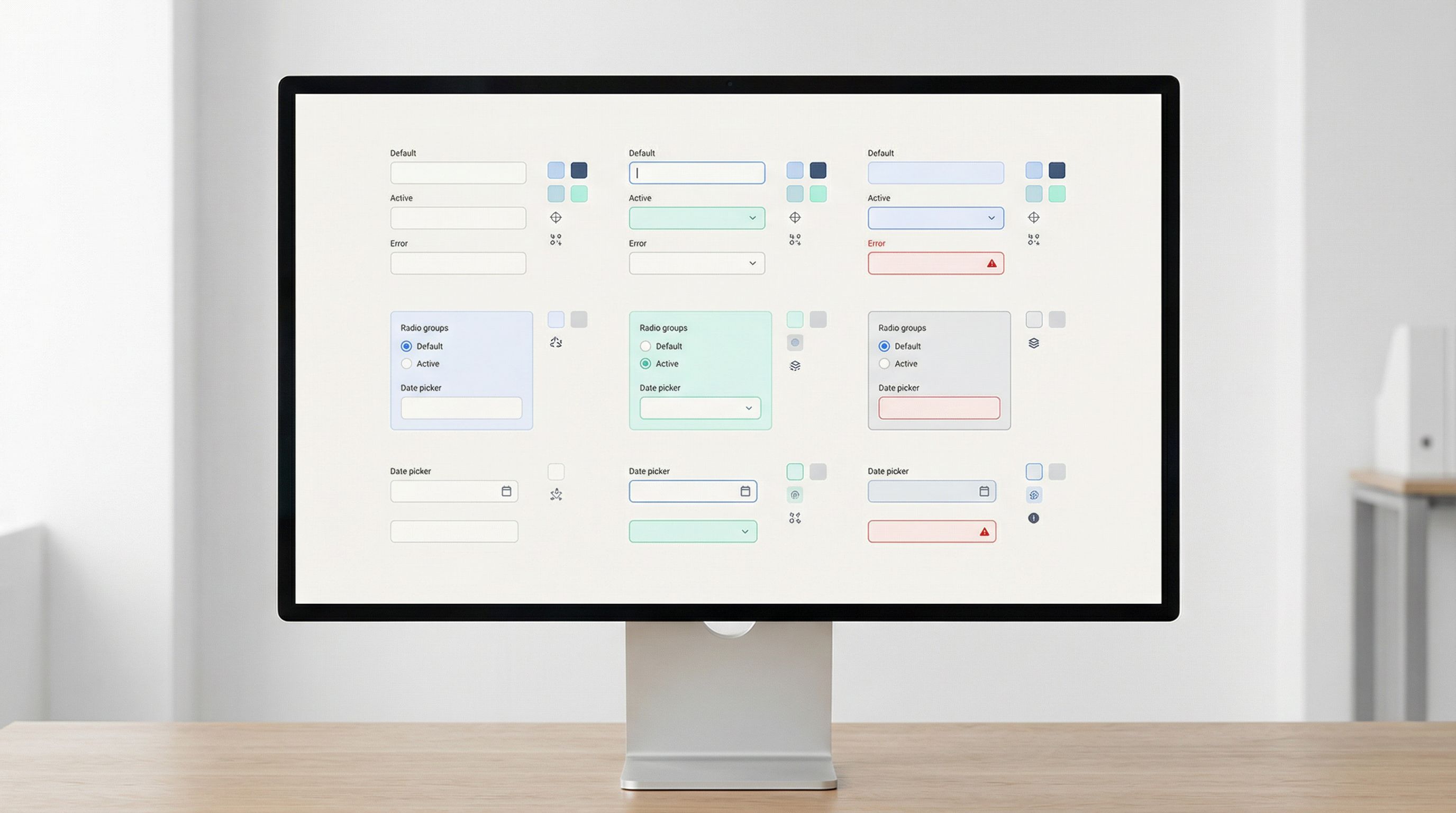
- Validation rules – required, patterns, length, dependencies
- States – default, focused, filled, error, disabled, read-only
- Accessibility requirements – labels, descriptions, ARIA attributes
Think of this as your “API,” even if you’re not a developer.
Example for an EmailField:
- Name:
EmailField - Purpose: Capture a valid email address for login, communication, or marketing.
- Configurable:
label,required,helperText,placeholder,autoComplete,validationMode(onBlur, onSubmit, real-time) - Validation: must contain
@, domain, no spaces; optional stricter pattern for corporate emails if needed. - States:
- Default: neutral border, placeholder visible
- Focus: highlighted border, helper text visible
- Error: red border, inline error message
- Accessibility:
<label>element linked viaforandidaria-invalidon error- Error message linked via
aria-describedby
Decide what’s global vs. configurable
A common failure mode: making everything configurable.
Your goal is to centralize decisions, not just move them.
Ask for each aspect:
- Should this be global (same everywhere)?
- Font size, label position, error color, focus ring style.
- Should this be per field type?
- Email validation pattern, phone formatting behavior, date picker behavior.
- Should this be per instance?
- Label text, whether it’s required, helper text, default value.
If you’re using Ezpa.ge, your “field library” may live partly in:
- A design system (Figma, Sketch, etc.)
- A set of saved form templates you clone and tweak
- A documentation page outlining how to configure each field type in the builder
The key is that everyone on the team knows: when we need X, we use Y component and configure it like this.
Step 3: Turn Your Catalog into Real Components
Now you’re ready to build.
How you implement your field library depends on your stack. You might be:
- Designing a Figma component library for your design team.
- Building React/Vue/Svelte components for your app.
- Creating saved field groups and templates inside Ezpa.ge.
The principles are the same.
Start with the top 8–10 fields
Resist the urge to “do it all” on day one.
Pick the fields that show up in most forms:
- Text (single-line)
- Textarea (multi-line)
- Phone
- Select dropdown
- Radio group
- Checkbox (single + group)
- Date / Date range
Get those right first. You’ll feel the benefits almost immediately.
Bake in states and behaviors, not just visuals
A true field component isn’t just a pretty box. It includes:
- Focus behavior (how it looks and behaves when active)
- Hover / active states
- Validation triggers (on blur, on submit, live as you type)
- Error states (message positioning, tone, icon usage)
- Success / neutral states (subtle cues that “this is fine”)
If you’re working in code, this means each component exposes a clear interface for:
value/onChangeerror/onValidaterequireddisabled
If you’re working inside a form builder like Ezpa.ge, it means:
- Documenting which built-in field type to use for each pattern.
- Defining your standard validation rules for each.
- Capturing copy guidelines (labels, helper text, errors) so they can be reused.
Make composite components for common clusters
Some patterns show up together so often that they deserve their own “macro”:
- Name block: first + last name with consistent widths and labels.
- Address block: street, city, state/region, postal code, country.
- Contact block: email + phone with shared helper text.
- Consent block: checkbox + legal text + link to policy.
In a codebase, these might be separate components that compose primitives.
In Ezpa.ge, they might be:
- Saved form sections you duplicate.
- A template form you clone and trim down.
Either way, the goal is to avoid rethinking “how we do addresses” every time.
Step 4: Align Fields with Data and Analytics
A field library is only as useful as the data it produces.
Standardize field names and data shapes
Across forms, align on:
- Field names / keys (
email,company_size,country, notEmailAddressin one place anduserEmailin another) - Value formats (e.g., country codes vs. country names, ISO date strings vs. human-readable dates)
- Option sets for selects and radios (e.g.,
company_sizeranges that match your CRM or analytics tools)
This makes it much easier to:
- Build dashboards (especially if you’re using live Google Sheets syncing).
- Run consistent reports across campaigns.
- Plug form data into CRMs, marketing tools, and internal systems.
Design fields with reporting in mind
When you define a field, ask:
- How will this be used later?
- Does it need to be structured (e.g., dropdown) or open (textarea)?
- Does it map cleanly to existing properties in our CRM or data warehouse?
This is exactly the tension explored in Form Fatigue Is Real: Designing Shorter Flows That Still Capture Rich Data. A good field library helps you strike the balance: fewer, smarter fields that still give you rich, usable data.
Tie fields to optimization workflows
Once your fields are standardized, you can:
- Track error rates per field type.
- Track drop-off per step in multi-step flows.
- Run A/B tests on label wording, helper text, or required vs. optional.
Because the underlying components are the same, every experiment teaches you something reusable—not just about one form, but about the entire system.
Step 5: Document Usage and Governance
Without clear guidance, even the best component library drifts into chaos.
Create a simple, living playbook
Your documentation doesn’t need to be fancy. It does need to be:
- Centralized – one link everyone knows.
- Searchable – people can quickly find “phone field” or “address block.”
- Opinionated – not just “what exists,” but “when to use what.”
For each field, include:
- When to use this field vs. alternatives.
- Configuration examples (screenshots or code snippets).
- Copy guidelines (labels, helper text, error messages).
- Accessibility notes (e.g., “Never use placeholder instead of label”).
Define who owns the library
Field libraries decay when “everyone” owns them. Make ownership explicit:
- Design owner – maintains visual and interaction patterns.
- Engineering owner – maintains code components and integrations.
- Product / ops owner – ensures fields align with data and process needs.
Set a simple process for changes:
- Request → Design/Dev review → Document → Roll out.
Bake the library into your tools
Make the right thing the easy thing:
- In Figma: publish field components in a shared library, deprecate old ones.
- In code: export field components from a single package/module.
- In Ezpa.ge: create starter templates that already use your preferred fields and sections.
The more your team can start from a “golden form” and adapt it, the less likely they are to go rogue.
Step 6: Plan for Edge Cases and Global Needs
A robust field library isn’t just for your “main” audience. It should scale as your reach grows.
Design for international inputs
If you ever expect global traffic, build that in from the start:
- Names that don’t assume first/last only.
- Addresses that work without US-centric assumptions.
- Phone numbers with country codes and flexible patterns.
- Dates and times that respect local formats and time zones.
For a deeper dive, pair your field library work with the patterns in Global-Ready Forms: Designing for Time Zones, Languages, and Local Input Patterns.
Handle sensitive and high-friction fields carefully
Some fields carry more risk and friction than others:
- Government IDs
- Payment-related details (even if not full card numbers)
- Health or financial information
For these, your field library should:
- Enforce stricter security and privacy practices.
- Use clear, reassuring microcopy about why the data is needed.
- Provide strong error handling to avoid repeated failures.
You don’t want every team solving “how do we ask for this safely and clearly?” on their own.
Step 7: Evolve Your Library with Real Data
Your first version of a field library is a hypothesis.
The real value comes when you:
- Ship forms built with the new components.
- Watch behavior in real time (Ezpa.ge + Google Sheets makes this straightforward).
- Iterate on the components based on what you learn.
Examples of what you might discover:
- Your
PhoneFieldis causing errors because people don’t understand the required format → add format hints, auto-formatting, or loosen validation. - Your
MultiSelectcomponent is overwhelming on mobile → introduce search, or switch to a different pattern for long lists. - Your
DateRangepicker is confusing for short bookings → add presets like “Next 7 days,” “Next 30 days.”
Each insight becomes a component improvement, not just a one-off fix.
Bringing It All Together
A reusable field library turns form building from a chaotic, one-off exercise into a repeatable craft.
You:
- Audit what you already have and find the real patterns.
- Define a field catalog with clear purposes, configs, and behaviors.
- Build components that include states, validation, and accessibility—not just visuals.
- Align fields with data structures and analytics needs.
- Document how and when to use each field, and who owns the system.
- Plan for global, edge-case, and high-friction scenarios.
- Evolve the library using real-world performance data.
The payoff is compounding:
- Faster launches.
- More consistent experiences.
- Cleaner data.
- Easier optimization.
And because Ezpa.ge already gives you responsive layouts, custom themes, and real-time Google Sheets syncing, a strong field library acts as a force multiplier—you’re not just building forms faster, you’re building smarter forms by default.
Your Next Move
You don’t need a full-blown design system team to start.
Here’s a simple way to take the first step this week:
- Pick three of your most important forms. Screenshot them or print them out.
- List every field they use and group them into patterns (text, email, phone, etc.).
- Choose 8–10 core fields you want to standardize first.
- Write a one-page spec for each: purpose, configuration, validation, and states.
- Update your next new form—whether in Ezpa.ge or your own stack—to use these standardized fields.
Once you’ve done that, you’ll feel the difference immediately. The next form will be easier. The one after that will be faster. And over time, you’ll have a library that quietly powers every signup, survey, and feedback loop you ship.
If you’re ready to move from chaos to components, open Ezpa.ge, pick one of your go-to forms, and start turning its best fields into reusable building blocks. Your future self—and your users—will thank you.