Form Microcopy that Converts: Writing Labels, Helpers, and Errors that Users Actually Read


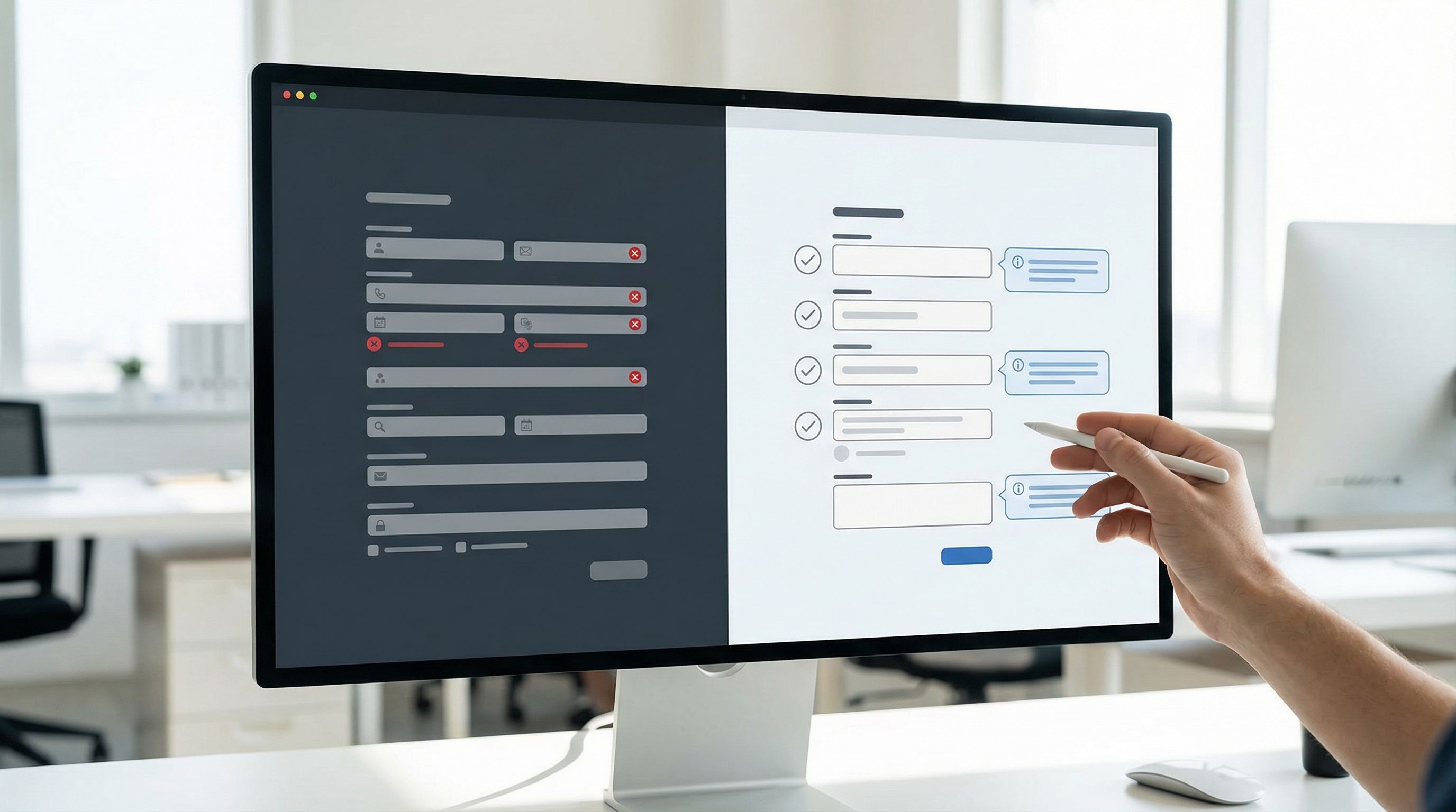
Forms don’t usually fail because of layout or colors.
They fail because people don’t understand what you’re asking for, why it matters, or what went wrong.
That’s a copy problem.
The tiny bits of text around your fields—labels, helper text, placeholders, error messages, button copy—do more than decorate your UI. They:
- Set expectations
- Reduce anxiety
- Prevent mistakes
- Recover from friction
- Signal brand voice and trust
Get these right, and your conversions rise without adding a single new feature.
In this guide, we’ll dig into how to write form microcopy that people actually read—and act on. We’ll focus on practical patterns you can apply immediately, whether you’re building with Ezpa.ge or hand-coding your own forms.
Why Microcopy Is a Conversion Lever (Not an Afterthought)
Most teams treat microcopy as “fill in the blanks at the end.” But the words around your fields are often the difference between:
- A confident user who breezes through vs. a confused user who bounces
- Accurate, high-quality data vs. messy, unusable submissions
- A brand that feels human and trustworthy vs. one that feels robotic or suspicious
A few reasons this matters so much:
1. Forms are high-stakes moments
Forms sit at the critical points of your funnel:
- Newsletter signups
- Trial or account creation
- Payment and checkout
- Support or feedback
If someone stalls here, you don’t just lose a click—you lose a lead, a customer, or an opportunity to learn. That’s why we talk so much on Form & Function about details like progress indicators and inline validation. Microcopy is part of the same trust-building toolkit.
2. People skim, but they do read when they’re uncertain
Eye-tracking studies show that people skim most interface text—but they slow down when:
- They’re asked for sensitive information
- They encounter friction or an error
- They’re unsure what a field label means
That’s exactly where microcopy lives. If you don’t give clear, reassuring guidance at those moments, users either guess (and make mistakes) or give up.
3. Good microcopy reduces support and clean-up work
Clear labels and helper text:
- Reduce invalid or incomplete submissions
- Cut down on back-and-forth emails
- Make your data easier to analyze (no more free-text chaos where a dropdown would do)
If you’re syncing responses straight into Google Sheets with Ezpa.ge, high-quality inputs mean cleaner dashboards and more confident decisions.

The Building Blocks of Effective Form Microcopy
Let’s break down the core pieces you control on every form and how to make them work harder for you.
1. Labels: Say Exactly What You Mean
Labels are your first line of clarity. They should be:
-
Specific, not clever
- Bad:
Details - Better:
Project description - Best:
Describe what you need help designing
- Bad:
-
Close to the field
Don’t rely on placeholders as labels. When the user starts typing, the placeholder disappears and they can forget what the field was for. -
Consistent in pattern
Stick to one style: either all noun phrases (Email address,Company size) or all prompts (Enter your email,Choose your company size). Mixing styles makes scanning harder. -
Appropriate to the level of trust you’re asking for
If it’s sensitive (salary, health info, identity details), don’t be vague. Spell it out and, when needed, add a short reassurance line below.
Quick label checklist
For each label, ask:
- Can a new visitor understand this without context?
- Would someone in a different role (finance vs. marketing) interpret it the same way?
- Does it match the language we use elsewhere (pricing page, product, docs)?
If you’re building a suite of forms, pair this with a reusable visual language like we describe in Theme Systems, Not One-Off Skins. Consistent wording across consistent themes builds recognition and confidence.
2. Helper Text: Answer the Question Before It’s Asked
Helper text is your chance to quietly coach the user.
Use it to:
- Clarify why you’re asking for something
- Explain how to answer
- Set constraints (format, length, options)
- Reduce fear around sensitive fields
Where helper text shines
a) Ambiguous fields
- Label:
Job title - Helper:
Use the title that best matches your current role, even if it’s unofficial.
This avoids responses like N/A or jokes that ruin data quality.
b) Sensitive or personal questions
-
Label:
Annual revenue -
Helper:
We use this only to recommend the right plan. It’s never shared publicly. -
Label:
Date of birth -
Helper:
Used to verify eligibility. We don’t use this for marketing.
c) Complex formats
-
Label:
Phone number -
Helper:
Include country code, e.g., +1 555 123 4567. -
Label:
Password -
Helper:
At least 12 characters, including a number and a symbol.
Keep helper text short and scannable
Good helper text is:
- One sentence, two at most
- Concrete, not generic (
We respect your privacyis weaker thanOnly your manager can see this response.) - Placed consistently (e.g., always under the label, above the field, or directly beneath the field)
On Ezpa.ge, this is where thoughtful theme and spacing choices matter. If you haven’t already, read Designing Inclusive Forms for guidance on keeping helper text legible and accessible.
3. Placeholders: Use Sparingly (and Never as Labels)
Placeholders are often misused. They should not carry essential information.
Use placeholders for:
-
Examples of valid input
- Label:
Website - Placeholder:
https://example.com
- Label:
-
Subtle hints when space is tight
- Label:
Preferred contact time - Placeholder:
Weekdays 9am–5pm PT
- Label:
Avoid using placeholders for:
- Required instructions (
Min 8 characters,MM/DD/YYYY) without mirroring them in helper text - Repeating the label verbatim (
Email addressas both label and placeholder)
Why? Because once the user starts typing, the placeholder vanishes. Anyone returning to the form later may not remember what the field was for, especially on mobile.
4. Error Messages: Turn Friction into Guidance
Error messages are the most underutilized microcopy on forms.
A generic Something went wrong or Invalid input tells users nothing about how to fix the problem.
Instead, aim for errors that are:
- Specific – What exactly is wrong?
- Actionable – What should they do now?
- Polite – Blame the system, not the user.
Transforming bad errors into good ones
-
Bad:
Invalid email
Better:That doesn’t look like an email address. Try name@example.com. -
Bad:
Password is too weak
Better:Use at least 12 characters, including a number and a symbol. -
Bad:
Required field
Better:Please enter your company name so we can personalize your quote.
Tone matters
Error messages are micro-moments of frustration. Your tone can either:
- Add shame (
You did this wrong), or - Offer support (
Here’s how to fix it)
Some tips:
- Avoid exclamation points in errors; they can feel scolding.
- Use calm, neutral language:
Please,Try,You can. - Don’t joke about sensitive data (health, money, identity).
Timing and placement
Error copy only works if people see it.
- Use inline validation where possible so users see issues as they go, not all at once at the end.
- Place error text near the field that needs attention, not just in a banner at the top.
- Highlight the field with a clear visual state (border color, icon) that meets contrast standards.
We go deeper into timing and interaction patterns in The Silent Drop-Off, but the short version is: the earlier and clearer your errors, the fewer people quietly abandon your flow.
Writing Microcopy that People Actually Notice
Knowing what to write is one thing. Getting people to notice and respond to it is another.
Here are patterns that help your microcopy cut through the noise.
1. Front-load the important words
People scan from left to right and often only read the first few words of a line.
- Instead of:
To help us route your request to the right team, please choose a category - Try:
Choose a category so we can route your request to the right team
For helper text and errors, start with the action:
Choose a planinstead ofIn order for us to recommend the right plan, please choose…Add a valid card numberinstead ofOops! It looks like the card number you entered…
2. Match the user’s mental model
Use the words your users use, not your internal jargon.
Team sizebeatsNumber of seatsMonthly budgetbeatsProjected MRR
If you’re not sure, look at:
- Support tickets
- Sales call notes
- Search terms on your site
Then reflect those exact phrases in your labels and helper text.
3. Keep a consistent voice across the form
Decide where you want to sit on this spectrum:
- Formal:
Submit request,Provide your email address - Friendly:
Send request,What’s your email? - Playful:
Let’s go,Where can we reach you?
Then stick to it.
Mixing tones (We’d love to hear from you! next to All fields are mandatory.) feels disjointed and undermines trust.
4. Prioritize clarity over cleverness on primary actions
Button labels are microcopy too.
- Avoid vague labels like
Continue,Next, orSubmitwhen the action is meaningful. - Prefer descriptive labels:
Create my account,Start free trial,Book my demo.
This reduces hesitation and makes it easier for users to predict what will happen next.
Microcopy for Different Form Types
Different forms have different emotional contexts. Your microcopy should adapt.
1. Lead capture and signup forms
Goals: reduce friction, build trust, and clarify value.
- Explain why you’re asking for each “extra” field.
Phone numberhelper:We’ll only call if we have questions about your request.
- Reassure around spam and privacy.
We’ll send 1–2 emails per month. No spam, ever.
- Make the main CTA crystal clear.
Get the guideinstead ofSubmit.
2. Payment and checkout forms
Goals: reduce anxiety, prevent errors, and confirm safety.
- Use clear labels like
Name on card,Billing address,Security code (CVV). - Add microcopy near security-sensitive fields:
We use industry-standard encryption. Your card is never stored on our servers.
- Write errors that protect users from surprises:
This card was declined. Try another card or contact your bank.
3. Feedback and survey forms
Goals: encourage honesty, reduce fear of consequences, and clarify anonymity.
- At the top of the form, state clearly:
Your responses are anonymous. We use them only to improve our product.
- For open-ended questions, add gentle prompts:
What’s one thing we could do better next month?
- For required questions, explain why:
We ask this on every survey so we can track improvements over time.
If you’re using Ezpa.ge for continuous learning, pair thoughtful microcopy with the real-time insights we talk about in Frictionless Feedback Loops.
How to Create a Microcopy System (Not One-Off Fixes)
You don’t want to re-argue the wording of Email address on every new form.
Instead, build a lightweight microcopy system:
-
Inventory your existing forms.
- Collect labels, helper text, placeholders, and errors into a single document or Google Sheet.
-
Standardize common patterns.
- Decide once:
Emailvs.Email address,Companyvs.Organization. - Define standard error messages for common validations (email, password, required fields).
- Decide once:
-
Create a mini style guide.
Include:- Voice and tone guidelines (with examples)
- Do/Don’t lists for sensitive questions
- Standard phrasing for privacy and security reassurances
-
Wire microcopy into your design system.
- If you have a component library, attach default labels and error patterns to each component.
- If you’re building with Ezpa.ge, create template forms with your preferred microcopy baked in.
-
Test, then refine.
- Run simple A/B tests on critical fields or CTAs.
- Watch session recordings or ask a few users to talk aloud as they complete key forms.
- Update your system based on what you learn.
This is the same philosophy we advocate for themes and visual design: invest once in a system, then reuse it. Microcopy deserves that same level of care.
A Simple Workflow for Writing Microcopy for Any Form
When you sit down to build your next form—whether in Ezpa.ge or elsewhere—try this workflow:
-
List the user’s questions first.
For each field, write down: “What might someone be unsure or worried about here?” -
Draft labels that answer those questions.
Make them specific, consistent, and in the user’s language. -
Add helper text only where needed.
If a label is perfectly clear, skip the helper. If there’s any ambiguity or sensitivity, add one short, concrete line. -
Define validation rules and errors together.
Don’t let engineers invent generic errors later. Write clear, actionable messages up front. -
Review for tone and consistency.
- Are you formal, friendly, or playful—and are you sticking to it?
- Are similar fields named and described the same way across the form?
-
Do a “read aloud” pass.
Read the entire form out loud as if you’re guiding a friend through it. Anywhere you stumble or feel awkward, rewrite. -
Ship, then measure.
Use your analytics (or real-time Sheets sync) to monitor drop-off points, error rates, and completion time. Iterate on the microcopy where friction shows up.
Bringing It All Together
Form microcopy is one of the highest-leverage, lowest-cost ways to improve:
- Conversion rates
- Data quality
- User trust
- Support volume
By treating labels, helper text, placeholders, and errors as part of your product—not filler—you:
- Guide users with clarity instead of cleverness
- Reduce anxiety at sensitive moments
- Turn mistakes into quick recoveries instead of dead ends
- Build a consistent, trustworthy experience across every form you ship
Paired with strong visual systems, inclusive patterns, and responsive layouts, thoughtful microcopy is what turns “just a form” into a confident interaction.
Your Next Step
Pick one high-impact form—your signup, your checkout, your main feedback form.
This week:
-
Audit every word around every field.
- Are labels specific and consistent?
- Does helper text answer real questions?
- Are error messages clear and actionable?
-
Rewrite the worst offenders using the patterns above.
-
Rebuild or update that form in Ezpa.ge with:
- Clean, consistent labels
- Short, concrete helper text
- Friendly, specific inline errors
Then watch what happens to completion rates and support tickets.
If you haven’t tried Ezpa.ge yet, this is the perfect kind of project to start with: a single, important form where better microcopy—and a beautiful, responsive layout—can pay off quickly.
Your forms already have something important to say. Now it’s time to make sure every word is working for you.