Theme Systems, Not One-Off Skins: Building a Reusable Design Language for Your Forms

Theme Systems, Not One-Off Skins: Building a Reusable Design Language for Your Forms
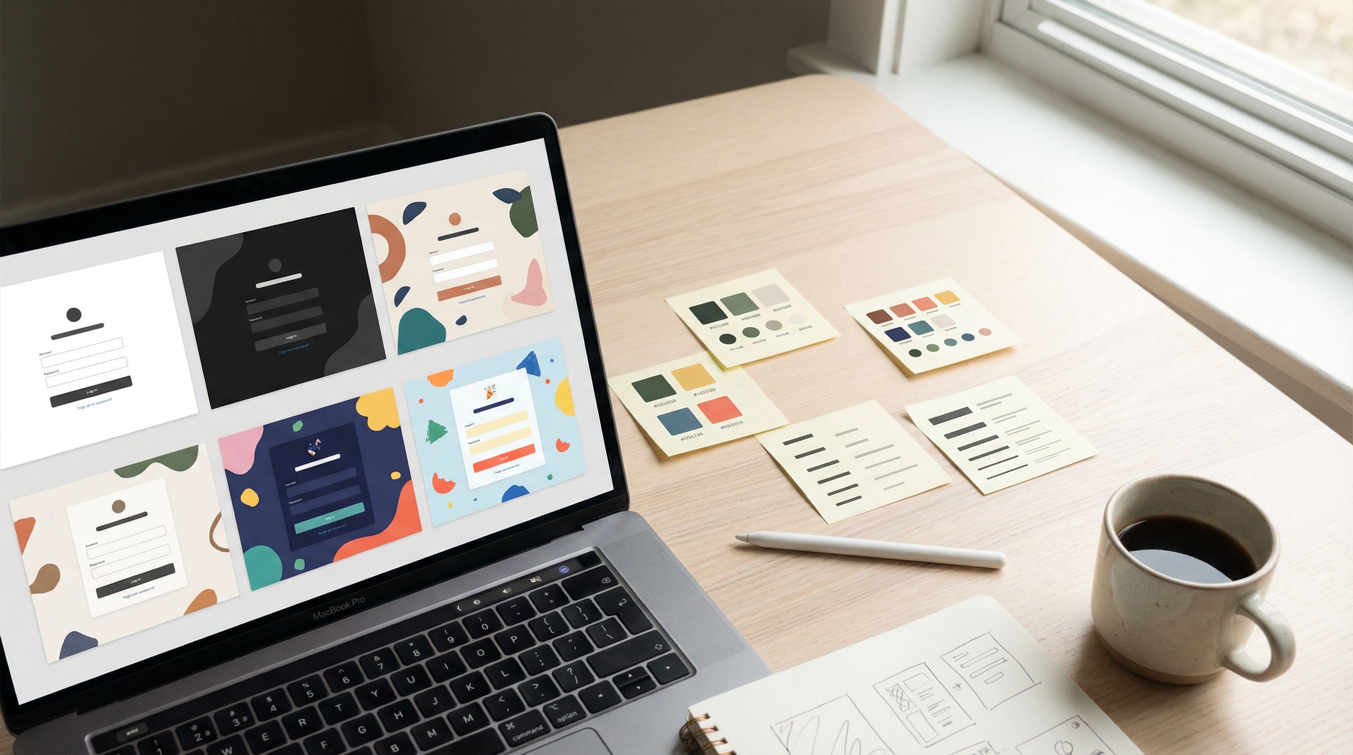
Forms are often treated like disposable flyers: spin up a quick layout, pick a trendy color, ship it, forget it.
That works—until you have:
- A dozen active campaigns
- Multiple teams spinning up their own forms
- Stakeholders asking, “Why does this signup look nothing like that survey?”
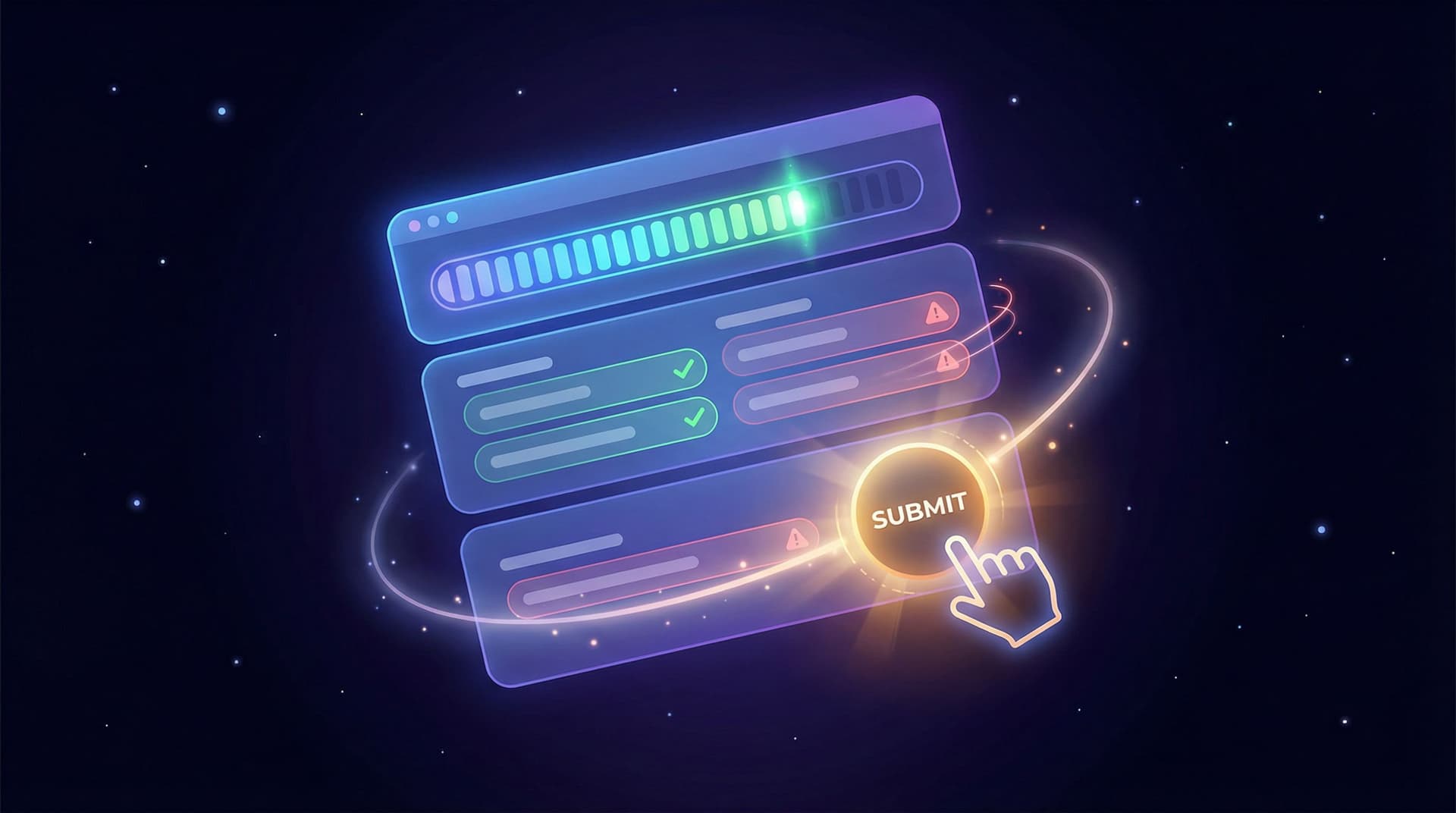
At that point, one-off “skins” stop scaling. You don’t need another pretty form; you need a theme system—a reusable design language that keeps every form on-brand, accessible, and easy to maintain.
Ezpa.ge was built with this mindset in mind: themes, custom URLs, and real-time Google Sheets syncing are all more powerful when they sit on top of a thoughtful, reusable system.
This post walks through how to think in systems, not surfaces—and how to translate that into a practical theme architecture you can actually use.
Why a Theme System Beats One-Off Skins
Before we get into how, let’s be clear on why this matters.
1. Consistency that builds trust
Every time someone hits one of your forms, they’re asking: “Is this really you?” A consistent visual language answers that question instantly.
A theme system ensures:
- Brand recognition: Colors, typography, spacing, and interaction patterns feel familiar across forms.
- Reduced cognitive load: Users don’t have to relearn how your forms work each time.
- Higher perceived quality: Consistency reads as care. Care reads as trust.
If you’ve read our piece on building trust with micro-interactions and validation cues, you’ve seen how even tiny details can change how safe a form feels. A theme system is how you make those details repeatable.
2. Speed without chaos
Without a system, every new form is a small design project:
- Which blue did we use last time?
- Are buttons rounded or pill-shaped now?
- Do we use labels above or beside fields?
With a theme system, you’re choosing from predefined tokens and patterns, not reinventing them:
- Need a new feedback form? Apply the “Feedback – Neutral” theme.
- Launching a campaign? Start from the “Promo – High Contrast” theme and tweak content only.
You ship faster and stay consistent.
3. Accessibility and responsiveness baked in
Accessibility and responsiveness shouldn’t be optional add-ons. When you build a system, you can:
- Lock in minimum contrast ratios for text and interactive elements
- Standardize focus states and error styles
- Ensure components adapt cleanly across breakpoints
That means every new form inherits these improvements by default. If you’re thinking about accessibility more broadly, pair this with our guide on inclusive, device-friendly form patterns.
4. Easier optimization and experimentation
When colors, typography, and components are defined systematically, you can experiment without creating visual debt:
- A/B test a “Primary” vs. “Accent” button style across many forms
- Try a high-contrast variant of your base theme for low-vision users
- Roll out improvements (like clearer error styles) globally instead of patching them form by form
Instead of a pile of bespoke designs, you have a design lab.
From Skin to System: The Mental Shift
A one-off skin asks: “How do I make this specific form look good?”
A theme system asks: “What are the reusable decisions behind this look?”
That means stepping back from:
- Individual color values → to color roles
- One layout → to layout patterns
- One button style → to a button hierarchy
Think like a front-end engineer designing a component library, even if you’re working entirely in a no-code builder like Ezpa.ge.
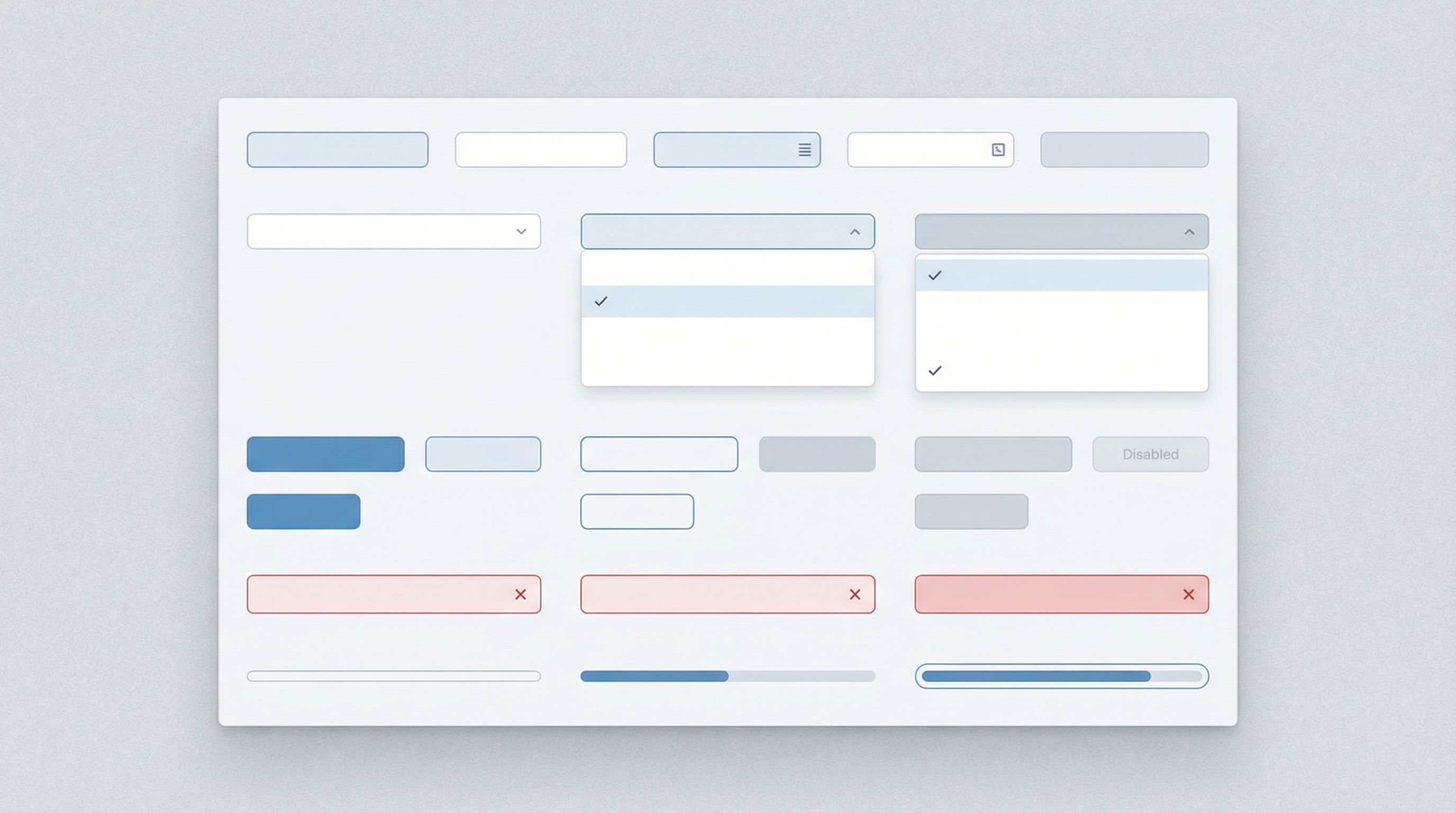
Step 1: Define Your Design Tokens
Design tokens are the smallest reusable pieces of your system—the named decisions that everything else builds on. Instead of “#2563EB,” you have “Primary / 500.”
For forms, focus on these categories first:
Color tokens
Don’t start with “What shade of blue do we like?” Start with roles:
color.background.basecolor.background.surfacecolor.text.primarycolor.text.mutedcolor.border.subtlecolor.accent.primarycolor.accent.successcolor.accent.warningcolor.accent.danger
Then map your brand palette into those roles. This lets you later say, “For this theme, color.accent.primary is teal instead of blue,” without rewriting every style.
Practical tips:
- Ensure text and interactive elements meet at least WCAG AA contrast (4.5:1 for body text, 3:1 for large text and UI elements).
- Reserve high-saturation colors for actions and feedback (primary buttons, errors, success states).
Typography tokens
Instead of hand-picking font sizes every time, define a type scale:
font.family.base(e.g., system sans-serif or your brand font)font.size.xs/sm/md/lg/xlfont.weight.regular/medium/semiboldline.height.tight/normal/relaxed
Then map them to use cases:
- Labels →
font.size.sm,font.weight.medium - Field text →
font.size.md,line.height.normal - Headings →
font.size.lgorxl,font.weight.semibold
Spacing and radius tokens
Forms live and die by spacing. Define a simple scale:
space.0= 0space.1= 4pxspace.2= 8pxspace.3= 12pxspace.4= 16pxspace.6= 24pxspace.8= 32px
Then use them consistently for:
- Gap between label and field (e.g.,
space.2) - Vertical spacing between fields (e.g.,
space.4) - Section spacing (e.g.,
space.6–space.8)
Do the same for border radii:
radius.none= 0radius.sm= 4px (inputs)radius.md= 8px (cards)radius.full= 999px (pills, tags)
State tokens
Don’t forget states:
shadow.focusfor focused fieldsborderColor.error,background.error.subtle,text.errorbackground.disabled,text.disabled
These ensure hover, focus, error, and disabled states are consistent across all components.
Deliverable: A simple one-page reference (even a Google Doc or Notion page) listing your tokens by category. This becomes your source of truth—and the blueprint for your Ezpa.ge themes.
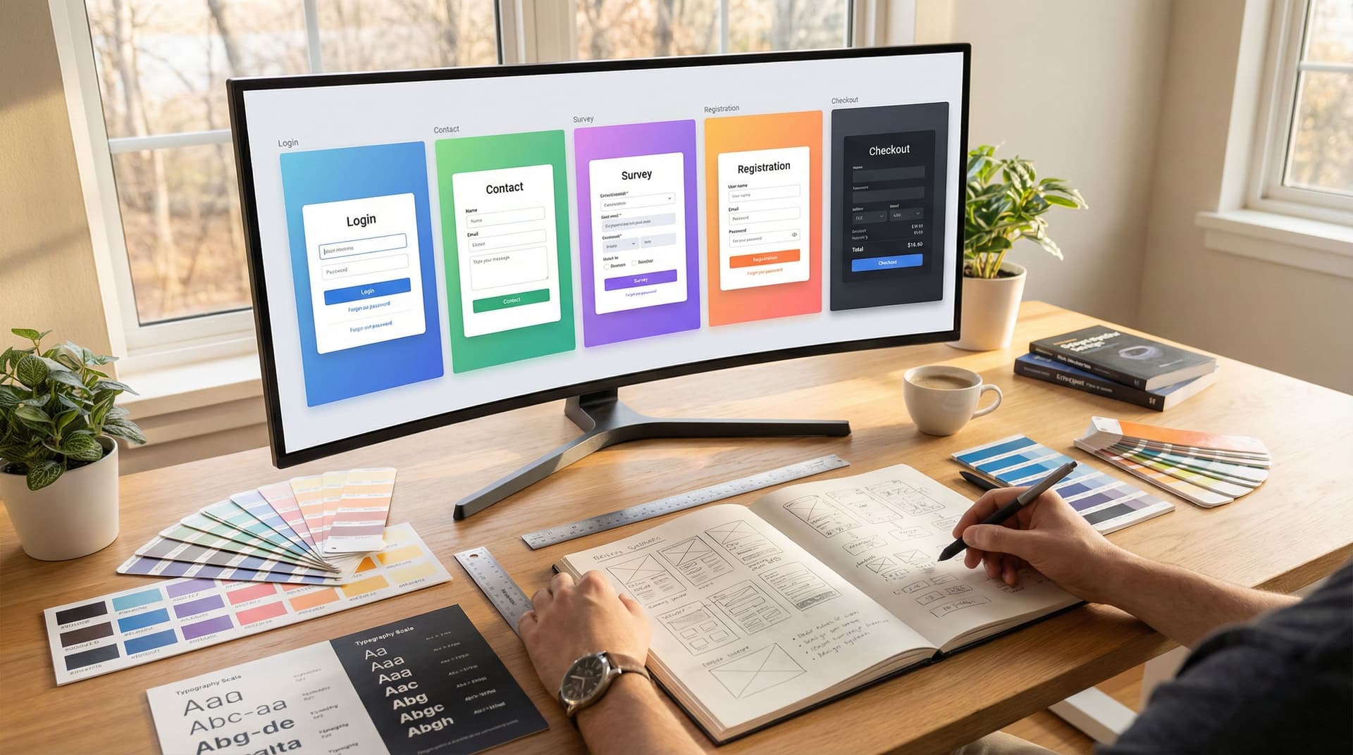
Step 2: Design a Small Set of Core Layouts
A theme system is not about infinite flexibility; it’s about intentional constraints.
For forms, you can cover most use cases with 3–5 layout patterns:
-
Single-column, centered
- Best for signups, contact forms, and mobile-heavy traffic
- Fields stacked with clear vertical rhythm
-
Single-column, full-width
- Ideal for longer surveys and multi-step flows
- More room for helper text and section headings
-
Two-column split
- Content on the left (copy, imagery, value props)
- Form on the right (short, focused)
- Great for high-intent landing pages
-
Stepped / wizard layout
- For complex flows with progress indicators
- Pairs well with patterns from our deep dive on multi-step friction
For each layout, define:
- Max width of the form container
- Alignment (left, center)
- Field grouping rules (when to use sections vs. single long lists)
- Mobile behavior (e.g., two-column collapses into single-column, spacing adjustments)
In Ezpa.ge, you can translate these into reusable templates that always start with the right structure.
Step 3: Establish a Component Hierarchy
Once tokens and layouts are in place, define how components look and behave.
Inputs and textareas
Decide once, then reuse everywhere:
- Label position: above the field by default (more robust across devices)
- Required indicator: e.g., a red asterisk with accessible text
- Helper text:
font.size.sm, muted color, consistent placement - Error state: red border + subtle background + clear message below
Buttons
Create a clear hierarchy:
- Primary: main action (e.g., “Submit”, “Continue”)
- Secondary: alternative action (e.g., “Back”, “Save draft”)
- Tertiary / Ghost: low-emphasis actions (e.g., “Skip for now”)
Define for each:
- Default, hover, active, and disabled styles
- Minimum tap target size (at least 44x44px on touch devices)
Navigation and progress
If you use multi-step forms, standardize:
- Progress indicator style (bar vs. steps)
- Placement (top of the form, always)
- Copy format (e.g., “Step 2 of 5: Billing Details”)
These patterns tie directly into the trust-building techniques we explore in From Click to Confidence.
Feedback states
Define what success, warning, and error look like across your system:
- Success banners after submission
- Inline success confirmation for key steps
- Non-blocking warnings (e.g., “You can update this later”)
Goal: Any designer or marketer on your team should be able to look at a new form and instantly recognize: “Yes, that’s our input. That’s our primary button. That’s our error state.”
Step 4: Turn Tokens into Themes
With tokens and components defined, you’re ready to build actual themes in your form builder.
Think of a theme as: tokens + layout + component styling presets.
Start with a base theme
Create a “Base / Brand” theme that reflects your default look:
- Brand colors mapped to your token roles
- Primary typography and spacing
- Standard input, button, and error styles
This is your workhorse theme—the one most forms will use.
Create purposeful variants
Instead of random variations, design themes for specific jobs:
-
High-contrast theme
- For accessibility-focused experiences
- Strong contrast, larger base font size, simplified decoration
-
Campaign theme
- Slightly bolder accent colors
- Space for imagery or promotional copy
- Still built on the same token structure
-
Minimal theme
- Neutral background, subtle borders
- Great for embedding into existing pages where the site’s brand dominates
The key: all themes share the same underlying tokens, but with different values or emphasis. That way, when you update a token (e.g., brand color change), you can propagate it thoughtfully across themes.
Use naming that scales
Name themes by purpose, not by one-off projects:
- ✅
Brand / Base - ✅
Brand / High Contrast - ✅
Campaign / Spring 2026 - ❌
LandingPage_NewLogo_Final_v3
Good names make it easier for others to pick the right starting point.
Step 5: Document the Rules (Lightly, but Clearly)
You don’t need a 100-page design system site. But you do need a lightweight reference that explains:
- When to use which theme (with examples)
- Do’s and don’ts for customization (e.g., “Don’t change button colors per form; use theme variants instead.”)
- Accessibility guardrails (e.g., “Never use red as the only indicator of error—pair with an icon and message.”)
A simple internal page or PDF is enough. The goal is to:
- Help non-designers make good choices
- Prevent theme drift over time
- Keep your system from becoming a suggestion box
Step 6: Connect Design to Data
A theme system isn’t just about aesthetics; it’s a lever for performance.
Once your themes are in place, use Ezpa.ge’s real-time Google Sheets syncing to:
- Track completion rates by theme
- Compare performance of high-contrast vs. standard themes
- Monitor drop-off at specific steps in multi-step flows
This lets you treat design decisions as hypotheses you can test, not beliefs you cling to.
To go deeper on turning form data into strategy, check out our guide on using real-time syncing as a growth engine.
Step 7: Evolve the System Without Breaking It
A good theme system is alive. It should evolve as:
- Your brand matures
- You learn more from user behavior
- New accessibility standards or device patterns emerge
But evolution doesn’t mean chaos. Use a simple process:
- Propose: Capture a change (e.g., “Increase base font size from 14px to 16px.”)
- Test: Apply it in a limited theme or small set of forms.
- Evaluate: Look at metrics (completion, time to complete, error rates) and qualitative feedback.
- Roll out: If it’s clearly better, update the relevant tokens or components and note it in your documentation.
Because everything is built on tokens and shared components, improvements become upgrades, not one-off fixes.
A Concrete Example: Turning a Messy Form Library into a System
Imagine your current situation:
- 25 active forms
- 6 different button styles
- 4 shades of “brand blue”
- Mixed label positions and error styles
Here’s a practical 30–60 day plan to move toward a system, especially if you’re using Ezpa.ge:
Week 1–2: Audit and extract tokens
- Screenshot representative forms (high-traffic, newest, oldest)
- Note recurring colors, fonts, radii, and patterns
- Define your token set and choose canonical values
Week 3–4: Build base theme + 1–2 variants
- Create
Brand / Basein Ezpa.ge using your tokens - Add one high-contrast variant for accessibility
- Standardize layout patterns and components in templates
Week 5–6: Migrate and measure
- Gradually apply the new themes to your highest-impact forms
- Use Sheets syncing to compare before/after performance
- Gather internal feedback and tweak tokens as needed
By the end, you’ll have:
- A consistent visual language
- A faster way to spin up new forms
- A foundation for more advanced personalization and AI-driven customization later on
Bringing It All Together
A theme system for your forms is more than a design exercise. It’s a way to:
- Build trust through visual and interaction consistency
- Move faster without sacrificing quality
- Bake in accessibility and responsiveness from the start
- Treat design decisions as testable, improvable assets
Instead of asking, “How do we make this one form look nice?” you’re asking, “How do we make every form we ship feel unmistakably ours—and reliably usable?”
That’s the shift from skins to systems.
Your Next Step
You don’t need a full-blown design system team to start.
Here’s a simple first move you can take this week:
- Pick your three highest-impact forms (most traffic, most revenue, or most sensitive).
- Audit them for inconsistencies in color, typography, spacing, and component behavior.
- Define a minimal token set (colors, type, spacing, radius) and a single Base theme that unifies those three forms.
- Implement that theme in Ezpa.ge and monitor completion rates and feedback for the next 2–4 weeks.
Once you see the benefits on those forms—faster updates, clearer UX, better performance—it becomes much easier to justify rolling the system out everywhere.
If you’re ready to move beyond one-off skins and build a reusable design language for your forms, start by defining your tokens and base theme. The rest—layouts, components, variants—will follow.
Your forms don’t have to be one-time designs. With the right theme system, they can become a durable part of how your brand communicates, learns, and grows.