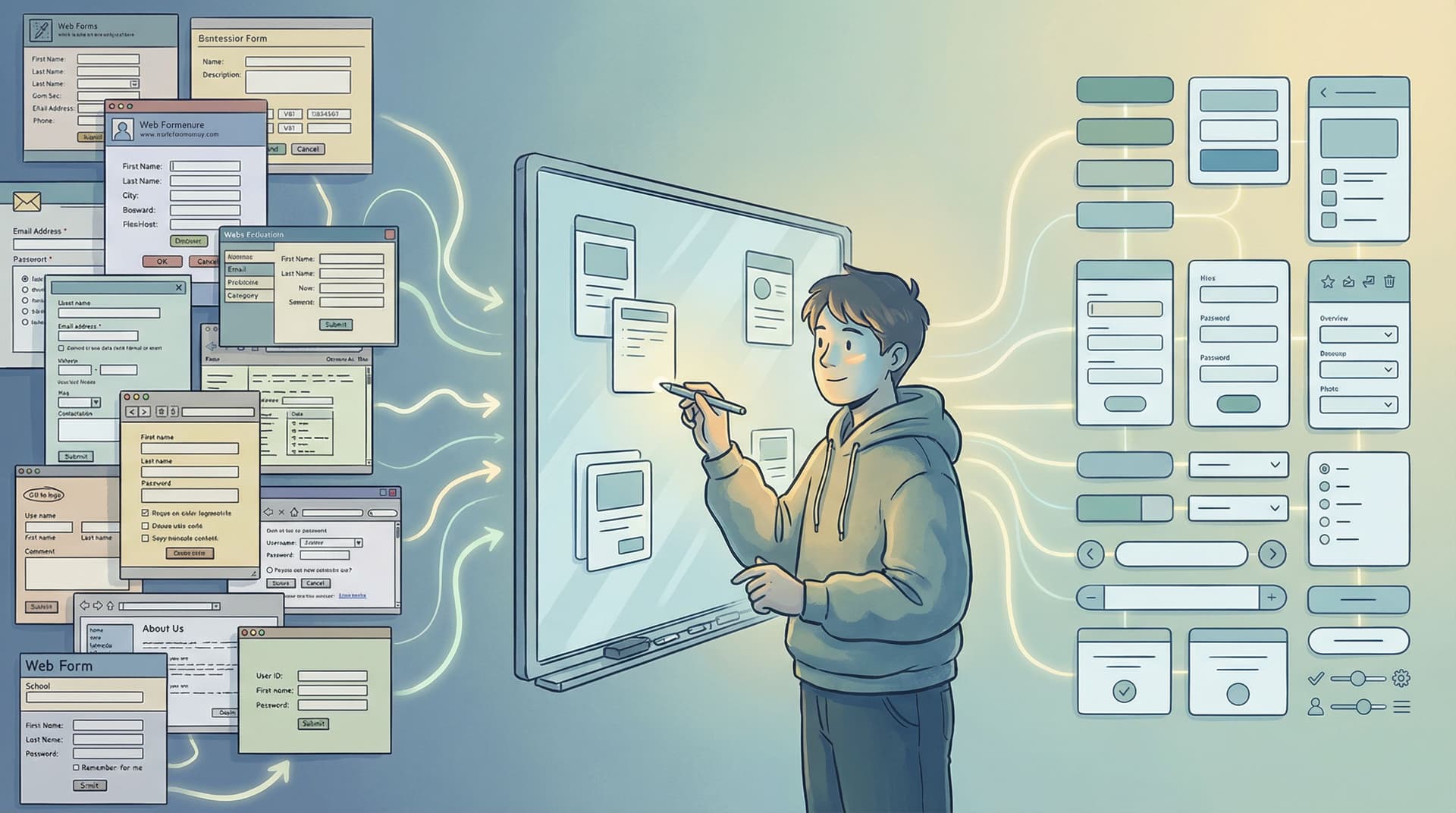
Adaptive Form Themes: Designing One Look That Automatically Fits Any Device

Forms are often where your brand makes its first real ask:
- Share your email.
- Tell us about your company.
- Give us feedback.
If that form looks great on a 27" monitor but breaks on a phone, you’re not just dealing with a minor annoyance—you’re losing trust, data, and revenue.
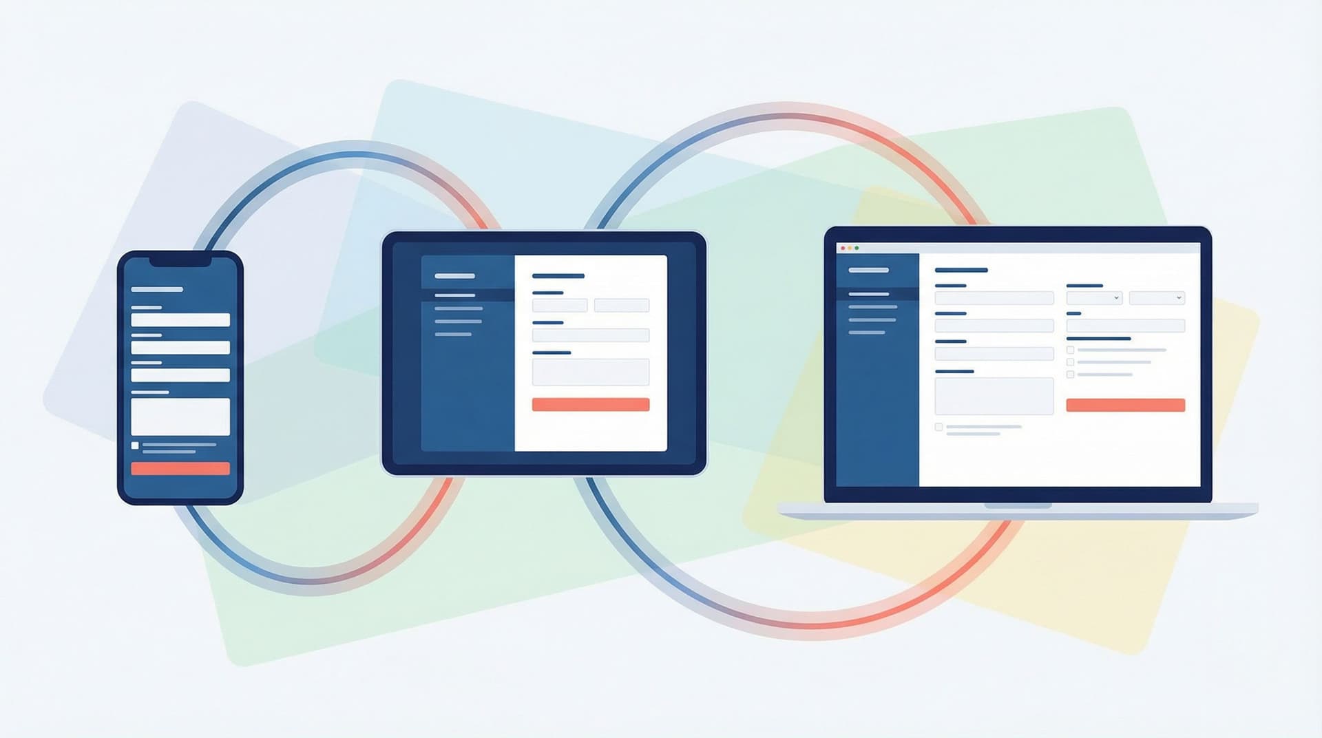
Adaptive form themes are how you escape that trap. Instead of hand-tuning layouts for every screen size, you design a single, coherent visual language that flexes intelligently across devices. With tools like Ezpa.ge—where responsive layouts, themes, custom URLs, and real-time Google Sheets syncing are built in—you can create one theme that:
- Feels native on phones, tablets, and desktops
- Stays on-brand, even as you spin up dozens of new forms
- Is easy for non-designers to reuse without breaking anything
This post walks through how to think about adaptive themes, how to design them, and how to ship them in Ezpa.ge so your forms look intentional everywhere.
Why Adaptive Themes Matter More Than You Think
If you’re reading this, you probably already care about responsive design. But adaptive themes go a step further: they’re about how your design system behaves, not just how your layout shrinks.
1. One brand, many contexts
People might encounter the same form:
- Embedded in a help center article
- Linked from a social ad on mobile
- Pinned in a Slack channel opened on a laptop
If every version feels slightly different—fonts off, buttons misaligned, colors inconsistent—you chip away at brand recognition. Adaptive themes give you one source of truth that automatically adjusts spacing, type size, and layout density while staying visually consistent.
2. Less maintenance, fewer “quick fixes”
Without adaptive themes, teams end up with:
- A “mobile version” of the form
- A “desktop version” that marketing likes
- A “partner version” with slightly different styles
Every change becomes a negotiation: which version do we update? An adaptive theme lets you change the system once and have those improvements roll out everywhere. If you’re already thinking about scalable systems, you’ll recognize this as the same mindset behind Design Once, Reuse Everywhere: Building a Scalable Form System for Your Entire Team.
3. Higher completion rates, quietly
Adaptive themes aren’t just about aesthetics. When your theme is designed to flex:
- Tap targets stay large and comfortable on touch devices
- Line lengths stay readable on large screens
- Error states remain visible and clear at any size
That means fewer mistakes, less frustration, and more people finishing your form.
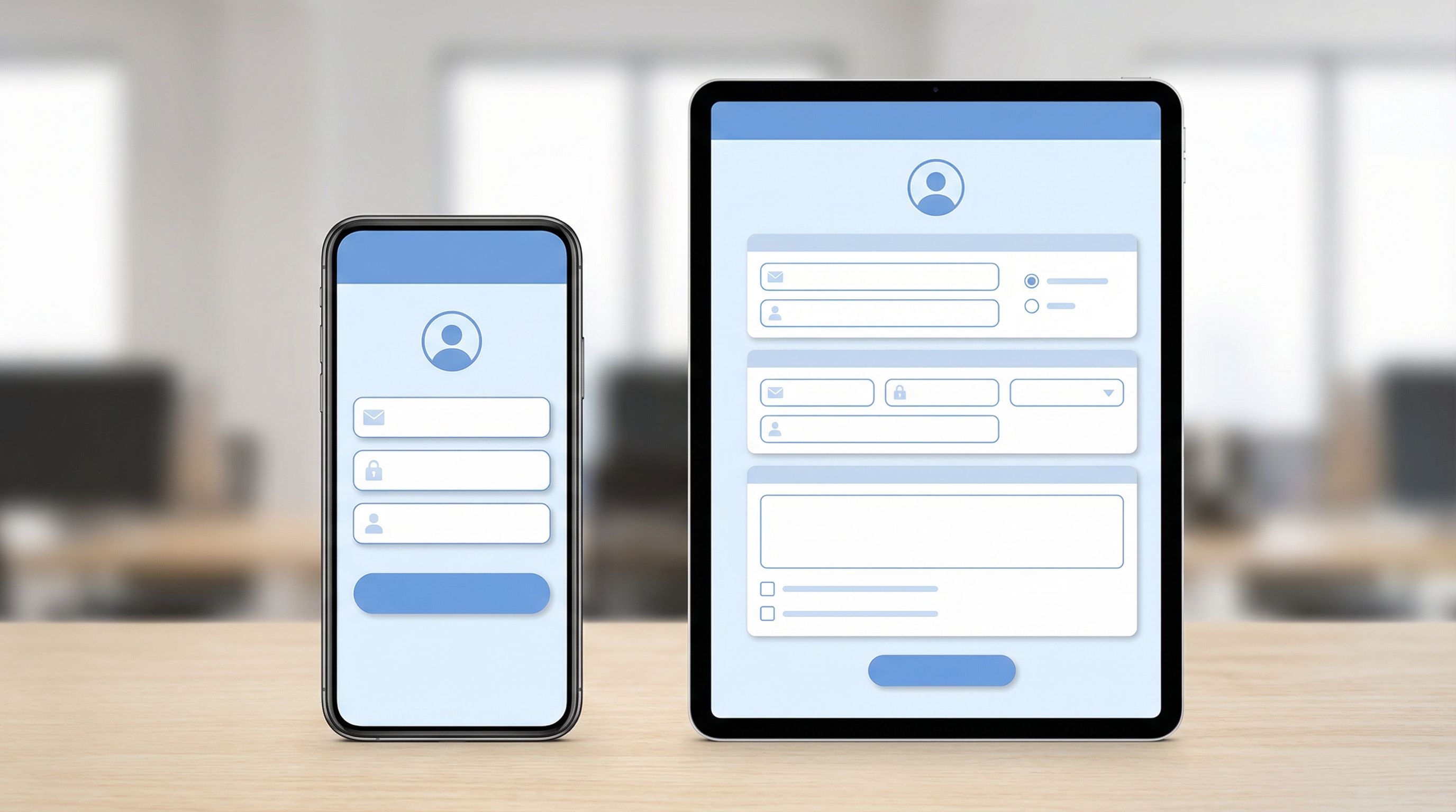
Adaptive Theme vs. Simple Responsiveness
It’s tempting to think, “Our forms are responsive; we’re done.” Not quite.
Responsive layout usually means:
- Grids that reflow from multi-column to single-column
- Components that scale down on smaller screens
Adaptive theme adds another layer:
- Type scales based on viewport, not just a single base size
- Spacing tokens (like
space-xs,space-m,space-xl) map to different actual pixel values on different breakpoints - Components can change hierarchy (e.g., label above field vs. inline) depending on available space
In other words, responsiveness answers “Where does this go?” while adaptiveness answers “How should this feel here?”
Start with Tokens, Not Screens
If you design your theme screen-by-screen, you’ll always be chasing edge cases. Instead, start with design tokens—named, reusable values for color, type, and spacing.
1. Define your core tokens
At minimum, define:
- Color tokens
color-bg-surfacecolor-text-primarycolor-text-mutedcolor-accent-primarycolor-border-subtle
- Typography tokens
font-family-basefont-size-xs,font-size-s,font-size-m,font-size-lfont-weight-regular,font-weight-semibold
- Spacing tokens
space-2,space-4,space-8,space-12,space-16,space-24
In Ezpa.ge, you can express a lot of this directly inside a theme configuration—colors, font choices, and spacing scales become part of a reusable preset instead of one-off tweaks.
2. Map tokens to breakpoints
Next, decide how these tokens should adapt across breakpoints.
- On small screens:
- Slightly larger base font size for legibility (e.g.,
font-size-m= 16–18px) - Increased vertical spacing between fields for tap comfort
- Single-column layouts only
- Slightly larger base font size for legibility (e.g.,
- On large screens:
- Slightly tighter vertical spacing so forms don’t feel sparse
- Controlled max-widths so line length stays readable
- Optional two-column layouts for non-critical fields
The key is that the names of the tokens don’t change—space-12 is still space-12—but the actual pixel values can shift by breakpoint. That’s what makes the theme adaptive instead of static.
Designing One Look That Works Everywhere
Once you have tokens, you can design a single, cohesive look that flexes gracefully.
1. Treat the form as a card, not a full-page app
On both small and large screens, your form will feel more intentional if it’s framed like a card:
- Set a max-width (e.g., 480–640px) for the main form body
- Center it with generous outer margins
- Use a distinct background color (
color-bg-surface) and subtle shadow or border
This keeps your form readable on wide monitors and helps it feel focused on narrow phones.
2. Establish a clear visual hierarchy
Adaptive themes work best when hierarchy is obvious regardless of screen size:
- Title – Use
font-size-l, strong weight, andspace-8below - Description – Use
font-size-s, muted color, andspace-16below - Sections – Group related fields with a subtle heading and extra top margin
- Primary action – High-contrast button that’s easy to spot at a glance
When hierarchy is clear, minor shifts in spacing or type size across devices won’t break comprehension.
3. Design fields for touch first
Even if your audience skews desktop, assume thumbs first:
- Minimum touch target height of 44px–48px
- At least
space-12vertical gap between fields - Labels large enough to read at arm’s length
If your theme feels great on a phone, it will usually feel effortless on a laptop.
For deeper techniques on making forms feel native on any screen, pair this post with Designing Forms That Feel Native on Any Device: A Practical Guide to Truly Responsive UX.
Making Your Theme Truly Adaptive: Key Decisions
Here are the specific decisions that separate a generic responsive form from a carefully adaptive theme.
1. Typography that scales with context
Instead of one fixed type scale, define viewport-aware rules:
- On small screens:
- Slightly larger body text (16–18px)
- Smaller heading jump (e.g., 20–22px) so titles don’t dominate
- On large screens:
- Body text around 16px
- More distinct heading sizes (e.g., 24–28px) for clear structure
In Ezpa.ge, you can approximate this by:
- Choosing a legible base font family
- Setting heading and body sizes in your theme
- Using layout settings to control max-width so text never stretches too wide
2. Spacing that breathes on phones, tightens on desktop
People interact differently with forms on different devices:
- On phones, extra space reduces mis-taps and makes scrolling feel calmer
- On desktops, too much space can make forms feel longer and more intimidating
Design your spacing tokens so that:
space-8might be 8px on desktop and 10–12px on mobile- Section gaps (
space-24orspace-32) stay visually distinct but not overwhelming
3. Component behaviors at breakpoints
Some components should change structure at different sizes:
- Label placement
- Mobile: labels above fields for clarity
- Desktop: labels can be inline for space efficiency (if your builder supports it)
- Inline vs. stacked helpers
- Mobile: helper text below the field, full-width
- Desktop: helper text can sit alongside in multi-column layouts
Even if you’re not hand-coding, you can simulate these behaviors by:
- Choosing themes that favor stacked layouts on small screens
- Using Ezpa.ge’s layout options to switch between single- and multi-column setups while keeping the same theme applied
Building Adaptive Themes in Ezpa.ge: A Practical Workflow
Let’s turn this into a concrete workflow you can follow inside Ezpa.ge.
Step 1: Create a “Base Brand” theme
Start by defining a single base theme that captures your brand:
- Primary and secondary colors
- Typography (headings + body)
- Button styles (primary, secondary)
- Background and surface colors
Name it something systemic, like Brand / Base instead of Signup Theme—you’ll use this across many forms.
Step 2: Test on three core breakpoints
Open a form using your new theme and test it at:
- Narrow mobile (~360–400px wide)
- Tablet (~768px wide)
- Large desktop (~1200px+ wide)
For each size, check:
- Is the title still readable and not overwhelming?
- Are fields easy to tap/click with comfortable spacing?
- Does the form feel like a focused card or a stretched wall of fields?
Adjust your theme’s typography and spacing until all three feel balanced.
Step 3: Lock in a reusable layout pattern
Pick 1–2 layout templates you’ll reuse:
- Short forms (≤5 fields)
- Single column
- Generous spacing
- Prominent primary button
- Longer forms
- Single column on mobile
- Optional two-column sections on larger screens for non-critical fields
The goal is to keep the theme identical while letting the layout adapt based on form length and device size.
Step 4: Test interaction details
An adaptive theme isn’t just static visuals. Pay attention to:
- Focus states – Are they visible on all backgrounds?
- Error states – Are messages legible and clearly associated with the right field?
- Hover and active states – Do they feel consistent with your brand?
If you haven’t thought deeply about error visuals yet, pair your theme work with Error States that Convert: Turning Validation Messages into Micro-Moments of Trust.
Step 5: Save variants without breaking the system
Once your base theme feels solid, you can create variants for special cases:
Brand / DarkBrand / High-Contrast(for accessibility)Brand / Campaign(temporary accent colors)
The key is that these variants:
- Use the same spacing and type scales
- Maintain similar component behaviors
- Only tweak what’s necessary (e.g., colors, subtle accent changes)
This lets you experiment visually—especially when paired with Ezpa.ge’s real-time Google Sheets syncing—without losing the consistency that makes your forms feel trustworthy.
Using Adaptive Themes to Power Experiments
Once your adaptive theme is in place, it becomes a powerful lever for experimentation.
- You can ship theme-driven A/B tests that change colors, typography, or button styles without touching layout or questions—exactly the approach covered in Theme-Driven Experimentation: A/B Testing Form Looks Without Touching the Layout.
- With Ezpa.ge’s real-time Google Sheets sync, you can route responses from different theme variants into a single sheet and analyze performance quickly. If you want a concrete workflow for this, check out Real-Time AB Testing with Google Sheets: Ship Form Experiments in a Single Afternoon.
Because your theme is adaptive, you don’t have to worry that Variant A looks great on desktop but breaks on mobile while Variant B does the opposite. The underlying system keeps everything consistent across devices while you iterate on the visual layer.
Common Pitfalls (and How to Avoid Them)
Even with a good plan, there are a few traps teams fall into when designing adaptive themes.
Pitfall 1: Designing only on desktop
If you craft your theme in a wide Figma frame and never check it on a phone, you’ll miss:
- Overly small type
- Cramped touch targets
- Titles that wrap awkwardly into three lines
Fix: Always preview your Ezpa.ge forms on an actual phone and at least one tablet size before calling a theme “done.”
Pitfall 2: Over-styling individual forms
When a stakeholder asks for “just a quick tweak” to one form, it’s tempting to override theme settings locally.
Fix: Ask: “Is this a one-off, or should this become a theme variant?” If it’s likely to be reused, promote it into a proper theme. If not, push back and keep the global system clean.
Pitfall 3: Ignoring accessibility
A theme that looks good but fails accessibility checks will quietly exclude people:
- Low contrast between text and background
- Tiny helper text
- Focus states that are hard to see
Fix:
- Aim for WCAG AA contrast for text and interactive elements
- Keep body text at least 16px
- Use clear, visible focus outlines on all interactive elements
If you’re designing forms that need to work for many abilities, devices, and languages, you’ll get a lot of mileage from Designing Inclusive Forms: Practical Patterns for Language, Accessibility, and Device Diversity.
Bringing It All Together
Adaptive form themes are what let you:
- Design once and trust that your forms will feel right on any device
- Keep dozens or hundreds of forms on-brand without hand-tuning each one
- Run visual experiments confidently, knowing your system holds up everywhere
With Ezpa.ge, you already have the building blocks:
- Themes to capture your brand system
- Responsive layouts that adapt intelligently
- Custom URLs that keep links clear and on-brand
- Real-time Google Sheets syncing so you can see the impact of your design decisions quickly
The missing piece is the mindset: thinking in tokens, behaviors, and reusable patterns instead of one-off “skins.” Once you make that shift, adaptive themes become a natural extension of how you design.
Your Next Move
You don’t need a full redesign to start.
Here’s a simple way to take the first step today:
- Pick one high-traffic form you care about.
- Create a new Ezpa.ge theme called
Brand / Adaptive v1. - Set clear tokens for colors, typography, and spacing.
- Preview the form on:
- A small phone
- A tablet
- A large desktop screen
- Tweak until it feels coherent across all three.
Once that single adaptive theme feels solid, apply it to your next three forms. You’ll start to feel the compounding benefits: faster builds, more consistent branding, and fewer “Does this look okay on mobile?” messages.
If you’re ready to see how adaptive themes, custom URLs, and real-time Google Sheets syncing can work together, open Ezpa.ge and spin up your Brand / Adaptive v1 theme now. One carefully designed theme can quietly upgrade every form your team ships from here on out.