Theme-Driven Experimentation: A/B Testing Form Looks Without Touching the Layout


When teams talk about “testing the form,” they usually jump straight to layout changes:
- Fewer fields
- Multi-step vs. single-page
- Different question order
Those changes can work—but they’re also slow, risky, and hard to compare. When you change both what you ask and how it looks, it’s almost impossible to know which change actually moved the needle.
Theme-driven experimentation gives you a cleaner path: keep the structure identical, and only test how the form feels.
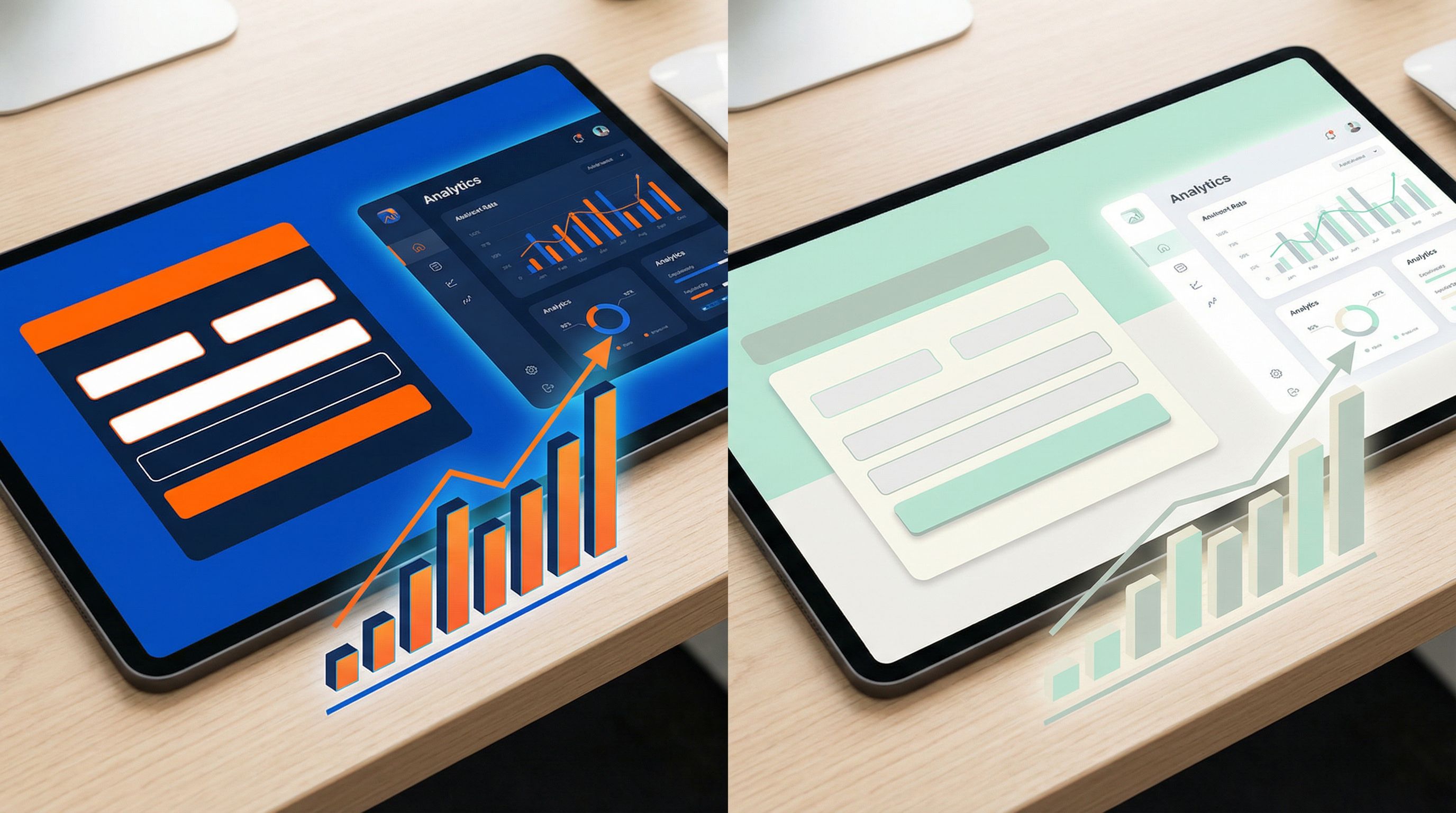
With tools like Ezpa.ge—where themes, custom URLs, and real-time Google Sheets syncing are built in—you can run serious experiments on colors, typography, spacing, and visual accents without touching the underlying layout or fields.
This post digs into why that matters, how to do it well, and how to turn “let’s try a darker button” into a systematic, repeatable practice.
Why Testing Only the Theme Is So Powerful
When you hold layout constant and only change the visual layer, you get three big advantages.
1. Cleaner data, clearer decisions
If Version A has 12 fields and Version B has 8, and B wins, you don’t actually know why:
- Was it fewer fields?
- Was it the new button copy?
- Was it the different color palette?
By contrast, theme-driven experiments:
- Control for structure. Same fields, same order, same logic.
- Isolate aesthetics. You’re testing color, contrast, spacing, and visual hierarchy.
- Produce clearer insights. “High-contrast themes work better for this audience” is a reusable lesson.
2. Faster iteration cycles
Changing layout often means:
- Re-approvals from stakeholders
- QA for conditional logic and validation
- Risk of breaking existing integrations
Changing a theme in Ezpa.ge is usually:
- Pick or clone a theme
- Adjust tokens (colors, fonts, radii, shadows)
- Apply to the same form
You can ship multiple theme variants in a day and watch results stream into Google Sheets in real time.
3. Brand consistency and performance
Teams often feel forced to choose between:
- “On-brand but maybe lower-converting”
- “Hacky but high-converting”
Theme-driven experimentation lets you:
- Stay within a reusable theme system (tokens, components, constraints)
- Nudge variables like primary color, surface contrast, and accent usage
- Gradually converge on a house style that’s both recognizable and high-performing
If you haven’t already, it’s worth pairing this approach with a broader system mindset—see how we think about this in Theme Systems, Not One-Off Skins: Building a Reusable Design Language for Your Forms.
What Exactly Is “Theme-Driven” Experimentation?
When we say “theme,” we’re talking about a layer of design tokens and rules that can be applied to any form:
- Colors (primary, secondary, background, surface, error, success)
- Typography (font families, weights, sizes for labels, headings, helper text)
- Spacing (padding around fields, gaps between sections, margins)
- Shape (border radius for fields and buttons, outlines vs. filled)
- States (hover, focus, active, disabled)
- Subtle effects (shadows, dividers, micro-animations)
Theme-driven experimentation means:
You only change these visual tokens and rules, not the form’s content or structure.
That means:
- Same fields
- Same labels and helper text
- Same error handling logic
- Same conditional flows
You’re asking: “How much can we improve completions and satisfaction just by changing how this form looks and feels?”
Designing Your First Theme Experiments
Let’s walk through a practical workflow for running your first theme-driven A/B test in Ezpa.ge.
Step 1: Choose a form with enough traffic
Theme experiments need volume to be conclusive. Start with forms that:
- Get at least a few hundred visits per week
- Matter to the business (signups, demo requests, key surveys)
- Are relatively stable in content (you’re not rewriting them every few days)
Good candidates:
- Newsletter signup
- Product waitlist
- High-traffic feedback widget
Avoid:
- Tiny one-off event forms
- Forms that are currently being restructured or shortened (for that, see Form Fatigue Is Real: Designing Shorter Flows That Still Capture Rich Data).
Step 2: Define a single, clear hypothesis
Instead of “Let’s see what happens if we make it prettier,” write down a testable statement:
- Color contrast hypothesis: “A higher-contrast theme with darker text and a bolder primary button will increase completion rate by 5% because the path to submit feels clearer.”
- Trust & calm hypothesis: “A softer, more spacious theme with muted colors will reduce abandonment on a sensitive feedback form because it feels less transactional.”
- Urgency hypothesis: “A theme that uses a strong accent color for the primary CTA and progress indicator will increase multi-step completion because users better perceive momentum.”
Your hypothesis should specify:
- What you’re changing (e.g., contrast, color temperature, spacing)
- Why it should matter (e.g., clarity, trust, perceived effort)
- How you’ll measure success (e.g., completion rate, drop-off on a particular step)
Step 3: Create two (or more) tightly scoped themes
In Ezpa.ge, you can clone an existing theme and adjust only the variables that relate to your hypothesis.
Keep each experiment focused:
- If you’re testing contrast, don’t also change font family.
- If you’re testing button style, don’t also introduce new micro-animations.
Some practical theme pairs to consider:
-
High vs. low contrast
- Version A: Dark text on light backgrounds, bold primary button, clear focus outlines
- Version B: Softer text color, subtler button, lower overall contrast (still accessible)
-
Warm vs. cool palette
- Version A: Warm accents (oranges, corals) for CTAs and highlights
- Version B: Cool accents (blues, teals) for CTAs and highlights
-
Compact vs. spacious
- Version A: Tighter vertical spacing between fields, smaller paddings
- Version B: More generous spacing, larger touch targets
-
Minimal vs. accented
- Version A: Flat surfaces, no shadows, minimal borders
- Version B: Subtle shadows on cards, faint dividers between sections, slightly elevated submit button
Rule of thumb: If a user would say “this feels like the same form, but it looks different,” you’re in the right zone.
Step 4: Keep URLs and routing sane
You don’t want your marketing team or partners guessing which link to use.
- Use clear, consistent naming for your variants, especially if you’re also running URL experiments.
- If you’re already managing a large library of links, pair theme testing with a strong naming system—see Branded in a Click: Building URL Naming Systems That Scale Across Hundreds of Forms.
In Ezpa.ge, you can:
- Use custom URLs that indicate the variant (
/signup,/signup-theme-b) when you’re deliberately splitting traffic. - Route traffic via your site, email campaigns, or experiments tools (e.g., segmenting email audiences between two links).
What to Measure (Beyond “Did More People Submit?”)
Completion rate is the primary metric—but theme changes often show up in more nuanced ways.
Core metrics to track
Use Ezpa.ge’s real-time Google Sheets syncing to log events and then build a lightweight dashboard (for a deeper walkthrough, see From Form to Funnel: Turning Raw Responses into a Live Google Sheets Dashboard). At minimum, track:
-
Start rate
- Of all visitors, how many start filling the form?
- Themes that clarify “this is a form, not a blog post” tend to improve this.
-
Completion rate
- Of those who start, how many hit Submit?
- This is your headline metric for most experiments.
-
Time to complete
- Does one theme help people move more confidently and quickly?
- Shorter isn’t always better (especially for high-intent flows), but big differences are signals.
-
Step-level drop-off (for multi-step forms)
- Which step loses the most people under each theme?
- A theme that clarifies progress and reduces visual noise often cuts mid-flow exits.
-
Error frequency and recovery
- Do people trigger fewer validation errors in one theme?
- Do they recover (fix and continue) more often?
Visual clarity, legible helper text, and obvious error states can quietly improve data quality.
Qualitative signals to watch
Not every impact will show up in raw numbers right away. Pay attention to:
- Support tickets or chat logs mentioning the form
- User interviews or usability tests where participants comment on clarity, trust, or perceived effort
- Drop-off patterns that suggest confusion (e.g., many users abandoning after encountering an error)
Remember: theme changes can amplify or undermine other conversion levers like defaults, microcopy, and error states. If you’re also tuning those, check out:
- The Psychology of Defaults: How Pre-Filled Answers Shape Form Completion Rates
- Error States that Convert: Turning Validation Messages into Micro-Moments of Trust
High-Impact Theme Variables to Experiment With
Not all theme knobs are created equal. Here are the ones that tend to move the needle most.
1. Contrast and legibility
If users can’t instantly see where to start or what’s tappable, they stall.
Focus on:
- Text contrast: Ensure labels and helper text meet accessibility guidelines against their background.
- CTA prominence: Make the primary button visually dominant without being overwhelming.
- Focus states: Clear outlines or glows on the active field reduce “Where am I?” moments.
Try testing:
- A stronger primary color for the submit button
- Darker text on form fields and headings
- More distinct focus styles for keyboard and mobile users
2. Spacing and density
Perceived effort often correlates with how dense a form looks.
Experiment with:
- Vertical spacing between fields and sections
- Padding inside fields and buttons (tap targets)
- Line height for helper text and descriptions
Patterns to try:
- For short forms (1–5 fields), a more spacious, premium feel often works well.
- For longer forms, a slightly denser layout can reduce scrolling fatigue while still feeling breathable.
3. Color temperature and emotion
Colors carry emotional weight:
- Blues and greens often feel trustworthy, calm, and professional.
- Oranges and reds can feel urgent, energetic, or warning-like, depending on usage.
Align your palette with the form’s job:
- A billing update or security form may benefit from cooler, steadier tones.
- A limited-time offer or event signup can lean into warmer accents to convey energy.
4. Visual hierarchy of steps and sections
For multi-step forms, theme choices can either clarify or obscure progress.
Test adjustments like:
- Progress indicators that are more prominent (bold color, clear labels for each step)
- Section headers with distinct typography and spacing
- Subtle backgrounds behind grouped fields to visually chunk related questions
5. Micro-animations and feedback
Motion should guide, not distract.
Consider experimenting with:
- Button hover and press states that feel responsive
- Field focus transitions that gently highlight the current area
- Success confirmations that give a small sense of completion when a step is done
For a deeper dive on motion as a conversion tool, see Micro-Animations in Forms: Subtle Motion That Reduces Drop-Off (Not Just Looks Cool).
How to Run Theme Tests in Ezpa.ge Without Losing Your Mind
Let’s turn this into a repeatable playbook.
1. Start from a stable base theme
Pick your current best-performing or most on-brand theme as the “base.” Document its key tokens:
- Primary / secondary / background colors
- Text styles for headings, labels, helper text
- Radii, borders, shadows
Then, for each experiment:
- Clone the theme in Ezpa.ge
- Rename it with a clear, consistent pattern (e.g.,
Signup – High Contrast v2) - Change only the tokens aligned with your hypothesis
2. Duplicate the form only when necessary
If your experimentation tooling or traffic split requires distinct URLs, you can:
- Duplicate the form in Ezpa.ge
- Apply Theme A to Form A, Theme B to Form B
- Keep all fields, logic, and settings identical
Use your site, email tool, or ad platform to split traffic evenly between the two URLs.
If you’re not tied to external tooling and are just iterating over time, you can also:
- Run Theme A for a defined period (e.g., one week)
- Switch to Theme B the next week
- Compare performance, controlling for traffic and campaigns as much as possible
Time-based tests are less pure than parallel A/B splits, but they’re easier for small teams.
3. Use Google Sheets as your experiment log
Since Ezpa.ge syncs responses in real time to Google Sheets, you can:
- Add a hidden field capturing the theme or variant name (A, B, HighContrast, Calm, etc.)
- Use formulas or pivot tables to compare:
- Completion rate per variant
- Median time-to-complete per variant
- Drop-off per step (if you log step events)
Over time, this becomes a knowledge base of what works for your audience, not just a one-off test.
4. Decide how long to run the test
As a rough guideline:
- Aim for at least a few hundred completed submissions per variant before calling a winner.
- Keep the test running long enough to cover typical weekly patterns (e.g., weekdays vs. weekends) if they matter for your audience.
If you’re not comfortable with statistical jargon, start simple:
- If one variant is consistently ahead by 5–10 percentage points in completion rate over a meaningful sample, that’s likely a real effect.
5. Roll out winners thoughtfully
When a theme variant wins:
- Promote it to your new base theme for similar forms.
- Update your theme documentation and design system to bake in the lessons.
- Consider running follow-up tests that refine the winning direction (e.g., once you know high contrast works, test within that family: button shape, specific accent colors, etc.).
Common Pitfalls (And How to Avoid Them)
Even with a clean setup, it’s easy to trip over a few recurring issues.
Pitfall 1: Changing copy mid-test
If you edit labels, helper text, or error messages during a theme experiment, you’ve just introduced another variable.
Fix:
- Freeze copy for the duration of the test.
- If you must change it, note the exact date and treat pre- and post-change as separate runs.
Pitfall 2: Ignoring accessibility
A theme that “wins” but fails accessibility checks is a long-term liability.
Fix:
- Ensure color contrast meets WCAG guidelines for text and interactive elements.
- Keep focus states visible for keyboard users.
- Avoid relying solely on color to convey meaning (e.g., error vs. success).
Pitfall 3: Overfitting to a tiny audience
If your test only has 40 completions per variant, you might just be seeing noise.
Fix:
- Run tests on higher-traffic forms first.
- Treat tiny-sample results as directional, not definitive.
Pitfall 4: Declaring victory too early
A 3% difference might look exciting in the first few days and then flatten out.
Fix:
- Set a minimum sample size and a minimum run time before you start.
- Resist the urge to peek and pivot every few hours.
Bringing It All Together
Theme-driven experimentation is about getting serious about the visual layer of your forms without constantly tearing up your layouts.
When you:
- Keep structure and content stable
- Systematically test colors, contrast, spacing, and motion
- Use Ezpa.ge themes, custom URLs, and Google Sheets syncing to manage variants and data
…you unlock a new kind of optimization loop:
- Less risky than layout overhauls
- Faster than full redesigns
- More reusable than one-off “pretty” tweaks
Over time, you don’t just get a handful of better-looking forms. You build a living theme system that’s grounded in evidence—one that makes every new form more likely to succeed on the first try.
Where to Start This Week
If you want to put this into practice right away:
- Pick one form with meaningful traffic.
- Write one hypothesis about a theme change you believe will help (contrast, spacing, color temperature, etc.).
- Clone your current theme in Ezpa.ge and adjust only the tokens that relate to that hypothesis.
- Set up a simple A/B split using two URLs or a time-based rollout.
- Use Google Sheets to log variant names and compare completion rates and time-to-complete.
You don’t need a full experimentation platform or a design overhaul to get started. You just need a form, a theme, and a willingness to learn from the results.
Ready to Try Theme-Driven Experiments with Ezpa.ge?
If you’re already building forms with Ezpa.ge, your next experiment is a few clicks away:
- Open your highest-impact form.
- Clone your current theme.
- Make one thoughtful, hypothesis-driven change.
- Share both variants and watch the data roll into Google Sheets.
If you’re not using Ezpa.ge yet, this is the perfect moment to start building forms that are beautiful, responsive, and experiment-ready by default.
Take the first step: spin up a form, create a second theme, and see how much impact the visual layer alone can have—no layout surgery required.