Beyond ‘Shorter Is Better’: When Long Forms Outperform Micro-Flows (and How to Design Them)


For years, form advice has been boiled down to a slogan: “shorter is better.”
Cut fields. Hide questions. Turn everything into a 3-step wizard or a one-question micro-survey.
Sometimes, that’s exactly right. (We’ve written about that in pieces like Form-First Lead Gen and Tiny Forms, Big Revenue.) But if you treat it as a universal rule, you leave a lot of value on the table:
- Leads that look good on paper but are impossible to work with.
- Support tickets that bounce around because you don’t have enough context.
- Research surveys that under-collect the nuance you actually need.
The reality: well-designed long forms can outperform micro-flows—on conversion, on data quality, and on downstream efficiency.
This post is about when that’s true and how to design longer forms that people actually complete. We’ll focus on practical patterns you can implement in tools like Ezpa.ge, where themes, custom URLs, and real-time Google Sheets syncing give you a lot of flexibility without code.
Why Long Forms Still Matter (A Lot)
Longer forms aren’t just a relic from the era of paper applications. They solve problems that tiny flows simply can’t.
1. You’re Qualifying for High-Stakes Interactions
If your form is the front door to something expensive, complex, or sensitive, you need more than three fields.
Think about:
- Enterprise sales demos
- Loan or financing applications
- Healthcare intake
- Custom implementation or onboarding requests
In these cases, a long form can actually increase trust and perceived value:
- Users expect you to ask more when the outcome is serious.
- Detailed questions signal professionalism and rigor.
- Your team gets the context to respond intelligently the first time.
A 5-field “enterprise demo” form might generate more leads, but your reps will spend weeks chasing people who aren’t a fit. A 20-question form that clearly explains why each question matters will produce fewer submissions—but more real opportunities.
2. You’re Trading Time for Clarity (and Users Know It)
People are willing to invest time if:
- The value is clear (e.g., tailored recommendations, faster approvals, fewer back-and-forth emails).
- The form feels like a guided conversation, not an interrogation.
Examples where long forms often win:
- Recommendation flows (insurance coverage, benefits selection, complex pricing)
- Detailed feedback forms for power users
- Internal intake for cross-functional work (e.g., “launch this campaign,” “request this integration”)
When you explain how the information will be used—and actually deliver on that promise—users see the extra questions as a service, not a tax.
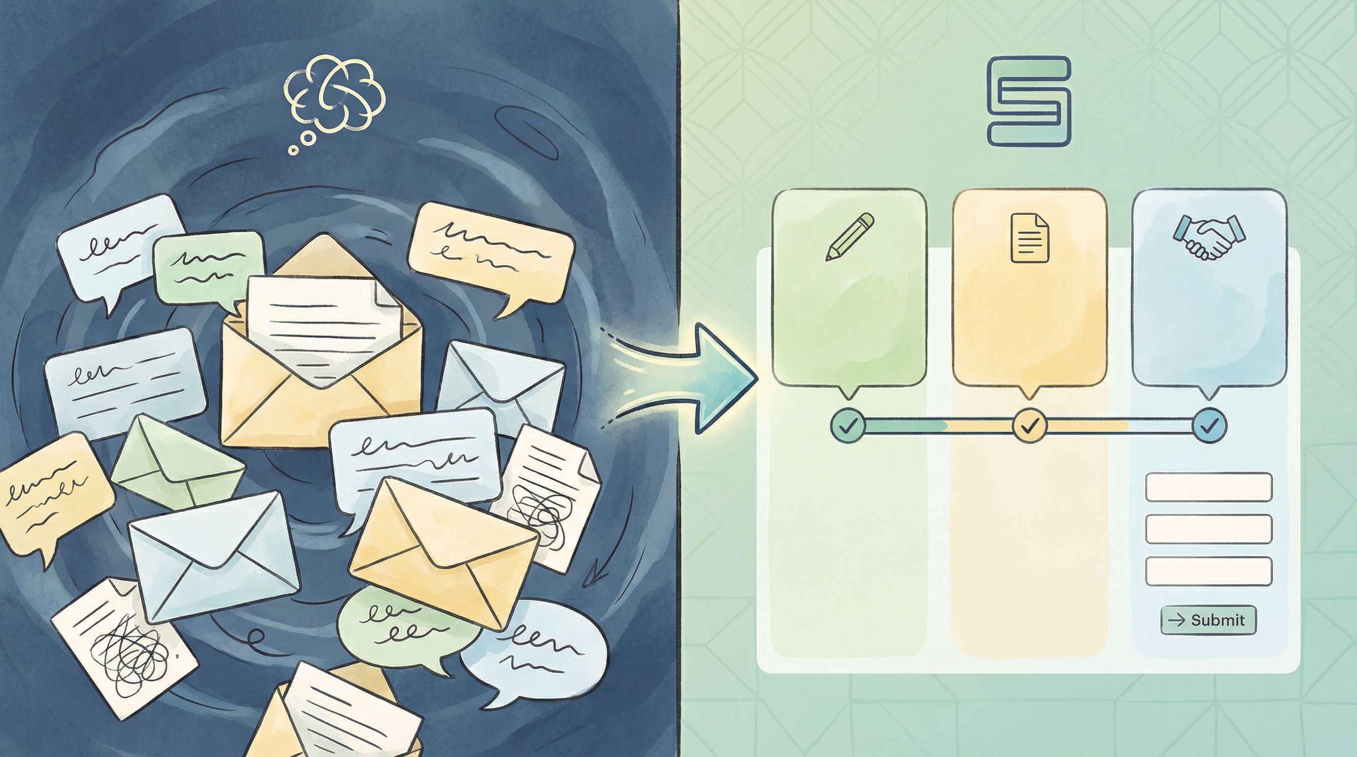
3. You’re Replacing Chaos, Not Competing with It
Internally, long forms can be a huge upgrade over:
- 15-message Slack threads
- Email chains with multiple forwards
- Spreadsheets where each row is a mystery
Here, the alternative to a long form is not a micro-flow. It’s unstructured chaos.
If you’ve read From Inbox Chaos to Intake Clarity, you’ve seen how a well-structured, longer form can:
- Reduce back-and-forth clarification
- Make requests searchable and sortable
- Standardize how work enters your system
4. You Need Rich, Structured Data (Not Just a Signal)
Micro-forms and single-question flows are fantastic for signals—quick, high-intent pings that tell you what to explore.
But when you’re:
- Prioritizing a roadmap
- Making pricing changes
- Designing a new onboarding flow
…you often need multi-dimensional data: who someone is, what they’ve tried, what they care about, what they’re comparing you against.
That doesn’t happen in three fields.
Long forms, done right, give you structured, analyzable inputs that can feed into your CRM, your analytics, and your roadmap—especially when submissions sync in real time to Google Sheets via Ezpa.ge.
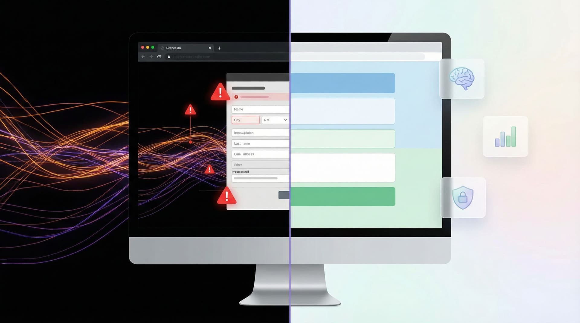
Where Long Forms Go Wrong (and How to Avoid It)
If longer forms are so powerful, why do they have such a bad reputation? Because many of them are:
- Unstructured: a random pile of questions.
- Opaque: users don’t know why you’re asking.
- Untrustworthy: the form looks sketchy or overreaching.
Let’s fix that.
1. Make Length Predictable, Not Mysterious
People don’t hate long forms as much as they hate not knowing how long something will take.
Design patterns that help:
- Progress indicators with real meaning
- “Step 2 of 5: About your company” is better than a vague progress bar.
- Group related questions into a handful of steps instead of 20 tiny ones.
- Upfront expectation-setting
- A short intro like: “This takes ~4 minutes. The more detail you share, the more tailored your onboarding will be.”
- Visible question counts
- “3 questions left in this section” calms the “is this ever going to end?” anxiety.
2. Group by Mental Model, Not by Database Table
Most bad long forms are organized around your system, not the user’s mental model.
Better grouping:
- You and your context – who you are, what you’re trying to do.
- Details about your situation – size, constraints, environment.
- Preferences and constraints – timelines, budget, communication.
- Wrap-up and consent – terms, privacy, next steps.
Each section should:
- Have a clear, human label (e.g., “About your team”, not “Account details”).
- Contain related questions that feel like one part of a conversation.
- Avoid jarring jumps (e.g., from billing info to product feedback).
With Ezpa.ge, you can mirror these sections visually using themes and headings so the form feels like a story, not a spreadsheet.
3. Ask for Sensitive Data with Quiet Confidence
The longer your form, the more likely you’ll touch sensitive territory—income, health, internal systems, budgets.
If you don’t handle that well, people will bail halfway through.
Borrow from the patterns we explored in Quiet Security and Security Signals in 3 Seconds:
- Explain why you’re asking.
- “We use this to match you with the right specialist. We never share it with third parties.”
- Right-size the UI to the sensitivity.
- Use masked fields, clear labels, and inline reassurance for things like payment or ID numbers.
- Avoid surprise questions late in the flow.
- If something might feel sensitive, hint at it early: “We’ll ask a few questions about budget and timeline later so we can recommend the right plan.”
Long forms don’t have to feel like a security questionnaire. They just need to signal safety without paranoia.
Designing Long Forms That People Actually Finish
Let’s move from principles to concrete design moves you can make, especially if you’re building in Ezpa.ge.
1. Start with the Outcome, Then Work Backward
Before adding a single field, answer:
- What decision will this form power?
- Who needs to act on the data, and how?
- What absolutely must be known to make that decision?
Then:
- List every question you think you want to ask.
- For each one, write a note: “We use this to…”
- If you can’t finish that sentence, cut the question.
This doesn’t always make the form short, but it makes it intentional. Length with purpose feels very different from length by habit.
2. Use Conditional Logic to Keep Length Honest
Just because your form is long overall doesn’t mean it has to be long for everyone.
Patterns to use:
- Branching based on role or segment
- If the user selects “Agency,” show a block of questions about clients and retainers.
- If they select “In-house,” skip that section entirely.
- Follow-up questions only when needed
- If someone answers “Yes” to “Do you use Salesforce?”, reveal 3–4 integration questions.
- If “No,” move on.
- Progressive disclosure for complexity
- Start with a high-level question. Only reveal the detailed matrix if they indicate a complex setup.
In Ezpa.ge, you can wire this up with conditional logic so that the form feels custom-fit without creating separate versions for every scenario.
If you’re interested in taking this further—like tailoring questions based on behavior or data—you’ll want to pair this with the principles from Ethical Personalization so you don’t cross into “creepy” territory.
3. Turn Sections into Mini Wins
A long form feels shorter if each section ends with a sense of progress.
Tactics:
- Section summaries
- After “About your company,” show a brief recap: “Got it: 25-person SaaS team, primarily US-based, using HubSpot.”
- Micro-affirmations
- Inline copy like “This helps us route you to the right specialist” at the end of a block.
- Clear transitions
- “Next up: your timeline. This helps us understand urgency and staffing.”
These touches don’t just make the experience nicer—they also reduce abandonment mid-form because users feel like they’ve already invested in something coherent.
4. Make Hard Questions Easier to Answer
Some questions are inherently difficult:
- “What’s your annual budget for this?”
- “Describe your current workflow.”
- “What are your top three priorities for next quarter?”
Instead of dropping these as giant textareas, reshape them:
- Use ranges instead of precise numbers.
- Budget brackets (“<$5k”, “$5–20k”, “$20–50k”, “> $50k”).
- Offer structured templates.
- For workflows: break into steps with short fields (“Tool,” “Owner,” “Trigger”).
- Provide examples and hints.
- Placeholder text that shows a realistic answer, not lorem ipsum.
You still get rich data, but you’re not asking users to write an essay from scratch.
5. Design for Mobile Without Shrinking the Experience
Long forms on mobile are where many teams give up and default back to micro-flows.
You don’t have to.
Borrow from the patterns in Beyond ‘Mobile-Friendly’:
- One clear action per screen
- Even in a longer flow, each step should feel digestible on a phone.
- Thumb-first controls
- Use tappable options, sliders, and segmented controls instead of tiny dropdowns where possible.
- Sticky progress and save states
- A simple “Save and continue later” option or auto-save can dramatically reduce frustration.
Ezpa.ge’s responsive themes help with layout; your job is to simplify interaction, not just shrink the desktop form.

Operational Superpowers: What Long Forms Unlock Behind the Scenes
Long forms are not only about user experience—they’re about operational leverage.
When you combine a well-structured long form with real-time syncing into Google Sheets, you get:
- Cleaner routing: auto-assign leads or requests based on fields like region, deal size, or product interest.
- Instant triage: identify high-urgency submissions and fast-track them.
- Better reporting: slice by segment, persona, or use case without retrofitting data later.
If you’ve read Real-Time Forms for Real-World Ops, you’ve seen how this setup keeps teams in lockstep. Longer forms simply give that system more signal to work with.
Some practical patterns:
- Use hidden fields and custom URLs to capture campaign, channel, or partner for each submission.
- Map key questions to validation rules in your Sheet (e.g., flag if timeline < 2 weeks and budget < $X).
- Create views for different teams (sales, support, ops) filtered by the fields they care about.
The more intentional your long form, the less “manual data cleanup” you’ll be doing later.
A Simple Blueprint for Your Next Long Form
If you’re ready to move beyond “shorter is better,” here’s a concrete blueprint you can adapt.
- Define the decision.
- What will this form let you say “yes/no/next” to?
- Draft your questions.
- For each, write: “We use this to…” and cut anything you can’t justify.
- Group into 3–6 sections.
- Label them in user language (About you → Your context → Preferences → Review & next steps).
- Plan conditional logic.
- Identify questions that only apply to certain roles, products, or answers.
- Design trust and clarity.
- Add microcopy explaining why sensitive questions exist.
- Apply visual patterns that signal professionalism and safety.
- Wire up real-time sync.
- Connect your Ezpa.ge form to Google Sheets.
- Set up basic filters and views by segment.
- Test on mobile first.
- Walk through the full flow on your phone.
- Fix any awkward taps, long scrolls, or unclear steps.
- Launch small, then refine.
- Start with one team or one campaign.
- Watch where people drop off, then simplify that step.
You don’t have to nail it on the first try. Long forms, like products, get better with iteration.
Bringing It All Together
Long forms aren’t the enemy of good UX. Badly designed forms are.
When you:
- Make length predictable, not mysterious
- Organize questions around the user’s story, not your database
- Use conditional logic to respect people’s time
- Signal security and intent without overwhelming them
- Connect submissions to real-time operations instead of static exports
…long forms become one of the highest-leverage tools in your stack.
Micro-flows and single-question forms still have their place—especially for quick signals and low-friction lead capture. But when the stakes are high, the workflows are complex, or the decisions are nuanced, a well-crafted long form will quietly outperform them.
Your Next Step
If you’re relying only on short forms and micro-flows, you’re probably:
- Over-qualifying by hand in Slack and email
- Missing key context in sales and support
- Making product and ops decisions on partial data
Pick one area—enterprise leads, internal intake, or complex onboarding—and design one long form on purpose.
Use Ezpa.ge to:
- Structure it into clear sections
- Apply a theme that matches your brand
- Set up a custom URL for the audience you’re targeting
- Sync responses directly into Google Sheets for real-time routing
You don’t need to rebuild your whole system. You just need one well-designed long form that proves the point: beyond “shorter is better,” there’s “smarter is better.”
Start there—and let that form show you what’s been missing.