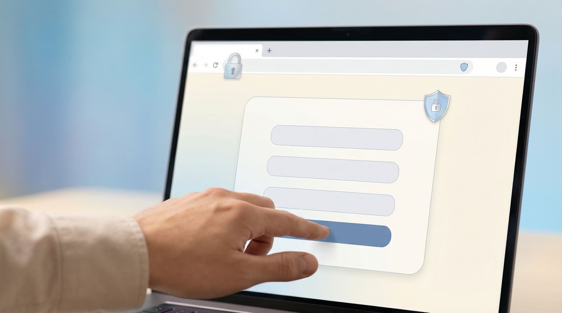
Quiet Security: Subtle UX Patterns That Signal Safety Without Killing Conversion

Most people don’t abandon a form because of one big red flag.
They leave because of a feeling.
A tiny moment of doubt: “Is this safe?”
A flicker of friction: “Why do they need that?”
A vague unease: “This looks… off.”
Quiet security is about designing forms so those doubts never get a foothold—without turning the experience into a wall of warnings, legalese, and scary security jargon.
For teams using tools like Ezpa.ge to spin up forms quickly, this balance is crucial. You want forms that:
- Feel safe enough for the data you’re asking for
- Stay light, fast, and conversion-friendly
- Scale across campaigns and teams without constant security babysitting
This post digs into the UX side of that equation: subtle patterns that communicate “you can trust us” while keeping your forms simple, beautiful, and high-converting.
Why Quiet Security Matters (Especially for Forms)
Security is usually framed as a technical problem: encryption, access controls, audit logs. All important. But at the moment someone is deciding whether to type their phone number or card details into your form, perception matters just as much as reality.
Three reasons this deserves your attention:
-
Trust is now the first hurdle, not the last.
People have been burned by spammy newsletters, shady lead gen, and outright phishing. If your form doesn’t look and feel safe, they won’t even start. -
Overt security can backfire.
Aggressive warnings, all-caps CONSENT blocks, and cluttered badges can make your form feel more like a legal document than a simple request. -
Subtle choices compound.
A slightly clearer label here, a calmer error state there, a concise privacy note at the right moment—together, they create a quiet sense of professionalism that lifts completion rates.
If you want to go deeper on the first-impression side of this, you’ll find a full breakdown of early trust cues in Security Signals in 3 Seconds: Visual and Copy Patterns That Earn User Trust Before the First Field.
Principle #1: Match the Security Tone to the Risk Level
Not every form needs to feel like a bank.
A newsletter signup asking for just an email should not have the same intensity as a loan application asking for income and ID details. When the tone is mismatched—either too intense or too casual—users feel it.
A simple rule of thumb:
-
Low-risk forms (email capture, basic feedback)
- Light reassurance, minimal legal copy
- Short note on how you’ll use their info
- No heavy security iconography
-
Medium-risk forms (demo requests, account creation)
- Clear privacy statement near the most sensitive fields
- Subtle visual cues of professionalism (consistent branding, calm colors)
- Optional link to more detailed security/FAQ page
-
High-risk forms (payments, health info, financial data)
- Explicit mention of protection measures (e.g., secure payment processor, encryption in transit)
- Strong but not alarming visual hierarchy for consent and terms
- Clear indication of who will see the data and for what purpose
Quiet security means right-sized reassurance, not blanket boilerplate.
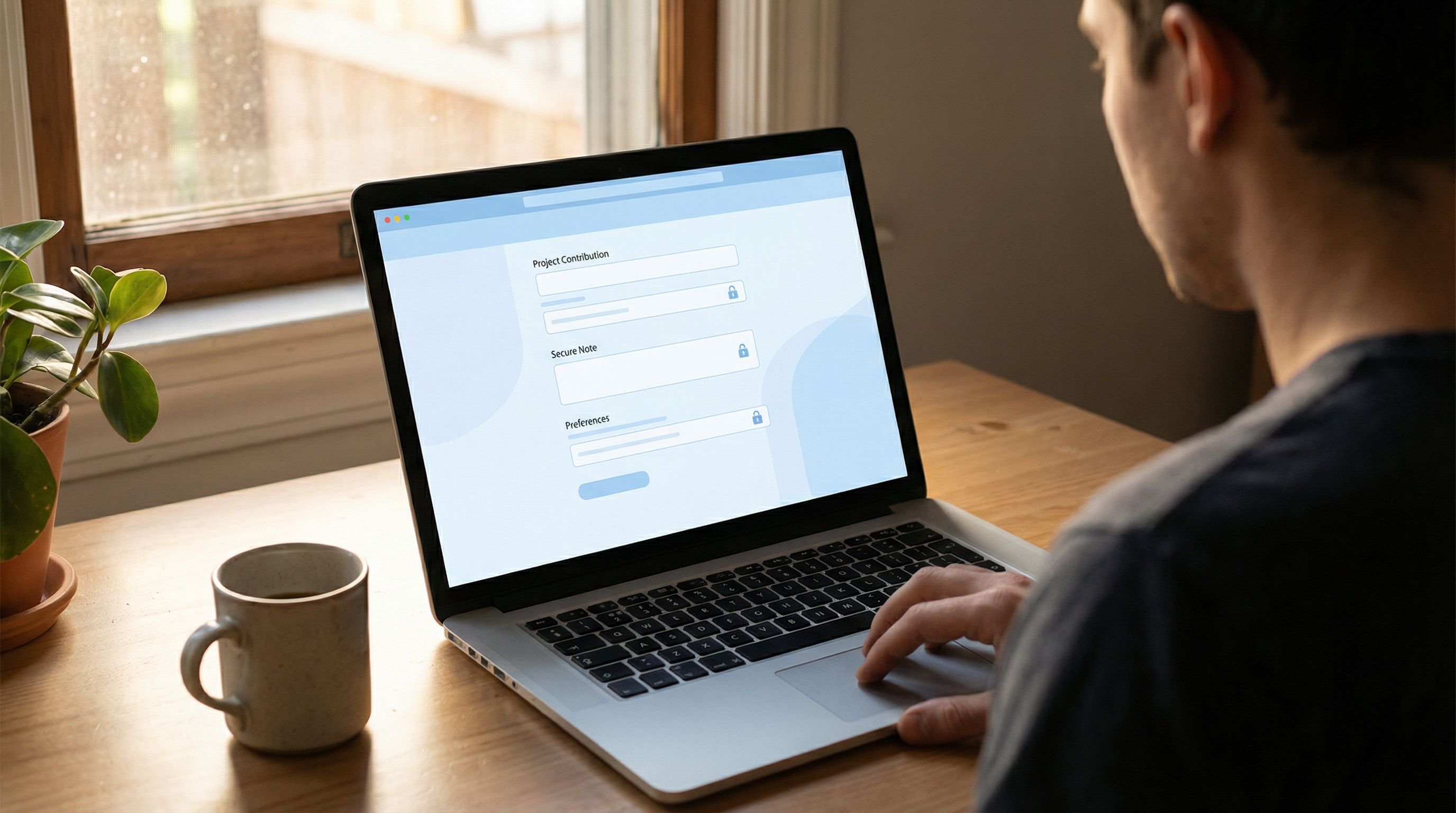
Principle #2: Make Safety Feel Native to the Design, Not Bolted On
Users can spot a bolted-on security fix from a mile away: a random red warning box, a mismatched badge, a footer paragraph that reads like it was pasted from legal.
Instead, bake security into the visual system of your forms.
1. Use Calm, Consistent Visual Language
- Color: Reserve aggressive reds for actual errors or fraud warnings. For reassurance, use softer blues or neutrals.
- Icons: Use a single lock or shield style across the product. Avoid mixing clipart-style icons with modern UI.
- Typography: Keep security-related copy in the same font system as the rest of the form—no ALL CAPS ransom-note sections.
In Ezpa.ge, this often means defining a form theme where your security cues (link color, helper text style, subtle icons) are part of the base design, not one-off decorations.
2. Place Security Cues Where Decisions Happen
A generic “We care about your privacy” in the footer is easy to ignore. Instead, place small, specific cues exactly where users hesitate:
-
Below an email field:
“We’ll only use this to send your receipt and important updates. No marketing without your permission.” -
Near a phone number field:
“Optional. Add your number if you’d like SMS updates about your order.” -
Next to a file upload:
“Files are stored securely and only visible to our review team.”
These micro-messages do more work than a long, abstract privacy statement.
Principle #3: Reduce Ambiguity Before You Add Friction
Many “security” problems in forms aren’t about actual risk—they’re about uncertainty.
- “Why do they need my company size?”
- “Who will see this salary information?”
- “Is this required, or just nice to have?”
Before you add extra steps like checkboxes or multi-factor verification, ask: Can we remove the doubt with clearer UX instead?
Clarify Why You’re Asking
For any field that feels personal or unexpected, add a short “why” note.
Examples:
-
Budget range
“Helps us match you with the right plan—never shared outside our sales team.” -
Role/title
“So we can tailor onboarding resources to your responsibilities.” -
Use case
“We’ll use this to recommend the best starter template.”
If you’re already thinking about tailoring experiences ethically, this pairs well with the ideas in Ethical Personalization: How Far Should You Go When Tailoring Forms With AI and Analytics?.
Be Honest About Optional vs Required
Quiet security is also about respecting boundaries.
- Visually differentiate optional fields (label, helper text, or “Optional” tag)
- Avoid dark patterns like hiding required status until submit
- Don’t punish people with aggressive errors for skipping non-essential questions
When people feel you’re honest about what’s needed, they’re more willing to share what matters.
Principle #4: Design Errors and Validation as Guidance, Not Punishment
Nothing feels more unsafe than a form that seems to “fight” you:
- Red text everywhere
- Vague messages like “Invalid input”
- Sudden loss of entered data
Good validation is a quiet form of security: it prevents mistakes, protects data quality, and shows that someone has thought about real-world use.
Better Error Patterns
Aim for errors that are:
- Specific – “Use at least 8 characters, including one number.”
- Local – Shown next to the field, not just at the top of the form.
- Non-destructive – Never wipe all fields on error.
- Polite – Avoid blamey language like “You failed to…”
Use Inline Hints Instead of Surprise Walls
Rather than waiting for users to submit and then blasting them with red, provide gentle hints while they type:
- Password strength meters with neutral language
- Format helpers (e.g.,
MM / YYunder card expiry) - Auto-formatting for phone numbers and credit card fields
These patterns say, “We know what good data looks like and we’re helping you get there,” which builds confidence.
For a deeper dive into validation patterns and how they affect completion and satisfaction, check out Beyond ‘Required’: Rethinking Form Validation Rules for Better Data and Happier Users.
Principle #5: Use Copy That Sounds Like a Human, Not a Policy PDF
Security-related copy is where many teams accidentally scare people off.
Compare these two:
-
Stiff:
“By submitting this form, you agree to the collection and processing of your personal data in accordance with our Data Processing Addendum and applicable regulations.” -
Human:
“We use your info to set up your account and support you. You can see exactly how we handle data in our privacy policy.”
Both can be legally accurate. One feels like a threat; the other feels like a conversation.
Guidelines for Trust-Building Microcopy
- Prefer short sentences. Break long clauses into separate lines.
- Use verbs people use. “Use,” “store,” “share,” “keep,” instead of “process,” “retain,” “utilize.”
- Name who sees what. “Only our support team can see these details.”
- Avoid fear words unless necessary. “Breach,” “liability,” and similar terms belong in your policy, not your main form body.
You can still link to the full legal text—just don’t make the form itself read like a contract.
Principle #6: Show the Path of the Data (At a Glance)
A big source of anxiety: people don’t know where their data goes.
Quiet security patterns make that path visible without forcing users to read a diagram.
Simple Ways to Expose the Data Journey
-
Who receives it?
“Submissions go directly to our onboarding team—no third-party resellers.” -
Where is it stored?
“Stored securely in our systems and synced to our CRM.” -
How long is it kept?
“We keep this for the duration of your trial unless you ask us to delete it sooner.”
In Ezpa.ge, you can back this up operationally by syncing submissions to a tightly controlled Google Sheet and limiting who can access that sheet. If you’re using forms as part of your operational backbone, Ops-Friendly Form Security: Practical Guardrails That Don’t Slow Teams Down is a useful companion read.
Principle #7: Use Structure to Imply Care and Competence
A sloppy form feels unsafe, even if the backend is rock solid.
Subtle structural choices send the opposite message: “We are careful. We notice details. You can trust us with yours.”
Structural Patterns That Signal Care
- Logical grouping. Related fields are grouped with short headings (e.g., “Contact details,” “Company info,” “Billing”).
- Progress indicators. Multi-step forms show a clear, non-threatening progress bar—no surprise extra steps.
- Reasonable length. Only the fields needed for the current promise. Extra questions can come later.
- Consistent spacing and alignment. Misaligned labels, random gaps, and inconsistent button styles all chip away at trust.
When you build forms in Ezpa.ge using reusable blocks and themes, you’re effectively creating a system of care. Each new form inherits those quiet signals of competence without extra effort.
Putting It All Together: A Quietly Secure Form Checklist
Here’s a practical checklist you can run through for your next form:
-
Risk level:
- What’s the most sensitive piece of data we’re asking for?
- Does the overall tone match that level of risk?
-
Visual cues:
- Are security signals (icons, colors, badges) consistent with our brand?
- Is anything shouting “danger” unnecessarily?
-
Field clarity:
- For any sensitive field, is it clear why we need it?
- Are optional fields clearly marked and truly optional?
-
Microcopy:
- Does the form read like a human wrote it?
- Do we explain who sees the data and how it’s used, in one or two plain sentences?
-
Validation:
- Are error messages specific, polite, and placed next to the field?
- Do we avoid wiping user input on error?
-
Data journey:
- Is there a short note or link explaining where submissions go?
- If we sync to tools like Google Sheets or a CRM, are access controls in place?
-
Overall feel:
- Would you personally feel comfortable filling this out with your real details?
- If not, what’s the exact moment you hesitate—and how can you smooth it?
Run this checklist once, then bake the resulting patterns into your Ezpa.ge templates so every new form benefits automatically.
Summary
Quiet security is the practice of making forms feel safe without overwhelming people with warnings, legal text, or friction.
You do this by:
- Matching security tone to the actual risk level of the form
- Embedding security cues into your visual system instead of bolting them on
- Reducing ambiguity with clear “why” explanations near sensitive fields
- Treating validation as guidance, not punishment
- Writing human, concise microcopy that explains who sees what and why
- Exposing the path of the data in a simple, reassuring way
- Using structure and consistency to signal care and competence
The result: forms that convert better, collect higher-quality data, and quietly earn you a reputation for being trustworthy.
Where to Go Next
You don’t need a security overhaul to start. You need one form and one improvement.
Pick a live form—maybe your main signup, your demo request, or your most sensitive intake flow. Then:
- Open it in Ezpa.ge.
- Choose one of the principles above (for example, clarifying why you ask for the most sensitive field).
- Ship a small change.
- Watch how it affects completion rate and support questions.
From there, you can gradually standardize these quiet security patterns across your templates and teams.
If you’re ready to build forms that feel as safe as they are powerful, open Ezpa.ge, spin up a new form, and start layering in these subtle cues. Your users may never comment on them—but you’ll see the impact in trust, completion, and the quality of the data you get back.