Security Signals in 3 Seconds: Visual and Copy Patterns That Earn User Trust Before the First Field


Your form has about three seconds to answer one question in a user’s mind:
“Is it safe to give you my information?”
If the answer feels even slightly like “I’m not sure,” people bounce. They don’t scroll. They don’t start the first field. They just close the tab and move on.
Those first three seconds are governed by signals, not logic. Users aren’t reading your privacy policy or inspecting your DNS records. They’re scanning for visual and copy cues that say:
- This is legitimate.
- This is professional.
- This is safe enough for what I’m about to share.
Ezpa.ge was built to make beautiful, responsive forms with custom themes, custom URLs, and real-time Google Sheets syncing—but none of that matters if people don’t trust the form at a glance. This post is about designing those crucial first impressions.
We’ll break down the specific patterns—layout, typography, color, microcopy, and small UX details—that quietly tell users: you can trust this form before you ever touch a field.
Why Three-Second Trust Signals Matter
Most teams think of “form security” as a backend concern: encryption, access control, audit logs. Those are critical (and we’ve written about them in depth in Ops-Friendly Form Security), but they’re invisible to the person actually filling out your form.
On the user side, what matters is perceived security and professionalism. That perception shapes:
- Start rate – Do people even begin the form?
- Completion rate – Do they feel safe enough to finish when questions get more personal?
- Data quality – Do they give real answers, or fake emails and placeholder phone numbers?
- Brand perception – Do they walk away thinking, “This feels like a serious company,” or “That looked sketchy”?
You can have perfect security under the hood and still lose conversions because your form looks fragile or improvised.
The flip side: if you design strong security signals into the first screen, you earn the right to ask for more sensitive data later—without adding friction or scaring people off. That’s the balance we explored in Security Without Paranoia; here, we’re zooming in on the very first moment.
What Users Actually Notice in the First Three Seconds
Most people scan a form page in a predictable pattern:
- Top-left / logo area – “Who is this?”
- Main headline – “What is this for?”
- Subhead / short description – “Why do you need my info?”
- Primary button or first field – “What am I committing to?”
- Tiny reassurance cues – “Is this safe?”
That’s your canvas. Every element above the first field should be doing one of three jobs:
- Establishing identity (who you are)
- Clarifying purpose (what this form does)
- Communicating safety (how you’ll treat the data)
If an element doesn’t help with one of those, it’s probably noise.
Visual Patterns That Quietly Signal “This Is Safe”
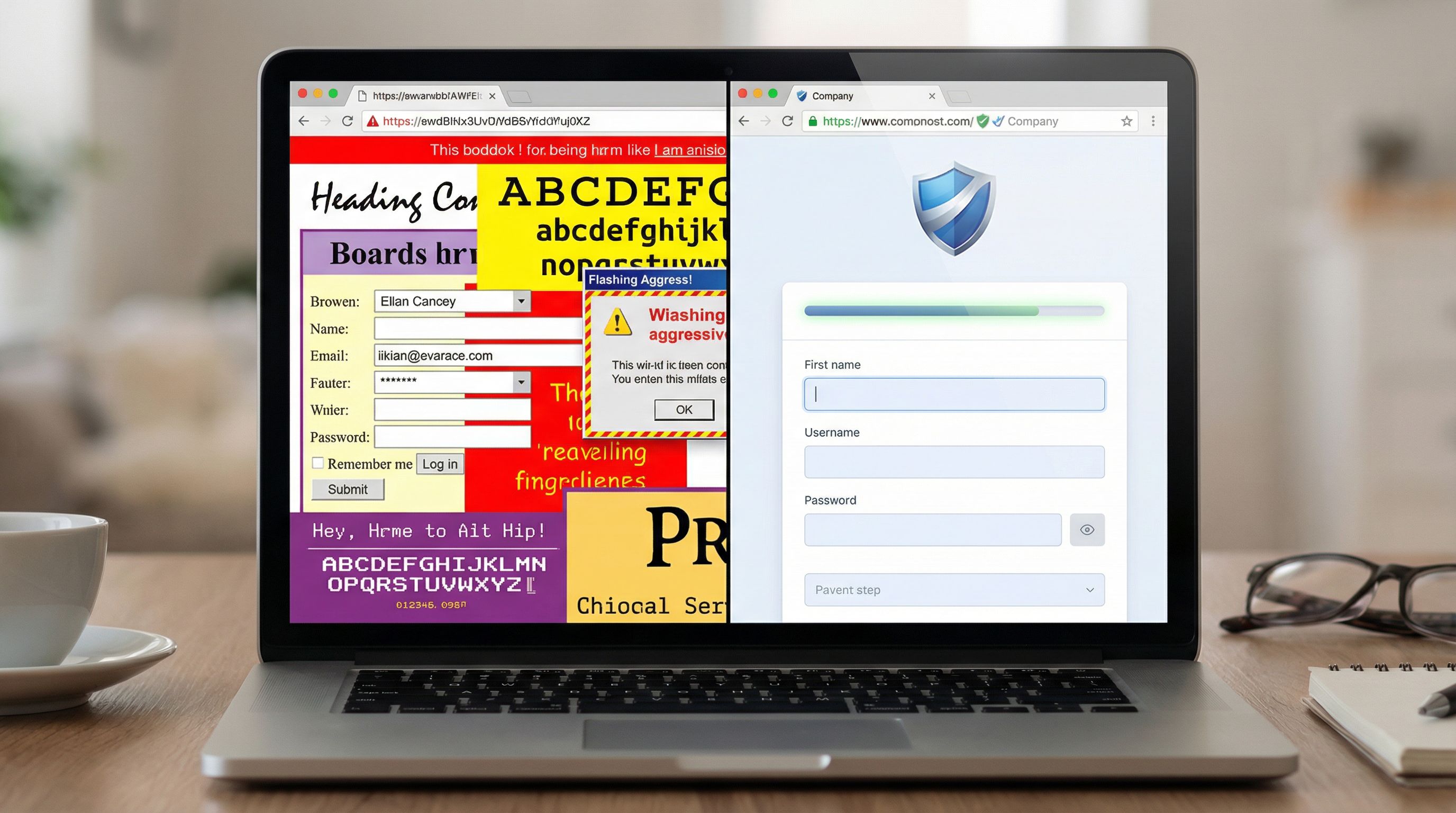
1. Layout That Looks Deliberate, Not DIY
People are remarkably good at sniffing out last-minute, “someone hacked this together” layouts. That’s a problem, because hasty layouts often correlate with hasty security.
Design your form shell so it feels intentional:
- Use a single clear column for the core content. Avoid multi-column chaos above the fold.
- Give the form breathing room with generous padding and whitespace around the container.
- Align everything – logo, headline, description, and form box should share a consistent grid.
- Avoid cramped edges – text or fields touching the edges of the screen feel unpolished.
On Ezpa.ge, this is where a well-chosen theme does a lot of work for you: consistent spacing, container width, and alignment come “for free” once you pick a solid base.
2. Typography That Feels Professional and Legible
Type is one of the strongest subconscious trust signals.
Aim for:
- One primary font family (two max, with a clear hierarchy).
- Readable sizes: a 24–32px headline, 16–18px body text, and 14–16px labels.
- Sufficient line spacing so text doesn’t feel cramped.
- High contrast between text and background (but not harsh pure black on pure white if you’re going for a softer tone).
Red flags that erode trust:
- Overly playful display fonts on serious flows (e.g., salary, healthcare, legal).
- Inconsistent font sizes and weights on the same screen.
- Tiny body copy that feels like it’s trying to hide something.
3. Color Choices That Separate Brand From Danger
Color is doing two jobs at once: expressing your brand and encoding meaning.
For security signals, follow these principles:
- Reserve red and orange for actual errors or urgent warnings. If your brand primary is a bright red, consider using a calmer shade for the form shell and keep the intense red for accent or logo only.
- Use a calm, neutral background (soft gray, off-white, or subtle gradient) behind the form container.
- Choose a single primary accent color for buttons and links; avoid a rainbow of competing colors.
- Make the submit button feel solid, not ghostly: filled, clear label, good contrast.
If you’re collecting especially sensitive data, it can help to lean into slightly more muted, “serious” tones for the form itself, even if your marketing site is more playful.
4. Familiar Chrome: Logos, Favicons, and URLs
Before users read anything, they often check: “Who owns this page?”
Strengthen that answer with:
- A recognizable logo in the top-left of the form or page.
- A branded favicon in the browser tab.
- A clean, human-readable URL (this is where Ezpa.ge custom URLs shine).
Instead of:
https://randomtool.io/form/3x9f7a?campaign=4432
Aim for:
https://forms.yourcompany.com/security-revieworhttps://yourbrand.ezpa.ge/vendor-security-intake
Short, descriptive slugs are tiny but powerful trust signals. If you’re running campaigns across multiple channels, you can still keep URLs clean while tailoring them per channel—see Channel-Specific Forms for patterns.
Copy Patterns That Build Trust Before the First Field
Visuals get users to pause. Copy convinces them to proceed.
The microcopy above your first field should answer three questions as quickly as possible:
- What is this form going to do for me?
- How long will this take?
- What will you do with my data?
1. A Headline That States the Outcome, Not the Form Type
Instead of generic headlines like:
- “Contact Form”
- “Submit Your Details”
Use outcome-driven headlines:
- “Request Your Security Review Report”
- “Get a Demo of Ezpa.ge for Your Ops Team”
- “Share Feedback to Improve Your Support Experience”
This frames the form as a helpful step, not a data grab.
2. A Subhead That Sets Expectations
Right under the headline, add a single sentence that covers scope and time:
“This short form (3–5 questions) helps us route your request to the right team within one business day.”
Or:
“We’ll use your responses to customize your walkthrough—no marketing spam, ever.”
Specificity builds trust. “Short form” is okay; “3–5 questions” is better.
3. A Single, Clear Privacy Promise Above the Fold
You don’t need a wall of legalese upfront. You do need one clear, plain-language promise before the first field, such as:
- “We’ll only use this information to respond to your request.”
- “Your responses are encrypted in transit and at rest.”
- “We never sell or share your data with third parties.”
Link to the full policy, but keep the key promise visible:
We respect your privacy. We’ll only use this information to follow up about your request. Read our full privacy policy.
4. Labels and Help Text That Don’t Feel Nosey
Every field label is a micro trust test. Avoid:
- Vague labels: “Information,” “Details,” “Comments.”
- Overly personal asks with no context: “Phone number,” “Budget,” “Home address.”
Instead, pair fields with purpose:
- “Work email (for sending your security report)”
- “Preferred contact method (so we don’t spam you)”
- “Rough budget range (helps us suggest the right plan—optional)”
If a field might feel sensitive, say why you’re asking and whether it’s optional.
5. Button Text That Describes the Next Step
“Submit” is vague. It doesn’t say what happens next.
Use verbs that describe the outcome:
- “Request My Security Review”
- “Schedule My Demo”
- “Send Feedback”
If the action will trigger something time-bound or specific, mention it:
- “Get My Quote (Within 1 Business Day)”
This reduces anxiety: people know what they’re agreeing to.
Micro-Interactions That Signal Safety Without Slowing People Down
Trust isn’t just what users see; it’s how the form behaves.
1. Gentle, Clear Validation (No Red Walls)
Harsh, all-caps error messages and aggressive red outlines can make a form feel hostile or broken.
Instead:
- Validate inline, near the field, with short, human messages.
- Use soft red or orange for errors, paired with calm language: “That email doesn’t look right—mind double-checking?”
- Avoid punishing users for small mistakes (e.g., auto-format phone numbers instead of throwing errors).
For a deeper dive on validation patterns, see Beyond ‘Required’.
2. Subtle Progress Indicators
If your flow is more than one step, a simple progress indicator can dramatically reduce abandonment:
- A step label: “Step 1 of 3: About your team.”
- A thin progress bar above the form.
The key is honesty: don’t say “Step 1 of 2” and then quietly add more steps. That’s a trust-killer.
3. Lightweight Security Badges—Used Sparingly
Logos for well-known security frameworks or certifications can help, but only when they’re:
- Truthful (you actually have the certification).
- Relevant to the data being collected.
- Placed near the action, not dominating the page.
For example, a small “SOC 2 Type II” badge with a tooltip or link to a security page can reassure more technical buyers without overwhelming everyone else.
4. Clear Contact Paths for Humans
A tiny line like:
Questions? Email security@yourcompany.com and we’ll help you out.
…does a lot of work. It tells users there are real people behind the form and gives them an escape hatch if something feels off.

Putting It All Together: A Three-Second Trust Checklist
Before you worry about advanced flows, ask: If someone glances at this form for three seconds, what story do they get?
Here’s a quick checklist you can run on any form—especially those you build in Ezpa.ge.
Above-the-Fold Shell
- Logo present and crisp, aligned with brand.
- Custom URL that’s short, branded, and descriptive.
- Clear headline describing the outcome, not the form type.
- Concise subhead setting expectations (purpose + time).
- One visible privacy promise in plain language.
Visual Design
- Single-column layout with generous whitespace.
- Consistent typography (1–2 fonts, clear hierarchy).
- Calm, neutral background around the form container.
- Single primary accent color for buttons and key links.
- No unnecessary red/orange unless something is truly wrong.
Copy & Interaction
- Field labels explain the “why” for anything that might feel sensitive.
- Optional fields are clearly marked and truly optional.
- Button text describes the next step, not just “Submit”.
- Inline validation is polite, specific, and non-technical.
- Progress indicators are honest and minimal.
Context & Continuity
- Form branding matches your main site (colors, logo, tone).
- Thank-you state or confirmation page continues the same story—what happens next, and when.
- Data routing is set up so responses actually go somewhere useful (Ezpa.ge → Google Sheets, CRM, or your ops stack). If you’re not sure what to measure, Low-Noise Analytics is a good next read.
If you can’t check most of these boxes, you don’t have a conversion problem yet—you have a trust problem.
How Ezpa.ge Helps You Ship Trustworthy Forms Quickly
You don’t need a full design team and a security engineer in every build. With a system like Ezpa.ge, you can bake these patterns into how you work:
- Themes as trust presets – Start from a clean, professional theme with sane defaults for spacing, typography, and color; tweak from there instead of reinventing the shell every time.
- Custom URLs for every flow – Use memorable, descriptive slugs for each form (and channel-specific variants when needed).
- Real-time Google Sheets sync – Route submissions into a controlled Sheet with proper access, so you’re not copying sensitive data into random files.
- Reusable copy blocks – Save your best headlines, privacy promises, and button labels as patterns you can drop into new forms.
Combine that with the patterns from this post, and you’ll start to see a shift: fewer bounces on the first screen, higher completion rates, and better-quality data from people who feel safe enough to be honest.
Summary
Those first three seconds on a form are a trust referendum. Users are scanning for signals—visual and verbal—that tell them whether it’s safe and worthwhile to share their information.
You earn that trust by:
- Designing a clean, intentional visual shell: clear layout, consistent typography, calm colors, and branded URLs.
- Writing outcome-focused headlines and honest microcopy that explain what the form is for, how long it will take, and how you’ll use the data.
- Using gentle, predictable interactions—inline validation, honest progress indicators, clear next steps—that make the form feel stable and cared-for.
- Ensuring continuity from first impression to submission: branding, tone, and expectations stay consistent, and data flows into systems that respect security.
When you get these details right, users don’t just complete your forms—they feel good about doing it.
Your Next Step
Pick one high-impact form—your demo request, security questionnaire, or main intake flow. Don’t rebuild it. Just:
- Open it and give yourself three seconds to scan the top of the page.
- Write down the story it tells right now about identity, purpose, and safety.
- Use the checklist above to make three concrete improvements to the shell: one visual, one copy, one interaction.
If you’re using Ezpa.ge, spin up a duplicate of the form, apply those changes with a cleaner theme and a custom URL, and run it side by side with your original. Watch what happens to start rate and completion.
The work of earning trust doesn’t start with the first field. It starts the moment your form appears on screen. Make those three seconds count—and let Ezpa.ge handle the rest.