Brand-First Error States: Designing Form Failures That Still Build Trust

Most teams obsess over how their forms look when everything goes right.
But the real test of your brand shows up when something goes wrong: a mistyped email, a declined card, a flaky network, a required field someone doesn’t understand.
Those error states are not just UX details. They’re small, high-stakes moments where users decide:
- “Do I trust this product?”
- “Do these people know what they’re doing?”
- “Is it worth trying again?”
Handled well, errors can increase completion rates, reduce support tickets, and leave users feeling more confident than if they’d breezed through on the first try.
Handled poorly, they quietly wreck funnels you’ve spent months perfecting.
This post is about treating error states as a brand surface—not just red text under a field. We’ll look at how to design failures that feel on-brand, respectful, and even reassuring, using tools like Ezpa.ge to ship those patterns consistently across every form.
Why Error States Are a Brand Problem (Not Just a UX Detail)
Error messages sit at the intersection of emotion, risk, and effort:
- People are already doing something slightly uncomfortable: sharing information, committing to a decision, or asking for help.
- An error introduces friction and doubt: “Did I mess up? Is this system broken? Is my data safe?”
- How you respond—visually and verbally—either calms that doubt or amplifies it.
A few reasons this matters more than it seems:
1. Errors are conversion choke points
Research on microcopy and form UX consistently shows that clear, specific error messages can lift conversion by double digits, while vague or hostile ones drive abandonment.
When you:
- Explain exactly what went wrong
- Show users how to fix it in one step
- Keep the tone calm and human
…you protect the intent they arrived with.
2. Errors carry more emotional weight than success states
People remember friction more vividly than smooth experiences. A single confusing or accusatory error can overshadow an otherwise polished flow.
That’s why treating errors as a brand channel matters:
- A supportive error can make your product feel competent and kind.
- A generic or snarky error can make your product feel careless or unsafe.
3. Errors are where your system’s honesty shows
When something fails—especially around payments, security, or sensitive data—users are scanning for signs of:
- Competence: “Do these people know what’s happening?”
- Transparency: “Are they hiding something?”
- Care: “Are they on my side, or am I the problem?”
Your error states are where you answer those questions, explicitly or implicitly.
If you’ve read posts like Security by Structure: Question Patterns That Reduce Risk Before Encryption Even Starts, you’ve seen how question design can signal safety. Error design is the other half of that story.
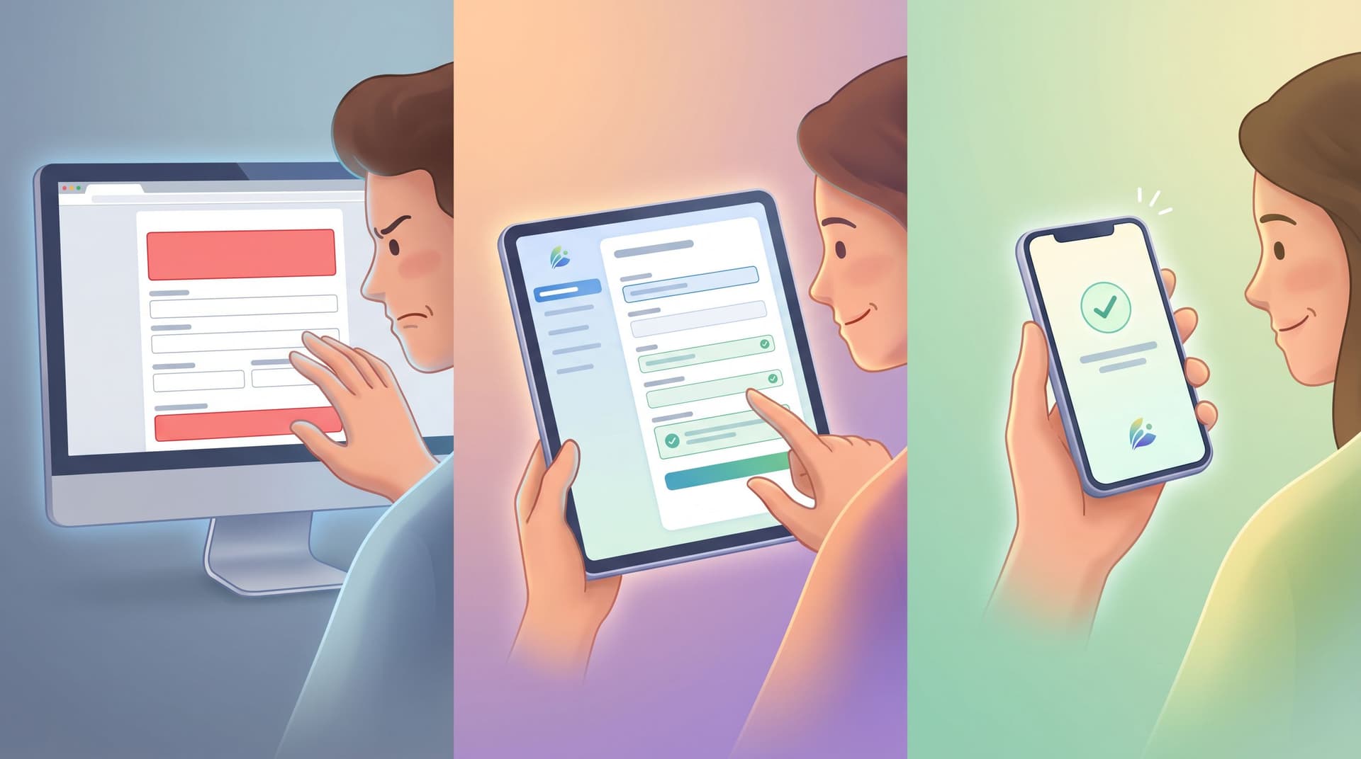
What “Brand-First” Error States Actually Mean
Brand-first doesn’t mean cute. It means coherent.
A brand-first error state:
- Uses visual language that matches your core UI: color, typography, spacing, iconography.
- Uses verbal language that matches your voice: calm, direct, and respectful—even under stress.
- Respects the promise your form made at the start: fast, simple, safe, helpful.
Think of it as a small checklist:
Visual alignment
- Error color is a deliberate token in your design system (e.g.,
--color-danger) that’s used consistently. - Layout doesn’t jump or break when an error appears (reserve space or use patterns that don’t push content unpredictably).
- Icons, borders, and highlights follow the same logic across all forms.
Verbal alignment
- Sentences are written in your approved voice & tone guidelines.
- Words you’d never use in marketing (e.g., “authentication credentials invalid”) don’t suddenly appear in a payment error.
- You avoid blame, jargon, and panic.
Interaction alignment
- Validation behavior (inline vs. on-submit) is consistent.
- Recovery paths (retry, contact support, save progress) match your trust posture elsewhere.
When these three layers line up, users don’t experience errors as “something went wrong.” They experience them as: “This product is helping me finish.”
Step 1: Map Your High-Risk Moments
Before rewriting a single line of microcopy, identify where errors matter most.
Look for:
- High-intent forms: demo requests, pricing inquiries, job applications.
- High-stakes forms: payments, identity verification, legal agreements.
- High-friction forms: long onboarding, research intake, multi-step flows.
For each, answer:
- What does a user think they’re doing here? (e.g., “I’m buying,” “I’m joining a cohort,” “I’m asking for help.”)
- What are the top 5 error scenarios? (e.g., invalid card, email already in use, missing required consent.)
- What’s the cost of failure—for them and for you?
Start with the flows where intent + risk + friction are all high. That’s where brand-first error states will pay off fastest.
If you’re already running structured programs with forms—like community onboarding or cohort intros—the post Forms for Community-Led Growth: Onboarding, Cohort Intros, and Rituals Without a Custom Portal is a useful companion to this mapping exercise.
Step 2: Design a Reusable Error System (Not One-Off Messages)
Most teams accumulate error messages one ticket at a time. The result: a messy patchwork of tones, patterns, and behaviors.
Instead, design a small system you can apply everywhere.
Define your error types
At minimum, define these categories:
-
Field validation errors
- Example: “Email must include an @ — try name@company.com.”
- Goal: fixable by the user in one step.
-
Form-level errors
- Example: “We couldn’t submit your request. Check the fields highlighted below.”
- Goal: orient the user when multiple fields need attention.
-
System/technical errors
- Example: “We’re having trouble saving your details. Your data is safe—please try again in a moment.”
- Goal: acknowledge the issue, protect trust, and offer a path forward.
-
Permission or policy errors
- Example: “This email is already linked to a workspace. Try signing in instead.”
- Goal: clarify rules and show the next action.
For each type, decide:
- Where it appears (inline, top of form, toast, modal).
- How it looks (color, icon, spacing, motion).
- How long it persists (until resolved vs. timed).
In Ezpa.ge, this is where themes and design tokens shine: you can set consistent colors, border styles, and typography for error states once, then reuse them across every form.
Step 3: Write Brand-Safe Error Microcopy
The highest leverage move is often rewriting 10–20 lines of microcopy.
Use these principles:
1. Lead with the fix
Structure messages as:
What went wrong + how to fix it
Compare:
- ❌ “Invalid input.”
- ✅ “Card number looks too short — check the 16 digits on the front of your card.”
The second line is doing work: it’s specific, visual, and immediately actionable.
2. Match tone to the moment
Playful copy might work for a newsletter signup. It does not work for a declined payment or lost application.
Consider a simple tone ladder:
- Low stakes (newsletter, feedback): light, friendly, brief.
- Medium stakes (feature access, trial signup): calm, encouraging, clear.
- High stakes (billing, identity, legal): serious, precise, reassuring.
You can still be human without being flippant:
- ❌ “Uh-oh! Something exploded on our side. Try again?”
- ✅ “We couldn’t process that payment. Your card hasn’t been charged—please try again or use a different card.”
3. Remove blame
Errors are rarely just the user’s fault. Even when they are, blame kills trust.
-
❌ “You forgot to fill this out.”
-
✅ “Please add your email so we can send your confirmation.”
-
❌ “You entered the wrong password.”
-
✅ “That password doesn’t match this account. Try again or reset it.”
4. Add just enough context
Explain why you’re asking for something when it’s not obvious:
- “Company size helps us match you to the right plan.”
- “We ask for your phone number only to send delivery updates.”
This is especially important for errors that block progress. If you’re going to stop someone, explain why.
5. Keep it short and scannable
Aim for:
- One sentence, two at most.
- Key words front-loaded: “Card declined — contact your bank or try another card.”
- No nested clauses or long explanations inside an error.
If you need more detail, link out to a help article instead of turning the error into a paragraph.
Step 4: Make the Interaction Feel Safe and Predictable
Even perfect microcopy fails if the interaction pattern is chaotic.
Design for predictable recovery:
Inline vs. on-submit validation
-
Use inline validation for simple, local rules (format, required fields, min/max length).
- Show the error as soon as the user leaves the field.
- Don’t validate while they’re still typing.
-
Use on-submit validation for rules that require the whole form or a server check (duplicate email, address verification).
Mixing these thoughtfully reduces surprise and supports a sense of flow.
Clear focus and navigation
When an error occurs:
- Move focus (for keyboard and screen readers) to the first problematic field.
- Provide a summary at the top for long forms: “We found 3 things to fix,” with jump links.
- Keep the Submit button visible after errors, so the path to retry is obvious.
Don’t punish retries
Avoid patterns that feel like punishment:
- Clearing all fields after a single error.
- Locking accounts aggressively.
- Hiding what the user already entered.
Instead:
- Preserve all valid inputs.
- Let users edit only what’s wrong.
- If you must rate-limit or lock, explain timeline and next steps clearly.
Ezpa.ge’s real-time Google Sheets syncing helps here too: you can log error events alongside submissions to see where people get stuck, which fields trigger the most retries, and where you might be over-validating.
Step 5: Align Errors with Your Broader Trust Story
Error states don’t live in isolation. They’re part of a larger trust narrative across your product.
Connect them to other trust-building patterns:
- Latency handling: If your backend is slow or relies on third-party APIs, pair clear error states with thoughtful loading and retry patterns. (For a deeper dive on this, see Latency-Aware Form Design: Keeping Users Engaged When Your Backend Is Slow.)
- Security posture: When errors touch sensitive data, reinforce how you protect that data: “Your card hasn’t been charged,” “Your answers are encrypted and only used for matching you to a researcher.”
- Personalization boundaries: If you’re using AI to shape follow-up questions or validation logic, be extra explicit in errors about what’s happening and why, so the experience feels guided—not creepy.
Brand-first error design means your values show up even when things break:
- If you value clarity, your errors are brutally clear.
- If you value care, your errors are empathetic and patient.
- If you value speed, your errors prioritize fast recovery paths.
Step 6: Operationalize Error Design in Ezpa.ge
Good news: you don’t need a bespoke design system or a custom frontend to get this right.
With Ezpa.ge, you can:
-
Create a form theme that bakes in error styling
- Define your error color, border style, and typography once.
- Ensure every form—marketing, product, internal—uses the same visual language for errors.
-
Standardize error microcopy patterns
- Keep a short “error copy library” in a doc or Sheet:
- Email, password, phone, address, date, file upload, consent, payment.
- Use these as the default messages for new Ezpa.ge forms so you’re not reinventing them on deadline.
- Keep a short “error copy library” in a doc or Sheet:
-
Use custom URLs for high-stakes flows
- For example:
/billing/update-cardor/community/applyinstead of generic links. - This makes it easier to track where errors happen and to route people to the right help content.
- For example:
-
Sync errors into Google Sheets for analysis
- Add hidden fields or event logging that note:
- Which field errored
- How many attempts before success
- Whether the form was eventually submitted
- Over time, this gives you a live map of where your error design is working—and where it isn’t.
- Add hidden fields or event logging that note:
-
Test error variants without new pages
- Use Ezpa.ge’s theming and duplication to A/B test:
- Different error wordings
- Different validation timing (inline vs. submit)
- Different levels of detail in guidance
- Use Ezpa.ge’s theming and duplication to A/B test:
You don’t have to overhaul your stack. You just have to bring error states into the same level of care you already give to headlines and hero sections.
Quick Checklist: Are Your Error States Brand-First?
Use this as a 10-minute audit of your most important form.
Visuals
- [ ] Error color is consistent and accessible (contrast, not just color).
- [ ] Error messages don’t cause layout jumps or overlapping elements.
- [ ] Icons and highlights match the rest of your UI.
Copy
- [ ] Every error explains what went wrong and how to fix it.
- [ ] Tone matches the stakes (more serious for billing/identity).
- [ ] No blamey language (“you forgot,” “you did X wrong”).
- [ ] No unexplained codes or jargon.
Interaction
- [ ] Inline validation is used thoughtfully for simple rules.
- [ ] On-submit validation handles cross-field and server checks.
- [ ] Focus moves to the first error; long forms have a summary.
- [ ] Valid inputs are preserved after errors.
Brand & trust
- [ ] Errors use the same voice & tone principles as your marketing site.
- [ ] High-stakes errors explicitly reassure users about safety (e.g., charges, data use).
- [ ] Error patterns are consistent across forms and teams.
If you can’t check most of these boxes, you’re leaving trust—and likely revenue—on the table.
Bringing It All Together
Error states will always exist. The question is whether they feel like bugs or like part of a well-designed conversation.
When you treat errors as a brand surface, you:
- Protect the intent users arrived with.
- Turn moments of friction into proof points of competence and care.
- Create a form system that feels coherent, even as your team ships new flows.
Ezpa.ge gives you the building blocks—custom themes, URLs, and real-time Google Sheets syncing—to roll out those patterns without waiting on a redesign or a new frontend.
Where to Go Next
If this post sparked a few “we really should fix that form” thoughts, don’t wait for a big project.
Pick one high-stakes form.
Today, you can:
- Screenshot the form with its error states visible.
- Rewrite the top 5 error messages using the “what went wrong + how to fix it” pattern.
- Update the Ezpa.ge theme to standardize error colors and typography.
- Add a Google Sheets sync (if you haven’t already) so you can track where errors happen.
You’ll feel the impact quickly—in fewer support pings, smoother submissions, and users who keep going instead of quietly disappearing.
Your brand isn’t just what people see when things go perfectly. It’s how you show up when they don’t.
Start there.