Latency-Aware Form Design: Keeping Users Engaged When Your Backend Is Slow

Latency-Aware Form Design: Keeping Users Engaged When Your Backend Is Slow
Slow backends are a reality: overloaded CRMs, third‑party enrichment APIs, legacy billing systems, complex workflows stitched together with webhooks and spreadsheets. None of that matters to your users. They just know one thing:
“I hit submit… and now I’m waiting. Do I trust this enough to keep waiting?”
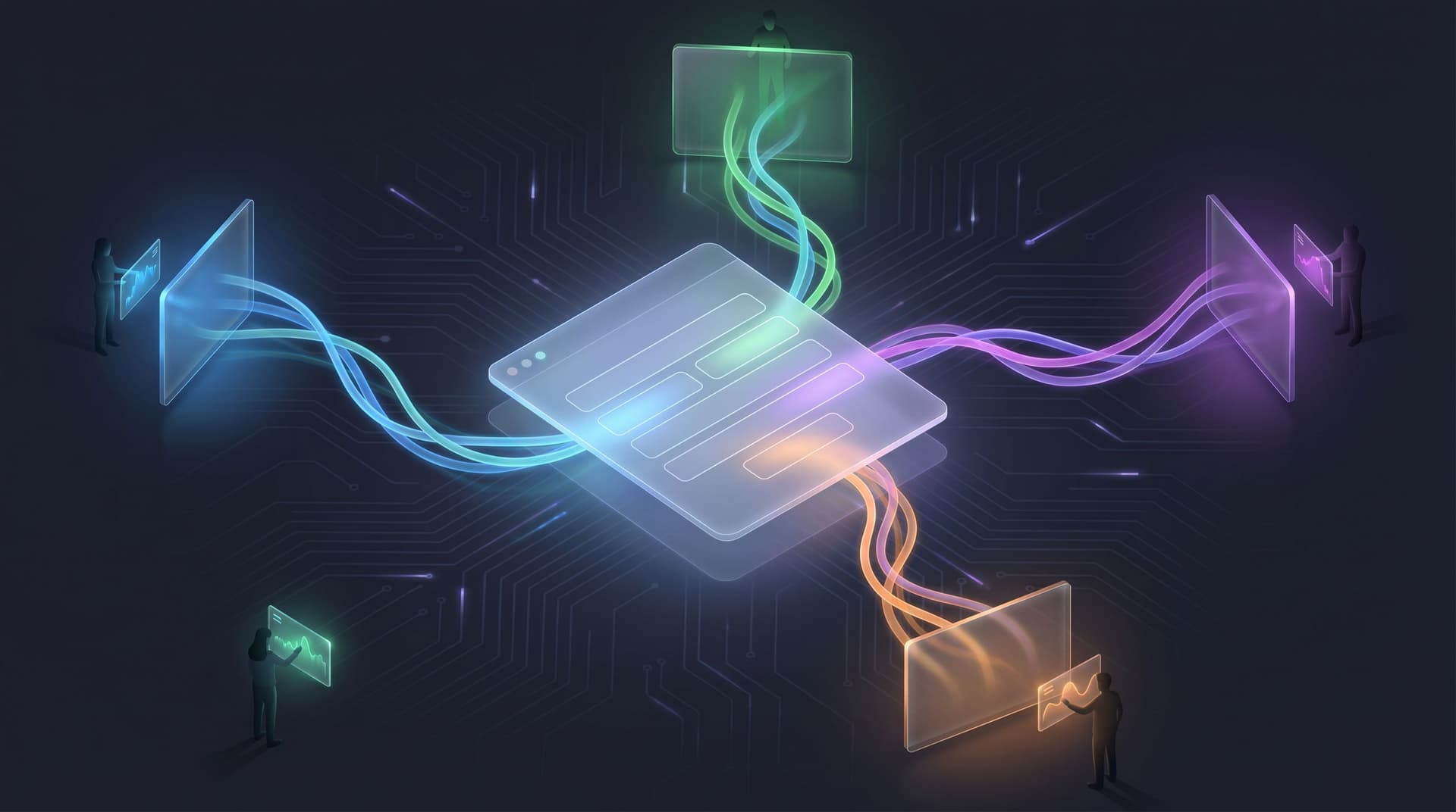
Latency-aware form design is about treating that gap—the time between user intent and system response—as a first-class design surface. When you do, you protect conversion, preserve trust, and buy your backend the time it needs.
This post walks through how to design forms that feel fast and reliable even when your infrastructure isn’t. We’ll focus on practical patterns you can ship with tools like Ezpa.ge, plus a few real-world tactics you can implement this week.
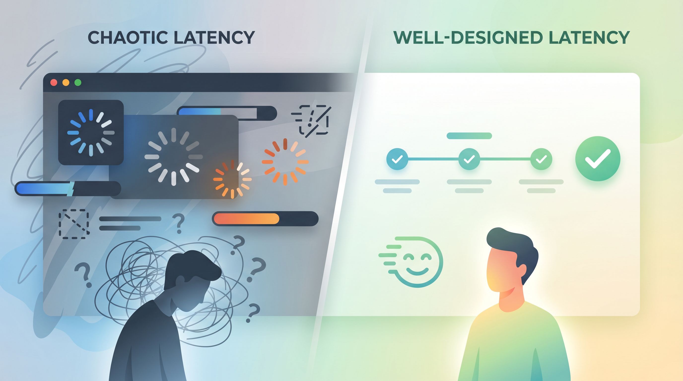
Why Latency Is a Form Problem (Not Just an Engineering Problem)
A slow backend doesn’t just add a few seconds of annoyance. It changes behavior:
- Drop-offs spike during waits. Studies on perceived performance show that people start to feel a delay at around 100–200ms, and delays above 1 second break the feeling of “flow.” Above ~10 seconds, people often abandon or switch tasks entirely.
- Trust erodes quietly. Unclear states (spinners that never end, buttons that seem unresponsive) make people wonder if their data is safe or if they should hit submit again.
- Support volume grows. Latency at submission time leads to “Did my form go through?” tickets, duplicate entries, and messy follow-up.
You may not be able to make your CRM, enrichment API, or internal workflow engine faster. But you can:
- Shape what users experience during the wait
- Decide when to sync with slow systems
- Design states that communicate clearly instead of leaving people guessing
That’s latency-aware form design.
Principle 1: Decouple “User Done” From “System Done”
The most important mental model shift:
The moment the user feels finished should not depend on your slowest dependency.
When someone hits submit on an Ezpa.ge form, you have at least two different milestones:
- User milestone: Their data is safely captured and acknowledged.
- System milestone: All the background work is complete (CRM write, enrichment, routing, notifications, etc.).
Latency-aware design makes the user milestone fast and explicit, then moves the system milestone into the background.
How to do it in practice
-
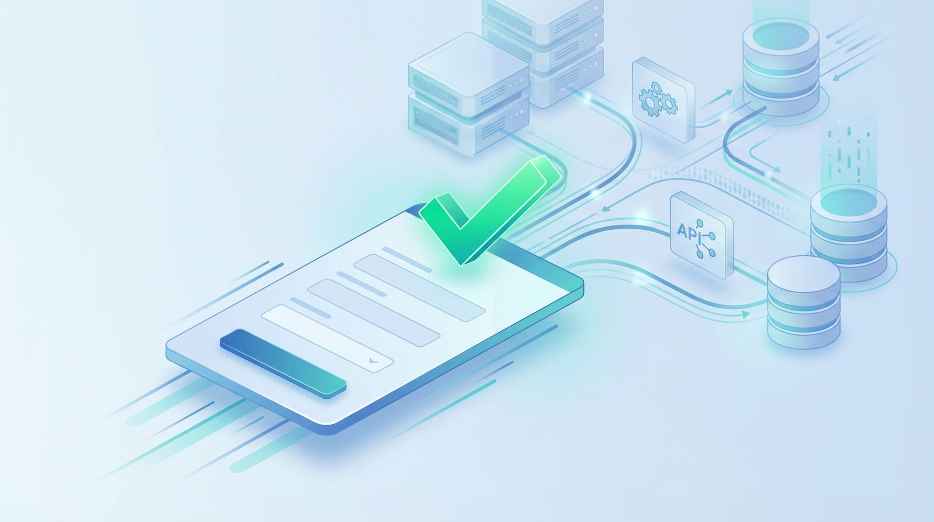
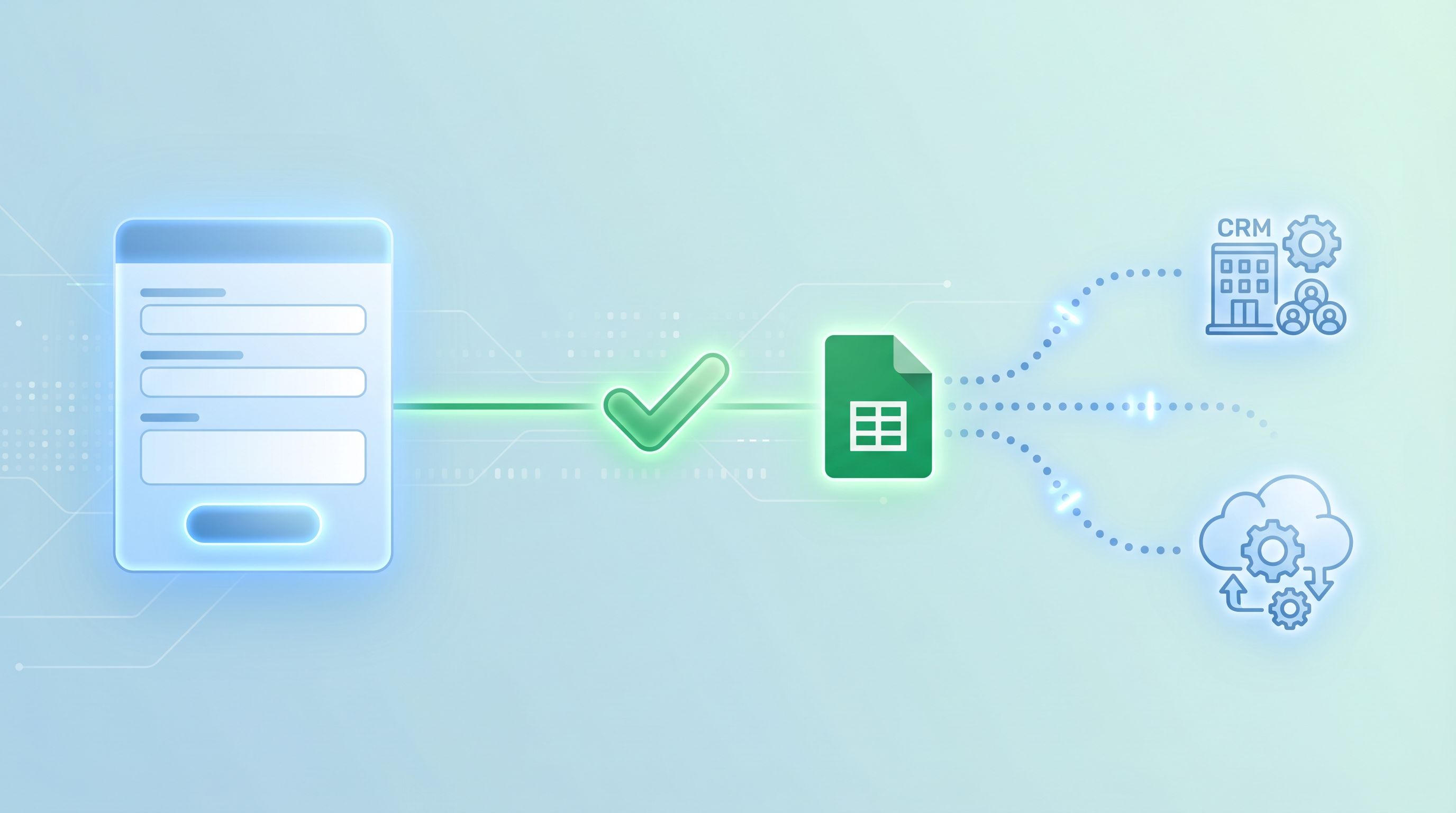
Write to a fast, reliable store first.
- Use Ezpa.ge’s real-time Google Sheets syncing as the first destination for submissions.
- Treat Sheets (or a similar fast store) as your “write buffer.” Once the row is there, you can safely tell the user “We’ve got it.”
- Later, sync that sheet into your CRM or workflow tools. For ideas on turning those raw rows into real pipeline views, see From Form to Revenue Signal: Using Google Sheets to Map Submission Data to Pipeline Stages.
-
Move slow work to async jobs.
- Instead of doing everything in the form submit handler, trigger webhooks or automation tools (Zapier, Make, n8n) that run in the background.
- Use status flags in your sheet (e.g.,
enriched = TRUE/FALSE,routed = TRUE/FALSE) to track progress.
-
Confirm fast, process later.
- Show a success state as soon as the fast write succeeds, not after every integration finishes.
- If you need to surface delays (e.g., “We’ll match you with a specialist”), do it in the confirmation message or follow-up email—not by holding the user on a spinner.
Principle 2: Design for Perceived Performance, Not Just Actual Speed
You can’t always shave seconds off your backend, but you can dramatically change how those seconds feel.
Make every interaction acknowledge input
A huge amount of “slowness” is just silence.
-
Instant button feedback.
- On click, immediately:
- Disable the button
- Change its label to something like “Submitting…”
- Slightly adjust its appearance (e.g., reduced opacity) to signal state change
- This removes the urge to double-click and avoids duplicate submissions.
- On click, immediately:
-
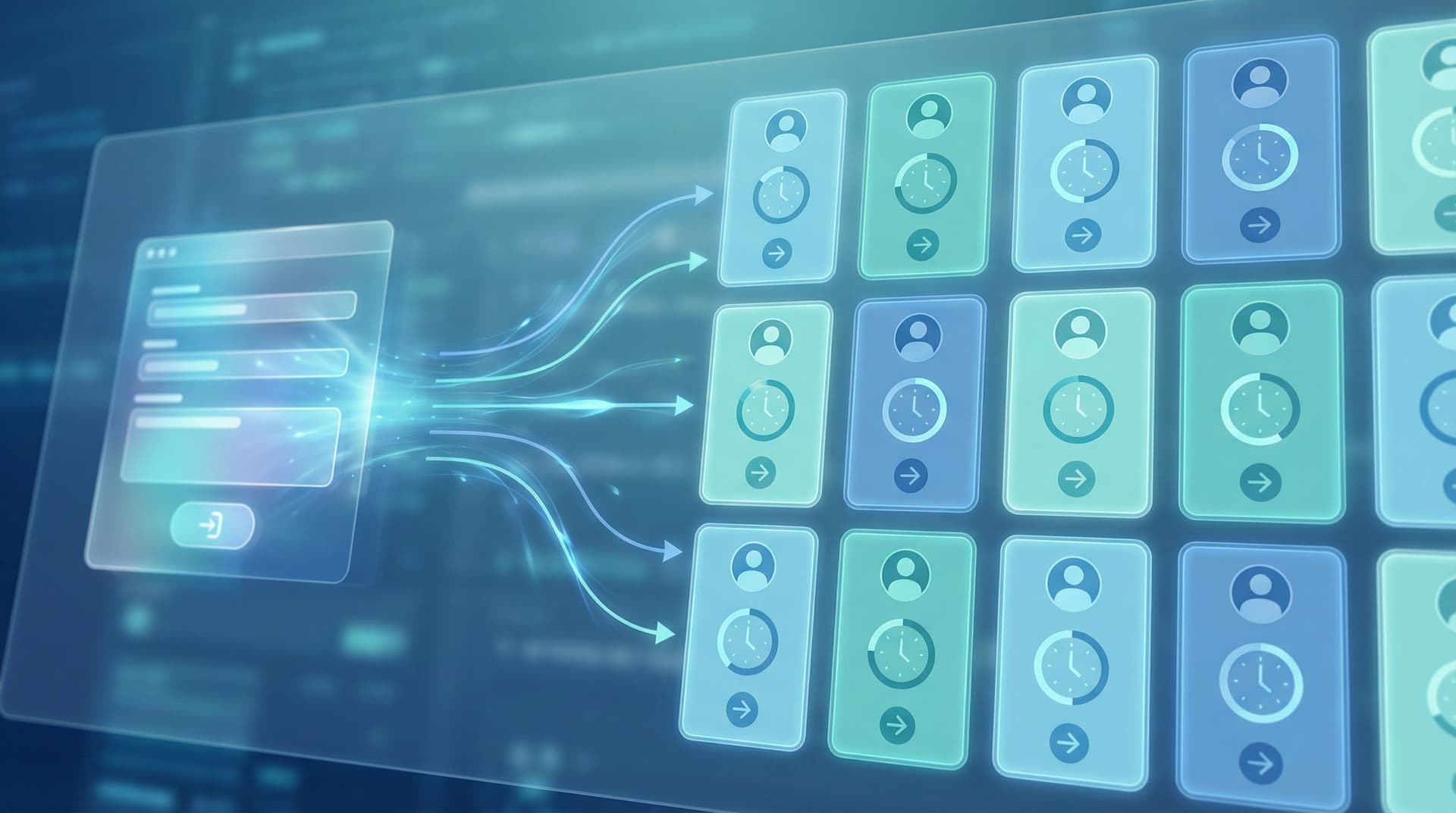
Inline progress cues.
- For multi-step forms, show a clear step indicator (e.g., “Step 2 of 4”).
- On submit, briefly show a micro-transition (e.g., progress bar animating to 100%) before the success state.
Use progress indicators strategically
Spinners are the default, but they’re not always the best choice.
-
For < 1 second waits:
- Avoid large spinners; they draw attention to tiny delays.
- Use subtle inline feedback (button state change, small shimmer) instead.
-
For 1–10 second waits:
- Use a progress bar or segmented indicator when you can approximate stages.
- Add contextual copy:
- “Encrypting your details…”
- “Matching you with the right teammate…”
- This keeps the wait from feeling like a black box.
-
For > 10 second waits:
- Don’t hold people hostage.
- Move to an async pattern:
- Show a success screen that says, “We’re finishing a few checks in the background. You’ll get an email in a few minutes.”
- Optionally include a lightweight status link for high-value flows (e.g., applications, complex onboarding).
Use content to reduce anxiety
Copy is one of your best latency tools.
Compare these two experiences:
-
Vague:
- Spinner with “Loading…”
- No indication of what’s happening or how long it might take.
-
Reassuring:
- “We’ve saved your answers. This can take up to 15 seconds while we sync with your workspace.”
- “No need to refresh or resubmit—your place is secure.”
The actual latency might be identical. The perceived reliability is not.
For more on using microcopy and structure to keep people comfortable—especially on mobile—take a look at Trust at First Tap: Mobile Form Patterns That Make Users Comfortable Sharing Sensitive Data.
Principle 3: Make Errors Boring, Clear, and Recoverable
Latency and errors are cousins. When time stretches, people start to wonder if something broke. Your job: make “something went wrong” a predictable, low-stress path.
Classify the failure modes
Think about three broad categories:
- Local/network issues (user goes offline, spotty connection)
- Backend timeouts (your server or third-party API is slow/unavailable)
- Validation or conflict errors (e.g., email already used, invalid data)
Each one deserves a distinct, human-readable response.
Design for safe retries
-
Never lose user input.
- Preserve field values client-side until you get a confirmed success.
- If a submission fails, keep everything filled and highlight only what needs attention.
-
Offer a single, obvious next action.
- “We couldn’t reach our servers. Your answers are still here.
- [Try again]
- Or email us at support@example.com”
- Avoid asking people to “go back” or start over.
- “We couldn’t reach our servers. Your answers are still here.
-
Guard against duplicate submissions.
- Use a client-side submission ID or timestamp.
- On retry, send the same ID so your backend can de-duplicate.
Communicate with specifics, not generic errors
Replace “Something went wrong” with:
- “We couldn’t connect to our system after 15 seconds. Your answers are still safe—please try again.”
- “Looks like this email is already associated with an account. Try logging in instead.”
The goal: even when things fail, the experience feels intentional.
Principle 4: Choose the Right Flow for Latency
Your flow shape—single-page vs multi-step, conversational vs traditional—can either amplify or hide latency.
When latency is mostly at submit time
If your backend work happens after the final submit (e.g., CRM write, routing, AI scoring), you want to:
-
Keep the form itself feeling snappy.
- Use client-side validation and helpful defaults.
- Avoid heavy on-change calls to the backend on every field.
-
Make the final submit feel decisive and safe.
- Clear CTA, strong confirmation, immediate success state.
A multi-step pattern often works well here, because it:
- Breaks a long form into smaller, less intimidating chunks
- Lets you validate and autocomplete locally as the user moves through steps
- Concentrates latency at a single, clearly signaled moment (“Submit application”)
If you’re weighing single-page vs multi-step patterns more broadly, you may find Multi-Step vs. Single-Page Forms: How to Choose the Right Flow for Each Use Case helpful.
When latency happens during the form
Sometimes you need to call the backend mid-flow:
- Checking domain availability
- Validating promo codes
- Fetching account details based on an ID
In those cases:
-
Make dependent fields clearly dependent.
- Gray out or hide fields that rely on a previous lookup until that lookup is done.
- Use labels like “We’ll fill this in for you once we find your account.”
-
Local-first where possible.
- Cache results in the browser so repeated checks feel instant.
- Use optimistic UI: show a provisional result quickly, then adjust if the backend disagrees.
-
Batch backend calls.
- Instead of validating every keystroke, validate on blur or on step change.
- For complex checks, move them to submit time and explain that you’ll verify later.
Principle 5: Use Themes and Micro-Interactions to Set Expectations
Visual design doesn’t just “look nice.” It shapes how people interpret latency.
-
Calm layouts reduce perceived wait stress.
- Generous spacing, clear hierarchy, and restrained motion make minor delays feel less alarming.
- Avoid frantic animations or aggressive timers unless they’re truly needed.
-
Consistent patterns build trust.
- Use the same loading states, button behaviors, and success patterns across all your forms.
- A form-focused design system—like the one outlined in Design Systems for Forms: Component Libraries, Tokens, and Guardrails Your Whole Team Can Use—helps you standardize these latency behaviors.
-
Match theme to emotional context.
- For high-stakes flows (financing, healthcare, legal), choose themes that feel stable and professional.
- For lighter flows (newsletter signup, event interest), you can afford more playful micro-interactions.
Tools like Ezpa.ge make this practical:
- Define themes that bake in your loading states, error patterns, and success screens.
- Reuse those themes across multiple forms, so users learn what to expect.
- Use custom URLs to give important flows memorable, trustworthy entry points.
Principle 6: Wire Latency Insights Back Into Your Ops
Latency-aware design isn’t just about the front-end experience. It’s also about giving your team the visibility to fix what matters.
Track the right signals
In addition to your usual analytics (completion rates, drop-off points), add:
- Time from first field focus to submit (are people hesitating?)
- Time from submit to first backend confirmation (how slow is “slow”?)
- Error and retry rates (are certain flows especially brittle?)
A lightweight analytics framework—like the one described in Baseline to Benchmarks: Building a Lightweight Form Analytics Framework Your Team Will Actually Use—pairs well with latency-aware design. You don’t need a full data warehouse; just enough signal to know where waits are hurting you most.
Connect latency to routing and SLAs
Once submissions land in Google Sheets, you can:
- Add columns for
first_touched_atandcompleted_attimestamps. - Calculate time-to-first-touch and time-to-resolution.
- Use conditional formatting or simple formulas to flag submissions that have been “waiting” too long.
Combined with patterns from From Form Fill to Auto-Routing: Designing Intake Flows That Assign Owners, SLAs, and Next Steps by Default, you can:
- Automatically assign owners based on form responses
- Set SLAs for follow-up
- Trigger alerts when something has been stuck longer than your target
The result: your forms don’t just hide latency—they help you systematically reduce it over time.
Putting It All Together: A Latency-Aware Checklist
When you ship your next Ezpa.ge form, run through this quick checklist:
Before you launch
- [ ] Do we write to a fast store (like Google Sheets) first, before slow systems?
- [ ] Is the user’s sense of “done” decoupled from our backend’s actual completion?
- [ ] Have we designed clear loading states for:
- [ ] Button click
- [ ] Step transitions (if multi-step)
- [ ] Final submit
- [ ] Are our error messages specific, human, and recoverable?
- [ ] Will users keep their input if something fails?
During implementation
- [ ] Are we avoiding unnecessary on-change backend calls?
- [ ] Are we batching or deferring heavy checks to submit time where possible?
- [ ] Do we have a plan for network issues (offline, timeouts, retries)?
After go-live
- [ ] Are we tracking submit-to-confirmation time?
- [ ] Do we know which forms have the highest error/retry rates?
- [ ] Are we using Sheets or another store to monitor SLAs and stuck submissions?
If you can tick most of these boxes, you’re already ahead of many teams whose forms are at the mercy of their slowest API.
Summary: Forms That Feel Fast, Even When Systems Aren’t
Latency-aware form design is about owning the parts of the experience you can control:
- Decouple user completion from system completion. Capture data quickly, confirm immediately, and let slow work happen in the background.
- Design for perceived performance. Use clear states, thoughtful progress indicators, and reassuring copy to make waits feel intentional, not broken.
- Handle errors gracefully. Preserve input, offer simple retries, and communicate in plain language.
- Choose flow patterns that hide latency. Use multi-step flows, local validation, and batched backend calls to keep the form itself feeling responsive.
- Use themes and systems to standardize good behavior. Build latency-aware patterns into your design system and Ezpa.ge themes.
- Feed latency data back into your ops. Track where waits hurt most and use Sheets-driven workflows to improve over time.
You may not be able to make every dependency faster. But you can absolutely make the experience of working with your product feel reliable, calm, and respectful of your users’ time.
Your Next Step: Ship One Latency-Aware Form This Week
You don’t need a full redesign to start.
Pick one high-impact form—demo request, onboarding intake, partner application—and:
- Move submissions into a fast store first.
- Use Ezpa.ge with real-time Google Sheets syncing as your initial destination.
- Add clear submit states.
- Instant button feedback, a short progress cue, and a confident success message.
- Write one great fallback path.
- A specific, friendly error message that preserves input and offers a simple retry.
Ship that version. Watch completion rates, error logs, and support tickets for two weeks. Then iterate.
If you’re using Ezpa.ge already, open your highest-value form and ask:
“Where does the user feel the wait—and what can I do in the next hour to make that moment calmer, clearer, and more trustworthy?”
That’s how latency-aware design starts: not with a big infrastructure project, but with one form that respects your users’ time, even when your backend can’t.