Branded in a Click: Building URL Naming Systems That Scale Across Hundreds of Forms


Custom URLs feel small—until you have a hundred forms, three teams, and no idea which link is which.
If you’ve ever:
- Slapped
-finalor-newon the end of a form URL - Sent the wrong link to a partner or customer
- Duplicated a form and forgotten which version is live
…you’ve felt the pain of not having a URL naming system.
For a handful of forms, you can get away with chaos. But once you’re managing dozens or hundreds of forms across campaigns, products, and regions, your URLs are your infrastructure. They’re how:
- Marketing tracks campaigns cleanly
- Sales knows which lead came from which motion
- Support can quickly find the exact form a customer used
- Brand stays consistent and trustworthy in every link you share
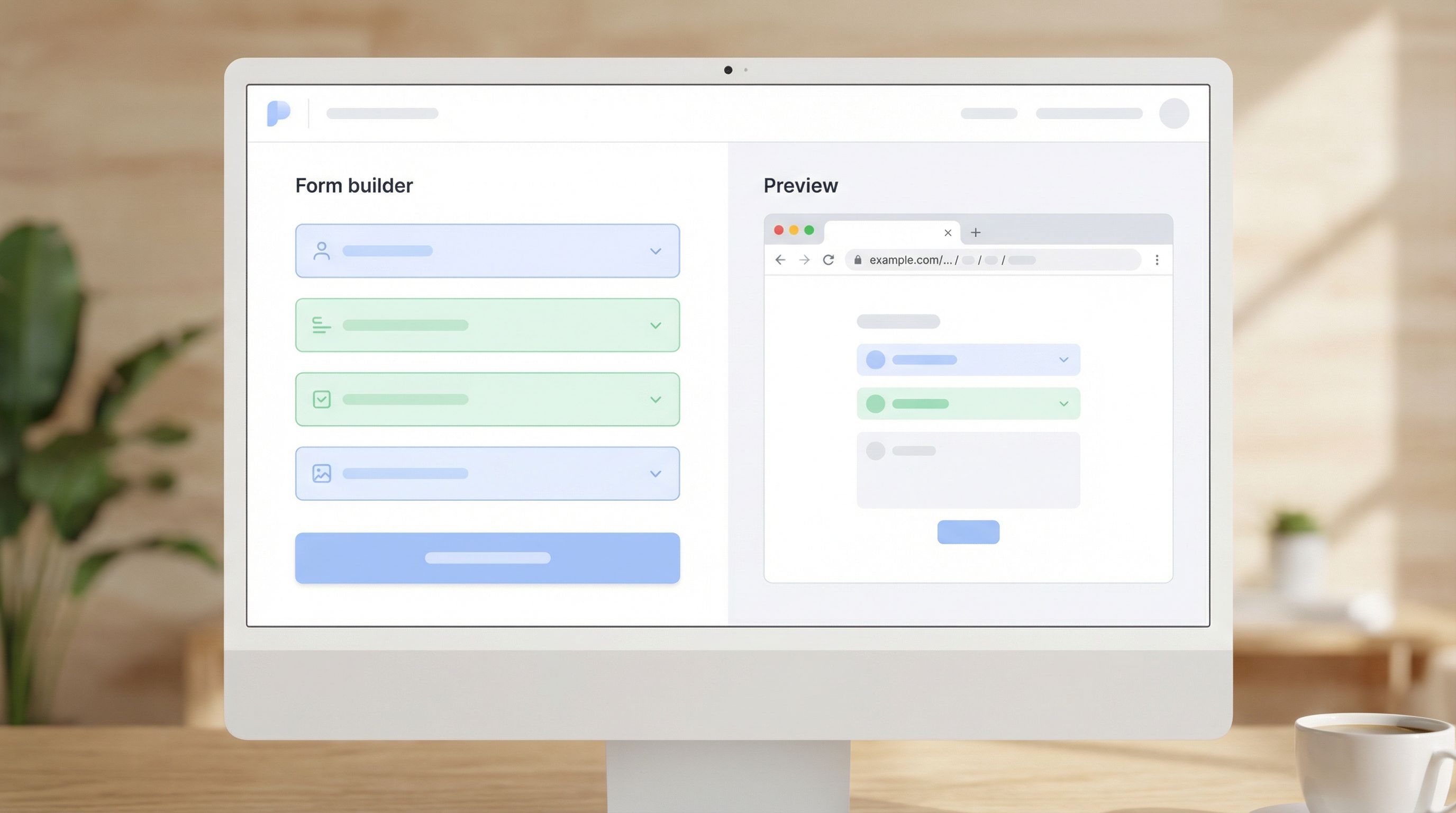
Ezpa.ge makes it easy to set custom URLs for every form. The difference between "nice touch" and "scaling superpower" is the system behind those URLs.
This guide breaks down how to design a URL naming system that:
- Stays readable and on-brand
- Scales from 10 forms to 1,000
- Plays nicely with analytics, SEO, and ops
- Is simple enough that everyone on your team will actually use it
Why URL Naming Deserves Real Strategy
Before we get into patterns and templates, it’s worth asking: why does this matter so much?
1. URLs are tiny trust signals
A clean, predictable URL does more than look good. It quietly tells people:
- This is official.
- This is relevant to me.
- This won’t waste my time.
Compare:
https://forms.example.com/marketing-2024-new-copy-final-2https://forms.example.com/events/nyc-saas-meetup-rsvp
The second one feels trustworthy and intentional. That matters when you’re asking for time, attention, and data.
If you want to go deeper on how links influence open and start rates, pair this article with From Link to Landing: Designing Custom URL Flows That Actually Get Your Forms Opened.
2. URLs are your internal control panel
When you have hundreds of forms, your URL structure becomes:
- A quick filter for what a form is (survey, signup, feedback)
- A hint at who it’s for (region, audience, product line)
- A clue about when and why it was created (campaign, quarter, lifecycle stage)
Done well, a URL tells you 80% of what you need to know before you even open the form.
3. URLs tie into systems you already care about
A thoughtful URL naming system makes life easier across:
- Analytics – cleaner reports, easier attribution
- SEO – more descriptive, human-readable URLs
- Governance – easier audits, fewer rogue forms
- Support – faster debugging when someone says, “The signup form is broken”
And because Ezpa.ge supports custom URLs and real-time Google Sheets syncing, a good naming system can ripple all the way from the link someone taps to the row that appears in your live dashboard.
Principles of a Scalable URL Naming System
Before defining patterns, agree on a few principles. These act as guardrails when new edge cases appear (and they will).
1. Human-first, machine-friendly
Your URLs should be:
- Readable: someone can guess what they’ll see
- Predictable: similar things follow similar patterns
- Stable: they don’t change just because the internal project name did
You’re not just naming files—you’re designing a shared language.
2. Short, but not vague
Avoid extremes:
- Too short:
/form1,/survey,/signup– impossible to manage at scale - Too long:
/marketing-q2-2025-enterprise-lifecycle-campaign-email-nurture-signup-form– unreadable and brittle
Aim for 3–6 segments separated by slashes or hyphens, each pulling its weight.
3. One primary URL per experience
Every form should have one canonical URL that you treat as the source of truth. You can layer on:
- Campaign-specific redirect links
- Short links for social
- Tracking parameters for analytics
…but the underlying form URL stays stable.
4. Systems over exceptions
If you find yourself constantly saying, “Well, except for this form…”, your pattern is too complex.
Your test: can a new teammate name 90% of forms correctly after reading a one-page guide? If not, simplify.
The Building Blocks of a Good Form URL
Let’s break down the components you can use to design a consistent pattern.
You won’t need all of these for every form—but you should consciously decide which ones are standard.
Common building blocks:
-
Base domain / namespace
forms.yourbrand.comoryourbrand.ezpa.ge- This is your front door. Keep it stable.
-
Category or function
- Examples:
signup,survey,feedback,event,support,beta,careers
- Examples:
-
Product or program
- Examples:
product-x,academy,partners,newsletter
- Examples:
-
Audience or segment
- Examples:
enterprise,smb,developers,customers,internal
- Examples:
-
Region or language (when relevant)
- Examples:
us,eu,latam,fr,jp - Use standard codes (ISO country/language) and document them.
- Examples:
-
Campaign or context
- Examples:
q1-2026-launch,black-friday,referral,webinar-series
- Examples:
-
Versioning (only when necessary)
- Examples:
v2,v3 - Use sparingly and only when multiple versions must coexist.
- Examples:
Choosing a Core Pattern (With Real Examples)
You don’t need a unique pattern for every team. You need one or two core patterns that cover most use cases.
Here are three that work well at scale.
Pattern 1: Function-first
Format:
https://forms.yourbrand.com/{function}/{product}/{context}
Example URLs:
https://forms.yourbrand.com/signup/platform/free-trialhttps://forms.yourbrand.com/survey/product-x/npshttps://forms.yourbrand.com/feedback/support/post-ticket
Best for:
- Teams with clear form types (signups, surveys, feedback)
- Organizations that care deeply about analytics by function
Pattern 2: Audience-first
Format:
https://forms.yourbrand.com/{audience}/{function}/{context}
Example URLs:
https://forms.yourbrand.com/customers/feedback/onboardinghttps://forms.yourbrand.com/partners/signup/program-applicationhttps://forms.yourbrand.com/internal/request/tool-access
Best for:
- Companies with distinct audiences and teams owning each
- Situations where “who it’s for” is more important than “what it is”
Pattern 3: Region-first (for global teams)
If you’re already thinking about time zones, languages, and local input patterns, you’ll recognize this from Global-Ready Forms: Designing for Time Zones, Languages, and Local Input Patterns.
Format:
https://forms.yourbrand.com/{region}/{function}/{product}/{context}
Example URLs:
https://forms.yourbrand.com/us/signup/platform/trialhttps://forms.yourbrand.com/eu/survey/product-x/feature-feedbackhttps://forms.yourbrand.com/jp/event/webinar-series-registration
Best for:
- Global teams with region-specific forms
- Legal/compliance-heavy industries where region really matters
Tip: Pick one primary pattern as your default. Allow a secondary pattern only when there’s a clear, documented reason.
Designing a URL Naming Playbook Your Team Will Actually Use
A great system on paper is worthless if it lives in someone’s head—or a forgotten Notion page.
Here’s how to turn your pattern into something real.
1. Create a one-page naming guide
Your guide should include:
- The default pattern (e.g., function-first)
- A short glossary of allowed values for each segment
- Examples of good vs. bad URLs
- Rules for special cases, like internal tools or experiments
Example excerpt:
Default pattern:
/function/product/context
Functions:signup,survey,feedback,event,support,beta
Context: short, descriptive, hyphenated, no dates unless required
Keep it short enough to actually read—one screen is ideal.
2. Standardize your vocab
Agree on canonical terms and stick to them.
- Use
signuporsign-up—not both. - Choose
nps,satisfaction, orcsatas your default survey label. - Decide whether you’ll use
customersvs.clients,partnersvs.resellers.
This is the URL equivalent of building a reusable field library. If you haven’t yet, read From Chaos to Components: Creating a Reusable Field Library for Faster Form Builds—the same mindset applies here.
3. Bake naming into your form creation flow
Don’t rely on people remembering the rules.
In Ezpa.ge, when someone creates a new form:
- Ask them to select:
- Function (dropdown)
- Product (dropdown)
- Audience (optional)
- Region (optional)
- Auto-generate a suggested URL slug based on your pattern.
- Let them adjust the context segment only.
This keeps consistency high while still allowing flexibility where it matters.
4. Decide how you’ll handle versions
At some point, you’ll need to update a form without breaking existing links.
You have three main options:
-
Silent updates (preferred)
- Keep the URL the same.
- Update fields, copy, and logic behind the scenes.
- Use version notes internally (e.g., in Ezpa.ge or your documentation).
-
Versioned URLs (when multiple versions must coexist)
- Example:
/signup/platform/partners-v2 - Use only when old and new forms need to run at the same time.
- Example:
-
Archive and redirect
- For deprecated forms, consider redirecting the old URL to a new canonical form or a friendly “This form is closed” page.
Make a clear call on which option is default and document edge cases.
5. Align URLs with your analytics strategy
Your URL pattern should work hand-in-hand with:
- UTM parameters (for campaigns)
- Event naming in tools like Google Analytics or Segment
- Sheet names and tabs in your Google Sheets dashboards
For example, if your URL is:
https://forms.yourbrand.com/signup/platform/free-trial
You might:
- Use
signup_platform_free_trialas the event name - Sync responses to a Google Sheet tab named
signup_platform_free_trial
That way, when you look at a dashboard (like the kind described in From Form to Funnel: Turning Raw Responses into a Live Google Sheets Dashboard), everything lines up.
Avoiding Common URL Naming Pitfalls
Even with a good system, there are a few traps worth avoiding.
Pitfall 1: Encoding dates everywhere
It’s tempting to add dates to every URL: -2025-q4, -2026-launch, etc.
Dates are useful when:
- A form is truly time-bound (e.g.,
black-friday-2025) - Legal or compliance requires historical context
Dates are not useful when:
- You just want to remember when you created it
- You plan to keep the form evergreen
Use internal metadata or your form tool’s history for "when"; keep URLs focused on "what" and "who".
Pitfall 2: Reflecting internal org charts too literally
Your org will change. Your URLs shouldn’t have to.
Avoid segments like:
/growth-marketing/vs./brand-marketing//team-a/vs./team-b/
Instead, choose more stable, user-facing concepts like:
/signup/,/feedback/,/event//customers/,/partners/,/internal/
Pitfall 3: Overfitting to one-off campaigns
If you design your whole system around a single big launch, you’ll regret it later.
Instead:
- Keep the core pattern stable.
- Let campaign-specific details live in:
- UTM parameters
- Internal notes
- Redirects or short links
Pitfall 4: Ignoring accessibility and inclusivity in slugs
URLs can carry bias and confusion if you’re not careful.
- Avoid slang, in-jokes, or culture-specific references.
- Use neutral, descriptive terms (e.g.,
feedback, notrant-box). - Be mindful of language if you’re serving global audiences.
This aligns with the broader practices in Designing Inclusive Forms: Practical Patterns for Language, Accessibility, and Device Diversity.
Operationalizing: Governance Without the Red Tape
A URL system only works if someone’s looking after it—but that doesn’t mean you need a committee.
1. Assign a lightweight owner
Pick a small group (or one person) who:
- Reviews new URL patterns when edge cases appear
- Updates the one-page guide as the system evolves
- Answers questions like “Where does this new partner program form live?”
2. Add a quick review step for high-visibility forms
For major launches or public campaigns, add a URL check to your launch checklist:
- Does it follow the pattern?
- Is it readable and on-brand?
- Will we be happy to see this URL in screenshots and decks a year from now?
3. Audit once or twice a year
Set aside an hour or two to:
- Export a list of all active forms (Ezpa.ge makes this easy).
- Spot-check for:
- Rogue patterns (
/new-form-3) - Duplicates (
/survey/customers/feedback,/survey/customer-feedback) - Old, unused forms that can be archived
- Rogue patterns (
Over time, this keeps your URL space clean and reliable.

How Ezpa.ge Helps You Put This Into Practice
Ezpa.ge is built for teams who care about both form experience and operational sanity.
With Ezpa.ge, you can:
- Set custom URLs that follow your naming system, not a random ID.
- Clone forms while keeping the ability to rename URLs cleanly.
- Sync to Google Sheets in real time, using naming conventions that mirror your URLs for easy reporting.
- Build themes and components that match your URL structure—signup themes, feedback themes, event themes, and more.
When your URLs, themes, and fields all follow coherent systems, every new form feels less like a one-off and more like plugging a new module into a well-designed platform.
Bringing It All Together
Let’s recap the core moves:
- Treat URLs as part of your brand, not an afterthought. They’re tiny but powerful trust signals.
- Choose a simple, stable pattern (function-first, audience-first, or region-first) and document it.
- Standardize your vocabulary for functions, products, audiences, and regions.
- Bake naming into your workflow with auto-generated suggestions and limited free-text editing.
- Align URLs with analytics and data structures so your reports and dashboards stay clean.
- Avoid common pitfalls like overusing dates, mirroring org charts, or encoding one-off campaigns.
- Assign lightweight ownership and run occasional audits to keep the system healthy.
Do this well, and you’ll feel the impact everywhere:
- Fewer "Which link is this?" Slack threads
- Cleaner dashboards and faster analysis
- More trustworthy, on-brand experiences for the people filling out your forms
Your Next Step: Name One Thing Better
You don’t need a giant project to start.
Here’s a simple way to move forward this week:
- Pick your default pattern. Write it down in one sentence.
Example:Our default pattern is /function/product/context. - List your standard values for function and product.
- Update the URLs for your top 5 most important forms to match the pattern.
- Add a short note to your form creation checklist: “Does this URL follow our naming pattern?”
If you’re using Ezpa.ge, log in, open one of your key forms, and give its URL a thoughtful rename. Feel how much clearer it is to share that link with your team or your audience.
From there, every new form you ship is a chance to reinforce the system—not reinvent it.
Your brand is already in your colors, copy, and components. With a little intention, it can be branded in a click—right there in the URL.