From Link to Landing: Designing Custom URL Flows That Actually Get Your Forms Opened

From Link to Landing: Designing Custom URL Flows That Actually Get Your Forms Opened
Custom URLs aren’t just a “nice touch” for your forms. They’re the front door.
Before anyone sees your beautifully themed Ezpa.ge form, your smart field logic, or your real-time Google Sheets syncing, they see a link. That link either feels trustworthy, relevant, and worth a tap—or it doesn’t.
This post is about everything that happens between sharing a link and someone actually landing on (and starting) your form. We’ll look at how to design custom URL flows that:
- Earn trust at a glance
- Set the right expectations
- Work seamlessly across channels and devices
- Make it easy for people to return and share
When you get this right, you don’t just get more opens—you get more qualified opens from people who already understand what they’re about to do.
Why the Journey From Link to Landing Matters
You’ve probably obsessed over form layout, validation, and microcopy. (If you haven’t yet, bookmark our guide on form microcopy that converts for later.) But many teams still treat the URL as an afterthought.
That’s a missed opportunity, because your URL and link flow directly impact:
1. Trust and perceived safety
People are more cautious about what they click and where they type their data. A clean, descriptive, branded URL signals:
- This is legitimate
- This is related to what I was promised
- This probably won’t waste my time
2. Clarity of intent
A well-crafted URL and link context tell people:
- What they’re doing (e.g., /customer-feedback, /beta-waitlist)
- Who it’s for
- Roughly how long it might take
When intent is obvious, people hesitate less.
3. Channel performance
Links behave differently in:
- Email campaigns
- SMS
- Social posts
- QR codes on print
Custom URL flows let you tailor the experience by channel while still pointing to the same underlying form.
4. Analytics and iteration
Thoughtful URL structures make it easier to:
- Attribute traffic (e.g., /survey/q4-2025/email vs /survey/q4-2025/linkedin)
- Run A/B tests on link wording and landing context
- Spot where interest drops before the form even loads
If you’re investing in real-time response syncing (like Ezpa.ge + Google Sheets), it’s worth investing in the front door too.
Start With a URL Strategy, Not Just a Pretty Slug
Custom URLs are often used like vanity plates: fun, but random. Instead, treat them like part of your information architecture.
Here’s a simple framework to design a URL strategy that scales.
1. Define URL “families” for your forms
Group URLs by purpose, not by one-off campaigns. For example:
- /signup/ for anything related to account creation or waitlists
- /signup/newsletter
- /signup/beta
- /feedback/ for qualitative input
- /feedback/product
- /feedback/support-experience
- /research/ for surveys and studies
- /research/usability-q1-2026
- /research/pricing-study
- /events/ for registrations and RSVPs
- /events/workshop-ux-essentials
- /events/webinar-forms-that-convert
Benefits of URL families:
- Easier for users to recognize patterns ("Oh, anything under /feedback/ is safe and quick to fill.")
- Cleaner analytics and reporting
- Easier for your team to remember and reuse
If you’re already working with a theme system for your forms, align your URL families with your theme categories. For instance, all /events/ forms might share a consistent color palette and layout.
2. Make slugs human, not clever
A good slug is:
- Descriptive: /customer-feedback, not /cf-23
- Short: Aim for 2–4 words
- Predictable: Use hyphens, avoid special characters
- Brand-aligned: Reflect your tone (formal vs playful)
Examples:
- /customer-feedback
- /cancelation-reason
- /onboarding-check-in
- /feature-request
Avoid:
- /form-12345
- /click-here-now
- /super-secret-project
If someone saw only the URL in plain text, they should still have a good idea what they’re about to do.

Map the Flow: From First Click to Form Start
Now let’s design the actual journey. Think of it as a mini funnel:
Link context → URL → Landing state → First meaningful action
Each step is an opportunity to either reassure or lose someone.
Step 1: Nail the link context
The text around your URL or button is just as important as the slug itself. It should answer three questions instantly:
- What is this?
“Share your experience with our support team.” - Why should I care?
“Help us improve and shape future features.” - What effort is required?
“Takes 2–3 minutes.”
For example, instead of:
“Fill out this form: https://yourbrand.ezpa.ge/form-12345”
Try:
“Tell us how we did (2–3 minute survey): https://yourbrand.ezpa.ge/support-feedback”
If you want to go deeper on the words around your forms, check out Form Microcopy that Converts.
Step 2: Match expectations on landing
When someone clicks, the landing view needs to match what was promised in the link context.
Get these aligned:
- Title: Mirror the language from the link
- Subtitle: Reinforce purpose and time expectation
- Progress signal: If it’s multi-step, show total steps or estimated time
- Brand cues: Logo, colors, and typography consistent with the channel they came from
Example alignment:
- Link text: “Apply for the UX Research Fellowship (5–7 minutes)”
- URL: /research/fellowship-application
- Form title: “UX Research Fellowship Application”
- Subtitle: “This application takes about 5–7 minutes. You can’t save and return, so please complete it in one sitting.”
This tight alignment reduces bounce because it removes the “Wait, is this the right place?” moment.
Step 3: Decide when (and whether) to pre-landing
Sometimes you don’t want to drop people straight into the form. You might want a pre-landing screen that:
- Explains eligibility or requirements
- Offers multiple paths (e.g., “Feedback” vs “Bug Report”)
- Shows legal or consent information
Use a pre-landing when:
- The form has high stakes (e.g., financial aid, job applications)
- You need informed consent before data collection
- You want to filter out ineligible users early
Skip pre-landing when:
- The ask is lightweight (e.g., NPS, quick poll)
- The primary goal is volume of responses
With Ezpa.ge, you can use a short intro step or a separate landing page that routes to multiple forms, each with its own custom URL.
Step 4: Remove friction between landing and first input
The distance between landing and the first keystroke should be as short and smooth as possible.
Audit your form for:
- Above-the-fold clutter: Are people forced to scroll past logos, banners, or paragraphs before seeing the first field?
- Confusing CTAs: Is it clear what to do first? (e.g., “Start” button vs. field auto-focus)
- Device comfort: On mobile, is the first field comfortably tappable? If not, revisit your layout—our guide on designing forms that feel native on any device goes deep on this.
A great test: open the form on your phone, tap the URL in a message, and time how long it takes before you’re typing. Aim for under three seconds on a decent connection.
Design URL Flows for Each Channel (Not Just One)
Where your link lives shapes how it should behave. Let’s look at common channels and how to tailor your custom URLs for each.
Email campaigns
Goals: trust, clarity, easy return visits.
Best practices:
- Use a branded domain and descriptive slug:
forms.yourbrand.com/customer-feedback - Make the link text descriptive instead of “Click here”
- Add a secondary plain-text URL under a button for people who don’t trust buttons
- Use URL parameters (e.g.,
?source=newsletter-q4) for analytics, but keep the base slug clean
SMS and messaging apps
Goals: brevity, tap-ability, and trust at a glance.
Best practices:
- Keep URLs short and readable; avoid long query strings
- Put the URL on its own line to make it easy to tap
- Provide a one-line expectation:
- “Quick 2-minute check-in: forms.yourbrand.com/onboarding-check-in”
- Avoid sending multiple different form URLs in the same thread unless you clearly label them
Social posts (organic + paid)
Goals: thumb-stopping clarity and shareability.
Best practices:
- Use a slug that reads well out loud (for videos, podcasts, or webinars)
- Consider a campaign-specific slug that’s memorable: /state-of-support-2025
- Ensure the landing view has strong branding and a concise explanation—social traffic is fickle
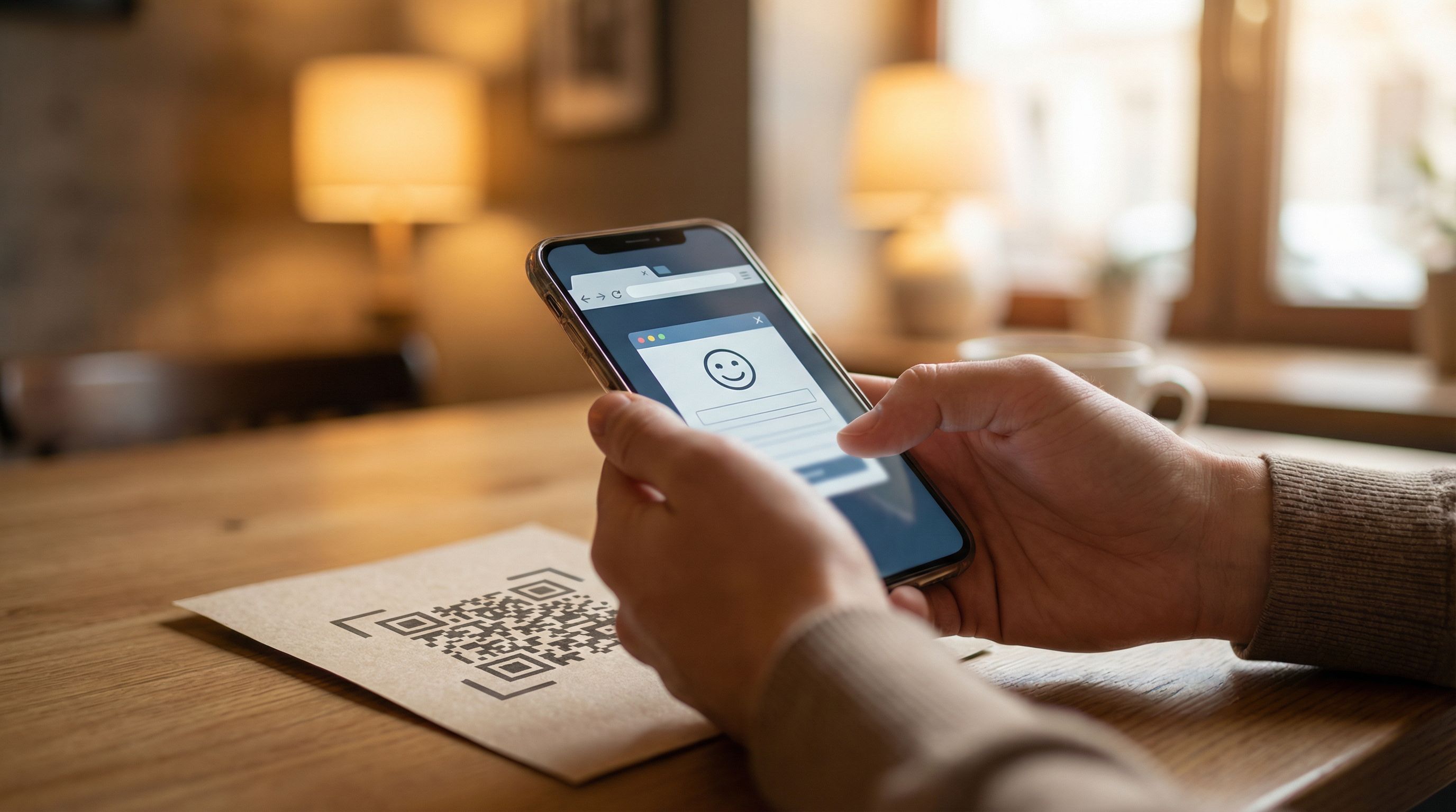
QR codes (print, packaging, in-person events)
Goals: scannability, memorability, and context without extra clicks.
Best practices:
- Use very short slugs that are easy to type if scanning fails
- Print the URL under the QR code
- Include a micro-description next to the code:
- “Scan to share event feedback (1–2 minutes)”
- Make sure the landing view is mobile-first—most people will scan on their phone
Use URL Variants to Learn, Not Just to Segment
Once you have a solid base URL structure, you can introduce variants to learn what actually gets people to open and start your forms.
Variant types you can test
-
Slug wording
- /customer-feedback vs /share-your-experience
- /beta-waitlist vs /early-access
-
Channel-specific paths
- /customer-feedback/email
- /customer-feedback/in-app
-
Campaign-specific redirects
- /summer-survey → redirects to /customer-feedback
-
Pre-landing vs direct
- /research/study-a → pre-landing page
- /research/study-a-direct → form only
What to measure
At minimum, track:
- Link click-through rate (CTR) from each channel
- Landing-to-first-input rate (how many visitors start typing)
- Completion rate and time to complete
If you’re syncing responses in real time to Google Sheets, as Ezpa.ge allows, you can:
- Add a hidden field for URL or campaign source
- Build simple dashboards that show performance by URL variant
For deeper insight into where people drop, pair this with the concepts in The Silent Drop-Off.
Don’t Forget Security and Trust Signals
A beautiful slug won’t save a sketchy-looking URL. People are more attuned than ever to phishing and spam, and your link flow should respect that.
Key elements:
- HTTPS everywhere: No exceptions
- Recognizable domain: Avoid random subdomains that don’t match your brand
- Consistent sender identity: Email, SMS, and landing page should all clearly come from the same organization
- Minimal, legible parameters: If you must include query strings, keep them short and non-sensitive
For a deeper dive, see our post on building trust through secure form custom URLs.
A Practical Checklist for Your Next Form URL
Before you share your next Ezpa.ge form, run through this quick checklist:
URL structure
- [ ] The form sits under a clear URL family (e.g., /feedback/, /research/, /events/)
- [ ] The slug is short, descriptive, and human-readable
- [ ] The domain is branded and uses HTTPS
Link context
- [ ] The surrounding text explains what the form is
- [ ] The benefit or purpose is clear
- [ ] The estimated time to complete is stated
- [ ] The tone matches your brand and audience
Landing experience
- [ ] The title and subtitle match the promise in the link
- [ ] The first field or primary action is visible without scrolling on mobile
- [ ] There’s a clear sense of scope (progress indicator, step count, or time estimate)
- [ ] Brand cues (logo, colors, typography) are consistent with the source channel
Channel fit
- [ ] The URL is short enough for SMS and QR code use if needed
- [ ] Social posts use a slug that’s easy to say and remember
- [ ] Email templates include both a button and a visible URL
Measurement
- [ ] You’re capturing source or campaign in a hidden field or via parameters
- [ ] You’ve set a baseline for opens, starts, and completions
- [ ] You have at least one URL or link-text variant planned to test
If you can check most of these boxes, you’re already ahead of the majority of forms shared with generic, forgettable links.
Bringing It All Together
Designing custom URL flows is about more than aesthetics or clever slugs. It’s about:
- Respecting people’s time and attention by being clear and honest from the first click
- Aligning your brand across domains, themes, and channels
- Creating predictable patterns so users feel safe and in control
- Learning continuously from how people move from link to landing to completion
When you pair thoughtful URL strategy with strong themes, inclusive layouts, and trustworthy interactions, your forms stop feeling like chores and start feeling like well-designed experiences.
Your Next Step
Pick one live form you’re already using—maybe a feedback survey, a waitlist, or an event registration—and:
- Rename its URL to fit into a clear family (e.g., /feedback/support-experience).
- Rewrite the link text wherever you share it to explain what, why, and how long.
- Open it on your phone from that link and see how long it takes before you’re typing.
Then, create a simple second variant—another slug, another link context, or a pre-landing vs direct flow—and compare performance over the next week.
If you’re building with Ezpa.ge, you already have the tools: custom URLs, reusable themes, and real-time Google Sheets syncing. The next step is intent. Start shaping your link-to-landing journey with as much care as you put into the form itself.
Your forms don’t just need to look good—they need to be found, trusted, and opened. The right URL flow gets you there.