Campaigns Without Landing Pages: Using Custom URLs + Form Themes to Replace Full Microsites

For years, the default move for any new campaign has been:
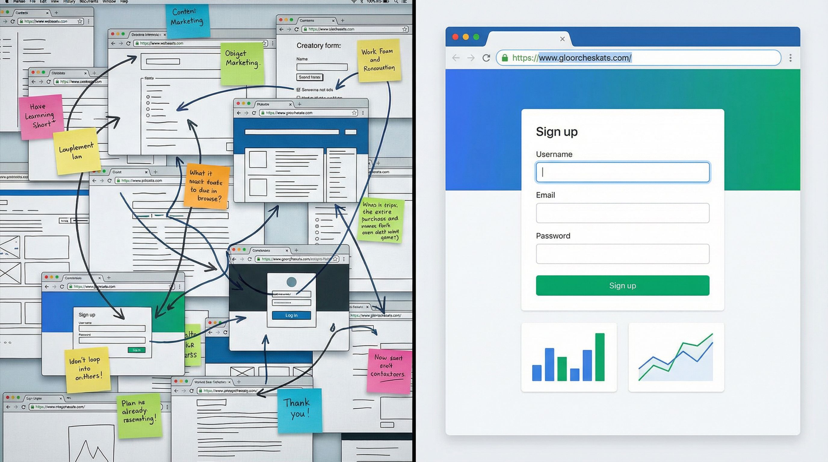
Brief → Figma → dev ticket → one-off landing page → form at the bottom.
It works—until it doesn’t.
Pages take weeks to ship. Stakeholders keep tweaking copy. Design wants everything on-brand. Dev is juggling ten higher-priority tickets. By the time the page is live, the campaign window has shrunk, and no one wants to touch the thing again.
Meanwhile, the only part of that whole stack that actually moves work forward is the form.
Ezpa.ge flips that script. Instead of building a full microsite for every campaign, you can run the campaign on the form itself—using:
- Custom URLs that are clean, memorable, and easy to route by channel or partner
- Form themes that look and feel like a fully branded microsite
- Real-time Google Sheets syncing so ops, sales, and CX get instant visibility
This post is about how to run campaigns without traditional landing pages—using custom URLs and themes to ship faster, stay on-brand, and keep your ops stack simple.
Why Campaigns Don’t Actually Need Full Landing Pages
Most teams overestimate what a campaign page has to do.
When you strip away the fluff, a high-performing campaign asset usually needs to:
- Explain the offer clearly (what, who, why it matters)
- Build just enough trust (brand, social proof, clarity)
- Make the next step obvious and low-friction (the form)
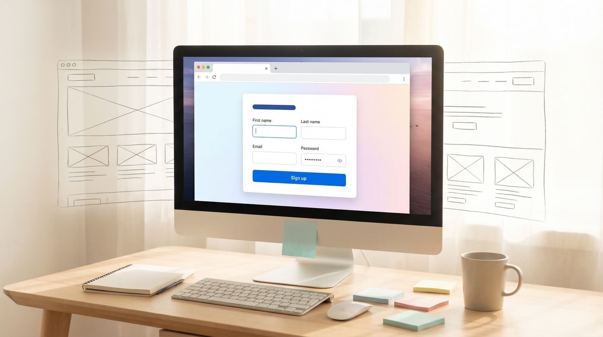
A themed form with a good layout can do all three.
The real costs of one-off landing pages
Even if you’re using a landing page builder, there’s still a hidden tax:
- Time-to-ship: Briefing, design reviews, approvals, dev handoff, QA.
- Maintenance: Every new campaign means another page to update, track, and eventually retire.
- Inconsistency: Different teams spin up different layouts, CTAs, and brand interpretations.
- Ops complexity: Each page has its own analytics, tags, and sometimes its own form and integration logic.
Industry benchmark reports show that median landing page conversion rates hover around 6–10%, depending on source and sector. That’s fine—but it also means many teams are investing heavily in pages that don’t dramatically outperform a well-designed, focused form.
If the form is where conversion happens, why not make the form the hero?
Form-First Campaigns: What It Actually Looks Like
A form-first campaign doesn’t mean a lonely, unstyled form in a blank browser tab. With Ezpa.ge, a campaign “microsite” can be:
- A fully themed, multi-step form that feels like a guided experience
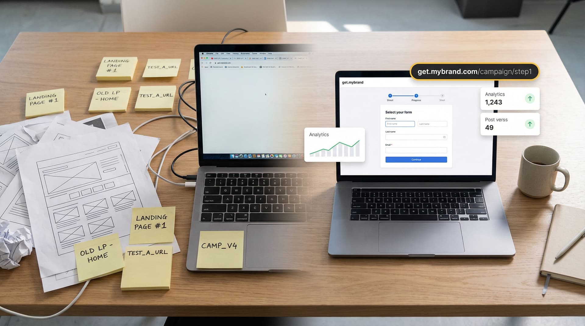
- Hosted on a clean, campaign-specific URL (e.g.
yourbrand.com/go/partner-summitvia redirect oryourbrand.ezpa.ge/partner-summit) - Structured with section headers, supporting copy, and inline visuals
- Synced directly into Google Sheets for routing, scoring, and reporting
If you want a deeper dive into the broader "form-as-microsite" pattern, it’s worth reading Forms as Microsites: Replacing One-Off Landing Pages with Theme-Driven Flows alongside this post.
Where this approach shines
Form-first campaigns are especially effective for:
- B2B lead gen (demo requests, pilot programs, waitlists)
- Event funnels (webinars, private roundtables, roadshows)
- Partner campaigns (co-marketing, co-branded offers, lead sharing)
- Lifecycle plays (upsell offers, customer research, advocacy programs)
In all of these, the job of the asset is to qualify, reassure, and capture intent—not to host a long narrative.
Custom URLs: Turning One Form into a Whole Campaign System
Custom URLs are where the “no landing page” strategy really becomes powerful.
Instead of:
yourbrand.com/campaign-q2-2026→ generic page → embedded form
You can run:
yourbrand.ezpa.ge/q2-launch→ fully themed formyourbrand.ezpa.ge/q2-launch-paid→ same form, different prefill/UTMyourbrand.ezpa.ge/q2-launch-partner-acme→ same form, partner-specific copy
This pattern is explored in depth in URL-Driven Ops: How Custom Links Turn One Form into a Dozen Targeted Workflows. For campaigns, it gives you three big advantages.
1. Channel-specific experiences without cloning forms
You can create URL variants that:
- Pre-fill fields based on channel (e.g. “How did you hear about us?”)
- Show/hide sections with simple logic tied to URL parameters
- Adjust microcopy to match the ad or email promise
Instead of managing 6–10 different forms, you manage one canonical form with URL-driven behavior.
2. Cleaner reporting and attribution
Because each custom URL can carry its own UTM parameters or internal tags, your Google Sheet becomes a live attribution log:
source(paid_search, email, partner)campaign(q2-launch, summit-2026)variant(v1, v2, acme-co)
From there, you can:
- Build pivot tables to see which URL variant converts best
- Route high-intent submissions differently (e.g. partner-sourced leads to a dedicated AE)
- Run quick experiments without touching your core form structure
3. A simpler link strategy for the whole company
Instead of a tangle of one-off pages, you can standardize on a simple pattern:
/go/{campaign-name}for external campaigns (redirecting to Ezpa.ge URLs)/internal/{process-name}for internal forms (deal desk, discount approvals, etc.)
Your team remembers the pattern, not the specific link, and your brand stays consistent.
Themes: Making a Form Feel Like a Microsite
If custom URLs are the routing layer, themes are the storytelling layer.
A themed Ezpa.ge form can carry almost everything you expect from a campaign microsite:
- Brand colors, typography, and logo
- Hero section with headline, subheading, and supporting text
- Content blocks between fields (FAQs, value props, feature highlights)
- Section dividers that turn a long form into a guided path
For teams whose main site is still a work in progress, this is especially useful. Form Themes for Non-Design Brands: Looking Premium Even When Your Site Is Still V1 goes deeper on that angle.
What a strong campaign theme includes
When you design a theme with “microsite replacement” in mind, focus on:
-
Clear visual hierarchy
- A bold hero area: campaign name, 1–2 line promise, primary CTA (the form itself).
- Distinct section headers ("Who this is for", "What you’ll get", "What happens next").
-
Intentional use of space
- Generous padding around key questions.
- Multi-step layout for longer flows (e.g. Step 1: basics, Step 2: details, Step 3: confirmation).
-
Trust elements
- Logos of customers or partners.
- Short testimonial or proof point.
- Compliance notes or guarantees near sensitive fields.
-
Contextual education
- Brief explanations next to complex questions.
- Microcopy that reminds people why each step matters.
You’re not trying to recreate your entire website in a form. You’re building a focused, story-backed path to a single conversion.
For more advanced theming strategies—like adapting themes by context, brand, or user preference—Beyond Dark Mode: Theming Strategies That Adapt to Brand, Context, and User Preferences is a useful companion.
Putting It Together: Designing a Campaign Without a Landing Page
Let’s walk through a concrete example: a B2B SaaS team running a “Q2 Implementation Fast-Track” campaign for existing customers.
The goal: get qualified customers to request a structured implementation review—no new landing page required.
Step 1: Define the job of the form
Before you touch Ezpa.ge, answer:
- Who is this for? Existing paying customers with >10 seats.
- What’s the offer? A 60-minute implementation review with a solutions engineer.
- What do we need to know? Account size, current setup, blockers, timeline, stakeholders.
- What should they feel? Confident, supported, and clear on the next step.
This becomes your blueprint for both fields and content.
Step 2: Create the form structure
In Ezpa.ge, create a new form and outline sections like this:
-
Hero + basics
- Headline: “Q2 Implementation Fast-Track Review”
- Subcopy: 1–2 sentences explaining the value.
- Fields: Name, work email, company, existing plan.
-
Context and goals
- Fields: Current usage summary (multi-select), main goal for the next 90 days, biggest blocker.
- Inline copy: Short bullets on what’s covered in the review.
-
Logistics
- Fields: Preferred time window, timezone, key stakeholders to include.
- Note: How scheduling will work after submission.
-
Confirmation & expectations
- A short “What happens next” block.
- Optional: link to a help center article or resource.
Step 3: Apply a campaign-specific theme
Create or select a theme tuned to this campaign:
- Use a slightly different accent color than your core brand to make it feel special but still on-brand.
- Add a subtle background pattern or illustration in the hero area.
- Style section headers to look like mini page headers.
You can even create a series of reusable “campaign themes” so future forms can inherit the same look with minimal tweaks.
Step 4: Set up custom URLs for segments and channels
Now, define your URLs:
yourbrand.ezpa.ge/q2-fast-track— the main campaign link for email.yourbrand.ezpa.ge/q2-fast-track-inapp— for in-app modals or banners.yourbrand.ezpa.ge/q2-fast-track-csm— for CSMs to send directly.
Use URL parameters or Ezpa.ge’s built-in logic to:
- Pre-fill the "How did you hear about this offer?" field.
- Hide or show certain questions for specific segments.
- Tag submissions in your Google Sheet for attribution.
Step 5: Wire it into Google Sheets for live ops
Connect the form to a Google Sheet:
- Each row = one submission.
- Columns include:
source_url,segment,CSM_owner,priority,status.
From there, you can:
- Build a live queue view for the CS team.
- Use filters/conditional formatting to highlight urgent accounts.
- Trigger follow-ups (via Zapier/Make or Apps Script) based on responses.
If you want a full walkthrough of this pattern, Zero to Live in 30 Minutes: Building a Fully-Branded Launch Funnel with Ezpa.ge and Google Sheets is a practical guide.

Practical Patterns You Can Steal Right Now
Here are a few plug-and-play patterns for running campaigns without net-new landing pages.
1. Paid search → form-as-microsite
Use case: High-intent keywords where the main action is “request a demo” or “book a consult.”
Pattern:
- Create a themed Ezpa.ge form with:
- Keyword-reflective headline (e.g. “Revenue Forecasting Software Demo”).
- 3–5 bullet value props.
- Short form focused on qualification and contact.
- Point Google Ads directly to the custom form URL.
- Use URL variants for different ad groups or messages.
You’re still giving Google a strong, relevant destination—but you’re skipping the extra layer of page layout and maintenance.
2. Partner co-marketing without a joint microsite
Use case: Webinar or joint offer where your partner wants co-branding but no one has time to build a full page.
Pattern:
- Create a co-branded theme in Ezpa.ge:
- Both logos in the header.
- Neutral or blended color palette.
- Spin up a single registration form.
- Generate partner-specific URLs:
yourbrand.ezpa.ge/webinar-acmeyourbrand.ezpa.ge/webinar-contoso
- Use URL parameters to:
- Pre-tag which partner sourced the lead.
- Adjust the intro line to name that partner explicitly.
All registrations land in one Sheet, but you can still split routing and reporting by partner.
For a deeper dive into partner operations on forms, see Forms for Partner Ecosystems: Onboarding, Co-Marketing, and Lead Sharing Without a Portal.
3. Lifecycle campaigns from email or in-app
Use case: Upsell offers, feedback requests, or advocacy programs targeting existing users.
Pattern:
- Create a single master form per lifecycle goal (e.g. “Account Expansion Interest”).
- Design a theme that feels like a native extension of your app.
- Generate URL variants for:
- Email sequences.
- In-app banners.
- CSM outreach.
- Use logic to:
- Show different questions to admins vs. end users.
- Skip basic account fields when you already know the user.
You’re turning your form into a flexible lifecycle surface, not just a static survey.
When You Still Need a Full Landing Page
There are scenarios where a form-first microsite is not enough on its own:
- SEO plays where organic discovery matters (you still want a content-rich page).
- Complex product education where you need long-form storytelling, video, or interactive demos.
- Multi-offer hubs where people need to browse and choose between paths.
Even in those cases, a form-first mindset helps. You can:
- Embed your Ezpa.ge form on the page while still using its custom URL for direct traffic.
- Use form themes to keep the experience consistent across different traffic sources.
The goal isn’t to eliminate landing pages forever. It’s to stop treating them as the default answer for every campaign.
Summary: The Form Can Be the Microsite
You don’t need a new landing page for every campaign.
By leaning on custom URLs and form themes in Ezpa.ge, you can:
- Ship campaigns dramatically faster.
- Keep brand and experience consistent across teams and channels.
- Run nuanced, URL-driven experiments without cloning forms.
- Centralize data and routing in Google Sheets instead of scattering it across tools.
For many campaigns, the highest-converting “page” is a focused, beautifully themed form with a clean URL and a clear promise.
Ready to Try a Campaign Without a Landing Page?
You don’t have to refactor your whole funnel to test this.
Pick one upcoming campaign—maybe a webinar, a partner promo, or a targeted lead-gen push—and:
- Design a single Ezpa.ge form that captures everything you need.
- Apply a campaign-specific theme that feels like a microsite.
- Create 2–3 custom URLs for your key channels.
- Wire it to Google Sheets and build a simple live queue.
Run that campaign for a week or two. Compare:
- Time to launch vs. your usual landing page process
- Conversion rate vs. your last similar campaign
- How easy it was for ops and GTM teams to iterate mid-flight
If the results are better—or even just easier—you’ve just unlocked a new default.
The next time someone says, “We need a landing page,” you can calmly reply:
“We might just need a better form.”
And with Ezpa.ge, you can have that form live—fully branded, with a custom URL and real-time syncing—before the old playbook would have even finished the first Figma round.