Beyond Dark Mode: Theming Strategies That Adapt to Brand, Context, and User Preferences

Dark mode used to feel like a power feature. Flip a switch, everything goes moody and modern, and users feel like you “get it.” But as more products ship light/dark toggles by default, the bar has moved.
If all your theming strategy does is invert colors, you’re leaving a lot of value on the table.
For teams using tools like Ezpa.ge to ship forms, flows, and microsites quickly, theming is no longer just a visual flourish. It’s how you:
- Reflect different brands and sub-brands without rebuilding layouts.
- Adapt to context (campaign vs. compliance, mobile vs. desktop, day vs. night).
- Respect user preferences—accessibility, contrast, motion sensitivity, and more.
This post is about going beyond the binary of light vs. dark and treating themes as a flexible system that can adapt in real time to brand, context, and people.
Why adaptive theming matters more than ever
A theming strategy that stops at dark mode creates friction in three places: brand, operations, and user experience.
1. Brand: every touchpoint is a branding decision
Your forms, surveys, and intakes are often the first interactive surface someone sees. If that surface looks generic, off-brand, or inconsistent with the campaign that led people there, you lose trust.
Adaptive theming helps you:
- Run multiple brands or sub-brands from the same underlying components.
- Localize visuals for regions or partners without forking your entire UI.
- Test new positioning safely at the form layer before committing to a full redesign (we dig into this pattern more in Theme-First Branding: Using Form Skins to Test Positioning Before You Redesign Your Site).
2. Operations: speed without chaos
Ops, marketing, and CX teams need to ship new flows constantly: new campaigns, partner intakes, support paths, hiring funnels, and more. If every new form needs a custom visual treatment, you slow them down—or end up with a graveyard of off-brand experiments.
A smart theming system gives operators safe presets:
- “Brand default” themes for always-on flows.
- “Campaign” themes with more expressive visuals.
- “Compliance / high-stakes” themes with conservative colors and typography.
That’s exactly the kind of foundation that makes ops-ready form experiments possible: you can ship new URLs and logic quickly without compromising brand.
3. User experience: comfort, clarity, and control
Users bring their own preferences and constraints:
- Some prefer dark surfaces at night.
- Some need high contrast or reduced motion for accessibility.
- Some are on low-power devices or spotty connections and need themes that load fast.
Modern platforms (browsers, OSes) expose these preferences through media queries like prefers-color-scheme, prefers-reduced-motion, and prefers-contrast. Respecting them is no longer a nice bonus; it’s table stakes for inclusive UX.
When you combine brand-aware themes with context-aware and preference-aware behavior, you get flows that feel intentional instead of generic.
From “one dark theme” to a theming system
To move beyond a single light/dark pair, you need to think in systems, not one-off styles.
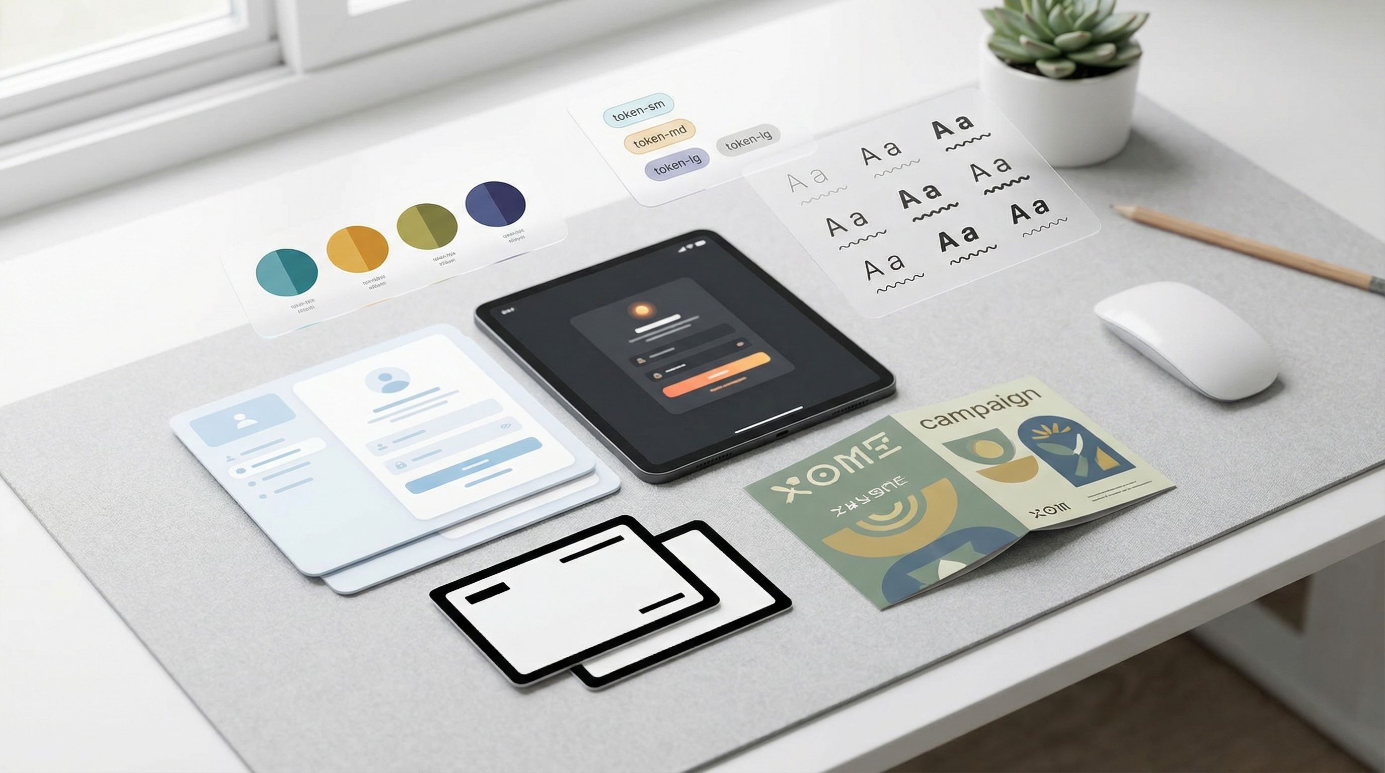
Step 1: Start with tokens, not raw values
If you’re still hard-coding colors like #3B82F6 directly into your forms, you’ll hit a wall the moment you need a second brand or a partner co-branded experience.
Instead, define theme tokens—named design decisions your components can reference. Examples:
color.bg.surfacecolor.text.primarycolor.text.mutedcolor.border.subtlecolor.accent.primaryradius.fieldshadow.cardfont.family.base
The key idea (covered in detail in Theme Tokens, Not One-Off Styles: Building a Form Design System That Scales Across Brands) is that components only ever talk to tokens. Themes then assign values to those tokens.
Why this matters for adaptive theming:
- Adding a dark variant is just a new set of values for the same tokens.
- Adding a partner-branded skin is just another set of values.
- Adjusting for high contrast or reduced motion can happen at the token level (e.g., stronger contrasts, no animated shadows) without rewriting components.
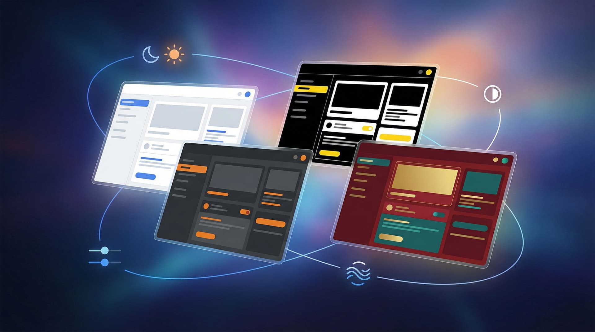
Step 2: Define a small, opinionated set of base themes
Rather than inventing a unique theme for every use case, define a small library of base themes you can reuse and extend:
-
Core brand — light
- Neutral background, high legibility.
- Ideal for general marketing and product flows.
-
Core brand — dark
- Dark surfaces with carefully tuned contrast.
- Ideal for late-night usage, developer tools, or visually intense campaigns.
-
High-stakes / compliance
- Minimal color, strong hierarchy, conservative typography.
- Ideal for legal agreements, financial flows, healthcare, or high-risk actions.
-
Campaign / expressive
- Bolder accent colors, more visual flair.
- Ideal for limited-time promos, events, or co-marketing.
Each base theme is just a bundle of token values. Once those bundles exist, your form builder (e.g., Ezpa.ge) can expose them as simple dropdown choices for operators.
Layering brand, context, and user preferences
Once you have tokens and base themes, you can start layering three dimensions:
- Brand: which visual language should this flow speak?
- Context: what is the job of this specific form?
- User preferences: what does this person’s device and behavior tell you they need?
Think of it as a decision tree where each layer narrows the options.
1. Brand: who is speaking?
Start by answering: Which brand or sub-brand is this form representing?
For a single-brand company, this might be straightforward. But many teams juggle:
- Corporate brand vs. product brand.
- Regional brands with different color systems.
- Partner-branded programs where you need to honor another company’s guidelines.
Practical steps:
- Map each brand or sub-brand to one or more base themes.
- For partner programs, create co-branded themes that combine your layout and structure with their logo, accent colors, and imagery.
- Store brand-specific assets (logos, favicons, illustrations) as part of the theme definition.
This is where the “forms-as-microsites” mindset becomes powerful: instead of spinning up a full landing page, you can give each brand or campaign its own themed form with a custom URL. If that pattern is new to your team, it’s worth reading Forms as Microsites: Replacing One-Off Landing Pages with Theme-Driven Flows.
2. Context: what is this form trying to do?
Next, consider the job of the form:
- Is it a high-intent sales request where clarity and trust matter more than visual flair?
- Is it a support intake where stress is high and people need reassurance?
- Is it a quick campaign signup where the brand can be louder and more expressive?
Context should influence:
- Color intensity: high-stakes flows benefit from calmer palettes; campaigns can be bolder.
- Density: complex B2B flows may need more structure and spacing; quick signups can be tighter.
- Components: high-stakes flows might avoid playful components in favor of standard inputs and clear labels.
You can encode this by tagging each base theme with suggested use cases, then giving non-designers clear guidance:
- “Use Core brand — light for standard product and marketing flows.”
- “Use High-stakes / compliance for anything involving contracts, payments, or sensitive data.”
- “Use Campaign / expressive only for time-bound promos and events.”
3. User preferences: what is this person telling you?
Finally, adapt to user-level signals where you can.
Respect OS and browser preferences
Modern browsers expose several useful preferences via CSS media queries and JavaScript APIs:
prefers-color-scheme: darkorlightprefers-reduced-motion: reduceprefers-contrast: moreorless
You can use these to:
- Default to dark or light variants of your chosen brand theme.
- Turn off or simplify animations for people who prefer reduced motion.
- Increase contrast and adjust subtle borders/shadows for people who need stronger separation.
Crucially, these should be defaults, not hard rules. Always give users a way to override.
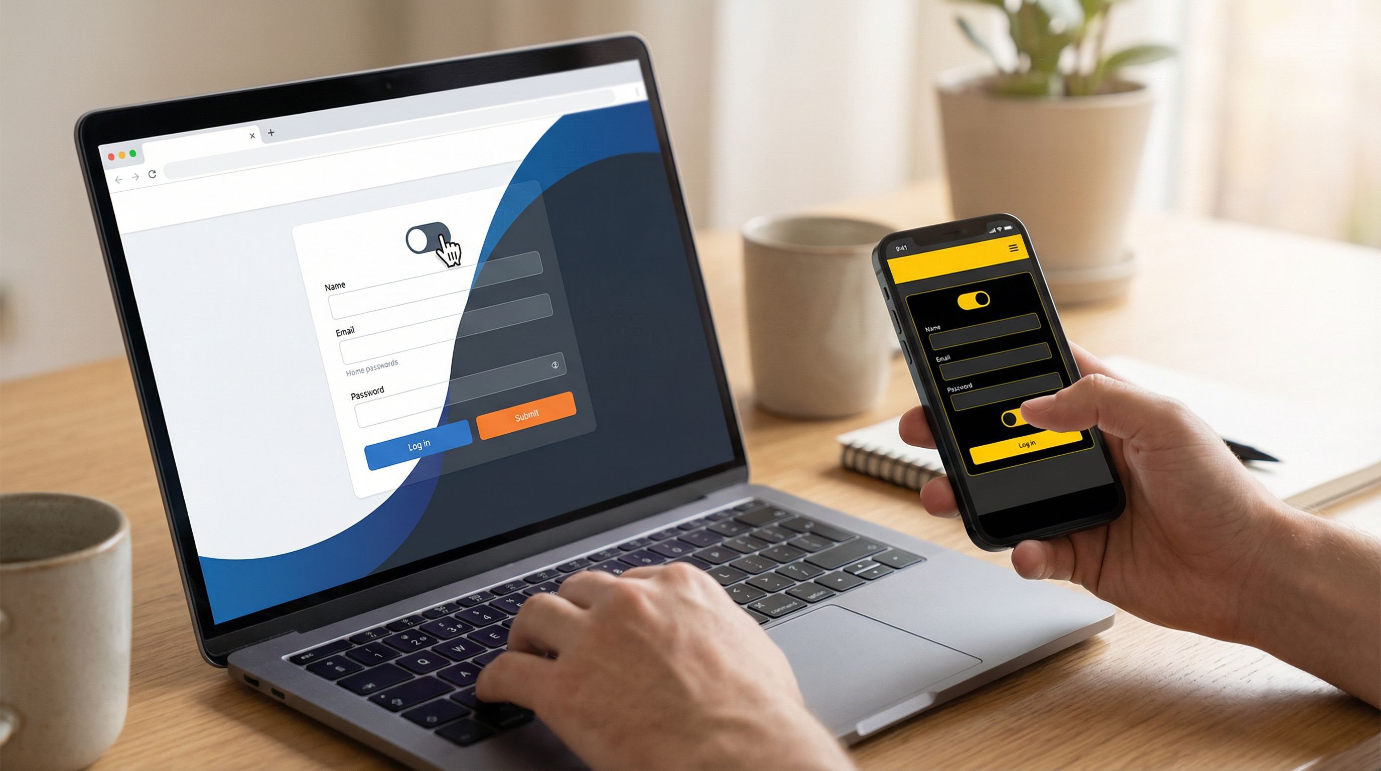
Offer clear, persistent controls
Even if you auto-detect preferences, people should be able to say, “Actually, I want light mode for this flow,” or “Give me the high-contrast version.”
Patterns that work well:
- A simple theme toggle (Light / Dark / Auto) in the form header or footer.
- A “Display options” link that opens a small panel with:
- Theme: Light / Dark / System
- Contrast: Standard / High
- Motion: Full / Reduced
Store these preferences locally (e.g., in localStorage) so people don’t have to reset them every time.
Practical patterns for adaptive theming in forms
Let’s ground this in some concrete patterns you can implement—especially if you’re building with Ezpa.ge or a similar tool.
Pattern 1: Theme presets for operators
Most of the time, non-designers shouldn’t be picking hex codes. They should be selecting from curated presets.
Set up a library of presets like:
- Brand / Default (Light)
- Brand / Default (Dark)
- Brand / High-Contrast
- Campaign / Q2 Launch
- Partner / Acme Co.
Each preset maps to a theme object:
{
  "id": "brand-default-light",
  "tokens": {
    "color.bg.surface": "#FFFFFF",
    "color.text.primary": "#111827",
    "color.accent.primary": "#2563EB",
    "radius.field": "8px",
    "shadow.card": "0 10px 30px rgba(15, 23, 42, 0.12)"
  }
}
Operators don’t see any of this; they see a name, preview, and description. That’s how you get both speed and consistency.
Pattern 2: URL-driven theme selection
Sometimes you want one form definition to power many experiences:
- A single partner intake form with different branding per partner.
- A single hiring form with different themes per role or region.
- A single support form that looks different when linked from the app vs. from email.
You can use URL parameters to drive theme selection:
?theme=brand-default-dark?theme=partner-acme?theme=campaign-q2-launch
In a tool like Ezpa.ge, this pairs nicely with URL-level personalization: the same form logic and Google Sheets syncing, but a different visual skin based on where the user came from.
Pattern 3: Contextual theming by route or entry point
If your forms live inside a product or a microsite, you can adapt themes based on where the user is.
Examples:
- Forms accessed from an admin or settings area use a calmer, more neutral theme.
- Forms accessed from a marketing campaign use the matching campaign theme.
- Forms accessed from a support widget use a reassuring, high-clarity theme.
Implementation ideas:
- Map routes or referrers to theme IDs.
- Use a simple rules engine: “If referrer contains
support.myapp.com, usesupport-intaketheme.”
Pattern 4: Accessibility-first theme variants
Instead of treating accessibility as an afterthought, bake it into your theming strategy:
- For each base theme, define at least one high-contrast variant.
- Ensure color pairs meet WCAG AA or AAA guidelines for text and interactive elements.
- Avoid relying on color alone to convey meaning (use icons, labels, and patterns as well).
Then:
- Automatically offer the high-contrast variant when
prefers-contrast: moreis detected. - Let users manually switch to high-contrast mode via the display options panel.
Pattern 5: Theming as an experimentation surface
Themes are a powerful way to test hypotheses about brand and UX without touching core product code.
You can experiment with:
- Different visual hierarchies (e.g., making primary actions more prominent).
- Adjusted tone of voice in headings and helper text.
- Alternate illustration styles or icon sets.
Because themes are layered on top of stable form logic and data handling, you can run these experiments safely, just like you would with ops-ready form experiments.
Guardrails: keeping adaptive theming from becoming chaos
The more powerful your theming system, the easier it is to create accidental chaos. A few guardrails will keep things sane.
Centralize theme governance
Someone—usually design or brand—should own:
- The canonical set of tokens.
- The approved theme presets.
- The naming conventions and usage guidelines.
This doesn’t mean design has to touch every form. It means they define the building blocks, and operators assemble them.
If you’re already thinking about governance for forms, you’ll find a lot of overlap with the patterns in Brand-Consistent Forms at Scale: Governance Rules for Themes, URLs, and Copy (slugged separately in your library). The same principles—clear rules, safe defaults, lightweight review—apply directly to themes.
Limit custom overrides
Avoid giving every user the ability to tweak arbitrary colors or fonts. Instead:
- Offer a few controlled levers (e.g., “accent color” within a safe range, or “header illustration on/off”).
- Keep the bulk of the system locked to tokens and presets.
This keeps your design system coherent and prevents support headaches when someone’s “creative” theme breaks legibility.
Test themes in real contexts
Don’t just test themes in a design tool. Test them:
- On low-end devices.
- In poor lighting conditions.
- With real copy and error states.
Pay attention to:
- How validation errors look in each theme.
- How focus states appear for keyboard users.
- How long it takes for people to understand what the form is asking.
Version and log theme changes
When themes affect high-stakes flows—sales, support, hiring—you should know who changed what, when, and why.
- Treat theme changes like any other operational change.
- Keep lightweight logs or version history.
- Roll back quickly if a new theme hurts conversion or comprehension.
This mindset mirrors what we’ve covered in Ops-Ready Form Logs: Lightweight Auditing, Version History, and Change Management for Busy Teams—the same discipline that keeps your fields and logic safe should extend to themes as well.
Bringing it all together with Ezpa.ge
If you’re using Ezpa.ge to build forms, you already have the core ingredients for adaptive theming:
- Custom themes and URLs let you treat forms as fully branded surfaces.
- Real-time Google Sheets syncing means you can measure the impact of different themes on completion rates, drop-off points, and downstream quality.
- Flexible logic and URL-level personalization let you reuse one form across many contexts while changing the skin.
A practical rollout plan might look like this:
-
Audit your existing forms
- List all active forms and categorize them by brand, context, and channel.
- Note where themes are inconsistent, off-brand, or inaccessible.
-
Define your token set and base themes
- Work with design/brand to codify a single set of tokens.
- Create 3–5 base themes that cover your main use cases.
-
Create operator-friendly presets in Ezpa.ge
- For each base theme, create one or more presets with clear names and descriptions.
- Hide raw token editing from most users; expose only presets.
-
Map themes to URLs and contexts
- For each campaign or partner, decide which theme preset to use.
- Use custom URLs and URL parameters to drive theme selection where appropriate.
-
Respect user preferences by default
- Implement system-aware defaults (light/dark, reduced motion, high contrast) at the theme layer.
- Add visible controls so users can override.
-
Measure, iterate, and log
- Track completion rates, time-to-complete, and error rates by theme.
- Log theme changes alongside form changes.
- Use what you learn to refine your token set and presets.
Summary
Dark mode was a useful first step, but it’s not a theming strategy. To build forms and flows that truly adapt, you need:
- Tokens instead of raw values, so components can flex across brands and contexts.
- A small library of base themes tuned for different jobs: default, high-stakes, campaign, partner.
- Layered decision-making that considers brand, context, and user preferences together.
- Operator-friendly presets that let non-designers move quickly without breaking consistency.
- Accessibility-first variants that respect system-level preferences and give users control.
- Governance and logging so your theming system scales without turning into chaos.
When you treat themes as a system—not just a color swap—you unlock a powerful lever for brand, UX, and operations.
Your next move
You don’t need to rebuild everything to get started. Take one step:
- Pick a single high-traffic form—a sales request, support intake, or hiring application.
- Define a token-based theme for it, plus a dark and high-contrast variant.
- Implement system-aware defaults and a simple theme toggle.
- Ship it via Ezpa.ge with a custom URL, and watch how it performs in your Google Sheet.
From there, you can expand the system: more presets, more brands, more contexts. The important part is to start treating theming as a strategic layer, not a last-minute polish.
The moment your forms feel like they belong to the brand, the moment, and the person using them—that’s when theming is finally doing its job.