Designing Forms for ‘Zero Instruction’ Use: Layout Patterns That Make Help Text Obsolete


If your form needs a paragraph of instructions to explain how to fill it out, the form is the problem.
Zero‑instruction forms are the opposite of “Read this before you start.” They’re layouts that are so clear, so predictable, and so well‑structured that people can complete them correctly without tooltips, FAQs, or long helper copy.
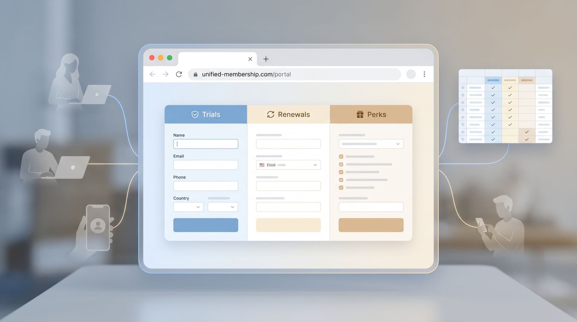
For teams using Ezpa.ge to run signups, intakes, and internal workflows, this isn’t just a UX nicety. It’s a force multiplier:
- Fewer support tickets and back‑and‑forth emails
- Higher completion rates on the first try
- Cleaner data flowing into Google Sheets and downstream tools
- Less time spent writing, localizing, and maintaining help text
This post is about how to get there using layout patterns—where you put labels, fields, hints, and errors—so that your form “teaches” itself without extra explanation.
Why “Zero Instruction” Is Worth Designing For
People rarely arrive at your form relaxed, focused, and eager to read. They’re:
- On a phone, between meetings
- Multitasking with three other tabs open
- Skimming for the one field that matters to them
Every extra sentence of helper copy is competing with that reality.
When you design for zero‑instruction use, you’re intentionally reducing cognitive load. You’re making it possible for someone to:
- Glance at the form.
- Instantly understand what’s being asked.
- Move through it without second‑guessing.
The benefits compound:
- Higher completion and lower abandonment. People don’t bail because they’re confused or overwhelmed.
- Fewer errors and resubmissions. Clear layouts reduce guesswork and invalid entries.
- More trustworthy data. When the path is obvious, users are less likely to rush, misinterpret, or “just put something in.”
- Scalable across teams. When your layout patterns are self‑explanatory, you don’t need a UX specialist on every new form. This is exactly the leverage we talk about in From Theme to Template: Building a Reusable Form Library for Every Team in Your Company.
Zero‑instruction doesn’t mean zero guidance. It means the guidance is baked into the layout instead of bolted on as help text.
Principle #1: Make the Question Unmissable
The fastest way to eliminate help text is to make the question so obvious that nobody needs extra explanation.
That starts with labels.
Use clear, permanent labels (not placeholders)
Research from usability and accessibility teams is consistent: placeholder‑only fields increase error rates and confusion, especially for longer or more complex forms. Users forget what the field was asking once they start typing; people with cognitive or memory challenges are hit hardest.
Layout pattern:
- Put the label above the field, left‑aligned.
- Use plain language: “Company size” instead of “Workforce composition.”
- Keep labels short; move nuance into microcopy if you truly need it.
Why it works:
- The eye can process label + field in one glance.
- The label remains visible while typing, so users can double‑check without deleting their input.
- Screen readers and assistive tech get a reliable label association.
Write labels as if there were no helper text
A useful constraint: assume the label has to carry 90% of the meaning.
Instead of:
- Label: “Details”
- Help text: “Please describe your use case, your team size, and any timelines we should be aware of.”
Try:
- Label: “What are you hoping to use Ezpa.ge for in the next 3–6 months?”
- Optional hint (if needed): “Share team size, main workflows, and any deadlines.”
You’ll find that stronger labels often make long helper paragraphs unnecessary.

Principle #2: Let the Layout Do the Explaining
Zero‑instruction forms lean heavily on visual structure. The way you group, align, and sequence fields should answer questions before they’re asked.
Go single‑column by default
Multi‑column forms force people to zig‑zag with their eyes, trying to decide which field to tackle next. That’s where you see users skip required fields or misread which label belongs to which input.
Pattern:
- One main column of fields.
- Occasional side‑by‑side pairs only when the relationship is obvious (e.g., “First name” and “Last name”).
Result:
- A clear, top‑to‑bottom reading path.
- Less scanning, more momentum.
Group related fields into tight sections
People rely on spatial grouping to understand structure. Use that to your advantage.
Pattern:
- Add short section headers like “Contact details”, “Billing info”, “Project scope”.
- Use spacing to create clear “blocks” of related questions.
- Keep each section focused on a single mental task.
A form that’s 20 fields long but broken into 4 well‑named sections feels more approachable than a wall of 12 fields with no structure. This is the same chunking logic we explored in Designing Forms for ‘Skim‑Only’ Users: Layout, Chunking, and Defaults That Respect Short Attention Spans.
Sequence questions in the order people think
If users are jumping around the form, it’s often because the question order doesn’t match how they reason about the task.
A helpful checklist when ordering fields:
- Context first. Who are they? What are they trying to do?
- Key decision next. The main choice or commitment (plan, date, quantity).
- Supporting details. Anything that depends on the key decision.
- Operational details. Internal routing fields, tags, and admin notes.
When the sequence mirrors the mental model, you don’t need “Step 1 / Step 2” instructions—the flow feels self‑evident.
Principle #3: Replace Instructions with Smart Defaults
A lot of help text exists to prevent bad input:
- “Please use a work email address.”
- “Select only one option.”
- “Use MM/DD/YYYY format.”
You can often remove these lines entirely by choosing the right field type and defaults.
Match field types to the decision
Whenever you find yourself writing “Please choose one” or “Select all that apply,” that’s a hint the input type is wrong.
- Use radio buttons when only one choice is valid.
- Use checkboxes for “select all that apply.”
- Use segmented controls or button groups for short, mutually exclusive options.
- Use date pickers instead of free‑text date fields.
Each of these tells the user what’s allowed without a single sentence of helper copy.
Use opinionated defaults and examples
Defaults are silent instructions. They suggest what “normal” looks like.
- Pre‑select the most common option (while still allowing change).
- Use example values in placeholders that show format and intent:
e.g., 25–50 peopleinstead ofe.g., 50. - For numeric ranges, consider sliders or stepper inputs rather than making people guess units.
Be careful not to let defaults bias sensitive choices (e.g., consent, communication preferences). That’s where patterns from Forms as First-Party Data Engines: Designing Consent-Forward Flows for a Cookieless Future become essential.
Principle #4: Make Errors Self‑Fixing
If someone hits an error and needs a paragraph of explanation to recover, the layout has failed them.
Zero‑instruction error states are:
- Immediate. Errors show as soon as it’s clear something is wrong (e.g., invalid email format), not only after submit.
- Local. The message sits right next to the field, not in a banner at the top.
- Specific. It tells the user exactly what to change.
A simple error layout formula
For each field that can error:
- Highlight the field with a clear color change and border.
- Show a short, specific message directly beneath the input.
- Keep the label as‑is; don’t move or hide it.
Examples:
- “Use your work email, not a personal address like Gmail or Yahoo.”
- “Use numbers only—no spaces or dashes.”
- “Choose at least one option.”
This pattern means you don’t need a separate “How to fill out this form” section. The form teaches the rules at the exact moment they’re relevant.

Principle #5: Keep Microcopy Where Eyes Already Go
Sometimes you do need a sentence or two of explanation. The trick is to place it so users can’t miss it—and so it doesn’t feel like homework.
Attach hints directly to the field they explain
Avoid long paragraphs at the top of the form. People skip them.
Instead:
- Put one short line under the label and above the field, or directly under the field.
- Use a lighter text style, but not so faint it’s unreadable.
- Limit yourself to one sentence.
Better:
Label: “Team size”
Hint: “Count everyone who will use this product in the next 12 months.”
Worse:
Intro paragraph: “Before you begin, please read the following information about how we define team size…”
Use progressive disclosure for edge cases
If you’re trying to cover every possible scenario in your help text, you’ll drown the average user.
Instead, use patterns like:
- “Learn more” links that open a small inline explainer or modal for complex policies.
- Tooltips on labels for jargon that only a subset of users will question.
The main layout stays clean and self‑explanatory, while power users can dive deeper when needed.
Principle #6: Design for Skimming, Not Studying
Even the best layout fails if it assumes careful reading. Zero‑instruction forms must work for skimmers.
Make the primary action unmistakable
Your main button should answer “What happens when I’m done?” without extra text.
- Use verbs tied to the user’s goal: “Start trial”, “Request demo”, “Join waitlist”.
- Place the button directly after the last required field.
- Avoid multiple competing primary buttons on the same screen.
Use visual hierarchy sparingly but deliberately
You don’t need five font sizes and three colors. You do need a clear hierarchy:
- Section titles slightly larger/bolder than labels.
- Labels stronger than hint text.
- Error messages in a distinct, consistent color.
When someone scrolls, they should be able to understand the form’s structure just by glancing at the typography and spacing.
Principle #7: Systematize Your Patterns
The real power of zero‑instruction design shows up when you standardize it.
Instead of redesigning every new form from scratch, capture the patterns that work:
- Standard label position: Always top‑aligned.
- Standard spacing: Same gap between label and field, same gap between fields, same gap between sections.
- Standard error pattern: Same color, placement, and tone.
- Standard field types: A go‑to choice for common questions (e.g., radio vs. dropdown).
If you’re running many forms across teams and brands, this is where a reusable library pays off. Combine layout patterns with themes and templates, and you can ship new forms that feel intuitive on day one—without a UX review every time. That’s the spirit behind From Theme to Template: Building a Reusable Form Library for Every Team in Your Company.
With Ezpa.ge, this systematizing step is practical:
- Create a “golden” form that embodies these patterns.
- Duplicate it as a starting point for new use cases.
- Keep your layout rules in a short internal doc instead of long per‑form instructions.
How to Retrofit an Existing Form in 30 Minutes
If you already have a form weighed down by instructions, you don’t have to start over. Here’s a quick retrofit checklist you can run through in about half an hour.
-
Delete non‑essential helper paragraphs.
- Keep only what’s legally or operationally required.
- Move any surviving explanations next to the fields they affect.
-
Standardize labels.
- Move every label above its field, left‑aligned.
- Rewrite vague labels to be self‑contained questions.
-
Fix field types.
- Replace free‑text inputs with radios, checkboxes, or selects where appropriate.
- Add a date picker for dates; add masks or format helpers for complex inputs.
-
Group and reorder.
- Create 2–4 sections with short titles.
- Order fields to match the user’s mental flow.
-
Tighten errors.
- Ensure each field with validation has a specific, local error message.
- Test by intentionally breaking the form: is the fix obvious?
-
Test with a true first‑timer.
- Ask someone unfamiliar with the process to complete the form while thinking aloud.
- You’re listening for questions like “What does this mean?” or “Do they want X or Y?”—those are layout or label problems, not user problems.
You’ll be surprised how much instruction you can safely remove once the layout carries its weight.
Bringing It Back to Form & Function
Zero‑instruction forms are not about stripping away all guidance. They’re about:
- Letting structure, sequence, and field types do most of the explaining
- Using labels and microcopy surgically, where they add clarity
- Designing error states that teach the rules as people go
When you layer these patterns on top of Ezpa.ge’s strengths—responsive layouts, themes, custom URLs, and live Google Sheets syncing—you get forms that feel effortless for users and powerful for your team.
If you’re already thinking about how your forms compete with chat, DMs, and other low‑friction channels, pairing zero‑instruction layouts with the conversational patterns from Forms in the Era of Instant Messaging: Designing Intakes That Compete with DMs and Chat Widgets is a natural next step.
Where to Start
You don’t need a full redesign to benefit from this approach.
Pick one form that matters this quarter—demo request, event signup, partner intake, internal request—and:
- Audit it using the principles above. Where are you relying on instructions instead of layout?
- Refactor just the labels, grouping, and field types. Don’t touch the backend yet.
- Ship a variant and watch the data. Compare completion rate, time to complete, and error rates.
If you’re using Ezpa.ge, duplicate that improved layout as a base template and let other teams build on it. The more your forms share the same zero‑instruction patterns, the less you’ll need to explain—and the more your forms will quietly do the work for you.
Ready to see how far you can go without a single block of help text? Open your highest‑traffic form, strip it back to structure, and let the layout start pulling its weight.