Designing Forms for ‘Skim-Only’ Users: Layout, Chunking, and Defaults That Respect Short Attention Spans


Most people are not reading your form.
They’re:
- Skimming labels
- Guessing what’s required
- Hunting for the one field that matters to them
- Deciding in seconds whether this is worth finishing
If your form assumes deep focus, you’re designing for a user who rarely exists.
Designing for “skim-only” users isn’t about dumbing things down. It’s about reducing cognitive load so people can make good decisions quickly, without getting lost or annoyed. When you do that well, you get:
- Higher completion rates
- Better-quality answers (less guessing, less junk data)
- Fewer support tickets that start with “I tried to fill out your form but…”
Tools like Ezpa.ge make this much easier: you can control layout, themes, defaults, and real-time syncing to Google Sheets, so you’re free to obsess over structure instead of fighting the tool.
Let’s break down how to design forms that work even when users are barely paying attention.
Why designing for skimmers matters
Skim behavior isn’t laziness; it’s self-defense.
People are juggling tabs, notifications, and competing priorities. Your form is one more thing asking for time and attention. If it feels heavy or confusing, they bail.
When you design for skim-first behavior, you:
- Shorten time-to-completion. Clear grouping, smart defaults, and predictable patterns mean users can get through forms in seconds, not minutes.
- Lower perceived effort. A 15-field form can feel like 5 if it’s well chunked and visually calm.
- Protect data quality. When users understand questions at a glance, they’re less likely to guess, skip, or type nonsense.
- Earn trust. Respecting attention is a trust signal. It says, “We value your time and won’t waste it.” That’s especially critical in forms that collect sensitive or first-party data—something we explore deeply in Forms as First-Party Data Engines.
The good news: you don’t need a full redesign to get there. You can apply layout, chunking, and default patterns to almost any form you already have.
Start with a ruthless hierarchy
Skim-only users need a clear sense of what matters most without reading everything.
1. Decide what’s truly primary
Before you touch the UI, answer this:
If a user only completes three fields on this form, which ones would you pick?
Those are your primary fields. Everything else is secondary.
- Put primary fields at the top of the form.
- Give them more visual weight (spacing, grouping, sometimes even subtle background or border emphasis).
- Make sure their labels are plain-language obvious, not internal jargon.
If you’re collecting info that will drive routing, scoring, or automation later, this hierarchy matters operationally too. Posts like Sheets-Native Scoring show how a handful of well-chosen fields can power entire workflows.
2. Use a clear visual reading path
Skimmers follow visual cues more than text. Use:
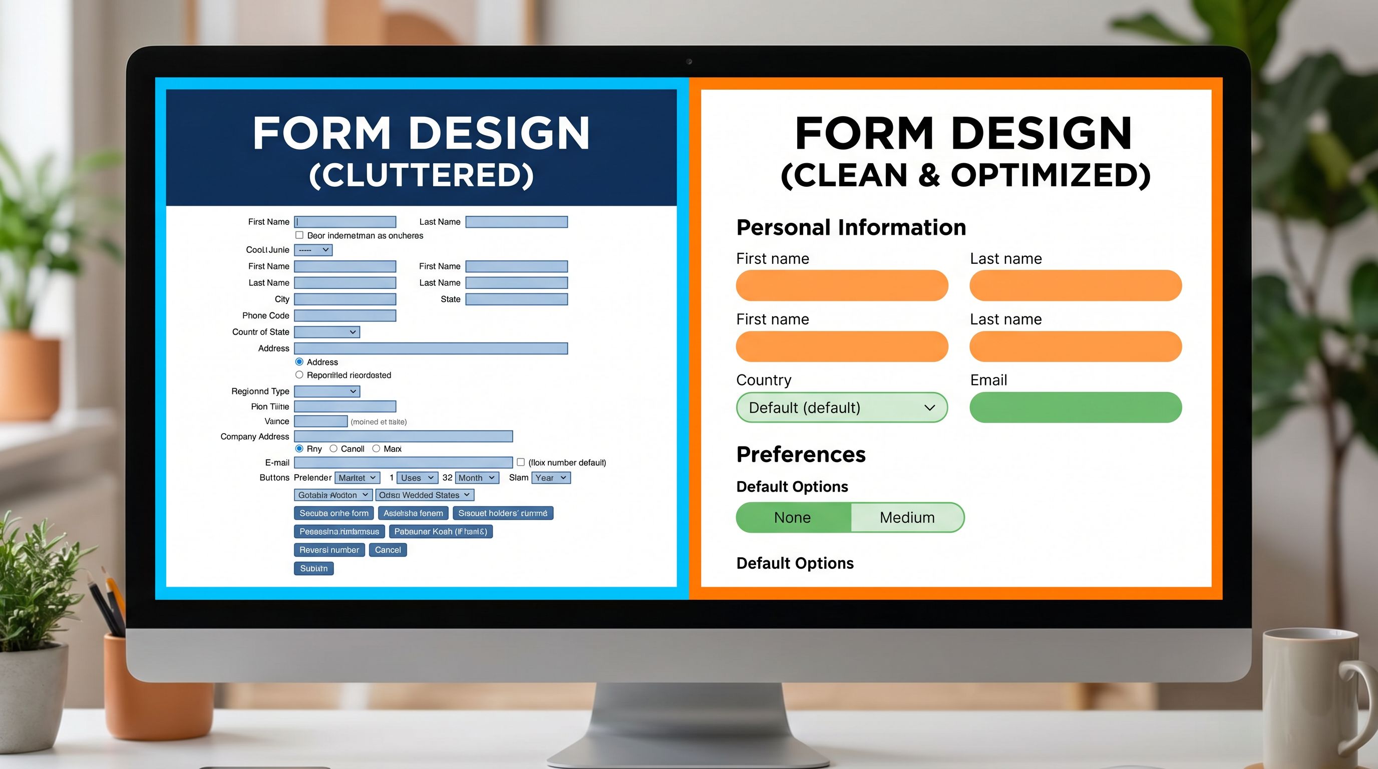
- Single-column layouts for most forms. Two columns seem efficient but create zig-zag scanning and missed fields.
- Consistent alignment (left-aligned labels, left-aligned fields) so the eye can sweep down in one motion.
- Predictable patterns: label → helper text (if needed) → field → error state. Avoid mixing label placements or switching between inline and stacked labels mid-form.
If you’re using Ezpa.ge, lean on themes to establish that consistent rhythm once, then reuse it across forms.

Chunking: turning walls of fields into breathable sections
Chunking is how you turn a long, intimidating form into something that feels quick.
3. Group by user intent, not internal org chart
Don’t group fields by which team owns the data ("Marketing questions", "Ops questions"). Group them by the mental steps your user is taking.
Common intent-based chunks:
- Who you are – name, email, role, company
- What you want – goal, request type, use case
- Details if you’re still with us – optional context, preferences, budget, etc.
Each chunk should answer, implicitly: "Why are you asking me this right now?"
4. Use section headers that act like signposts
For skim-only users, section headers are often the only text they fully read.
Make them:
- Short and descriptive: “About you”, “Project details”, “Timing & budget”
- Visually distinct: slightly larger font, weight, or subtle divider line
- Sequentially meaningful: they should feel like a logical story as you scroll
Avoid cute or vague headers like “Let’s get to know each other” if the fields beneath are serious or transactional.
5. Limit chunk size
A good rule of thumb:
- 3–5 fields per chunk for desktop
- 2–4 fields per chunk for mobile
If you regularly exceed this, consider:
- Splitting into multiple pages (or micro-steps)
- Moving non-essential questions to a follow-up form or progressive profiling flow (see Beyond Required Fields for deeper strategies).
6. Consider micro-form funnels for longer flows
If your form is genuinely long—onboarding, applications, complex intake—consider a micro-form funnel pattern:
- One primary question per screen
- Clear progress indicator ("Step 2 of 6")
- Easy back navigation
This keeps cognitive load low while still collecting detailed data. For a full walkthrough, see Micro-Form Funnels: Chaining Single-Question Flows Without Losing Context or Data.
Defaults that do real work (without being pushy)
Defaults are one of the most powerful tools you have for skim-only users. They can:
- Reduce typing
- Nudge toward recommended choices
- Encode business logic quietly
But they can also backfire if they feel sneaky or misaligned.
7. Use defaults to remove obvious decisions
Great candidates for safe defaults:
- Country based on IP (with easy override)
- Preferred contact method if there’s a clearly best option for most users
- Common timeframes: “Timeline” defaulted to “Within 1–3 months” instead of empty
Patterns that help:
- Pre-select the most common, low-risk option in radio groups.
- For dropdowns, sort by most likely choice first, not alphabetically.
8. Make defaults transparent and easy to change
Skim-only users shouldn’t feel tricked.
- Clearly label any default that has real consequences: e.g., “We’ll follow up by email (default). You can change this below.”
- Avoid pre-checking anything that implies consent (marketing emails, data sharing) without explicit clarity. If you’re balancing rich data collection with compliance, the patterns in Privacy-Forward Forms are a good reference.
9. Encode smart fallbacks in your logic
Behind the scenes, use defaults to keep operations smooth:
- If “Request type” is blank, route to a general queue instead of failing silently.
- If “Budget” is unknown, treat it as “TBD” rather than forcing a guess.
Ezpa.ge + Google Sheets makes this powerful: you can set formulas or logic in Sheets that interpret missing or defaulted fields in a consistent way, instead of relying on manual triage.
Labeling and microcopy for people who only half-read
The words around your fields are doing more work than you think—especially for skim-only users.
10. Make labels scannable, not clever
Good labels:
- Use plain language (“Work email”, “Team size”, “Project goal”)
- Avoid internal jargon (“Customer segment”, “Lifecycle stage”, “LOB”)
- Are short: 1–4 words where possible
If you need more explanation, use helper text, not a long label.
11. Use helper text sparingly and purposefully
Helper text should:
- Answer “What do you want here?” or “Why does this matter?”
- Be visually lighter than labels (smaller font, lighter color)
- Stay under one short sentence
Examples:
-
Label: Project goal
Helper: “What does success look like for you in 3–6 months?” -
Label: Team size
Helper: “Include full-time and part-time teammates.”
12. Turn validation into guidance, not punishment
Error states are a key moment for skim-only users; they’re often the first time someone really slows down.
Instead of:
“Invalid input.”
Try:
“Use a work email so we can match you to the right account.”
or
“Please enter a number between 1 and 500.”
Patterns that help:
- Inline, real-time validation so users don’t discover five errors after hitting Submit.
- Polite, specific messages that tell them how to fix the issue.
Layout patterns that respect short attention spans
Once your hierarchy, chunks, and defaults are in place, layout details make the experience feel frictionless.
13. One primary action per screen
Don’t compete for attention.
- Have one clear primary button ("Submit", "Next", "Request demo").
- If you need a secondary action ("Save draft", "Skip for now"), make it visually lighter.
14. Keep CTAs anchored and predictable
For longer forms:
- Keep the primary button anchored at the bottom of the viewport or clearly visible after the last field.
- Avoid making users scroll back up or hunt for how to continue.
15. Use progress indicators thoughtfully
Skim-only users want to know: "How long will this take?"
Options:
- Step counter: “Step 2 of 4”
- Progress bar: simple fill bar, no extra labels needed
- Section labels: “About you → Project details → Timing & next steps”
Avoid fake precision ("23% complete") that doesn’t help anyone.
16. Design for mobile first
Even if most of your conversions are on desktop, many people first see the form on their phone.
Mobile-friendly patterns for skimmers:
- Large tappable targets for radio buttons and checkboxes
- Minimal horizontal scrolling (ideally none)
- Native pickers for date, time, and select fields when possible
Ezpa.ge’s responsive layouts help here, but it’s still worth testing your forms on a small screen with this question in mind: “Can I complete this with one thumb, while distracted?”
Using Sheets and automation to support skim-first UX
Skim-friendly forms aren’t just a UX choice; they’re an ops choice.
When you reduce friction up front, you:
- Increase volume and diversity of submissions
- Get more partial or low-detail answers
- Need a reliable way to triage and enrich data on the back end
That’s where real-time syncing to Google Sheets becomes powerful:
- Lightweight scoring and routing: Use simple formulas to prioritize submissions based on a few key fields (see Sheets-Native Scoring).
- Operational workflows: Turn form responses into tasks, follow-ups, or Slack alerts instead of manual inbox triage.
- Micro-optimizations over time: With all submissions in Sheets, you can spot which fields are often left blank, which options are rarely chosen, and where people drop off.
Skim-first design doesn’t mean you accept lower-quality data. It means you shift some of the work from the user’s brain into your systems.
Putting it all together: a quick checklist
When you’re about to ship or refactor a form, run it through this skim-only checklist:
Hierarchy & layout
- [ ] Primary fields are clearly at the top
- [ ] Single-column layout with consistent alignment
- [ ] One clear primary CTA per screen
Chunking & flow
- [ ] Fields are grouped into 3–5-field chunks by user intent
- [ ] Section headers are short, descriptive, and visually distinct
- [ ] Long flows are broken into micro-steps with clear progress
Defaults & logic
- [ ] Safe, helpful defaults are set for obvious choices
- [ ] Defaults are transparent and easy to override
- [ ] Back-end logic handles missing or defaulted values gracefully
Copy & validation
- [ ] Labels are short, plain-language, and free of jargon
- [ ] Helper text is used only where needed, in one short sentence
- [ ] Error messages are specific, polite, and inline
Responsiveness & operations
- [ ] The form feels usable on a small phone with one thumb
- [ ] Submissions sync into a structured system (like Google Sheets)
- [ ] There’s a plan for routing, follow-up, and optimization
If you can check most of these boxes, you’re in a good place for skim-only users.
Summary
Most forms are still designed as if users will carefully read every label and helper line. Reality is different: people skim, guess, and abandon quickly.
Designing forms for skim-only users means:
- Establishing a clear hierarchy so the most important fields stand out instantly
- Using chunking and section headers to turn long forms into breathable, logical steps
- Setting smart, transparent defaults that reduce effort without undermining trust
- Writing scannable labels and helper text that clarify intent at a glance
- Applying layout patterns that keep actions obvious and progress visible, especially on mobile
- Backing everything with Sheets-powered workflows so your systems—not your users—carry the complexity
When you respect short attention spans, you don’t just improve conversion. You build trust, reduce operational friction, and create form experiences that feel like a quick, helpful interaction—not a chore.
Where to start
You don’t need a full rebuild. Pick one high-impact form—a demo request, intake, waitlist, or support form—and do this:
- Identify the three most important fields. Move them to the top and simplify their labels.
- Group the rest into 2–3 clear sections. Add short, descriptive headers.
- Add or refine defaults for any obvious choices, and remove at least one field that isn’t truly necessary.
- Test it on your phone. If it feels even slightly annoying, fix that first.
If you’re using Ezpa.ge, you can do all of this quickly with themes, custom URLs, and real-time Google Sheets syncing—then reuse the pattern across every new form you ship.
Ready to make your forms skimmer-proof? Pick that one form, apply the checklist above, and ship a cleaner, calmer version this week. Your users (and your future self in the data) will feel the difference.