Forms in the Era of Instant Messaging: Designing Intakes That Compete with DMs and Chat Widgets


People don’t wake up thinking, “I hope I get to fill out a form today.”
They DM. They drop a quick note in Slack. They tap a chat bubble on your site and expect a response in minutes.
If your intake still looks like a static wall of fields, you’re not just competing with other forms—you’re competing with every frictionless channel your users already love.
The good news: forms can absolutely hold their own against DMs and chat widgets. But they have to earn that right.
This post is about how to design intakes that feel as quick, responsive, and human as messaging—while giving your team the structure, data quality, and automation that chat alone can’t.
Why Messaging “Wins” by Default (And Where It Fails)
Before you can design forms that compete with messaging, you have to understand why people default to DMs and chat in the first place.
What users love about DMs and chat
Instant messaging feels:
- Low commitment – You can send a half-formed question and refine later.
- Conversational – It feels like a back-and-forth with a human, not an exam.
- Contextual – You can paste screenshots, links, and threads in one place.
- Responsive – Even a “Got it, we’ll look into this” feels better than silence.
For a user, a DM is often the path of least resistance. No hunting for the right page. No deciding which category their issue fits into. Just: type, send, done.
Where messaging quietly breaks down
On the operations side, DMs and chat are often a mess:
- No consistent fields – Hard to report on or route requests.
- Scattered history – Context lives in dozens of channels and inboxes.
- Ownership confusion – Who’s actually responsible for this request?
- Lost signals – Important asks get buried under newer pings.
If you’ve ever had to reconstruct a customer story from Slack screenshots, you know the pain.
Forms exist to solve these problems. The trick is making them feel as approachable as a DM without losing the structure that makes them powerful.
For a deeper dive into designing for low-friction behavior, it’s worth pairing this with Designing Forms for ‘Skim-Only’ Users: Layout, Chunking, and Defaults That Respect Short Attention Spans.
The New Bar: Forms That Feel Like Conversations
To compete with messaging, your form has to answer one question in seconds:
“Is this easier than just pinging someone?”
That’s a high bar—but reachable when you combine a few principles:
- Conversational framing – The form feels like a guided chat, not a bureaucratic questionnaire.
- Clear payoff – You explain what happens next and why structured info helps.
- Smart defaults and branching – The form adapts based on what people say.
- Tight operational loop – Submissions trigger visible, reliable follow-up.
Let’s break that down into things you can actually ship.
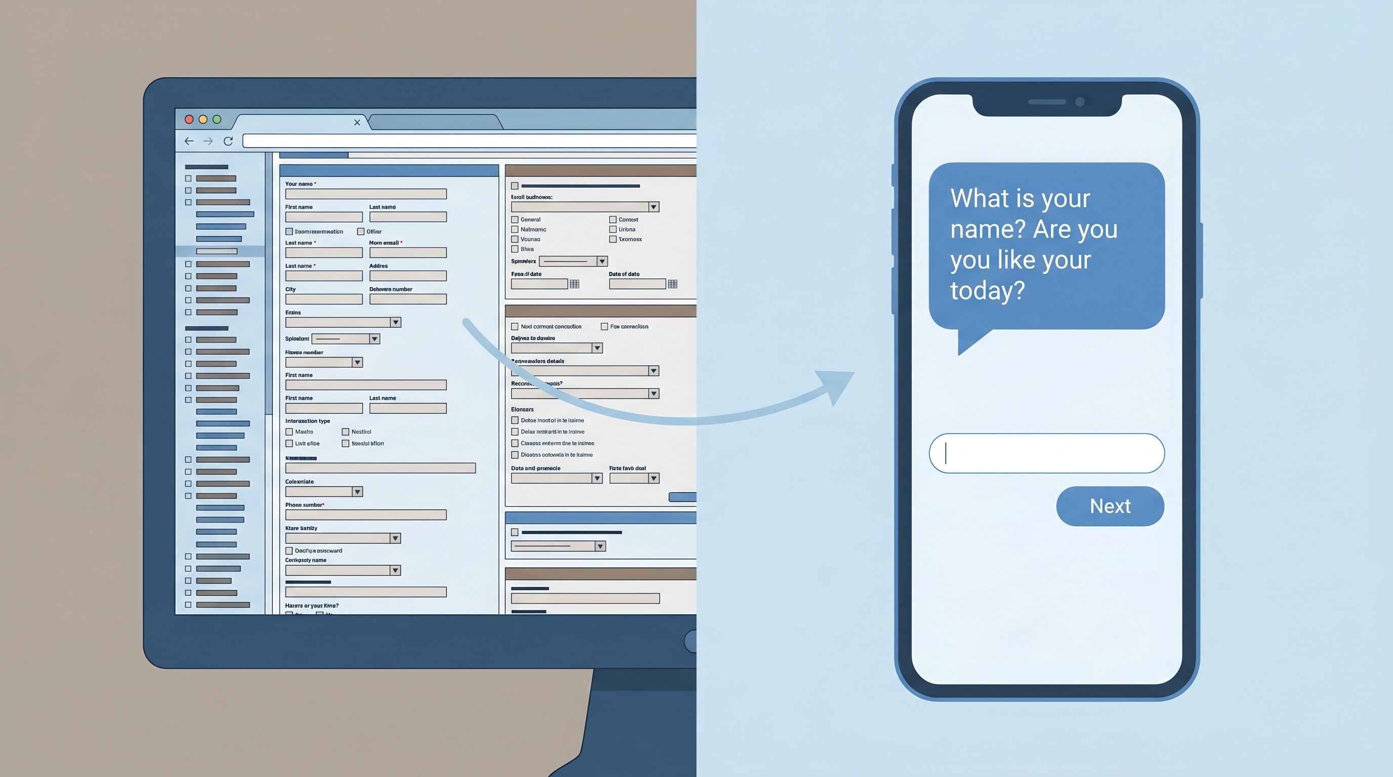
Principle 1: Make the Form Feel Like a First-Class Conversation
Static, monolithic forms lose to chat every time. What wins is a form that feels like a thoughtful first interaction with your team.
We explored this deeply in Forms as First Meetings: Designing Intake Flows That Feel Like a Great Intro Call. Here’s how to apply that thinking specifically against DMs and chat.
Rewrite your form like a DM thread
Take your current intake and literally rewrite it as if you were messaging a user one-on-one. For example:
- Instead of: “Issue Category” → “What are you trying to get help with today?”
- Instead of: “Description” → “Can you share a bit more detail so we can route this to the right person on the first try?”
- Instead of: “Priority” → “How urgent is this for you?”
Then translate that conversational flow back into fields. Keep the tone; keep the context.
Use microcopy to replace back-and-forth clarifications
In chat, a human would naturally clarify. Your form can do that with tight microcopy:
- Under a file upload: “Screenshots or short Looms are perfect here—whatever’s fastest for you.”
- Under a long-text field: “2–3 sentences is plenty. We’ll ask for more if we need it.”
- Next to a required field: “Required so we can send you an update when this moves.”
These tiny lines answer the questions users would otherwise DM you about.
Break complex flows into micro-steps
Multi-purpose, 30-field forms feel like paperwork. Micro-steps feel like a conversation.
Patterns like Micro-Form Funnels: Chaining Single-Question Flows Without Losing Context or Data are especially powerful here:
- Ask one key question per screen when stakes or complexity are high.
- Use progress indicators (“Step 2 of 4: About your account”) instead of a long scroll.
- Let people back up without losing answers, just like scrolling in a chat.
This doesn’t just feel better; it mirrors the cadence of a DM exchange.
Principle 2: Set Expectations as Clearly as a Human Would in Chat
A big reason people prefer messaging is expectation-setting. A human can say, “Got it, we’ll get back to you by tomorrow,” and your anxiety drops.
Your form needs to do the same job.
Answer “What happens after I hit submit?”
Right near the top of the form, add a short, specific promise:
- Support example:
- “You’ll get a response from a human within 1 business day. For urgent production issues, we aim for 2 hours.”
- Sales example:
- “We’ll review your answers and send 2–3 time options for a call within 24 hours.”
- Internal ops example:
- “Once you submit, this goes into our Requests board and is triaged every weekday at 10am.”
Then reinforce that promise on the confirmation screen and in the confirmation email.
Show that structure = better outcomes, not red tape
People abandon forms because they assume they’re doing unpaid data entry for your CRM.
Flip that narrative:
- Add a short explainer near the top: “These questions help us route your request to the right person so you don’t have to repeat yourself later.”
- Use inline notes like: “This helps us pull the right logs before we reply, so we can skip the back-and-forth.”
Explicitly connecting each field to user benefit makes the form feel like a service, not a hurdle.
Reflect urgency and channel options
Sometimes, chat really is the right channel—especially for emergencies.
Use your form to:
- Offer an escape hatch for truly urgent cases: “If this is blocking a launch today, ping us in chat and mention ‘P1’ so we can jump in.”
- De-prioritize low-urgency chat: “For feature ideas and non-urgent feedback, this form is the fastest way to get it into our roadmap.”
You’re not trying to kill chat; you’re guiding people to the best channel for their goal.
Principle 3: Use Branching and Context to Beat Generic Chat Widgets
Most chat widgets start with the same generic prompt: “How can we help?” That’s friendly—but shallow.
Forms can go deeper, faster, by adapting to what the user tells you.
Design smart branching paths
Use conditional logic so people only see what’s relevant:
- If “What do you need help with?” = Billing, show fields about invoices, plan, and renewal dates.
- If “What do you need help with?” = Technical issue, show environment, error logs, and steps to reproduce.
- If “Where are you reaching out from?” = Enterprise customer, show fields about account team and contract.
Branching lets you:
- Respect people’s time (fewer irrelevant questions).
- Collect richer, more specific data where it matters.
- Route requests with much higher accuracy.
Prefill everything you already know
Nothing makes a form feel more outdated than asking for information you already have.
- Use custom URLs and prefills to carry context from emails, campaigns, or in-app links.
- Pre-populate fields like email, account ID, or plan tier.
- Lock fields that should not change (e.g., account ID) while keeping them visible for clarity.
If you’re not yet using custom URLs and prefills to bridge the gap between clicks and known users, From Anonymous Clicks to Known Users: Using Custom URLs and Prefills to Bridge the Attribution Gap is a practical next read.
Combine free text with structured options
Chat is great for nuance; forms are great for structure. You want both.
For key questions, pair:
- A multiple-choice field for routing and reporting.
- A short free-text field for nuance.
Examples:
- “What best describes your request?” (radio buttons) + “Anything else we should know?” (optional text).
- “What’s your timeline?” (select) + “Is there a specific date we should be aware of?” (date + text).
This combo lets your ops stay sane without forcing users into boxes.

Principle 4: Make Forms the Operational Backbone Behind Chat and DMs
The strongest way to “compete” with messaging is not to replace it—but to connect it to a reliable backbone.
Instead of:
- Random Slack pings
- Unstructured chat transcripts
- Email threads with no owner
…you route everything through forms that sync into a single source of truth (often Google Sheets), then surface that structure back into your messaging tools.
We unpacked this pattern in Signals in Slack Pings: Using Google Sheets–Synced Forms to Replace Ad-Hoc Requests. Here’s the condensed playbook.
Step 1: Define your core “intake types”
List the top 3–5 things people currently DM or chat you about:
- “Can you run this report?”
- “I need design help on this deck.”
- “Can someone approve this budget?”
- “Customer X needs a contract update.”
For each, define a single canonical form that should capture that request.
Step 2: Turn those into shareable, branded Ezpa.ge forms
With Ezpa.ge, you can:
- Create clean, responsive forms that look good on desktop and mobile.
- Use themes so each intake type feels aligned with your brand.
- Publish them at custom URLs (e.g.,
ops.yourbrand.com/report-request). - Sync every submission to Google Sheets in real time.
Now, instead of a DM like, “Can you help with this?”, your team can reply with:
“Yes—drop it in this link so it doesn’t get lost:
ops.yourbrand.com/report-request. That routes it straight to our queue.”
You’re not saying “no” to DMs. You’re giving people a faster path to a reliable outcome.
Step 3: Wire forms into your messaging tools
Once your forms sync to Sheets, you can:
- Push new rows into Slack channels using tools like Zapier or Make.
- Trigger notifications to the right owner based on form fields (e.g., region, product line).
- Update request status back in the Sheet and mirror that status in Slack.
From the user’s perspective, it still feels like messaging. Under the hood, it’s a structured intake system.
Principle 5: Respect Privacy and Trust More Than Any Chat Bubble
Forms often ask for more sensitive information than a quick DM. That’s a responsibility—and an opportunity.
If your form feels like a safe, respectful place to share real context, people will tell you the truth. If it feels risky or opaque, they’ll either abandon or sanitize their answers.
A few patterns to borrow from Privacy-Forward Forms: Collecting Rich Data While Meeting SOC 2, GDPR, and Enterprise Requirements:
Minimize by default
- Only ask for data you can explain and actually use.
- Mark truly required fields clearly—and keep that list short.
- Avoid collecting sensitive PII unless there’s a clear, user-facing reason.
Make consent specific and understandable
- Replace vague catch-all checkboxes with clear purposes: “Email me about feature updates” vs. “I agree to receive communications.”
- Use short, plain-language summaries before linking to longer policies.
Show how data flows into your operations
- Add a line like: “Your answers go straight into our secure request tracker. Only the X team can see them.”
- For especially sensitive topics (HR, health, financial stress), borrow patterns from Forms as Brand Safe Rooms: UX Patterns That Protect Sensitive Topics Without Feeling Clinical.
When your form feels safer and more respectful than a chat widget, people will choose it—even for delicate conversations.
Putting It All Together: A Quick Design Checklist
If you’re redesigning an intake to compete with DMs and chat, run it through this checklist:
Clarity & Tone
- [ ] Does the headline explain the form’s purpose in plain language?
- [ ] Does the intro copy answer “What happens after I submit?” with a concrete timeline?
- [ ] Are field labels written the way a human would ask in a DM?
Flow & Friction
- [ ] Is the form broken into logical sections or micro-steps instead of one long scroll?
- [ ] Are optional vs. required fields clearly indicated—and are there as few required fields as possible?
- [ ] Do people only see questions that are actually relevant (via branching)?
Context & Prefill
- [ ] Are we pre-filling anything we already know (email, account, plan, campaign)?
- [ ] Are we pairing structured fields with at least one free-text space for nuance?
- [ ] Are we using custom URLs to align this form with specific campaigns or sequences?
Operations & Follow-Through
- [ ] Does each submission sync to a single, reliable source of truth (e.g., Google Sheets)?
- [ ] Is ownership clear—who responds, and how fast?
- [ ] Are status updates visible somewhere (internally or to the requester)?
Trust & Safety
- [ ] Are we only asking for data we can justify to the user?
- [ ] Is our privacy/consent language short, clear, and specific?
- [ ] Would I personally feel comfortable submitting this form for a sensitive request?
If you can confidently check these boxes, your form isn’t just “less bad” than a DM. It’s the obvious, trustworthy way to get something done.
Summary
Messaging has set a new standard: people expect interactions that are quick, human, and responsive.
Forms don’t have to be the stodgy alternative. When you:
- Write like a person, not a policy manual
- Use micro-steps and branching to keep focus tight
- Prefill what you already know and ask only what matters
- Connect submissions to a real operational backbone
- Treat privacy and consent as part of UX, not just legal
…your intake forms start to feel like the best version of a DM: structured enough to drive action, human enough to earn trust.
Instead of competing with chat and DMs, your forms become the place where conversations turn into decisions, next steps, and real outcomes.
Ready to Build a Form That Can Stand Next to Any Chat Bubble?
If your requests, leads, or support tickets are scattered across DMs, Slack threads, and inboxes, the first step isn’t “add another widget.” It’s designing one great intake that people actually want to use.
With Ezpa.ge, you can:
- Spin up beautiful, responsive forms in minutes
- Use themes and custom URLs to match each intake to its context
- Sync responses to Google Sheets in real time so your team has a single source of truth
Pick one messy DM-driven workflow—support requests, internal ops asks, sponsorship pitches, anything—and turn it into a form that feels like a conversation but runs like a system.
Ship that one intake. Share the link. Route the next DM there.
You’ll feel the difference within a week.
And once you’ve seen a form out-perform your chat bubble, you’ll never look at “just a form” the same way again.