Form UX for Membership Businesses: Trials, Renewals, and Perks in a Single URL

Membership businesses live and die on moments of decision.
- Do I start a trial?
- Do I renew or churn?
- Do I upgrade for better perks—or quietly downgrade?
Those decisions often happen in tiny windows of attention: a link in an email, a banner in your app, a DM from a community manager. If every one of those moments sends people to a different form, a different page, or a different system, you’re making membership harder than it needs to be.
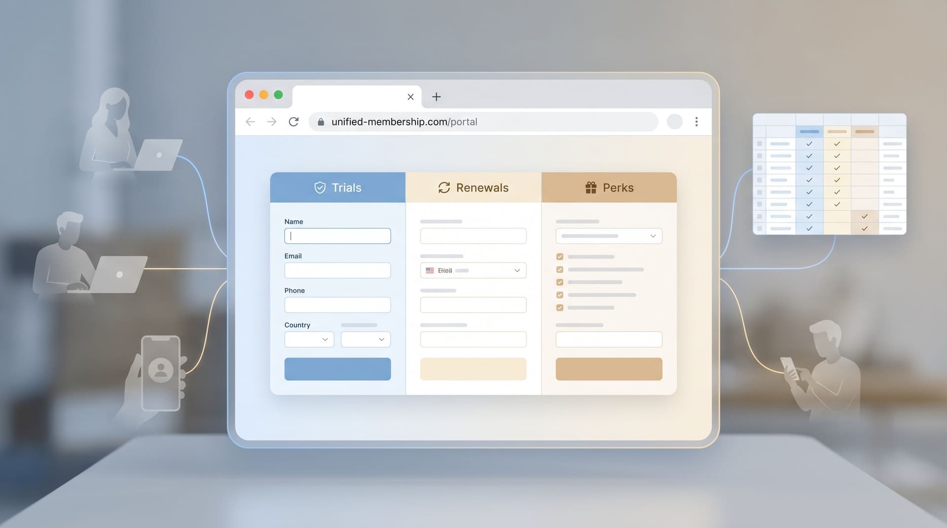
A better pattern is emerging: one canonical URL that can gracefully handle trials, renewals, and perks in a single, adaptive flow.
When you combine flexible form UX with custom URLs and real‑time data (for example, through Google Sheets), you can:
- Reduce friction for members
- Centralize operational logic for your team
- Test new offers quickly without spinning up new pages
- Keep your data clean and your funnels visible
This post is about how to design that kind of unified membership form experience—especially if you’re using a tool like Ezpa.ge to power your forms.
Why membership UX breaks (and how forms can fix it)
Most membership businesses evolve into a tangle of flows:
- A marketing site with a generic “Start free trial” form
- A billing portal with its own upgrade/downgrade UI
- A support queue handling edge cases like failed renewals, gift memberships, or special discounts
Each of those flows usually means a different URL, a different form, and a slightly different data model.
The result:
- Inconsistent experiences. Members see different questions and offers depending on which link they clicked.
- Operational gaps. Your team has to manually reconcile who started where and what they actually chose.
- Lost intent. A member ready to renew or upgrade hits a confusing page and decides to “deal with it later.”
If you’ve read our piece on why the URL itself acts like a call to action, you know that every extra URL is another decision point. A single, trustworthy membership URL dramatically simplifies that decision.
The case for one canonical membership URL
Imagine you had just one URL for all membership actions:
yourbrand.com/membership
Behind that URL, your form can adapt based on:
- Who’s clicking (existing member vs. prospect)
- How they arrived (email campaign, in‑app banner, referral)
- What state they’re in (trial, active, lapsed, VIP)
Instead of building separate experiences for:
- “Start trial”
- “Renew now and save”
- “Unlock perks”
- “Update billing”
…you orchestrate one adaptive flow that routes people to the right path with minimal friction.
That’s where Ezpa.ge’s strengths—custom URLs, themes, and real‑time Google Sheets syncing—become especially powerful.
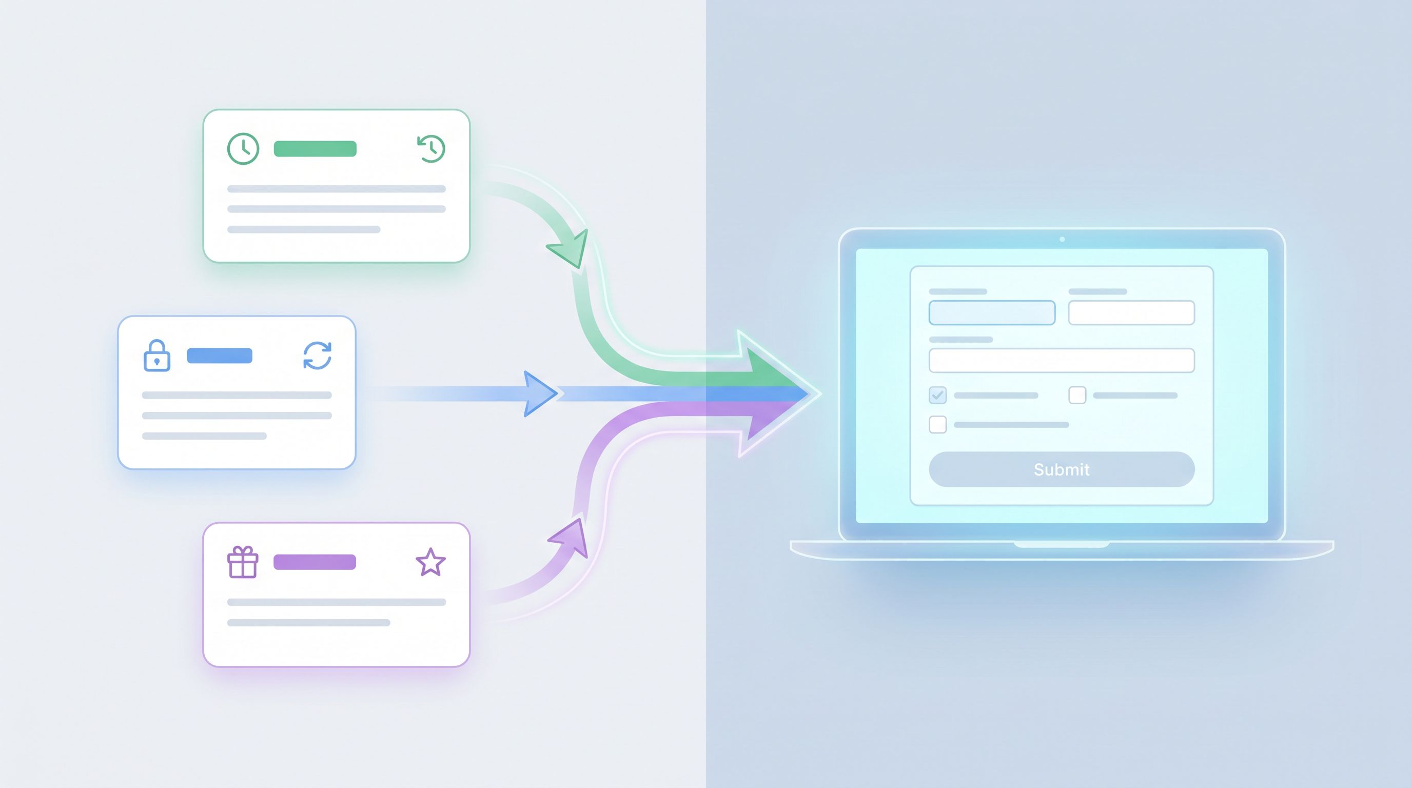
The three core journeys: trials, renewals, and perks
Before you design a unified form, you need to understand the journeys you’re unifying.
1. Trial starts: lowering the first commitment
For trials, your form’s job is to:
- Make the offer crystal clear (length, what’s included, what happens after)
- Collect just enough data to personalize the experience
- Set expectations about billing and communication
Key UX patterns:
- Single clear promise at the top.
- Example: “Start your 14‑day Pro trial—no card required. You’ll choose a plan at the end.”
- Minimal required fields. Name, email, and 1–2 segmentation questions (e.g., team size, primary goal).
- Transparent billing section. If a card is required, make renewal timing and pricing explicit.
If you’re thinking about trials as a way to learn about users, not just convert them, it’s worth pairing this with a consent‑forward mindset. Our post on forms as first‑party data engines goes deeper into how to ask better questions without creeping people out.
2. Renewals: reducing anxiety at the moment of decision
Renewals are emotionally different from trials. People are asking:
- “Did I get enough value?”
- “Is this still worth the price?”
- “Are there better options?”
Your renewal flow should:
- Surface the value they’ve already received (usage, perks, savings)
- Offer clear options (renew, change plan, pause, cancel)
- Make the default path easy but not manipulative
Key UX patterns:
- Contextual recap. A short summary like “You’ve attended 6 classes and saved $84 this month” or “You unlocked 3 member‑only events last quarter.”
- Side‑by‑side options. Renew vs. change plan vs. pause, with one clearly recommended based on their pattern.
- Gentle downgrade paths. Let people right‑size instead of forcing an all‑or‑nothing choice.
3. Perks: turning benefits into visible wins
Perks are where membership becomes felt, not just billed.
Common perk flows:
- Claiming a member‑only discount or credit
- Registering for member‑exclusive events
- Accessing partner offers
Your perks experience should:
- Make eligibility obvious
- Keep redemptions simple (ideally one or two fields)
- Feed into the same operational backbone as trials and renewals
Key UX patterns:
- Prefilled identity. If someone clicks from a logged‑in area or an email, prefill their name/email so the perk form feels like a confirmation, not a new signup.
- Clear “what you get” summary. Short, benefit‑first copy: “Apply your 20% loyalty discount to your next 3 months.”
Designing a single URL that adapts to every membership state
Now, how do you actually merge these journeys into one form experience?
Think of your membership URL as a router and your form as the conversation engine.
Step 1: Choose a URL that feels like a “home base”
This URL should be:
- Memorable. Easy to say on a podcast or write on a slide.
- Flexible. Not tied to a specific offer (“/free‑trial‑2024” will age badly).
- Brand‑aligned. If you’ve explored how URLs act as brand signals in Custom URLs as Brand Signals, this is where that thinking pays off.
Examples:
/membership/member/join
With Ezpa.ge, you can map this to a custom domain or subdomain and keep the structure consistent across campaigns.
Step 2: Use parameters and prefills to set context
The same base URL can carry different context via parameters. For example:
yourbrand.com/membership?source=renewal_email_q3yourbrand.com/membership?intent=perks&perk_id=loyalty-20yourbrand.com/membership?intent=trial&plan=pro
In Ezpa.ge, you can use those parameters to:
- Prefill hidden fields (e.g.,
intent,campaign,plan) - Prefill visible fields (e.g., email, name, company)
That context lets your form:
- Show different intro copy
- Skip unnecessary questions
- Route submissions to the right workflow in Google Sheets
Step 3: Start with a lightweight “who are you?” step
Instead of guessing, ask a single, friendly question early in the flow:
“What would you like to do today?”
With options like:
- Start a free trial
- Renew or extend my membership
- Claim a member perk or benefit
- Update my billing details
This can be a single‑select question that branches the rest of the form.
Patterns that work well:
- One question per screen for mobile friendliness and clarity (see our post on designing for skim‑only users for why this matters).
- Short descriptions under each option to reduce uncertainty.
Step 4: Branch the flow without breaking your data
Behind the scenes, you want one response schema that can handle all paths.
A practical structure in Google Sheets might include:
member_id(if known)emailintent(trial / renewal / perks / billing)plan_currentplan_requestedperk_idcampaign_sourcestatus(pending, processed, failed)
In Ezpa.ge, you can:
- Use conditional logic to show/hide questions based on
intent - Keep all submissions flowing into one Sheet, then build views or dashboards filtered by
intent
This is where a lot of teams accidentally fork their systems. Resist the urge to create separate forms for each journey; instead, let one adaptive form feed a unified data model.
Step 5: Mirror membership states in your themes and copy
A single URL doesn’t have to look the same for everyone.
With themed forms and dynamic copy, you can:
- Use a calm, reassuring theme for renewals (softer colors, more whitespace)
- Use a more energetic theme for trials and limited‑time perks
- Tailor headlines based on parameters (
intent=renewal→ “Stay a member for another year and keep your perks.”)
The visual and verbal signals should match the emotional state of the journey. If someone is nervous about being charged, a loud, promotional design will feel off.
Real‑time Sheets syncing: your membership control center
A unified form is only as good as the operations behind it. This is where real‑time Google Sheets syncing becomes your membership control center.
What to track in your membership Sheet
At a minimum, consider tracking:
- Member identity (email, member ID, name)
- Membership state (trial, active, paused, lapsed)
- Plan details (tier, billing cycle, price)
- Perk usage (which perks claimed, when, how often)
- Last interaction (what they did via the membership form)
Every new submission from your single URL updates this record. That means:
- Support can see the latest membership request without digging through tickets
- Marketing can segment based on real actions (e.g., “claimed a perk but hasn’t renewed yet”)
- Finance can reconcile renewals and upgrades more easily
Automations you can run from Sheets
Once your Ezpa.ge form is feeding a Sheet, you can layer on lightweight automations with tools like Google Apps Script, Make, or Zapier:
- Trial → Active. When
intent=trialandstatus=approved, trigger a welcome email and update your CRM. - Renewal reminders. If a member is 7 days from renewal and hasn’t interacted with the form, send a gentle nudge with the same membership URL.
- Perk fatigue checks. If someone hasn’t claimed any perks in 90 days, send a “Did you know you have these benefits?” campaign.
Because everything flows through one URL and one Sheet, your automations are simpler and less brittle.

Practical patterns and micro‑optimizations that move the needle
Once the core architecture is in place, small UX details make a big difference.
Make membership feel like a conversation, not paperwork
- Use progressive disclosure: don’t show billing fields until someone has confirmed their plan.
- Add microcopy that answers the questions people are quietly asking:
- “You can change or cancel anytime before your renewal date.”
- “We’ll email you 3 days before your trial ends.”
- Consider optional open‑ended questions at key moments:
- On downgrade: “What’s the main reason you’re changing plans?”
- On renewal: “What’s one thing we could do to make your membership more valuable next year?”
Respect attention and reduce friction
Borrow from messaging‑style UX (we covered this in Forms in the Era of Instant Messaging):
- Keep screens short and scannable
- Use clear, conversational labels instead of jargon
- Default to the most common, member‑friendly options (e.g., renewing on the same plan)
Handle edge cases gracefully
Your single URL should also be able to handle:
- Expired payment methods – a path that focuses purely on updating billing details
- Gift memberships – a branch for “I’m activating a gift” vs. “I’m buying a gift for someone else”
- Account recovery – a simple way to say “I can’t access my account” that routes to support with context
Use conditional logic so these paths appear only when relevant, based on:
- Parameters (e.g.,
intent=gift) - Simple qualifying questions at the start
Bringing it all together
When you design form UX for membership businesses around a single, adaptive URL, you:
- Simplify the member journey. No more guessing which link to click or which page to trust.
- Centralize your operations. One form, one Sheet, one set of automations.
- Unlock faster experimentation. Want to test a new perk, a different trial length, or a renewal discount? Add a branch, not a new site.
- Strengthen your brand. A consistent URL and themed experience send a quiet but powerful signal of reliability.
Instead of a patchwork of flows, your membership experience becomes a coherent conversation that meets people where they are—whether they’re just starting a trial, debating a renewal, or finally cashing in on the perks they’ve earned.
Where to go from here
If you’re running a membership business—whether it’s a SaaS product, a subscription community, or a recurring services program—you don’t need to rebuild everything at once.
Start with one small step:
- Pick your canonical membership URL.
- Map your three core journeys (trial, renewal, perks) on a whiteboard.
- Create a single Ezpa.ge form that:
- Lives at that URL
- Asks “What would you like to do today?” up front
- Branches into the right paths while syncing everything into one Google Sheet
From there, you can iterate—tighten copy, refine branches, add automations—knowing that every improvement compounds at the same URL your members already know and trust.
If you’re ready to make your membership flows feel more like a thoughtful conversation and less like a maze of disconnected pages, set up your first unified membership form with Ezpa.ge and claim your own “membership home base” URL.
That single link can quietly become one of the most valuable assets in your entire business.