Form-Led Experimentation for Non-Designers: Using Themes, Copy Variants, and URLs to Run Real UX Tests


Most teams treat forms as something you “set and forget.” You design one version, ship it, and hope it works.
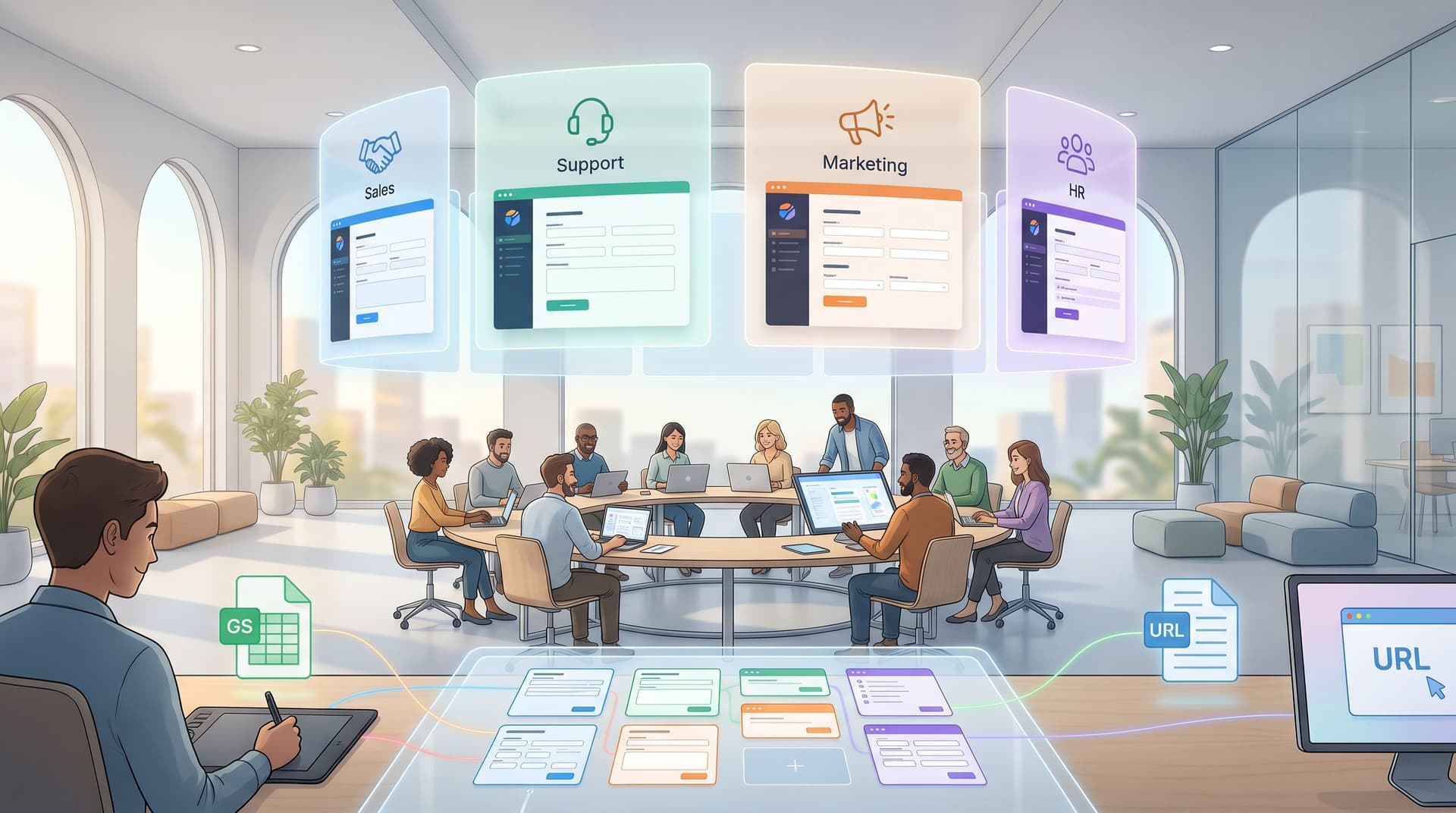
But your forms are also the easiest place to run real UX experiments—especially if you’re not a designer and don’t want to touch code. With tools like Ezpa.ge (themes, custom URLs, and real-time Google Sheets syncing), you can test how design, wording, and link structure change behavior, without standing up new pages or begging for engineering time.
This post is about how to do that: how non-designers can use themes, copy variants, and URLs as levers for structured, trustworthy UX experiments.
Why Form-Led Experimentation Matters
If you work in marketing, ops, CX, or product, your forms are where:
- Leads become opportunities
- Visitors become customers or attendees
- Internal requests become trackable work
Improving those flows by even a few percentage points can have outsized impact. A/B testing—showing people two variants and measuring which performs better—is a well-established way to do that. It’s widely used to test copy, layouts, images, and colors to improve conversion and UX. (uxpin.com)
But most smaller teams never get there because:
- Setting up a “proper” experiment sounds technical and scary
- They assume they don’t have enough traffic
- They think experimentation requires a full UX or data science team
The reality:
- Forms are a perfect scope for lightweight experiments: constrained, measurable, and close to the business outcome.
- You don’t need complex tooling to get value—especially when your form builder already gives you themes, custom URLs, and structured data.
- Non-designers can absolutely run credible tests if they follow a few simple rules.
The payoff isn’t just higher conversion. It’s a culture shift from “I think” to “We saw,” where decisions about UX, copy, and branding are grounded in evidence.
The Core Idea: Treat Every Form as a Mini Lab
Instead of asking, “Is this the perfect form?” start asking:
“What’s the next question we want this form to answer about our users?”
That question becomes your experiment hypothesis.
Examples:
- “A calmer, more minimal theme will reduce drop-off on our long intake form.”
- “Benefit-led copy will increase demo requests vs. feature-led copy.”
- “A more descriptive URL will increase clicks from outbound emails.”
Then you design two versions:
- Variant A (control) – your current best guess
- Variant B (test) – a single, deliberate change
You split traffic between them, collect data in Google Sheets, and compare.
The key is to change one main thing at a time—theme, copy, or URL—so you can attribute results.
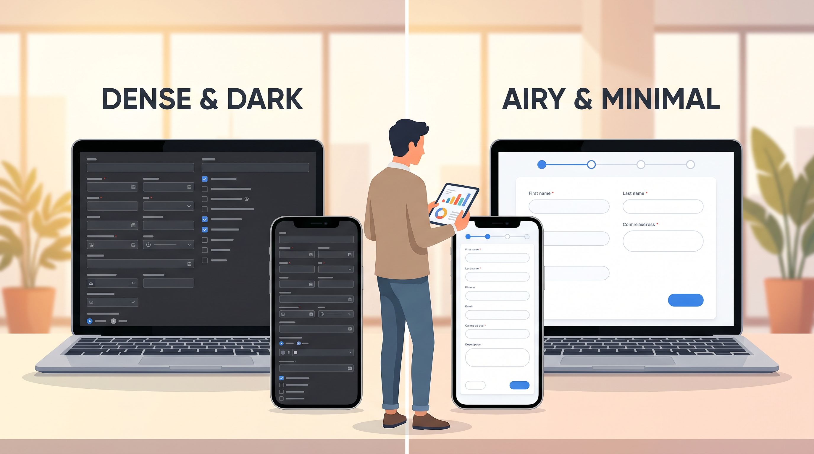
Pillar 1: Using Themes as a UX Experiment Lever
Visual design can feel subjective. Themes make it testable.
What you can test with themes
Within your form builder’s theme system, you can experiment with:
- Color contrast and emphasis – e.g., high-contrast buttons vs. softer palettes
- Typography scale – larger labels and headings vs. compact text
- Spacing and density – roomy, card-based layouts vs. tighter lists
- Brand expression – bold, saturated brand colors vs. neutral, low-key palettes
These choices quietly influence trust, clarity, and perceived effort—often before someone reads a single label. We unpacked this in detail in Signals in the Theme: What Your Form Aesthetics Quietly Tell Users About Your Brand.
A simple theme experiment you can run this week
Scenario: You have a multi-step onboarding form that feels heavy. Completion rate is lower than you’d like.
Hypothesis:
“A lighter, more minimal theme with clear progress cues will increase completion rate by at least 10%.”
Steps:
- Clone the form in Ezpa.ge.
- Create Theme A (control): your current theme.
- Create Theme B (test):
- Increase white space
- Use a single accent color for primary actions
- Add a clear progress indicator (e.g., “Step 1 of 3”)
- Ensure high contrast for labels and error states
- Keep everything else identical: fields, copy, logic, and URL structure (we’ll talk URLs separately later).
- Split traffic:
- Track outcomes in Google Sheets:
- Total visits (or at least total starts)
- Submissions
- Drop-off by step (if multi-step)
What to look for:
- Completion rate = submissions ÷ starts
- Where drop-off changes (e.g., fewer people abandoning on Step 1)
If Theme B meaningfully outperforms Theme A, you’ve just run a legitimate UX experiment—no design degree required.
Pillar 2: Copy Variants Without a Content Team
Words are often the highest-leverage variable in a form. Headings, field labels, microcopy, and button text all shape how people interpret what you’re asking.
The good news: you don’t need to be a UX writer to experiment with copy. You just need a structure.
Where copy changes move the needle most
Focus your experiments on:
- Form title and intro – sets expectations and answers “Why should I bother?”
- Primary CTA – “Submit” vs. “Get my demo” vs. “Save my spot”
- Field labels – jargon vs. plain language
- Helper text – vague vs. specific guidance
If you want a deeper dive on how to systematically improve this text, bookmark AI as Your Form Editor: Using Models to Rewrite Labels, Hints, and Microcopy for Clarity and Conversion. It pairs perfectly with the experimentation approach here.
A copy experiment template
Scenario: You’re running a demo request form. You’re not sure if your copy is too product-centric.
Hypothesis:
“Benefit-led copy (focusing on outcomes) will increase demo requests vs. feature-led copy by at least 15%.”
Variant A – Feature-led (control)
- Title: “Request a product demo”
- Subheading: “See all our features in action.”
- Button: “Request demo”
Variant B – Benefit-led (test)
- Title: “See how we can shorten your onboarding by 30%”
- Subheading: “Get a tailored walkthrough based on your team and workflows.”
- Button: “Book my walkthrough”
Steps:
- Duplicate the form and change only the copy above and on the button.
- Keep fields identical so you’re not accidentally testing form length.
- Split traffic 50/50 using your email platform, ad platform, or a URL splitter.
- Measure:
- Visits / starts
- Submissions
- Downstream quality (e.g., qualified opportunities) if you can track it
Pro tip: If you’re unsure how to phrase Variant B, use AI as a drafting partner. Generate a few benefit-led options, then pick the ones that sound like your brand. The experiment is about users, not pleasing the model.
Guardrails for copy experiments
- Avoid changing tone and offer at the same time. If Variant B is both friendlier and promises a bigger discount, you won’t know what actually drove results.
- Stay honest. Don’t promise benefits you can’t deliver just to win a test.
- Respect clarity first. Cleverness that confuses people is almost always a losing bet.
Pillar 3: URLs as a UX and Experimentation Tool
Most experimentation content focuses on what happens on the page. But the URL itself is a powerful UX and conversion lever.
People see URLs:
- In email hover states
- In mobile browser status bars
- Read aloud on podcasts or webinars
- Pasted into Slack or community chats
We explored this in depth in The URL Is the New CTA: How Link Structure Shapes Ad Performance More Than Button Copy. For our purposes here, the key idea is:
A clear, trustworthy, descriptive URL can increase both clicks and completions.
What you can test with URLs
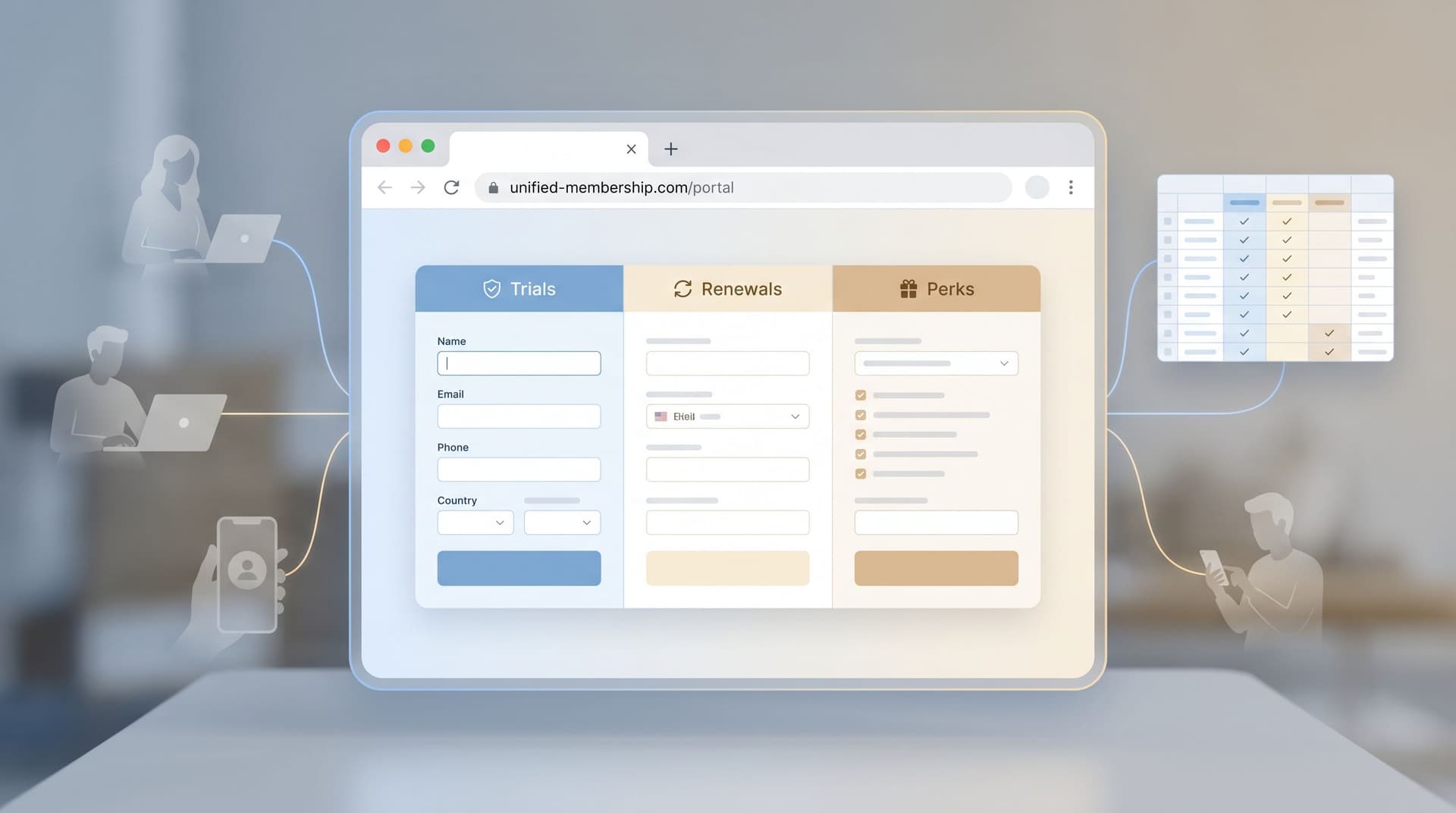
Using Ezpa.ge’s custom URLs, you can experiment with:
- Semantic structure
/demovs./product-demovs./personalized-demo
- Audience-specific paths
/demo/marketingvs./demo/engineering
- Campaign-specific paths with tracking
/demo?utm_source=linkedinvs./demo-linkedin
- Trust and brand cues
- Short, human-readable slugs vs. long, parameter-heavy links
A URL-focused experiment
Scenario: You’re running outbound sequences for sales. You suspect that a more specific, benefit-oriented URL will get more clicks than a generic one.
Hypothesis:
“A custom URL that mirrors the email CTA will increase click-through rate by 10% vs. a generic
/demolink.”
Variant A – Generic URL (control)
- Link:
https://forms.yourcompany.com/demo - Email CTA: “Schedule a quick demo”
Variant B – Mirrored URL (test)
- Link:
https://forms.yourcompany.com/schedule-a-10-minute-demo - Email CTA: same text
Steps:
- Point both URLs to the same underlying form in Ezpa.ge.
- Set up tracking:
- Use UTMs or your email tool’s click tracking to distinguish A vs. B.
- Randomly assign prospects in your sequence to Variant A or B.
- Measure:
- Click-through rate from email
- Form submission rate after click
Because the form is identical, you’re isolating the effect of the URL on getting people to the form.

Making Your Experiments Real (Without a Stats Degree)
You don’t need perfect statistical rigor to get value, but you do need basic discipline so you don’t fool yourself.
1. Start with a clear hypothesis
Write it down in a simple template:
We believe that [change] for [audience] will lead to [metric change] because [reason].*
Example:
We believe that a minimal theme for first-time visitors will increase completion rate by 15% because it reduces visual noise and makes the form feel shorter.
If you can’t fill in that sentence, you’re not ready to test.
2. Choose a primary metric
Pick one main thing to judge success:
- Completion rate – for long or multi-step forms
- Submission rate from visits – for short forms
- Click-through rate on the URL – for URL experiments
You can track secondary metrics (e.g., lead quality), but don’t move the goalposts mid-test.
3. Run the test long enough to be meaningful
You don’t need formal power calculations, but avoid making decisions on a handful of submissions.
As a rule of thumb:
- Aim for at least 100–200 submissions per variant before declaring a winner, if your traffic allows.
- If traffic is low, run tests for a fixed time window (e.g., 2–4 weeks) and treat results as directional, not absolute.
4. Keep a simple experiment log
In a Google Sheet or Notion doc, track:
- Experiment name
- Hypothesis
- Start and end dates
- Variants (with links)
- Primary metric and results
- Decision (ship B, keep A, need more data)
Over time, this becomes your UX playbook—a record of what actually works for your audience.
Connecting Form Experiments to the Rest of Your Funnel
Form-led experimentation gets even more powerful when you connect it to what happens after someone hits Submit.
If you’re already streaming submissions into Google Sheets, you can:
- Segment by variant (A vs. B) using a hidden field or URL parameter
- Compare downstream outcomes: show rates, activation, retention, NPS
For a deeper view on how to turn submissions into structured onboarding flows, check out From Form to Onboarding Journey: Mapping Every Submission to Emails, Tasks, and Touchpoints. It shows how small UX improvements at the form level compound when every submission triggers a better follow-up.
Putting It All Together: A 30-Day Experiment Roadmap
If you want to make this concrete, here’s a simple 30-day plan for a non-designer.
Week 1: Pick your form and baseline
- Choose one high-impact form: demo request, event registration, key internal intake.
- Record your current baseline for 1–2 weeks of recent data:
- Views / starts
- Submissions
- Any downstream metric you care about (e.g., qualified leads)
- Write 2–3 potential hypotheses touching themes, copy, and URLs.
Week 2: Run a theme experiment
- Clone the form and create Theme B (minimal changes, clear rationale).
- Split traffic 50/50.
- Let it run for at least 7 days (or until you hit a reasonable number of submissions).
- Log results and decide: keep A, ship B, or iterate.
Week 3: Run a copy experiment
- Using the winning theme, duplicate the form again.
- Test benefit-led vs. feature-led copy, or clarity-focused vs. clever copy.
- Keep fields identical; change only headings and primary CTA.
- Again, split traffic, run for ~7 days, and log results.
Week 4: Run a URL experiment
- Keep the winning theme and copy.
- Create two custom URLs pointing to the same form.
- Split traffic from your main source (e.g., outbound emails, ads) between the two URLs.
- Measure click-through and submission rates.
By the end of the month, you’ll have:
- A better-performing form
- A repeatable experimentation habit
- A basic evidence base for what your users respond to
All without touching code or filing a single Jira ticket.
Summary
Form-led experimentation isn’t reserved for UX researchers or growth teams with dedicated tooling. With Ezpa.ge’s themes, custom URLs, and Google Sheets syncing, non-designers can:
- Use themes to test how visual design impacts trust and completion
- Use copy variants to learn which messages and tones drive action
- Use URLs as quiet but powerful levers for clicks and conversions
- Connect everything to data, so decisions are based on what users actually do—not just internal opinions
When you treat every form as a small, focused experiment, you gradually build a UX system that’s tuned to your audience, not your assumptions.
Take Your First Step
You don’t need a grand experimentation program to start. You just need one form and one hypothesis.
- Open your highest-impact form in Ezpa.ge.
- Write a single-sentence hypothesis about a theme, copy, or URL change.
- Clone the form, make that one deliberate change, and wire both variants to Google Sheets.
- Split traffic for a week and see what happens.
Once you’ve seen how much a small, intentional tweak can move the needle, you’ll never look at “just a form” the same way again.
Your forms are already where the important decisions happen. It’s time to let them become where the learning happens, too.