Signals in the Theme: What Your Form Aesthetics Quietly Tell Users About Your Brand


Forms don’t just collect data. They broadcast who you are.
Before someone reads a single field label, your form has already made a promise: “This is the kind of company you’re dealing with.” The colors, spacing, typography, and micro-interactions all send signals about your competence, your values, and whether you’re worth trusting.
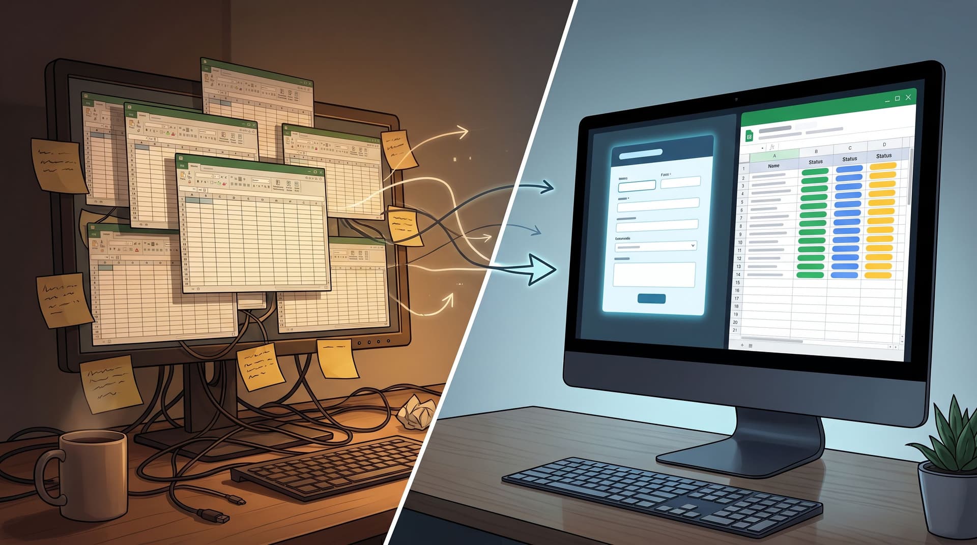
For teams using Ezpa.ge, that’s not a side effect; it’s a lever. Themes, custom URLs, and responsive layouts give you control over those signals. The question is whether you’re using that control deliberately—or letting a default theme speak for your brand.
This post is about reading and shaping those quiet messages, so every form you ship pulls your brand in the right direction.
Why Form Aesthetics Matter More Than You Think
Most teams treat form aesthetics as a finishing touch: pick a brand color, round the corners, ship it.
But research on visual design and trust tells a different story:
- First impressions form in under a second. People make snap judgments about credibility based largely on visual design—long before they process your copy.
- More polished visuals are consistently rated as more trustworthy and higher quality, even when the underlying content is identical.
- The “aesthetic–usability effect” means users perceive better-looking interfaces as easier to use—even when objective usability is the same.
That doesn’t mean you should chase dribbble shots. It means:
The way your form looks changes how people believe it will behave.
That belief affects:
- Completion rates (Do I feel safe giving you my data?)
- Data quality (Do I feel like you’ll use this responsibly?)
- Brand memory (Will I recognize and trust you next time I see you?)
If forms are where leads, customers, and community members actually cross the line into relationship with you, then aesthetics aren’t decoration. They’re part of your core brand system.
The Three Layers of Brand Signals in a Form Theme
When someone lands on your form, they’re unconsciously scanning three layers of signals:
- Baseline competence – “Do these people look like they know what they’re doing?”
- Emotional tone – “How does this make me feel—relaxed, rushed, safe, hyped?”
- Brand distinctiveness – “Does this feel like this brand, or just another SaaS template?”
Let’s break those down into concrete aesthetic choices.
1. Baseline Competence: Clean, Coherent, Predictable
Competence is communicated through order.
Key visual cues:
- Alignment and spacing
- Consistent padding around fields
- Labels, inputs, and helper text aligned on a clear grid
- Enough whitespace that nothing feels cramped
- Typography discipline
- 1–2 font families, 3–4 sizes, used consistently
- Clear hierarchy: title > section headings > labels > helper text
- Minimal visual noise
- Limited color palette
- Only a few accent elements (icons, dividers) used purposefully
What these cues say:
- “We pay attention to details.”
- “Our systems are structured.”
- “You’re unlikely to be surprised in a bad way.”
If you’ve ever seen a form with misaligned inputs, six font sizes, and a rainbow of button styles, you’ve felt the opposite: If you can’t keep this tidy, can you keep my data safe?
2. Emotional Tone: Color, Contrast, and Motion
Once competence is established, users pick up the emotional temperature.
- Color choices
- Deep blues and muted neutrals → calm, stable, professional
- High-saturation reds/oranges → urgent, energetic, sometimes aggressive
- Soft greens and pastels → supportive, wellness-oriented, approachable
- Contrast and density
- High contrast, dense layouts → intensity, speed, “get this done now”
- Softer contrast, more whitespace → calm, reflection, “take your time”
- Motion and micro-interactions
- Snappy, precise animations → confident, modern, high-competence
- Over-the-top or inconsistent motion → playful at best, chaotic at worst
If your brand is about safety, care, or confidentiality, your form theme should not feel like a trading dashboard. If your brand is about bold moves and speed, a washed-out, low-contrast form will feel off.
3. Brand Distinctiveness: Patterns, Not One-Offs
Distinctiveness comes from recognizable patterns that repeat across surfaces:
- A particular corner radius and card style
- A signature accent color or gradient used sparingly but consistently
- A specific way of grouping fields or styling section headers
When your Ezpa.ge theme carries those patterns, your forms start doing what we talk about in “Custom URLs as Brand Signals: How Link Structure Shapes Trust, Click-Through, and Conversion”: they become recognizable brand surfaces, not just utilities.
Common Theme Choices and the Messages They Send
You can read a lot about a company from a single form. Here are some of the most common aesthetic patterns and what they quietly tell users.
Color Palettes
1. All-brand-primary-everywhere
Bright brand color on background, buttons, links, and highlights.
- What it says: “We care more about being memorable than being legible.”
- Risks: Eye strain, poor contrast, accessibility issues, banner-blindness for CTAs.
- Better pattern: Use your primary color for CTAs and key highlights, with a neutral background and subtle tints for sections.
2. Heavy neutral + one accent
Soft gray or off-white background, dark text, a single accent color.
- What it says: “We’re stable, methodical, and careful.”
- Best for: B2B, finance, healthcare, legal, infrastructure products.
- Watch out for: Feeling generic if you don’t have at least one distinctive pattern (e.g., unique section dividers or icon style).
3. Soft gradients and pastels
- What it says: “We’re human, friendly, and approachable.”
- Best for: Consumer products, communities, education, wellness.
- Watch out for: Low contrast and tiny fonts; if someone has to squint, they won’t finish.
Layout and Structure
Single-column, clear sections
- What it says: “We respect your time and attention.”
- Benefits: Easier scanning, fewer decision points, better on mobile.
Multi-column, dense grids
- What it says (to users): “You’re going to work for this.”
- When it’s OK: Internal tools for power users, complex B2B workflows where users expect complexity.
- When it hurts: Public-facing lead gen, waitlists, feedback forms.
If you’re curious how structure affects support flows specifically, we dig into this in “Form UX for Product-Led Support: Turning ‘Contact Us’ Into Guided Self-Service Flows”.
Typography
Large, confident headings + high-contrast labels
- What it says: “We’ve thought about this; here’s what matters.”
- Benefits: Clear hierarchy, easier scanning, better accessibility.
Tiny labels, low contrast, decorative fonts
- What it says: “We designed this for a screenshot, not for real people.”
- Risks: Errors, drop-off, frustration—especially on mobile.
Micro-Interactions
Subtle hover states, clear focus rings, gentle validation
- What it says: “We’re attentive and precise.”
- Effect: Users feel guided rather than judged.
Jarring error colors, vague tooltips, no loading feedback
- What it says: “If something breaks, you’re on your own.”
- Effect: Abandoned forms, support tickets, lower trust.
For a deeper dive into what happens when things go wrong, pair this with “Brand-First Error States: Designing Form Failures That Still Build Trust”.
Designing Themes That Align With Your Brand Story
So how do you go from “nice-looking form” to “theme that tells the right story”?
Here’s a practical process you can run in an afternoon.
Step 1: Write the One-Sentence Brand Promise of the Form
Not your company tagline. The promise of this specific form.
Examples:
- “Share just enough so we can match you with the right specialist—nothing more.”
- “Tell us about your stack so we can show you a realistic ROI model.”
- “A quick, low-friction way to join our beta without talking to sales.”
This sentence should answer: What reassurance does someone need to feel before they type?
Keep it visible while you design your Ezpa.ge theme.
Step 2: Choose a Primary Emotion to Support
Based on that promise, pick one primary emotion you want the theme to evoke:
- Calm confidence (for security, finance, healthcare)
- Momentum and energy (for growth, experimentation, launches)
- Care and safety (for sensitive topics, mental health, layoffs, feedback)
- Curiosity and play (for education, community, lightweight onboarding)
Then translate it into specific choices:
- Calm confidence → cooler hues, generous spacing, steady micro-interactions
- Momentum and energy → stronger contrast, bolder CTAs, slightly snappier animations
- Care and safety → softer edges, warmer neutrals, extra clarity in helper text
- Curiosity and play → subtle color accents, friendly icons, progressive disclosure
Step 3: Lock in a Small Set of Theme Tokens
In Ezpa.ge, think in tokens, not one-off tweaks. For example:
- Color tokens
background-base(e.g., #F7F7FB)surface-card(e.g., white)text-primary(e.g., #15151F)accent-main(e.g., your brand color)accent-soft(a tint of your brand color)danger(for errors)
- Typography tokens
font-family-basefont-size-body,font-size-label,font-size-headingfont-weight-heading,font-weight-label
- Shape + elevation tokens
border-radius-small,border-radius-largeshadow-card,shadow-focus
Set these once in your theme, then reuse. The consistency is what signals competence.
Step 4: Design for Two Extremes: Mobile and Stress
Most people will meet your form either:
- On a phone, or
- In a slightly stressed state (deadline, budget, emotion, or all of the above).
Design your theme with that in mind:
-
On mobile:
- One column only
- Generous tap targets
- Sticky or clearly visible primary CTA
- Minimal decorative imagery
-
Under stress:
- Extremely clear labels and error messages
- Helper text that explains why you’re asking
- Progress indicators for multi-step flows
- A calm, steady visual rhythm (no surprise color shifts between steps)
If your form is used for layoffs, medical intake, or financial hardship, it’s worth reading “Forms as Brand Safe Rooms: UX Patterns That Protect Sensitive Topics Without Feeling Clinical” and layering those patterns into your theme.
Step 5: Check for Theme-Form-URL Alignment
Your form doesn’t live alone. It’s part of a chain:
Ad or email → URL → Form theme → Thank-you state
Ask:
- Does the URL structure match the promise? (
/pricing-consult, not/form-123) - Does the theme feel like a continuation of the click source, not a reset?
- Does the thank-you state visually belong to the same brand (same tokens, same tone)?
When those three are aligned, users experience continuity—and continuity is a huge trust signal.
Using Ezpa.ge Themes as a Brand System, Not Just a Skin
Ezpa.ge makes it easy to spin up a decent-looking form. But the real power comes when you treat themes as part of your brand system.
Here are a few patterns to consider.
1. One Core Brand Theme, Many Context Variants
Create a core brand theme (tokens, typography, base palette), then derive variants for:
- Acquisition (slightly bolder CTAs, stronger contrast)
- Onboarding (more guidance, softer tones)
- Support and feedback (calmer, more neutral, extra clarity)
Each variant:
- Shares the same base tokens (so it’s recognizably you)
- Tweaks only what’s necessary for the context (e.g., accent intensity, section dividers)
This mirrors what we talk about in “Adaptive Themes in the Wild: Matching Form Skins to Channels, Devices, and Time of Day”: the theme adapts, but the brand stays coherent.
2. Multi-Brand, One Stack
If you manage franchises, partner programs, or multiple product lines, themes let you:
- Give each brand its own palette and logo
- Keep structure, spacing, and data schema identical
That way you get:
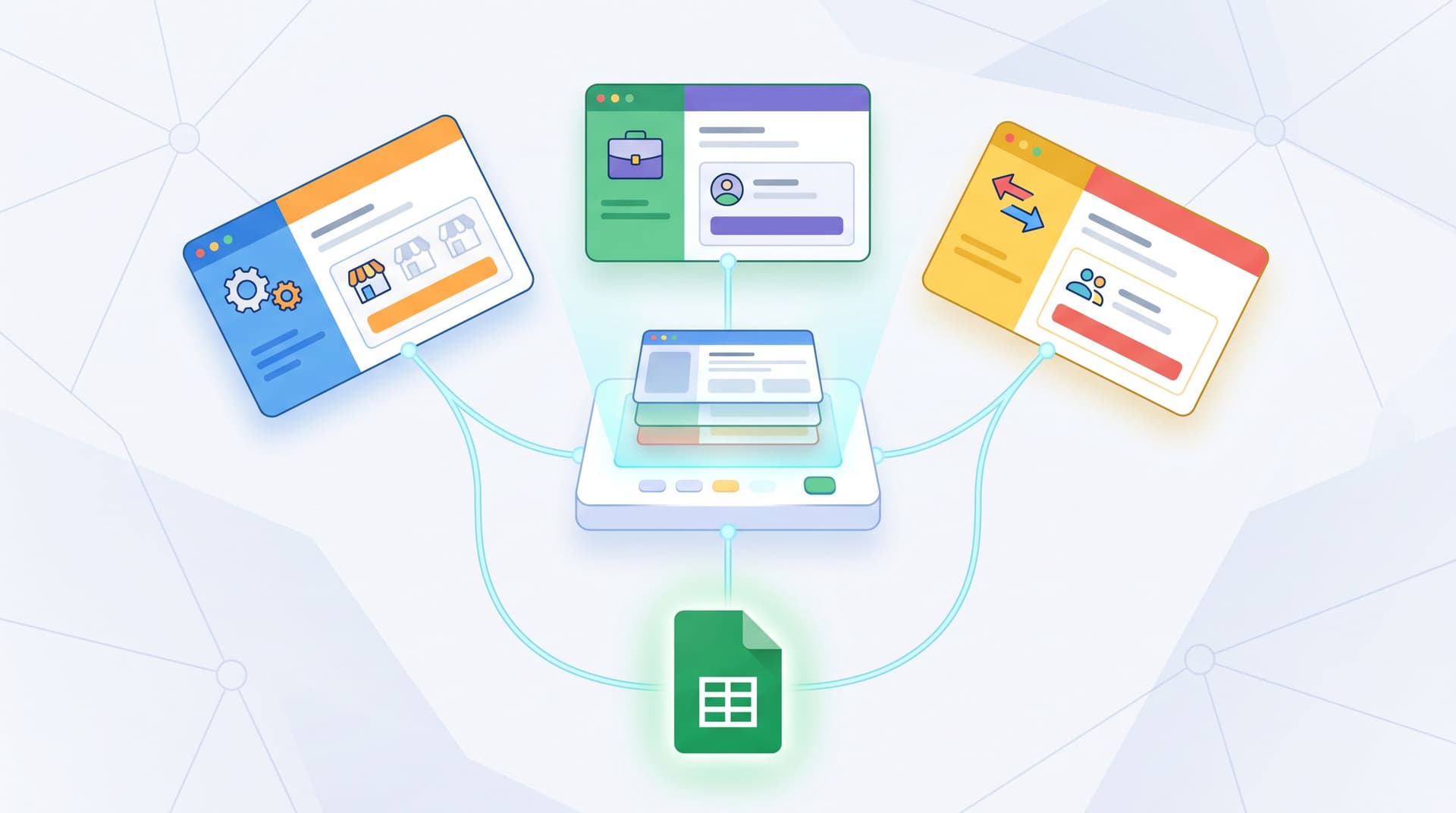
- Distinct brand experiences on the surface
- A single, clean operational backbone in Google Sheets underneath
We go deeper on this pattern in “Multi-Brand, One Stack: Running Franchises, Agencies, and Resellers with Themes + Custom URLs”.
3. Theme-Driven Experimentation
Because themes in Ezpa.ge control layout, colors, and typography, you can:
- A/B test button contrast, label size, or section dividers
- Run experiments on multi-step vs. single-step layouts
- Try different emotional tones (e.g., calmer vs. more energetic variants)
All without:
- Spinning up new landing pages
- Breaking your Google Sheets structure
- Asking engineering to clone templates
Over time, you’ll learn what aesthetic signals actually move the needle for your audience—which is exactly the mindset we explore in “Theme-Driven A/B Testing: Experimenting with Copy, Layout, and Visual Hierarchy Without New Pages.”
A Quick Checklist: What Is Your Form Theme Saying Right Now?
Open one of your highest-stakes forms and run through this checklist:
-
Can I summarize the emotional tone in three words?
If not, your theme may be sending mixed signals. -
Do labels, helper text, and inputs feel like one coherent system?
Or does it look like pieces from three different products? -
Is my brand color used intentionally?
- Only for CTAs and key highlights? Good.
- Everywhere, including backgrounds and borders? Time to dial back.
-
Would this still feel like our form if I removed the logo?
Distinctive patterns (spacing, shapes, section headers) should carry some of the brand weight. -
How would this feel to someone stressed, on a phone, with 60 seconds?
If that mental picture makes you nervous, prioritize mobile and stress-state improvements. -
Does the theme match the promise of the form?
A “quick beta signup” form shouldn’t feel like a mortgage application.
If you find yourself answering “no” to several of these, you don’t need a rebrand. You need a more intentional theme.
Bringing It All Together
Your form theme is doing quiet brand work every time someone opens a URL:
- Clean alignment and consistent spacing whisper “We’re competent.”
- Thoughtful colors and typography whisper “We understand how you feel.”
- Repeated patterns across forms whisper “You can recognize and trust us.”
When those whispers line up with your brand story and your operational reality, forms stop being generic intake points and start acting like high-signal brand touchpoints.
With Ezpa.ge, you already have the building blocks:
- Themes you can tune once and reuse everywhere
- Custom URLs that carry brand signals into the click
- Real-time Google Sheets syncing that keeps the backend as clean as the front
The opportunity is to connect those pieces on purpose.
Your Next Step
Don’t overhaul everything. Start with one mission-critical form—demo request, onboarding, support, or community intake—and:
- Write the one-sentence promise of the form.
- Pick the primary emotion you want the theme to support.
- Open Ezpa.ge and create or refine a theme that:
- Uses a disciplined set of tokens
- Aligns color, typography, and spacing with that emotion
- Feels consistent with your other high-traffic surfaces
- Ship it as a controlled change and watch completion, time-to-submit, and feedback.
Then, once you’ve proven the pattern on one form, roll that theme (and its variants) across the rest of your stack.
Your forms are already collecting the data that runs your business. It’s time to let their aesthetics carry their weight for your brand, too.