Form UX for Customer Research: Turning Signups and Surveys into Always-On Insight Streams

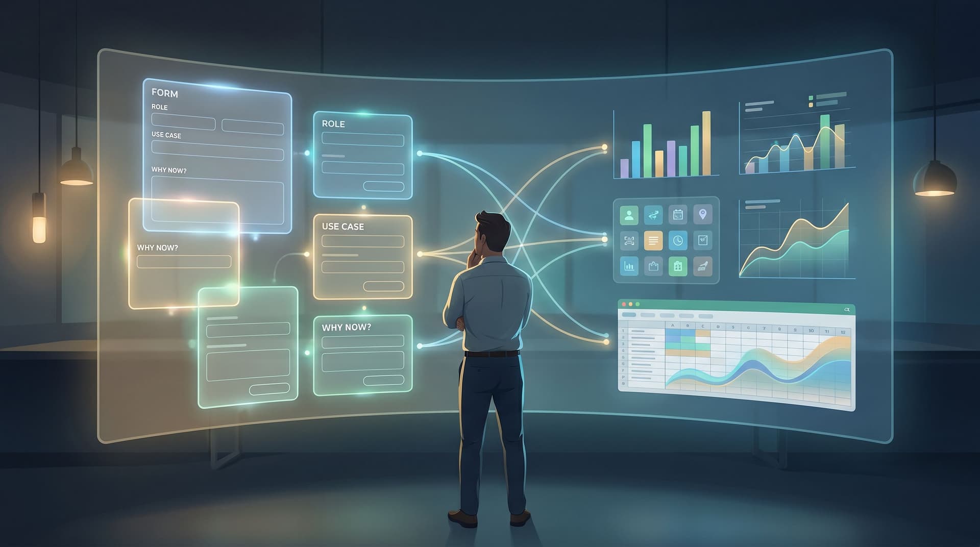
Customer research used to be something you “do” a few times a year: a big survey, a handful of interviews, maybe an NPS pulse. The rest of the time, you’re guessing.
Your forms can change that.
Every signup, waitlist, feedback form, and quick poll is a chance to listen. With the right UX, those moments stop being one-off touchpoints and start acting like an always-on research engine—quietly collecting structured signals about who your customers are, what they need, and how those needs change over time.
This post is about designing forms so they don’t just capture data—they power a continuous stream of insight.
Why “Always-On” Beats “Occasional” Research
If you only learn about your customers during big survey pushes, you’re flying blind between cycles. You miss:
- Emerging use cases that show up first in small numbers
- Shifts in language (how people describe their problems)
- Early warning signs of churn or dissatisfaction
- Segments you didn’t know existed
When you treat forms as research instruments, you get a very different picture:
- Every interaction is a datapoint. Signups, cancellations, feature requests, event registrations—each one adds to the story.
- Patterns emerge faster. You don’t wait for 1,000 survey responses to notice that a new segment is showing up.
- Decisions get grounded. Roadmaps, campaigns, and pricing experiments can be backed by live behavioral and attitudinal data, not just gut feel.
And because tools like Ezpa.ge sync responses straight into Google Sheets in real time, you don’t have to build a heavyweight research stack. Your “insight stream” can literally be a spreadsheet that updates itself.
Step 1: Decide What You Want to Learn Continuously
Before you redesign a single form, get clear on the questions you want answered all the time—not just during a quarterly survey.
Start with three buckets:
-
Who is this person?
- Role, company size, industry, geography
- Experience level (“beginner / intermediate / advanced”)
- Self-identified segment (“agency / in-house / solo creator”)
-
What are they trying to do?
- Primary job-to-be-done (“plan events”, “launch a course”, “track internal requests”)
- Trigger moment (“switching from another tool”, “starting from scratch”)
- Time horizon (“need this live this week / this month / just exploring”)
-
How do they feel about it?
- Biggest frustration or fear
- Desired outcome in their own words
- Confidence level or urgency
You don’t need to ask every question on every form. The goal is to define a core research schema that can be sprinkled across multiple touchpoints.
A practical way to do this:
- List the 5–7 variables you wish you always had about every customer.
- Mark which ones are must-have vs nice-to-have.
- Map each variable to at least one form you already use (signup, demo request, onboarding intake, cancellation survey, etc.).
This is where the philosophy from The Minimal Field Manifesto kicks in: you’re not trying to cram everything into a single mega-form. You’re designing a network of lightweight, focused forms that collectively tell a rich story.
Step 2: Turn “Dead-End” Forms into Research Moments
Most teams have dozens of forms that start and end with a single operational goal:
- “Book a demo.”
- “Download the guide.”
- “Submit a ticket.”
They do their job—and then the trail goes cold. To turn those into research instruments, you don’t need to overhaul everything. You need to add one or two high-signal questions that:
- Clarify context (who they are, what they’re trying to do)
- Capture motivation (why now, why this)
- Are easy and fast to answer
Examples of small, high-leverage additions:
-
Demo request form
- Add: “What made you look for a tool like this now?” (short text)
- Add: “Which best describes you?” (3–5 segment options)
-
Newsletter signup form
- Add: “What do you hope to get from this newsletter?” (multi-select with an “Other” field)
- Add: “How experienced are you with [topic]?” (3-level radio)
-
Feature request form
- Add: “How are you solving this today?” (short text)
- Add: “How often does this come up?” (frequency scale)
-
Cancellation form
- Add: “What would have needed to be true for you to stay?” (short text)
- Add: “If we fixed one thing, what should it be?” (short text)
The trick is to embed these questions where intent is already high. Someone asking for a demo or taking time to cancel is already invested; asking one or two well-placed questions here feels natural, not intrusive.

Step 3: Design Form UX for Honest, High-Signal Answers
You can ask brilliant questions and still get useless data if the form UX works against you. For research-grade responses, prioritize three qualities:
1. Clarity: Make Questions Effortless to Understand
- Use plain language. Replace jargon with the words your users actually use.
- Ask one thing at a time. Avoid double-barreled questions like “How satisfied are you with our pricing and support?”
- Show, don’t explain. Use examples inside placeholders or helper text sparingly, but clearly: “e.g., ‘I’m switching from spreadsheets’.”
If you want a deeper dive on layout patterns that reduce confusion, Designing Forms for ‘Zero Instruction’ Use is a great companion read.
2. Safety: Make Sharing Feel Low-Risk
People won’t give you candid feedback if the form feels sketchy or overly nosy.
- Explain why you’re asking. A tiny line like “We use this to prioritize what we build next” can double the quality of answers.
- De-emphasize optional sensitive fields. Make them clearly optional and visually lighter.
- Avoid surprise redirects and pop-ups. Keep the experience on-brand and predictable (this is where Ezpa.ge’s custom URLs and themes shine).
3. Ease: Reduce Friction Without Losing Signal
- Mix structured and unstructured inputs. Use multiple choice for quick segmentation, then a small free-text field for nuance.
- Use conditional logic. Don’t show advanced questions unless someone indicates they’re relevant. Tools like Ezpa.ge make it straightforward to create “one form, many journeys”—you can go deeper on this idea in One Form, Many Journeys.
- Optimize for mobile. Short labels, large tap targets, and minimal scrolling make it more likely people will finish the form and give thoughtful answers.
Step 4: Standardize Fields So Insights Can Compound
Random, one-off questions create random, one-off data. To build an insight stream, you need consistency.
That means:
-
Reusing key fields across forms.
- Example:
Primary use case,Company size,Role,Region. - Keep labels and options identical wherever they appear.
- Example:
-
Favoring controlled vocabularies where it matters.
- Use dropdowns or radios for segment labels and industries.
- Leave open text for “anything else we should know?” style prompts.
-
Versioning carefully.
- When you change a field (e.g., update segment options), note the date and version somewhere in your Google Sheet.
- This keeps your historical analysis honest—so you don’t compare apples to oranges.
With Ezpa.ge’s real-time Google Sheets syncing, your standardized fields become columns you can pivot on instantly—no manual exports or schema wrangling.
Step 5: Wire Your Forms into a Live Research View
Collecting better data is only half the job. The other half is making it visible and usable.
A simple but powerful setup:
-
Sync everything into Google Sheets.
- Each form gets its own tab (e.g.,
Signups,Feature Requests,Cancellations). - Shared fields (e.g.,
Role,Use case) use the same column names.
- Each form gets its own tab (e.g.,
-
Create a “Research Hub” tab.
-
Add lightweight dashboards.
- Use Looker Studio, Geckoboard, or Retool to visualize trends.
- Keep it simple: a few key charts that answer “Who’s showing up?” and “What are they asking for?”
-
Automate summaries.
- Use an AI model or a tool like Tally’s AI summaries or Typedream AI Forms as inspiration for your own stack to generate weekly digests of open-text responses.
- Even a simple script that pulls the top 20 new comments into a doc for your team to review can go a long way.
Once this is wired, your forms become live instrumentation for your customer base. You’re not just collecting; you’re continuously seeing.

Step 6: Close the Loop with Product, Marketing, and Support
An insight stream is only valuable if it changes how you work. Make your form data part of regular decision-making:
For Product Teams
-
Prioritize features by segment and impact.
- Combine “how often does this come up?” with segment and plan data.
- Example: “This request is common among high-value accounts in onboarding.”
-
Validate roadmap bets.
- Add a simple field to your waitlists and betas: “Which upcoming feature are you most excited about?”
- Track how interest shifts as you announce new ideas.
-
Detect friction early.
- Use partial submits and drop-off points as signals that a question or step is confusing. For a deeper dive into this diagnostic approach, see Signals in Partial Submits.
For Marketing Teams
-
Refine messaging.
- Mine open-text “What made you sign up?” answers for phrases to reuse in ads, landing pages, and email subject lines.
-
Segment campaigns.
- Use role, use case, and experience level to tailor nurture sequences.
- Example: advanced users get deep-dive content; beginners get “start here” guides.
-
Spot new ICPs.
- If a segment you never targeted starts showing up with strong intent, you have a new audience to explore.
For Support & Success Teams
-
Pre-qualify tickets.
- Add a few structured fields to your support form to capture context (plan, environment, urgency).
- Use that data to route and prioritize.
-
Identify at-risk accounts.
- Watch for patterns in “What’s your main challenge right now?” across high-value customers.
-
Feed back into onboarding.
- If the same confusion shows up in tickets, adjust your signup and onboarding forms to set clearer expectations.
Make this operational by:
- Reviewing key form metrics and insights in your weekly product or growth meeting.
- Sharing a short “Form Signals” update in Slack—top 3 quotes, top 3 trends.
- Giving each team a small set of form fields they “own” and care about.
Step 7: Treat Forms as Experiments, Not Static Assets
Your understanding of customers will evolve. Your forms should too.
Instead of shipping a form and forgetting it, adopt a test-and-tune mindset:
-
Rotate one research question at a time.
- Keep core fields stable, but swap a single exploratory question every month.
- Example: One month you ask “What tools are you switching from?”; next month you ask “Where did you first hear about us?”
-
A/B test copy and structure.
- Try different phrasings for the same question to see which yields richer answers.
- Experiment with moving a key research question earlier or later in the flow.
-
Retire questions that stop pulling their weight.
- If a field rarely gets filled or doesn’t influence decisions, remove it.
If you want a tactical guide to running these tests without engineering help, Form-Led Experimentation for Non-Designers walks through themes, copy variants, and URL strategies you can apply directly in Ezpa.ge.
Bringing It All Together
When you combine thoughtful questions, clean UX, standardized fields, and live syncing, your forms stop being static boxes and start acting like:
- A continuous interview with your customer base
- A segmentation engine that keeps your messaging aligned with reality
- A feedback radar that picks up weak signals long before they hit your churn numbers
You don’t need a massive research team or complex tooling to get there. You need:
- A clear idea of what you want to learn continuously
- A handful of high-signal questions embedded in the forms you already use
- A basic but reliable pipeline from form → sheet → simple dashboards
- A habit of looking at the data and adjusting your product, marketing, and support accordingly
Summary
- Every form is a research opportunity. Signups, demos, surveys, and cancellations can all feed a shared understanding of your customers.
- Small, targeted questions beat giant surveys. Add 1–2 high-signal fields to existing forms instead of building bloated questionnaires.
- Good UX drives honest answers. Clear language, safe-feeling experiences, and mobile-friendly layouts are non-negotiable.
- Standardization makes insights compound. Reuse the same fields and options across forms so you can analyze trends over time.
- Real-time syncing turns forms into instrumentation. With Google Sheets and lightweight dashboards, you can watch segments, needs, and sentiments evolve.
- Closing the loop is where value appears. Product, marketing, and support should all use form data to make better decisions.
- Forms should evolve. Treat them as experiments you continuously refine, not one-off projects.
Your Next Step: Turn One Form into an Insight Stream
You don’t have to redesign everything at once. Start with one high-traffic form—a signup, a demo request, a feedback form—and:
- Add a single question about who the person is (role, segment, or experience level).
- Add a single question about why now (trigger, goal, or frustration).
- Sync responses into a Google Sheet and create one simple view (e.g., “New signups by use case over the last 30 days”).
Ship that, watch the data for a week or two, and then iterate.
If you’re using Ezpa.ge, you already have the building blocks: clean themes, custom URLs, and real-time Google Sheets syncing. Take one of your existing forms, give it a small research-focused upgrade, and turn it from a dead-end submit button into the first node in your always-on insight stream.
Your customers are already telling you who they are. It’s time to design forms that actually listen.