Signals in Partial Submits: What Abandoned Forms Can Teach You About Copy, Friction, and Fit


You probably know your form’s conversion rate.
But do you know where people almost converted?
Those half-finished, never-submitted forms aren’t just “lost leads.” They’re one of the richest diagnostic tools you have for understanding:
- Which questions scare people off
- Where your UX breaks down
- Whether your offer actually fits the audience you’re attracting
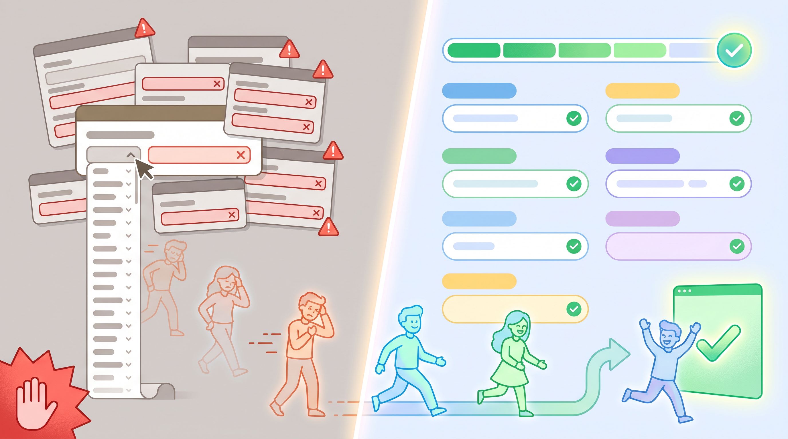
Most teams treat partial submits as noise. This post is about treating them as signals—and using those signals to sharpen your copy, reduce friction, and tighten audience–offer fit.
Why partial submits are a goldmine, not a graveyard
When someone starts a form, they’ve already done the hardest part:
- They clicked your ad or email
- They skimmed your page
- They decided, at least briefly, that your offer might be worth it
If they drop off after that, something specific changed:
- The form felt longer than expected
- A question felt invasive or confusing
- The next step wasn’t clear or trustworthy
Unlike top-of-funnel metrics, partial submits show you exactly where the friction lives. That makes them incredibly actionable.
Benefits of treating partial submits as a first-class signal:
- Faster experiments. Small tweaks (labels, grouping, microcopy) can be tested against field-level completion and drop-off.
- Cleaner data. You learn which questions people will actually answer honestly, not just which ones your team wishes they’d answer.
- Better fit. You see where the wrong people self-select out—and whether that’s good (healthy filtering) or bad (misaligned expectations).
If you’re already using Ezpa.ge with real-time Google Sheets syncing, you’re sitting on this data already—every started-but-unsubmitted session is a row full of clues.
Step 1: Decide what counts as a “partial submit” (and track it)
Before you can learn from abandoned forms, you need a clear definition and a way to capture the data.
Define your thresholds
Not every interaction is worth analyzing. Create tiers:
- Micro-engagement – User loads the form but doesn’t touch any fields.
- Useful for diagnosing context issues (wrong traffic, mismatched promise).
- Partial attempt – User completes at least 1–2 fields but not the primary ones.
- Useful for early friction and trust issues.
- High-intent abandonment – User completes all critical fields (e.g., email, company) but doesn’t submit.
- Most valuable tier. These are people who wanted to convert.
In practice, you might treat tiers 2 and 3 as “partial submits” and log them into a sheet.
Capture field-level progress
To turn partial submits into signals, you need at least:
- Form session ID or anonymous user ID
- Timestamp
- Which fields were touched (focused or changed)
- Which fields were completed
- Device + viewport (mobile/desktop, approximate width)
With Ezpa.ge, syncing to Google Sheets gives you a simple way to store these events and then build your own dashboards or pivot tables on top.
If you’re not capturing partials yet, start by logging any interaction that changes a field value—even if the final submit button is never pressed.

Step 2: Map where people bail—field-by-field
Once you’re collecting partial data, the first question is simple:
At which field do people most often disappear?
Build a basic drop-off map
You don’t need complex BI tools to start. In a Google Sheet synced from Ezpa.ge, you can:
-
List fields in order (e.g., name, email, company size, budget, etc.).
-
For each field, count:
- How many sessions reached this field (focused or changed).
- How many sessions stopped here (no further fields touched, no submit).
-
Calculate a simple step drop-off rate:
Drop-off at Field X = Sessions that stopped at X ÷ Sessions that reached X
Patterns to look for:
- Sharp cliffs. One field has a dramatically higher drop-off than the ones before/after it.
- Slow bleed. Each field loses a consistent small percentage—your form may simply be too long.
- Device-specific cliffs. A field that’s fine on desktop but brutal on mobile often points to layout or interaction issues.
This is where other posts on Form & Function, like Designing Forms for ‘Skim-Only’ Users, become relevant: if people are skimming, your layout and chunking decisions show up directly in these drop-off maps.
Step 3: Diagnose why they’re dropping—copy, friction, or fit?
A high drop-off field doesn’t automatically mean “delete it.” You need to figure out which of three forces is at play:
- Copy problem – People don’t understand the question or why you’re asking.
- Friction problem – The interaction feels annoying, slow, or risky.
- Fit problem – The question reveals a mismatch between what they want and what you offer.
1. Copy problems: confusion and anxiety
Signals you’re dealing with copy issues:
- Users start typing in the field, then erase and leave.
- You see a lot of obviously-wrong answers (e.g., “asdf” in a budget field).
- Support or sales mentions “people keep asking what X means.”
Fixes to test:
- Rename the field in plain language.
- Add a short hint that explains why you’re asking and how it’s used.
- Reorder so sensitive questions come after value-setting copy.
Example:
- Instead of:
Annual contract value
Try:Roughly how much do you expect to spend with us each year? (A ballpark is fine.)
Pair this with the ideas in AI as Your Form Editor to quickly generate and test clearer labels and helper text.
2. Friction problems: UX pain
Friction can be technical or interaction-based:
- Technical: slow loads, validation errors, reflows, keyboard popping up and down on mobile, network hiccups.
- Interaction: dropdowns with 100 options, date pickers that fight mobile users, fields that reset on error.
Signals from partial data:
- Drop-offs clustered on fields that use a specific widget (e.g., multi-select).
- Higher abandonment on certain browsers/devices.
- More partials when the user is likely on flaky connections (e.g., event Wi‑Fi).
Fixes to test:
- Swap complex inputs for simpler patterns (free-text with suggestions instead of mega-dropdowns).
- Break a long form into 2–3 clear, lightweight steps.
- Use “offline-adjacent” patterns—autosave progress locally, avoid wiping fields on reload. See Offline-Adjacent Forms for patterns that keep forms usable even with bad Wi‑Fi.
3. Fit problems: honest no’s
Sometimes, a high drop-off field is doing its job.
Examples:
- A pricing question that reveals you’re premium, not cheap.
- A qualification question that shows your product isn’t for very small teams.
- A required field that forces a commitment (e.g., “How soon are you ready to start?”).
Signals you’re seeing fit issues:
- People who do complete the field convert and retain well.
- Removing or softening the field increases volume but tanks lead quality.
In these cases, the right move might be:
- Keep the field, but make the tradeoff explicit: “We’re a better fit for teams who…”
- Move the filter earlier, so the wrong-fit users self-select out before investing effort.
Partial submit data helps you decide whether you’re losing the right people or the wrong ones.
Step 4: Turn partials into experiments, not regrets
Once you know where and why people are dropping, you can start running focused experiments instead of random redesigns.
Prioritize the biggest cliffs
You don’t need to optimize every field.
- Rank fields by drop-off rate and by their position in the flow.
- Prioritize fields that are:
- Early in the form (compounding impact).
- Critical for lead quality.
- Clearly suffering from copy or friction problems.
Create simple hypotheses
For each problem field, write:
“If we change X to Y, then Z metric will improve because [reason].”
Examples:
-
Copy hypothesis:
If we change “Phone” to “Best number to reach you for a quick 10-minute setup call” and make it optional, completion of this field will increase because users understand the value and lack of obligation. -
Friction hypothesis:
If we replace the 50-option “Industry” dropdown with a short list plus “Other,” mobile completion will improve because scrolling and searching are less painful. -
Fit hypothesis:
If we add helper text to the “Team size” question explaining we’re optimized for 20+ person teams, we’ll see fewer partials and higher downstream close rates because very small teams will self-select out earlier.
Use Ezpa.ge features as levers
With Ezpa.ge, you can run these experiments without rebuilding everything:
- Themes – Change visual hierarchy and spacing to reduce perceived length.
- Custom URLs – Create variant URLs for different traffic sources (e.g.,
/demo-enterprise,/demo-startups) and compare partial patterns. - Google Sheets syncing – Track variants in separate tabs or with a “variant” column, then compare field-level drop-off.
For more structured testing ideas, pair this with the patterns in Form-Led Experimentation for Non-Designers.
Step 5: Read “micro-signals” inside partial data
Beyond raw drop-off, partial submits contain subtle patterns that tell you what’s really happening.
Time spent per field
If you log timestamps when fields are focused or changed, you can approximate time-on-field.
- Very short time + abandonment – User is skimming and rejecting the question on sight. That’s often a fit or trust problem.
- Long time + abandonment – User is stuck, anxious, or confused. That’s usually a copy or friction problem.
Order deviations
If your form allows skipping around:
- Users jumping ahead to “What do I get?” fields before coming back may be looking for reassurance.
- Users who only fill in the first and last fields might be signaling they want the shortest possible interaction.
Use these patterns to:
- Move reassurance copy (benefits, social proof) earlier.
- Group related questions so the path feels more linear.
Device and context clues
Partial patterns often change dramatically by context:
- Mobile vs. desktop – Long text fields and complex widgets are much more punishing on phones.
- QR-scanned vs. clicked links – People coming from a QR code at an event are often in a noisy, time-pressured environment; they’ll abandon faster if the form feels heavy. See Conversion by Context for how to tune themes and expectations by entry point.
Step 6: Decide when to shorten, split, or gate
Partial data will eventually push you toward structural decisions:
- Shorten – Remove or postpone low-signal fields that create high friction.
- Split – Turn one long form into a short “hand-raise” plus a follow-up intake.
- Gate – Keep high-friction questions, but only show them to people who’ve already signaled strong intent.
When to shorten
Shorten when you see:
- Steady, incremental drop-off across many non-essential fields.
- No meaningful difference in downstream quality from answers to those fields.
Combine this with principles from The Minimal Field Manifesto: fewer, better questions almost always improve your first-party data.
When to split
Split when:
- You have a clear, simple commitment that can stand alone (e.g., “Join the beta waitlist”).
- The rest of the questions are “nice to have” for operations.
Pattern:
- Form A – Commitment form
- Name, email, one qualifier.
- Clear promise: what they get and when.
- Form B – Follow-up intake
- Sent via email or in-app once they’ve raised their hand.
- Deeper questions about use case, team, budget.
Your partial data will often show a huge increase in completed Form A with acceptable completion of Form B.
When to gate
Gate when:
- Certain questions are essential for quality, but intimidating upfront.
- You can reasonably ask them after the user has seen some value.
Examples:
- Ask for detailed company data only after they’ve seen a personalized demo invite.
- Ask for billing details only after a clear trial explanation and trust-building copy.
Conditional logic (which Ezpa.ge supports) makes this easier: you can show or hide gated sections based on earlier answers without creating separate URLs.
Bringing it all together: a simple workflow
Here’s a practical loop you can run monthly or quarterly:
- Instrument – Make sure field-level interactions and partials are logging to a Google Sheet.
- Visualize – Build a basic drop-off table or chart: fields vs. reach vs. abandon.
- Classify – For top drop-off fields, label each as mainly a copy, friction, or fit issue.
- Design changes – Draft 1–2 specific changes per field (label tweaks, layout changes, gating, or removal).
- Ship variants – Use Ezpa.ge themes, custom URLs, and conditional logic to deploy tests.
- Review – Compare not just submit rate, but downstream quality: replies, show-up rates, retention.
- Document learnings – Turn each win into a reusable pattern or template for future forms.
Over time, you’re not just fixing one form—you’re building an internal playbook for how your audience responds to questions, structure, and tone.
Summary
Abandoned forms aren’t just a cost of doing business; they’re a feedback channel you probably haven’t been listening to.
By treating partial submits as structured signals, you can:
- See exactly where people drop off—and why.
- Separate copy issues from UX friction and true fit problems.
- Run focused experiments that improve both completion rates and lead quality.
- Make smarter decisions about which questions to ask, when, and of whom.
The mechanics are straightforward:
- Log field-level interactions to a sheet.
- Build a simple drop-off map.
- Diagnose the cause (copy, friction, fit) for your biggest cliffs.
- Use Ezpa.ge’s themes, custom URLs, and conditional logic to test improvements.
- Keep the questions that filter in the right people—and retire the ones that just create drag.
Do this consistently and your forms stop being static walls of fields. They become living interfaces that adapt to how real people actually behave.
Start listening to your almost-conversions
If you’re already running forms with Ezpa.ge, you’re a small configuration tweak away from seeing partial submits as clearly as full ones.
Here’s a concrete first step you can take this week:
- Pick one high-traffic form—demo request, waitlist, or onboarding.
- Turn on or tighten field-level logging to your Google Sheet.
- Spend an hour mapping where people drop off.
- Choose one field to improve based on what you see.
- Ship a small change and watch how the partial patterns shift.
You don’t need a full analytics overhaul to start. You just need to care about the people who almost said “yes” to you—and let their half-finished forms teach you how to earn the rest of the journey.
The forms you build with Ezpa.ge are already beautiful and responsive. When you add partial-submit intelligence on top, they also become incredibly smart.
Start with one form. One field. One experiment. Then let the partials talk.