One Form, Many Journeys: Using Conditional Logic to Personalize Flows Without Creating New Pages


Most teams add a new form every time they add a new use case.
New campaign? New form. New audience segment? New form. New product tier? Definitely a new form.
Six months later, you’re juggling:
- Different URLs for the same basic flow
- Slightly different fields that don’t line up in your spreadsheet
- Integrations and automations that only work on some forms
It’s chaos—and it’s completely optional.
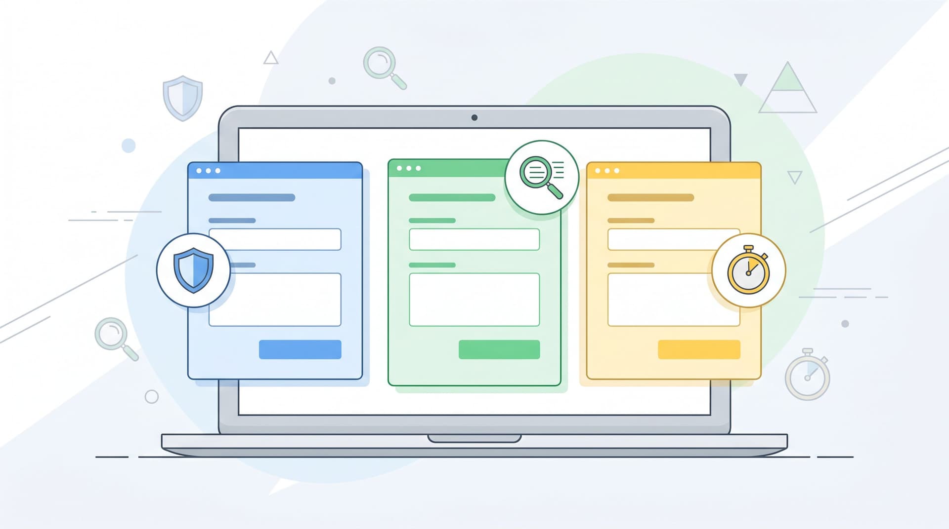
Conditional logic lets you flip the script: one canonical form, many possible journeys. Instead of cloning forms for every scenario, you use rules to adapt the questions, steps, and outcomes based on what each person tells you.
Done well, this gives you:
- Cleaner ops: One URL, one schema, one place to maintain.
- Better UX: People only see questions that are relevant to them.
- Higher completion rates: Multi-step forms that skip irrelevant steps see up to ~30% higher completion than static equivalents.
- More personalization: The form feels like it’s “for me,” not “for everyone.”
This post is about how to do that—practically—without spinning up a new page every time you want a new journey.
Why conditional logic on a single form is such a big deal
Before we get tactical, it helps to be clear on why this pattern matters.
1. You get the upside of multi-step forms without multiplying URLs
Research across tools and industries shows that multi-step forms consistently outperform single long forms, especially when you’re asking more than a handful of questions. Benchmarks in 2025–2026 report:
- Multi-step forms converting 14–200% better than equivalent single-page forms, depending on field count and use case.
- The biggest lift on B2B lead-gen and quote forms with 5+ fields.
- Additional gains when you show progress and start with one easy question.
When you layer conditional logic on top of that—so each person only sees the steps that matter—you compound the effect: shorter perceived forms, less fatigue, and more relevant questions.
The old way to get this personalization was to build separate forms and pages for each path. Conditional logic lets you keep one form structure and still deliver multiple experiences.
2. One schema makes your data (and automations) sane
Every time you duplicate a form, you’re also duplicating:
- Field IDs and naming conventions
- Validation rules
- Integrations (to CRM, email, Slack, etc.)
They drift. Someone adds a new field to one form but not the others. A required field gets renamed in one place and breaks a Zap or an internal workflow.
With a single, logic-driven form:
- You define a canonical set of fields once.
- You show or hide those fields per user path.
- Your Google Sheet or data warehouse gets consistent columns every time.
If you’re already thinking in terms of a Form OS or unified intake system, this pattern pairs beautifully with the ideas in From Spreadsheet Chaos to Form OS: How to Turn Rogue Sheets into a Unified Intake System.
3. People feel seen instead of interrogated
Nobody likes answering irrelevant questions.
Conditional logic lets you:
- Skip company-size questions for a solo creator.
- Ask implementation details only if someone chooses an enterprise tier.
- Dive deeper into a specific use case only when they signal interest.
That shift—from generic to contextual—does two important things:
- Reduces friction: Fewer visible questions, less mental load.
- Builds trust: You’re clearly paying attention to what they say.
If you think of your forms as first meetings instead of data grabs, conditional logic is how you keep that “intro call” feeling. (For a deeper dive on that metaphor, see Forms as First Meetings: Designing Intake Flows That Feel Like a Great Intro Call.)
Core patterns: How “one form, many journeys” actually works
Let’s break down the building blocks you’ll use in Ezpa.ge (or any modern form tool that supports logic).
Pattern 1: The router question
Your router question is the fork in the road. It’s usually:
- Early in the form (often question 1–2)
- Multiple-choice, not open-ended
- Framed around who they are or what they want
Examples:
- “What best describes you?” →
Founder,Marketing lead,Agency partner,Student - “What do you want to do today?” →
Start a trial,Upgrade plan,Cancel membership,Ask a question - “How are you planning to use our product?” →
Client work,Internal ops,Personal project
You then use conditional logic to:
- Show different sections based on their answer
- Skip entire steps for certain options
- Trigger different confirmation messages or follow-up flows
Design tips for router questions:
- Keep the options mutually exclusive and collectively useful. If someone can honestly pick three, you’ll end up with messy paths.
- Use plain-language labels that match how your users describe themselves.
- Favor fewer, clearer options over a long list of edge cases.
Pattern 2: Conditional sections instead of separate pages
Instead of sending users to different URLs, keep your sections inside one form and control visibility.
Common sections to gate with logic:
- Billing or budget questions (only for high-intent or enterprise leads)
- Technical requirements (only for certain products or integrations)
- Membership perks (only for existing members)
- Event logistics (only for in-person attendees vs virtual)
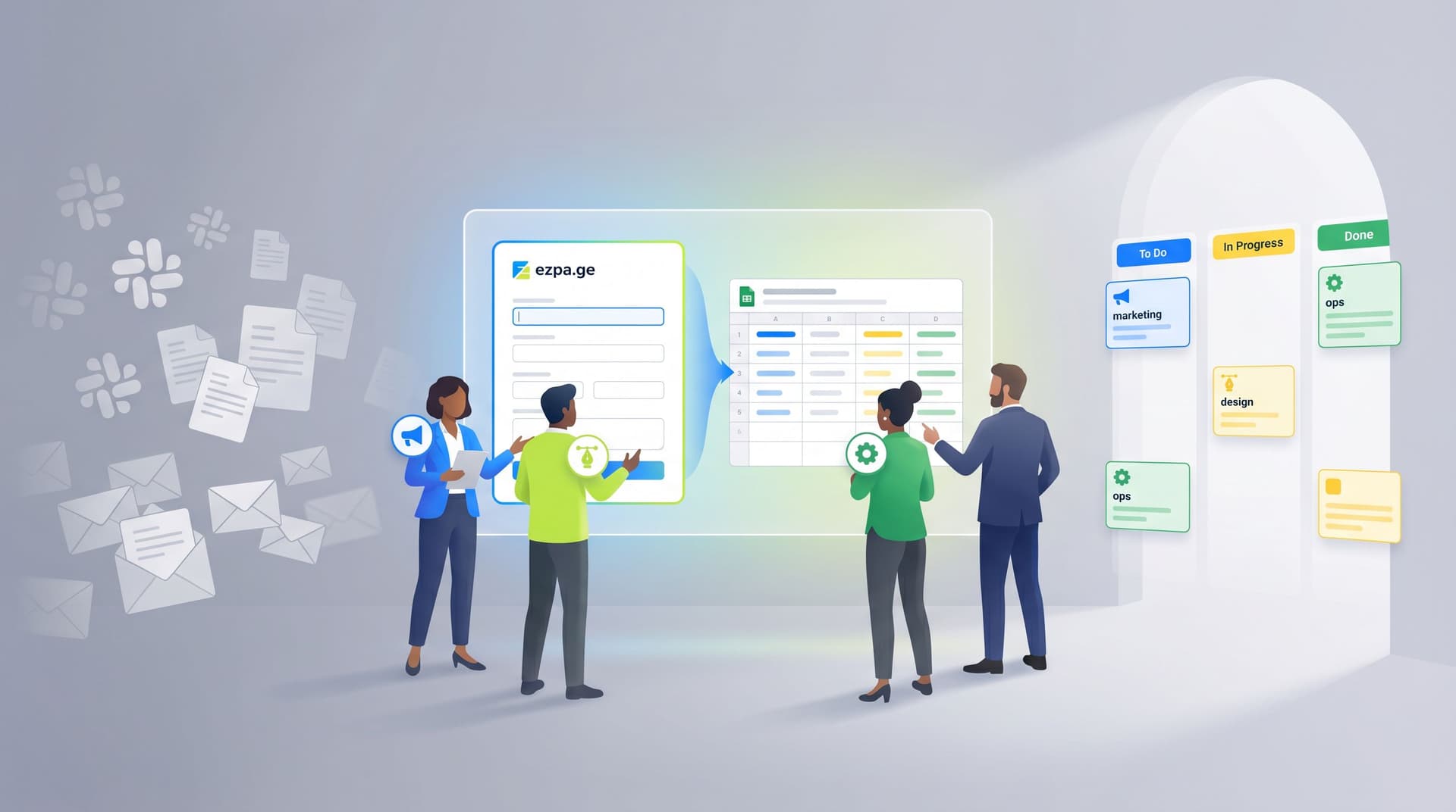
In Ezpa.ge terms, you might:
- Create a base form with all possible sections.
- Add a router question like “Are you a new or existing customer?”
- Set rules:
- If
New customer→ showOnboardingsection, hideAccount detailssection. - If
Existing customer→ showAccount details, hideOnboarding.
- If
From the user’s perspective, it feels like there are two different forms. Under the hood, you’re maintaining exactly one.
Pattern 3: Step skipping for “shortest path to done”
Multi-step forms work best when most people don’t have to visit every step.
Use logic to:
- Skip a “Team details” step if someone selects “I’m a team of one.”
- Skip “Payment method” if they choose “I’m just joining the free community.”
- Skip “Advanced preferences” unless they toggle “Customize my setup.”
The goal is shortest path to done for each user type, not equal treatment.
A practical rule of thumb:
- If fewer than ~30% of users need a step, make it conditional and skippable.
Pattern 4: Outcome-specific confirmations and follow-ups
Personalization doesn’t stop at the last question.
With conditional logic, you can:
- Show a different thank-you message based on path.
- Trigger different notifications (e.g., send enterprise leads to Sales, bug reports to Support).
- Tag or segment people differently in your email tool.
Example:
- If they chose
Book a demo→ show calendar embed, send to sales@, add tagdemo-request. - If they chose
Download the guide→ show download link, send them a resource email, add tagcontent-lead.
This is where conditional forms connect directly into the ideas in From Form to Onboarding Journey: Mapping Every Submission to Emails, Tasks, and Touchpoints.

Designing your first conditional form: a step-by-step playbook
Let’s walk through a concrete approach you can adapt for almost any use case: demo requests, membership flows, internal request forms, and more.
Step 1: Map the journeys before you touch the builder
Open a doc or whiteboard and answer three questions:
- Who are the main segments?
- New vs existing customers
- Self-serve vs enterprise
- Member vs non-member
- What does each segment need to accomplish?
- Book a call
- Get access to a resource
- Change a plan
- Submit a request
- What data do you actually need for each segment?
- Must-have fields
- Nice-to-have fields
- Fields you can infer from context or URL parameters
Then sketch your form as a simple flowchart:
- Start → Router question
- Branch A → Fields/steps → Outcome
- Branch B → Fields/steps → Outcome
- Branch C → Fields/steps → Outcome
You don’t need to think in terms of “pages” yet—just questions and decisions.
Step 2: Define your canonical field set
Now, list every field you might need across all branches.
For each field, decide:
- Field ID / name (how it will appear in your Google Sheet)
- Type (short text, long text, select, checkbox, etc.)
- Required? (Always, conditionally, or never)
- Visible on which paths? (All, only A, only B, etc.)
This is your schema. The schema stays stable even as you change the UX.
A few tips:
- Prefer one flexible field over many narrow ones (e.g.,
company_sizewith options instead of separate yes/no fields for each tier). - Use consistent naming across forms and tools so you can join data easily later.
- Keep the number of required fields low; you can always collect more context later.
If you’re trying to reduce fields without losing insight, pair this work with the ideas in The Minimal Field Manifesto: How Fewer Inputs Can Actually Enrich Your First-Party Data.
Step 3: Group questions into logical steps
Once you know your questions, you can group them into steps. A common structure:
- Step 1 – Identity & intent
- Who are you?
- What are you trying to do?
- Step 2 – Context
- Company size, role, use case, current tools
- Step 3 – Details
- Anything your team needs to route or prepare
- Step 4 – Optional extras
- Preferences, nice-to-have data, referrals, etc.
Guidelines:
- Start with one low-friction question (e.g., “What best describes you?” or “What do you want to do today?”).
- Keep 3–4 steps for most public-facing forms.
- Make sure each step feels cohesive—don’t mix billing with basic profile info.
Step 4: Add conditional rules for visibility and skipping
Now translate your flowchart into logic.
For each router or branching question, define rules like:
- If
"What best describes you?" = Agency→ showAgency detailssection. - If
"Plan type" = Free→ hideBillingstep. - If
"Are you already a customer?" = No→ skipAccount numberquestion.
In practice, you’ll usually:
- Attach conditions to sections or steps, not just individual fields, to keep rules manageable.
- Avoid deeply nested logic trees on v1; start simple, then refine.
A helpful habit: write each rule in plain language first, then implement it. For example:
“If they say they’re an existing customer, we should ask for their account email and skip the onboarding questions.”
Then translate that sentence into your builder’s rule interface.
Step 5: Personalize copy and micro-interactions per path
Logic isn’t just for fields. You can also:
- Change headlines or step titles based on answers.
- Swap helper text to match context.
- Adjust button copy (“Book my demo” vs “Get the guide”).
Examples:
- If someone chooses
I’m an existing customer, your step title might be “Help us find your account” instead of “Tell us about your company.” - If they choose
I’m just exploring, you might soften required fields and add reassurance like “No sales call unless you ask for one.”
These small touches add up to a form that feels like it’s paying attention, not just branching silently.
Step 6: Wire up segment-specific automations
Finally, connect your form to the rest of your stack.
Common patterns:
- Google Sheets: One master sheet with columns for every field and an extra column for
pathorsegment. - Notifications: Different Slack channels or email recipients based on segment.
- CRM / ESP: Tags, pipelines, and campaigns that match the journey.
Because you’ve kept one schema, this is simpler than maintaining separate automations for every form you might have cloned.

Common pitfalls (and how to avoid them)
Conditional logic is powerful, but it’s easy to overdo it. Watch out for these traps.
Pitfall 1: Logic trees that only one person understands
If your logic diagram looks like a plate of spaghetti, you’re going to have a bad time.
Avoid this by:
- Limiting yourself to one primary router question per form.
- Grouping related conditions into sections, not sprinkling them field by field.
- Documenting your rules in a shared doc, not just in the builder UI.
A quick self-check: could a new teammate understand your form’s structure in under 10 minutes? If not, simplify.
Pitfall 2: Hiding critical questions behind rare branches
Sometimes the pendulum swings too far and you hide questions you actually need for almost everyone.
Ask yourself:
- “If we didn’t get this field, would we still be able to follow up effectively?”
- “Is this question truly only relevant to a small subset?”
If a field is operationally critical, keep it visible for most users and use logic only to hide it in the rare cases where it’s genuinely irrelevant.
Pitfall 3: Forgetting about analytics and testing
When every user sees the same static form, it’s easy to analyze drop-off. With conditional paths, you need to be more deliberate.
Best practices:
- Track which path each submission took (e.g., a hidden field you populate via logic).
- Look at completion rates per path, not just overall.
- A/B test router questions and step groupings, not just button copy.
If you’re already running form experiments, logic-based paths are a natural extension of the ideas in Form-Led Experimentation for Non-Designers: Using Themes, Copy Variants, and URLs to Run Real UX Tests.
Pitfall 4: Treating logic as a one-time setup
Your product, pricing, and audience will evolve. Your logic should too.
Set a recurring reminder (monthly or quarterly) to:
- Review which paths are heavily used vs barely touched.
- Retire options that no longer make sense.
- Adjust questions that consistently cause drop-off or confusion.
Think of your conditional form as a living system, not a static artifact.
Bringing it all together
Conditional logic is how you turn a single form into:
- A membership hub that can handle trials, renewals, and perks from one URL.
- A support intake that guides users to self-service or the right team without extra pages.
- An internal request portal that routes marketing, design, and ops work from one shared link.
You don’t need a new page for every journey. You need:
- A clear understanding of your core segments and their goals.
- A canonical set of fields that can support all of them.
- Thoughtful router questions and step groupings.
- Simple, well-documented logic that keeps the experience personal and the data consistent.
When you get this right, you feel the impact on both sides:
- Users finish more often, with less frustration.
- Teams spend less time maintaining forms and more time acting on the data.
Where to go from here
If you’ve been cloning forms for every new use case, the next step is simple:
- Pick one high-impact flow (demo request, membership change, event registration, or internal intake).
- Map the segments and journeys on paper.
- Rebuild it as one Ezpa.ge form with conditional logic instead of three or four separate URLs.
Start small. Ship a v1 with one router question and two or three paths. Watch how it performs. Then layer in more nuance.
Your forms don’t have to be static walls of fields. With a bit of logic, they can become flexible, respectful conversations—one URL that quietly adapts to every person who walks through it.
If you’re ready to try this with Ezpa.ge, open your next form, add a single router question, and create your first branch. That one change is often all it takes to turn “just another form” into the start of a tailored journey.