Form UX for Experiments: Designing A/B Tests, Holdouts, and Variant Themes Without New Pages


Most teams know they should experiment with their forms.
You want to test:
- Different headlines and value props
- Short vs. long flows
- Social proof vs. urgency
- Light vs. dark themes
But the reality is usually messier:
- Every new test means a new landing page
- Marketing waits on design and engineering to ship variants
- Analytics gets fragmented across URLs
- Ops has to reconcile data from five slightly different forms
The result: experimentation feels expensive, slow, and brittle—so it rarely happens at the pace you’d like.
The good news: you don’t actually need new pages for most form experiments.
If you treat the form itself as the primary surface—and use themes, configuration, and routing intelligently—you can run robust A/B tests, holdouts, and variant experiences from a single form definition.
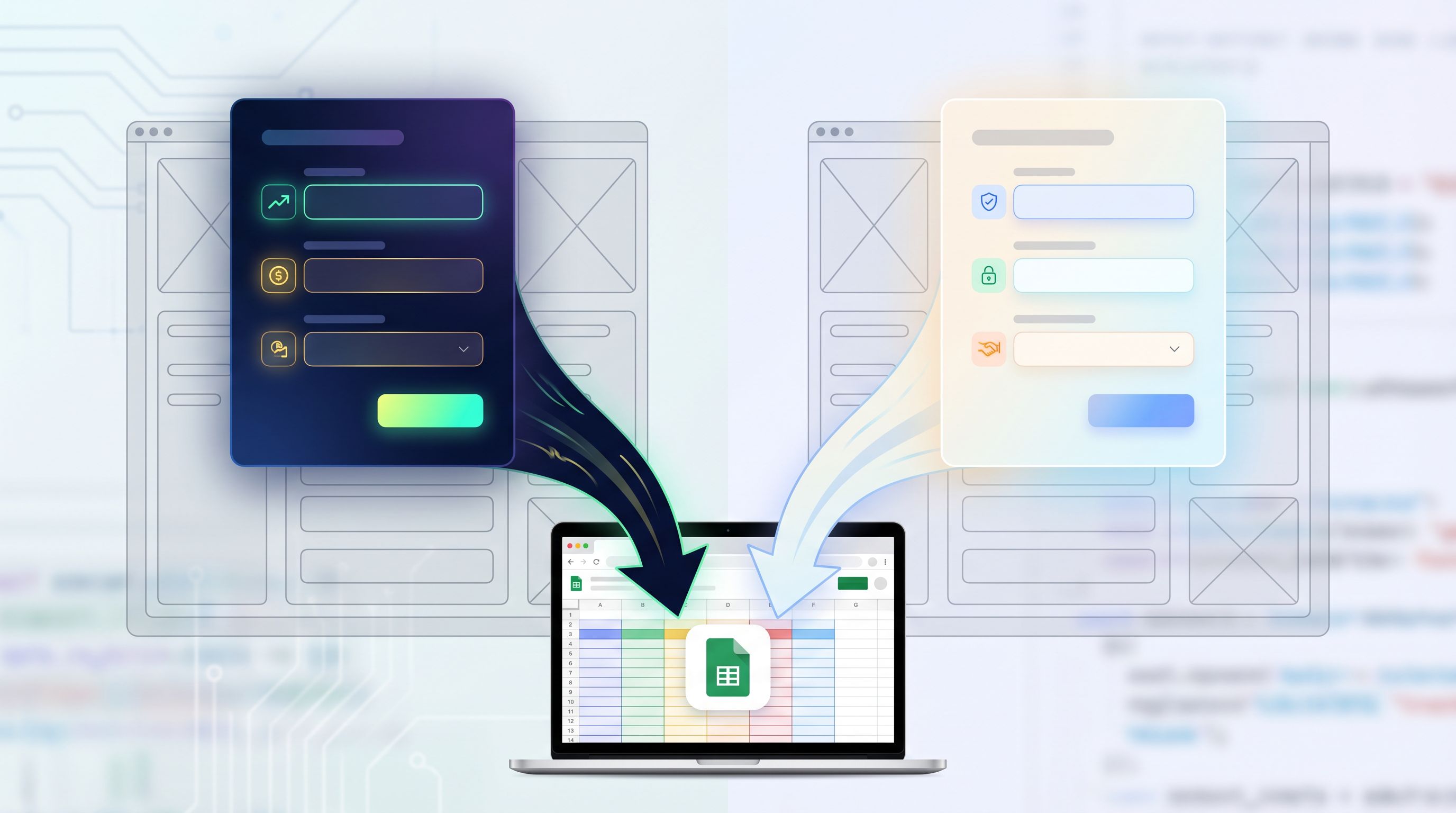
This post walks through how to design that kind of experiment-ready form UX, especially with tools like Ezpa.ge where themes, custom URLs, and real-time Google Sheets syncing are first-class features.
Why Experiment Inside the Form Instead of Spinning Up New Pages?
Before we get tactical, it’s worth asking: why bother doing this work at the form layer at all?
1. Lower cost per experiment
When every test requires a new page, you pay a tax:
- New designs
- New copy passes
- New tracking setup
- New QA environment
By contrast, when you keep a single form backbone and vary themes, content blocks, or question sets, you can:
- Ship more tests with the same team
- Reuse analytics and routing instead of rebuilding it
- Keep data schemas stable, so downstream systems don’t break
2. Cleaner data and easier analysis
If your “demo request” exists as six different forms across eight different URLs, you’re constantly normalizing:
- Field names that don’t quite match
- Required vs. optional fields
- Different validation and help text
When you centralize on one form and experiment through configuration, you get:
- One schema feeding your CRM, Sheets, and analytics
- Comparable cohorts (because the underlying structure is consistent)
- Less manual cleanup every time you want to answer, “Which variant worked better?”
If you’re already thinking about how to turn form data into reliable revenue signals, this pairs nicely with the workflow in From Form to Revenue Signal: Using Google Sheets to Map Submission Data to Pipeline Stages.
3. Faster iteration cycles
Experiments only compound when you can:
- Ship a variant quickly
- Learn something meaningful
- Fold the winner back into your baseline
Form-level experiments make that loop tighter because you’re changing:
- A theme token instead of an entire page layout
- A prompt or label instead of a section of long-form copy
- A conditional path instead of a whole new flow
4. Consistent UX with targeted variation
You want variation where it matters (offer framing, question order, visual emphasis) without:
- Breaking accessibility
- Introducing new error states
- Confusing your ops team
A shared form backbone with controlled variation gives you guardrails—especially if you’re already investing in a system like the one described in Design Systems for Forms: Component Libraries, Tokens, and Guardrails Your Whole Team Can Use.
The Core Pattern: One Form, Many Experiences
Think of your experiment-ready form as three layers:
-
Structure – The stable backbone
- Core fields (email, company, use case)
- Validation rules
- Submission behavior and routing
-
Presentation – The configurable surface
- Themes (colors, typography, spacing)
- Layout (single-column vs. two-column, multi-step vs. single-page)
- Microcopy (headlines, help text, button labels)
-
Logic – The adaptive behavior
- Conditional fields and steps
- Branching based on answers
- AI-generated follow-ups or smart defaults
Your goal is to freeze layer 1 as much as possible and experiment primarily in layers 2 and 3.
That’s how you:
- Avoid schema drift
- Keep integrations stable
- Still give yourself room to run meaningful tests
Designing A/B Tests Without New Pages
Let’s make this concrete. Say you’re running a lead form for a B2B product. You want to test two hypotheses:
- A conversational, multi-step layout will convert better than a single-page layout.
- A “ROI-focused” theme will outperform a “trust-and-safety” theme for paid traffic.
You can do all of this inside a single Ezpa.ge form.
Step 1: Define a stable baseline form
Start by designing a baseline form that will serve all variants:
- Core questions you know you need
- Minimum validation rules
- Submission destination (Google Sheets, CRM, etc.)
Keep this baseline as lean as possible. You can always add experimental questions via conditional logic.
Step 2: Identify your experimental levers
For each A/B test, list the levers you’ll actually change. For example:
Layout levers
- Single-page vs. multi-step
- Grouping of fields (e.g., “About you” vs. “About your company”)
- Progress indicator style
Theme levers
- Color palette (high-contrast vs. muted)
- Typography (bold, assertive headlines vs. calm, neutral)
- Button styling and hover states
Copy levers
- Headline angle (ROI vs. risk reduction vs. speed)
- Subcopy framing ("Book a demo" vs. "See it in action")
- Microcopy on sensitive fields (e.g., data privacy reassurance)
In Ezpa.ge, you’d represent many of these as themes and content variants attached to the same form, not as separate forms.
Step 3: Route traffic to variants via URLs, not duplicate forms
Instead of cloning the form, you:
- Create variant-specific URLs that map to the same form ID
- Attach different themes or layouts to each URL
For example:
/demo?variant=A→ Baseline theme + single-page layout/demo?variant=B→ ROI theme + multi-step layout
Under the hood, both URLs:
- Write to the same Google Sheet
- Use the same field IDs
- Trigger the same downstream workflows
But the experience feels different.
Step 4: Track variants in your data
To analyze results, you need a way to know which variant someone saw. You can do this by:
- Adding a hidden field like
experiment_variant - Populating it from the URL (
?variant=A) - Syncing that value into Google Sheets and your CRM
Now you can answer questions like:
- “What’s the completion rate for Variant A vs. B?”
- “What’s the lead-to-opportunity conversion rate by variant?”
- “Does one variant attract a different type of lead?”
This is also where a lightweight analytics framework, like the one in Baseline to Benchmarks: Building a Lightweight Form Analytics Framework Your Team Will Actually Use, becomes invaluable.
Running Holdout Experiments Without Breaking Your Funnel
A/B tests are great for optimization, but sometimes you need holdouts—users who don’t get the new thing.
Why?
- To measure the real impact of a new feature (e.g., AI-powered follow-up questions)
- To validate that a new theme system doesn’t accidentally hurt conversion
- To maintain a control group for long-term performance monitoring
You can implement holdouts at the form UX level without new pages.
Pattern 1: Randomized holdout via hidden logic
- On page load, generate a random bucket for each visitor (e.g., 0–99).
- Use a simple rule:
- 0–79 → New experience (80% of users)
- 80–99 → Holdout (20% of users)
- Store the bucket and experience type in hidden fields.
Then:
- Show or hide certain fields based on the bucket
- Switch between a “classic” and “experimental” theme
- Enable or disable AI-driven follow-up questions
From the user’s perspective, they just see “the form.” From your perspective, you’ve built a controlled experiment with a durable holdout group.
Pattern 2: Source-based holdout
Sometimes it’s cleaner to define holdouts by source instead of randomness:
- Paid campaigns get the experimental experience
- Organic traffic stays on baseline
- Existing customers see a different path than net-new leads
You can implement this by:
- Passing a
sourceorcampaignparameter in the URL - Mapping certain sources to “holdout” or “experimental” in your form logic
Tip: Always log both the source and the experience type in hidden fields. That way you can untangle “this campaign underperformed” from “this experimental experience wasn’t a fit for this audience.”
Variant Themes: Matching Intent Without Multiplying Forms
Themes aren’t just about looking on-brand. Used well, they’re a behavioral design tool.
You can use variant themes to:
- Match the emotional state of different audiences
- Reinforce the promise made in the ad or email
- De-emphasize or highlight certain fields
And you can do all of this without creating new forms.
Examples of theme-based experiments
-
Performance marketing variants
- Dark, high-contrast theme for ROI-focused ad traffic
- Light, calm theme for content-driven, educational traffic
- Social-proof-heavy header for retargeting audiences
This builds directly on ideas from Form Themes for Performance Marketers: Matching Creative, Channels, and Copy Without New Pages.
-
Lifecycle variants
- New visitors see more reassurance and trust signals
- Logged-in or returning users see a stripped-down, high-velocity path
-
Use-case variants
- Enterprise buyers get a theme that feels serious, stable, and compliance-ready
- Smaller teams get a theme that feels friendly, fast, and flexible
All of these can be represented as theme configurations attached to a single form definition.
Implementation checklist
When designing variant themes for experiments, make sure you:
-
Keep interaction patterns consistent
- Don’t change how validation works between variants
- Avoid moving field order too dramatically unless that’s the test
-
Define theme tokens, not one-off styles
- Colors, typography, radii, spacing should live in a token system
- Variants should be combinations of tokens, not bespoke CSS
-
Track theme ID in your data
- Add a hidden
theme_idfield - Populate it based on the theme applied to that URL or user
- Add a hidden
This way, you can later ask: “Which theme actually drives higher-quality submissions?”—not just higher raw conversion.

Layering in Smarter Logic: Experiments on Questions, Not Just Chrome
Visual changes matter, but some of the highest-leverage experiments happen at the question level:
- Do we ask company size up front or later?
- Do we gate calendar booking behind a qualification field?
- Do we use AI-generated follow-ups to go deeper on certain answers?
With a form builder like Ezpa.ge, you can:
- Use conditional logic to show different fields based on variant or segment
- Introduce AI-generated follow-up questions only for certain cohorts
- Treat the form as a conversation, not just a static list of fields
If you’re exploring this space, it’s worth reading AI-Generated Follow-Up Questions: Using Response-Aware Prompts to Go Deeper Without Longer Forms alongside this post. Together, they point to a future where your experiments aren’t just “blue button vs. green button,” but:
- “Did we ask the right next question for this person?”
- “Did we earn enough trust to ask for sensitive data?”
- “Did we adapt the flow to their intent in real time?”
Practical ways to experiment at the question level
-
Optional vs. required fields
- Variant A: Only email and use case are required
- Variant B: Add company size and role as required
- Measure: Completion rate vs. downstream lead quality
-
Question order
- Variant A: Start with easy, low-friction questions
- Variant B: Lead with a strong intent question ("What’s your biggest challenge?")
-
AI-assisted deep dives
- Variant A: Static, pre-written follow-up questions
- Variant B: AI-generated follow-ups based on free-text answers
- Measure: Richness of data vs. completion time and drop-off
Again, you don’t need new forms for any of this. You need:
- A stable baseline schema
- Hidden fields for
variant,theme_id,experience_type - Clear logic rules tied to those fields
Guardrails: How to Experiment Without Creating Chaos
When experimentation becomes easier, teams naturally want to run more of it. That’s good—but only if you put some guardrails in place.
Here are a few principles to keep your form UX experiments healthy:
1. One primary metric per experiment
Before you launch, decide:
- Is this test about completion rate?
- Or about lead quality?
- Or about time to complete?
Secondary metrics are fine, but if you don’t pick a primary one, you’ll always be able to “find a win” somewhere—and you won’t actually learn.
2. Minimum sample sizes and durations
Even simple rules help:
- Run each variant until you have at least X submissions (pick a number that fits your volume)
- Or a minimum time window (e.g., two full weeks) to account for day-of-week patterns
3. Change one major thing at a time
It’s tempting to bundle:
- New theme
- New layout
- New questions
…into a single “big” experiment. But then you can’t tell why something worked or failed.
Try to isolate:
- Visual changes (theme-only tests)
- Structural changes (layout-only tests)
- Content changes (copy-only tests)
4. Bake experiments into your operations
Make sure your downstream systems know about your experiments:
- Include
variant,theme_id, andexperience_typein your CRM - Teach sales or success teams how to interpret those fields
- Use them in reporting and pipeline reviews
That way, you avoid the classic scenario where a new experiment quietly changes lead mix, and no one can explain why the pipeline “feels different” this month.
Bringing It All Together
Designing form UX for experiments—A/B tests, holdouts, and variant themes—without new pages is about a mindset shift:
- From: “Every new idea needs a new landing page.”
- To: “We have a stable form backbone and we experiment through configuration.”
When you:
- Keep structure stable
- Vary presentation and logic thoughtfully
- Track variants and themes in your data
- Treat themes, layouts, and questions as levers
…you unlock a way of working where experimentation is cheap, continuous, and operationally safe.
You get more learning, faster, without:
- Fragmenting your analytics
- Overloading your design and engineering teams
- Breaking the workflows that depend on your form data
Where to Start This Week
If you want to put this into practice quickly, here’s a simple sequence:
-
Pick one high-impact form.
Your main demo request, onboarding intake, or support triage form. -
Define your baseline.
Lock in the core fields and submission behavior. Document them. -
Add hidden fields for experimentation.
At minimum:experiment_variant,theme_id,experience_type. -
Create two themes for the same form.
One that leans into urgency/ROI, another into trust/reassurance. -
Route traffic to both via different URLs.
Use URL parameters to set the variant and theme. -
Sync everything into Google Sheets.
Use that as your experiment log—variant, theme, source, outcome. -
Review results after a fixed period.
Decide what “wins,” fold it into your baseline, and plan the next test.
Do that a few times, and experimentation stops being a special project. It becomes the default way you design and ship forms.
Take the First Step with Ezpa.ge
If you’re using Ezpa.ge, you already have most of the building blocks:
- Custom themes you can attach to a single form
- Custom URLs and parameters for clean variant routing
- Real-time Google Sheets syncing so every experiment is instantly analyzable
The next step isn’t a massive rebuild. It’s a decision:
- Choose one form.
- Decide on one hypothesis.
- Configure one A/B test using themes, logic, and hidden fields—without cloning the form.
Once you’ve seen how much you can learn from a single experiment-ready form, it becomes hard to go back to “one page per idea.”
Your forms are already where people raise their hands. With the right UX for experiments, they can also be where your team learns fastest.