Form Themes for Performance Marketers: Matching Creative, Channels, and Copy Without New Pages

Performance marketers don’t have a traffic problem. You have a fit problem.
You’re shipping:
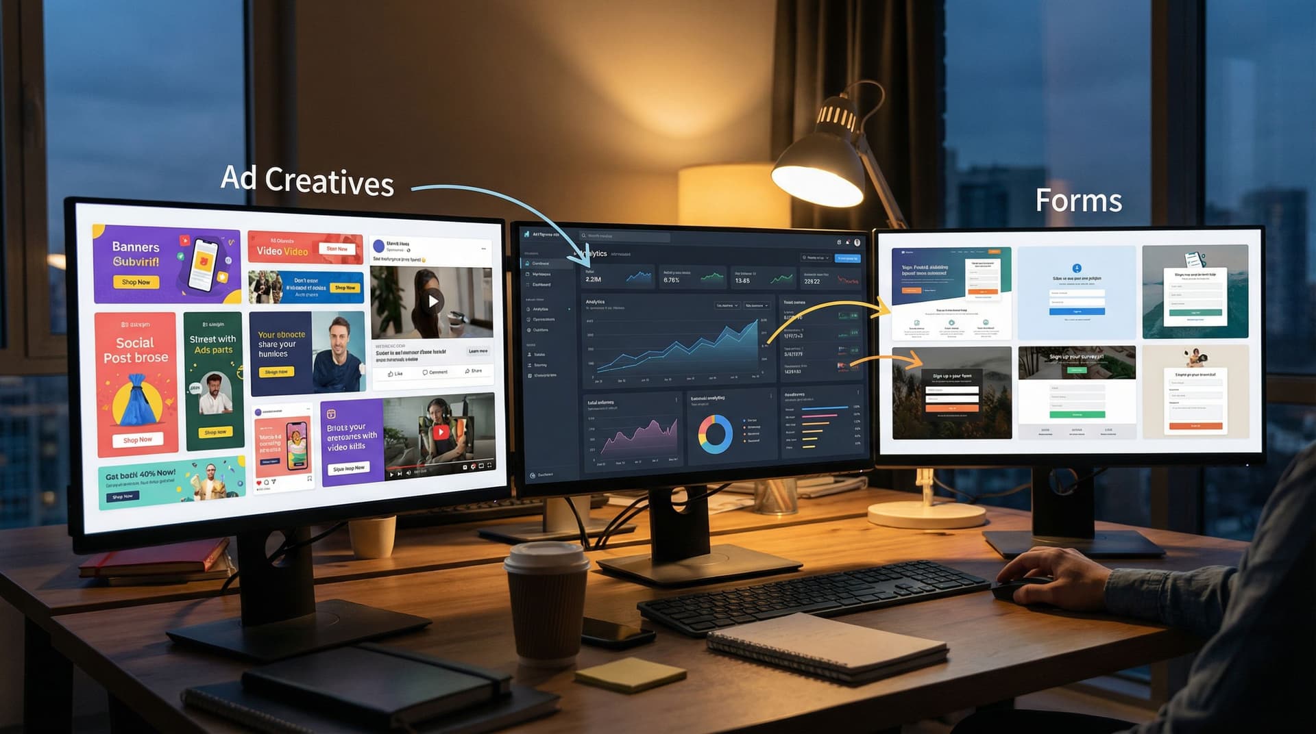
- Dozens of ad variations across Meta, Google, LinkedIn, X, TikTok
- Multiple angles per offer (pain-first, ROI-first, social proof, urgency)
- Experiments on pricing, bundles, and guarantees
But most of that complexity slams into the same bottleneck: one or two generic landing pages with a single embedded form.
The result:
- Message–market mismatch between ad and form
- Wasted budget when high-intent clicks hit a bland, off-angle experience
- Slow iteration cycles because every new angle supposedly needs a new page
Form themes give you a different path.
With tools like Ezpa.ge, you can treat the form itself as the conversion surface—using themes, custom URLs, and channel-specific variants to match creative, channel, and copy without spinning up new pages every time you launch a test.
This post is about how to do that deliberately.
We’ll cover:
- Why aligning form themes with creative and channels moves the needle
- A practical framework for mapping themes to campaigns
- How to run structured experiments without wrecking your ops
- Real-world patterns you can steal for your own funnels
Why Performance Marketers Should Care About Form Themes
When you think about conversion rate optimization, you probably think about hero copy, social proof, and page structure. But for performance marketers, the highest-intent surface in your funnel is almost always the form.
The last mile is where you’re losing people
Research from form analytics tools consistently shows that form friction is one of the top reasons visitors abandon a flow, even after they’ve already decided they’re interested. Small details—tone, length, visual trust cues—can swing completion rates by double digits.
And yet, performance teams often:
- Route all paid traffic to the same generic form
- Run creative-heavy tests at the ad level while the form stays frozen
- Treat theming as a brand exercise, not a performance lever
That’s backwards. The story your ad tells has to land cleanly in the experience where people actually convert. A misaligned form theme is like a bait-and-switch: people feel the disconnect and quietly bounce.
What “theme alignment” actually does for you
When you match form themes to creative and channels, you get:
- Higher conversion rates – Visual and tonal continuity reduces cognitive dissonance. The jump from ad → form feels like one continuous story instead of a hard reset.
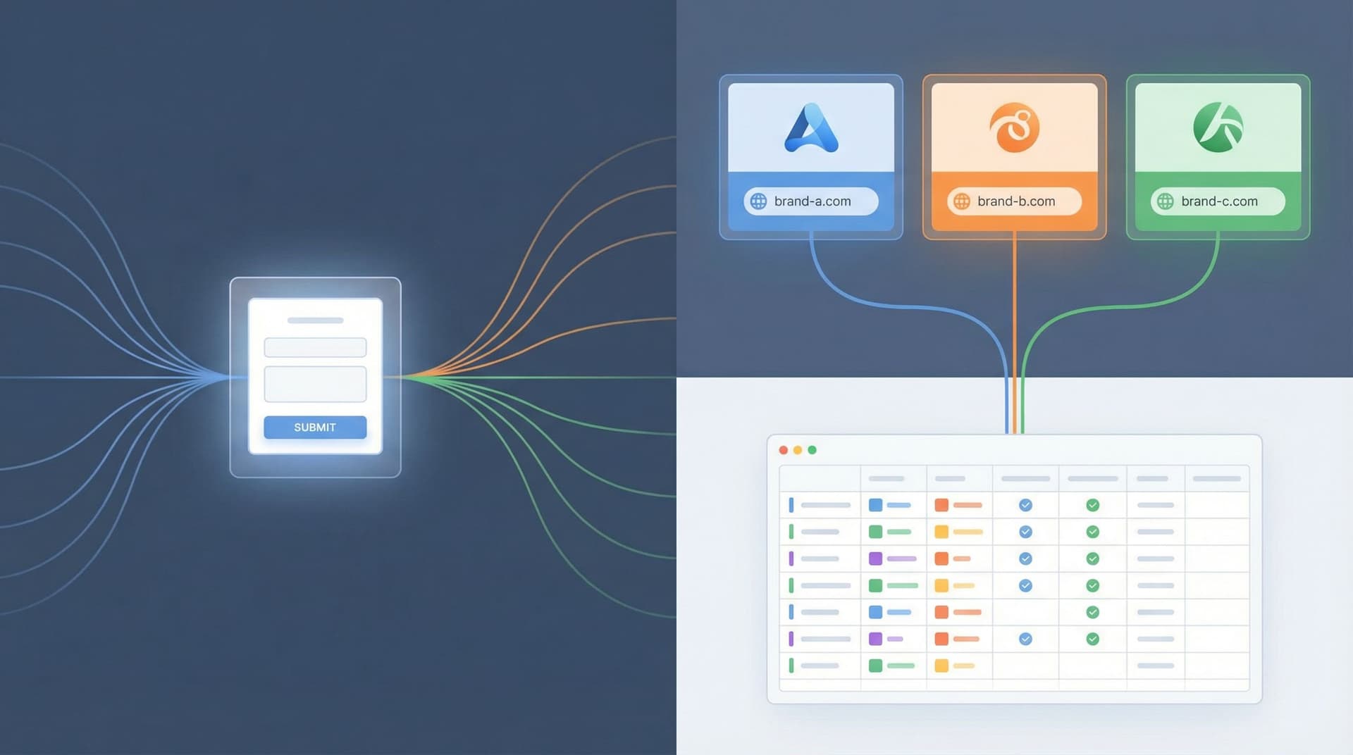
- Cleaner segmentation – Channel- or angle-specific themes tied to custom URLs give you precise attribution and behavioral data without duplicating the underlying form logic.
- Faster experimentation – You can swap themes and copy on a single form instead of asking design/dev for a new page every time.
- Operational sanity – One form schema, many themes. Your data stays consistent even as your front-end experiments multiply.
If you’ve read our pieces on using themes for white-label programs (“One Form, Many Brands”) or replacing microsites with custom URLs (“Campaigns Without Landing Pages”), this is the same idea—applied directly to performance marketing.
Start With the “Form as Microsite” Mindset
Before we get tactical, it helps to reset how you think about forms.
Most teams treat forms as a widget that sits at the bottom of a page.
Instead, think of your form as a lightweight microsite:
- It has its own URL (e.g.
yourbrand.com/ai-auditor a branded Ezpa.ge link) - It has a visual identity (layout, color, typography, imagery)
- It has message hierarchy (headline, subcopy, microcopy on fields)
- It has interaction design (multi-step vs single-page, progress indicators, inline help)
Once you accept that, themes stop being “make it on-brand” and start being:
“How do we ship 5–10 tightly aligned, high-converting microsites… all powered by one underlying form?”
That’s where performance marketers win.
A Simple Framework: One Form, Many Themes
Let’s anchor on a core pattern you can reuse across campaigns.
1. Define your base form once
Your base form is the operational backbone. It should be:
- Channel-agnostic in structure (fields, validation, routing)
- Opinionated about what data you need (so you don’t keep adding fields per campaign)
- Tightly integrated with your ops (Google Sheets, CRM, routing rules)
In Ezpa.ge, that looks like:
- A single form with all the fields you need for sales, CS, or ops
- Real-time syncing into a master Google Sheet
- Optional logic for conditional questions (e.g. different questions for SMB vs enterprise)
You do not copy this form for every campaign. You lock it in as your source of truth.
2. Layer themes on top for each performance context
Now you create themes that sit on top of that base form:
- Visuals – Colors, typography, button styles, spacing, background
- Framing copy – Headline, subheadline, short explainer above the form
- Field-level microcopy – Helper text, placeholders, examples
- Layout – Single-page vs multi-step, progress bar, grouping of questions
Each theme is mapped to:
- A channel (e.g. Paid Search vs LinkedIn)
- A creative angle (e.g. “Save 10 hours/week” vs “Cut CAC by 25%”)
- Or a segment (e.g. agencies vs in-house teams)
Because the underlying fields don’t change, your data stays clean—even as your front-end experience is tailored.
3. Route traffic with custom URLs
Finally, you use custom URLs to send the right traffic to the right theme.
Examples:
forms.yourbrand.com/paid-search-demo→ Theme tuned to high-intent search trafficforms.yourbrand.com/creative-test-ugc→ Theme that mirrors your UGC creativeforms.yourbrand.com/linkedin-cmo-offer→ Theme built for exec-level social traffic
This is the same pattern we explore more deeply in “URL-Driven Ops”: one form, many URLs, each with its own behavior and presentation.
Matching Themes to Channels: Concrete Patterns
Let’s walk through how you might theme a single base form for three common performance channels.
1. Paid Search: High Intent, Low Patience
Search visitors have strong intent and time pressure. They’ve just typed a specific problem or solution into Google; your ad and your form need to reassure them they’re in the right place—fast.
Theme moves for search:
- Minimalist visual design – Clean, high-contrast layout; no decorative imagery that competes with the fields.
- Reinforce the query – Headline that mirrors the core keyword:
- Ad: “B2B Form Builder with Live Google Sheets Sync”
- Form headline: “Get a Live Demo of Our B2B Form Builder with Sheets Sync”
- Short, direct copy – Subheadline that spells out the next step: “Share a few details and we’ll send a live demo link within 1 business day.”
- Single-page or 2-step max – Use a short, scannable layout. If you go multi-step, keep step labels crystal clear.
- Trust cues near the button – Short line like “Trusted by 1,200+ growth teams” or small logo row right under the CTA.
On Ezpa.ge, this is a theme with:
- Tight spacing
- Neutral background
- Bold, keyword-relevant headline
- Emphasis on speed and clarity in helper text
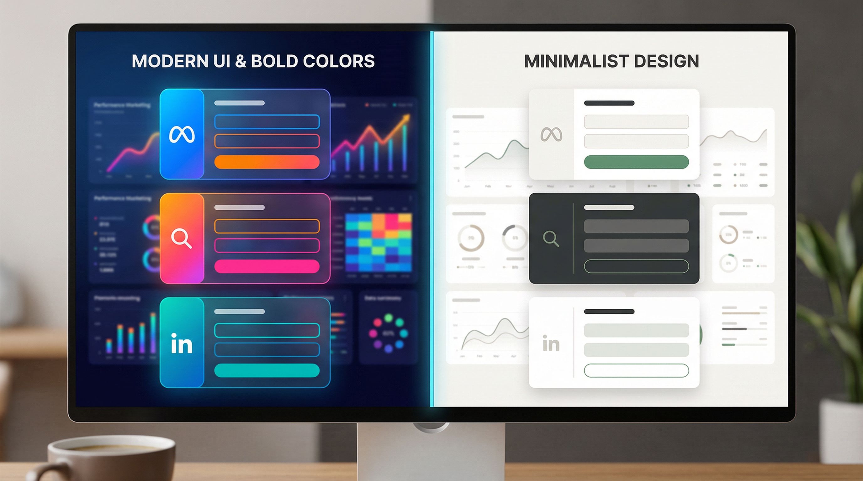
2. Paid Social: Pattern-Breaking and Story-Driven
Paid social traffic (Meta, LinkedIn, TikTok) is usually lower intent but higher curiosity. They didn’t wake up searching for you; your creative hooked them.
Your form theme should continue that story instead of resetting into a corporate template.
Theme moves for social:
- Carry over creative elements – If your ads use bold gradients or a specific illustration style, echo that in the form background or header.
- Angle-specific headlines – If the ad angle is “Ship campaigns without landing pages,” your form headline might be: “See How Teams Ship Campaigns Without Landing Pages.”
- More context above the fold – A short bullet list or 2–3 benefit lines above the form to reframe the offer.
- Multi-step with progress – Break the form into 2–3 steps to make it feel lighter and more interactive.
- Social proof that matches the angle – If the ad leans on ROI, show a quick metric. If it leans on ease-of-use, show a testimonial about setup time.
This is where form themes start feeling like mini landing pages—without the overhead of building a full site.
3. Retargeting & Nurture: Warm, Reassuring, Specific
Retargeting traffic has seen you before. Maybe they’ve visited your pricing page, attended a webinar, or clicked a previous campaign.
Your form theme can assume more context and lean into specific use cases or objections.
Theme moves for retargeting:
- Use case–specific headlines – “Get a Form Audit for Your Paid Social Funnels” instead of “Book a Demo.”
- Inline education – Small callouts or helper text explaining what will happen next, how long it takes, and what they’ll get.
- Longer, more thoughtful fields – Warm leads are more willing to answer a couple of deeper questions if you explain why.
- Softer visual tone – Slightly muted colors, calmer layout, more white space to signal a considered decision.
You can even run multiple retargeting themes off the same base form: one for people who visited your pricing page, another for those who engaged with a specific content asset.
Aligning Themes With Creative Angles and Copy
Channels are one dimension. Creative angles are another.
Instead of “one form per offer,” think “one theme per angle”:
Common performance angles:
- Pain-first – “Stop losing leads to broken funnels.”
- Gain-first – “Double your qualified demos from the same ad spend.”
- Speed/efficiency – “Ship new campaigns in under 30 minutes.”
- Risk reduction – “Test new positioning without touching your site.”
- Social proof – “Used by top performance teams at X, Y, Z.”
For each angle, your theme adjusts:
- Color and mood – Urgency angles might use bolder, warmer colors; risk-reduction might lean into calm blues and greens.
- Headline and subheadline – Mirror the exact promise from the ad.
- Microcopy – Pain-first themes might use language like “Where are you losing leads right now?”; gain-first might say “What would a 20% lift mean for your team?”
If you’ve experimented with themes as brand labs, you’ll recognize this pattern from “Form Themes as Brand Labs”. The twist here is that you’re optimizing for performance metrics, not just brand direction.

Making This Work Operationally: Guardrails for Performance Teams
All of this sounds powerful—until someone in RevOps asks, “Are you about to create 27 versions of the same form?”
You don’t have to.
Here’s how to keep your experiments performance-friendly and ops-safe.
1. Separate schema from presentation
Non-negotiable: your base form’s field schema is the source of truth.
- Changes to required fields, routing logic, or integrations happen once, in the base form.
- Themes can change labels, helper text, placeholders, and layout, but not the underlying field IDs.
This gives you:
- Consistent data in Google Sheets and your CRM
- One place to update when you add a new field or tweak routing
- Freedom to change front-end presentation per campaign
2. Use URL parameters and hidden fields for attribution
Instead of duplicating forms for every ad set, use:
- Custom URLs per theme
- Hidden fields that capture:
- Campaign ID
- Ad group / ad set
- Creative ID or angle label
Your tracking might look like:
- Base URL:
forms.yourbrand.com/ezpage-demo - Theme for LinkedIn CMOs:
forms.yourbrand.com/ezpage-demo?theme=linkedin-cmo - Hidden fields auto-populate from the URL (
utm_campaign,utm_content, etc.)
Because Ezpa.ge syncs directly into Google Sheets, you can then use that sheet as a live experiment board—something we dive into more in posts like “Zero to Live in 30 Minutes” and “From Form to Live Queue”.
3. Standardize a theme naming convention
Treat themes like you treat ad naming:
channel-angle-audience-variant- Examples:
meta-ugc-pain-smb-v1search-intent-high-b2b-v2linkedin-proof-cmo-v1
This makes it easy to:
- Compare performance across similar themes
- Roll out winning patterns to new campaigns
- Keep your team aligned on what each theme is for
4. Build a small “theme library” instead of one-offs
Resist the urge to craft a totally bespoke theme for every single ad.
Instead, aim for a library of 5–10 reusable themes that cover your main channel + angle combos:
- Search – High intent, minimal
- Search – Comparison / competitor
- Meta – UGC / social proof heavy
- LinkedIn – Exec-focused, premium feel
- Retargeting – Use case–specific, educational
When a new campaign launches, you:
- Map it to the closest existing theme.
- Make small copy tweaks if needed.
- Only create a new theme if you’re testing a fundamentally new story.
Turning Form Themes Into a Structured Experiment Program
Once you’ve got the basics in place, you can start treating form themes as a systematic testing surface.
Here’s a lightweight playbook:
- Pick one funnel stage to own – e.g. “Paid search → demo request” or “Retargeting → strategy call.”
- Establish a baseline – Run your current, generic theme for 1–2 weeks. Capture:
- Click → form view rate
- Form view → start rate
- Start → completion rate
- Design 2–3 theme variants that differ on one major dimension:
- Layout (single-page vs multi-step)
- Tone (formal vs conversational)
- Visual intensity (minimal vs bold)
- Angle emphasis (pain vs gain)
- Split traffic evenly between themes using separate URLs in your ad sets.
- Measure not just conversion, but downstream quality:
- Lead qualification rate
- Show-up rate for calls
- Pipeline generated per theme
- Promote winners into your theme library and retire underperformers.
Because Ezpa.ge pipes everything into Google Sheets, you can:
- Build a simple dashboard that tracks conversion by theme
- Layer on rules or scripts to prioritize leads from top-performing themes
- Feed structured data into your AI models if you’re running AI-assisted routing or scoring (“Forms as On-Ramps to AI” goes deeper on that front).
Practical Tips to Implement This Week
If you want to put this into practice without a full rebuild, here’s a 7-step quickstart you can run in a few hours.
-
Audit your current funnels
- List your top 3–5 paid campaigns by spend.
- For each, note: channel, main angle, current destination URL, and form.
-
Identify one base form
- Choose the form that already has the best field schema for your team.
- Migrate others toward it so you can standardize.
-
Create 2–3 initial themes in Ezpa.ge
- One for high-intent search
- One for paid social creative-heavy campaigns
- One for retargeting / nurture
-
Map campaigns to themes
- Repoint your ad destinations to the appropriate custom URLs.
- Use consistent naming and UTM conventions.
-
Tighten copy alignment
- For each theme, make sure the headline and subcopy echo your highest-volume ad variations.
- Add 1–2 lines of microcopy to clarify what happens after submission.
-
Set up tracking in Sheets
- Make sure each submission includes:
- Theme name
- Channel
- Campaign / ad set
- Build a simple pivot table or chart to compare performance.
- Make sure each submission includes:
-
Review weekly and iterate
- Kill themes that underperform by a clear margin.
- Clone winners and make small, isolated tweaks for new tests.
Bringing It All Together
Performance marketing is already complex. You’re juggling targeting, bids, creative, and budgets. The last thing you need is a form setup that requires a new landing page and a new ops workflow every time you want to test a fresh idea.
Form themes give you a way out:
- One base form as your operational backbone
- Many themes tuned to channels, angles, and segments
- Custom URLs to route traffic cleanly and keep attribution intact
- Real-time syncing into Google Sheets so you can see, in black and white, which themes actually move pipeline—not just clicks
When you treat your forms as flexible, themed microsites instead of static widgets, you unlock a new lever for performance:
- Better message–market fit at the moment of conversion
- Faster experimentation without dev dependencies
- Cleaner data and smoother handoffs to sales, CS, and ops
Your Next Step
You don’t need to redesign your entire funnel to start.
Pick one high-importance flow—say, your paid search → demo request path—and:
- Standardize on a single base form.
- Spin up two Ezpa.ge themes: one minimal search-focused variant, one story-driven variant that mirrors your top creative.
- Point half your traffic to each custom URL and watch what happens for a week.
From there, you can expand into social, retargeting, and partner campaigns—building a small library of high-performing themes that work across your entire performance program.
If you’re ready to turn your forms into a serious performance lever, start by designing your first theme today. The ads are already doing their job. It’s time for your forms to catch up.