Custom URLs as Brand Signals: How Link Structure Shapes Trust, Click-Through, and Conversion


When someone hovers over a link, they’re making a snap judgment.
Do I trust where this goes? Does this feel like the same brand I just saw in the ad or email? Is this worth a click right now?
Your URL is answering those questions before your headline, your hero image, or your form copy gets a chance. For teams that live and die on form completion—demo requests, waitlists, intakes, applications—that makes custom URLs one of the highest‑leverage brand surfaces you probably aren’t treating as strategy.
This post is about using custom URLs as deliberate brand signals: how they affect trust, click‑through, and conversion—and how to design them in a way that’s easy to maintain across campaigns, channels, and teams.
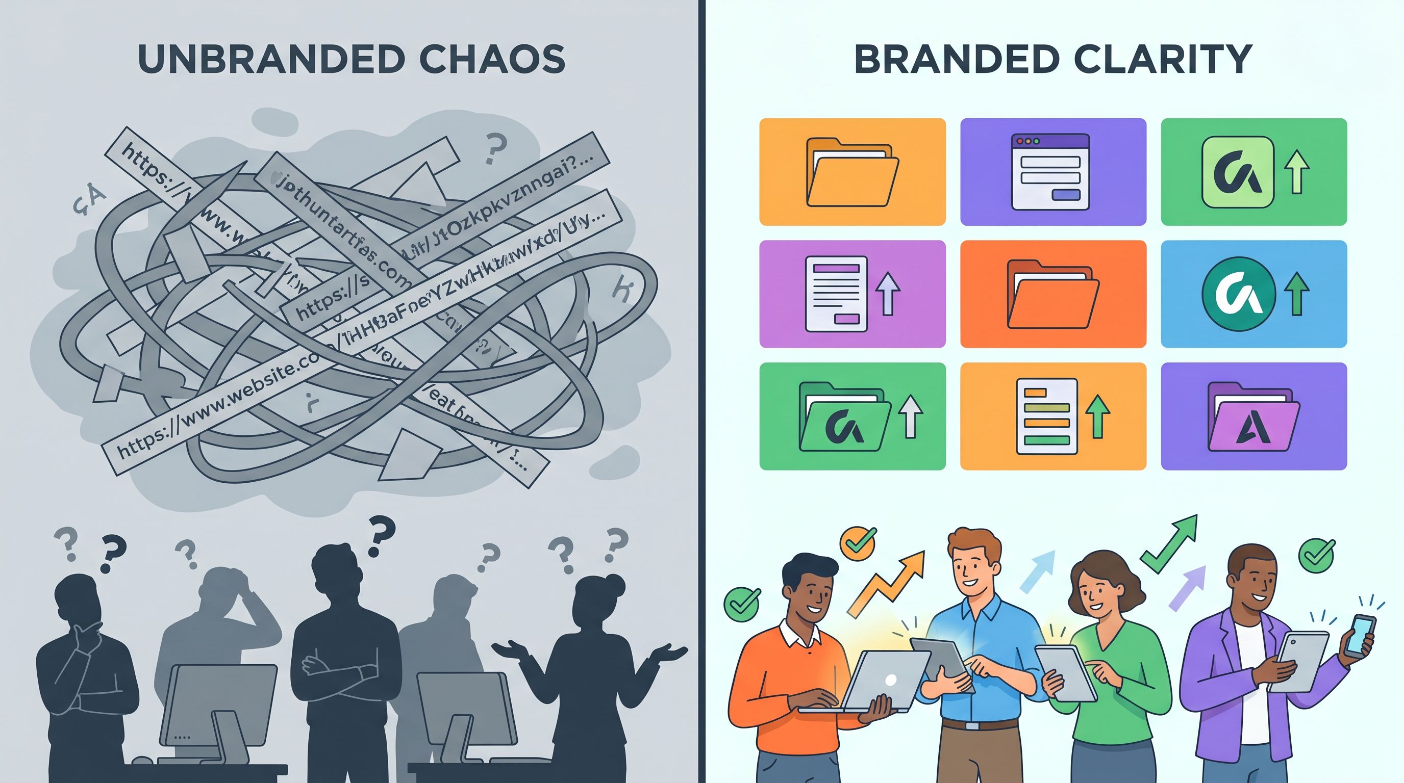
Why URLs Are Quiet but Powerful Brand Artifacts
Most people don’t think of URLs as part of their brand system. They think of them as plumbing.
But URLs show up in some of your most fragile moments:
- A cold outbound email where the only thing someone sees is your sender name and a link
- A DM from a rep dropping a direct link to a consultation form
- A QR code on a slide, flyer, or conference badge
- A support interaction where someone is already frustrated and just wants a reliable link that works
In all of those cases, the URL is the first impression.
A growing body of link‑management platforms report that branded short links (using your own domain and meaningful slugs) consistently outperform generic shorteners, with case studies showing 30–40% higher click‑through rates when the domain is recognizable and aligned with the brand. That’s not just aesthetics—it’s basic psychology: familiar, legible, and specific links feel safer and more relevant than random strings.
What a custom URL signals in one glance
A thoughtful link structure can communicate all of this in under a second:
-
Who is behind this?
https://forms.ezp.page/acme-demofeels like a legitimate brand touchpoint.http://bit.ly/3xYz7Qorrandomformtool.com/1234feels like a black box.
-
Is this safe?
- HTTPS, a recognizable domain, and a clean path all reduce the “is this spam or phishing?” anxiety.
-
What will I see if I click?
…/pricing-feedback,…/join-beta, or…/talent-networkgives a clear expectation.
-
Is this meant for me?
…/acme-customer-advisoryor…/latam-onboardingsuggests this isn’t a generic blast.
When your forms are the landing page—as we explored in From Click-Through to Conversation—URL clarity and coherence are no longer a nice‑to‑have. They’re part of the pitch.
The Three Layers of URL Signaling
Think of URL signaling as three layers you can design:
- Domain – the root trust and recognition layer
- Path – the context and relevance layer
- Parameters – the data and personalization layer
Each one shapes how people feel before they ever see your form.
1. Domain: The Trust Anchor
Your domain is the loudest signal in the URL. It answers: “Who is this, really?”
You have a few common patterns:
- Primary brand domain –
yourbrand.com/form/partner-intake - Subdomain for forms –
forms.yourbrand.com/partner-intake - Dedicated short domain –
yrbnd.co/partners
For most teams running Ezpa.ge forms, the sweet spot is either:
- A subdomain (
forms.yourbrand.com) that points to your Ezpa.ge workspace, or - A short domain (
yourbrand.io,ybnd.co) used for all public‑facing links.
Why this matters:
- Consistency builds habit. When users see the same domain in emails, SMS, and social, they learn “links from here are safe.”
- Security expectations. A stable, HTTPS‑secured domain feels more legitimate than bouncing between random tools.
- Brand memory. Short, pronounceable domains are easier to say out loud, print, and remember.
Practical guidelines:
- Use HTTPS everywhere. Anything collecting form data should be on an SSL‑secured domain.
- Keep the domain short and pronounceable. If you have to spell it three times on a call, it’s working against you.
- Avoid mixing too many domains. Pick 1–2 patterns and commit.
2. Path: Context and Promise
If the domain says who, the path says what and why.
Compare:
forms.yourbrand.com/123abcvs.forms.yourbrand.com/customer-advisory-application
The second one:
- Reduces click hesitation (“yes, that’s what I wanted to do”)
- Sets expectations (this is an application, not a random survey)
- Reinforces your internal naming (easier for teammates to share correctly)
Good path slugs are:
- Descriptive –
demo-request,partner-intake,incident-report,post-webinar-survey - Human‑readable – lowercase, hyphen‑separated, no cryptic IDs if you can avoid them
- Stable – don’t rename URLs every time you tweak copy; treat them like API contracts
Form‑specific examples with Ezpa.ge:
forms.yourbrand.com/leadership-coaching-intakeforms.yourbrand.com/layoff-support-request(and pair it with the patterns from Forms as Brand Safe Rooms)forms.yourbrand.com/abm-acme-briefing(tying into the strategies from Forms for Account-Based Marketing)
3. Parameters: Personalization Without Creepiness
Query parameters (?utm_source=…&utm_campaign=…) and fragments (#section) are where you pass data to your form.
Used well, they let you:
- Track which campaigns and channels drive the best completions
- Pre‑fill known information (email, name, company)
- Adjust form logic (show certain questions or themes based on source)
Used poorly, they:
- Turn URLs into unreadable messes
- Leak sensitive data into logs, screenshots, and referrer headers
- Make users feel like they’re being watched instead of helped
We covered the “helpful, not creepy” side of this in depth in Invisible Personalization. The short version for URL design:
- Keep tracking parameters standard. Use consistent
utm_fields so your analytics stay clean. - Avoid putting PII in URLs. Don’t pass raw phone numbers, full addresses, or sensitive answers as query params.
- Use IDs, not secrets. If you need to identify an account, use a non‑guessable ID, not an email address in the URL.
How Custom URLs Influence Click-Through and Conversion
Custom URLs don’t work by magic. They work by removing friction and fear.
Here’s how that plays out in the funnel.
1. Higher initial click-through
Every extra bit of uncertainty in a link costs you clicks:
- Generic shorteners (
bit.ly/…,tinyurl.com/…) have a reputation for being used in spam and phishing. - Long, parameter‑stuffed URLs look like tracking machines, not helpful invitations.
- Mismatched domains (brand in the sender, random tool in the URL) feel off.
Custom URLs counter that by:
- Showing your brand name right in the domain
- Using meaningful paths that match the copy in the email, post, or ad
- Keeping links short enough to preview fully in tooltips and status bars
That combination is why you see branded links outperform generic ones in CTR experiments: people are simply more willing to click something that looks intentional and safe.
2. Better completion once they land
The trust signal doesn’t stop at the click. A clean, coherent URL also affects what happens on the form itself:
- Reduced bounce on arrival. If someone clicks from
yourbrand.comand lands onforms.yourbrand.com/customer-advisory-application, that continuity reassures them they’re in the right place. - Higher willingness to share sensitive info. For topics like money stress, layoffs, or health, a trustworthy URL is part of the “safe room” feel you’re aiming for.
- Easier return visits. If someone needs to come back to a form (e.g., internal intake flows), a memorable URL is far easier to find or retype.
3. Cleaner data and more confident optimization
Custom URLs also make your ops life better:
- Campaign clarity. When each campaign or segment has a distinct, human‑readable URL, your Sheets and analytics are easier to interpret.
- Less mis‑routing. Internal teams learn the canonical URL for each request type, especially if you adopt a “one URL per internal service” pattern.
- Better A/B testing. If you’re running theme or copy experiments on the same form (as in Theme-Driven A/B Testing), stable URLs with clear variants (
?variant=a) keep your data clean.
Designing a URL System That Scales
Treat your URLs like you treat your design system. You don’t want every new campaign inventing its own rules.
Here’s a simple way to design a URL system that scales across Ezpa.ge forms, channels, and teams.
Step 1: Choose your canonical domains
Decide where forms live:
- External / customer‑facing forms
- Use
forms.yourbrand.comor a short branded domain (yourbrand.io).
- Use
- Internal / ops forms
- Consider
requests.yourbrand.comorops.yourbrand.com.
- Consider
Make a short internal doc that says:
“All public forms live at
forms.yourbrand.com. All internal request forms live atrequests.yourbrand.com.”
Then configure these as custom domains in Ezpa.ge so every new form starts from a trusted base.
Step 2: Define naming patterns for slugs
Create a handful of patterns for your path names:
- Action + object
demo-request,partner-intake,incident-report,support-escalation
- Audience + action
customers-feature-feedback,ambassadors-onboarding,beta-users-survey
- Program + step
customer-advisory-application,customer-advisory-intro-survey,customer-advisory-debrief
Write these patterns down and share examples. The goal is that anyone creating a new Ezpa.ge form can name its URL in 30 seconds and be 90% consistent with everyone else.
Step 3: Map forms to journeys, not just campaigns
Instead of naming URLs only after campaigns, name them after jobs they do in the journey.
For example:
forms.yourbrand.com/lead-qualification(used across multiple lead sources)forms.yourbrand.com/onboarding-intake(linked from product UI, emails, and CS outreach)forms.yourbrand.com/churn-interview-request(triggered from cancellation flows)
Campaigns can add tracking parameters (?utm_campaign=summer-2026), but the core URL stays stable. That means:
- Old links don’t break.
- Analytics roll up cleanly across time.
- Your team can memorize the forms that matter most.
Step 4: Standardize tracking parameters
Pick a minimal set of parameters and stick to them:
utm_source– channel (email, linkedin, partner, in-app)utm_medium– type (newsletter, ad, dm, webinar)utm_campaign– initiative name (q3-abm-pilot,customer-advisory-2026)utm_content– specific asset or variation if you need it
Then wire these into your Ezpa.ge → Google Sheets setup so they land in dedicated columns.
This is where custom URLs and Sheets really shine: once your parameters are consistent, you can build:
- Weekly review rituals around form performance (see Ops Analytics, Not Dashboards)
- Lightweight scoring models using only form + URL data (Sheets-Native Scoring)
Step 5: Document and templatize
Finally, make it hard not to follow the system.
Create:
- A URL naming checklist in your form creation process:
- Does the domain match the audience (public vs internal)?
- Is the slug human‑readable and descriptive?
- Are tracking parameters present and correct?
- A set of Ezpa.ge templates that already use your preferred domain and slug patterns.
The less your team has to think about this, the more consistent your brand signals become.

Using Custom URLs to Support Sensitive and High-Stakes Forms
Some forms carry more emotional weight than others: harassment reports, layoff support, mental health resources, financial hardship applications.
For these, URL structure is part of how you say, “You’re safe here.”
Consider:
forms.yourbrand.com/incident-reportvsthirdpartytool.com/form/6d9f1support.yourbrand.com/layoff-support-requestvsgenericform.com/survey?id=123
The first set:
- Keeps the brand front and center, signaling accountability
- Uses calm, respectful language in the slug
- Avoids words that feel clinical, bureaucratic, or stigmatizing
Combine this with the UX patterns from Forms as Brand Safe Rooms—soft theming, plain‑language copy, clear data handling—and your URL becomes one more layer of safety.
Guidelines for sensitive flows:
- Avoid slugs that feel minimizing or jokey (
spill-the-tea,gripe-form). - Avoid exposing sensitive categories in query parameters (
?issue=harassment). Keep that inside the form. - Use subdomains that feel supportive:
support.,care.,people., rather thanops.oradmin.
Bringing It All Together with Ezpa.ge
Ezpa.ge is built for this kind of URL‑first thinking:
- Custom domains let you map
forms.yourbrand.comoryourbrand.linkdirectly to your forms. - Clean, editable slugs mean you can name each form in plain language.
- Real‑time Google Sheets syncing turns URL parameters into structured data you can actually use.
- Themes and layouts let you match the visual experience to the promise your URL makes.
A simple example workflow:
- Register
forms.yourbrand.comand connect it to Ezpa.ge. - Create a new demo request form.
- Set its URL to
https://forms.yourbrand.com/demo-request. - Add UTM parameters for each channel:
- Email:
?utm_source=email&utm_medium=newsletter&utm_campaign=product-launch - LinkedIn:
?utm_source=linkedin&utm_medium=post&utm_campaign=product-launch - SDR outreach:
?utm_source=outbound&utm_medium=dm&utm_campaign=product-launch
- Email:
- Sync submissions to Google Sheets and build a simple view that groups by source/medium.
You’ve just turned a URL into:
- A trust anchor for prospects
- A consistent, memorable link for your team
- A structured data source for your ops and analytics
Quick Checklist: Is Your URL Pulling Its Weight?
Before you ship your next form, run through this list:
-
Domain
- [ ] Uses your brand or a clearly related short domain
- [ ] Secured with HTTPS
- [ ] Consistent with other links in the same journey
-
Path
- [ ] Human‑readable, lowercase, hyphen‑separated
- [ ] Describes the action or purpose of the form
- [ ] Feels respectful and appropriate to the topic
-
Parameters
- [ ] Only include what you’ll actually use
- [ ] Follow a standard naming convention (e.g.,
utm_*) - [ ] Avoid PII and sensitive details in the URL
-
Experience match
- [ ] The URL matches the promise in the email/ad/DM
- [ ] The form theme and copy feel like a natural continuation of the link
If you can tick these boxes, your URL is no longer just a technical detail. It’s a quiet, consistent brand signal that nudges people toward clicking, trusting, and completing.
Summary
Custom URLs are one of the most underused levers in form performance.
By treating your domains, paths, and parameters as part of your brand system—not just plumbing—you:
- Build trust before the page even loads
- Earn higher click-through rates from emails, ads, posts, and DMs
- Improve conversion by making arrivals feel expected and safe
- Get cleaner data in Sheets and analytics tools for smarter decisions
When your “landing page” is often just a form, the URL becomes a headline in its own right. It tells people who you are, what you’re asking, and whether this is worth their time.
Your Next Move
Pick one high‑leverage form—demo request, waitlist, partner intake, or a sensitive support flow—and redesign its URL.
- Point it at a branded domain or subdomain.
- Rename the slug to something human and descriptive.
- Standardize the tracking parameters.
- Wire it into a Google Sheet and actually review the performance.
If you’re using Ezpa.ge, you can do all of this in a few minutes per form. Set up one URL that really looks and behaves like your brand—and then use it as the pattern for everything that follows.
Your links are already speaking for you. It’s time to decide what you want them to say.