Invisible Integrations: How to Connect Forms to Your Stack Without Breaking UX or Brand Trust


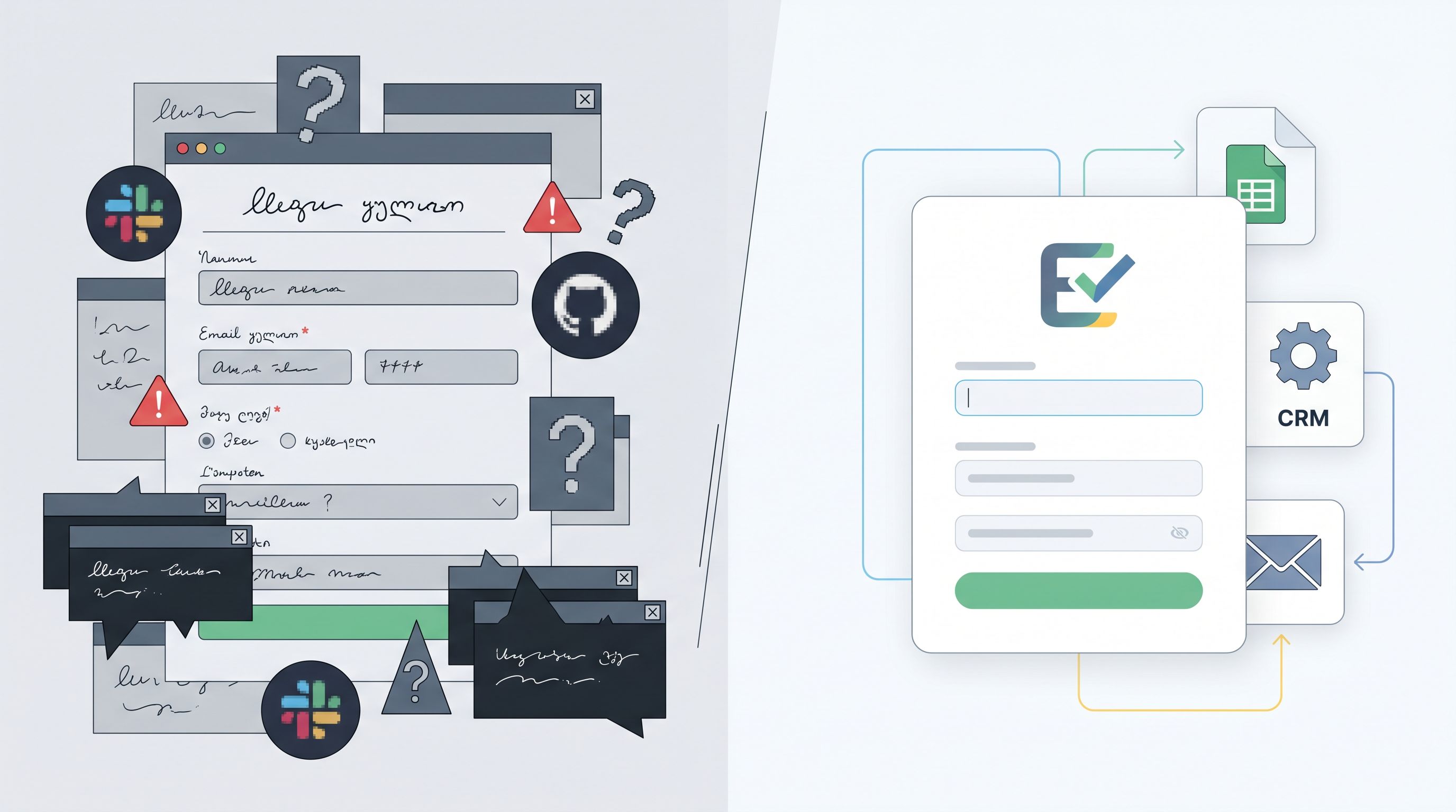
Most teams don’t lose users because the form fields are bad.
They lose them in the layer underneath: the hidden integrations, scripts, redirects, and automations that make the form “work” for the business—but feel sketchy, slow, or confusing for the person filling it out.
If you’ve ever started a form that suddenly:
- Flashes a different domain in the URL bar
- Loads three extra trackers and a cookie banner
- Pops a new tab to some unknown survey tool
- Freezes for a second after every field change
…you’ve felt this problem from the user’s side.
The irony: integrations are supposed to make your stack feel seamless. Instead, they often leak technical decisions into the experience—exactly where trust is most fragile.
This post is about building invisible integrations: connecting your forms to Sheets, CRMs, ESPs, feature flags, and internal tools in a way that feels native, fast, and safe to the people using them.
We’ll focus on Ezpa.ge forms, but the principles apply anywhere you’re wiring forms into a broader stack.
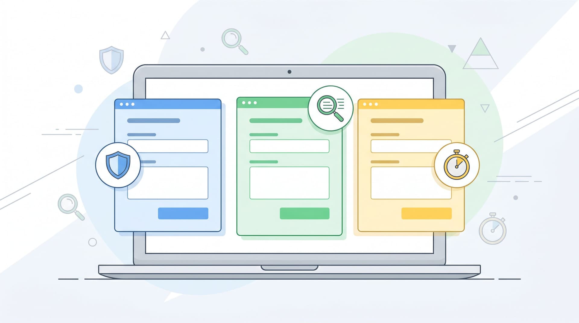
Why Invisible Integrations Matter So Much
A form is usually the first time someone hands you real information about themselves: email, company, budget, health context, payment details, or internal politics. It’s also where privacy and performance concerns are most acute.
A few realities worth keeping in mind:
- People are already wary about data use. Surveys consistently show that most Americans are concerned about how companies collect and use their data, and a large majority worry that the risks of data collection outweigh the benefits.
- Forms are a known “danger zone.” One study found that over 90% of consumers worry about data security when filling out online forms—especially when payment or identity data is involved.
- Speed is a trust signal. Slow, janky forms don’t just hurt conversion; they make people doubt your competence and security. Extra third‑party scripts, unoptimized tracking, and cross‑domain redirects are common culprits.
When your integrations are visible—through domain jumps, jarring UI changes, or suspicious loading behavior—people start asking:
“Who actually has my data?”
“Is this legit or a scam?”
“Why does this feel so heavy for a simple form?”
Invisible integrations flip that. The user feels like they’re interacting with one coherent product, while under the hood you’re:
- Syncing to Google Sheets in real time
- Pushing leads into your CRM
- Triggering onboarding or support workflows
- Routing requests to the right team
…all without making them feel like they’ve left your brand’s front door.
Principle 1: Keep the Surface Simple, Move Complexity Backstage
The core mindset shift: your form is not an integration surface; it’s a stage. Everything complex should happen behind the curtain.
Ask this for every tool you’re tempted to embed directly into the form:
“Can this run after submission instead of during the session?”
If the answer is yes, move it downstream.
What belongs backstage
These are almost always better as post‑submit automations, not live scripts in the form:
- CRM enrichment and scoring
- Lead routing logic across regions or territories
- Feature flag assignment or eligibility checks
- Internal notifications and task creation
- AI triage, summaries, or tagging
With Ezpa.ge, a common pattern is:
- Front stage: Ezpa.ge form with a clean, on‑brand theme and custom URL.
- Backstage hub: Real‑time sync to Google Sheets.
- Downstream automations: Your CRM, ESP, or task system (HubSpot, Salesforce, Intercom, Asana, etc.) reads from that Sheet or from Ezpa.ge’s direct integrations.
This is the same pattern we unpacked for feature launches in From Form to Feature Rollout: Using Google Sheets Signals to Decide Who Sees What, When: the form stays simple; the spreadsheet and automations carry the complexity.
Quick audit: what’s visible that shouldn’t be?
Open your highest‑traffic form and look for:
- Extra logos or watermarks from embedded tools
- Domain changes mid‑flow
- Inconsistent typography or spacing where an iframe lives
- Noticeable loading jumps when certain fields change
Anything the user can see that comes from an integration is a candidate to move backstage.
Principle 2: Make the URL and Theme Do the Trust Work
Invisible integrations start before the first field: in the URL bar and the visual frame.
Own the URL story
People glance at URLs more than they admit. Hover states, status bars, link previews in Slack—these are all micro‑moments where trust is won or lost.
Patterns that help:
- Custom domains or subdomains. Use
forms.yourcompany.comor a clean Ezpa.ge custom URL instead of a random tool domain. - Readable slugs.
forms.yourcompany.com/customer-intakefeels more intentional than/form/123abc. - No mid‑flow domain hops. If you must send people to a different tool, do it after a clear confirmation step, not halfway through the form.
We go deeper on how URLs shape behavior in The URL Is the New CTA: How Link Structure Shapes Ad Performance More Than Button Copy, but the short version is: your link structure is part of the UX, not just a technical detail.
Design themes that say “this is still us”
Every integration that shows up visually—an embedded calendar, a payment widget, an upload tool—should feel like it belongs.
A few guardrails:
- Match typography and spacing. If your app uses a certain font scale and line height, mirror that in your Ezpa.ge theme and any embedded components.
- Limit competing logos. If a third‑party logo must appear (e.g., Stripe for payments), treat it as a security signal, not decoration.
- Use color sparingly for third‑party elements. Keep your brand colors on primary actions; use neutral tones for vendor‑driven UI.
If you’re not sure whether your theme is helping or hurting trust, use the framework from Beyond ‘Looks Good’: A Practical Framework for Scoring Form Themes by Trust, Clarity, and Speed to score your current setup. Then adjust integrations to support, not fight, that theme.
Principle 3: Design for “Zero Surprise” Privacy
You can’t make integrations invisible by hiding what they do. That backfires. Instead, you make them invisible by making their effects predictable, minimal, and clearly explained.
What users actually want to know
At the moment of filling out a form, people are less interested in your full legal stack and more interested in three plain‑language questions:
- Who is receiving my data? (Just you? You + specific vendors?)
- What will you do with it next? (Email, onboarding, support, research?)
- How long will you keep it and can I opt out?
You can answer all three without torpedoing conversion.
Microcopy patterns that work
Add short, human explanations near the form or key fields:
- Below the email field:
“We’ll use this to follow up about your request. No marketing blasts unless you opt in.” - Near sensitive fields:
“Stored securely and only shared with our billing provider for payment processing.” - Near the submit button:
“By submitting, you agree we can store your responses and contact you about this request. You can ask us to delete your data at any time.”
If you’re integrating with tools like Google Sheets, CRMs, or AI services, you don’t need to name every vendor—but you do need to be honest about categories:
“We store your responses in our internal systems and trusted vendors (like analytics and support tools) to help us respond and improve the product. We don’t sell your data.”
Pair this with a clearly linked, reasonably readable privacy policy. That combination—plain‑language summary + full policy—builds more trust than a wall of legalese alone.
Limit the blast radius of every integration
For each integration you add, answer:
- What’s the minimum data this tool actually needs?
- Can we pseudonymize or aggregate before sending?
- Can we keep it server‑side instead of client‑side?
For example:
- Instead of sending full form payloads to every analytics tool, send event‑level data (e.g., “submitted pricing inquiry form”) without the body.
- For AI triage, send summaries or tags downstream, not raw text with personal identifiers, wherever possible.
This makes integrations feel invisible because even if someone did peek under the hood, they’d see a tight, intentional data flow—not a free‑for‑all.
Principle 4: Use Sheets as the Integration Hub, Not the Front Door
One of Ezpa.ge’s superpowers is real‑time Google Sheets syncing. Used well, Sheets becomes your universal integration hub—without ever touching the form UX.
Why Sheets makes integrations feel invisible
- It’s already trusted internally. Most teams are comfortable wiring tools into Sheets.
- It decouples front‑end changes from back‑end logic. You can adjust automations without touching the form.
- It’s transparent. Anyone can audit what’s flowing where.
Common patterns:
- Lead routing: A Sheet that powers rules like “If company size > 50 and region = EU, assign to AE X and trigger outreach sequence Y.”
- Feature access: As described in From Form to Feature Rollout…, use Sheets as a live list of who should see which beta feature.
- Internal request queues: Combined with the ideas in Form UX for Internal Tools You Don’t Have Yet (another Ezpa.ge post), Sheets can act as your lightweight ticketing system for design, marketing, or ops requests.
In all of these, the user only ever sees:
- A clean Ezpa.ge form URL
- A fast, well‑themed layout
- A clear confirmation state
All the routing, scoring, and automation happens after the fact.

Principle 5: Make Conditional Logic Carry the Personalization, Not Extra Tools
A lot of teams reach for extra integrations when what they really need is smarter branching in the form itself.
Instead of:
- Sending some users to a different form hosted elsewhere
- Embedding a separate survey or quiz tool
- Spawning a pop‑up for “advanced options”
…you can often use conditional logic inside a single Ezpa.ge form to:
- Show or hide sections based on previous answers
- Adapt copy and help text for different segments
- Route people to different thank‑you states or follow‑up instructions
This is the pattern we explored in One Form, Many Journeys: Using Conditional Logic to Personalize Flows Without Creating New Pages. The key benefit here is that personalization happens inside one coherent experience, instead of bouncing people between tools.
Guardrails for trust‑preserving logic
- Avoid “telepathy.” If the form changes based on an earlier answer, make the connection obvious:
“Because you selected ‘Enterprise’, we’ll ask a few extra questions about your team.” - Keep URLs stable. Don’t change domains or paths mid‑branch.
- Use predictable progress indicators. If some branches are longer, set expectations early:
“This will take about 3–5 minutes based on your answers.”
When logic lives inside the form rather than across tools, integrations can stay focused on what happens after submission, not on stitching together the experience itself.
Principle 6: Test Integrations Like UX, Not Just Like Plumbing
Most integration testing stops at: “Did the data arrive in the right place?” That’s necessary, but not sufficient.
To keep integrations invisible, you also need to test:
- Perceived speed. Does the form feel snappy, or does each field lag because of live validation calls or trackers?
- Perceived safety. Do any browser warnings, mixed‑content issues, or blocked scripts appear in the console or UI?
- Perceived consistency. Does anything in the visual frame suddenly change when an integration kicks in?
A lightweight test plan:
- Baseline pass without integrations. Publish a version of the form with only Ezpa.ge’s core features and Google Sheets sync. Measure load time and perceived smoothness.
- Add integrations one by one. After each addition, re‑test speed and UX. If something feels off, you’ve found the culprit.
- Run a “trust review.” Ask a teammate who hasn’t seen the form to fill it out. Watch where they hesitate. Listen for comments like “Is this still your site?” or “Why did it reload?”
- Test on constrained networks and devices. Integrations that feel fine on fiber and new MacBooks can feel broken on older phones and slower connections.
If you’re already experimenting with themes, copy, and URLs (see Form-Led Experimentation for Non-Designers: Using Themes, Copy Variants, and URLs to Run Real UX Tests), fold integration changes into those experiments. Measure not just conversion, but completion time and drop‑off during loading states.
Putting It All Together: A Practical Blueprint
Here’s a concrete way to design your next Ezpa.ge form so integrations stay powerful and invisible.
-
Start with a single, branded URL.
- Use a custom domain or subdomain.
- Choose a readable slug that matches the intent of the form.
-
Pick a trustworthy theme first.
- Align fonts, colors, and spacing with your product or site.
- Score it on trust, clarity, and speed using the framework from Beyond ‘Looks Good’.
-
Wire in real-time Google Sheets syncing.
- Treat the Sheet as your integration hub.
- Keep the form itself unaware of downstream tools.
-
Design conditional logic instead of parallel forms.
- Use one canonical form for each “job” (e.g., sales inquiry, internal request, membership change).
- Adapt questions and outcomes based on what people tell you.
-
Add downstream automations off the Sheet.
- CRM: Create or update contacts and deals.
- ESP: Add tags or segments based on fields.
- Internal tools: Create tickets or tasks with links back to the Sheet row.
-
Layer in privacy microcopy.
- Answer who/what/how‑long in plain language near the form.
- Link to a full privacy policy for details.
-
Test like a user, then like an engineer.
- First, fill out the form on multiple devices and networks.
- Then, verify data flows correctly to Sheets and downstream tools.
- If any integration forces you to compromise speed or trust, re‑evaluate whether it belongs in the critical path.
Do this, and you’ll end up with forms that feel almost boring—in the best way. No surprises, no domain jumps, no drama. Just a clean experience that quietly powers sophisticated workflows behind the scenes.
Summary
Invisible integrations are about respecting the boundary between what users see and what your systems need.
- On the surface, your forms should look and feel like a natural extension of your brand: stable URL, coherent theme, clear copy, predictable behavior.
- Under the hood, they should plug into Google Sheets, CRMs, email platforms, internal tools, and AI helpers in a way that’s deliberate, minimal, and auditable.
The payoff is more than just cleaner architecture:
- Higher completion and conversion rates
- Stronger trust at the exact moment users are most vulnerable
- Faster iteration, because you can change integrations without redesigning forms
- Less risk, because every new tool has a clearly defined role and data scope
Invisible integrations let you have it both ways: a form experience that feels simple and safe, and a stack that’s anything but simple behind the scenes.
Your Next Step
You don’t need a full replatform to start.
Pick one high‑leverage form—a sales inquiry, a waitlist, an internal request intake—and:
- Move its data into a real‑time Google Sheet via Ezpa.ge.
- Remove any non‑essential third‑party scripts from the form itself.
- Rebuild your automations off the Sheet instead of inside the form.
Then watch what happens to completion rates, support overhead, and your own confidence in shipping changes.
If you’re ready to turn your forms into trustworthy entry points that quietly power your entire stack, Ezpa.ge gives you the building blocks: custom URLs, on‑brand themes, and real‑time Sheets syncing that keeps the magic backstage—exactly where it belongs.